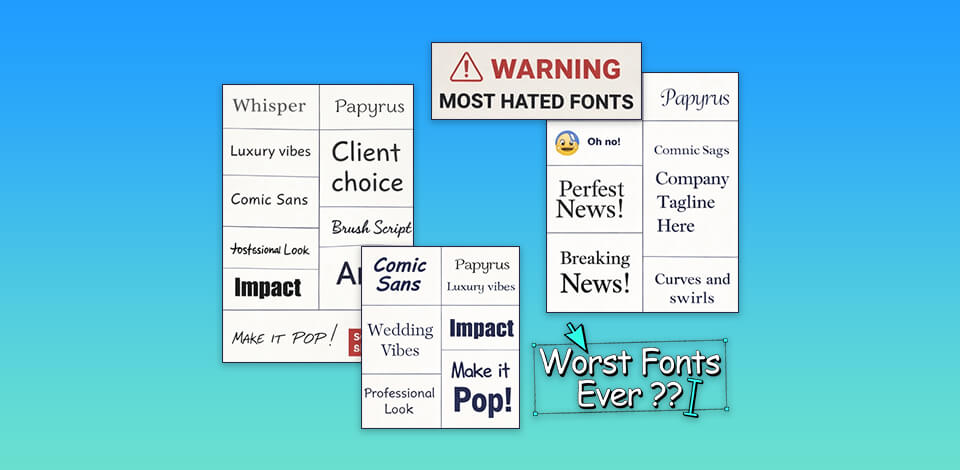
Bad fonts ruin good design. I've seen talented work undermined by poor typeface choices. Comic Sans, Papyrus, and Curlz MT make the most hated fonts lists for real reasons – overuse, terrible kerning, and zero versatility. Designers cringe because these choices signal carelessness. Want your work taken seriously? Ditch the clichés. I'll break down exactly which fonts to avoid and which modern alternatives truly work.
Bad fonts are everywhere, and as a designer, it genuinely hurts to see them. My obsession with the most hated fonts by designers started during a painful client project. A startup founder kept pushing for fonts that clashed completely with their brand. The wrong mood and the wrong weight ruined the entire feel. I tried explaining it, but they didn't budge.
That experience opened my eyes. Suddenly, I was spotting the same offenders on multiple logos, websites, social media, ads, and other types of graphic design. The same tired choices, misused and overexposed. Here's what I've come to believe. Most people aren't choosing bad fonts out of laziness. They simply don't know what makes a font fail in a real design context. Nobody taught them. That's the gap I want to close, because once you understand why certain fonts don't work, you can't unsee it.
Frustration is useful when you do something with it. So, I started writing an in-depth guide on the fonts designers quietly despise and the real reasons behind it. I wanted to prepare an honest breakdown of how bad font choices damage brands, hurt readability, and strip away any sense of professionalism. The goal isn't to mock anyone. It's to explain why context matters more than most people think. One wrong font choice can silently undermine an otherwise solid design, and that's worth talking about.
Real design mistakes teach you more than any theory. I looked through logos that screamed "2003," websites that hurt your eyes, and presentations that killed credibility before a single word was read. It all happens because of bad font choices. These are the fonts designers hate, and studying them is surprisingly revealing. I'm looking at how each one performs across print, digital, banners, and mobile. Then I'm pairing them against smarter alternatives. Tiny tweaks like tighter kerning, better line spacing, and a stronger pairing, and the same layout breathes differently.
Still, the majority of "bad" fonts aren't broken. They're just misused, overexposed, or forced into contexts they were never built for. Wrong spacing, clashing pairs, and outdated vibes turn a decent typeface into a design disaster. The font rarely fails alone. The decision around it does.
This overview exists because I wanted to make bad font choices harder to defend. I want designers and non-designers alike to understand why certain typefaces fail, not through jargon, but through clear examples. Next time a client pushes for a questionable font, I'd love to have something concrete to show them.
I also reached out to fellow designers from the FixThePhoto team. Turns out, every experienced graphic and web designer carries a mental list of fonts they silently cringe at but see everywhere. So, together, we built a definitive list of the most hated fonts in the design world.
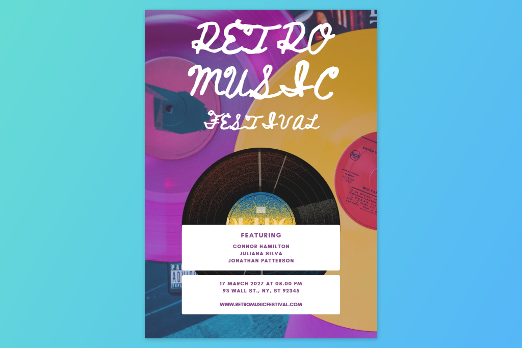
Poor readability. If someone has to squint to read your text, the font has already failed. Overly decorative, paper-thin, or detail-heavy typefaces may look interesting at first glance, but they break the most basic rule – text needs to be read easily.

Too much decoration. Swirls, ornate shapes, and unusual letterforms can work beautifully only when the font is purely visual, almost like an illustration, or when you want to experiment with very creative graphic design ideas. In other scenarios, they overwhelm the design and make it look amateurish. Logos and presentations suffer the most from this mistake.
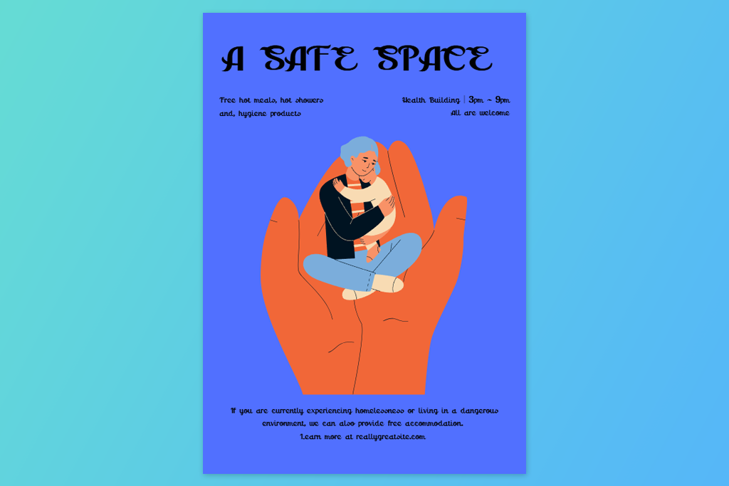
Wrong context. Even a well-designed font can look completely out of place. A playful, casual typeface in a serious business document sends the wrong signal immediately. Every font carries a mood, and that mood needs to match the project's purpose.
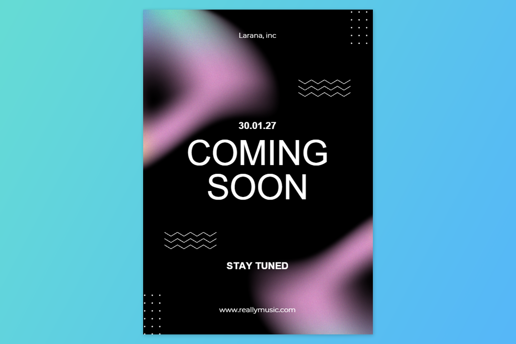
Outdated design. Certain typefaces are frozen in a specific era. Use them today, and your design quietly signals "we stopped paying attention." Modern projects need typography that looks current, not nostalgic.
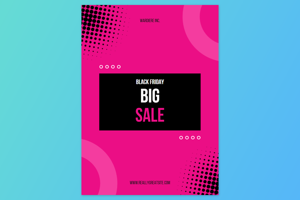
Excessive use. Overused fonts lose their power. When a typeface appears on everything from coffee cups to corporate decks, it stops saying anything meaningful. This is especially dangerous in branding, where distinctiveness is paramount.
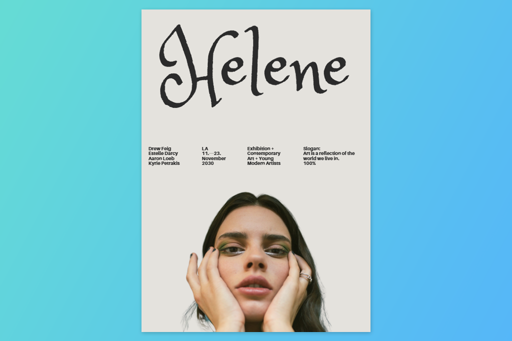
Technically weakness. Among the worst fonts for graphic design are those with uneven proportions, awkward letter spacing, or unbalanced shapes. Poor craftsmanship shows. The text is off, even though you can't immediately explain why.
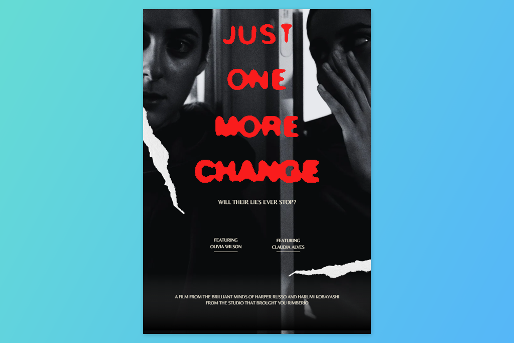
Lack of versatility. A reliable font works at any size, be it small print, large banners, or mobile screens. If it only functions in one specific context, it becomes a liability the moment your project grows.
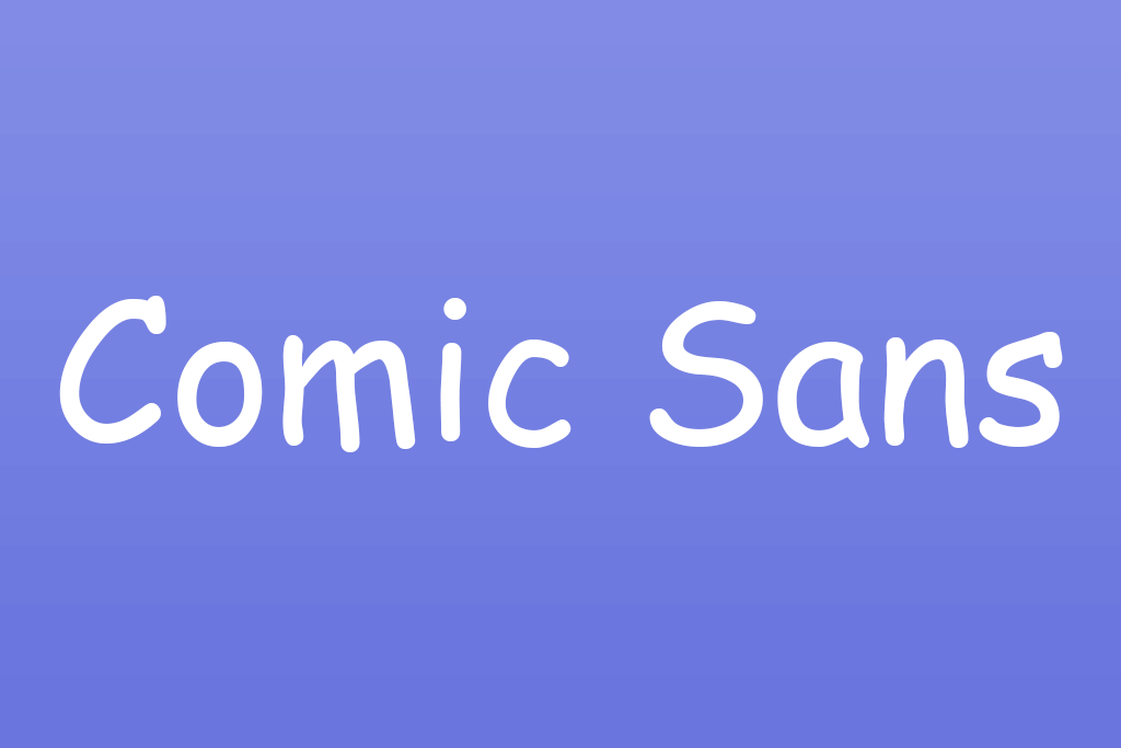
Comic Sans tops the list of fonts graphic designers avoid, and for good reason. It feels playful in all the wrong ways. The uneven strokes and cartoonish vibe may work for a kindergarten flyer, but drop it into anything professional, and credibility disappears instantly. Designers reach for it, thinking "friendly", but it reads "sloppy" instead.
Where it’s used: school materials, informal office documents, signage, memes
Better alternatives: Poppins, Nunito, Quicksand
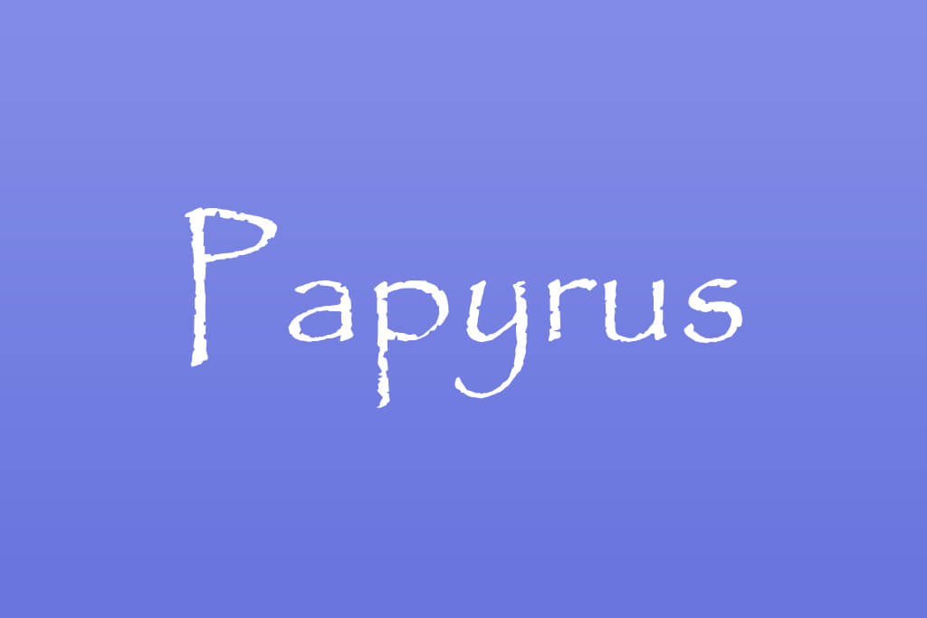
Papyrus was supposed to feel ancient and mysterious. Instead, it just feels tired. The rough, textured edges that once seemed artistic now scream "overused." Designers leaned on it so heavily, especially in spa branding and fantasy media, that it lost all personality. What was meant to look authentic just looks like a shortcut now.
Where it’s used: movie posters (notably fantasy films), café branding, wellness/yoga studios
Better alternatives: Cinzel, Cormorant
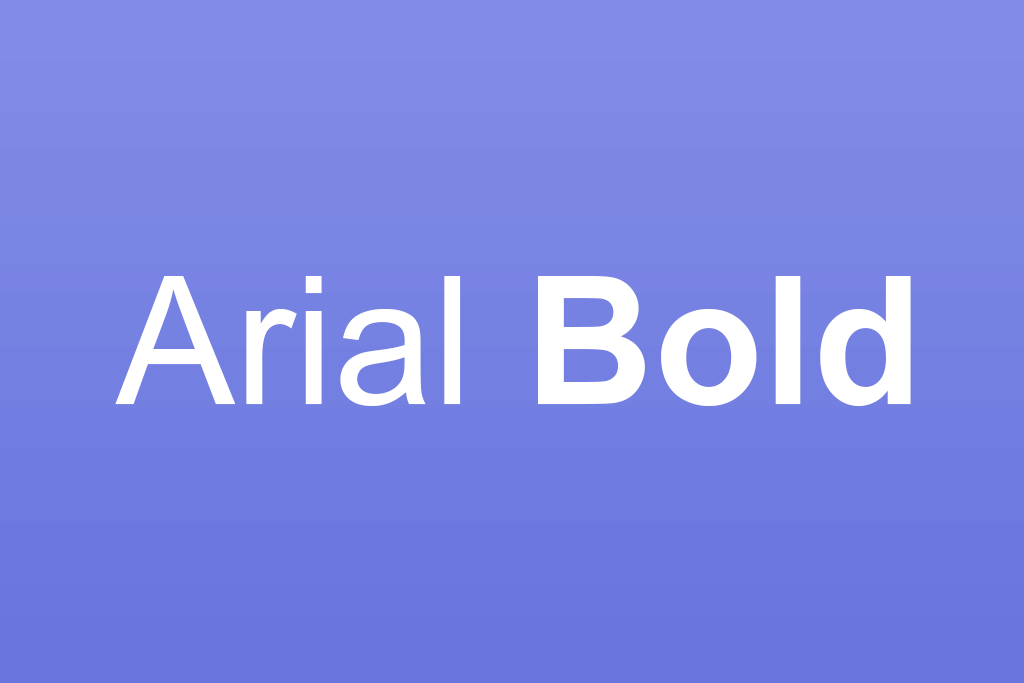
Arial sits among the most annoying fonts designers complain about, not because it's ugly, but because it says absolutely nothing. It's the font equivalent of beige walls. Overused as a default, it screams "nobody made a choice here," quietly killing any chance of memorable branding.
Where it’s used: documents, websites, presentations, and some album covers
Better alternatives: Inter, Lato, Source Sans Pro
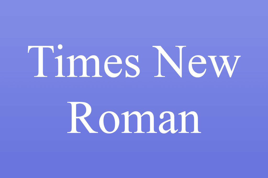
Times New Roman carries serious baggage. It instantly transports people back to school essays and legal paperwork, which is hardly the feeling any brand wants. It is often ranked among the fonts designers refuse to use in modern projects. It's not unreadable, just emotionally stuck in 1995.
Where it’s used: academic papers, books, legal documents, newspapers
Better alternatives: Merriweather, Georgia
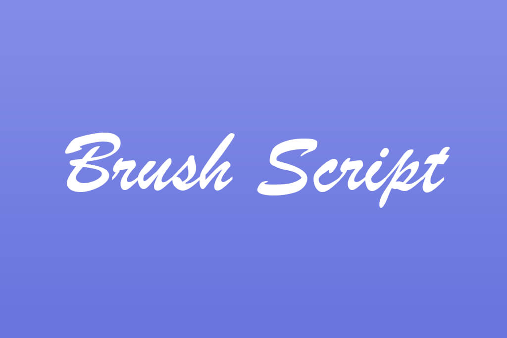
Brush Script promised personality but delivered chaos. Those looping, connected letters look charming for about two seconds before your eyes give up trying to follow them. It aged badly, too, landing somewhere between a 1970s diner menu and a craft store clearance bin. Personal? Not anymore. Just predictable.
Where it’s used: vintage logos, signage, greeting cards, old advertisements
Better alternatives: Pacifico, Satisfy

Impact was built to grab attention, and it does, just not the kind you want professionally. Squished letters, heavy strokes, and zero breathing room tire eyes easily. What is more, the internet turned it into the official font of memes, and that reputation stuck hard. Using it now feels less like bold design and more like a joke nobody asked for.
Where it’s used: memes, posters, headlines, internet content
Better alternatives: Bebas Neue, Oswald

Courier New was built for typewriters, not modern screens. Every character takes up the same space, which sounds fair but actually makes reading slow and clunky. It works fine for coding or legal documents, but in creative design, it sticks out like a relic from 1975. Most designers keep away from it for good reason.
Where it’s used: coding environments, screenplays, typewriter-style designs
Better alternatives: IBM Plex Mono, Fira Code
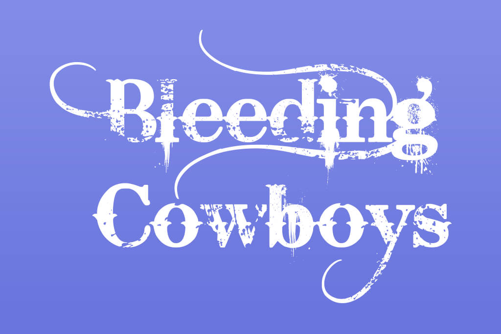
This one makes you immediately think about "2007 tattoo parlor." Bleeding Cowboys leans hard into scratchy textures and jagged edges, which may seem edgy at first glance. But it's exhausting to read and ages incredibly fast. It's so specific in personality that it fits almost nowhere professionally.
Where it’s used: band posters, tattoo designs, early 2000s graphics
Better alternatives: Playfair Display, Adobe Caslon
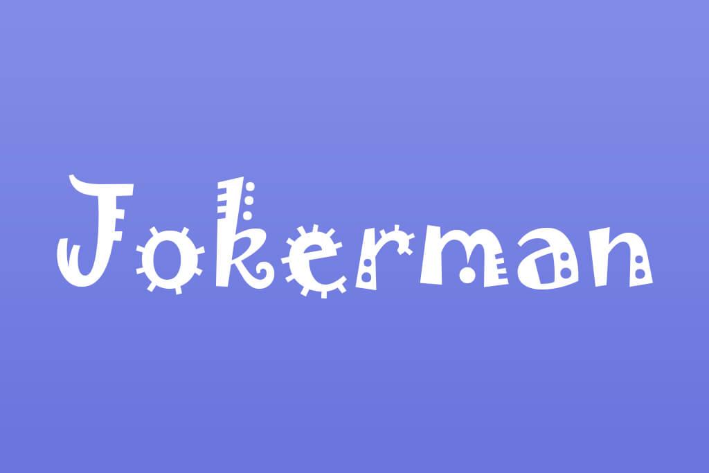
Jokerman is pure visual noise. The swirls, bumps, and random decorations fight for attention all at once, making your brain work overtime just to read a single word. When people talk about ugly fonts in graphic design, Jokerman is usually the first example that comes up.
Where it’s used: party invitations, carnival signs, novelty designs
Better alternatives: Baloo, Fredoka One
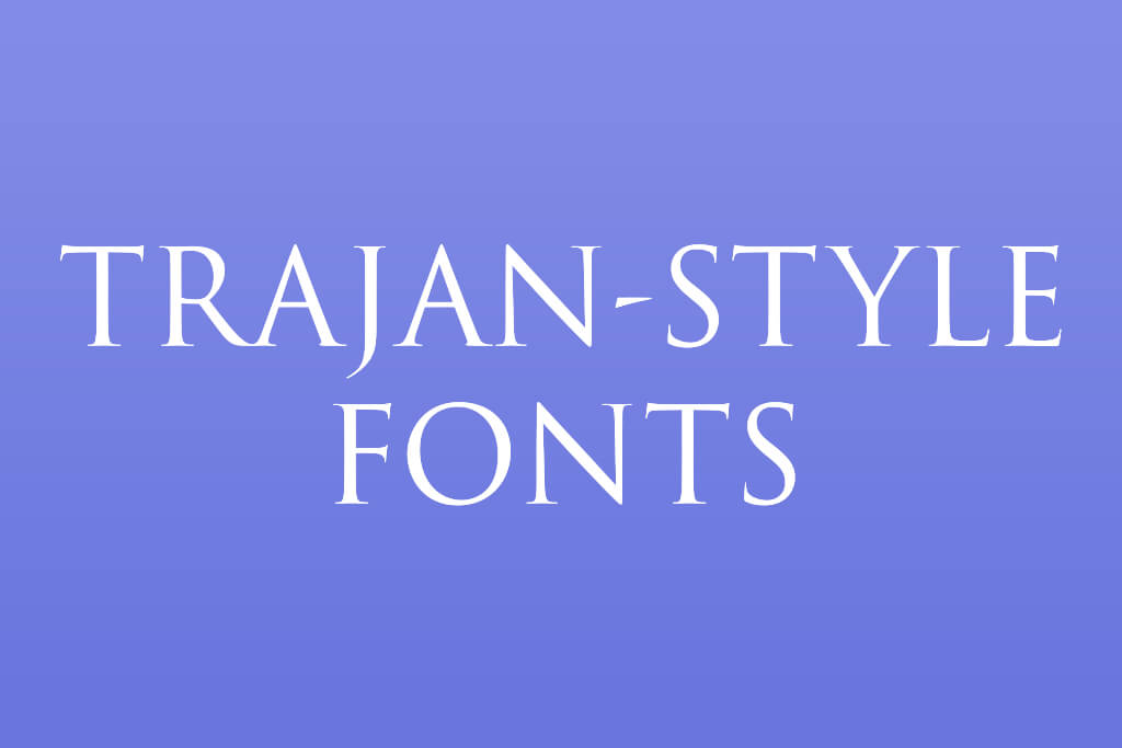
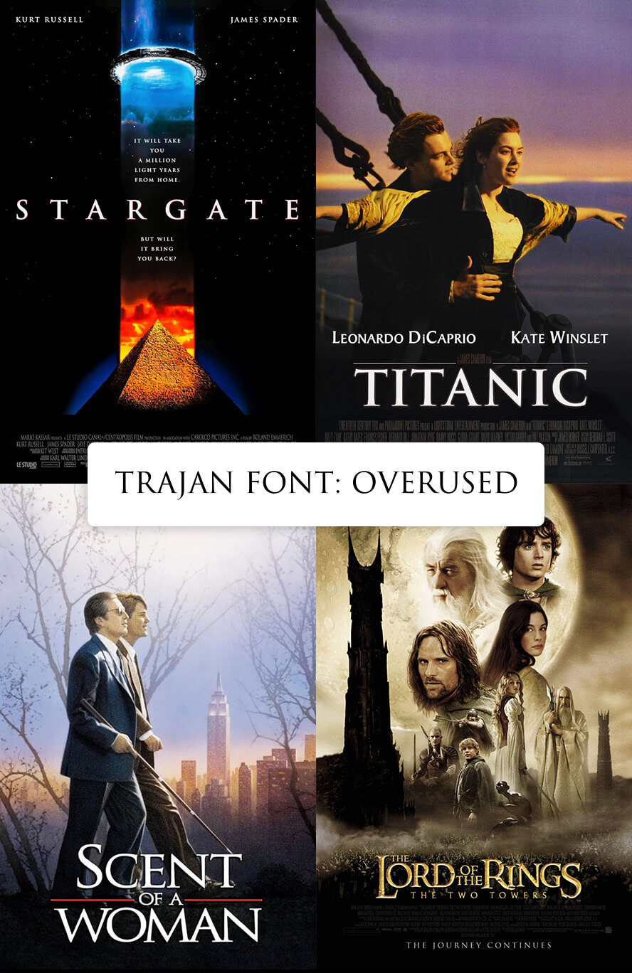
Trajan looks stunning, but just the first time. After that, it becomes the font equivalent of a movie trailer cliché. Every epic film poster and every "serious" brand seemed to grab it at once. That overexposure killed its elegance. The all-caps-only format makes it even harder to use flexibly in real projects.
Where it’s used: movie posters (historical and drama films), luxury branding
Better alternatives: Cinzel
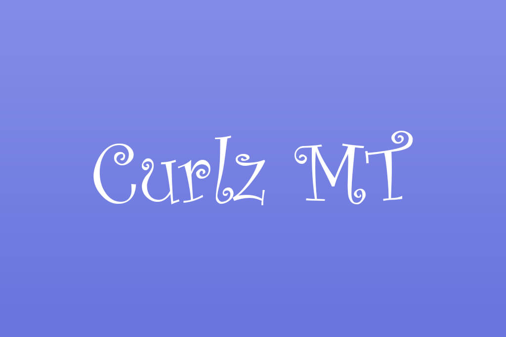
Curlz MT is the font equivalent of glitter. It is fun in theory, chaotic in practice. Those loopy, bouncy curves signal "birthday card from 2003" more than anything professional. Designers instinctively avoid it, and I can totally see why.
Where it’s used: children’s invitations, party flyers, school materials
Better alternatives: Comic Neue, Amatic SC
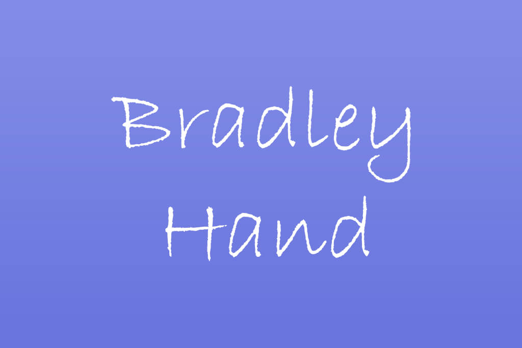
Real handwriting has rhythm and imperfection. Bradley Hand has neither. Every letter repeats identically, which instantly kills any warmth it's trying to fake. It sits comfortably among the controversial fonts designers hate, not because it's bold, but because it pretends to be something it simply isn't.
Where it’s used: casual branding, greeting cards, informal notes
Better alternatives: Indie Flower, Amatic SC
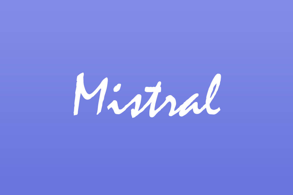
Mistral looks handwritten, but that's exactly the problem. Its uneven strokes and choppy spacing make the text harder to follow than it should be. Next to modern, clean typography, it feels like a relic – charming maybe, but rarely the right call.
Where it’s used: old print materials, packaging, signage
Better alternatives: Great Vibes, Allura
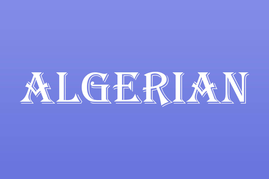
Algerian tries too hard. The heavy serifs, dramatic contrast, and ornate styling pull attention away from the actual message. It's bold, but in a way that seems dated and overdone. Modern branding needs clarity, and Algerian simply doesn't deliver that.
Where it’s used: posters, restaurant menus, signage
Better alternatives: Playfair Display, Abril Fatface
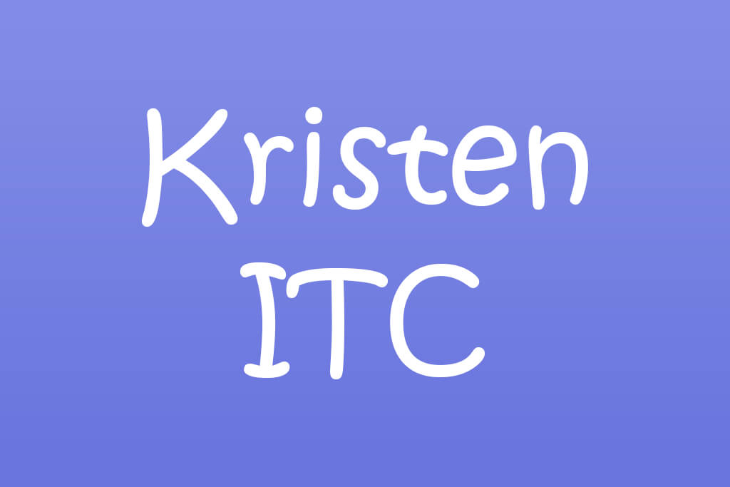
Kristen ITC is built for casual, playful contexts, but it ends up everywhere it doesn't belong. That irregular, childlike style declares "informal" immediately, which is a problem when your design needs to look professional. It is one of the most overused fonts designers hate.
Where it’s used: classroom materials, children’s books, informal graphics
Better alternatives: Poppins, Comfortaa
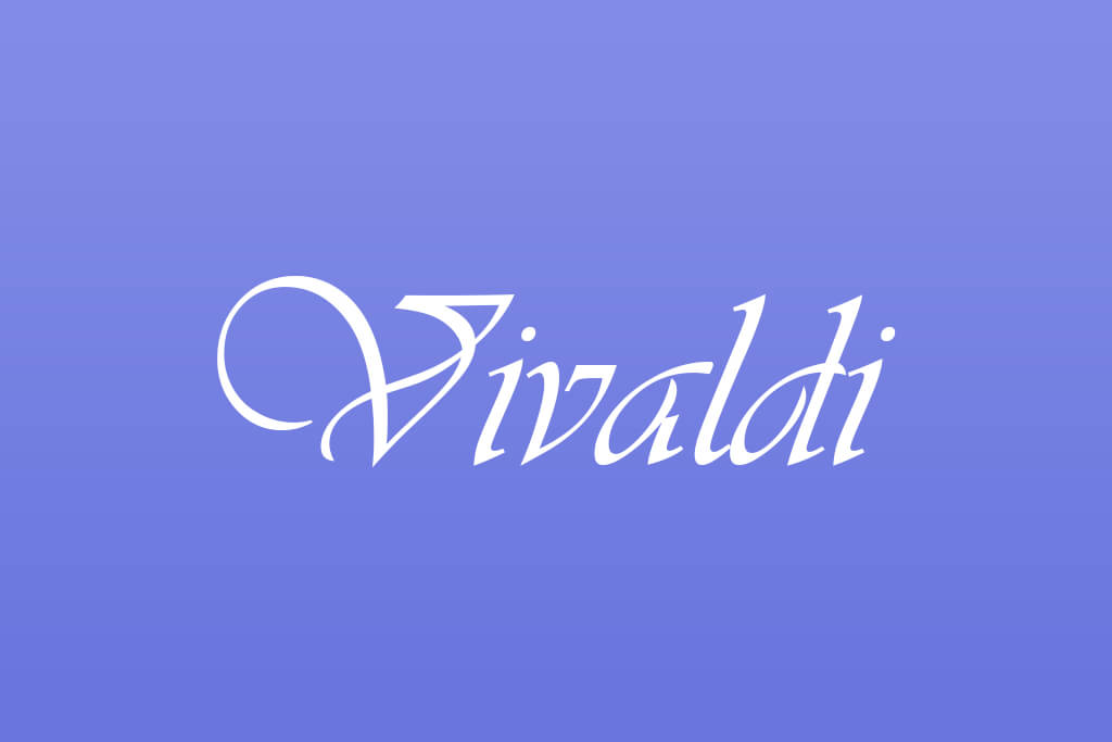
Vivaldi looks stunning at first glance with flowing curves and elegant strokes. But elegance doesn't always mean functional. In real-world use, those intricate letterforms become a readability nightmare. Small sizes and body text make you squint when reading it.
Where it’s used: invitations, certificates, formal stationery
Better alternatives: Playball, Alex Brush
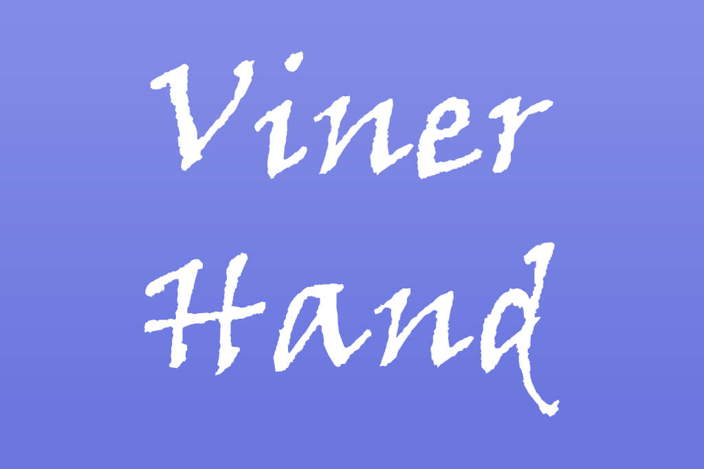
Viner Hand had its moment, then overstayed its welcome. What once looked personal and organic now just feels generic. Handwritten fonts only work when they are distinctive, and Viner Hand lost that quality long ago. For branding, especially, it creates no real identity or memorable impression.
Where it’s used: youth branding, casual designs, school projects
Better alternatives: Patrick Hand, Shadows Into Light
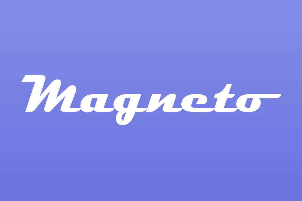
The dramatic curves and retro styling might have felt fresh once, but now it just looks like a throwback nobody asked for. Magneto is so tied to a specific aesthetic that using it anywhere seems immediately dated. Readability takes a hit too, especially at smaller sizes. Designers tend to reach for it when they want something "different," but it ends up looking anything but.
Where it’s used: retro signage, diner-style branding, posters
Better alternatives: Lobster, Milkshake
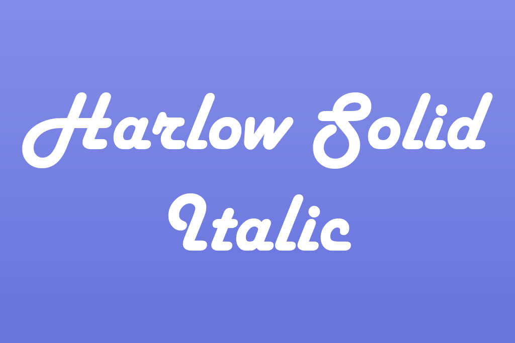
Harlow Solid Italic gives so much drama that it forgets to be functional. The exaggerated slant and heavy decorative styling are unbalanced and almost unstable. It looks like it's trying to be elegant but lands somewhere between outdated and overwhelming. Modern design has no real place for it.
Where it’s used: vintage ads, posters, decorative branding
Better alternatives: Raleway, Quicksand

Accelerator prioritizes looking "cool" over being readable, and that's a fatal flaw. The distorted, futuristic shapes work in extremely narrow contexts, nowhere else. It's no surprise fonts like these regularly appear on lists of most hated fonts among designers.
Where it’s used: gaming graphics, sci-fi posters, tech-themed visuals
Better alternatives: Eurostile, Orbitron
Using trendy fonts can be tempting, but they're not always the right choice. Just because something looks great on design blogs or blows up on social media doesn't mean it'll work for your project. This is a common issue among designers when they chase trends without thinking about context.
In fact, most trendy fonts are built for the moment or particular media.
They feel fresh today and dated six months later. Drop a font for flyers into a corporate report or a professional logo, and suddenly your design looks more gimmicky than credible.
Readability is the other trap. Trendy styles love to experiment with unusual letterforms, heavy decorative details, and extreme spacing. That may grab attention in a big headline, but shrink it down to body text or a mobile screen and it falls apart fast. A font that looks stunning on a mockup can completely fail in print or email. Always test before you commit.
A Truly Good Font Checks All These Boxes:
Start with Google Fonts. It's free, open-source, and surprisingly powerful. Filter by style, weight, or language support, and you'll land on something solid fast. Great for both web and print.
If you’ve paid for an Adobe subscription, take advantage of Adobe Fonts. In fact, you already have access to Free Adobe fonts. You don’t need to download anything. The fonts sync directly into Photoshop and Illustrator. The quality is consistently professional.
For something truly distinctive, browse MyFonts. It's a massive marketplace where independent typography artists and studios sell unique, high-end typefaces. Check the trending and bestseller sections to find stuff nobody else is using yet.
DaFont is a massive package of decorative, quirky, and experimental fonts. However, the quality isn't consistent, and licenses vary wildly. Always read the fine print before using anything commercially.
Font Squirrel flips that problem entirely. Every font is hand-picked and cleared for commercial use and typography apps. There is a smaller library, but you can trust what's there.
Creative Market is worth browsing if you want fonts bundled with textures, mockups, and graphics. Independent graphic designers sell modern, trend-forward typefaces here, often packaged with extras that save you time.
And if you need serious variety without buying everything separately, Envato Elements runs on a subscription model. You can enjoy unlimited downloads across fonts, templates, and graphics. It's a solid deal for designers juggling multiple projects at once.
Behance is the place where designers love to show off their work, and fonts are no exception. You'll often find free downloads or links to buy, plus a solid pulse on what's trending.
Dribbble works similarly, with lots of typography experiments and downloadable fonts. Great for stumbling onto something fresh and unexpected.
Fontshare is the newer website, but don't let that fool you. It offers free, genuinely professional fonts. The library isn't huge, but every pick is intentional and polished.
“Always check the font license before using it. Many of the fonts designers hate dealing with are the ones that seem free but aren't for commercial use. Branding, ads, or packaging may need a paid license. Read the fine print. It saves you from legal headaches and surprise costs later.”

“Before you download anything, test the font with your own text. Don't just rely on the sample preview. Type in your real headings or copy. I've seen so many awkward spacing issues caught this way. It saves time and stops you from picking a font that looks wrong in practice.”

“Don't download fonts from random websites you've never heard of. I've seen people end up with corrupted files or even malware. Stick to trusted platforms only. Reputable sources also give you better quality fonts with multiple weights and full character sets.”

“Just stick to trusted platforms like Google Fonts, Adobe Fonts, Font Squirrel, or DaFont. You get proper licensing, solid kerning, and multi-language support. These platforms also help you move past overused fonts designers hate and discover modern, curated options that fit your project better. Makes the whole process easier.”

“I always go back to Google Fonts and Adobe Fonts. Why risk it elsewhere? These platforms just work and offer clean licensing and multilingual support. You also discover beautifully curated collections you wouldn't find randomly browsing.”

“Font pairing is something even experienced designers struggle with, and there are definitely fonts designers refuse to use because they simply don't play well with others. A font may look stunning alone, but completely fall apart next to another typeface. I always pick fonts that work across multiple weights, sizes, and formats. That flexibility is beneficial for web, print, and mobile use.”

“Some of the worst fonts for graphic design aren't bad because they look ugly. They're bad because they break across platforms. A font that looks crisp on Mac can appear chunky or unreadable on Windows. The same goes for web versus print. I always test before committing. Check every device and every medium. Consistency and readability should hold up everywhere.”

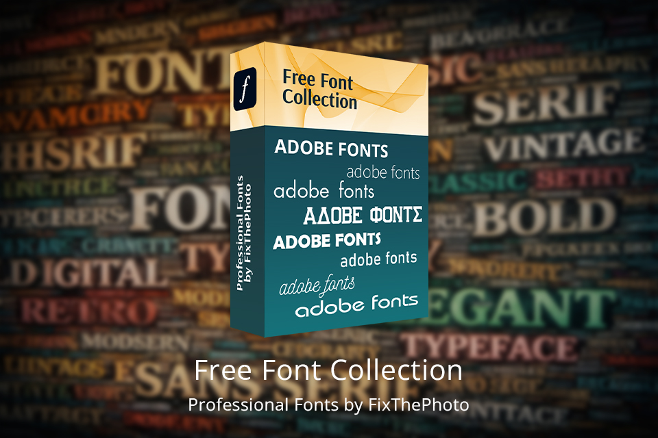
Need fresh fonts for Photoshop but don't want to spend a dime? FixThePhoto has you covered. They've put together a solid free collection packed with styles for every mood. There are clean sans-serifs, flowing scripts, and everything in between. Whether you're crafting a logo, designing for social media, or working on something for print, there's a typeface here that fits. Every pick is chosen with real design work in mind: readable, flexible, and ready to make your project stand out.





![Golden Hour Filter Online [FREE]](http://fixthephoto.com/blog/images/gallery/news_main__preview_28916.png)

![7 Best YouTube Banner Generator [Real Channel Tests]](http://fixthephoto.com/blog/images/gallery/news_main__preview_28946.jpg)