Typography should never be considered a mere means of communicating a particular meaning. It was originally meant to evoke a strong emotion. Artists like Paula Scher, Alexis Persani, and Sabeena Karnik are the perfect examples of this. Working as a designer, I have always thought that each letter should have a unique personality and rhythm. However, recently, more and more people started to consider typography as a basic form of visual expression. One can see typography designs in galleries, motion visuals, installations, and sculptural compositions.
This is why I decided to create a list of typography artists who transformed the way I see letters. These designers set trends instead of following them. They experiment with text when creating different art forms and masterfully convey a pure emotion. Each of them tells a unique story of how typography transcends the borders of design and becomes art with its own voice.
Before sharing my thoughts on the greatest typography artists, I want to emphasize that not every attention-grabbing design posted on Instagram can be considered an example of typographic art.
Nowadays, you may see a lot of self-proclaimed “aesthetic typography” designs on social media. However, most of them look like forgettable examples of decorative design. True typography artwork has a much deeper impact. It is well-structured and conveys a strong message that stays with you forever.
When one downloads free photography fonts for Photoshop, it does not automatically make them a typography artist. A true artist knows how to come up with a strong concept and express it in the most impactful way possible.
Before learning more about the artists who transformed modern typography art design, here are some things I take into account when considering whether a piece of typography can be considered art.
| Element | What It Means | Why It Matters in Typography Art |
|---|---|---|
|
Concept
|
The main idea behind the artwork
|
Impactful typography starts with an objective. Not everything is about a style.
|
|
Form & Structure
|
Shape, composition, layout, and balance between letters
|
Impacts visual rhythm and emotional tone
|
|
Medium & Technique
|
Tools and materials used: digital, paper, 3D, installations
|
Demonstrates a unique approach used by each artist
|
|
Communication
|
Tells whether the artwork can communicate a feeling or a story
|
Typography must convey a meaning, even if one uses a short word
|
|
Impact
|
Lasting emotional or visual impact
|
True typographic art is impossible to forget
|
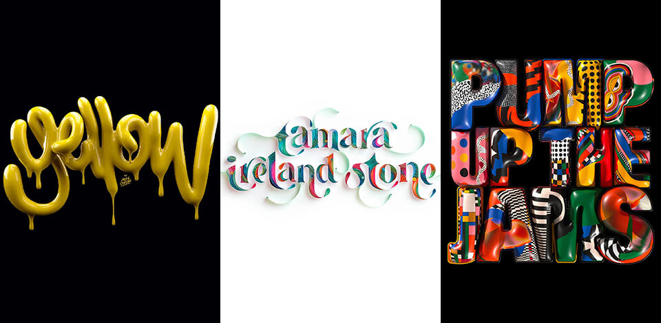
This simple method allows one to understand why some typography designs have a strong impact while others look too generic. Typography becomes a form of art when letters make a strong impact on a viewer and become a unique experience. Below, you will find a list of artists who have revealed the transformative potential of typography.

Paula Scher is one of the most well-known typography designers of our time. It was she who inspired me to explore typography as a language, instead of considering it as a mere tool. When working on her projects, she uses bold and smart approaches, using words to build compositions with complex architecture.
If you have ever seen the posters she created for The Public Theater in New York or her huge typographic maps, you might have already experienced the powerful impact of her unique style. When I discovered her works, I was struck by her ability to create splendid designs of great scale and intensity.
She boldly selects the best placement for type. Her typography style has changed corporate identity at Pentagram and transformed the future of visual branding. Paula does not consider what the best font for flyers is. When creating her works, she sets trends and conveys a message full of emotion. Her unique approach makes her the pivotal figure in modern typography art design.

Alexis Persani is a French typography designer and artist famous for his surreal 3D letter compositions. When I first saw his typography work, it reminded me of CGI from a futuristic movie. He experiments with digital sculpture techniques and cinematic lighting to create stunning typography artwork.
Alexis is different from other famous typography artists, as he knows how to add some physical weight and texture to his words. He uses 3D typography designs to give his artworks a tangible feel. They should be perceived within a space where light and shadows interact with each other. Each word tells a unique story. The letterforms float, change their shape and position, and always manage to surprise a viewer. If you want to discover modern typography art examples with a strong dynamic feel, take a closer look at the works created by Alexis Persani.

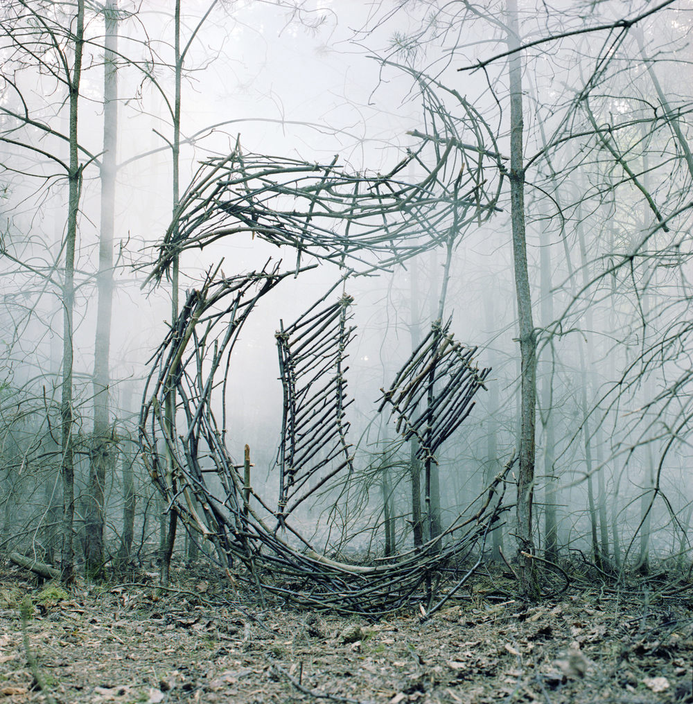
Sabeena Karnik works with paper and uses this traditional material to create elaborate forms of typography as art. She works in the quilled typography style and writes beautiful letters that look as if they were blossoming off the page. Every curve looks elaborately sculpted. Each stroke has a dynamic feel about it. Her handmade works show us that craft is more imperfect than an immaculate effect one can achieve using digital tools.
When I first saw her typography art, I was struck with how beautifully she conveyed her emotions. Her letters look like beautiful flowers swirled by the wind. Sabeena believes that a sheet of paper has a soul. She conveys her creative vision masterfully, so that everyone can see it.
Her work shows that modern design can learn a lot from handmade crafts and take inspiration from vintage typography ideas. Sabeena demonstrates the power of craftsmanship and creates artworks filled with emotion that stand out among AI-generated projects and generic designs.
Peter Strain works as an illustrative typography designer whose work combines hand-lettering, social commentary, and visual storytelling. He uses typography to convey emotion when working on portraits and poster art. It allows him to emphasize a particular idea when working with political and cinematic subjects.
Peter’s typography art is deeply personal, gritty, and full of emotion. He prefers the creative chaos of artistic expression to order. He twists and tangles letters with faces and shapes, using typography to defy conventions.
His compositions have a raw feel about them. They convey a deep meaning in a powerful, passionate, and honest way.
Many people consider which typography elements to use only when choosing a resume font or a typeface for business use. However, Nicola Yeoman has fully transformed our understanding of what typography means. She specializes in installation-based typography art and contemplates the limits of typography. She does not simply draw letters on paper. She prefers to create them from various objects instead.
Nicola can use rope, books, fabric, wood, chairs, or any suitable object to create a letter. When creating her works, she re-imagines the space around them. I was particularly impressed by her use of perspective when looking at her artworks.
She assembles typography elements so that one can read her message only from a particular angle. A viewer should guess her sculptural puzzle by carefully choosing the right position. Her art should not be just read and interpreted, it should be experienced. Every her work functions as an art installation.
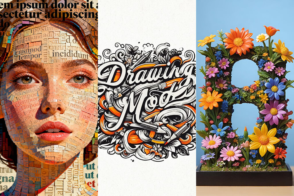
Ralph Ueltzhoeffer is a unique typography artists who made me reconsider the connection between text and identity. His style is easy to recognize if you take a look at his Text Portraits. He creates faces using biographical information, news headlines, and fragments of personal history typed across the canvas. Ralph creates typography art with a deep psychological meaning.
I was intrigued by his ability to show that we are defined by words. It makes one think whether we are a collection of information, and our lives can be explained through the lens of the words written about us. Ralph works on thought-provoking projects that combine art and philosophy. He sees typography as a mirror of human existence. If you are interested in typography artwork with a deep meaning, be sure to take a closer look at his works.

Farhad Moshiri creates unique typography projects by combining fine art and culture. Even though many people consider that only famous graphic designers prefer to experiment with expressive lettering, Farhad has discovered how to give his projects a sculptural look and make them more impactful on an emotional level.
He takes inspiration from Persian calligraphy and pop art and uses all sorts of materials to show that words have deep cultural meaning. He uses Swarovski crystals, beads, or cake icing techniques to make his projects more unique. He builds bridges between East and West using irony, nostalgia, and language to express his ideas.
I was impressed by Farhad’s ability to make typography appear as luxurious sarcasm. He uses regular phrases and popular expressions and then turns them into sculptural typographic art to give them a monumental look. Even though his lettering is highly decorative, there is always a deep meaning behind it. He stands out among other famous typographers for his ability to blend different cultures and use letters to tell stories about language and identity.


Fred Eerdekens is famous for his shadow typography works. If you take a first look at his works, you may think that they are just some abstract metal sculptures with strange twists and curves. However, when light hits them at the right angle, you will see hidden words and phrases. They become visible only due to the interplay of light and shadow. It’s one of the most wonderful typography examples I’ve ever seen.
What strikes me about this artist is that he knows how to combine physics and poetry. He does not simply write words. He creates them using an illusion. He knows how to use light and space to create invisible words that can be read only under the right conditions. Fred experiments with space and shows us that typography is not limited by a page or screen. It can exist in the real world and reveal itself to a viewer in the most unexpected way.
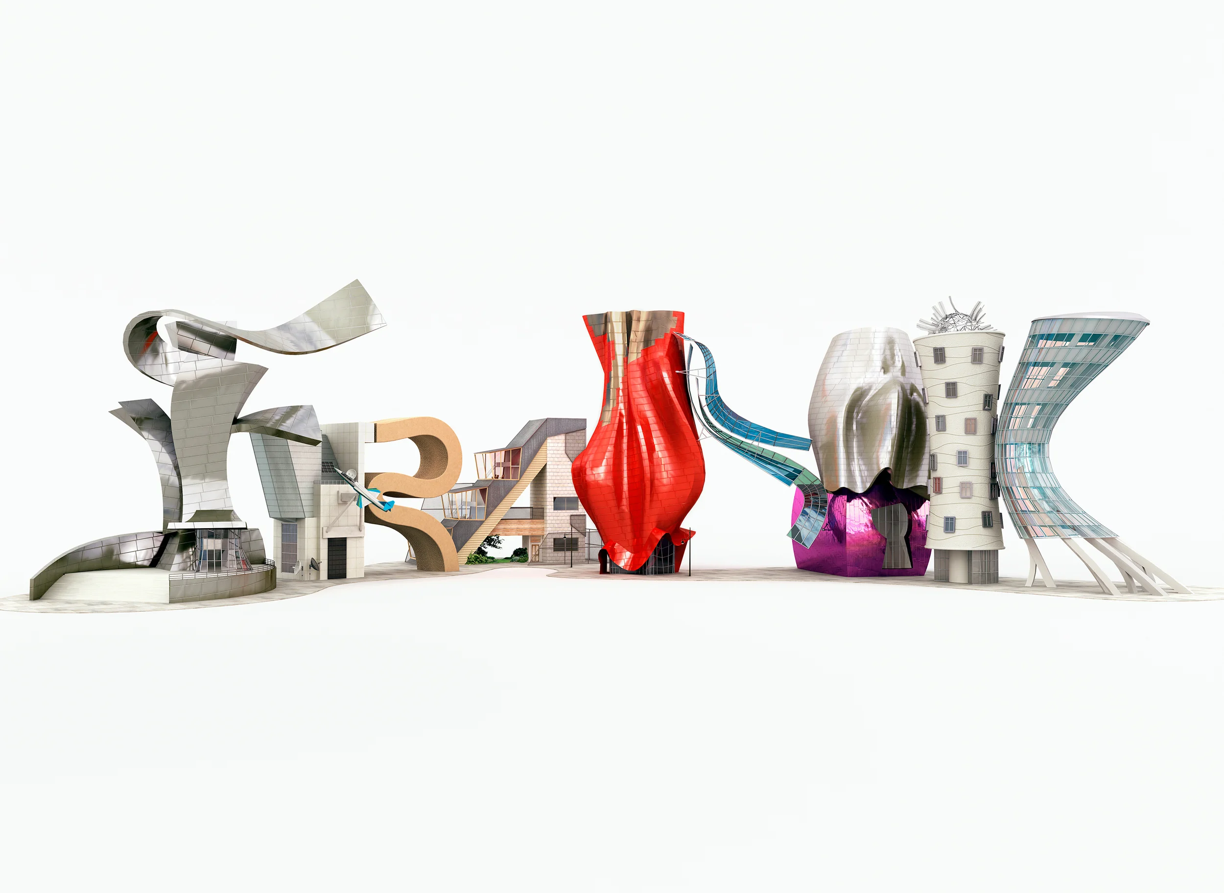
Chris Labrooy is one of the most recognizable typography artists who specializes in 3D surrealism. When working on his projects, he seamlessly combines typography, architecture, and product design to create artworks rich in visual details. He does not simply write words. He uses them as design concepts and transforms them depending on his current needs. As a result, his projects look as if they were scenes from alternate realities.
Many people prefer to use basic text layouts. They may search the web for wedding hashtags ideas or look for simple designs. However, Chris believes that typography can be a form of visual storytelling. I was truly impressed by the fact that Chris masterfully uses typography to defy the rule of logic.
He challenges the laws of physical space, but there is still something harmonic in his artworks. He created a unique form of typographic art that functions as letter-based storytelling visualized with the help of space. His work always makes me think about new dimensions of words.
Ged Palmer is known for his handcrafted typography. While many artists today prefer to use digital tools, he finds inspiration in the golden age of lettering. He creates professional sign-painted typography, works on stunning decorative scripts, and produces retro-themed compositions with the help of brushes and traditional techniques. His art has a unique feel about it. There are no unnecessary lines in his designs, and every curve has its deep meaning.
Ges stands out among other artists due to his devotion to letter craftsmanship. He creates every word from scratch and produces typography artwork with a human touch and a strong, timeless feel. His work is a real example of typography as an art. Instead of using typography solely for design purposes, Ged creates unique artworks with a recognizable style.

Thuy Mat Tit is famous for her ornamental typography. Her artworks are extremely expressive and have a deep emotional feel about them. She has a unique style with a focus on detail. Her delicate letters are embellished with floral motifs, elaborated shapes, and strokes that look like decorative ribbons. It gives her calligraphic work a unique feel. Her artwork has deep value and stems from her poetic vision of the world. She creates her project with extreme patience, focusing on beautiful details.
What impressed me most about her style is that her designs have an emotional feel about them. Her intimate artworks truly stand out among the rest. She does not see letters as a mere means of communication. Instead, she considers each of them as a true artwork. Each of these letters tells its own story, allowing one to find an answer to the question, “What is typography art?”
At first, typography was used primarily for communication purposes, but gradually it became a form of visual storytelling. These days, several styles of typography art have gained prominence in digital and print culture:
These trends have one important thing in common. They allow one to create typography that is easy to read and has a strong emotional impact, allowing designers to bring their point across. Designers and typography artists experiment with words and use various typography designs to achieve the desired effect on a viewer.
It’s a type of visual art that involves using letters and words as the key elements of designs.
It combines the traits of both. When it comes to design, typography prioritizes readability. As an art form, it focuses on expression.
Paula Scher, Alexis Persani, Sabeena Karnik, Chris Labrooy, Ged Palmer, and Fred Eerdekens.
Design transmits specific information. Typography art is all about emotion and ideas.
There is no need to buy any expensive tools. It will suffice to use paper and a pen or find some free digital tools.
Yes. Many artists create typography designs using various objects, light, metal, or installations.
Try searching for the examples on Instagram, Behance, and Pinterest. Design studios like Pentagram and DIA also have plenty of interesting examples you may use.