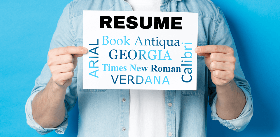
I work in visual marketing at FixThePhoto, so I notice the small design details — like the layout used for an ad or font that makes a brochure stand out. That’s why I care a lot about which font to use on a resume, probably more than most hiring managers.
Not long ago, a co-worker and I spent hours talking about which font looks better for a creative resume. I think Garamond looks more polished, but she thinks Helvetica is the better choice. We both had strong opinions and didn’t change our minds.
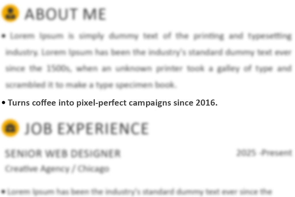
I sometimes help look through resumes when we’re hiring new people for the creative team, and I’ve seen fonts that were so distracting or outdated, I started to wonder if the individual even pays any attention to details.
After reviewing hundreds of resumes, talking with FixThePhoto teammates, and even checking Reddit for more ideas, I decided to make a list of the fonts that are best for resumes. These fonts are neat, easy to read, and look professional, making a good impression even before someone starts reading your resume.
I also included which fonts are best for certain jobs, which ones you should never use, and a few easy tips to make your resume look good and simple to read.
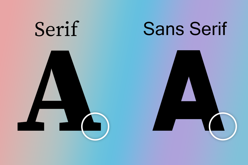
There are two main types of fonts, and knowing the difference can help your resume look better to the person reading it.
Serif fonts have small lines or shapes at the ends of the letters. Examples are Times New Roman and Georgia. They look more classic, like something you’d see in a book. These resume fonts work well for paper resumes and jobs like law, teaching, or publishing. When I see someone use serif fonts in a good way, it shows they might be detail-focused and like a more traditional style.
Sans serif fonts don’t have those extra lines. Fonts like Calibri, Arial, and Lato look clean and modern. They are great for screens and digital resumes, especially for jobs in design, tech, marketing, or anything creative.
When I use resume writing software, I usually pick sans serif fonts for my resume because they look clear and sharp on the screen.
Picking the right font style for your job can really help your resume stand out.
Cambria looks a bit fancier than Times New Roman. The letter ends are sharper, and the letters look strong. I used it on my resume using a typography app, and I still like how clean it looks.
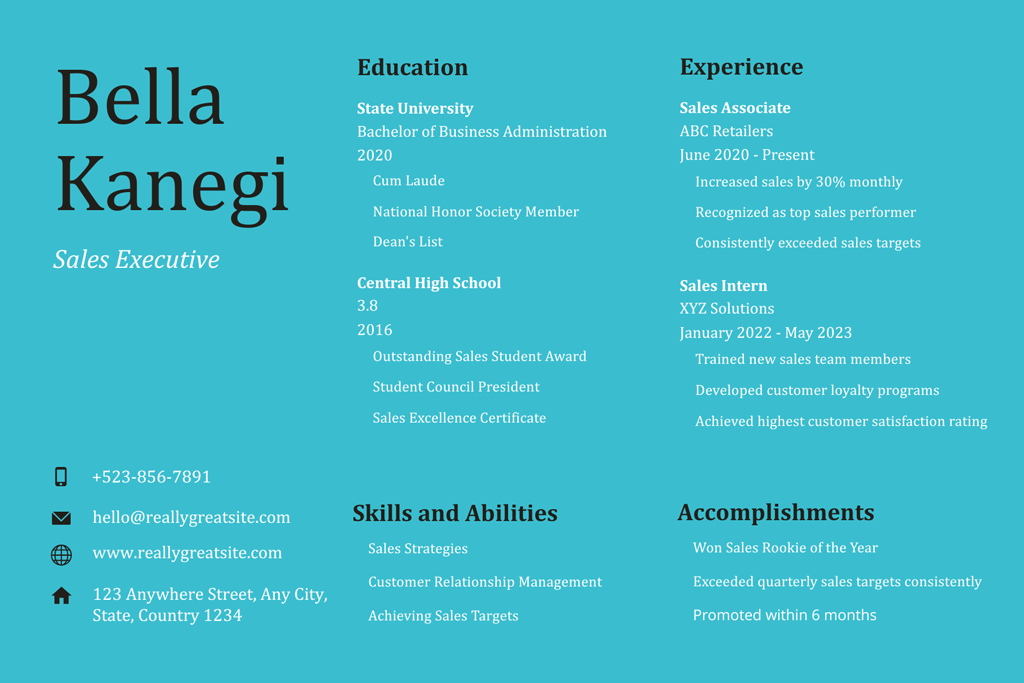
For law, finance, and corporate jobs. I’ve looked at hundreds of resumes for these types of jobs. Trust me, fun or silly fonts turn people off fast. Use resume fonts that look smart and professional.
I once saw a legal assistant's resume written in Lobster font. It looked more like a bakery menu than a job resume.

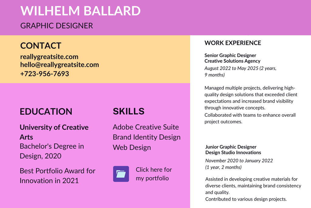
For creative roles like design, marketing, or media. In creative jobs, the font you use for your resume can show your style. I always notice when photographers choose the right font, because it shows they understand good design even before I see their photography portfolio.
One graphic designer used Courier for their resume. I could see they didn’t understand how to use space or font sizes properly just by looking at their CV.
For tech, software development, or engineering. I’ve worked with our dev team a lot, and I know that when they hire people, they want the resume to be clear and easy to read. The font should not distract from your skills or coding samples.
I once saw a developer use Impact for their whole heading, and it looked like the resume was shouting.
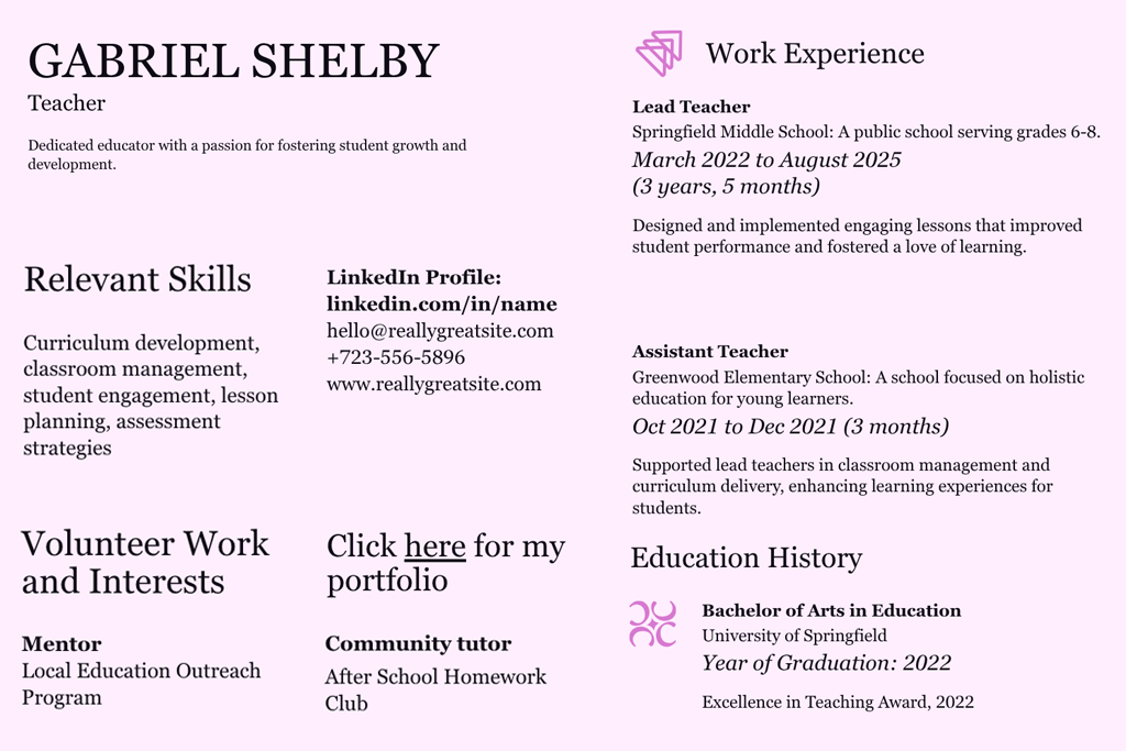
For education and academia. When I look at resumes for educational jobs, I like fonts that look calm and easy to read. It should look professional but not too business-like.
Yes, someone once used Jokerman on their resume for a teacher job. I genuinely thought it was a joke.
For entry-level or general resumes. If you’re just starting out, your resume should look neat and confident. You don’t need to use fancy resume fonts; just show you care about how it looks.
We've received a resume in Kristen ITC with a bright pink background. I must admit, it was quite creative, but I just couldn’t take it seriously.
The way your resume looks is very important. Even if you have great experience, it won’t matter if your resume is hard to read or if recruitment software can’t understand it. I’ve looked at tons of resumes over the years, both when hiring people and as someone who loves design, and here’s what I’ve found.
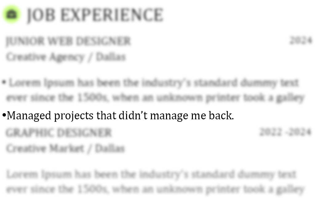
Font size. The size of the letters is just as important as the type of font you choose for your resume. If the letters are too small, it’s tough to read. If they’re too big, it can look like you don’t have much to say. Here’s what usually works best:
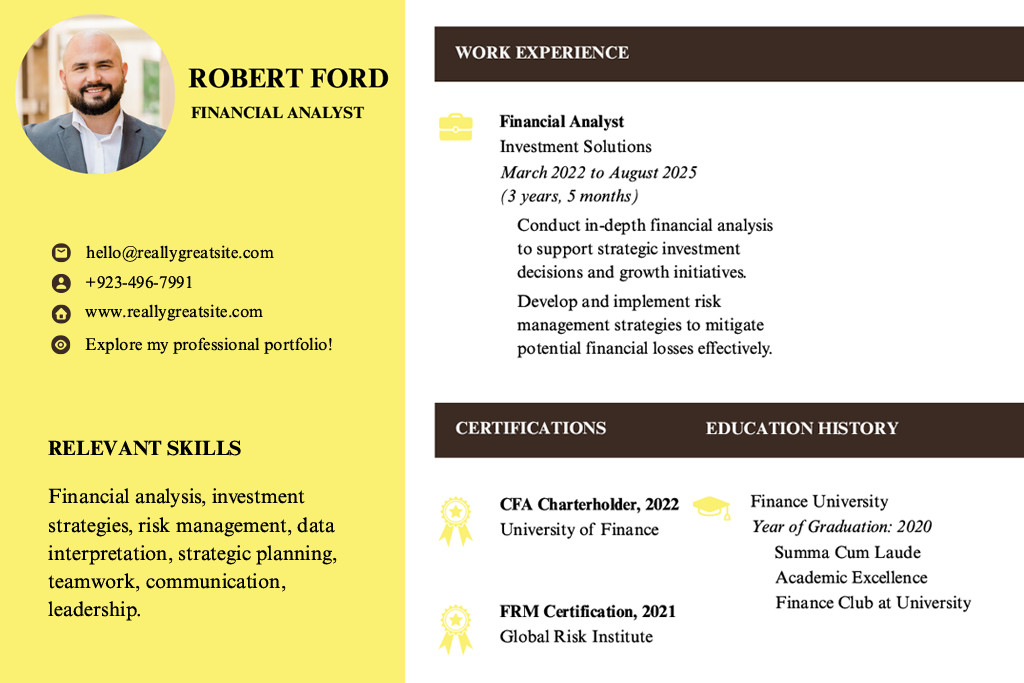
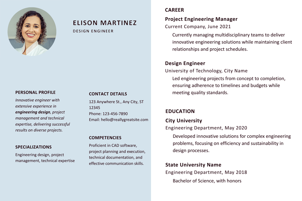
Resume format. There are a few ways to set up a resume, but one is better than the others these days:
After a lot of testing, I always suggest using the hybrid style. It shows off your best skills at the top and helps both recruiters and software match you with the right jobs.
ATS-friendliness. I’ve worked with teams that used some very strict workforce management software. These programs can be super picky. Here's how to make sure your resume looks good for both software and real people:
Dates and formatting. This might seem like a small thing, but using different date styles in one resume looks messy. Some software might also get confused. Pick one way to show dates and stick with it:
Avoid mixing different styles or only using years like “2023–2024.” Some systems need both the month and the year to understand how long you worked somewhere.
Resume jargon. Using too many buzzwords like “team player” or “go-getter” doesn’t help much. Instead, use the exact words from the job ad, especially names of tools, software, or certifications.
Tailor every resume you send. Yes, it takes extra time. But changing your resume to match the job you’re applying for really helps. Some hiring managers even say, “We didn’t pick the person with the prettier resume- we picked the one with the right keywords.”
Use the job ad like a checklist. Try to use similar words when it makes sense. Even small changes can help your resume get noticed.
A few more quick wins:
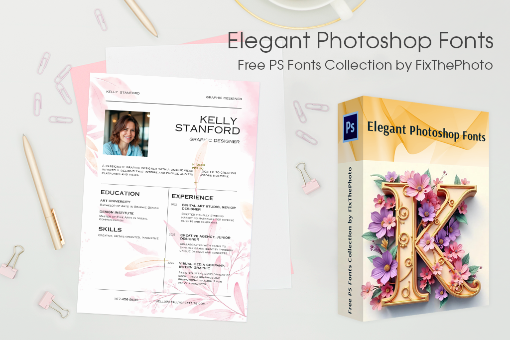
Designing your resume in Photoshop? Make it look neat and professional by using these free Photoshop fonts from FixThePhoto.
These resume fonts are great if you’re creating a custom design in Photoshop. They look nice and are still easy to read, which is perfect for creative jobs where showing your style is important. There are clean, simple fonts as well as more classic ones, which are good quality, simple to install, and free.
Whether you're applying for a creative job or just want your resume to look different from a basic Word document, these fonts add a nice personal touch without being hard to read.