If you’re looking for vintage typography ideas, you’re likely enamored with old-school prints – wood block printing, hand-painted signs, and charming letterpress creations.
Despite all our technological advancements, vintage typography still has an appeal to it that stood the test of time. Not long ago, my coworkers and I decided to explore the world of vintage fonts to prepare posters for a new café that wanted to infuse its design with a retro aesthetic.
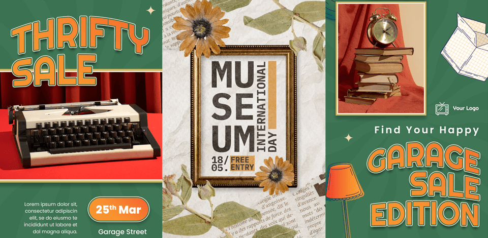
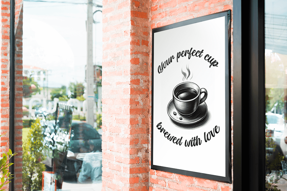
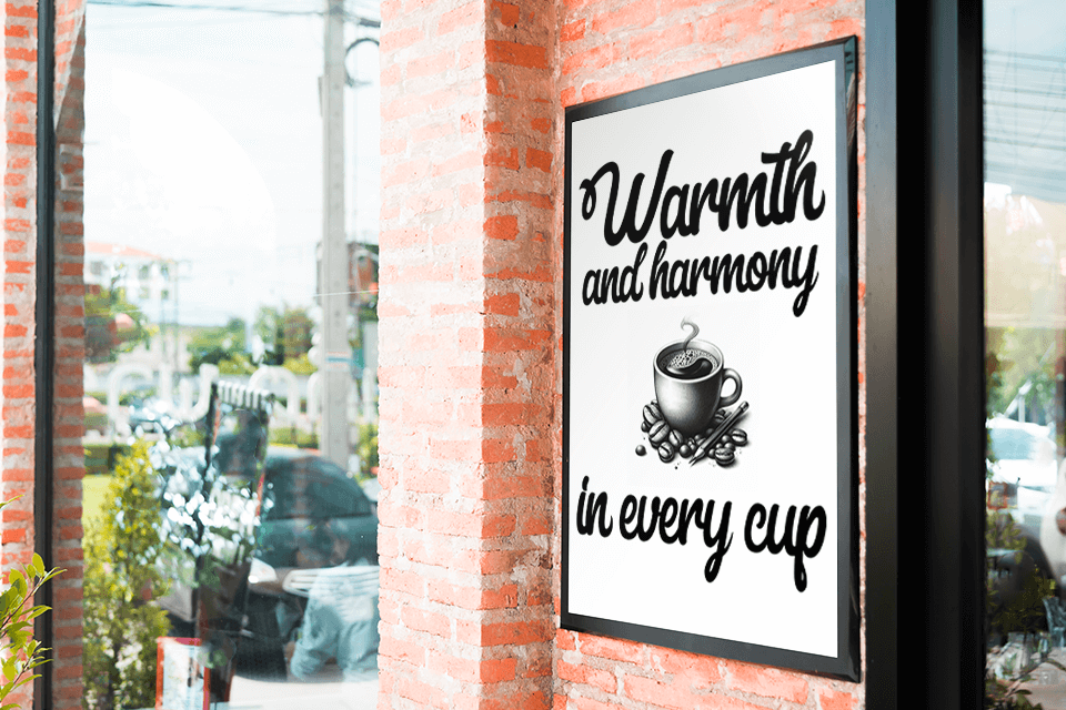
The café owner explained their plans – they ordered posters that would look like they’ve been up on the walls for decades and had appropriate vintage style typography without any modern illustrations.
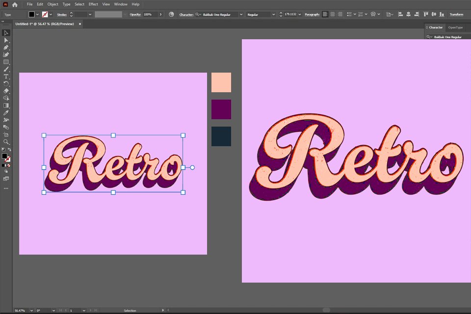
I’ve invested several hours trying to find a suitable vintage typeface. Exhausted, I resorted to designing my own – and the process was a lot simpler than I thought. Rather than using free premade vintage typography fonts, I chose to make a unique one, infused with the look and feel of retro posters. Thankfully, Adobe Illustrator made this task pleasantly straightforward.
I created sketches for each letter, trying out various styles I’ve seen on vintage signs, posters, and advertisements. After I finalized a concept in my head, I opened Illustrator and leveraged its Pen and Brush tools to vectorize my sketches. I also used the Shape Builder to enhance the smaller details and ensure all letters had that signature hand-drawn look.
The process slightly resembled using a font generator, but rather than employing premade presets, I could adjust and fine-tune every detail, which allowed me to receive a far more personalized result.

To ensure the font had a vintage aesthetic, I added appropriate textures and a distressed effect to emulate the look of aged ink prints. I relied on Illustrator's Effects and Textures to make the edges of the letters rougher and seem like they were printed over half a century ago. Lastly, I tweaked the spacing and alignment to preserve legibility without losing the nostalgic vibes.
However, if you don’t want to create a vintage typography font from scratch, I’ve put together a selection of existing typefaces that you can use for your projects while enjoying the classic look of retro lettering and the versatility of modern designs.
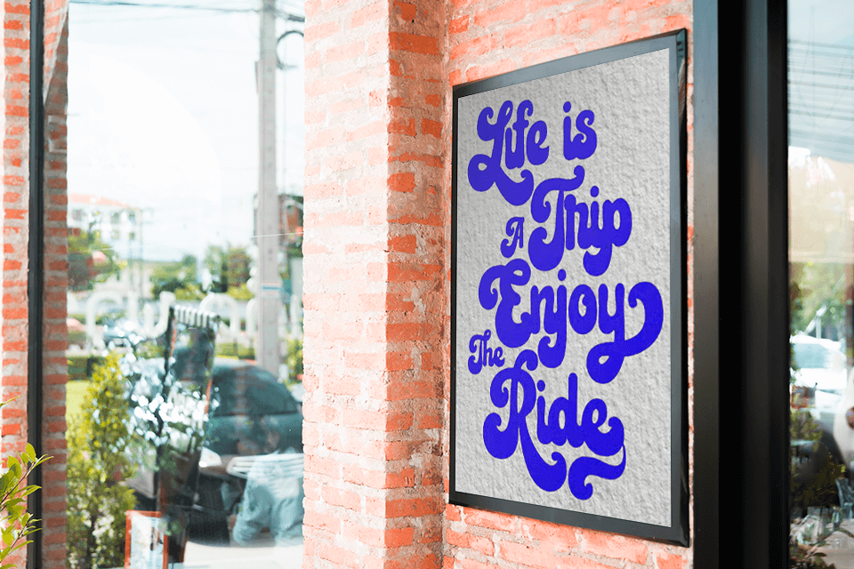
I found Lovadelic when I was looking through a vintage magazine store. It oozes funky 70s vibes, featuring psychedelic swirling letters and playful details. It’s a fantastic choice if you want your title to have as much personality as possible. For instance, it can be used to shine light on a special or seasonal dish or drink in a café’s menu.
The café owner praised its aesthetic and asked us to add it to several designs that we hung up on the walls, as it became the core typography element of our vintage posters.
West End offers a striking and refined style that conveys the beauty of retro theatre posters and stores of the early 20th century. It’s highly reminiscent of cult Western movies, with their rugged yet aesthetically pleasing letterforms. We decided that it can be a nice fit for the café’s interior, adding to its rustic atmosphere.
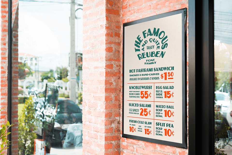
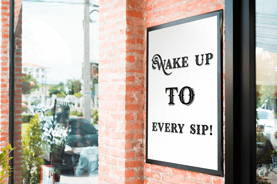
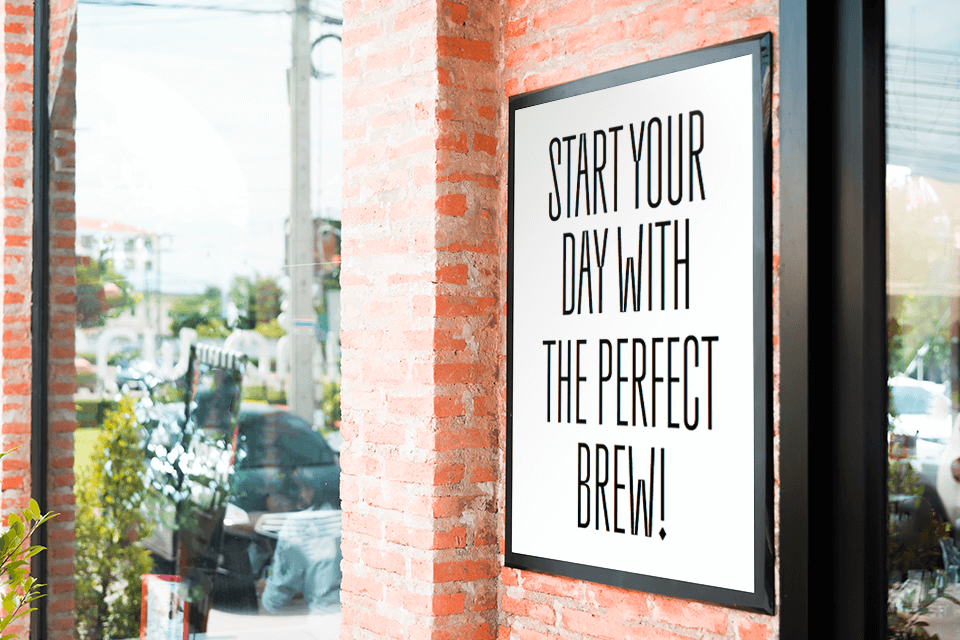
This vintage typography displays font traces its root to New York’s delicatessens that were extremely common at the Lower East Side at the turn of the century. Reuben is a bold-style font that comes in three variations.
This sans serif typeface has high thick-to-thin contrast and a vintage-aesthetic look typically used for hand-painted signs. It’s perfect if you want to create eye-catching branding or packaging elements.
My coworkers and I instantly fell in love with this font and you can see it all over social media as well. Due to how commonplace it has become, designs that use this font have both a modern and classic vibe to them, making them a great fit for Instagram. You can recognize it by its thick, high-contrast strokes, reminiscent of old diner signs.
This type of vintage typography prints adds a sense of playfulness and relaxation to our posters. It features striking, somewhat uneven letters that you'd often see on diners in the '50s, which is why we used it for the café's comfort food menu. The main problem with this font is that some words are illegible when printed in smaller sizes.
To improve on this design, we tested some of the best typography apps available to experiment with multiple variations and pick the most readable option without sacrificing the font’s retro appeal.
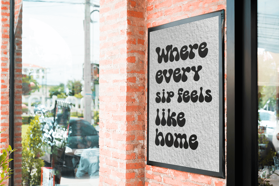
I’ve started seeing this vintage typography design in different TikTok clips, particularly ones promoting cafes and bakeries. It has a playful appeal to it, which enticed my coworkers to add it to several of their projects.
It’s a great fit for a café’s interior due to its comforting feel that helps the visitors relax and lose themselves in the homely atmosphere.
Malibu won me over with its smooth curves and elegant balance. I can easily add it to a vintage milkshake ad or ice cream menu board, as it excels at conveying a sense of freshness and revitalizing energy.
California represents the type of modern vintage typography that is all the rage these days. However, while I adore its eye-catching look, I think that its excessive flourishes make it harder to combine with other fonts without making the final poster look too busy.
Blackout Oldskull radiates the vibe of old rock concert posters with edgy, rebel-fueled branding elements of days long gone. Its striking brushstrokes add a handmade feel that instantly catches your eye.
I’ve seen this font on some alt clothing brands and it made me want to incorporate it into my designs. However, that proved to be rather challenging since its rough look is hard to pair with more refined design elements, but that doesn’t mean it won’t work for your project.
The Everleigh instantly caught my attention with its refined calligraphy, representing a fantastic option if you want to create a design that is all about class and elegance.
I’ve added it to the café’s promotional materials and it blends perfectly with other retro fonts to achieve a unified look. It can be a particularly great choice for seasonal promotions and special events that require that extra bit of pizazz.
A coworker of mine recommended Bumerang, stating that’s a great fit for channeling the atmosphere of the Art Deco era. It’s both refined and striking, which is why it looks so appealing on promotional banners. I’ve also added it to a poster stylized after a 1920s jazz night, as it infused the design with the sense of glamour and refinement I was looking for.
Hellosty Blast caught my eye with its expressive, hand-drawn aesthetic. You can use it to create a hand-typography vintage logo that oozes energy and character, or for a special offers board at a restaurant. The subtly rough brushstrokes make it seem like the text was painted onto the poster, making it feel more artistic and handmade.
Additionally, I leveraged the Text to Pattern feature of Adobe Firefly to design personalized seamless backgrounds and strengthen the retro-style feel of the posters.
Coming up with suitable vintage typography ideas wasn’t simple, but our professional FixThePhoto team looked for fonts that would convey a sense of nostalgia while still being applicable to modern settings. We looked through old archives, retro ads, and antique sign collections, some nearly a hundred years old. We weren’t only paying attention to the aesthetics, we also needed typefaces that convey a certain atmosphere and can fit into specific poster designs without clashing.
For starters, we tested several dozen fonts with different designs to see how well they can fit into various backgrounds, color schemes, and layouts. Some typefaces look fantastic on their own but become messy when laid on top of images or textures. Others offer a strong retro vibe but can't be read properly when printed in a smaller size. That's why we strived to find the perfect middle ground between legibility and
Our top picks are often fonts with striking, high-contrast lines that resemble vintage diner signs along with refined costive typefaces that would look at home in a retro café menu. We also like it when a font has subtle flaws that make them feel more handmade. Subtly rough edges make them even more appealing and authentic.
Once we were finished with our tests and shared our opinions, we put together this rundown of the best classic vintage sign typography designs. Each option is unique and oozes character, while covering a wide range of styles, be it playful and uplifting or elegant and refined.
Handpicking all of these options allowed us to appreciate how important fonts are for shaping the look and feel of a poster or sign, and how they can be utilized as a means to tell a story or evoke a certain emotion.