The font for flyers is more powerful than you think. Not long ago, I came across a flyer for a new stylish café. The photos, the layout, and the colors looked perfect. But the typeface didn’t match.
Instead of an elegant font, a designer went with a neon comic one that looked playful and silly. Suddenly, the flyer looked out of place, and the café’s classy image was lost. It was a clear reminder that the wrong font can ruin even the best design work.
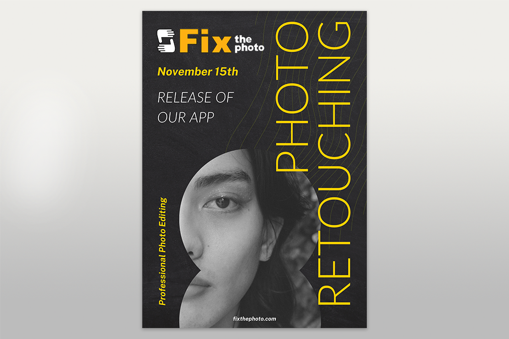
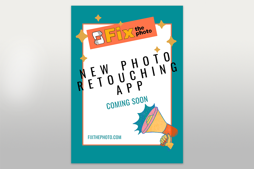
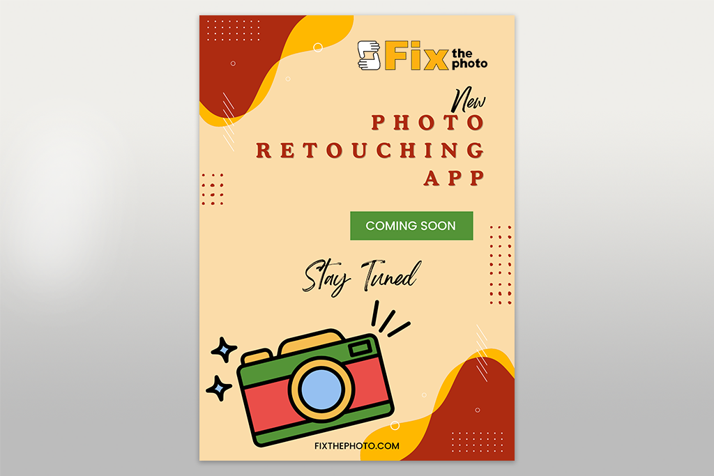
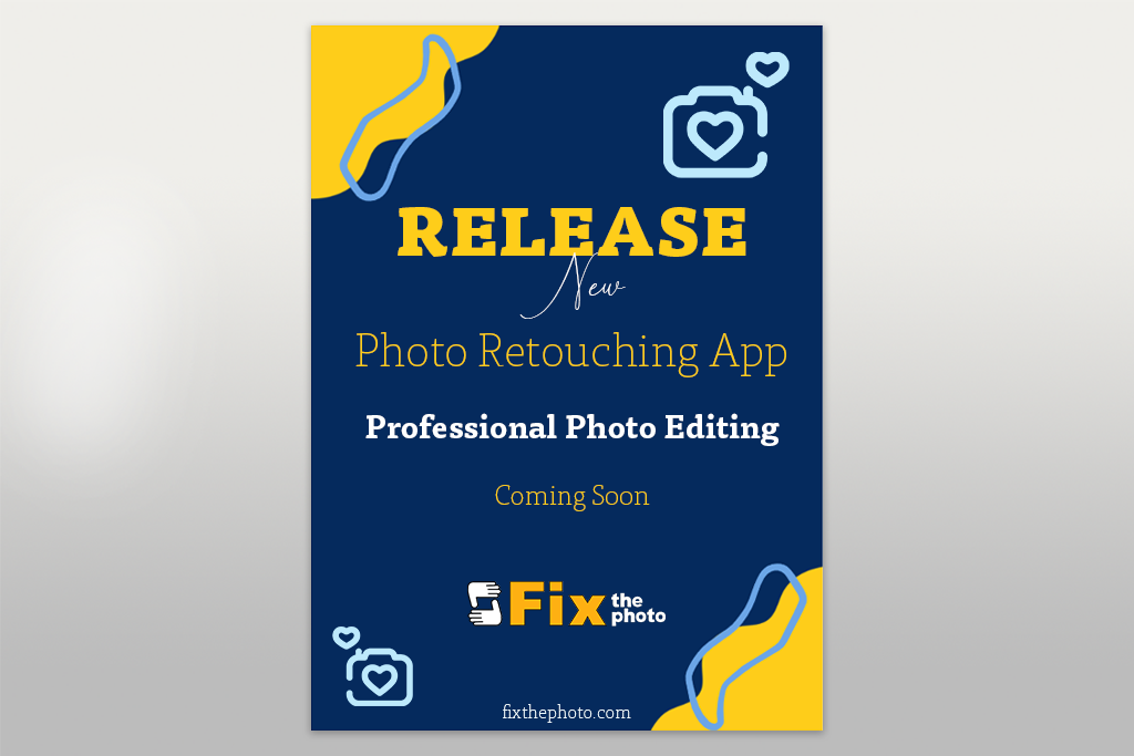
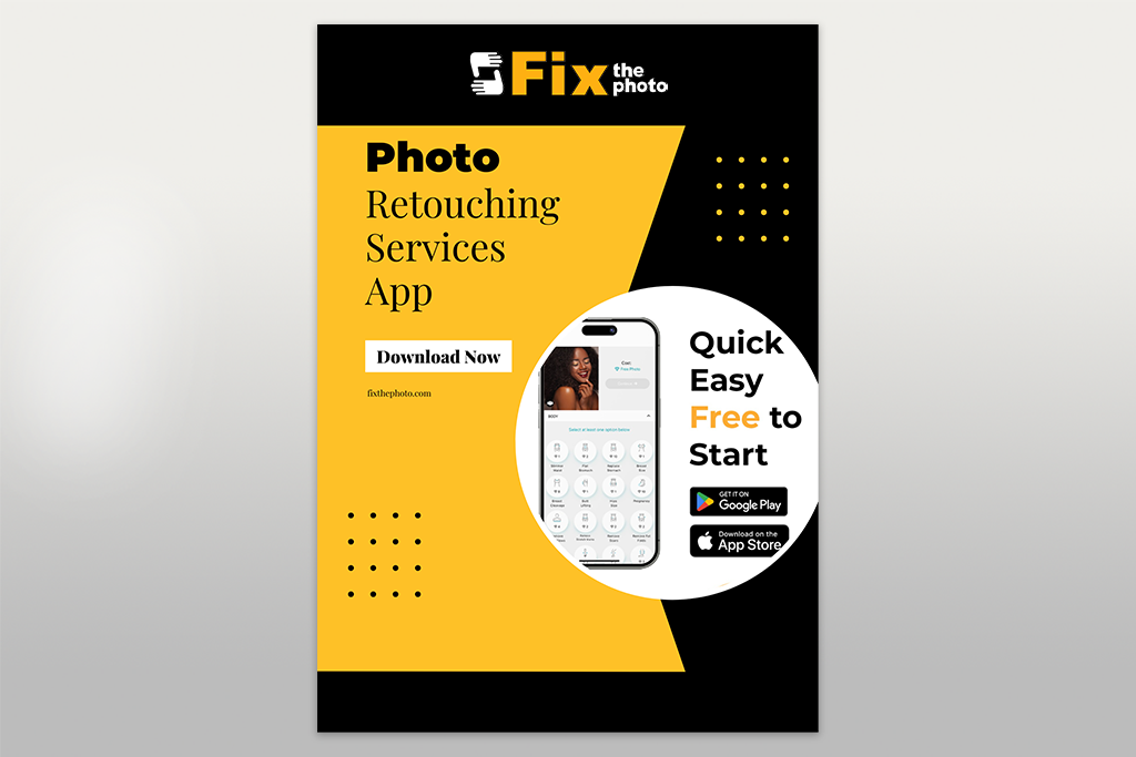
Flyer design is part of my everyday work at FixThePhoto. I’ve made them for marketing campaigns, the launch of our Fix The Photo Body Editor&Tune app, and other projects. Each time, my team experiments with styles, color palettes, and typefaces.
Doing this, I’ve realized that fonts are very powerful. A single one can turn a flyer into a success or a flop. That’s why I decided to create the guide on the best font for flyers. I included my experiences, expert advice from colleagues, and real-world design insights.
Designers often get caught up in picking visuals and color palettes, forgetting that fonts matter just as much. A font isn’t only text, but part of your flyer’s personality. It reflects your tone, your brand’s style, and even your credibility.
That’s why, whenever I’m working on a flyer, whether it’s for general marketing or a photography flyer template in PSD, I always pause and think carefully about:
When choosing fonts for flyers, watch out for a few common mistakes:
What is the best font for flyers? One that tells your audience how to feel about your material. Even if you use the best flyers software, but pick the wrong font, all your effort will go in vain. But choose wisely, and a simple Adobe Express template paired with the perfect font can look like a custom design from a professional graphic artist.
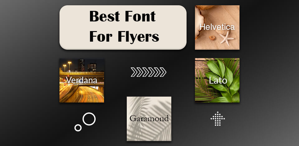
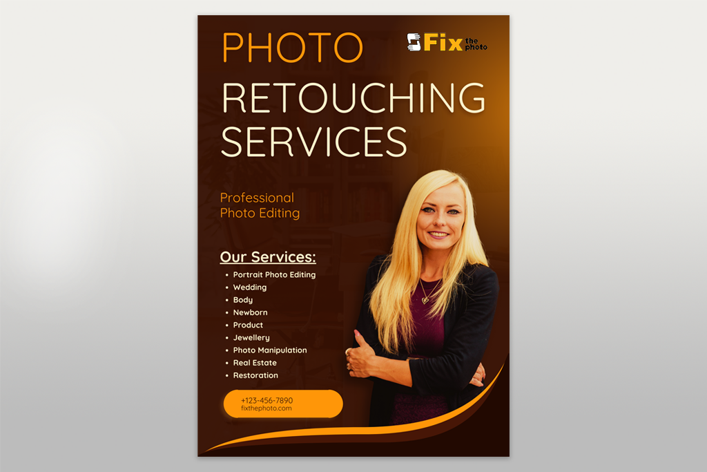
I always choose Helvetica when I need a flyer that looks stylish and professional. I discovered its potential while designing a flyer in Photoshop to advertise FixThePhoto’s corporate retouching packages.
Thanks to a sleek, neutral look, the design appeared pro-grade and credible right away. Plus, it attracted more attention than any casual font we tested. I particularly like that Helvetica is built into Photoshop and can also be accessed as a premium font in Canva.
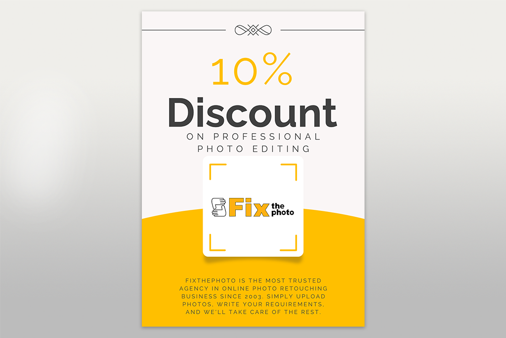
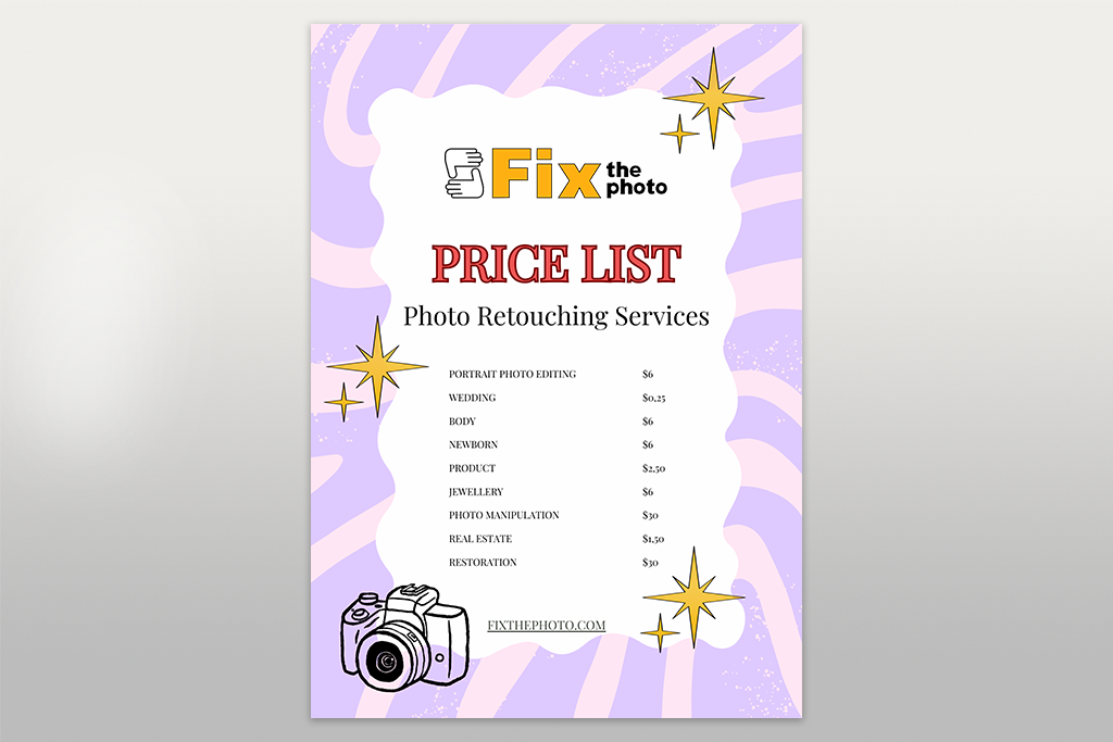
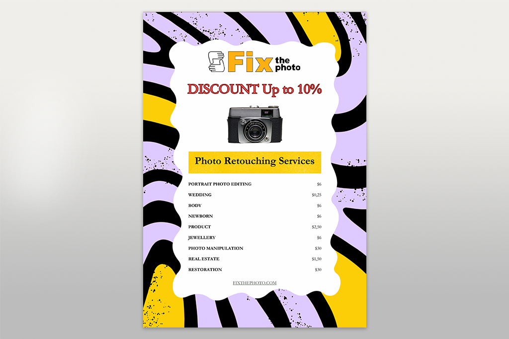
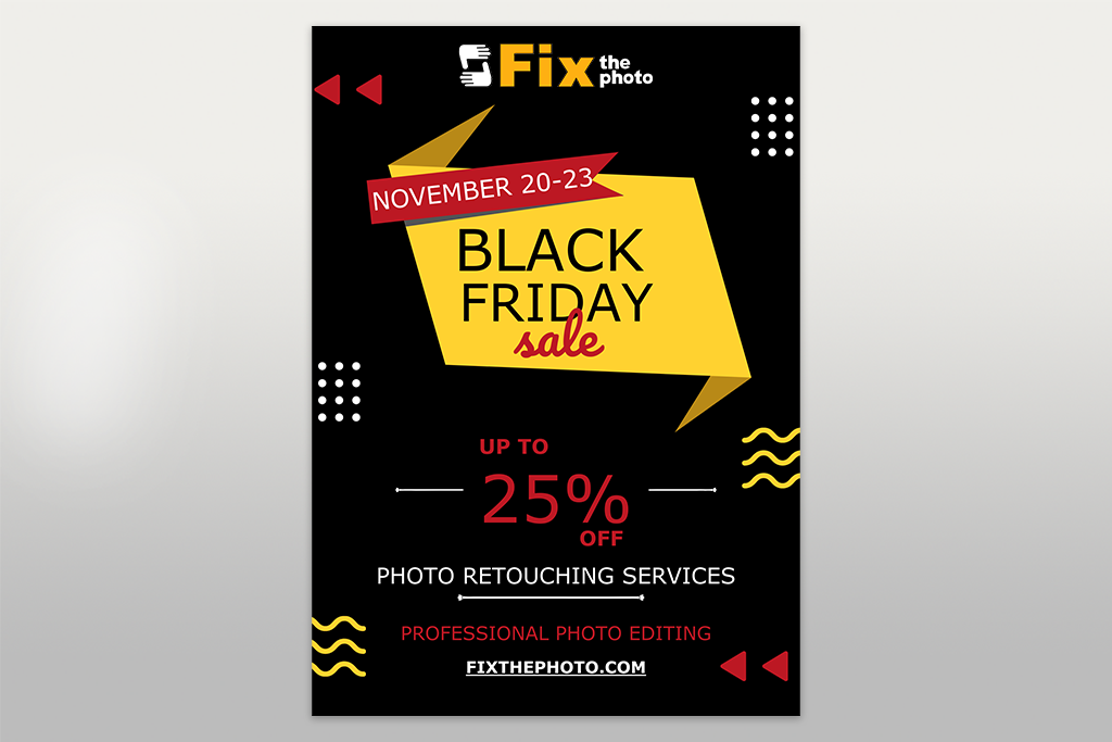
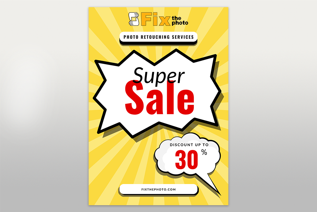
If you want headlines that demand attention without looking overdone, Futura is the best font for advertising flyers. I tested it with a seasonal discount flyer for photo retouching services in Canva, and the bold design stood out so strongly that even fast-scrolling viewers paused to take a look.

Montserrat quickly became one of my favorite flyer fonts. I found it in Canva while making free photography marketing templates for the company. It has a balanced and neat style that works just as well for bold headlines as it does for longer text.
We once used it for a flyer about our mobile editing app. The design looked modern and inviting at the same time.
Roboto is perfect for flyers where clarity matters. I tested it on a flyer promoting our retouching services and loved that it looked clear and stylish, both digitally and in print.
You can use it easily in Canva, grab it from Google Fonts for Photoshop, or find it in Word. It has open, readable letters, so no wonder many designers claim it is the best font style for flyers with lots of text.
Lato makes your flyers look gentle and inviting without sacrificing a professional vibe. It is the best font for marketing flyers when you want your design to feel friendly rather than cold. You can easily find it in many apps for creating flyers like Canva, Word, and Photoshop, via Google Fonts.
If you want stylish and sophisticated flyers, Raleway is a great choice. I tested it on a wedding retouching flyer. The layout turned out professional and elegant.
You can use it in Canva, Photoshop, or Word via Google Fonts. Thin weights look refined, but for strong headings, Raleway Bold is a perfect fit.
Oswald makes headlines pop, even when space is limited. I tried it on a FixThePhoto flyer for our club-night event, and the title looked clean and bold without shrinking. You can grab it for free in Canva, Word, and Photoshop.
For educational or informational flyers, Merriweather is always my top choice. Thanks to a slightly condensed design, the text is professional and easy to read. I also used it as a resume font. You can get Merriweather free in Canva and Photoshop as part of Adobe fonts.
If you want a timeless, classy font, Garamond is a great choice. I picked it for a Photoshop flyer promoting a historical photography exhibit. Garamond added a beautiful vintage style. It’s available in Word and as a free photography font for Photoshop.
Cooper Black can easily make any design recognizable. I used it for a retro flyer in Canva. It immediately grabbed people’s attention. Thanks to a bold, chunky style, your designs will have nice nostalgic vibes.
Quicksand is favored for its rounded shape, which creates a friendly look in printed and digital materials. It works really well for advertising events or products for young people. I once used it on a flyer for a photography class, and it instantly made the design feel more inviting. The best part is that it’s a free font from Google, so you can use it in Canva, Photoshop, and Word.
The best font for sales flyers packed with information is one that won't strain your readers' eyes. That's exactly what Verdana offers. While it might seem plain, it's actually one of the most readable fonts around, even in small print.
I relied on it for a text-heavy flyer and was amazed at how clear every word was. This font is built into Microsoft Word and Photoshop, so you can start using it immediately.
Atkinson Hyperlegible is a great font if you want your flyer to be easy for everyone to read. I learned about it when I was researching accessible designs on Reddit. We tried it on a marketing flyer for a photography event. All the information was quick and easy to read. It's one of the free Adobe fonts, so you can easily use it in Photoshop.
Tisa is the best Canva font for flyers if you want to include lots of words without creating a messy look. I added the font in Adobe Creative Cloud Express for a museum flyer that had a lot of text. I was impressed by how easy it was to read. The little "feet" on the letters help keep your eyes from getting tired. The good news is that you can use Tisa in popular design programs like Photoshop and Canva.
Business & corporate flyers → Helvetica, Lato, Merriweather, Garamond, Overpass
Marketing & sales flyers → Montserrat, Futura, Oswald, Raleway, Roboto
Advertising & event flyers → Oswald, Futura, Cooper Black, Quicksand, Playfair Display
Photography & creative flyers → Montserrat, Raleway, Playfair Display, Tisa, Quicksand
Real estate flyers → Lato, Verdana, Garamond, Playfair Display, Helvetica
Education & nonprofit flyers → Merriweather, Tisa, Roboto, Atkinson Hyperlegible, Verdana
Luxury & fashion flyers → Playfair Display, Raleway, Garamond, Montserrat, Overpass
Youth & playful flyers → Quicksand, Cooper Black, Montserrat, Oswald, Lato

In the beginning, I made the rookie mistake of picking two fonts that were too similar. The result looked dull and messy, but I didn’t understand why. I later discovered that the secret to good design is maintaining contrast and harmony in fonts.
My usual method is to pick two fonts only. One bold and strong for the headline, and one clear and easy-to-read for the main content. If you’re using Photoshop, you can even stick with a single font family. Try Montserrat Bold for titles and Montserrat Regular for body text. Thus, your design will be consistent without looking boring.
Follow these simple rules when pairing fonts:

Business flyers. Merriweather + Roboto, Garamond + Arimo, Helvetica + Lato
Marketing & sales flyers. Oswald + Lato, Montserrat (Bold/Regular), Futura + Roboto
Advertising flyers. Playfair Display + Montserrat, Oswald + Lato, Futura + Tisa
Photography flyers. Raleway + Tisa, Playfair Display + Montserrat, Montserrat (Bold/Light)
Real estate flyers. Garamond + Arimo, Lato + Merriweather, Helvetica + Roboto
Education flyers. Merriweather + Roboto, Tisa + Overpass, Verdana + Lato
Luxury & fashion flyers. Playfair Display + Montserrat, Raleway + Tisa, Garamond + Overpass
Youth flyers. Cooper Black + Quicksand, Quicksand + Montserrat, Lato + Oswald
Back when I began creating flyers, I poured all my effort into images and color schemes. But then one of our promo flyers flopped, and I realized the problem was the font choice. The typeface just didn’t align with the brand’s essence. Now, before I start any flyer, whether it’s in Adobe Express, Photoshop, or Word, I go through a checklist.
The more flyers you design, the more you realize that picking the best font for flyers is worth the effort. A flyer can have beautiful visuals and an amazing offer, but if the typeface doesn’t fit or feels tricky to read, the whole design falls flat.
Over time, I’ve created a set of go-to rules. These are the checks I always run through after creating flyers in Photoshop or Adobe Express.
Always make sure your font is readable. Fonts that look amazing on a screen can become hard to read when printed. I figured this out when I used a thin script font for a flyer. Initially, it looked beautiful digitally, but I was disappointed when I saw it in printed materials. Today, I check it at full size in Photoshop and print a test to see how it really looks.
Get your colors right. One of the hardest flyers to read I came across had yellow letters on white. I could barely see the date. To avoid such a mistake, always check that your text contrasts well with the background. If there are photos behind text, make sure they don’t hide your message.
Mind your letter and line spacing. Even if you pick the best font for flyers on Canva, incorrect kerning or leading can spoil the result. Kerning controls the space between letters, and leading defines the space between lines. Both affect readability. On fast-scanning sales flyers, I slightly loosen kerning so the text isn’t too tight.
Use whitespace wisely. At the beginning of my design career, I stuffed every flyer full of text. That was the wrong thing to do. Space around your text makes your design cleaner and your text easier to read.
Pick the right font size. The wrong size can make your flyer hard to read, even if you used a font generator to get a perfect one. When deciding on the best font size for flyers, use these recommendations:
For one of our photography flyers, we increased the headline from 20 pt to 28 pt. By doing so, we improved readability and print impact.
Focus on hierarchy in your design. Your headline should pop, but the rest of the text should be easy to read. A quick reference for sizes:
Play around with alignment, but don’t sacrifice readability. Left-aligned text is the easiest for people to follow, so I use it most of the time. I tested center alignment on an app launch flyer. It looked artistic, but readers said it slowed them down. These days, I stick to center alignment only when the layout is minimal and the text is short.
When your flyer is packed with text, don’t cram it into one block. Divide it into columns. Since lines will be short (around 45–75 characters), the text will be quicker and easier to read. I use this approach often in Word for our retouching and service flyers.