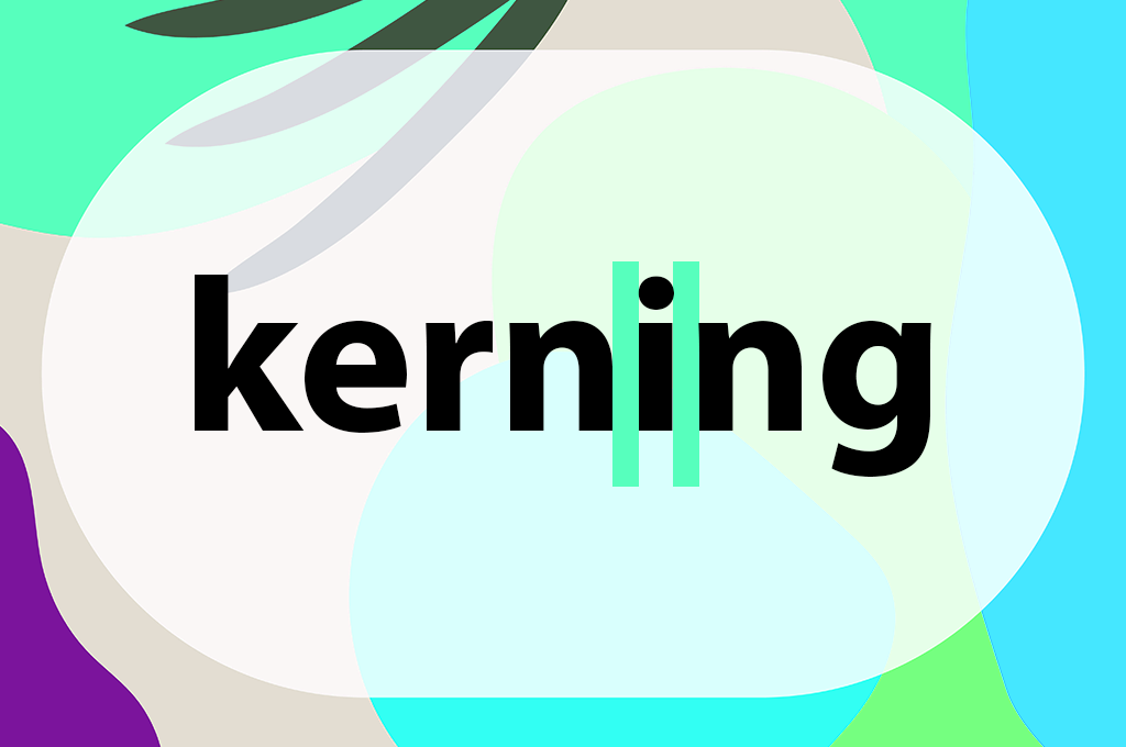
If you're wondering what kerning is in typography, the answer can be broken down to “the amount of space in between letters.” This may seem like a minute detail, but it can have a tremendous effect on the visuals and readability of your content.
After having a friendly little argument, our FixThePhoto team decided to discover what is the meaning of kerning in typography. It started with us trying to figure out why certain headlines look fantastic on desktop but weird on mobile. Some thought it was because of the fonts, others pointed out the screen size difference. I believed it was related to poor kerning.
In this overview, I’ll explain exactly what kerning in typography is and how it's different from tracking and leading so that you know what to pay attention to and how to deal with possible issues. Additionally, I’ll go over the tricks I’ve learned over the years, the subtle nuances you only discern after working on hundreds of webpages and portfolios.
If you’re a photographer working on a personal website, building your brand identity, or simply want to ensure your text looks appealing on all devices, this is the guide for you.
While seemingly straightforward and obvious, it’s often a thing you don’t notice until you do. Kerning isn’t just pressing the spacebar or doing guesswork. It’s a visual technique that has you fine-tuning the spacing until the text looks evenly spread out and polished.
A well-kerned word written with visual content marketing effort in mind won’t attract attention to a specific letter. Instead, the entire text flows naturally and cohesively.
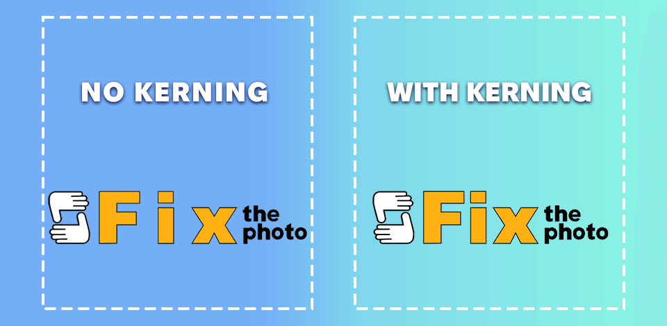
Whenever I bring up kerning, I always look back at the redesigned logo we made for FixThePhoto. I was a part of the project tasked with updating our wordmark, and arguably, the main enhancement we made was improving the kerning, particularly since the previous logo looked a bit disjointed.
The bold “Fix” felt cumbersome and compact, while the “the photo” seemed to exist in isolation. I recommended reducing the space between the two parts and presenting them as a singular unit instead of two separate words. Additionally, we tweaked the spacing between the “t” and “h”, and “o” and “t” to secure a more natural flow.
The result is a fantastic example of mindful kerning. Even though the logo uses different weights and cases, the spacing looks flawless. The “Fix” part conveys boldness and clarity, while “the photo” adds some airiness without feeling isolated. As such, the wordmark oozes confidence, cohesiveness, and professionalism, which was our exact goal.
Why kerning is important:
If you have ever tried to master the art of using text for your projects, you probably know how important it is to learn what the difference is between kerning, leading, and tracking in typography. While many people think these terms are interchangeable, that actually isn’t the case.
Each affects the look and flow of text in a different way, and after you learn the distinction between them, you’ll never interchange these terms again.
Kerning. We already discussed this one, but in short, kerning refers to the spacing between two individual letters. It’s a micro-level element. You’re manually tweaking the distance between letter pairs to ensure the world looks balanced.
Employ kerning whenever:
Tracking. Tracking is responsible for preserving uniform spacing across all the letters in a word or block of text. Rather than just dealing with separate letters, you’re tweaking the general spacing across the entire text, affecting all the selected letters.
Employ tracking whenever:
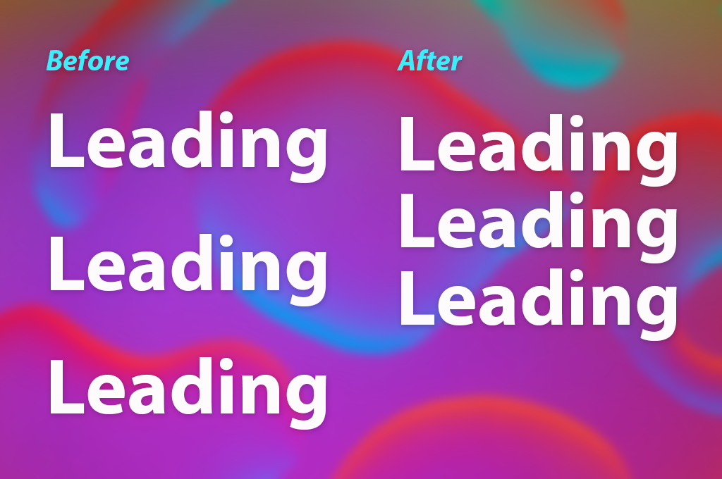
Leading. Leading (pronounced ledding, not leeding) revolves around the vertical spacing between lines of text. It harkens back to the old age of metal type when literal strips of lead were employed to divide lines apart, and you can often see that reflected in vintage typography ideas.
Use leading whenever:
Quick visual recap:
| Adjusts What? | Affects? | |
|---|---|---|
|
Kerning
|
Space between individual letters |
Pairs (e.g., "AV", "To")
|
|
Tracking
|
Space between all letters equally |
Entire word or block
|
|
Leading
|
Space between lines of text |
Paragraphs, lists, and so on
|
Since I spend a lot of time creating portfolios and ensuring they’re pixel-perfect, I can guarantee that all three techniques are more important than you think.
After establishing the definition, it’s time to learn how you can use kerning in typography in different ways. Some techniques are fast and simple, while others demand a creative vision.
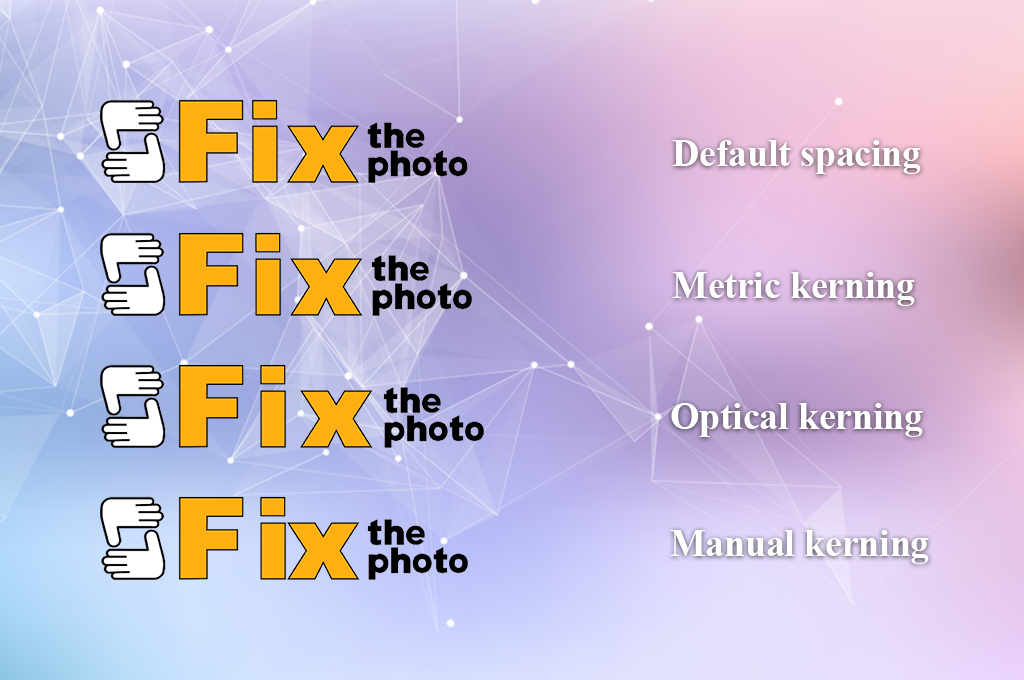
Default spacing (a.k.a. no kerning). This is the standard state that your font is available in – no changes or fine-tuning. It’s usually acceptable, but it can come across as robotic. Everything looks mechanical and ignores the human perception of letterforms.
Employ default spacing if:
Don’t use if:
Most typography apps, like Adobe InDesign, Illustrator, Photoshop, and Canva, come with preset kerning parameters. This lets you easily establish the desired baseline, and that’s enough for most situations. You can ordinarily pick between two types:
Metric kerning. Relies on the integrated spacing parameters set by the font generator. If you're employing a professionally created font, this is ordinarily a great foundation.
Employ metric kerning if:
Don’t use if:
Optical kerning. The software examines the shapes of the letters and tweaks spacing while accounting for its visual perception instead of preset metrics. Incredibly useful if you can see that something is wrong with the text.
Employ optical kerning if:
Don’t use if:
Manual kerning (designer’s vision). This method allows you to unleash your creativity and flex your trained eye. Manual kerning entails fine-tuning each letter by hand to achieve the desired visual balance. This is a more time-consuming approach, but it ensures you can choose the placement of every letter down to the pixel.
Employ manual kerning if:
Don’t use if:
When I do my work, I tend to start with metric kerning, move on to optical if I notice any issues, and then do a manual pass if it's a particularly important design that requires special refinement.
When it comes to designing a photographer’s landing page, a portfolio webpage, or making a photography logo – even a single poorly kerned headline can make everything else feel unprofessional. Keep in mind that kerning isn’t about perfection; it’s about how the text is perceived by the viewer.
If you know how painful it is to waste 5 minutes tweaking the space a “T” and a “Y,” only to still be disappointed with the result, you’re not alone.
Knowing what kerning is great, but typography often tends to throw a lot of obstacles your way before you can achieve perfection. During my career, I’ve picked up several tricks that I can now share with you to help you avoid some typical mistakes that I see when browsing the web.
Train your vision instead of your mouse. You should never rely on measurements alone when doing kerning. Even if something is technically “even”, it can still look wrong.
Common mistake: believing in auto-kerning without checking. Auto-kerning is an extremely helpful tool until it lets you down. Particularly, when handling decorative or free fonts, where automatic parameters often don’t look good.
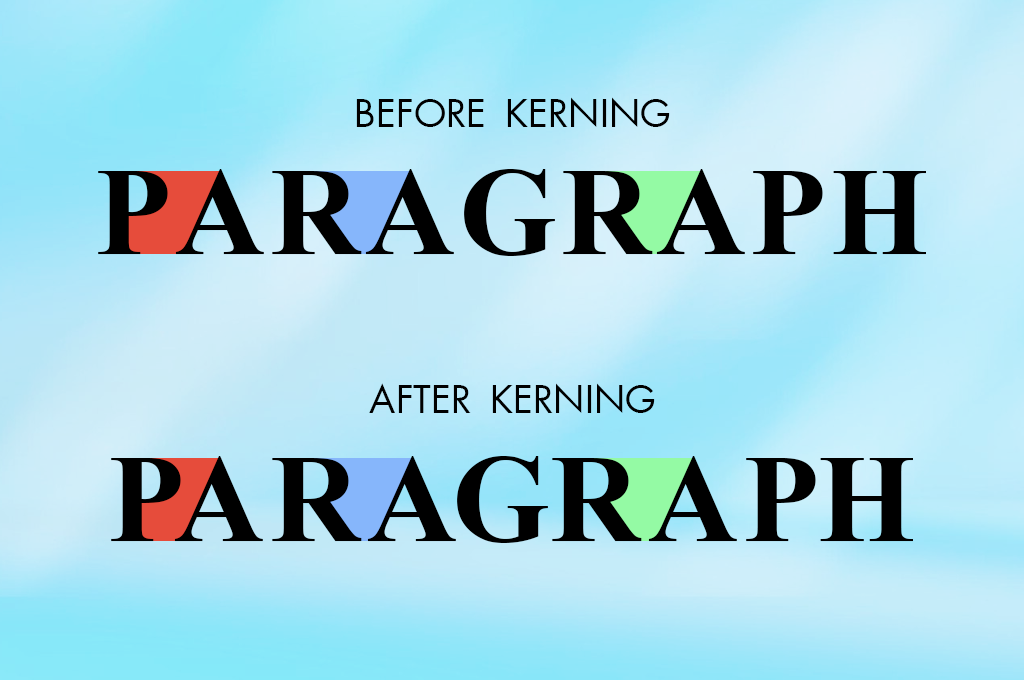
Keep an eye on these problematic combinations. Certain letter pairs are famous for looking weird due to their shapes. I always double-check whenever I encounter:
| Letter pair | ❌ Problem | ✔️ Solution |
|---|---|---|
|
T + A / T + Y
|
The wide top of the T often leads to an overabundance of white space to the right
|
Move the second letter a bit to the left
|
|
A + V / A + W
|
These angled letters might cause an unappealing visual gap
|
Reduce the space without making them touch
|
|
L + T / L + Y
|
Same problem as with T-pairs; looks off-balance
|
Tweak depending on the specific font, possibly moving the L to the left
|
|
P + A / R + A
|
Rounded letters after upright ones often feel like they are placed too far
|
Decrease the gap between them
|
|
F + o / F + a
|
That top line of the F can create unnecessary negative space
|
Optical kerning is great for this purpose, but manual adjustments are even better
|
Avoid kerning body text. This is important. I know some users who like to manually kern entire paragraphs of regular text – don’t be like them. It’s too much effort, and the benefits are non-existent.
Pause and return later. Occasionally, you’ll find yourself examining letters for hours, which compromises your vision.
Don’t overly rely on a grid or ruler. Guides are useful for aligning different elements, but when mastering kerning in typography? You should trust your eyes. Grids tend to lure you into spacing letters too “technically” rather than visually pleasingly.
Kerning is an aspect that no one notices when it’s done properly, but it becomes instantly visible when the spacing is off. Moreover, since I need to design professional, refined portfolios for photographers, I know full well that improper spacing can turn a $5,000 wedding package headline look like an amateurish DIY project.
Now that you know what kerning and tracking are in typography, allow me to share how I approach this part of my work when creating portfolios or logos in Adobe InDesign. After in-depth testing of different Adobe software, I’ve concluded that InDesign is definitely the most suitable typography-oriented solution for my needs.
To give you an example, here’s how I would adjust kerning for the FixThePhoto logo with the help of Adobe InDesign.
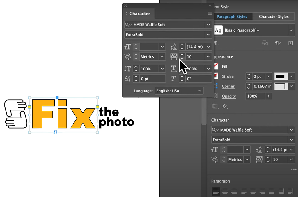
Step 1. Begin with the correct typeface weights. The logo features a bold font for “Fix” and a slimmer, more minimalistic typeface for “the photo.” Using InDesign, I’d open each layer separately to ensure I have complete control over its placement.
Step 2. Optical or manual kerning? InDesign provides integrated Optical Kerning, which can be a fantastic baseline. However, when creating a logo, I prefer to rely on Manual Kerning. I begin with “Fix” and tweak the distance between F-i and i-x to make the word look like a single fluid unit.
Step 3. Strive for visual harmony. Afterward, I add “the photo” beneath or next to “Fix.” I subtly bring the-ph and ph-oto pairs closer to get rid of lopsided negative space. The objective is to ensure both phrases look like one cohesive shape, not two separate typefaces smashed together.
Step 4. Remember to zoom out! You don’t do kerning in typography at any specific zoom value. You have to frequently zoom in and out, checking out how the design looks on smartphones, PCs, and thumbnails. In FixThePhoto’s case, the kerning remains proper on screens of any size, which was my goal.
Step 5. Export for review. After achieving visual balance, I save the result in multiple formats to ensure the logo looks great in printed mockups, sites, social headers, favicons, etc. It’s incredible how kerning that felt fantastic in isolation can require fine-tuning when viewed in context.

If you get a weird feeling that a logo or headline doesn’t look right, the most likely reason behind that is that the designer doesn’t know the importance of kerning in typography.
Kerning might seem insignificant, but it plays a very important role. Proper kerning adds balance, polish, and a professional look that makes an impact on the viewer even before they read the text.
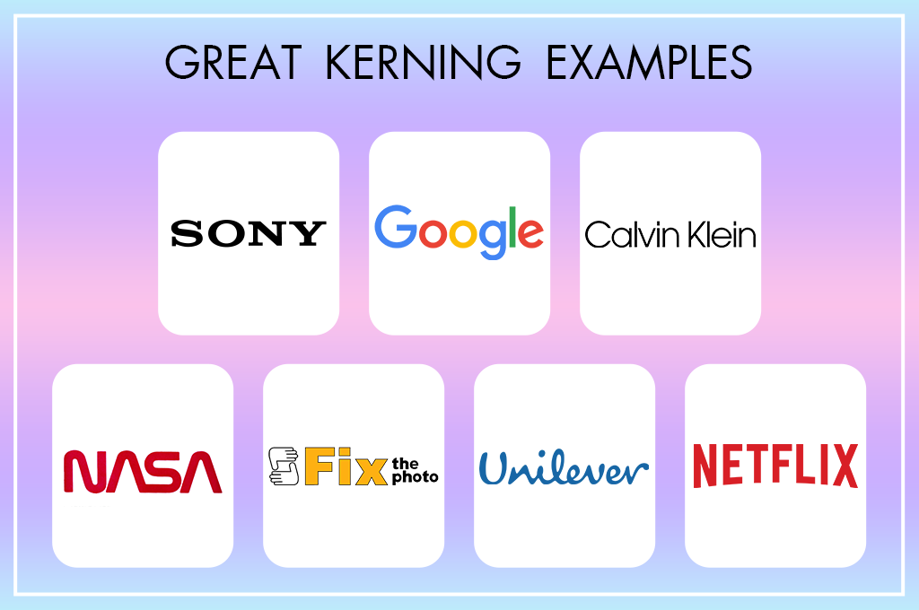
Let’s explore some impressive real-world kerning examples in product marketing.
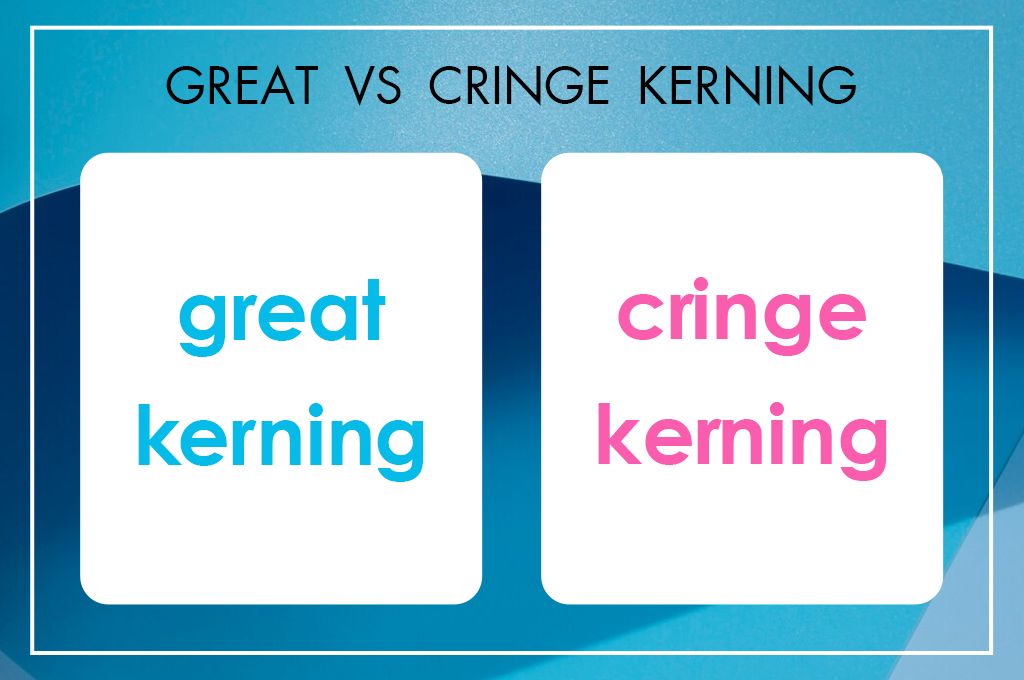
In contrast, improper kerning can distract, disappoint, or, on rare occasions, make the viewer laugh or cringe. Such scenarios are rather common and professional designers jokingly call them: “keming.” (Yes, it’s an example of poor kerning, where the “r” and “n” are too close to each other and look like an “m”.)