22 Graphic Design Ideas & Examples
When you purchase through affiliate links on our site, we may earn a commission. Here’s how it works.
People who are engaged in a creative sphere run out of interesting ideas from time to time. This happens regardless of the experience or its lack, newbies and professionals are in equal need of graphic design ideas to boost the workflow. The list below contains 22 concepts that you may use to get inspired and track the latest tendencies.
Top 22 Graphic Design Ideas
Having studied the latest tendencies, I’ve noted down the frontmost design ideas for any kind of project so you can return here multiple times. All you need is your computer for graphic design and appropriate graphic design software.
1. Incorporate Color Glitches

If something looks too boring, casting some multi-colored glitches over the image will immediately make it an attention grabber. This idea for design is even sometimes applied to buttons, let alone full-size posters. This is a very experimental technique, thus very attractive to designers, but it also requires meticulous work to avoid making a mess.

2. Use Double Exposure

Being influenced by double exposure photography, where one frame gets exposed two times to combine different images.
This is not a new trend but it will remain relevant for a while still as more intense experiments are being published. The effect is not too hard to replicate with a bit of knowledge of how to create a double exposure in Photoshop.
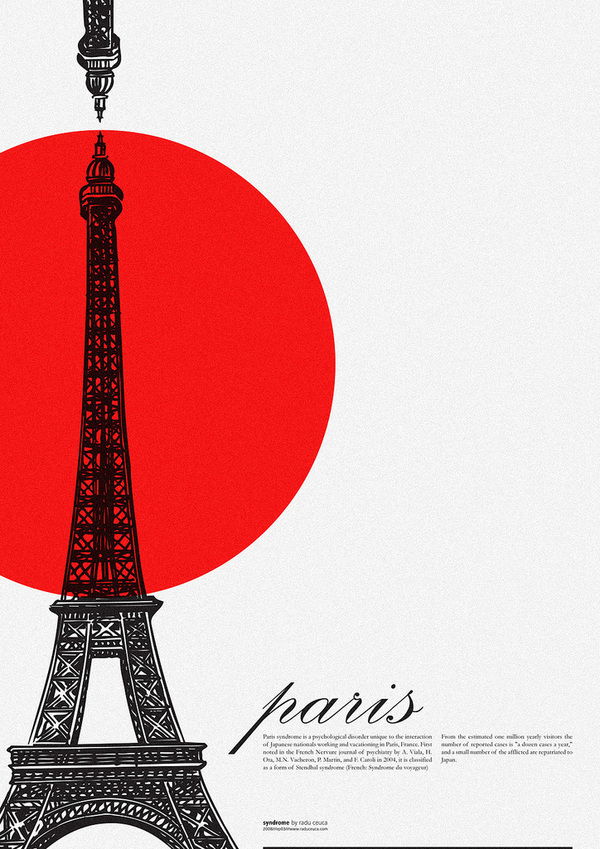
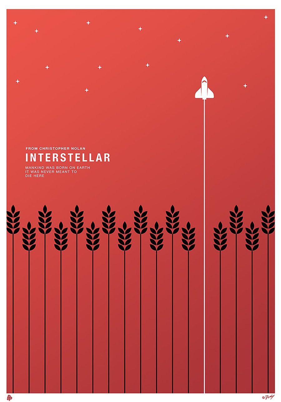
3. Incorporate Negative Space

Naturally, with a miniature design, you would want to use every bit of available space to convey your message. However, in a larger piece, the blank space will help narrow the viewer’s attention to what’s crucial.

Minimalism is still a growing trend so it will appeal to many as well as assist you in creating contrast and centering the focal point. If you want to study this effect better, you can research the works of Noma Bar who excels in this technique and creates designs for the loudest names in the world of press.
4. Use the Low Poly Technique

Another minimalistic kind of ideas for graphic design made its way from video games. You can already see it everywhere, from the widespread advertisements and fashion pieces to the more private business cards and similar items.

You need some good designing skills to apply the geometric shapes varying in type and color to resemble a 3D object. The technique can be applicable to the entire design as well as its portion.
5. Create Asymmetrical Balance
The human brain likes symmetry so whenever we encounter its lack, the image disturbs us and attracts attention. Famous graphic designers use that psychological feature to make their works visible, deliberately throwing elements off the balance.

That can be done by shifting images and inscriptions around the canvas, leaving large open spaces, or causing heavier contrast. You still need to be careful and maintain harmony. Introduce additional elements and use the play of color to tie everything in the project into a coherent message.
6. Use Lines to Lead the Eye

With the interest that leading lines photography arises, you can already find it in this sphere too. It is a powerful directional tool that ensures that the viewer’s gaze follows the directions you set.

Such guidelines can be added over or comprise the main element of the design itself, causing strong visual interest in either case. There are ways of implementing this technique to achieve different results. The lines can guide towards the main element, putting a strong accent on it.
Alternatively, they can lead towards additional pieces of important information scattered around. When you look at a poster, your eye typically lands on the predestined focal point but then makes its own way around the elements. With leading lines, the eye will naturally travel over them and thus study the elements how the designer intended it.
7. Use the Duotone Technique

The graphic design ideas implemented in a pair of contrasting colors are another efficient way of standing out. When normal posters are a mess of colors, putting a duotone piece next to them will increase its noticeability.
For a more subdued effect, you can apply an analogous color scheme. However, it makes more sense to use something more contrasting as the complementary colors photography does.
8. Try Minimalism
This style always receives good coverage in any graphic design book. It is unlikely to ever get out of fashion even though it undergoes certain transformations with time. The idea is simple – give the most information with the least number of elements, and leave everything that is not strictly necessary out.

This is the preference of many world-famous brands, you can surely remember a few on the spot that used a bold font on a solid background or a simplistic line drawing. If you want a source of inspiration with such an aesthetic, check the works of Rick Barclay.
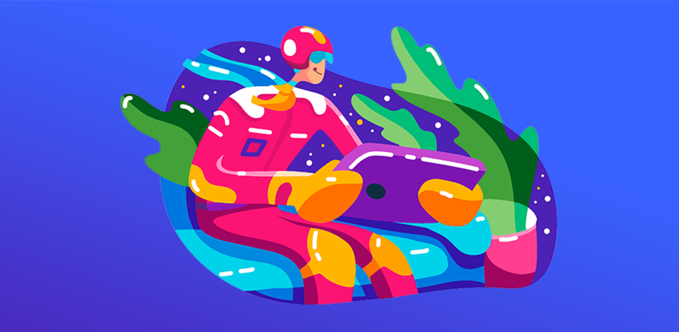
9. Use Bold Colors

As practice shows, neutral colors are giving wat to brighter colors. Nowadays, specialists shifted their palettes towards the more striking colors that attract attention, maintaining moderation in the number of elements. This also tends to be helpful for preserving the brand identity in the design because many tend to use saturated colors.
10. Incorporate Optical Illusion

It is interesting that what eyes can see and how the brain interprets it can be very different. Optical illusions require some special knowledge of the patterns and shapes that confuse our visual apparatus.
However, much graphic inspiration can be found in this respect and the rules for creating an illusion are not too difficult. The result will be a design that’s impossible to ignore, especially if you use elements that our brain perceives as being in ceaseless motion.
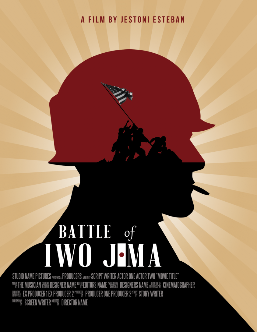
11. Create Retro-Inspired Posters

Like there are cycles in fashion, certain eras return to us periodically, and now is the time for the 80s rebirth. For many, this is quite an emotional period because it excites nostalgia. Some prefer a proper vintage look but you can add a touch of modernity to tie it closer to our viewers.
It is an interesting style and can turn out futuristic or heartwarming childhood memories depending on what elements you emphasize. Those can be recognizable illustrations, old-fashioned typography, combinations of colors, even the layout.
12. Choose Clean Typeface

Even though the temptation is big to use a pretty or elaborate font, a simple typeface is your best friend. Many such designs are not intended for a lengthy examination so making the information immediate to receive is crucial. At least, use those easy to read fonts for the main part.
13. Try Different Sizing

There are ways of using contrast in graphic ideas and playing with sizes is another one of them. This is a great way of exploiting the user’s natural curiosity. You put one large element that will draw attention and then some small ones to encourage closer looks at whatever the design is for.
14. Add Overlaps

If your client needs a logo, then here is an interesting trick that adds depth with a minimum of elements. This duality is quite simple to achieve but can have a pretty voluminous look when needed. Such a design will be more noticeable and appealing, having a deeper look than a simple flat icon.
15. Add a Gradient
Despite how simple it sounds, there is a lot a gradient can do. It can be one color vanishing into transparency or merging into another one, as well as a number of different colors seamlessly blending into each other. It is colorful and vibrant, and looking at a few popular apps, like Instagram, Tinder, and some others, you will see it is currently on-trend.
A gradient can be overwhelming, so be careful of where you apply it. Give preference to the outline of a symbol or monogram, maybe the container. And, obviously, make it correspond to the brand’s identity. If you can't come up with a proper gradient design for your products, you can seek assistance from the a COAX Software team. They offer a comprehensive approach to software development, including design services.
16. Incorporate the Product into the Text

More intricate graphic design ideas are the ones where the product emerges from the name in the logo. Here, Guitar Studio used the first two letters of their name to create a recognizable outline of the instrument itself. Messing around with fonts and layouts can result in some pretty interesting designs.
17. Create a Badge Logo
Such logos are distinguished by a pretty geometrical shape, like a triangle or oval, outlined fully in a dark contrasting color. These are often filled with colors and have some thick rough lines. A logo of this kind looks like a bold statement so mind the kind of company you’re creating it for. You can either make such a logo from scratch or download a suitable template from Wepik and modify it.
18. Create a Shapeshifting Logo

It is no longer feasible to create just one logo for a company. Many brands now work with a selection to ensure flexibility and recognizability under any circumstances. This means that you need to create the main logo and then supplement it with several adapted versions, the common types being:
Responsive— the size of the logo will be determined by the type of device and its screen space so a desktop version will differ from the smartphone one.
Contextual— the complexity of the design increases in correspondence with the use, so a monochrome logo will go on a business card but an embellished one will be required for a t-shirt.
Variable—elements in the logo can change to enforce the campaign you’re using it for, for instance, subtle changes can help distinguishing product lines.
19. Create a Metallic Logo

This year the metallic trend is booming and if you look at how sophisticated this shiny effect looks, there is no wonder. For graphic design ideas inspiration, you should look at luxurious brands that used to monopolize this effect.
With different techniques, you can obtain an array of graphic metals to serve different purposes. The gold can radiate luxury or flamboyance, the silvery shades can be delicate or heavy, and a multitude of other metals could add a very particular air to the design.
20. Create a Chaotically Arranged Logo
Sometimes you need a more rebellious design and such an interesting technique is as far as you can go in this direction. Seemingly chaotic, it is very difficult to create in a way that would preserve readability but generate more visual excitement and remain memorable.
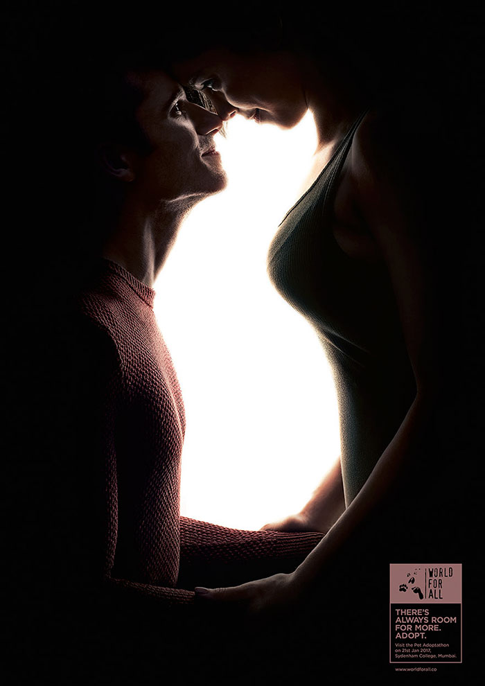
21. Incorporate Lost Fragments

Another trick to engage the human brain is to force it to fill in the gaps. It is proven that such light exercise will leave a mark in the viewer’s memory and so the brand will obtain more recognition. A certain amount of skill is needed to make it challenging enough for a regular person and avoid illegibility at the same time.
22. Incorporate Repetition
Regardless of the idea for design you use, your creation still has to preserve the integrity and a helpful trick is repeating some elements throughout. You can preserve one font in all elements, execute it in one color or with the same pattern, use the layout to really imprint the name or symbol of the brand.
It is important to include repetition when you have too many standalone pieces and the side effect of it would be strengthened influence on the viewer.