Complementary Colors In Photography: 21 Tips

Colors located on opposite sides of the color wheel are called complementary. Many photographers and other visual artists actively use stunning combinations of these colors. The correct use of complementary colors will help you draw more attention to your images.
21 Tips to Create Complementary Colors Photography
The main advantage of complementary colors is their ability to add drama to the composition. They are so bright and striking that the viewer immediately notices them and perceives the presented picture as an important and significant one. Thanks to complementary colors in photography, you can convey your messages to the viewer and be sure that they will be paid attention to.
1. Complementary Colors Wheel

The Color Theory says that you can successfully use two opposite colors from a color wheel. Alternatively, you can combine the three colors that make up the triangle.
Remember that they must be evenly spaced around the color wheel. Finally, you can use four colors that form a rectangle. Specialists call this approach color schemes or in other words ‘color harmonies’. The angle of rotation does not affect the harmony of color schemes.
2. Find Complementary Colors

Finding suitable objects for complementary color photography is not very difficult. The subject is not the most important component. The key to success is color!
Once you have studied the theory of color and remember all the possible color combinations well, you can start your complementary photography.
For example, you can capture an orange inflatable raft on a blue water surface. Red balls hanging on a green Christmas tree also look very harmonious. Don’t forget about the relativity of colors. White balance settings, lighting conditions and shooting time are essential for your color combinations.
3. Combine Red and Green
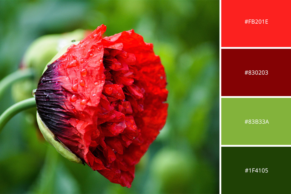
Finding a combination of green and red in your surroundings is a simple task. You can take a picture of a ladybug on a blade of grass or a leaf, red apples on green grass, tulips, roses or other red flowers on a green background.
Combining red and green in photography can create striking and visually captivating images. These two colors are complementary to each other on the color wheel, meaning they are opposite each other and can enhance the vibrancy and impact of the resulting composition.
Combining red and green in photography can create striking and visually captivating images. These two colors are complementary to each other on the color wheel, meaning they are opposite each other and can enhance the vibrancy and impact of the resulting composition.
In nighttime cityscapes or street photography, the combination of red and green lights can create a captivating ambiance. Photographing the glow of red taillights on a busy street with green traffic lights in the background can result in a visually compelling image that captures the energy and movement of the scene.
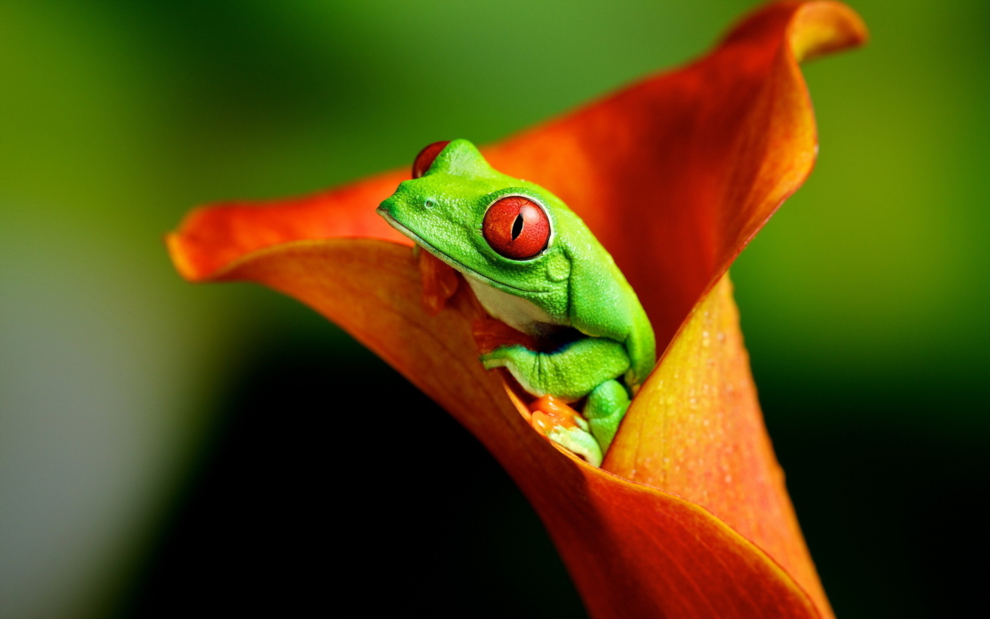
- Learn more about flowers photography.
4. Combine Orange and Blue

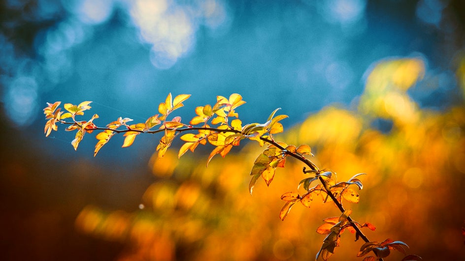
This is the most emotionally significant and vibrant combination. This color harmony embodies the strongest contrasts, such as ice and fire, heat and cold, land and sea and more. Photograph any orange object on a blue background and you will get a stunning complementary picture.
5. Combine Green and Purple

Use deep dark green shades in combination with rich purple. Mint and sage will also look amazing with saturated purple tones.
- Read more about nature photography.
6. Combine Red and Blue

It will make the picture more modern, add energy and freshness. If don’t want to be disappointed by the results, you must work carefully with red. Do not forget that it looks the most saturated on the camera sensors. Do not overdo it, especially with saturation.

7. Combine Yellow and Purple

A splash of yellow will come in handy if you want to attract the viewer's eye. Looking at the complementary color wheel, you will find that purple is opposite to yellow. This combination is great for fashion photography and color blocking experiments. Such pictures look incredibly bright, playful and modern.
8. Use Special Tools & Programs
Color Adobe. Using this tool, you can find and create color schemes from pictures. Upload your image to this browser app and it will automatically detect the colors that your picture contains.
Color Palette Generator is great for working with photos that contain specific colors. The professional team of Canva company has designed a great web application that recognizes colors from the picture you upload. Extracting colors from a picture, the application creates color schemes.
Hue Snap. If you need a simple and straightforward tool to create and share color palettes, this tool can be a perfect solution. The features of this application let you make color schemes based on your pictures or using special color pickers. If you want to share your color palettes with other users, you can do this through social networks.
9. Use Complementary Colors for Landscapes

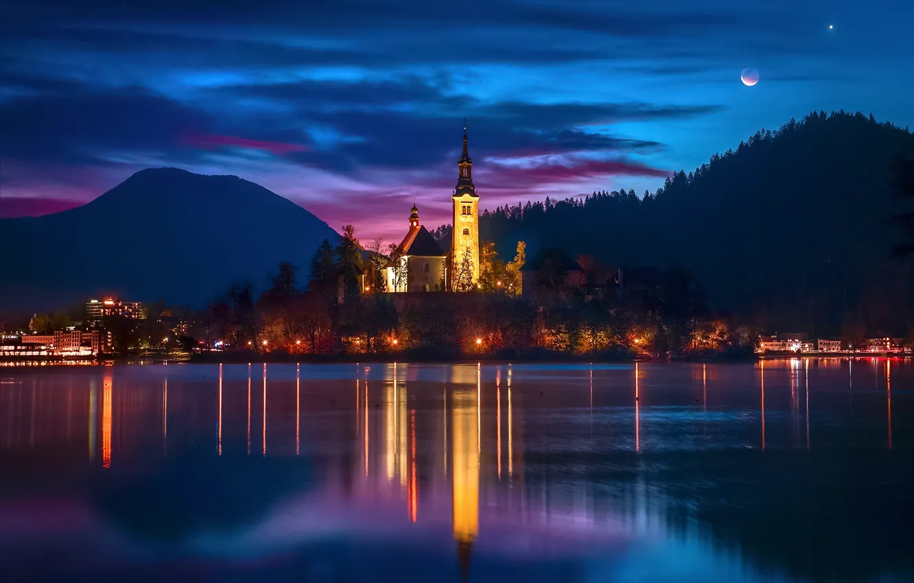
Landscape photographers actively use opposite colors to emphasize contrast and make the image captivating. This approach allows you to display the duality of an environment.
10. Use Complementary Colors for Food

In food photography, Color Theory can be applied in many ways. Complementary colors are a great field for experiments. Technically, this is not a difficult thing at all. You need to create color contrast in your photo with split complementary colors.

- Get more info about food photography.
11. Use Complementary Colors for Flowers

Sometimes nature creates beautiful combinations that need only to be successfully captured in the frame. However, if you really want to achieve a picture with complementary colors, you can change them in any photo color editor online free or paid version.
12. Use Complementary Colors for Architecture
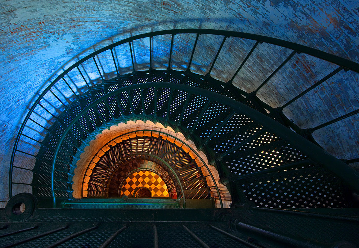
The complementary colors photography technique can be applied when taking city or street shots. Opposing colors from the Color Wheel help convey the atmosphere that surrounds you during the shooting.

- Check out this urban photography.
13. Use Complementary Colors for Fashion

This technique is often used by fashion magazines. When placing the model in a contrasting environment, you can get attractive and vivid photos.

14. Use Complementary Colors in Design

If you need to add design elements or some text to the image for advertising purposes, then you should think about a color harmony calculator to get amazing complementary colors images. With its help, you can identify complementary colors that match a specific color in your picture.

If you are making a flyer based on some image, it is important for you to choose the right color for the text on it. Using a complementary color, you will make the text striking and noticeable.
15. Always Edit Complementary Colors
Always do color correction to keep all your complimentary colors vivid and bright. Or outsource this task to experts.
Unfortunately, sometimes there are cases when you find and capture an amazing combination of colors but you do not get the result you expected. Then it's time to turn to photo editing. Most photo editors have many features and tools to make your complementary color picture awesome.
When editing an image, it is important for you to work out the colors correctly. Keep in mind the color scheme and apply the subtraction technique. Get rid of the colors that your color palette does not include. Don’t forget to work with both visible and invisible colors.
- Find out more info on photo editing software for beginners.
16. Edit Hue
Go to the HSL tab and choose the Hue section. Move the sliders to affect the shades. In this way, you can replace the colors in your image with neighboring ones on the color wheel.
Imagine that you need to replace red with magenta. You can get the desired result by setting the Red Hue slider to -100. If you need orange instead of red, then set the slider to +100. You get this result because orange and magenta are located next to each other in the color wheel chart.
17. Edit Saturation
To adjust the saturation, you need to move the corresponding sliders in the HSL tab. If you increase the intensity, your double complementary colors will look brighter and deeper. By reducing saturation, you make colors faded and less intense.
Carefully study your photo to make sure that there are no colors beyond your color palette. Move the desired sliders to make unwanted colors desaturated. As a result, your photo will only contain colors from your palette. When you have only the colors you need, you can increase their saturation to make your complementary colors images pop up.
18. Add Luminance
Look at your photo and color palette. Compare them. If the colors look too light or dark, you should fix it. To darken colors or make them lighter, you should adjust the Luminance by moving the necessary sliders.
If you compare the resulting image with your palette after changing any settings in the HSL tab, this will bring your split complementary colors photography only good. If at this stage it seems to you that the colors require some adjustment, work with the appropriate sliders.
- Check out these free Lightroom tutorials.
19. Work with Curves
Want to make your photo collection really outstanding? Then you should take care that all the images are in the same style.
Have you developed your own unique photo editing style? If yes, you can safely apply it to all your complementary colors images. If you have not decided yet or are at the beginning of your search, then I recommend you pay attention to the environment or some subject and use it as a style guide.
20. Utilize the Scheme in Other Ways
You get more contrast if you stick to the color scheme as much as possible. Be careful with intensity. The stark contrast may seem too graphically overwhelming while you prefer an energetic and dynamic one. In this case, you should make one or both colors from your palette less intense. As a result, the effect will not be so over-the-top and vibrating but the picture will remain attractive.
21. Add Brightness and Dominance
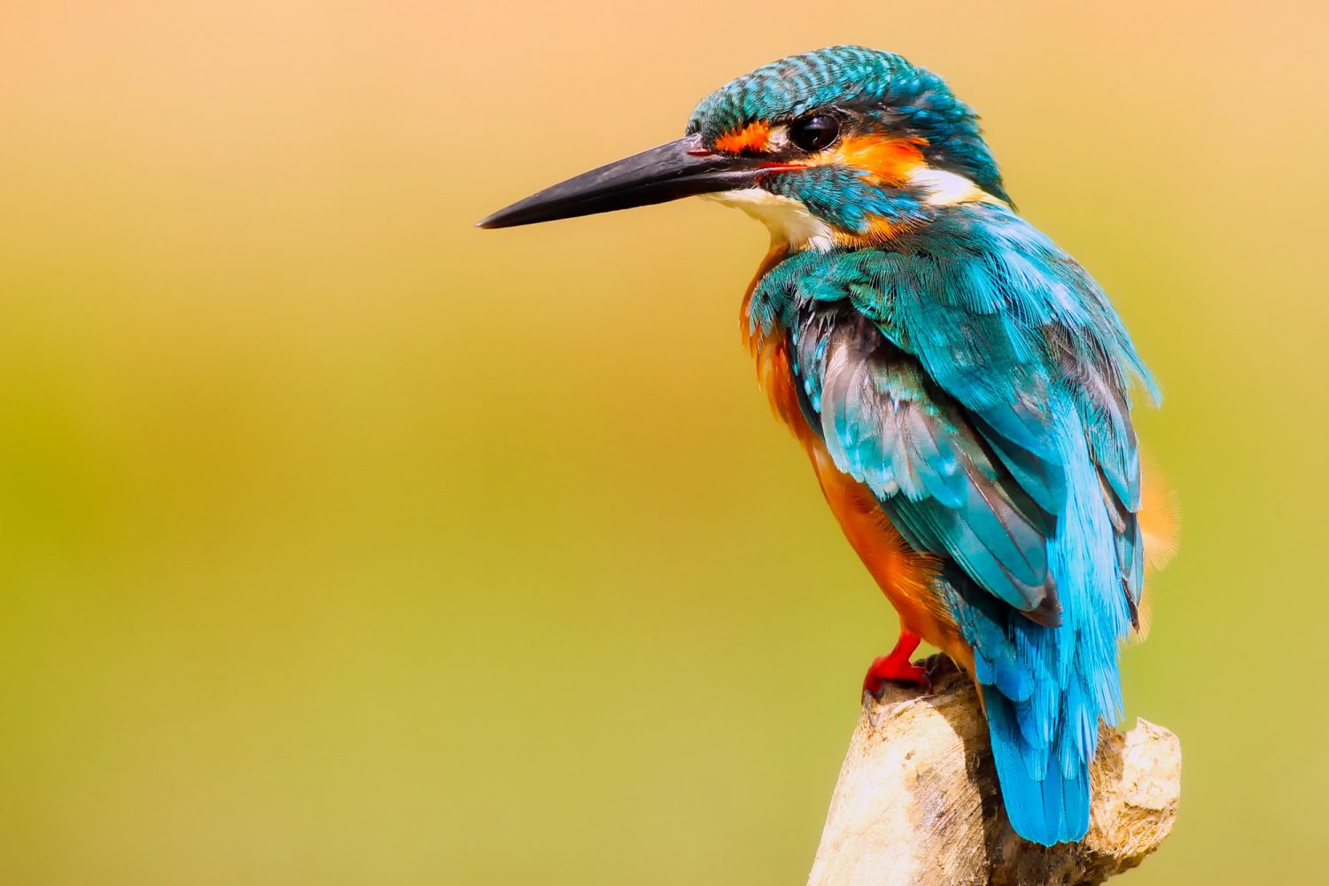
To achieve success in complementary colors photography, it is not enough for you to combine the colors correctly. You should keep in mind some other aspects as well. For example, take into account visual brightness when photographing objects in two complementary colors.
You need to choose the dominant color in the image if you capture two colors in equal amounts. Otherwise, your viewers will be at a loss and will not know what to focus on.
Imagine that you are photographing a red flower against a background of green grass. To get the desired effect, either grass or flower should occupy most of the picture. They should not be equal. The complementary colors photography definition does not provide precise guidance on exact color ratios. However, it will be quite successful if you capture colors in a ratio of 2/3rds to 1/3rd.
- Get more info on how to enhance photos.
Freebies for Complimentary Colors in Photography
The main idea of the photos described above is to display the opposite of complementary colors. To emphasize this feature, you can use detailed picture editing, or you can apply ready-made presets.
Brighten Sky
Sometimes it’s enough to add contrast and complementary colors will appear. This complementary colors photography preset is so rich and contrasting that it can improve even the plainest photo.
Juicy Contrast
This preset is rather bright and juicy. It significantly enhances the contrast of photographs. After applying it, complementary colors will become more expressive.
Pumpkin
This preset is a real find for photos where complementary colors do not look bright. It is ideal for the combination of orange and blue shades.
Sunshine
This filter is warm, sunny and contrasting. It will make your photos incredibly attractive. The preset is perfect for nature shots.
Dream Island
This action is designed to improve contrast, saturation and brightness. Therefore, it is suitable for complementary photography. Nature photos will become especially attractive with this action.


