When I started working with video on the FixThePhoto team, I viewed captions as a simple technical thing. Just a text under a video, standard fonts like Arial, Helvetica, Verdana, or Roboto, and that’s it. But the deeper I delved into content creation, marketing, and accessibility, the more I realized that there are different types of captions and they are one of the most underrated tools.
Nowadays, they impact not only accessibility but also engagement, attention retention, brand perception, and even marketing performance. Whether you’re creating a YouTube tutorial, short Instagram Reels, or preparing content for a client, understanding the caption categories for content and how to format them can truly make a difference.
In this guide, I’ll discuss the main types of captions, their styles, formats, and the best way to work with them, drawing on both theory and my own practical experience.
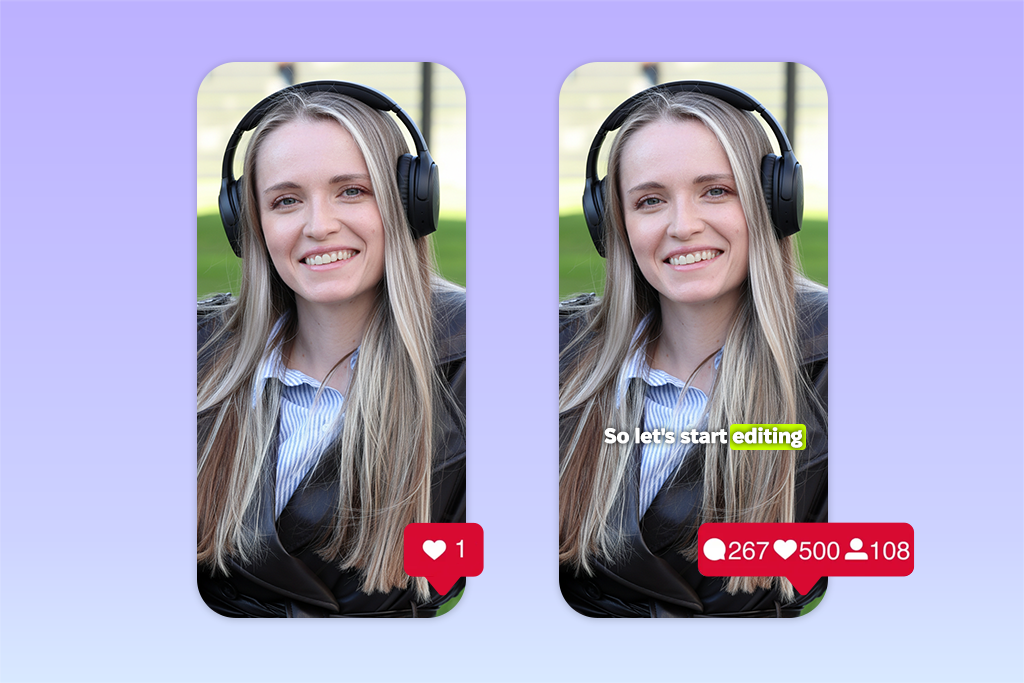
Captions are on-screen text that conveys not only speech but also sounds, important audio details, and the overall context of what is happening.
At first glance, it seems simple: just “translate” the audio into text. But in practice, their role is much broader. In my experience, captions serve multiple purposes at once:
Originally, they were created for people with hearing impairments. But now the audience is much broader:
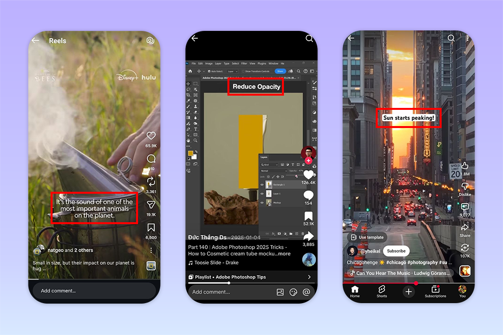
On projects, I regularly notice that videos with social media caption types perform better – especially short-form videos. Here’s why:
Accessibility. Over 1.5 billion people worldwide have hearing impairments. Captions make content accessible, and in some countries, they are also a mandatory requirement. From a professional standpoint, this is not an “extra,” but part of quality work.
Social media engagement. The most obvious point from real-world experience is that videos with captions hold viewers’ attention for longer. Many platforms play videos without sound, and if the users can’t grasp the meaning from the screen, they simply scroll on.
Marketing and search. Search engines don’t “watch” videos, but they do read text. Marketing captions and transcripts help content get indexed and appear in search results.
Audience reach. Captions (and especially subtitles) enable you to reach an international audience without having to reshoot. In videos I edit for clients in apps for video captions, this is one of the fastest ways to scale content.
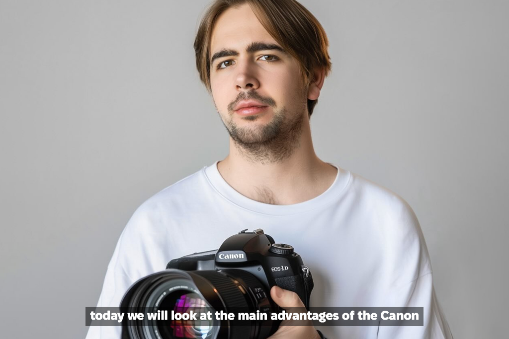
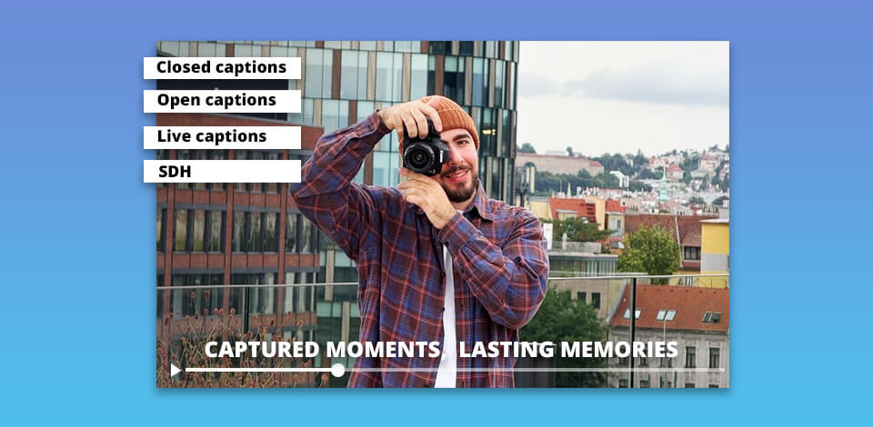
Closed captions (CC). This is the format I work with most often, especially when dealing with closed captioning software for long videos or content intended for platforms. The main advantage is flexibility:
I often use this type of captions when rewatching content, for example, late at night or in a noisy environment. This makes my work much easier. Where it is most commonly used:
The main advantage here is obvious: everything adapts to the viewer. This is especially important from an accessibility perspective.
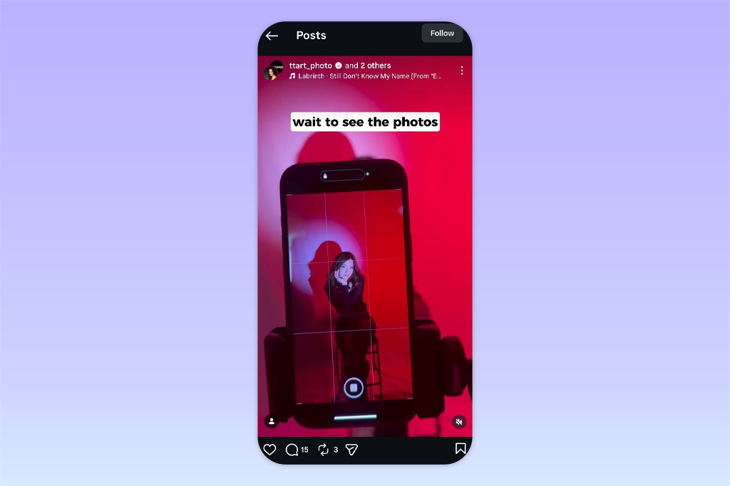
Open captions (burned-in captions). This is the opposite option: these captions are already “embedded” in the video, and you can’t turn them off. That’s why they’re so popular on social media, and I often use them in my projects.
At first glance, it might seem that the lack of choice is a disadvantage. But in practice, it’s actually more of an advantage. When I create content for social media, I almost always choose this social media caption type. It ensures that the text will be seen, even if a person is watching without sound and doesn’t turn on the closed captions. Why I choose them for social media:
Yes, the viewer doesn’t have the option to customize anything. However, for short videos, this is usually not a critical issue. What matters more when creating visual content for social media is that the information is immediately understandable and visually effective.
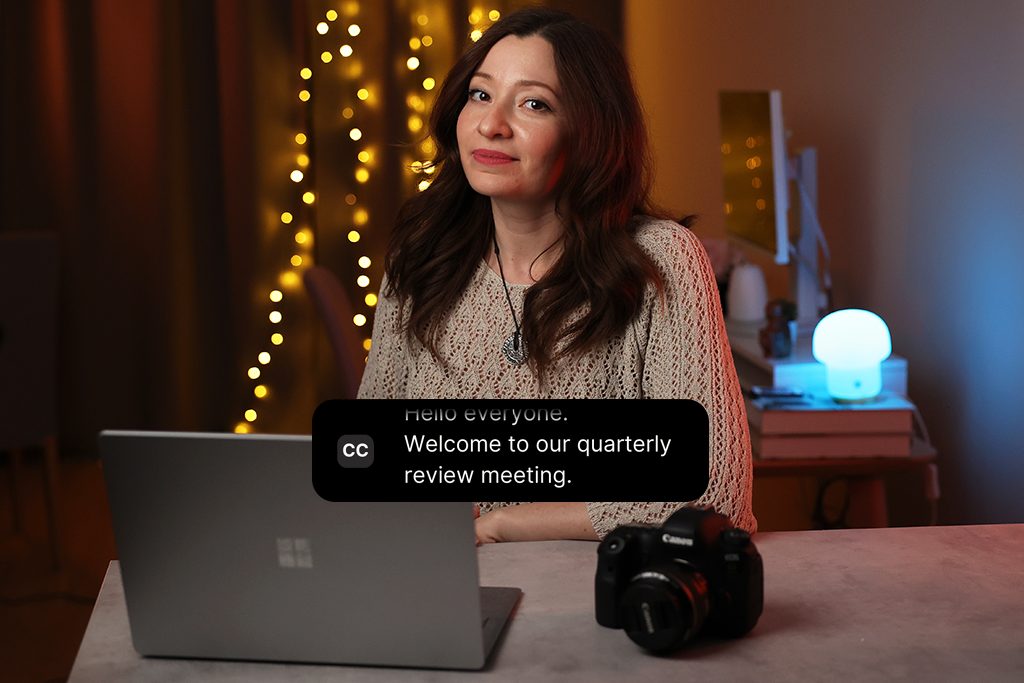
Live captions. These are captions that appear in real time during a broadcast. They are used in:
I’ve worked on projects like these, most often in corporate or educational content where they’re simply indispensable.
The main challenge here is to strike a balance between speed and accuracy. These types of captions are created either by specialists (e.g., stenographers), by AI, or by a combination of the two. In any case, there may be a slight delay and errors, especially if the audio quality is not ideal.
But even with inaccuracies, it’s better than nothing. For live content, this is often the only way to make the information understandable for everyone.
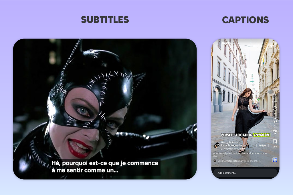
Subtitles vs. captions. This is one of the most common confusions I saw.
Subtitles:
Captions:
Example: Korean movie with English subtitles → translation; English video with captions → full text + additional sounds and details
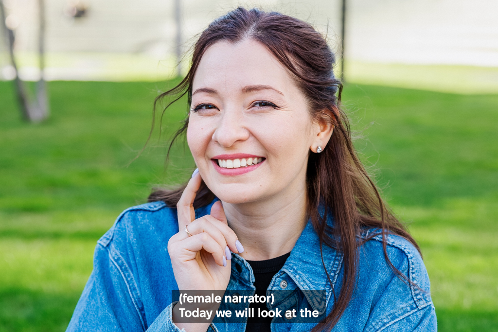
SDH (Subtitles for the Deaf and Hard of Hearing). This format lies somewhere between subtitles and captions, and, in my opinion, it is one of the most well-thought-out formats. It combines:
This is especially useful for international projects. You’re not just translating text; you’re striving to preserve the entire viewing experience, even for those who rely entirely on subtitles.
From a professional standpoint, SDH is one of the best caption formats when you need to adapt content for a global audience without sacrificing quality or accessibility.
In addition to caption types, they also differ in how they appear on the screen. And this is where the most interesting part begins, especially from a visual perspective.
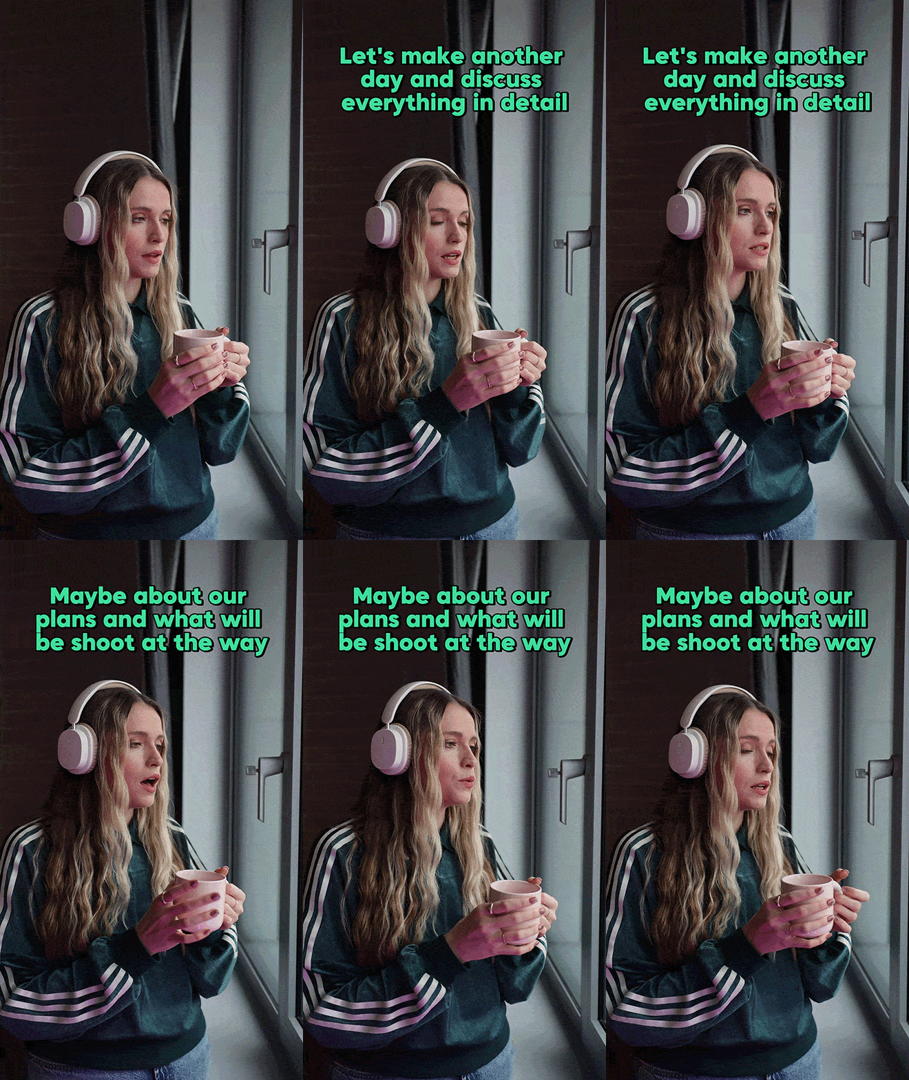
Pop-on captions. This is the style that everyone is used to, even if they don’t think about it. How it works:
The entire text appears at once → remains on the screen → is then replaced by the next text
Why I choose this caption style most often:
In my work, I almost always use this style for longer, more “straightforward” videos like tutorials, client projects, and educational content. It’s clear, predictable, and doesn’t distract from the video itself.
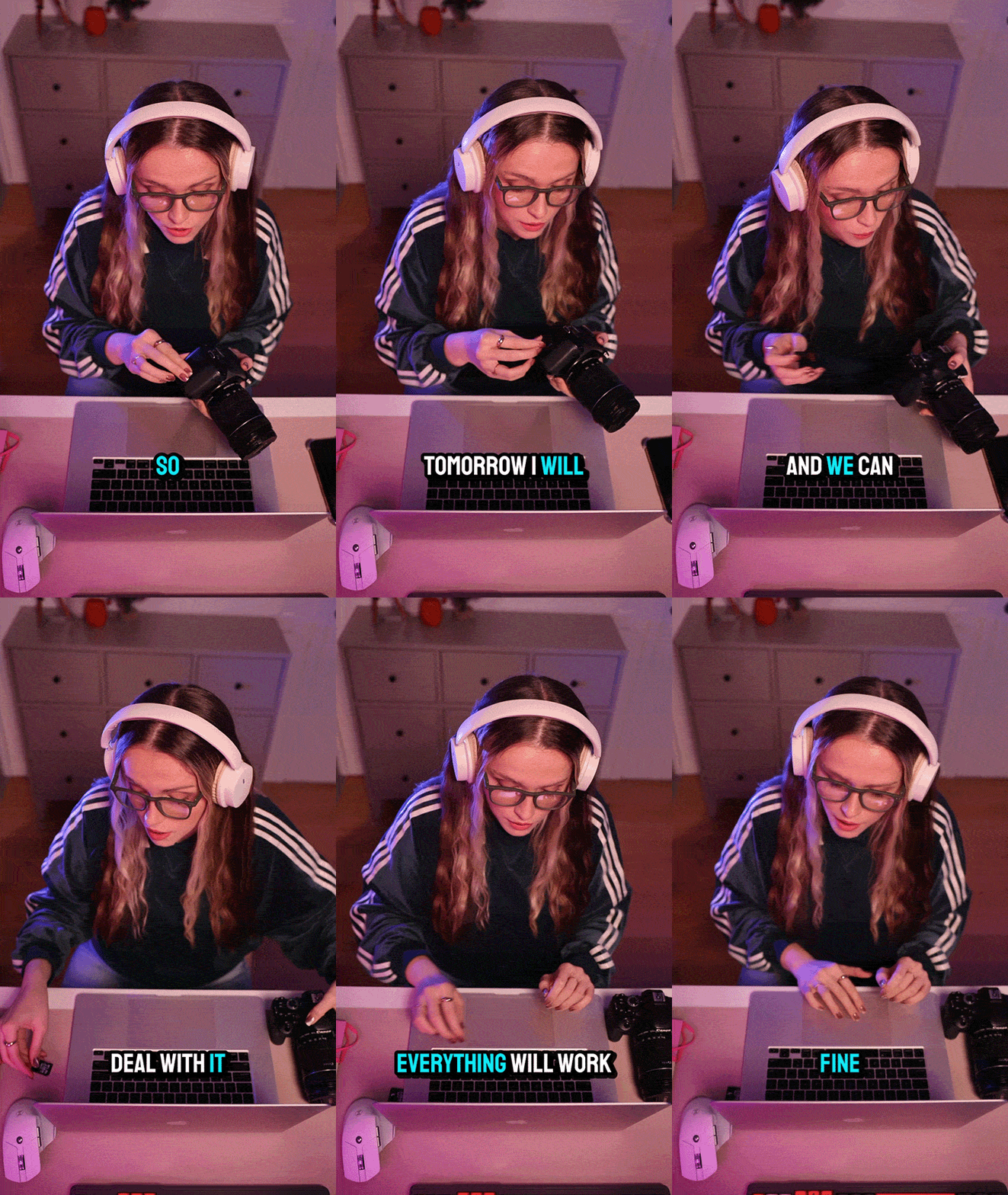
Roll-up captions. This format looks different; it is often seen on television. How it works:
Lines appear gradually → old lines disappear → text “scrolls” upward
I’ve encountered this style most often in live content: news, sports, and broadcasts. And in those contexts, it really makes sense. When there is no time to add text to video online in advance, this format allows the text to be displayed immediately, as the speaker talks.
But visually, I like it less. Compared to pop-on, these captions look more cluttered and are harder to understand, especially for audiences accustomed to more streamlined formats. Plus, the timing is less precise here because it depends on the speed of speech recognition.
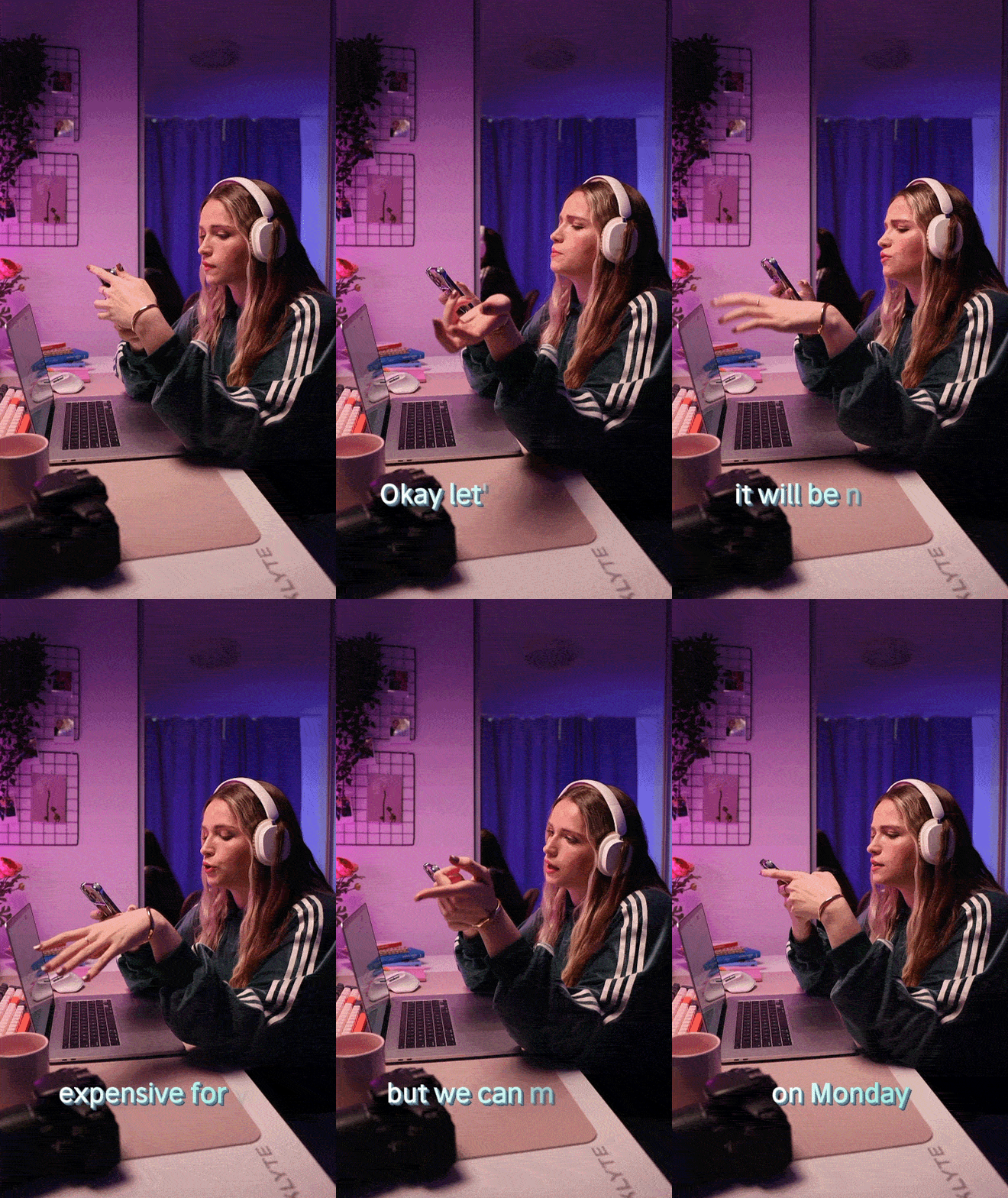
Paint-on captions. This format is now quite rare. The text appears gradually, as if it were being typed directly on the screen. What it looks like:
Letters appear one by one → creating a “typing” effect
Where you might see it:
Personally, I haven’t come across this caption style very often – mostly in older TV shows or in specific scenes, such as the intro of a reality show. Sometimes it’s used at the very beginning, when the speech starts immediately and there’s no time to wait for the entire phrase to appear.
From a visual perspective, this can look interesting. It adds movement and makes the image a bit more dynamic. However, I rarely use this approach in my work.
The main reason is readability. Even a slight delay caused by animation affects perception. And nowadays, when viewers’ attention spans are limited and they scroll through content quickly, things like this can reduce engagement.
To put it simply in terms of practical application:
Over the past year, Adobe Express has become my go-to tool for working with social media caption categories for content. Not because it’s the most “sophisticated,” but because it makes everything faster and easier. I can go from a raw video to a finished clip with formatted captions in one place, without constantly switching between programs.
Now my process is as simple as possible – and that’s exactly what I like about it. I upload the video, open it in the editor, and instantly generate captions right on the timeline. After the updates, Adobe Express automatically transcribes the audio and creates a caption track that I can check and correct right away.
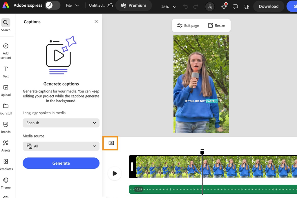
Then everything happens in one window:
I also often use the new AI features. Now, you can not only generate captions but also rewrite them or adapt them for different languages. This is convenient when you’re working with different audiences or adapting the same content for different formats.
From a production standpoint, this is one of the key considerations. The way different caption formats are created directly affects their accuracy, timing, and how comfortable they are to read while watching. In practice, there are several main approaches, and each one is suitable for a specific type of task.
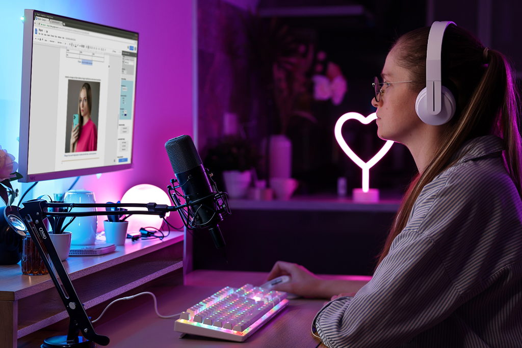
Here, everything is done literally: a person listens to the audio and writes the text from scratch, manually synchronizing it with the video without relying on easy subtitle synchronizers. To this day, this is considered the highest-quality option.
I use this approach for projects where accuracy is important, for example, in educational videos, branded content, or client work. Even if you don’t do everything from scratch, final manual editing is almost always necessary. It gives you complete control over the wording, timing, line breaks, and even how the text sounds when read.
From my experience, I can say that captions created this way read much more naturally. They’re not just accurate – they’re “user-friendly” for the viewer, and that’s something automated tools still struggle with.
The obvious downside is time. It takes a long time, especially if the video is long. If you outsource it, it’s also expensive. Therefore, I rarely use it as an initial step, but I use it almost always at the final stage, when the quality is important.
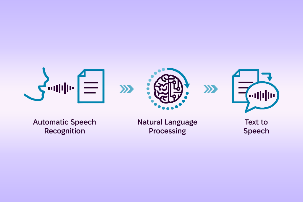
This is where most processes start these days. AI automatically converts speech into text quickly and conveniently. I use these tools almost every day, especially when I have a lot of content and tight deadlines.
This is a great option for a draft: instead of starting from scratch, you immediately get text that you can refine. However, there is one important caveat: you cannot rely on it completely. Accuracy is highly dependent on:
Even minor errors can distort the meaning or make the text seem sloppy. That’s why I always consider ASR as a starting point, not as the final caption writing style.
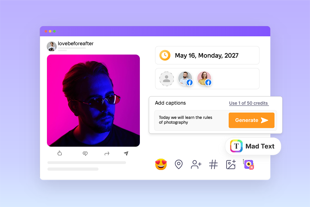
Hybrid captions combine the speed of automatic generation with the accuracy of manual refinement. First, an AI-generated draft is created, and then it is edited manually.
In my work, this is the most convenient caption category for content. It saves a lot of time compared to a fully manual process, while still maintaining control over quality. This approach works particularly well when you need to process a large amount of content, for example, for social media series or client campaigns. In those cases, both speed and a consistent style are important.
Another advantage is scalability. As the volume of projects increases, the hybrid approach helps manage the workload without sacrificing quality, unlike a fully manual method. This is the option I use most often, and the one I usually recommend for real-world projects.
Here, everything happens simultaneously: as the speech is delivered, the text appears immediately. There is no way to edit anything later. I’ve encountered this format in webinars, livestreams, and at conferences. There are two main methods:
Stenocaptioning. A specialist quickly types out the text using a special keyboard. This requires skill and experience, but it delivers high accuracy.
Respeaking. It’s a different approach: a person listens to the speech and articulates it clearly into a system that then converts the voice into text. This method is more flexible and is often used in conjunction with advanced speech to text software.
In our experience, captions created using these methods are rarely perfect, and that’s expected. Here, the goal is not accuracy down to the last letter, but rather for the text to appear immediately. Even with minor delays and errors, these caption type make live content much more understandable and accessible.
After exploring all these approaches, I have developed a simple logic:
If you work with video or editing software, you’ve probably already encountered different caption formats, even if you didn’t pay much attention to them at first. Essentially, the format determines how the text is stored, synchronized, and displayed. In my work, I most often deal with SRT, VTT, and embedded captions.
SRT (SubRip Subtitle) is the most common format. It’s as simple as possible: plain text plus timecodes. Because of this, it is supported by almost all platforms from YouTube to video players and editing software. When I need stability and versatility, I almost always choose this format.
VTT (WebVTT) is a more advanced format. It’s used more often in web players and offers more options: you can control styles, text positioning, etc. But in my actual work, I use it less frequently; mainly if the platform requires it.
And the third option is embedded captions. This type become part of the video itself, so they are displayed identically for everyone and are not dependent on separate files. I usually use this type of captions for social media, where it’s more important to ensure that the text is seen accurately than to give the user a choice.
My advice on the process: For YouTube and most work projects, I almost always use SRT. With SRT, it’s easier to control timing and text, it’s simple to make edits if something goes wrong, and you don’t have to re-encode the video every time you make a change.
Over time, working with various caption styles for posts – from quick Reels to client campaigns – I’ve tried out many different ways to style them. And the main takeaway is simple: there is no one-size-fits-all “best” style. It all depends on the platform, the format, and how people consume content there.
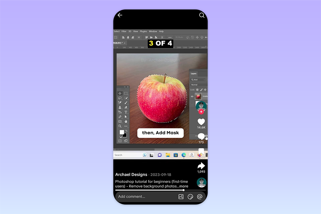
TikTok is one of the most demanding platforms in this regard. The feed scrolls quickly, attention spans are short, and you have just a few seconds to engage the viewer.
In my experience, captions here should be part of the action, not a static element. What works best:
A common mistake is overloading the video with text. Yes, creative caption types are important, but they should complement the video, not replace it.
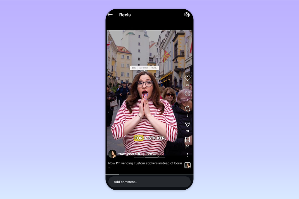
Instagram is perceived as more visually “cohesive,” and it’s better to adapt the captions to that if you want to have a successful Instagram. Here, I pay more attention to the overall coherence and quality of the design. Instagram caption ideas types become part of the overall style, not just a functional element. Here’s what I usually focus on:
There’s a small but important point: if you use the same caption style across different videos, your content starts to look more recognizable.
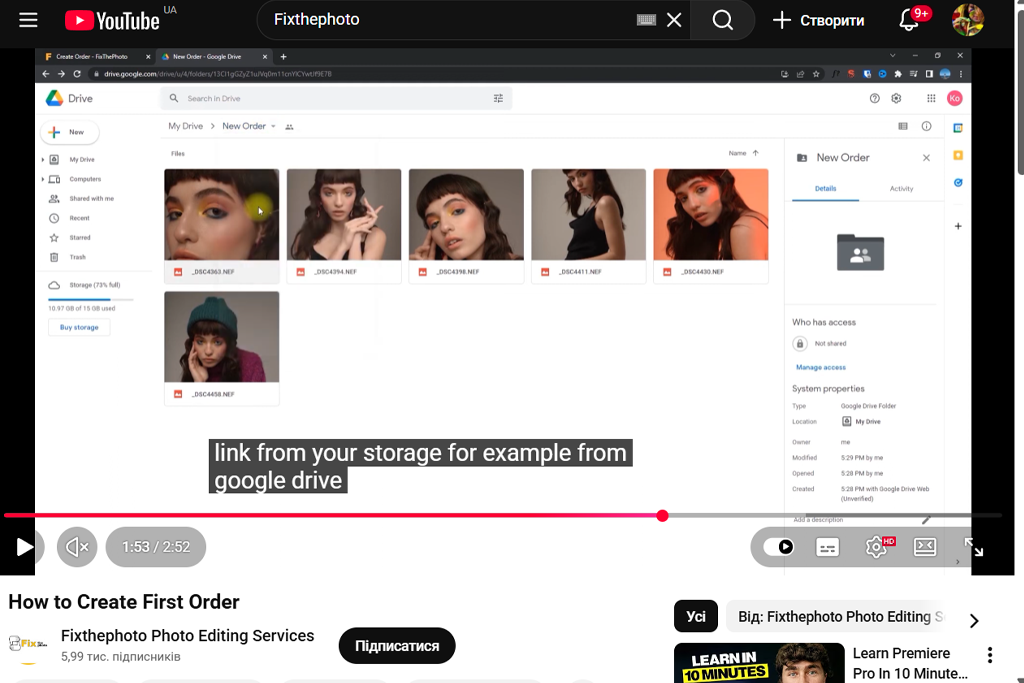
YouTube is a completely different environment. Here, people don’t just come to “scroll”; they come to watch something intentionally.
Therefore, the engaging caption types should not carry the burden of the entire content. Their purpose is to help people understand, not to distract them. I usually keep them more restrained:
From experience: If you overdo the on-screen text in long videos, it starts to interfere with the viewing experience. In such cases, the simpler, the better.
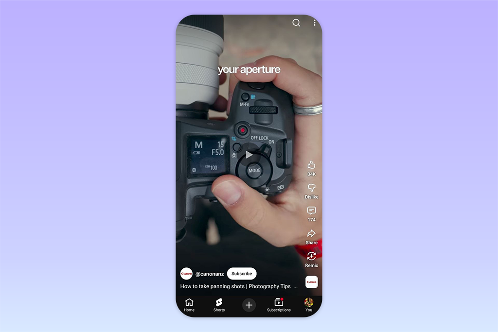
Shorts feel more like TikTok, but they have a slightly more subdued style. Here, captions play a key role, especially when videos are watched without sound. Often, it is the caption writing styles that determine whether a viewer will stay or scroll on. What works best:
I’ve noticed that even small details, like highlighting a couple of words in a sentence, can significantly increase retention.
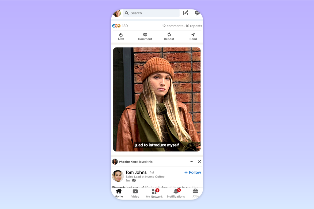
LinkedIn is one of the most predictable platforms in terms of captions or adding subtitles to video online, and that’s actually an advantage. Here, the audience expects clarity and a professional presentation, so creative caption types usually don’t work. I take a simple approach:
In my experience, on LinkedIn, captions are not about creativity; they are about readability. The main thing is that the content is easy to read and looks appropriate in a business context.
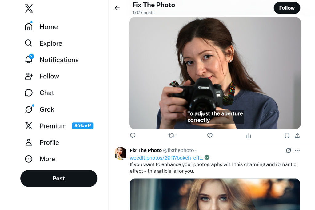
X is a bit of an outlier. Many videos on this platform don’t have captions at all. However, when captions are used, they are employed quite deliberately and typically kept as simple as possible. Two different caption formats tend to work best:
This platform relies more on the idea than the design. Captions are not mandatory here, but if done well, they can significantly enhance the impact of the video.
After testing different caption formats and working with various audiences, I have developed several principles that work almost every time, regardless of the social media for photographers:
Readability is paramount. If the text is difficult to read, nothing else matters. The font should be easy to read, the contrast should be sufficient, and the size should be comfortable to perceive.
Timing is key. Even perfectly written captions look bad if they don’t match the speech. When everything is in sync, the video immediately feels more professional.
The simpler, the better. Especially on mobile devices. Excessive text overloads the screen, so it’s best to keep only what’s truly important.
Placement is crucial. You need to consider the platform’s interface: buttons, controls, and other overlays can easily obscure the text if you don’t plan the placement carefully.
Consistency creates style. By using the same approach to captions across different videos, your content will appear more cohesive and recognizable without any extra effort.



![7 Best YouTube Banner Generator [Real Channel Tests]](http://fixthephoto.com/blog/images/gallery/news_main__preview_28946.jpg)

![7 Adobe Capture Alternatives [Free for iOS & Android]](http://fixthephoto.com/blog/images/gallery/news_main__preview_28909.jpg)


![Top 7 Bookmark Makers [Printable & Custom]](http://fixthephoto.com/blog/images/gallery/news_main__preview_28951.jpg)
![Add Skeleton Filter on Photo Online [FREE]](http://fixthephoto.com/blog/images/gallery/news_main__preview_28921.jpg)