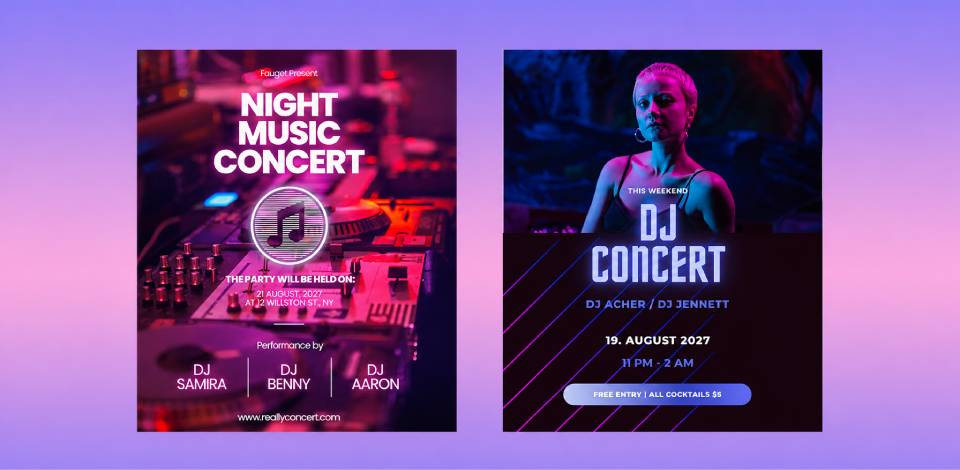
Concert flyers are different from posters, banners, and other materials used for advertising music events. When designing a concert flyer idea, one should not only consider how to grab a person’s attention but also how to provide details about the artist lineup, venue, date, and tickets.
Working as a designer in the FixThePhoto team, I am often tasked with designing concert flyers, event posters, and other advertising materials for artists, venues, entertainment companies, and festivals.
After creating many custom designs for all types of events, I discovered which layouts, color schemes, or visuals have the most noticeable impact on the audience. When working on my projects, I have created a list of practical recommendations and concert flyer ideas that can help novices create polished designs and avoid making typical mistakes.
Despite the popularity of digital marketing campaigns, many people still use concert flyers for promoting live performances, because they allow one to reach out to the target audience quickly. Such flyers can be distributed in printed formats or displayed in local establishments.
When they are digitized, one can share them on social media as well. They allow one to inform the audience about event details. In many situations, it takes one a few seconds to decide whether they want to attend an event. This is why it’s important to design flyers with a strong visual impact.
“It will help you build anticipation before the beginning of the event. A polished flyer can help an artist to improve their brand, promote an event, and boost engagement.”

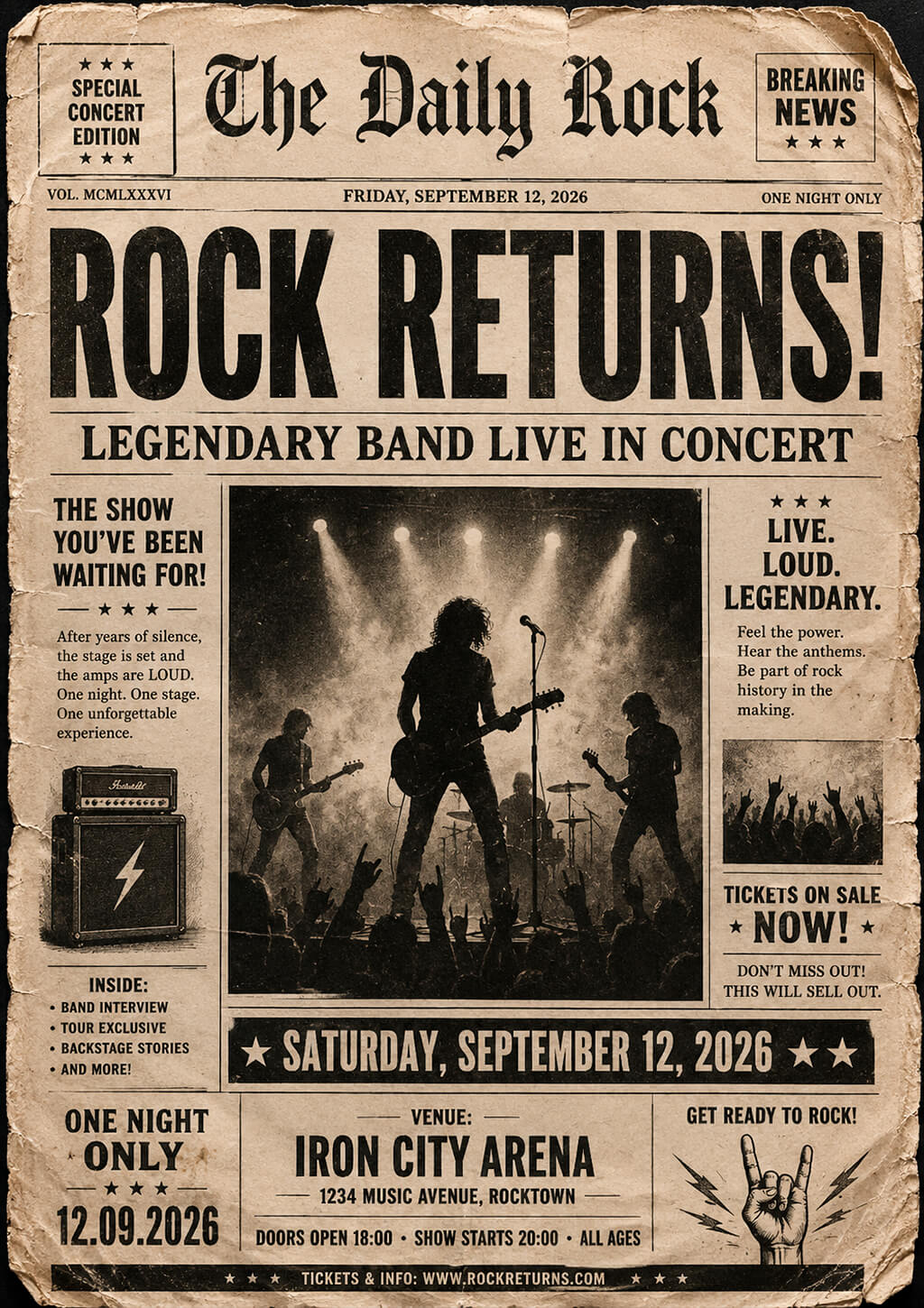
Distressed newspaper front page. Be sure to advertise the event using breaking news headlines, vintage paper textures, torn edges, and newspaper-like layouts. It will allow you to design a flyer with an underground feel and tell a viewer all the details of an event without making the design look too cluttered.
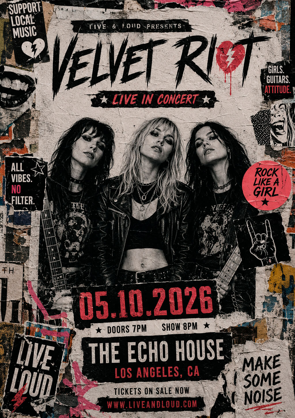
Gig poster wall collage. When designing a flyer, you can use a picture of a city wall covered with gig posters, stickers, graffiti, and torn paper. A flyer creating app will help you expedite your workflow. You can experiment with various textures and hide some elements to emphasize the importance of the event and make your flyers look less promotional.
Band photo with cinematic lighting. Many inexperienced designers add artist photos to flyers without considering the whole composition. However, it’s better to consider how you are going to present them carefully. I like implementing band photo ideas that involve the use of dramatic cinematic lighting, like it is used by album cover designers.
You may also add shadows, limited color palettes, smoke effects, or visuals of industrial locations. It will allow you to create the right atmosphere and produce professional designs that will instantly inform a viewer what kind of music concert they are invited to attend.
“Make sure to leave some free space around the subjects instead of filling it with textures and graphics. It will allow you to highlight the band name, tour detail, and ticket information.”

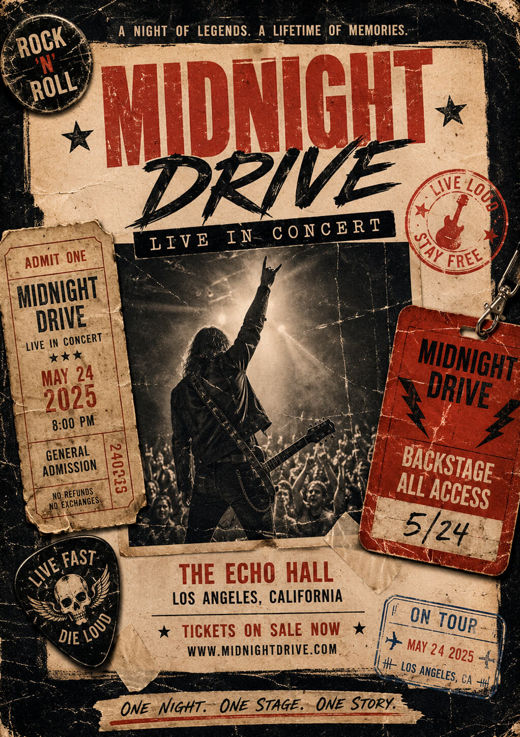
Vintage tour memorabilia design. Create a complex composition using such elements as worn ticket stubs, backstage passes, tour stamps, handwritten notes, and old photos. This is suitable for promoting classic rock, indie rock, and tribute bands. It will allow you to evoke a strong nostalgic feel without using common guitar visuals.
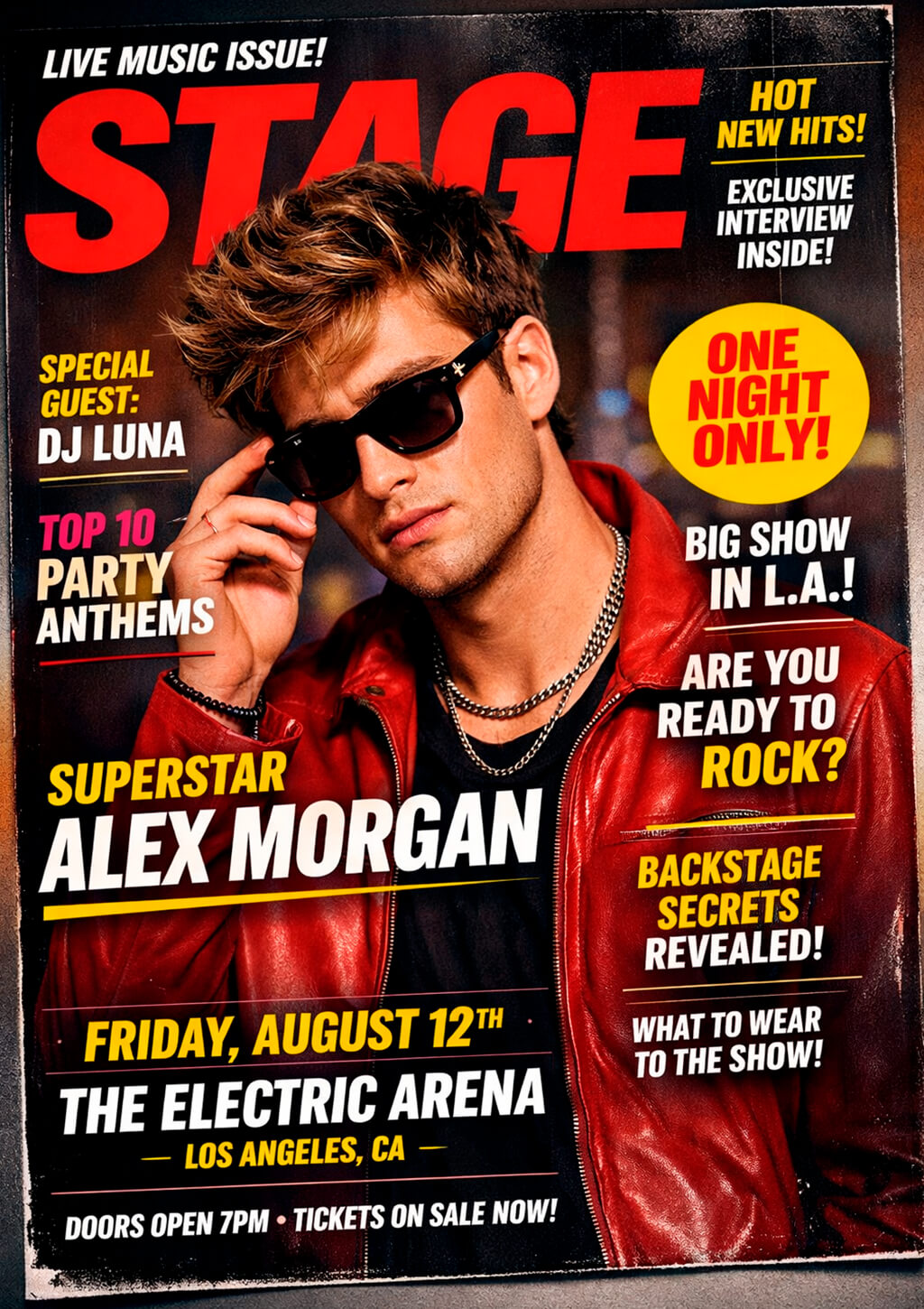
Magazine cover-inspired design. When promoting pop artists, you can create designs that are inspired by fashion, celebrity culture, or top brands. A pop concert flyer idea that will look like a magazine cover is perfect for such situations. You can create an eye-catching design that will be designed in the style of an entertainment or lifestyle magazine. Use bold headlines, add text snippets, and organize the layout in the editorial style.
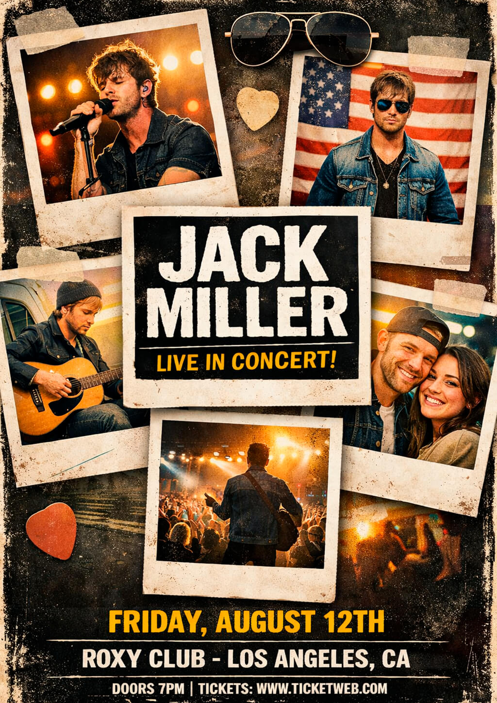
Polaroid storyboard layout. It will allow you to tell the whole story about the artist you are going to promote, including their personality, preferred music style, or brand. Such layouts are relatable and energetic at the same time. This Polaroid picture idea is good for pop artists who are still at the beginning of their careers and want to strengthen the connection with their audience.
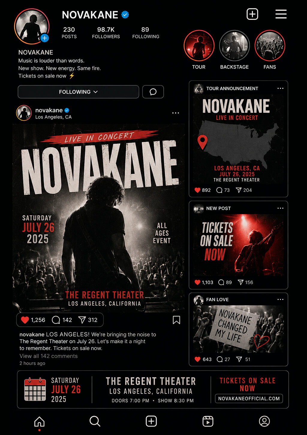
Social media feed mockup. Many pop artists use social media to establish a connection with their audience. By adding related elements to a flyer, you can make such designs more attention-grabbing. You can create a design in the style of a profile page, carousel, or content feed to provide information entertainingly and familiarly. Such designs appeal to younger audiences.
Color gradient spotlight concept. Smooth gradients will be perfect for a flyer advertising a contemporary pop music concert. Avoid a flat background. Instead, add spotlight-like color transitions to your design to highlight the artist’s name and information about an event. By using gradients and subtle lighting effects, you can add extra depth to your designs.
“I typically create gradients in Photoshop using the Gradient Tool and then tweak the colors using Gradient Maps or adjustment layers. It’s better than just applying effects to the background.”
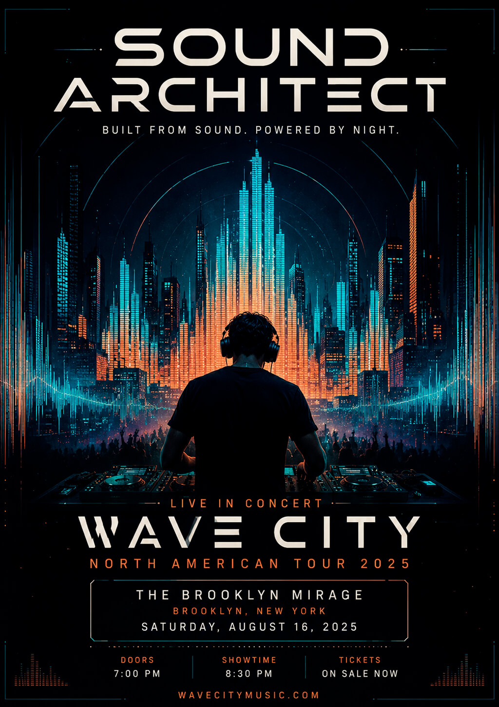
Audio spectrum architecture. You may use audio waveforms and frequency patterns as a basis for your design and visualize them as architectural structures. By using a music visualizer for concert flyer inspiration, you can turn equalizer bars into city skylines, landscapes, and depictions of urban spaces, and then organize these elements to highlight the event information.
Digital glitch broadcast. If you want to make your EDM flyer unique, produce a design that is reminiscent of a digital broadcast with some issues like distorted text, broken images, scan lines, and signal interference. The main thing is to add glitches around the main elements instead of distributing them evenly across the whole layout.
“Many beginner designers make the mistake of adding glitch effects to every block of text on the flyer. I avoid applying such effects to the event name, date, and venue to ensure that they are easy to comprehend.”
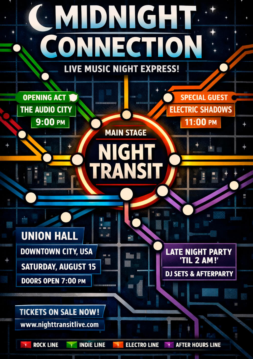
Night transit map concept. It is one of the most creative concert flyer design ideas. You can make information about DJ sets, stages, or performance times look like routes and stations. It might also be a good idea to make event details look like a navigation system. Such layouts allow you to organize information in a more intuitive way and keep one’s attention.
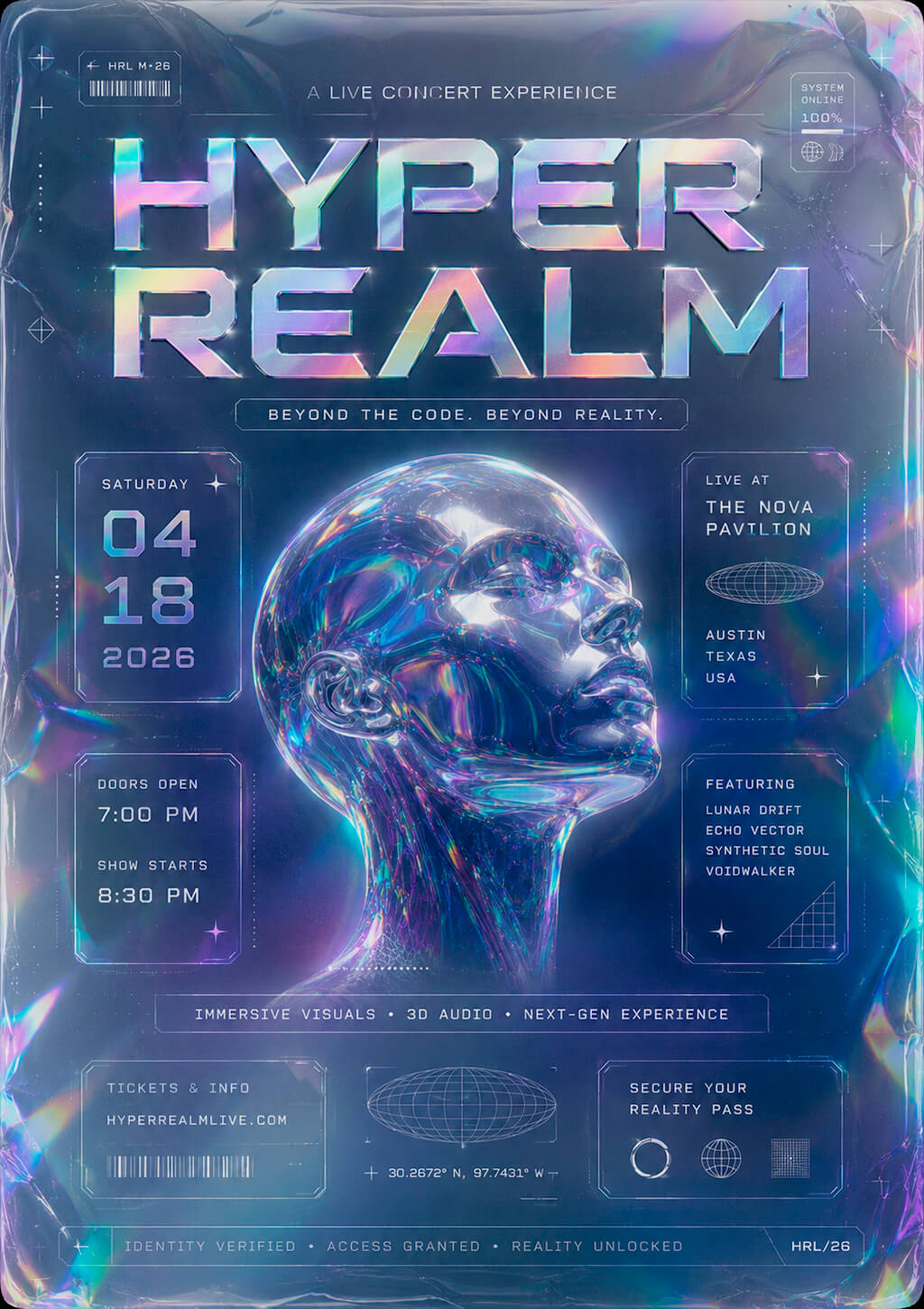
Holographic identity system. You may also create flyer designs that look like promo materials for a performance of a futuristic entertainment brand or virtual festival. I also use such designs when implementing poster design ideas. Add metallic gradients, experiment with holographic textures, transparent layers, and floating interface details to make it look as if a concert was fully digital.
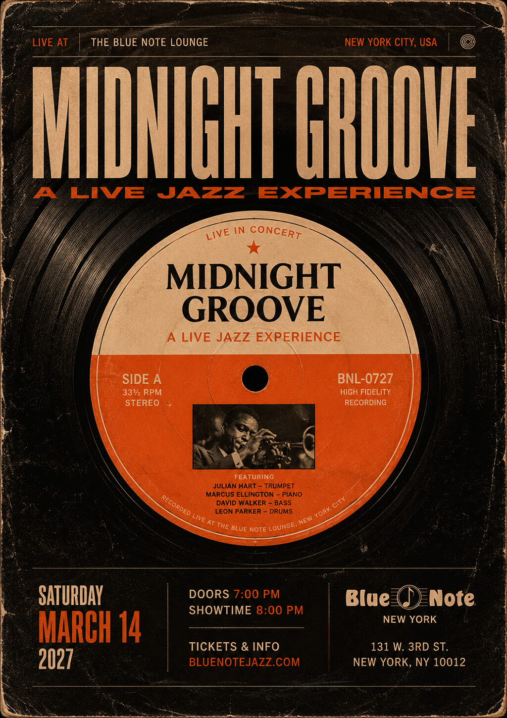
Vinyl record label design. A concert flyer design featuring vinyl record elements can help you recreate the atmosphere of a jazz or blues event. It’s better to structure the design around a record sleeve, add label visuals, insert text blocks with track lists, and add some imperfections and signs of wear. It will allow you to achieve realistic results even if you use an AI flyer generator.
Smoke and spotlight composition. Jazz and blues concerts often take place at small venues, with poor lighting and a unique live atmosphere. A flyer with subtle spotlight effects, smoke textures, and shadows can help you recreate the mood. Instead of adding decorative elements to the composition, try creating depth and an ambience effect to recreate the experience of attending such events.
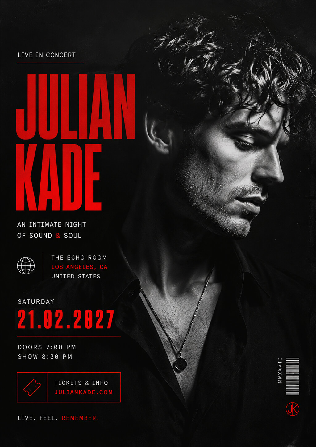
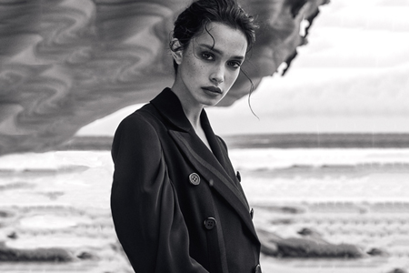
Monochrome portrait with accent color. Black-and-white photos are especially suitable for jazz-and-blues-themed flyers. They allow one to convey strong emotions, highlight textures, and emphasize expressions. A powerful portrait photo can become the main component of a flyer. You may also add a single color highlight to emphasize the artist’s name, the name of an event, or other important information.
“I typically tweak local contrast and improve facial details instead of desaturating my pics. In Photoshop, I use Curves and Dodge & Burn to highlight expressions and lighting.”
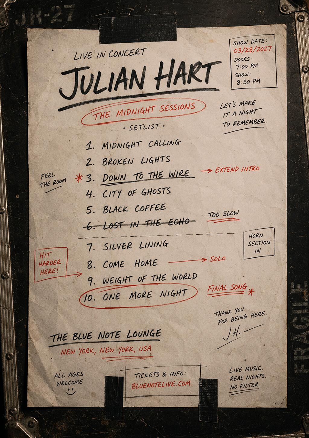
Handwritten setlist concept. Instead of song titles, use even details. You may also add notes, markings, and minor imperfections to create a more authentic composition. It will allow you to produce designs that have a personal feel and look authentic without using generic visuals like musical notes or instrument silhouettes.
Streetwear lookbook layout. You can make references to modern fashion or urban photography instead of trying to produce traditional designs. You can use editorial photos, oversized typography, labels that look like product tags, and well-organized grid layouts. This will help you achieve polished results with a premium feel and create a flyer that reflects the strong identity of a rap artist.
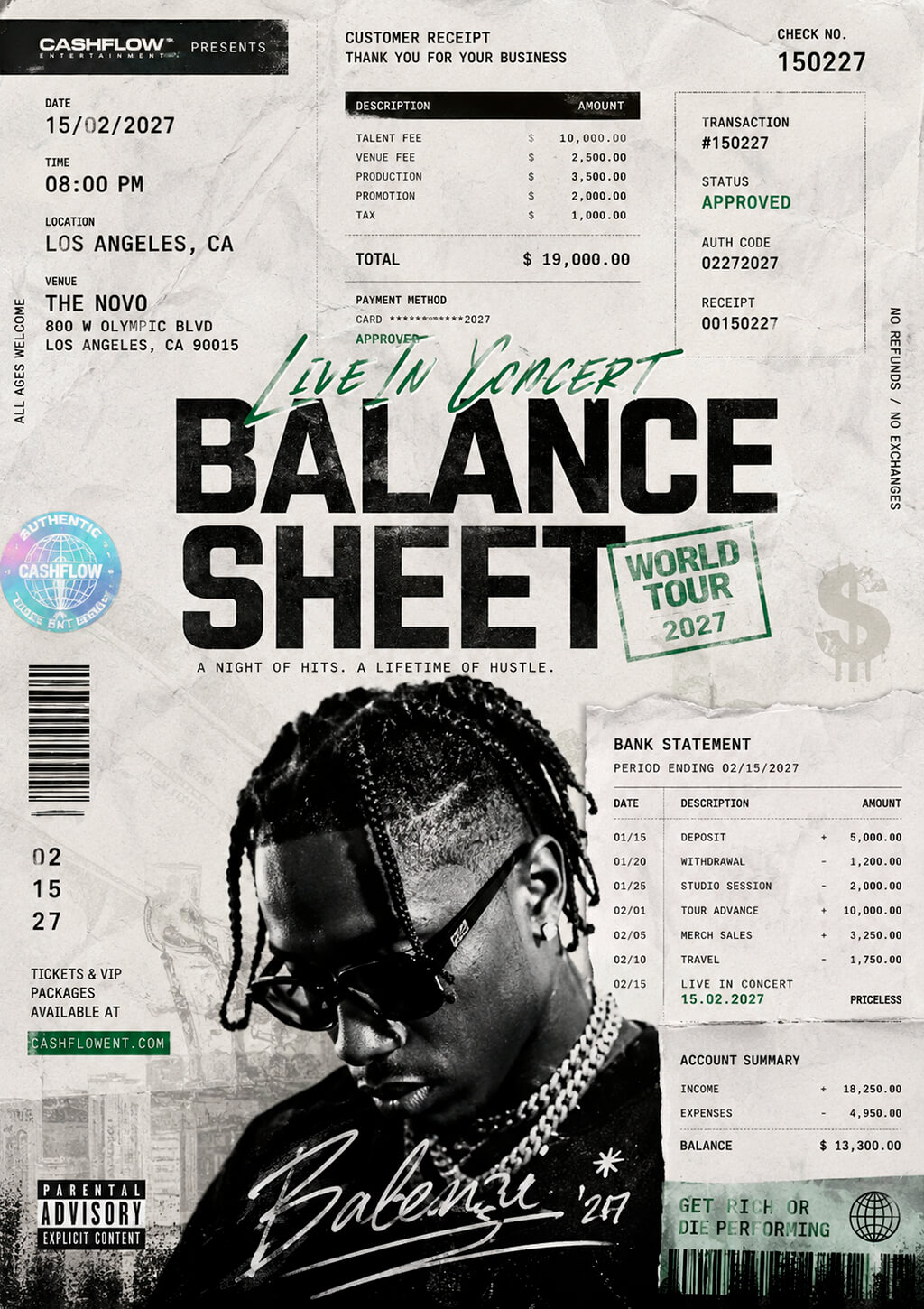
Money, receipts, and transaction theme. You can use concert flyer templates that can remind one about bank statements, receipts, invoices, shipping labels, or the stock market. Such elements will become a natural addition to a themed layout and allow you to provide comprehensive information about an event.
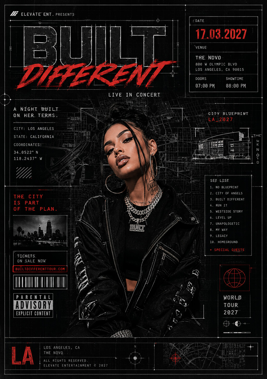
Urban blueprint concept. Try using a city map as the base of your project. The streets, blocks, and landmarks, as well as information about coordinates, can be used to inform a viewer about the venue and tell them more about the artist lineup. Such rock concert flyer ideas are perfect for local rap concerts because it emphasizes the background of the artists and their connection to the local community.
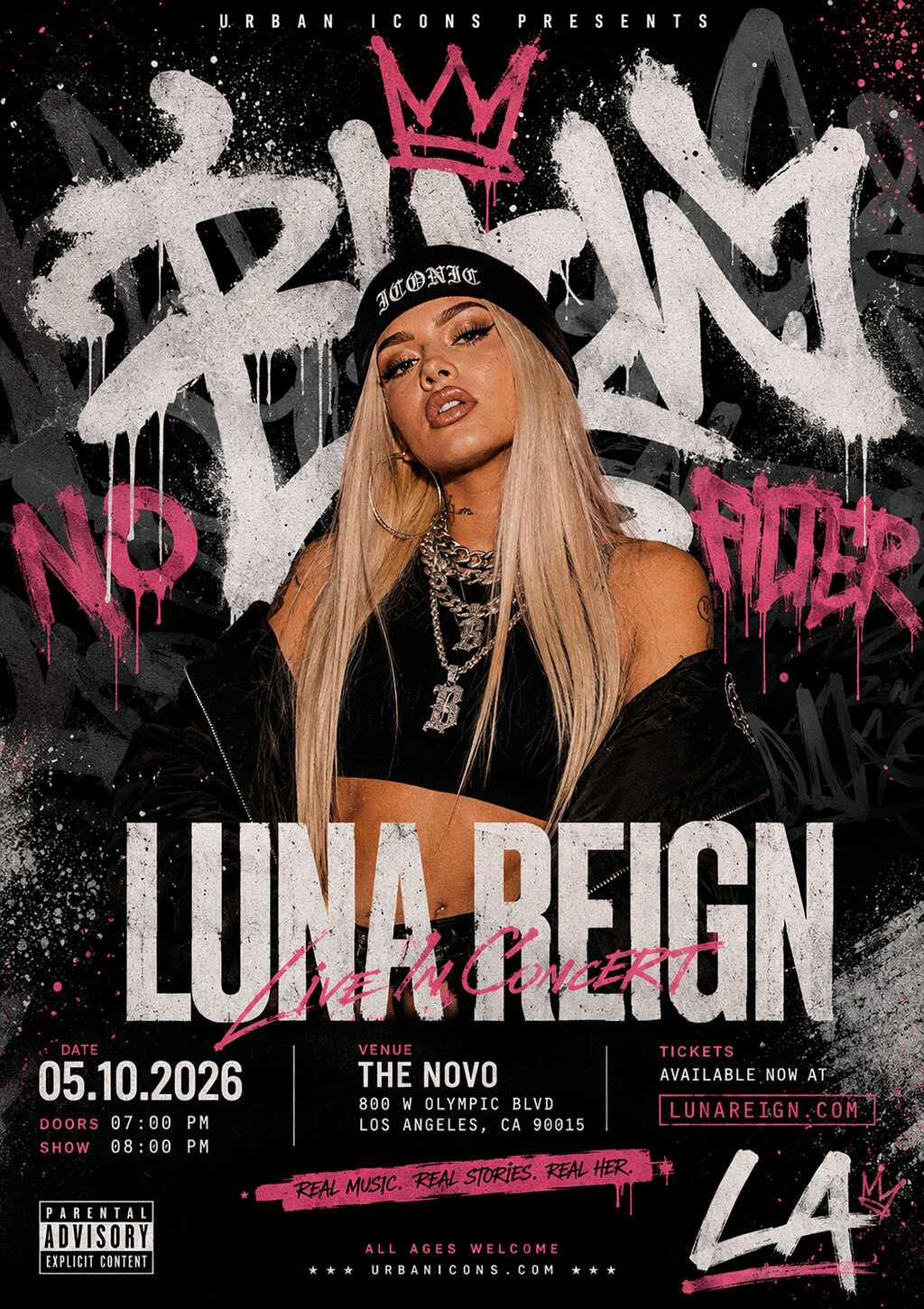
Graffiti typography as a secondary element. You can focus on lettering in the graffiti style to give a hip-hop flyer a unique feel. However, it’s important to avoid extremes. It’s better to utilize graffiti elements to add accents to the background or stylize supporting elements while using a clean typography style for the main details. This will allow you to experiment with urban aesthetics without distorting clarity.
“Graffiti generator can help you create the first versions of custom graphic elements. However, it’s better to use the generated visuals as a design asset instead of using them as the primary typeface.”
Minimalist designs. Concert flyers normally use one attention-grabbing element instead of many effects and patterns. A designer can focus a viewer’s attention on an artist’s name, a portrait, or a stylish geometric composition. Such festival flyer ideas are good for a clean, polished appearance, while ensuring that event details are easy to see and comprehend.

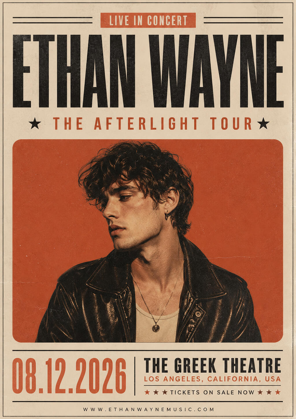
Vintage and retro concepts. You may use vintage paper textures, print defects, classic typography, and bleak colors to achieve the desired effect. When choosing an era for a reference, consider the music genre. You can get inspired by 1970s rock posters, 1980s synthwave aesthetics, or 1950s jazz ads. The best retro flyers have recognizable historical references but do not fully copy existing designs.
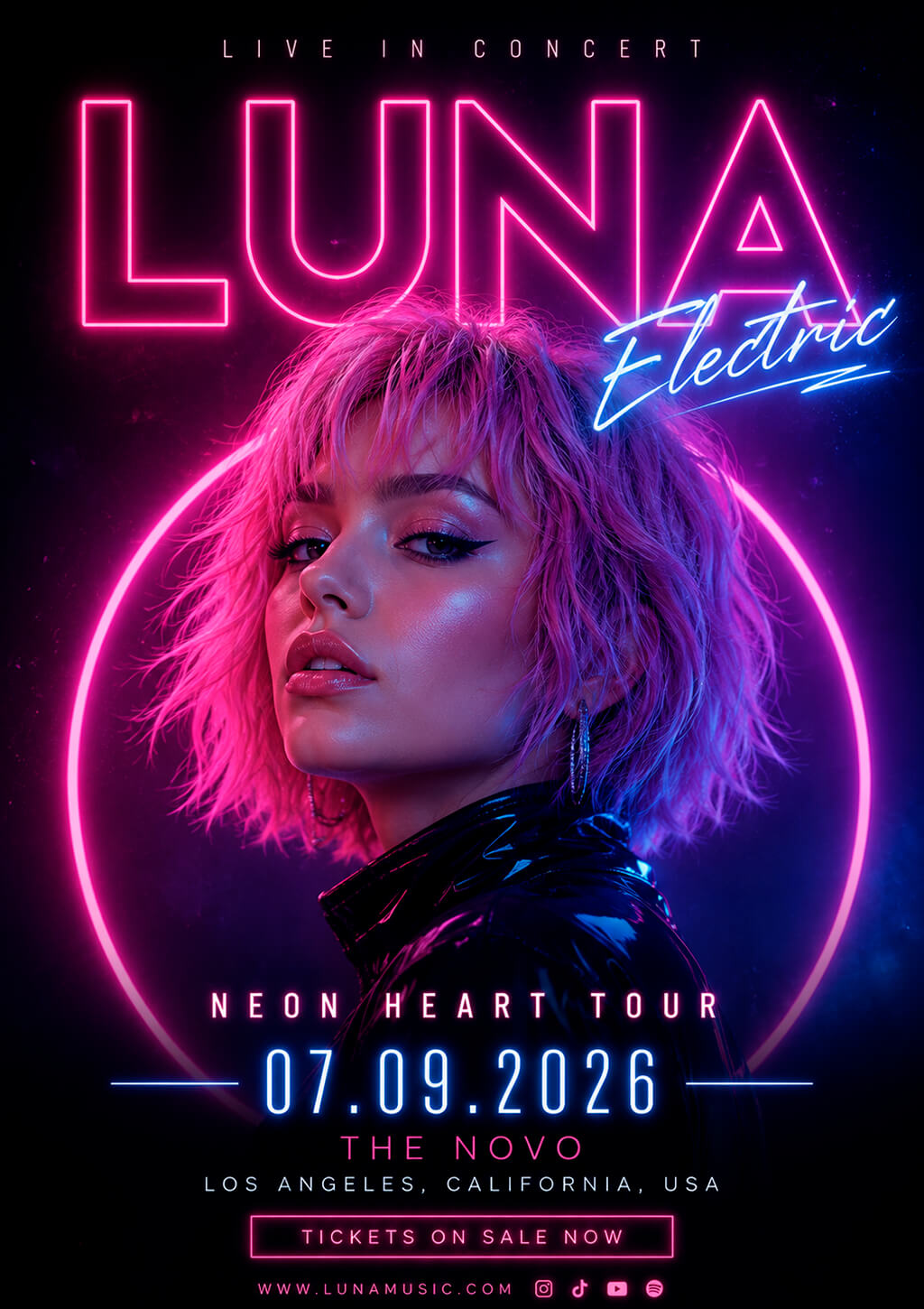
Neon-inspired designs. Such concert poster ideas are suitable for promoting concerts, club performances, and festivals. You can use glowing typography elements, illuminated shapes, and high-contrast color combinations to make your flyers more attention-grabbing. I normally limit neon effects to one or two main elements to create well-balanced compositions.
Collage-style flyers. Collage designs typically include photos, textures, typography, illustrations, and graphic elements. I use layers to create complex compositions. This format is perfect for those who support creative experimentation and allows one to work across different music genres, as it can be customized depending on a visual style.
The main problem is to use the right structure. This is why I prefer to choose the main element first and then add secondary ones to avoid creating clutter.
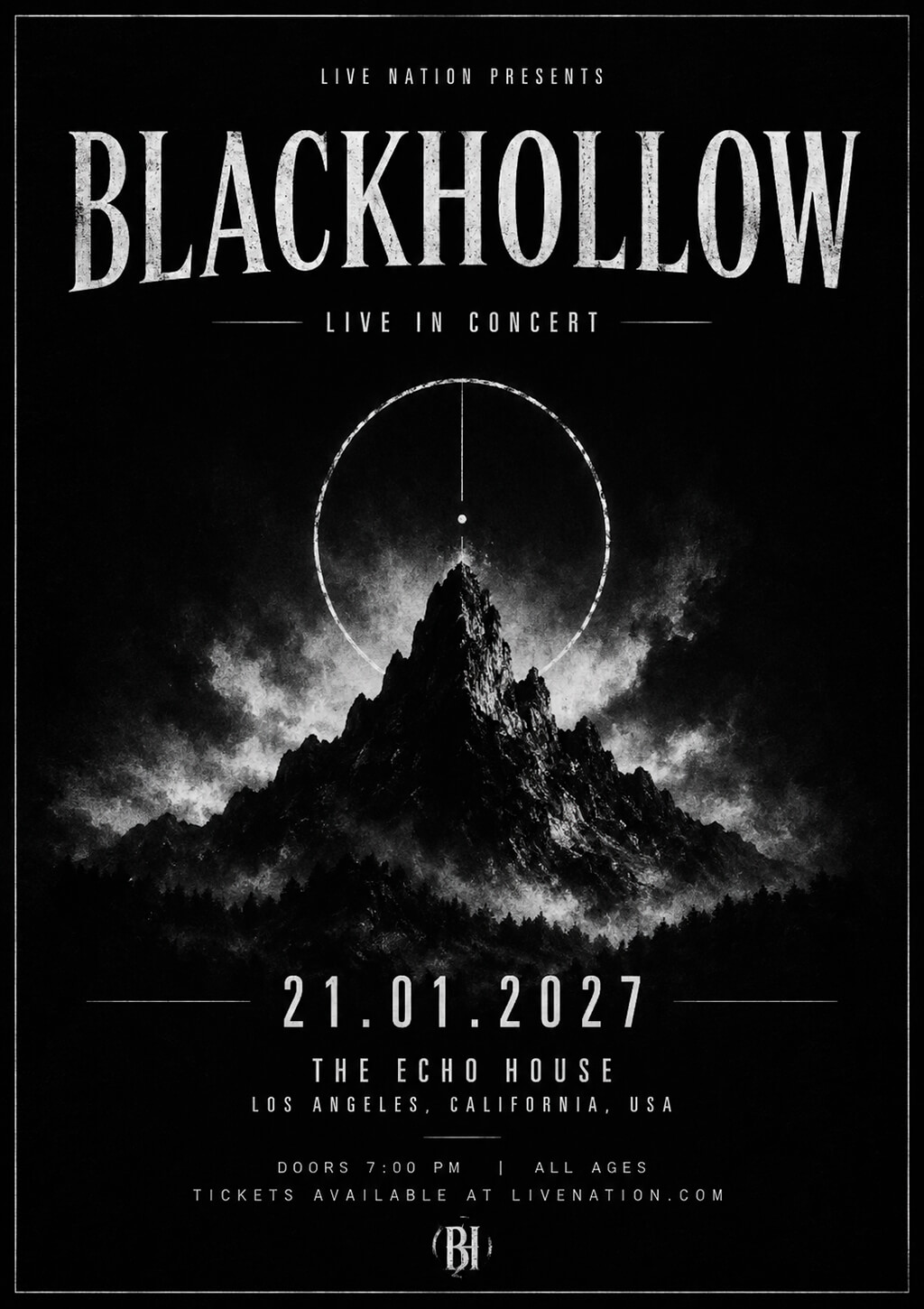
Black-and-white poster concepts. A monochrome flyer might be more impactful than a design with too many colors. However, one should use it in the right way when implementing band concert flyer ideas. Black-and-white designs are perfect for highlighting contrast, lighting, shapes, and typography.
They are perfect for promoting artists with a recognizable brand. By using the main accent color for the most important information, you can create a stronger hierarchy. Monochrome aesthetic is perfect for standard flyer size.
Artist-focused flyer layouts. If you want to make the artist the central element of your design, you can use a photo of the performer and choose typography elements that emphasize it. Such designs are especially suitable for promoting well-known musicians as they work best when an artist has built a recognizable identity.
“When editing artist images, I prefer to simplify the background or tweak color grading subtly to emphasize the performer instead of the environment.”
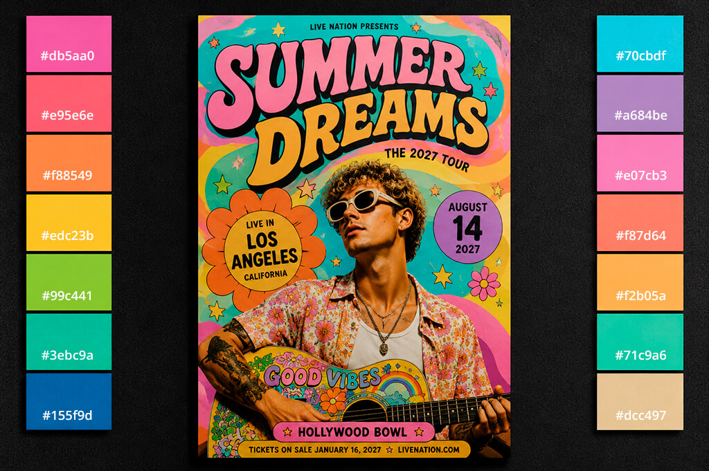
High-contrast color palettes. Such live music flyer ideas help to emphasize certain details. You can experiment with the combinations of black and yellow, dark blue and white, or deep purple and bright to ensure that there is a clear difference between the background and important information.
“Use color palette testers like Adobe Color or Colorspace to check how to combine different colors. Some colors may look nice, but they may be challenging to read on mobile phones or in a printed format.”
Dark-themed concert flyers. They allow one to draw a viewer’s attention to photos, typography, and lighting effects. I prefer to use deep shadows of blue, charcoal, burgundy, or green colors instead of black. It allows me to add extra depth to my designs and enhance highlights. This facilitates creating professional designs that do not look flat.
Bright festival-inspired color combinations. Such music flyer design ideas work best for outdoor festivals, summer events, or pop or electronic music concerts. Orange, pink, blue, and yellow tones will give your flyers a dynamic feel. When I need to use saturated colors, I also add neutral elements to create a well-balanced composition.
A design may look less professional if its fonts for flyer are poorly structured or their style does not align with the style of the music that will be performed.
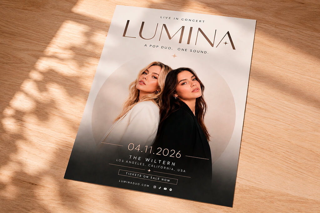
By choosing the right size, weight, spacing, and contrast, you can achieve better visual hierarchy. I often make the whole design blurry and check whether it’s still possible to read the most important information. If every element looks equally important, be sure to improve the visual hierarchy.
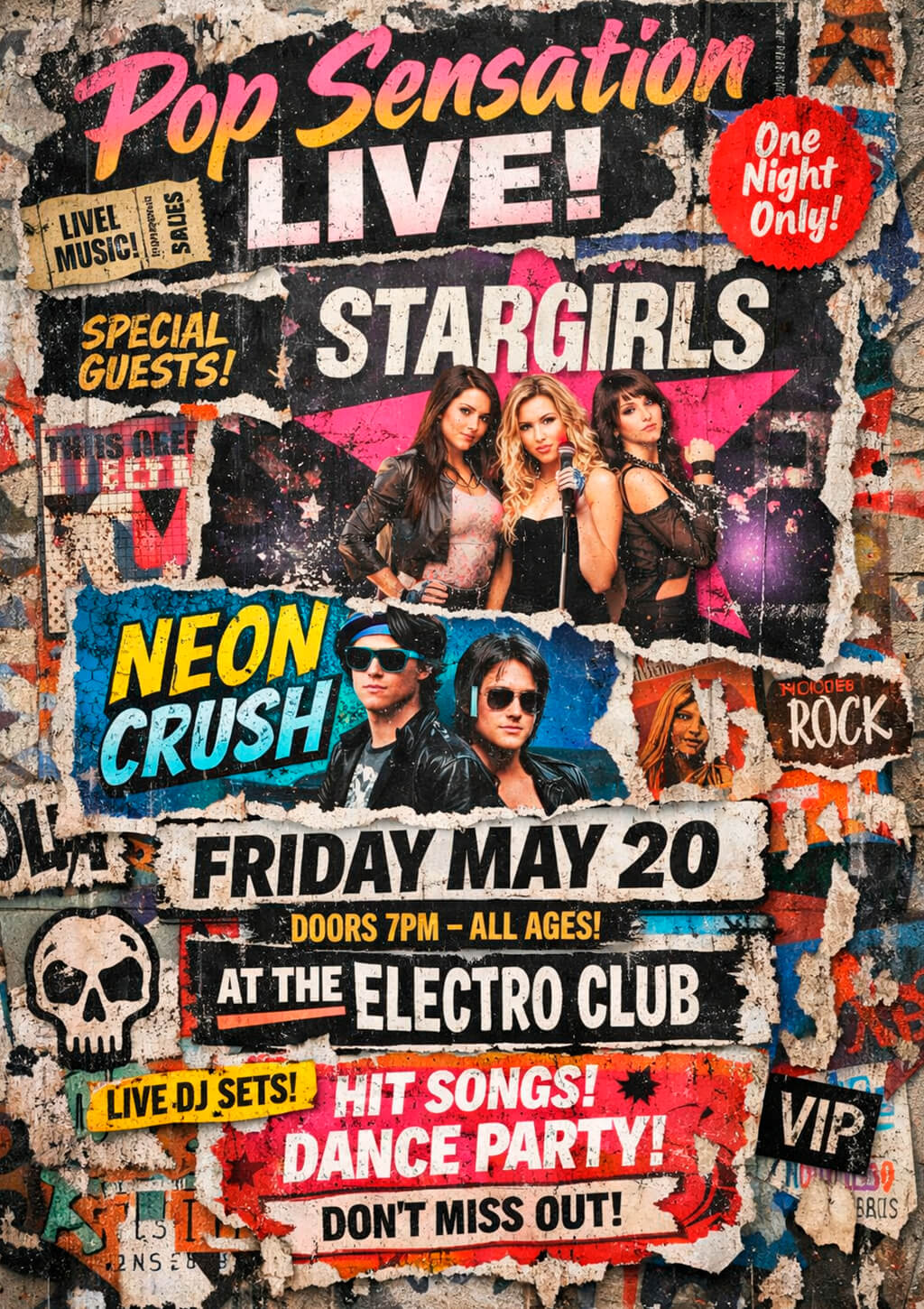
“Many novices mistakenly believe that they can make their flyers more professional by adding as many effects as they can. However, the best flyers typically stand out for their clear messaging, well-organized layouts, and polished designs.”
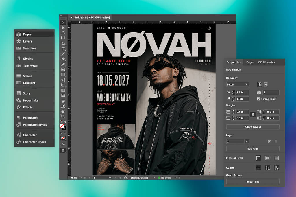
When designing concert flyers, I prefer to use Photoshop, Illustrator, or InDesign, depending on the project I am currently working on. Photoshop is perfect for editing images, performing color grading, and producing visual effects.
Illustrator is the best choice for designing custom graphics, logos, and vector elements. I mostly use InDesign when I need to design flyers with complex layouts or work on multi-page projects when creating event marketing materials, as this solution allows me to control typography elements and composition with high precision.
Canva is a practical choice for novices, as it can replace pro-grade flyer software. It comes with lots of templates and design assets. It facilitates testing out various layouts and promo graphics without spending a lot of time. Even though its capabilities are limited compared to dedicated solutions, it’s perfect for flyers for small events and social media campaigns.
In addition, I often use Google Fonts when looking for free typefaces and utilize Coolors when choosing suitable color combinations for new projects. Both solutions allow me to expedite my creative workflow and develop a recognizable visual style before starting to work on the design.
Yes, this approach works best. A flyer designed to be distributed in a printed format may look less appealing on a smartphone screen. When creating a flyer design for social media, make the text larger and ensure that its details stay visible at smaller sizes.
Use pictures that are at least 300 DPI at the print size to avoid degrading quality. If you are going to distribute flyers only online, choose the output resolution depending on the platform. However, it’s always better to use high-quality visuals, as it will be easier to edit and resize them afterward.
After taking a quick look at a flyer, one should be able to understand the most important information, including the name of an artist, the date of an event, and the venue. It’s better to remove any distracting details and publish them on the official website, ticketing page, or social media.
Try zooming out a lot and previewing the design as a small thumbnail. If you can still see the focal point clearly and the most crucial information stays comprehensible, it means that the composition remains perfectly balanced and has the desired effect.
Most print providers require users to send files in PDF format to ensure that embedded fonts and bleed settings will stay consistent. Before exporting your files, consider the printer’s specifications. Each provider has specific requirements for crop marks, color profiles, and documents.



![9 Best AI Virtual Try On Outfits Tools in {{%year}} [100% FREE]](http://fixthephoto.com/blog/images/gallery/news_main__preview_29082.jpg)
![9 Best Image Brighteners Online [{{%year}} FixThePhoto Choice]](http://fixthephoto.com/blog/images/gallery/news_main__preview_29194.jpg)
![9 Best AI Car Video Generators [{{%year}} FixThePhoto Choice]](http://fixthephoto.com/blog/images/gallery/news_main__preview_29281.jpg)