I decided to write about flyer design ideas because I know it can be hard for anyone, whether you’re a beginner or seasoned pro, to come up with fresh designs that really stand out when everyone’s seeing so much stuff all the time.
As a graphic designer at FixThePhoto, I’ve developed many projects, but designing flyers is one of my favorite things. Flyers are a great way to catch people’s eyes and share information fast, whether it’s for an event, a sale, or something personal.
For my research and examples, I used Adobe design tools. I got ideas from real flyers, online design sites, and my own past work. I also checked printing rules and popular styles to make sure every idea was both creative and usable.
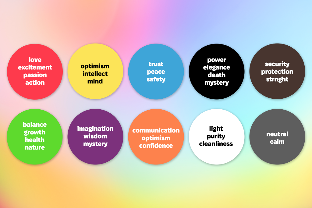
One of my favorite tricks is using color as the main way to catch the eye. Your color choices set the mood and direct people’s focus.
I follow basic color feelings – red means excitement, blue means trust, and yellow means energy. To keep the flyer looking sharp, I avoid using too many different colors that attract attention.
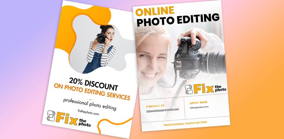
At FixThePhoto, I often use this method when designing flyers for photography projects. For ads about retouching portrait photos, I choose warm colors like red and yellow to give a friendly, personal feel. For ads about product photos, I use cool colors like blue and gray to create a clean, professional look.
Pro tip: Before adding color, test your flyer in black and white. See if the most important parts stand out clearly. If it’s easy to read and looks good without color, it will work even better when you add color.
“Only add bright color to things you really want people to notice first - like discounts, ‘Click Here’ buttons, or event details.”

Another good graphic design idea is to add patterns to your flyer. Patterns (like shapes, waves, or textures) can make simple flyers more interesting and unique.
Just make the patterns very light, so your words are easy to read. And pick a pattern style that fits your theme - like straight lines for a modern look, or natural shapes for a softer feel.
Pro tip: For printed flyers, test your patterns at the exact size they’ll be printed. Tiny details might get blurry or vanish, especially on cheap prints or small flyers. For digital flyers, make sure patterns never cover up buttons or important messages.
A great way to update a flyer design is by changing angles and perspective. Tilting elements, slanted lines, or depth tricks can turn a flat design into a lively look. This method naturally pulls the viewer’s eye to key parts, helping your message pop. Adding shadows, stacked shapes, or light 3D touches also gives the layout more depth.
Make your flyer more fun: tilt photos, text, or lines. This fixes boring flyers and makes them lively. Also, I often add light shadows or overlapping pieces to create a 3D effect.
Pro tip: Always keep your main text level (horizontal) so it’s easy to read. Only angle decorative items like photos, headlines, or background shapes. For printed flyers, keep tilted graphics away from the edges - otherwise parts might be cut off during trimming.
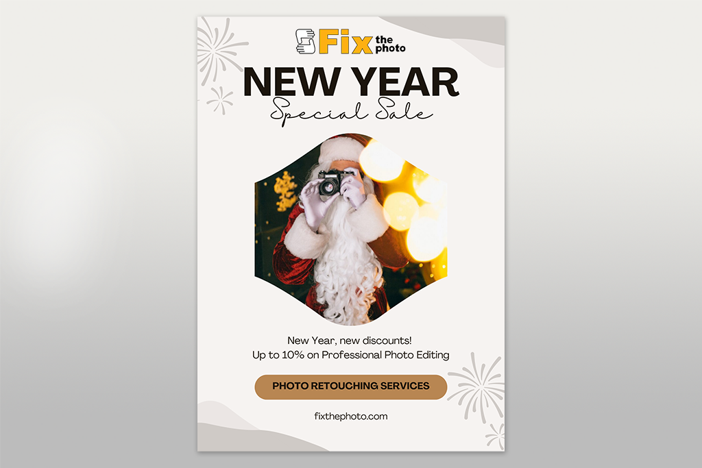
Seasonal details can quickly make a flyer feel current and fitting. For holiday events or summer ads, I include just one or two themed touches like holiday colors, small symbols, or a seasonal border to keep the design neat and professional. Using too many seasonal pictures makes the layout look messy.
Pro tip: Make reusable seasonal flyer templates. Each year, just change the colors, pictures, and text. For digital designs, apps for creating flyers, like Adobe Express or Canva, let you quickly update templates while keeping your brand style consistent.
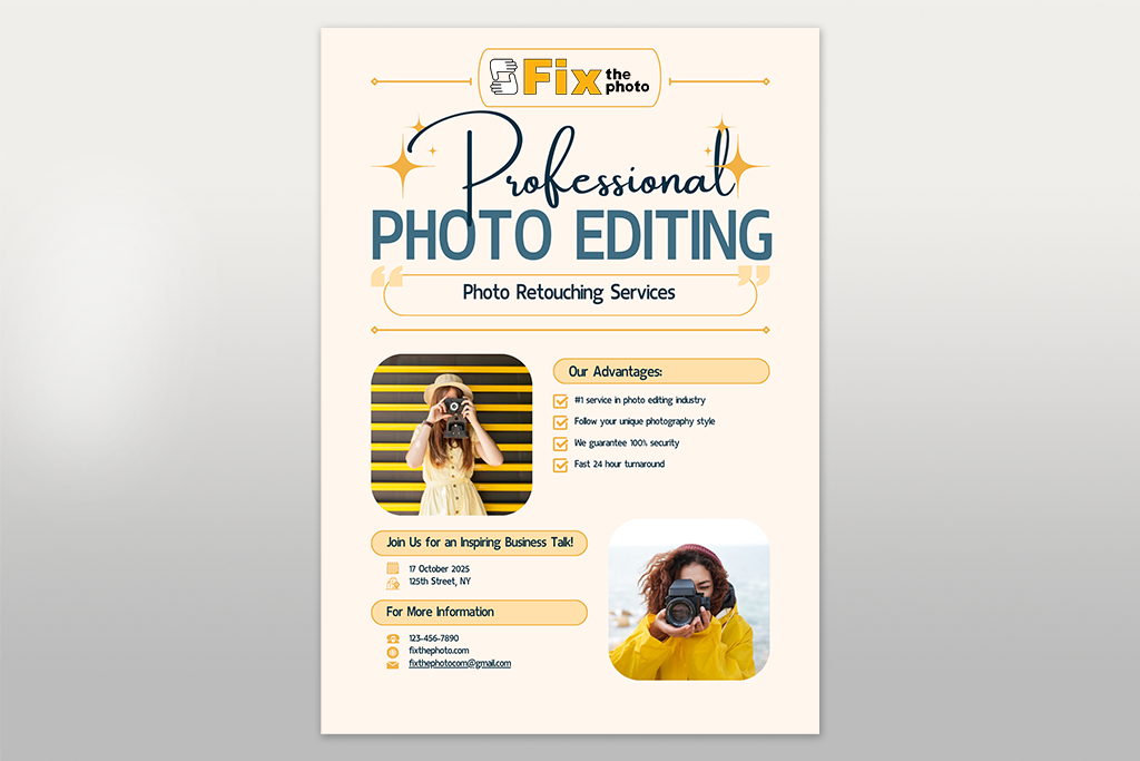
One flyer design idea I especially love is to use small pictures, symbols, or simple drawings. This helps people understand your flyer faster and gives it a neat, current look. I often use tiny icons to point out contact info, show services offered, or share quick details about events.
Pro tip: In simple, clean flyers, I use flat or outline icons. For lively ads, solid, colorful icons work best. Just remember: keep all icons looking the same style. This makes your design feel planned and professional.
Additionally, I occasionally use Noun Project when I require minimalist icons that don't detract from the layout or basic, clean design-related photographs. It's helpful when I want modest, human-made images that enhance the flyer without overpowering it.
“Always get icons from good websites like Flaticon, The Noun Project, or Adobe Stock. This makes sure they look professional and you’re allowed to use them safely.”


Flyers can teach people, too. This is why it would be a great idea to include short instructions, helpful hints, or simple infographics to give readers real value. Use this for service promotions, workshops, or event flyers – anywhere your audience needs straightforward guidance.
At FixThePhoto, I make flyers that teach clients how to get ready for a photo shoot. They include easy tips like what to wear, where to go, and how to pose. This not only advertises our service but also helps clients feel confident and builds trustworthy relationships.
Pro tip: Put your most important message at the very top of the flyer to make people see it first.
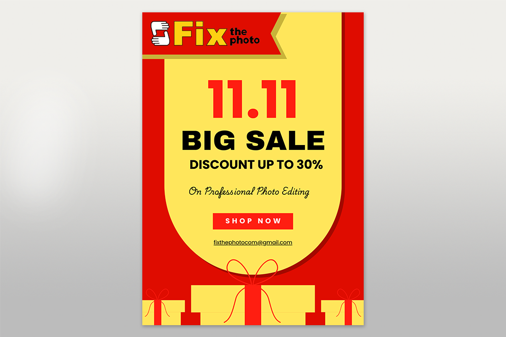
In my flyer designs, the best results happen when I add a clear deal that is hard to resist. Things like discounts, gifts, or special offers catch eyes immediately and give people a good reason to respond. I make sure nobody misses this deal by putting it in a very noticeable spot and using big, bold text, bright colors that stand out, or eye-grabbing shapes like badges or banners.
Pro tip: Use urgent phrases like “Limited Time,” “Offer Ends Soon,” or “Only 10 Spots Left” to make people act fast. Clearly explain how to get the deal and make the offer stand out with bigger, bolder, or brighter text than everything else.
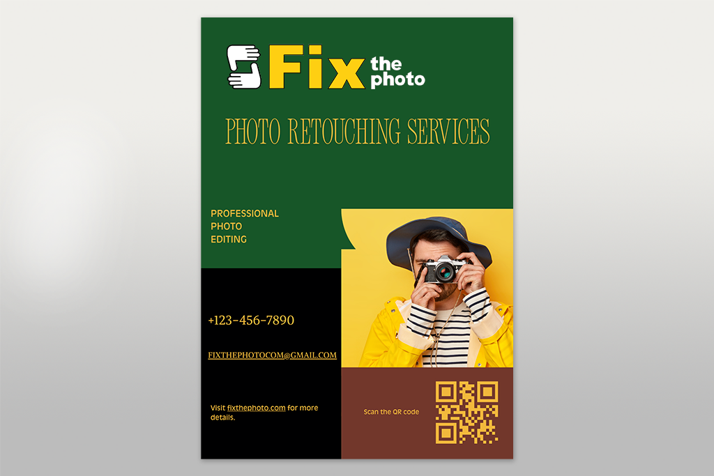
One of my best tricks is adding a QR code to flyers. It lets people scan and instantly go to your website, booking page, or special deal. Always add a clear message like “Scan to Book Now” or “Scan for Free Guide” so they know why to scan it.
At FixThePhoto, I use special QR codes made with dynamic QR code generators like QR Code Dynamic or Uniqode. These “dynamic” codes let me change where the code sends people later, like updating a seasonal sale link without needing to reprint flyers. I also match the code’s colors to the flyer and put a tiny logo inside it so it looks like part of the design.
“Put your QR code where it’s easy to scan. Leave empty space around it, and don’t make it smaller than a coin (about 2x2 cm) for printed flyers.”

One of my favorite flyer design ideas is to use photo collages to make flyers feel artistic and special. By overlapping pictures, textures, and simple drawings, I create backgrounds that look personal and interesting.
This style works great for creative ads, like for artists or workshops, because it shows their unique style instantly.
When I make collages at FixThePhoto, I use a free collage maker like Adobe Express. I stick to just a few colors and carefully mix the layers so everything looks neat and not messy.
Pro tip: Use matching colors all the way through and blend the parts gently so they look natural.
Using text style is one of the best ways to make a flyer design stand out. I like to add things like shadows, color fades, or outlines to headlines so they catch attention, while keeping the main text plain and readable.
Mixing different fonts and adjusting the space between letters can also make the design more interesting without making it hard to read.
I normally pick simple, easy-to-read fonts such as Montserrat or Helvetica for the main text, keeping the size between 10 and 12 points so it’s clear.
For titles, I make them bigger and heavier - usually 24 to 36 points, depending on how big the flyer is, so they stand out. Sticking to just a few font styles helps the whole design look consistent.
Pro tip: Only use special text effects a little, and check that the words are easy to read both on a screen and on paper, so people understand your message.
Flyer layouts don’t always need perfect center alignment. Try overlapping photos, placing items off-center, or using uneven text layouts. This creates a modern, eye-catching look that stands out.
When I make flyers for FixThePhoto, I trust my eye but always do the “squint test.” If I blur the design and can still see what’s most important, I know it works. This helps me keep things clear, even when the design is fun and playful.
“It’s okay to mix neat grids with more free shapes - just keep things balanced so the flyer looks exciting, not messy.”

My FixThePhoto colleagues and I have tried lots of flyer tools. For fast, simple designs, I pick Adobe Express, as it’s super easy. But when I need full control for custom flyers (like special events or branded layouts), I create a flyer in Photoshop.

Here are the steps I usually perform during my design:
1. Start with inspiration. I get inspired by browsing professional flyer designs. I search by topic, business type, or visual style to find layouts that match what my project needs.
2. Customize your design. Next, I change the colors, fonts, and layout pieces to match the brand or event's style. I add custom images, adjusting their position to create a clean, eye-catching layout.
3. Add extra flair. To make my flyers really grab attention, I try adding special extras like animated text (for digital flyers), small drawings, or overlays to make the flyer more eye-catching and polished. These small upgrades turn a good flyer into something sharp and special.
4. Resize for different platforms. I adjust the same flyer example for different uses like print, social media, or email. Tools like Adobe Express let me quickly change its size while keeping the design sharp.
5. Save and share your flyer. Once my flyer is ready, I download it and share it on social media, via email, or print it. Adobe Express also lets me tweak it later if needed, so I can reuse the design for future projects without starting from scratch.
At FixThePhoto, we tested lots of flyer tools and methods to see which ones work best. Here are our easiest tips to help you quickly make flyers that stand out and get attention.
A flyer stands out when it has visuals that catch the eye and a message that’s easy to understand. Bright colors, fun fonts, and interesting layouts can draw people in. Adding things like clear photos, simple icons, or even unusual shapes can help make your flyer unforgettable.
Start by getting inspired! Check out ready-made flyer designs for your type of business or event. This can give you ideas and a good layout you can change to fit your needs.
Flyer software, like Adobe Express, VistaPrint, and Flipsnack, has free flyer templates you can change to fit your needs.
Put your main message, contact details, and a clear call to action. Use good-quality photos of your product to show what you’re offering, and add a bold line or clear benefit so people know why they should be interested.
Yes! Photos help people connect by showing real things - like your products or team. Drawings add a special touch and explain tricky things simply. Mixing both can make your design really grab attention!
Yes. Digital flyers can have moving effects, clickable links, and videos, which print flyers can’t. When making digital flyers, make sure they fit well on screens and keep the file size small so they’re easy to share.
Look at design sites like Behance, Dribbble, and Pinterest, or scroll through Instagram/Facebook. Also, check out flyers from businesses like yours. This helps you see what looks good and what doesn’t.


