Over the years, I’ve worked with many different clients on hundreds of poster design ideas – from small music artists to new product brands – and they often asked the same thing: “Can you design something that makes people stop and pay attention?”
That sounds easy, but since people see numerous AI and human designs online nowadays, it takes more than just placing text on a background to make a poster stand out. Sometimes I use free poster makers to quickly test ideas, try out text styles, or build a starting layout before adding customized details.
Whether it’s a poster for print or a digital version for Instagram, I follow a simple formula: one big idea, a clean design, and one strong detail that makes people feel something.
Good design isn’t only about making something “pretty.” It’s about knowing what catches people’s eyes and emotions in just seconds. Here are poster design ideas I’ve used for real client projects and my own photo work.
Let’s be honest: some poster styles are overused and don’t stand out anymore. If your design looks like a free Canva template without any personal changes, people will probably scroll past it or ignore it in real life. Although these kinds of “safe” designs might look neat, they’re also boring and forgettable.
Here are a few poster layout ideas you should stop copying:
Of course, I’ve made these mistakes too, especially when I was working fast or didn’t know how to do better. However, recognizing this helped me realize that strong poster design isn’t just about adding decorations. It’s about grabbing attention and starting a visual conversation.
One change that really improved my work was changing up my fonts: I tried some free photography fonts for Photoshop that gave my posters more style and clear structure.
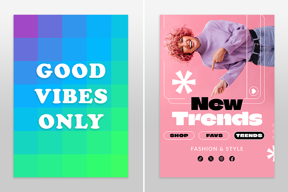
Sometimes, you don’t even need an image. The text itself can be the design. I’ve used this easy poster layout idea for workshop posters: the event name was the headline, and the font choice carried the emotion. If you’re searching for bold graphic design ideas that don’t need photos or illustrations, this is a good option.
The secret is scale: use very large text (100pt or more), tight kerning, and stick with one font family. Combine high-contrast colors and plenty of empty space to make it pop. This works especially well for posters you see from far away or for modern brands that want a clean, confident look.
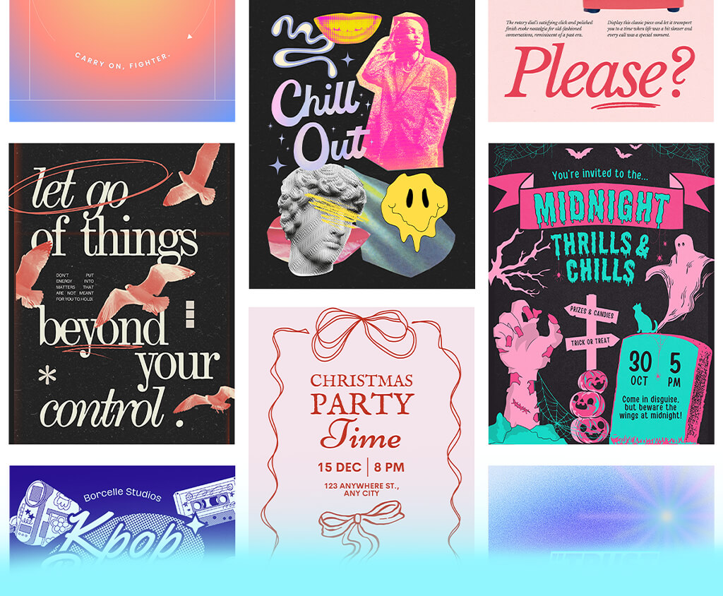
One of my favorite poster ideas for photography clients is to split the page either vertically or horizontally. On one half, place the photo, and on the other half, put the text. This style feels clean and professional, and it balances the story of the picture with the message you want to share.
This kind of design gives space for both parts. The viewer can either look at the picture or read the message without the two fighting for attention. But keep in my that to make it work, the text should connect with the photo, so I suggest using matching colors or aligning the words close to the edge of the image.
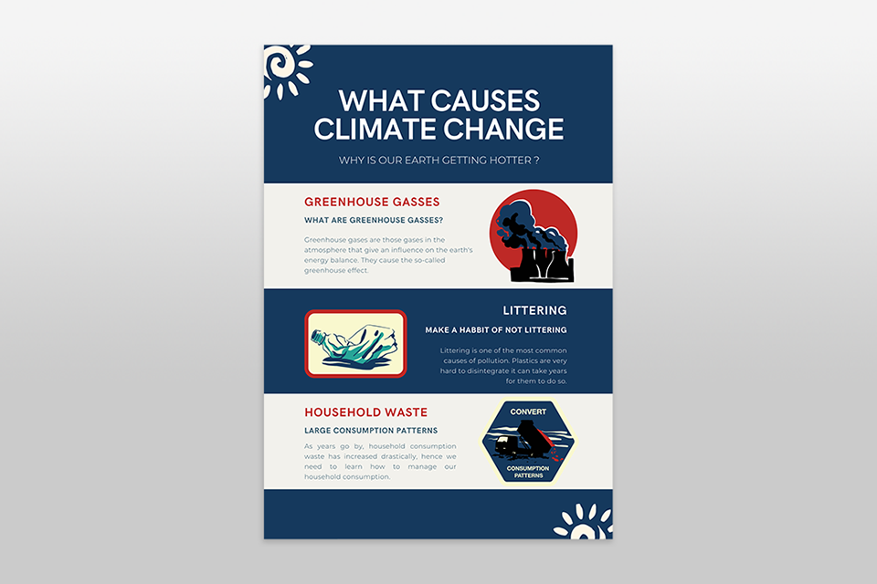
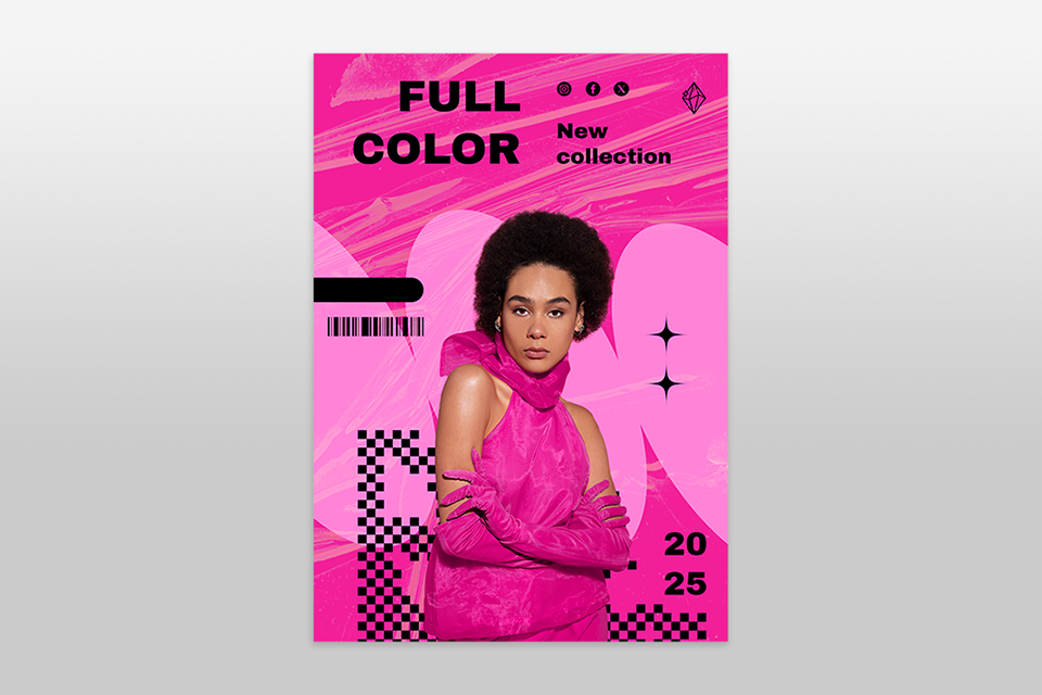
People also love posters that let them learn something quickly. For a sustainable fashion project, I made a poster that showed how much water is wasted in fast fashion. I used pie charts, bold headings, and short facts that stood out.
Free infographic makers helped me build designs that looked simple and clear but also filled with data. Instead of just telling people about an event or problem, you’re giving them information they can understand in seconds. If it’s done well, people might even take a photo of the poster to remember the details later.
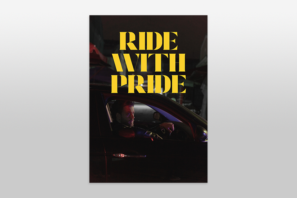
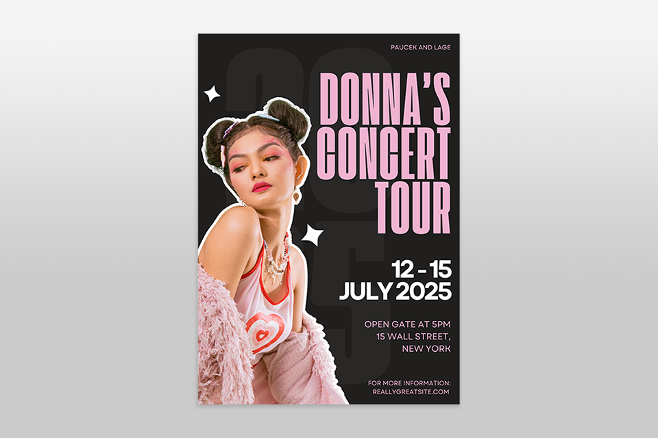
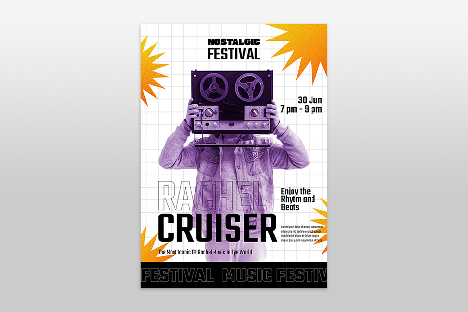
Another easy poster design idea is to treat the poster like a movie poster. Capture one strong moment in a photo, use dark shadows or dramatic light, and let the picture send the message. I once used this poster style for a musician’s album launch – it was just a powerful photo taken from behind with large bold serif text in the negative space.
This style works best when you have great photography skills and only a small amount of text. Don’t crowd the image. A single striking photo plus one short line of text can create an unforgettable poster. No surprise this is also one of FixThePhoto team’s favorite poster styles.

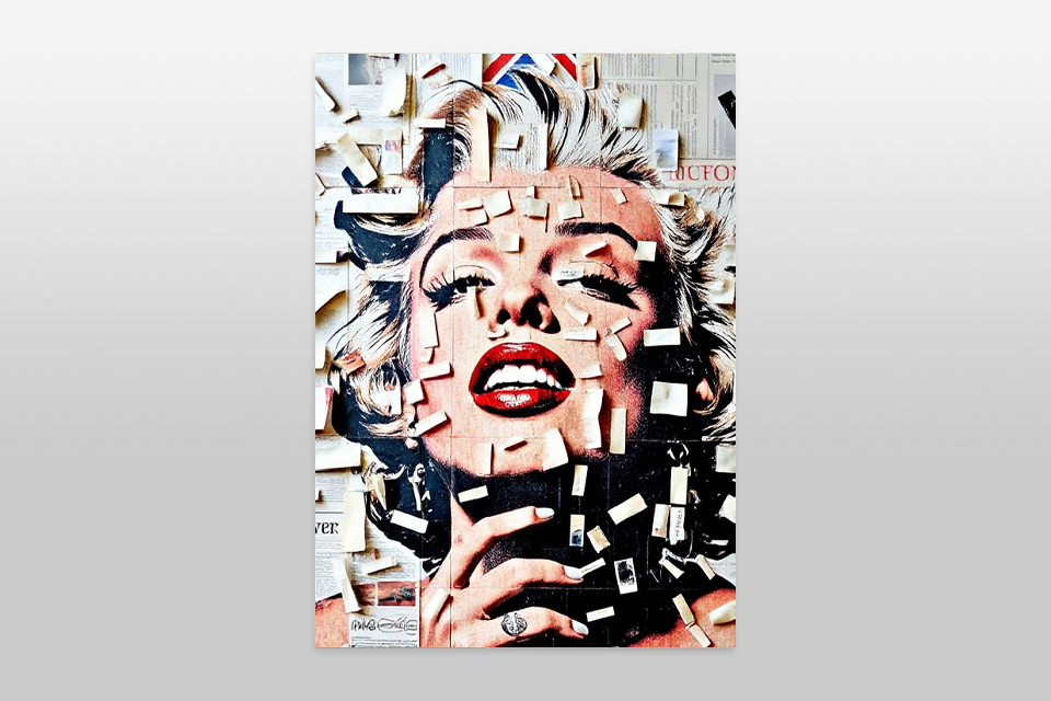
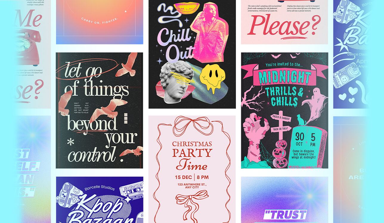
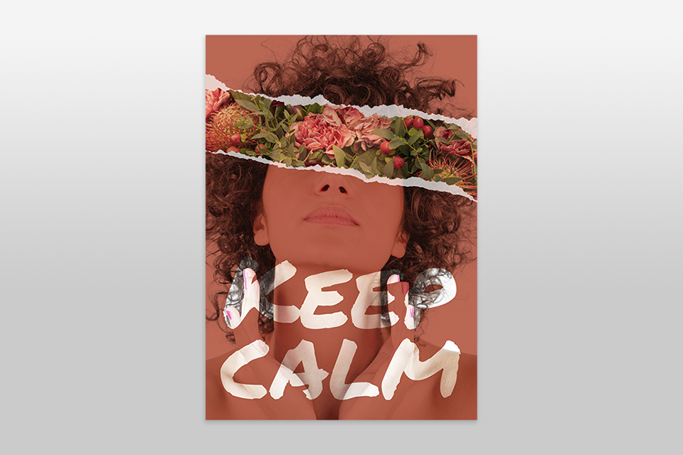
Another way to stand out among all the “perfect” AI-generated designs is to go raw and handmade. Try using hand-drawn fonts, collage textures, or scanned sketches. I once made a poster by printing photos, cutting them out, writing on them with a marker, and scanning the whole thing. It looked rough, but it worked really well because it felt human and unique.
This poster layout idea is perfect for youth culture, underground events, or brands that want a bold, rebellious voice. It makes the poster feel personal instead of looking like it came from a big company.
Sometimes the best poster design is the simplest. For a blood donation campaign, I made an all-red poster with only white text. No photos. It grabbed attention instantly – strong, clear, and urgent.
The trick is to choose one main color and build the whole design around it. Use lighter and darker versions of that color, add white text, and keep the contrast high so the message stays bold. This poster style stays clean and powerful while looking consistent.
This type of poster is very popular in the Fix The Photo Body Editor&Tune app, especially for bold events and campaigns that want a minimal look.
Sometimes I like to add both order and mess in posters by using grid overlays. These can be clear guiding lines or textured line elements added to the design. They make a clean poster look more detailed and give people’s eyes something extra to look at.
It also adds an editorial style that feels inspired by Swiss design. Learning how to use Photoshop grids and Photoshop guides can help you build a clear layout, line things up properly, and then break those rules when you want to.
You can also place soft textures, like light noise or paper folds, over the grid. It’s a small detail, but it makes the poster feel designed and people notice it, even if they can’t explain why.
Another easy poster design idea is to take your best photo and place large, see-through text over it. This works best when the photo has empty space, like a sky, a wall, or a plain background. I use this idea a lot for posters that promote photography services and studios.
The text blends with the image so it looks like part of the photo. It feels modern and immersive, and with the right font, the design can look like it belongs in a gallery.
“Use the difference between the subject of the photo and the text placement to lead the viewer’s eyes across the poster.”

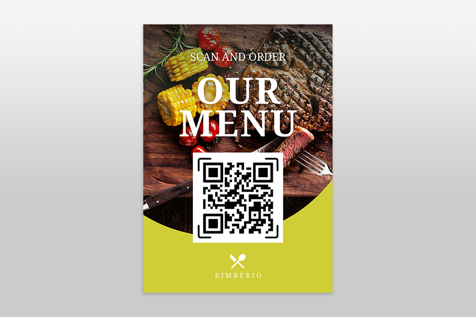
I’ve also made posters where people could interact with them. For example, physical posters with tear-off strips, QR codes, or blank spots where someone could write something. In one project for a local artist, we added a “Take a Poem” strip, and it made people stop and engage with the poster.
For the QR code parts, I test designs with the best QR code generator software so they work quickly and also fit the poster’s look.
This kind of interactivity turns the viewer into a participant. Even online posters with QR codes can create curiosity if they’re placed in the right spot.
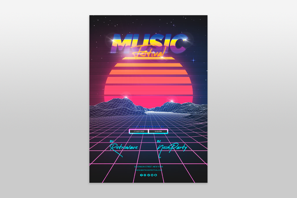
I like mixing old-school designs from the 80s and 90s with sci-fi fonts, textures, or shiny chrome effects. This poster design idea works great to get attention online because it mixes pop culture with retro design in one poster. I usually start with free vintage overlays for Photoshop to add light leaks or VHS-style textures to make it retro without looking fake.
I once designed a poster with purple neon, VHS glitch effects, and bold fonts. That version did three times better on Instagram compared to a clean, modern design.
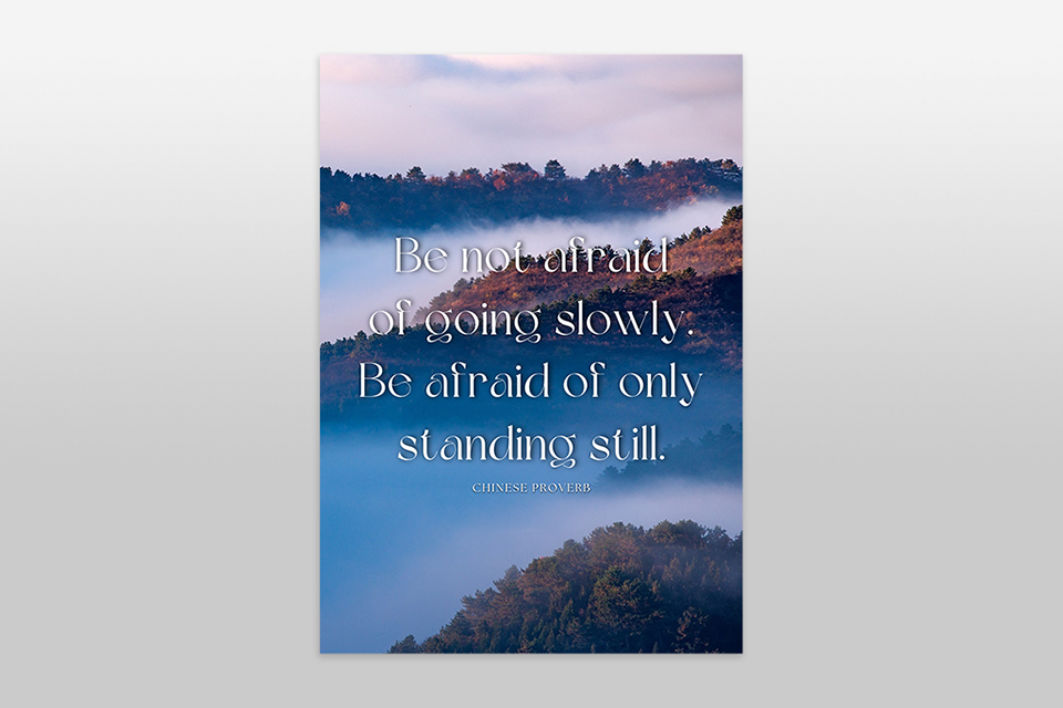
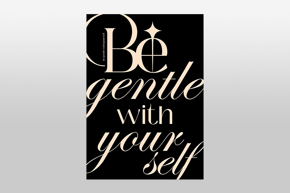
One of the simplest and strongest poster layout ideas is using a bold quote styled in a beautiful way. I’ve seen this used for activism, mental health awareness, and personal branding, and when it’s done well, it spreads quickly.
The important thing is to pick a quote that’s both visually strong and emotionally powerful. Don’t make it too long or too philosophical. The font choice and design need to do the emotional work here, so don’t keep the design plain.
We didn’t just look at Pinterest and stop there. Our team tested poster design ideas the same way we test photo edits, layouts, and presets - by actually trying them out.
We built posters as if they were for real clients. For example, we made promo posters for app updates, editing services, and online campaigns. No fake examples – we used real cases like promoting a photo filter pack or advertising AI tools. To start, we often used free vector graphics software so layouts stayed simple and flexible.
We also tested how posters worked on social media. Our team ran A/B tests on Instagram Reels covers, Pinterest pins, and event posters to see what people clicked on, saved, or ignored. The result: simple designs with one bold idea worked better than busy posters filled with icons and small text.
We checked what people asked for in our Fix The Photo Body Editor&Tune app. Many clients wanted poster-style edits for profile banners, music launches, or sports events. The top request was cinematic posters with dramatic lighting and only a few words. That’s why “Cinematic Still Frame” and “Freeze Frame Drama” poster inspos scored highest.
We cut out what didn’t work. Some posters looked nice in theory (like glitch overlays, infographic-heavy designs, or big 3D text effects), but once resized for phones or email headers, they looked too messy. Our rule: if someone needs more than 30 seconds to “get it,” it’s not good enough.
Examples we removed:
The poster styles we kept weren’t just trendy; they actually grabbed attention and worked. These are the kind of poster layout ideas that even beginners can use to leave a strong impression.
Start with simple layouts, 1–2 fonts, and high-contrast colors. Minimal posters, event ads, or quote designs are great first projects.
Think about your audience and your goal. Use mood boards, colors that match emotions, and grids for structure. Mix photos with text or add surreal touches.
Clear visual hierarchy, a headline that stands out, a call-to-action, consistent colors, and enough empty space. A good poster tells its story fast.
Yes. Free graphic design software, like Canva, Adobe Express, and Figma, work great. They offer drag-and-drop templates and easy customization.
Try 3D text, collage layouts, hand-drawn sketches, or bold photo posters. For social campaigns, emotional storytelling works best.


