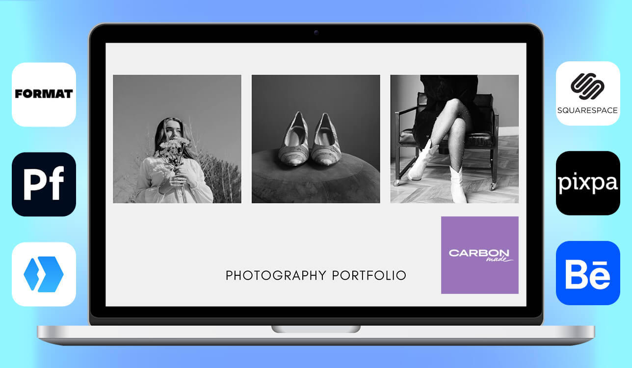
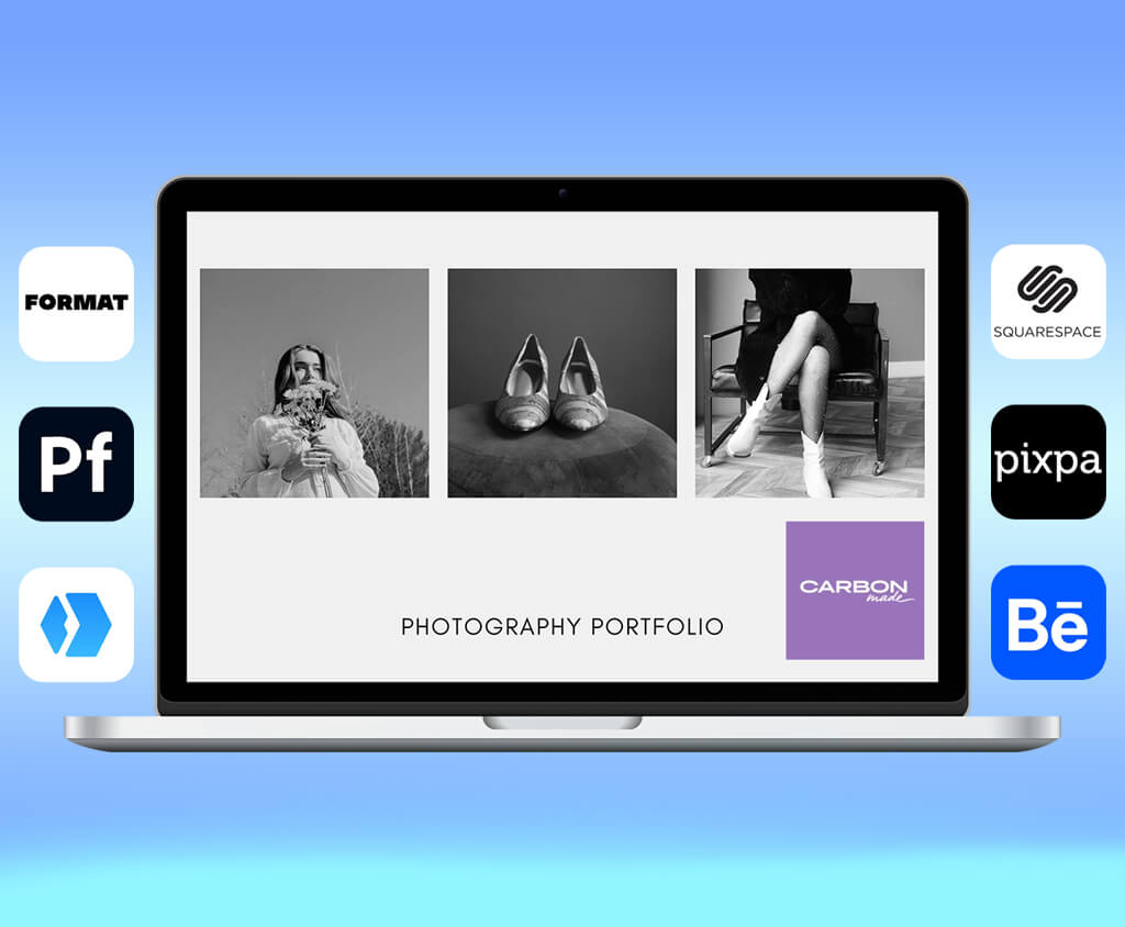
When I started building my photography portfolio, people kept suggesting the same CarbonMade alternatives. I work as an HR specialist at FixThePhoto and also shoot photos on weekends, so I often review portfolios from other creatives. That made me curious to test these platforms myself.
At first, CarbonMade seemed easy and friendly. However, after spending more time with it, something felt off. Some layouts looked outdated; I ran into design limits, and the editing process didn’t align with how I like to structure visual stories.
After a few frustrating days, my coworkers joked, “Why don’t you test it like for one of our FixThePhoto tools guides?” That idea stuck. I spoke with our designers and photographers, searched Reddit discussions, watched YouTube reviews, and gathered a long list of portfolio builders similar to CarbonMade.
Then our team spent two full weeks testing 50+ CarbonMade alternatives to see which ones feel modern, flexible, and easy to use today. By the end, we narrowed everything down to platforms I would confidently suggest to photographers, designers, illustrators, 3D artists, and even marketers who need clean layouts for case studies. For me, the ideal portfolio platform needs to include:
CarbonMade is not a bad platform. It’s simple and works well for people who want a portfolio with minimal effort. However, after reviewing thousands of creative portfolios as part of my job, I’ve noticed that “simple” often becomes “restrictive” as your skills and projects grow. Here’s what made me move away from CarbonMade:
Many creatives forget one important thing: a portfolio is more than a collection of nice images. It tells a story about how you work, what you value, and how professional you are. From my experience, I’ve learned a few key lessons:
That’s why a portfolio platform must balance structure and freedom. You need both.
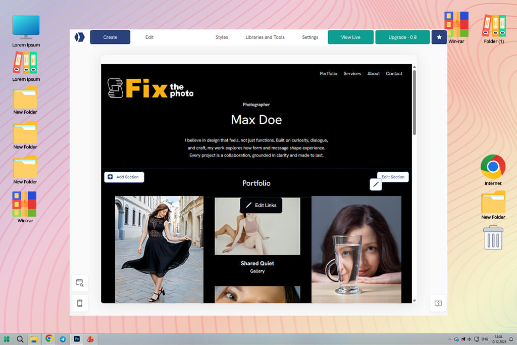
Since Adobe Portfolio became my top choice as a CarbonMade alternative, here’s how I moved my CarbonMade site to it without stress:
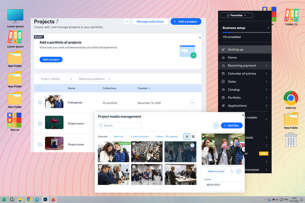
Step 1. Organize your files first. Resize images to about 2048 pixels on the long side for faster loading. Sort projects into folders like Portraits, Events, Retouching, Concept Art, or Case Studies. Use clear file names because this helps with search visibility.
Step 2. Choose the right layout. Adobe Portfolio offers grids and slideshow styles. I suggest:
Step 3. Rewrite project descriptions. Don’t copy old text word-for-word. Pages work better when they include:
Step 4. Use Lightroom integration. This feature saves a lot of time. If you already use Lightroom:
Step 5. Check how it looks on all devices. Preview your site on phones and tablets. Adjust spacing, cropping, and alignment. Adobe Portfolio gives more control here than people expect.
Step 6. Publish and track results. After going live, enable:
After a week or two, you’ll see what visitors click on and what they ignore.
Best for: Adobe users, photographers, designers, hybrid creators
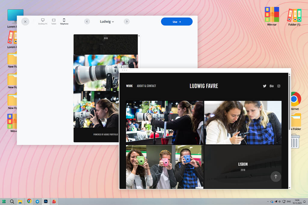
I first learned about Adobe Portfolio from several sources simultaneously: coworkers, Reddit discussions, and a few YouTube channels. They all kept saying something similar: “If you already use Adobe tools, Adobe Portfolio is the easiest alternative to CarbonMade.”
Setting everything up felt simple, almost like working inside a quiet extension of Lightroom. As soon as I connected my Lightroom albums, all my portrait work, retouching projects, and behind-the-scenes folders showed up instantly in ready-to-use layouts. The images remained sharp, with no odd cropping, and I didn’t have to worry about quality loss.
“Any time I change something in LR, the website updates on its own. For someone who balances photo shoots with writing deadlines, this kind of automatic update saves a lot of time and effort.”

What surprised me was how flexible Adobe Portfolio is for people who work in more than one creative field. Designers on my team use it to present UX case studies, retouchers create clean before-and-after galleries, and videographers embed their video reels. It adjusts well to different types of creative work.
Of course, it has limits. Compared to platforms like Webflow and some other Adobe Portfolio alternatives, customization is more restricted, so you won’t be building wild layouts or animated effects.
My main advice is simple: focus on storytelling. Adobe Portfolio works best when projects follow a clear order, use synced Lightroom sets, and include strong captions that explain the work.
Key features:
Pricing: Adobe Portfolio free with any Adobe Creative Cloud plan
Best for: Fine-art photographers, illustrators
Portfoliobox kept appearing at the top of Google when I searched for minimalist portfolio website builder. The preview images looked clean and Scandinavian, which felt very different from CarbonMade’s playful style. That contrast alone made me want to test it.
Portfoliobox feels like it was designed for fine-art photographers, illustrators, and designers who want their work to feel like it’s displayed in a gallery. The layouts are focused, which fits perfectly with my dark-background stage photos and the moody portraits I shoot outside of work.
“The color control is better than what I saw in many other builders. I was able to recreate the soft yellow tones we use for FixThePhoto moodboards in just a few minutes.”

What impressed me most was how the system is structured: instead of choosing one fixed template, you create pages by adding sections one by one. It feels similar to setting up a small exhibition, because each part is placed with purpose.
However, this CarbonMade alternative is not flawless. Some advanced effects, like parallax scrolling or animated menus, are limited, and the online store tools aren’t as strong as Pixpa’s.
My main recommendation is to use Portfoliobox when you want simplicity to highlight the work. It’s a strong choice for portraits, product photography, editorials, illustrations, and any project that benefits from open space and clean presentation.
Key features:
Pricing: Free tier with limitations; paid plans from $3.50/mo, yearly discounts available
Best for: Photographers needing proofing + portfolios
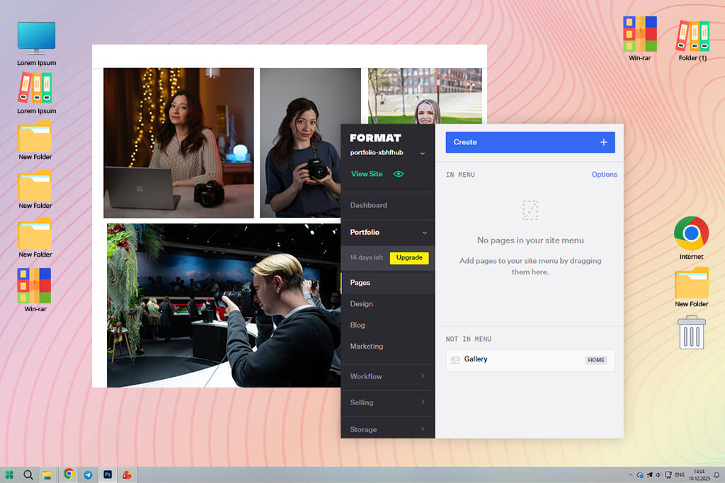
Format was added to my testing list after one of our real estate retouchers at FixThePhoto said it was “the only portfolio platform that truly fits photographers.” At first, that sounded like an exaggeration, but once I tested it myself, I understood why she felt that way.
Even though Format is made for different creatives, it is clearly designed around a professional photography portfolio workflow. What impressed me most was uploading a large wedding photo gallery and seeing how smoothly everything worked. It handled the files without slowing down, optimized the images, and the gallery viewer felt faster and cleaner than most others I tested.
“Format’s biggest advantage is its client-proofing. It works like a small client manager: private galleries, watermarks, download limits, and feedback tools are all built in and easy to use.”

I tested it by sharing a short dance performance photo series with a friend, and the experience felt professional and complete. That’s when I thought it could easily replace CarbonMade. However, if you don’t customize the templates much, they can look a bit standard.
My advice is to focus on the proofing tools, because that’s where Format performs best – as a platform for client delivery and feedback.
Key features:
Pricing: No free plan; from $10/mo; yearly plans cheaper
Best for: Photographers, small studios, creators selling digital goods
Pixpa came to my attention thanks to a teammate who uses it for client proofing. He likes how it combines galleries, selling tools, and delivery features in one place. That immediately caught my interest because CarbonMade felt too limited and focused only on display.
What stood out first with Pixpa was its all-in-one system. Instead of connecting several external tools, this CarbonMade alternative gives you client galleries, proofing, an online store, a blog, and even invoicing in one dashboard. When you’re balancing HR work, freelance projects, and writing assignments at FixThePhoto, having everything in one place saves time.
I tested Pixpa by uploading a set of photos from a modern dance performance, converted from RAW to JPEG. The gallery layout options were more flexible than I expected, without becoming complicated like Webflow.
“What I liked most was how easy it was to organize multiple sections. I created separate areas for photography, graphic design, and BTS blog posts, and everything felt consistent and connected.”

There are some drawbacks. The themes don’t feel as premium as Format’s or as minimal as Portfoliobox’s. And if you try to push customization too far, you’ll reach its limits sooner than with WordPress or CarbonMade.
My recommendation is to choose Pixpa if you want one platform for your portfolio, client delivery, and selling work. It keeps things simple and efficient.
Key features:
Pricing: No free plan; from $6/mo; yearly discounts
Best for: Designers, illustrators, concept artists, public visibility
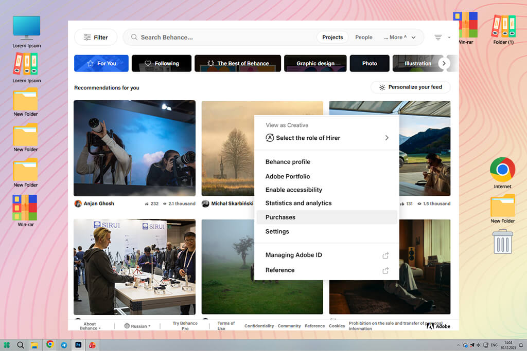
Many Reddit users kept saying, “If being seen matters, Behance is better than CarbonMade or any portfolio website.” I tested it with that mindset: not as a full website replacement, but as a tool for exposure. Behance doesn’t work like a normal site builder. It sits somewhere between a social media for artists, a publishing platform, and an inspiration feed.
When I uploaded a set of HDR dance photos and a step-by-step retouching project from FixThePhoto, I noticed how quickly Behance pushed the work into relevant categories. Within a short time, I received likes, saves, and comments from creatives I would never reach through a personal website.
“The project-based format makes it easy to build detailed case studies. I enjoy turning editing work into clear visual stories, and Behance allows that better than CarbonMade’s fixed layouts.”

Nevertheless, there are some downsides. You don’t get the design control of Squarespace or the full business setup of Pixpa. It’s also not ideal if you need a traditional portfolio website for clients who prefer simple browsing.
My main advice is to use Behance as your public showcase. Share new work, test ideas, get feedback, and then direct potential clients to your main website.
Key features:
Pricing: Free
Best for: Photographers, designers, creative freelancers needing a polished website
Squarespace was another paid but beginner-friendly website builder that I kept seeing mentioned as a good CarbonMade alternative. It came up often on Reddit and YouTube, especially in discussions by photographers, designers, and small creative studios.
When I compared Squarespace vs Adobe Portfolio, I noticed that both focus strongly on visual balance. Their grid layouts, spacing, and font choices feel similar to how a magazine page is designed. Since I photograph concerts and stage performances that use a lot of space for effect, this style worked perfectly for my work.
“What impressed me most was how consistent everything looked. No matter what content I added, the layout stayed clean and purposeful. The mobile version also is better than CarbonMade’s.”

But, if you want very precise control over every pixel, as you get with Webflow or some other Squarespace alternatives, the editor may feel limiting. My best advice is to choose a template that already matches most of your style and then make small changes. Squarespace works best when you don’t over-edit.
Key features:
Pricing: No free plan; from $16/mo; yearly discounts
Best for: Creators needing high visual control and flexibility
I returned to Wix after reading several Reddit posts where designers casually mentioned using it as a quicker portfolio builder than CarbonMade and many other Wix alternatives. When I tested Wix, my main goal was to see how fast I could put together a clear and unified portfolio for both my illustration and photography work.
What stood out to me wasn’t the templates themselves, but how freely I could change them. The Wix Editor feels like an open workspace where you can move, resize, layer, and adjust elements in ways that CarbonMade and most other builders don’t allow. For someone who wants layouts that break strict grid rules, this freedom was vital.
“Instead of relying on outside tools, I could add booking forms, social media feeds, and small interactive elements directly inside Wix using the built-in App Market.”

When comparing Adobe Portfolio vs Wix, I noticed that Wix requires more control and good judgment to keep designs from becoming messy. My personal advice is to start with a simple layout and only add features that improve how visitors move through your site. With Wix, less is often better.
Key features:
Pricing: Free (with Wix branding, limited customization); Premium from $16/mo, from $168/year
Best for: Designers wanting animation-rich, custom portfolio experiences.
I found Webflow through YouTube, after watching a detailed tutorial by a motion designer who built a portfolio that felt almost like an interactive magazine. From the start, Webflow felt very different from CarbonMade and other Webflow alternatives.
Instead of acting like a basic site builder, it treats your portfolio as a structured design system. You can set styles, animations, scrolling effects, and reusable sections – the type of setup I usually expect when working with web developers.
“One thing that surprised me was the Interactions panel. I was able to create animated page transitions and even add a small parallax header without writing any code.”

Of course, this level of freedom means that it'll take some time to familiarize yourself with the tools. My advice from testing is to plan your pages and interactions on paper or an iPad first. Webflow works best when you think things through ahead of time, and you’ll build faster once you understand how each section should connect.
Key features:
Pricing: Free (limited projects, no custom domain); Premium from $14/mo, from $168/year
Best for: Creators who want full control, scalability, and long-term ownership
I decided to try WordPress again after I noticed many people on Reddit talking about it when discussing long-term portfolio websites. A lot of artists said that platforms like CarbonMade are easy to use, but WordPress is a better choice if you want a portfolio that can grow and change as your career develops.
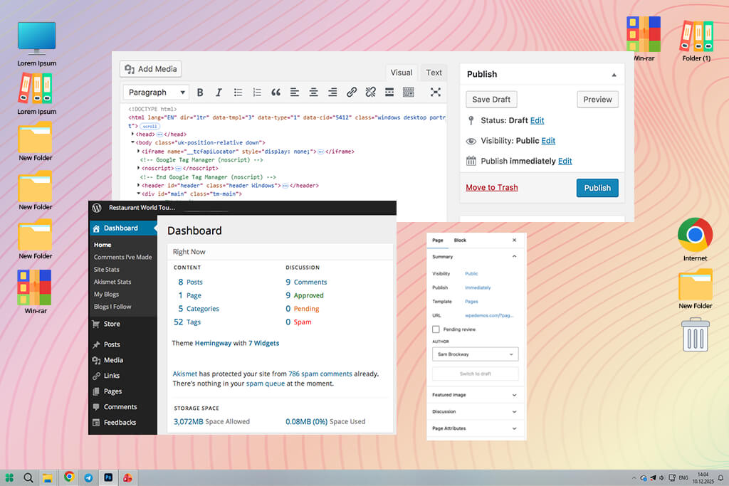
While testing this CarbonMade alternative, I focused on block-style themes and simple portfolio plugins. I was surprised by how modern everything felt: the Gutenberg editor lets you build pages using blocks, so you don’t need to know HTML or coding. If you choose a good free WordPress theme for portfolios, you can design pages almost as freely as in Wix.
“I like how flexible plugins are. You can start with a simple website and later add client galleries, languages, and an online store. You don’t need to move your site to another platform when your needs change.”

That said, WordPress is not fully automatic. You still need to update the system, watch out for plugin issues, and check site speed sometimes. It’s not completely hands-off, especially for beginners.
My suggestion is to keep things simple: pick one theme, install only the plugins you need, and use managed hosting so technical tasks are taken care of.
Key features:
Pricing: Free (with limited hosting features and customization); Premium from $4/mo, from $48/year
Best for: Creators who want a fast, clean, low-maintenance portfolio.
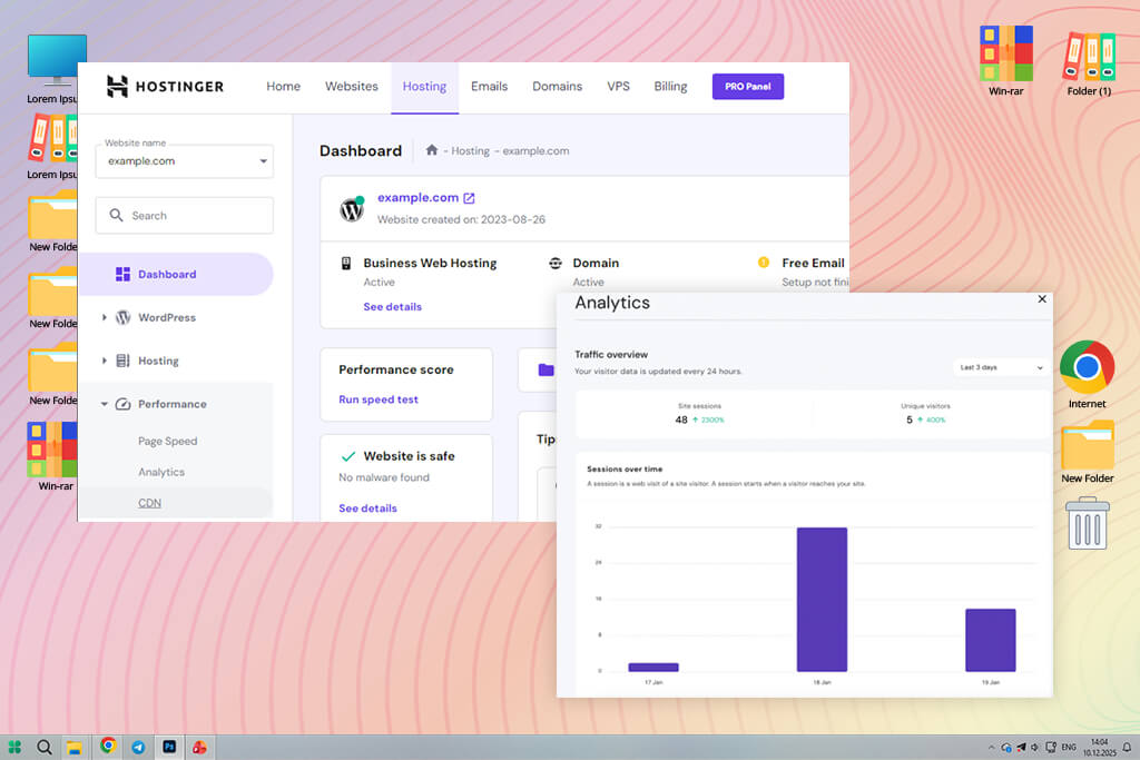
I decided to try Hostinger after watching a YouTube video where a web designer created a full portfolio using its AI Website Builder in less than an hour. Compared to CarbonMade, Hostinger seems more focused on speed than heavy design features, which is nice when you want your portfolio to open fast for clients.
When I tested it, I used Hostinger for a portfolio that included photography, retouching work, and a few pages that explained projects in more detail. The AI setup was more useful than I expected. It gave me a neat and organized base layout that I could adjust step by step. The website builder is very simple on purpose, which helped me avoid adding too many design elements.
“Everything works so smoothly. I didn’t deal with plugin problems, slow loading, or strange design bugs. I choose Hostinger when I need to launch a portfolio fast but professionally.”

However, you won’t have the same level of design control that platforms like Webflow or Wix offer. Hostinger works best when you keep things simple and focused. My advice is to pick a basic theme, remove all example content right away, and let your images and work speak for themselves.
Key features:
Pricing: Free (basic AI site, limited control); Premium from $2.99/mo, from $36/year
Best for: Designers seeking visibility, community, and fast discoverability.
I also went back to Dribbble after reading Reddit posts where designers joked that Dribbble is their portfolio. That made me rethink it, since I always saw it more as a social network than a full alternative to CarbonMade.
Instead of creating a full website with multiple pages, I used Dribbble as a carefully chosen gallery of my best work, sharing illustrations, retouching examples, and short video clips. What sets Dribbble apart from CarbonMade is its built-in audience. Getting that level of attention on a personal website is hard unless you already have a big name.
“When I posted my work at peak hours, I quickly got likes, comments, and even messages from recruiters.”

Unfortunately, Dribbble can’t fully replace a personal website, particularly if you need long case studies or detailed service pages. It works more like a showcase of highlights, so when used together with a main portfolio site, it can be very influential. My advice is to post often and treat each upload like a finished design piece, not just a file export. The platform rewards careful presentation.
Key features:
Pricing: Free (basic uploads, limited visibility); Pro from $8/mo, from $60/year
As a part of my job, I often build and update portfolios, so I decided to work together with my colleagues at FixThePhoto to run hands-on tests of many CarbonMade alternatives. Our goal was clear: find tools that help creative work stand out, not just another basic website builder with a few templates.
How I chose the platforms to test. I started by creating a long list of tools from Reddit discussions, YouTube reviews, design forums, and recommendations from my team. We included anything that could reasonably work as a portfolio, including classic website builders, portfolio-focused platforms, and community-based sites.
Not every tool stayed on the list. We removed platforms like Dunked, Crevado, Fabrik, Pixieset, and Zyro. They weren’t bad, but during hands-on testing, they either felt outdated, lacked important customization opportunities, or didn’t offer any unique tools compared to the strongest CarbonMade alternatives.
What we tested and how we tested it. To keep things fair, my team and I built the same sample portfolio on every platform. Each one included a homepage, two project pages, one photo gallery, and a simple About and Contact page. For each tool, we tested the following:
Set up and first steps. How fast could we go from sign-up to a usable site? Some platforms pushed too many choices at once, while others provided a clear starting layout. Builders that required coding or hid key features deep in menus lost points straight away.
Design control and templates. Since creative portfolios must look polished, we looked closely at layout options, font control, and overall style. Team members who work in branding helped judge whether templates felt modern or outdated.
Image quality and galleries. As photographers and retouchers, we checked how each platform compressed files, displayed colors, loaded large images, and handled big galleries. Tools that reduced image quality too much were removed immediately.
Editing experience and workflow. I paid attention to how smooth the editor felt. Could I move sections easily? Did the interface slow down with large images? Platforms that felt clumsy or outdated didn’t make the cut.
Marketing, speed, and hosting. We tested loading speed and mobile performance. Some sites looked good but loaded slowly on regular devices. We favored tools that stayed fast without needing extra setup.
Unique strengths. Because many portfolio builders offer similar basic features, we focused on what made each one distinct. That’s why Adobe Portfolio, Portfoliobox, and Squarespace ranked highest: each offers something specific that sets it apart from the rest.


