When I first started looking for graphic design portfolio tips, I thought the problem was just the look. I thought maybe the grid was too simple, the covers were boring, the fonts weren’t catchy, and the mock-ups didn’t look expensive enough. I was constantly changing the previews, rearranging the projects, selecting new fonts, and trying to make the presentation “stronger.”
At some point, like many beginners, I decided to speed things up with the help of AI tools. I made more polished mockups, tried fictional brands, and put together a few “perfect” concepts that looked impressive at first glance. But there were hardly any more responses. Then I realized: it’s not just about a beautiful picture.
The portfolio looked nice, but it didn’t explain the main thing – why I could be entrusted with a real design task. It was more like a gallery of works than a clear professional argument.
Working as a graphic designer on the FixThePhoto team has greatly changed my view of a portfolio. I often come across visuals that need to work quickly: promotional graphics, social media creatives, before/after materials, and other formats. In such tasks, the design cannot be just beautiful. It should guide the eye, reinforce the message, adapt well to different sizes, and still look good even on the phone.
The quickest way to make a beginner’s portfolio look fake is to fill it with projects that are too perfect, created by a neural network, but without a real task behind them. The client may be impressed by the picture for a couple of seconds, but then they will still ask: what was the brief, what decisions did you make, and what can you do yourself, without a prompt?
Work done by an AI can look clean and neat. But more often than not, they don’t show how a beginner designer solves real problems.
Before sending a link to my portfolio, I quickly check it against a few points:
First impression
Project selection
Case studies
Visual quality
Contact
After this graphic design portfolio checklist, my favorite test is very simple. I open the portfolio for 10 seconds, close it, and ask myself: “What did I remember?” If I remember one or two strong projects and a clear direction, then the portfolio works. If I only remember “well, it’s nice,” then the positioning is too vague.

My first mistake was that I tried to appear versatile before I became clear and useful. I wanted to show that I could do everything: logos, posters, social media graphics, banners, product mockups, photo editing, magazine spreads, and a little bit of web design. In my head, it looked like flexibility. In practice, the portfolio only became more difficult to understand.
A portfolio is not just a folder with finished projects. It’s a positioning tool. So before I choose my work, I now ask myself one question: who should open this portfolio and feel that it was made just for them?
The answer to this question is the best-practice graphic design portfolio tip, which changes almost everything: the order of projects, the tone of the text, the number of cases, the choice of mockups, and even the title on the main page.
If I want to work with small businesses that need brand identity and content for social media, I should show corporate systems, Instagram templates, packaging stickers, email headers, and promotional materials. If I want to get into an agency, it’s important to show that I can work according to a brief, create variations, accept edits, and develop one graphic design idea in multiple formats.
Before opening Adobe Express, Adobe Portfolio, Figma, InDesign, or any other tool, I first write a simple positioning statement: “I create [design type] for [client or project type] so they can [desired result].” For example:
Weak positioning usually sounds like this:
The problem with such phrases is that they don’t help you decide which projects should be in your portfolio. When the goal is vague, almost every work seems suitable: from a poster from school to a logo from two years ago. A social media template that doesn’t match the rest of the work at all? Let it be. This makes a graphic designer’s portfolio longer, but weaker.
“I only add a project if it supports the type of work I want to get more often. If a project is beautiful but doesn’t bring in the right clients, I move it down or remove it altogether.”

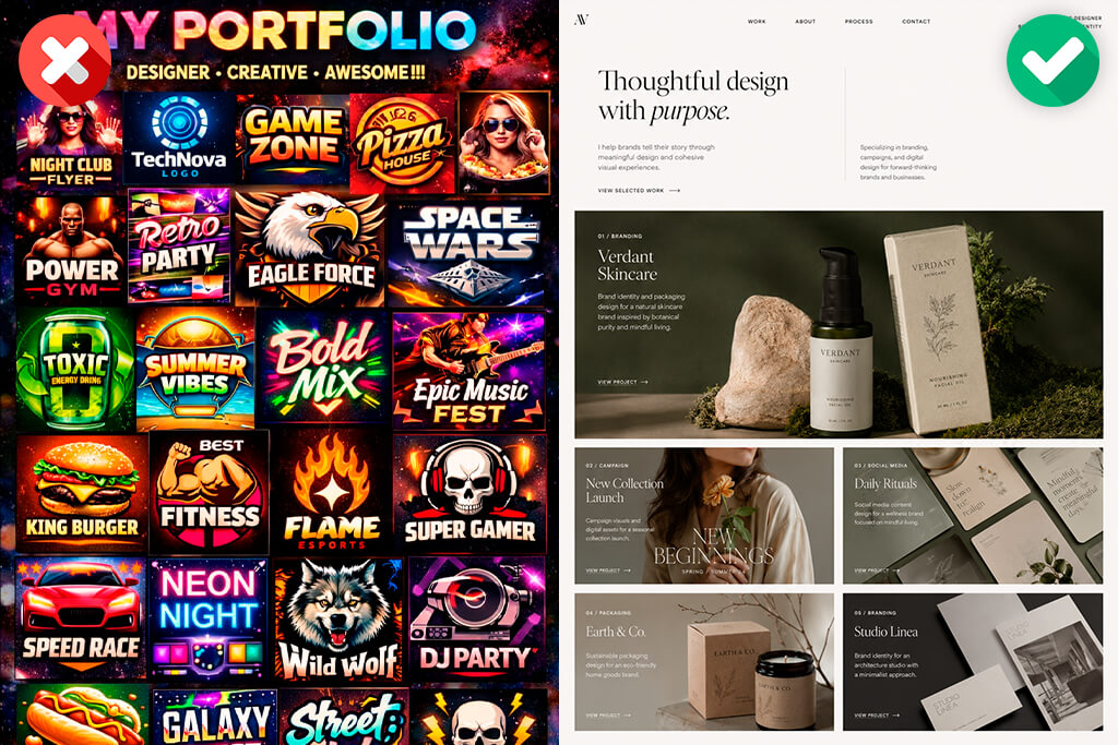
Almost all designers understand that it’s better to remove weak work from their portfolio. But the more difficult thing is to leave out good projects that simply don’t fit the current direction. I used to think that the more work you have, the more convincing your portfolio is.
Now I think the opposite. A short portfolio often looks more confident, because it is immediately clear that the designer knows how to evaluate themselves and choose the most important things.
In the portfolio of most graphic designers, I would be more interested in seeing 6 strong projects than 20 average ones. Six works are quite enough to show different skills if they are well selected. But twenty projects can simply hide the strongest one.
Following this graphic design portfolio tip, I divide my work into three groups:
My “keep or delete” rule is very simple. I remove a project if:
And I keep the project if:
A graphic design and photography portfolio is evaluated very quickly. A person does not know how much effort was put into each project. They only see a selection and draw a conclusion based on it.
“I try not to treat my portfolio as proof that I’ve worked hard. For me, it’s more of a testament to my ability to select, organize, and articulate my work.”

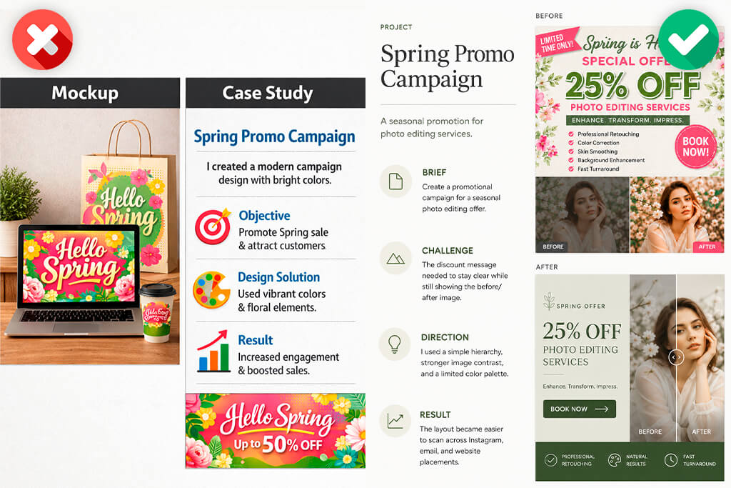
A beautiful mockup can make a project visually more expensive, but it won’t replace the story of the work itself. I often see portfolio pages with neat mockups of laptops, posters on the walls, shopping bags, business cards, and Instagram screens. At first glance, everything looks professional. But after a few seconds, it’s still unclear what the project was about.
Was it a rebranding? An advertising campaign? A packaging concept? A system for social media? What was the challenge? What did the designer improve? Is this a real client project or an educational idea? If the viewer has to guess about everything, then the case is not doing its job.
One of the graphic design portfolio best practices is understanding that a good project page works like a short “before/after” story. It doesn’t have to be long, but it should explain why the final design looks the way it does. I usually use this structure:
For example, instead of writing:
I would write:
In the second version, you can already see design thinking. The solution is not just about beauty, but about a specific task. In a portfolio project, I like to show:
If it’s brand identity, I show not only the logo, but the entire system. If it’s a campaign, I show how the idea works in different placements. If it’s a photo-based layout, I explain how image quality, typography, and composition support each other.
I picked up one useful trick from graphic design agencies: show a controlled “bad version.” Not an embarrassing draft, but an earlier version that shows exactly what has improved. For example:
Before: too many points of attention, weak CTA, low image contrast.
After: cleaner hierarchy, stronger focus on the product, easier to read on a phone.
This graphic design portfolio idea makes it clear that the final design was not accidental. It grew out of specific decisions.
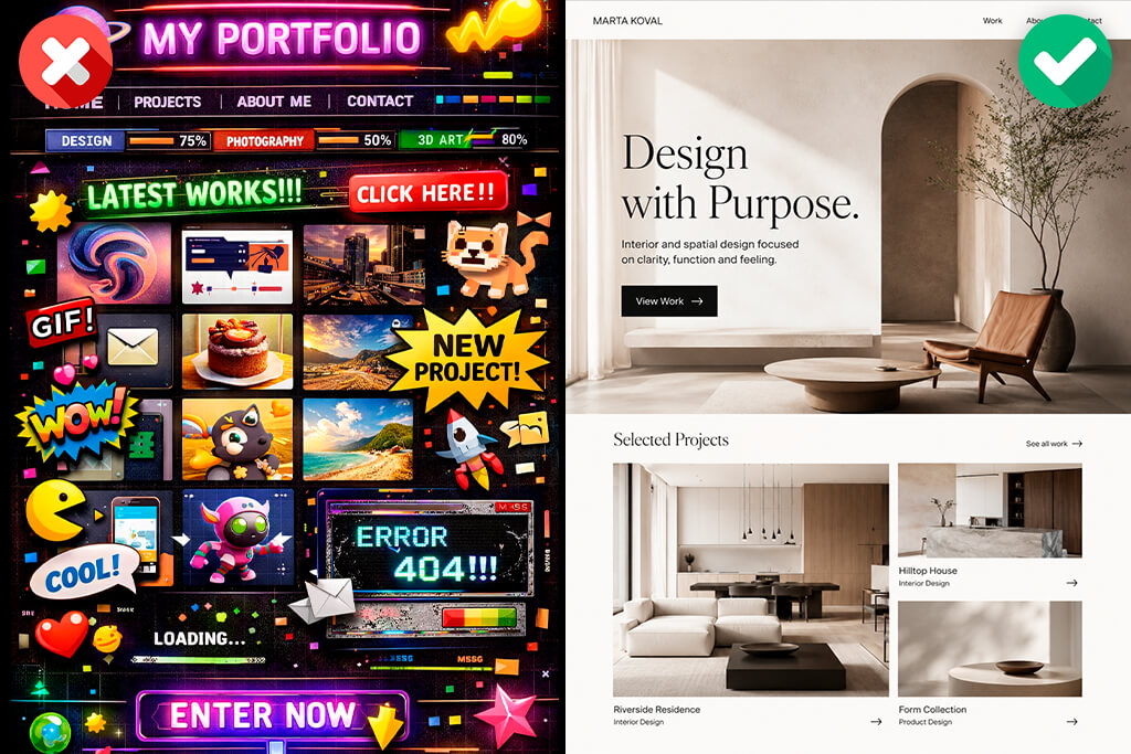
A graphic design portfolio layout is not just about design. It immediately tells a person where to look, which projects are more important, and what kind of designer you are, even before reading the text. That’s why I don’t choose a portfolio structure just because it looks trendy. It’s more important to me that a person quickly understands what I do and how I can be useful.
A strong first screen usually consists of three things:
There’s no need for a long biography, complex animation, or a clever phrase that only makes sense after scrolling down the page.
For example, a headline like “Visual stories for bold brands” may sound nice, but it explains almost nothing. It could mean anything. A more direct option works better: “I create advertising visuals based on photos, graphics for social networks, and brand materials for creative businesses.” It’s not as poetic, but people immediately understand what I do.
When I put together a project grid, I don’t just arrange the covers by color. First of all, I think about priority. The first row should answer several questions:
I also try not to put projects that are too similar next to each other. Even if each poster is good in itself, three posters in a row can look monotonous. The same happens with logos on mockups, packaging boxes, Instagram carousels, and other similar elements of design. It’s better when there’s a rhythm in the portfolio. For example:
I avoid layouts with tiny previews, hidden project names, heavy videos, decorative cursors, and animations that distract from the work itself. The portfolio should be designer-oriented, but its layout should not conflict with the projects.
“I always check the portfolio on my phone. Many clients open links from email, LinkedIn, or messengers on their phones. If an important part of the image is cropped on the phone, the contact button disappears, or the text is difficult to read, the portfolio loses trust.”

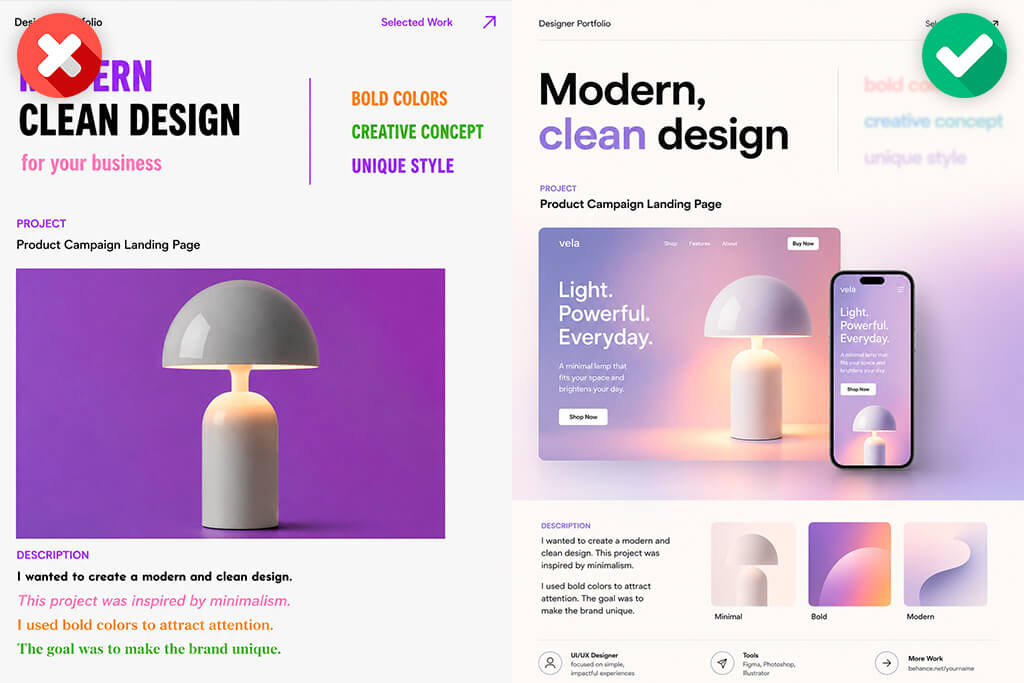
Visuals grab attention, but text helps people understand exactly what you’ve done. The most common problem in descriptions is empty phrases:
These phrases aren’t terrible in themselves, but they fit almost any project. Text that links the solution to the reason works much better:
My basic graphic design portfolio tip is the following formula: task + complexity + design solution + result. I also try to write more actively:
This makes it immediately clear what role I played. This is especially important in team projects. If I worked with a graphic design company and was only responsible for part of the task, I state this directly. For example: “Role: layouts for social networks, image preparation, and final export. The brand strategy was developed by the agency team.” Such honesty does not weaken the portfolio; on the contrary, it inspires more trust.
“I try not to overuse the words modern, bold, clean, elegant, timeless, creative, etc. They are not forbidden, but they need support. Instead of just writing “clean design,” I explain what exactly I removed. Instead of ‘bold,’ I specify what made it that way: contrast, typography, or color.”

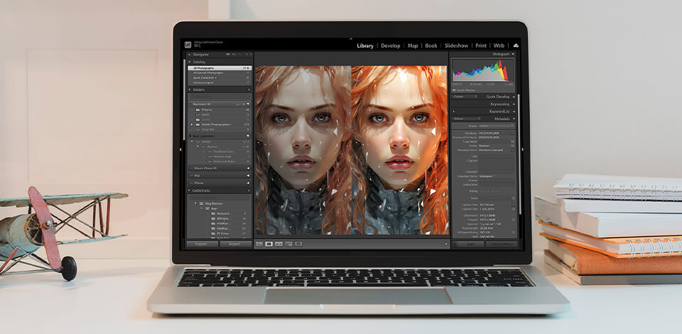
I work with Adobe programs almost every day, but the program itself doesn’t make a portfolio stronger. A weak graphic design portfolio project won’t become convincing just because it was put together in Photoshop, Illustrator, or InDesign. But the right tool really helps to organize the work faster and make the presentation neater.
Here’s how I use Adobe in my process:
| Task | Tool I’d Use | Why |
|---|---|---|
|
Clean project images
|
Photoshop
|
Better image quality and consistency
|
|
Prepare logos/icons
|
Illustrator
|
Precise vector work
|
|
Build PDF version
|
InDesign
|
Strong multi-page control
|
|
Make social previews
|
Adobe Express
|
Fast resizing and promo layouts
|
|
Publish a simple site
|
Adobe Portfolio
|
Clean structure without coding
|
I use Photoshop before adding images to my portfolio. In it, I clean the background, adjust the contrast, correct the colors, and prepare mockups. This is important because poor image quality can weaken even a good design.
I most often need Illustrator for logos, icons, patterns, packaging elements, and vector systems. If I’m showing an identity project, I like to add not only the final logo, but also its variations, indents, small-size tests, and examples of real use.
I choose InDesign when I need to put together a neat PDF graphic design portfolio. The PDF should not look like a set of screenshots simply pasted into one file. It needs a rhythm: a cover, a short introduction, selected projects, clear cases, and a contact page.
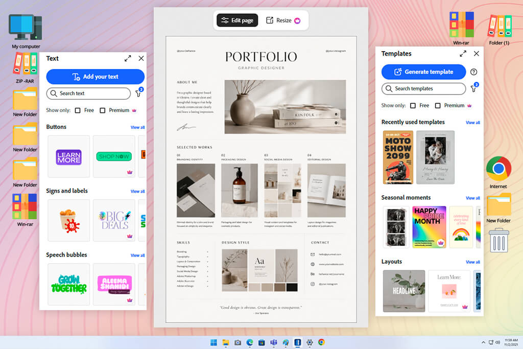
Adobe Express helps when you need to quickly prepare additional visuals: project covers, previews for LinkedIn, first slides of Instagram carousels, portfolio teasers in different sizes, and simple promotional graphics. I wouldn’t advise blindly relying on templates, but if you adapt them properly to your needs, they save a lot of time.
Adobe Portfolio can be a convenient option for a simple portfolio site, especially if you don’t need complex animations and interactivity. For many designers, especially beginners and freelancers, a clear structure is better than a custom site where it’s easy to get lost.
Templates are fine. The problem starts when the portfolio looks too template-based.
I used to think that a portfolio was just one website. Now I believe that it is better for a designer to have at least three versions: a website, a PDF, and a presentation. They can contain the same projects, but the presentation should not be completely identical.
| Version | Main Purpose | Biggest Risk |
|---|---|---|
|
Website
|
Let people explore selected work
|
Too much scrolling with no hierarchy
|
|
PDF
|
Give a fast curated overview
|
Heavy file and tiny text
|
|
Presentation
|
Support a live walkthrough
|
Reading slides instead of telling a story
|
Graphic design portfolio website is needed for introductions. Through it, a person can understand my style, services, approach to cases, and quickly find contact information. You can provide more details on the site, because the visitor decides for themselves how deeply they want to look at the projects.
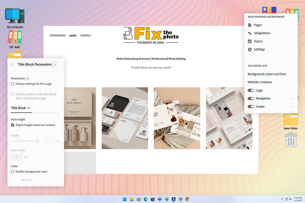
I usually recommend the following portfolio website builders: Adobe Portfolio, Squarespace, or Webflow. Personally, I prefer Adobe Portfolio because it gives me enough control over the layout and interaction, but it doesn’t complicate site management.
PDF portfolio is needed for speed. It is often sent in emails, job applications, or client pitches. Such a file should open quickly and immediately show the strongest works, without any unnecessary actions on the part of the person.
For a graphic design portfolio PDF, I still prefer Adobe InDesign because it’s the most convenient way to control typography and page structure. If you need to do something faster and easier, Canva can also work.
A presentation is needed for a conversation. It helps guide a person through my logic during an interview or a call with a client. For presentations, I usually use Google Slides or Keynote. Google Slides is convenient for collaboration and quick edits, and I choose Keynote when I want a cleaner visual presentation and smooth animations.
My PDF structure usually looks like this:
For the graphic design portfolio presentation, I use less text and make the images larger. I don’t need to read from the slides. It is important for me to explain the task, the complexity, the solution, and the result. A strong explanation might sound like this:
“The main problem was that the offer was lost among unnecessary visual elements. Therefore, I restructured the hierarchy around the product photo and the CTA. After that, I adapted the same system for the Story, email newsletter, and website placement.” This approach shows not only the final result, but also how I think while working.
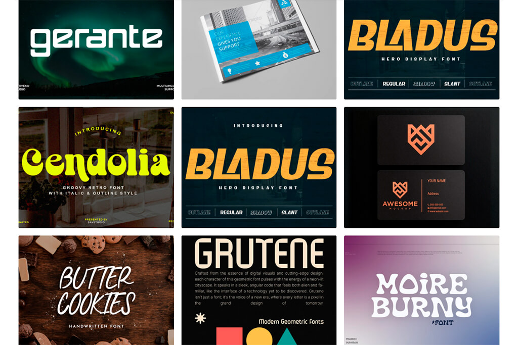
Sarah Lewis graphic design portfolio
A beginner’s portfolio doesn’t have to look empty. And you don’t have to fill it only with training assignments, random posters, or “practice” work. Often, the strongest graphic design portfolio tip for beginners is to understand that projects are created precisely when they come up with a task themselves, but make it as close to a real-world assignment as possible.
The key word here is realism. A fictional project only becomes useful when it has the same conditions as a real job: a target audience, a visual problem, multiple formats, and at least one constraint.
The phrase “I redesigned a coffee brand” sounds too broad. This would be stronger: “I developed a visual identity for a small local coffee shop. It needed a warm, accessible, and easily recognizable style that would look good on takeaway cups, loyalty cards, and Instagram posts.”
The second option already has context. And when there is context, the designer can show not just a beautiful picture, but their solutions.
Good ideas for projects in a beginner graphic designer’s portfolio:
It’s easy to scroll past a single logo and forget about it. But a full-fledged system shows how the design works in real life.
“An important rule: don’t pass off a concept as client work. It’s better to honestly label it as a concept project, self-initiated project, student project, or personal redesign. Honesty looks much more professional than trying to create a false ‘solidity’.”

I also like to add restrictions to my personal projects:
These restrictions make a beginner’s projects more plausible. And at the same time, they make it easier to write a case, because it is immediately clear what tasks have to be solved.
I like to look at graphic design portfolio examples, but I try not to gather inspiration haphazardly.
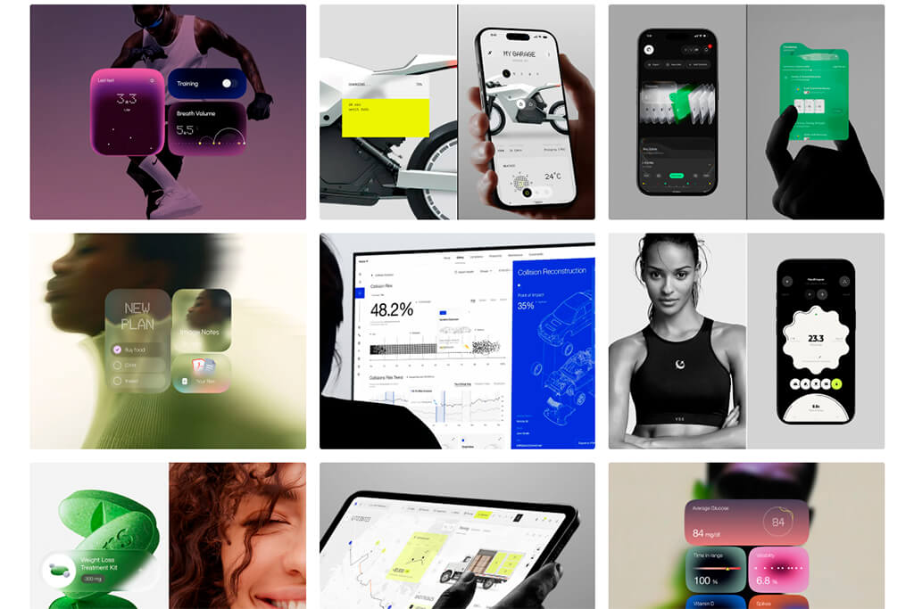
Jack R. graphic design portfolio
When I need to figure out how to best structure my portfolio, I usually look at AIGA articles, design school resources, Adobe portfolio guides, and blogs about creative careers. These sources are useful because they focus less on trends and more on the essence: how to choose projects, how to design cases, how to show the process, and how to present yourself professionally.
When I need visual ideas, I open Behance, Adobe Portfolio examples, Dribbble, Framer sites, Webflow collections, and personal sites of working designers. But I don’t copy their colors, fonts, animations, or grid. It’s more important for me to understand how they manage attention. I look at what appears on the first screen, how many projects are shown, how the case begins, where the contacts are located, and how quickly it becomes clear what the designer does.
For graphic design portfolio layout on websites, I also browse the galleries of portfolio builders: Adobe Portfolio, Squarespace, Webflow, Format, and Framer. Such examples help me see how the same type of work can be presented in different ways: through a clean grid, an editorial case, a one-page portfolio, or a more interactive presentation.
For PDFs and presentations, I often look for inspiration beyond portfolios. I look at magazine spreads, pitch decks, brand books, media kits, and design presentation templates. A good graphic designer’s PDF portfolio is usually more like a short magazine or a client presentation than a set of screenshots from a website.
When I study strong portfolios and graphic design blogs, I don’t copy the design. I analyze the logic and ask myself questions:
Strong portfolios usually have clear positioning, powerful first projects, a well-edited selection, consistent image quality, useful text, a visible process, easy navigation, and a clear path to contact information.
Weak portfolios often have a different problem: there are beautiful works, but there are no explanations. There are too many categories, the mockups look inconsistent, the descriptions are vague, old projects are mixed with new ones, contact information is hidden, and pages take a long time to load.
“A graphic designer’s portfolio template can help, but it shouldn’t decide for you what your style and character are. If I use a template, I still change the order of projects, the cover, the scale of the typography, the structure of the cases, the text of the buttons, and the contact block.”
The goal is not to hide that I used a template. The goal is to make the final portfolio feel like it belongs to my work.
One thing I understood well at FixThePhoto: presentation greatly influences how people perceive design. A strong layout can look mediocre if the product photo is dull. A good poster may seem unfinished if the mockup is of poor quality. And a neat identity easily loses the feeling of an expensive brand if the colors in different images look different.
Before adding visuals to my portfolio, I check:
If the answer is “no”, I first refine the image and only then assemble the page. Sometimes a project is strong, but the original images are not suitable for a portfolio. And you don’t always want to spend extra hours manually cleaning each detail.

A portfolio should not look fake or too polished. But it should look well thought out.
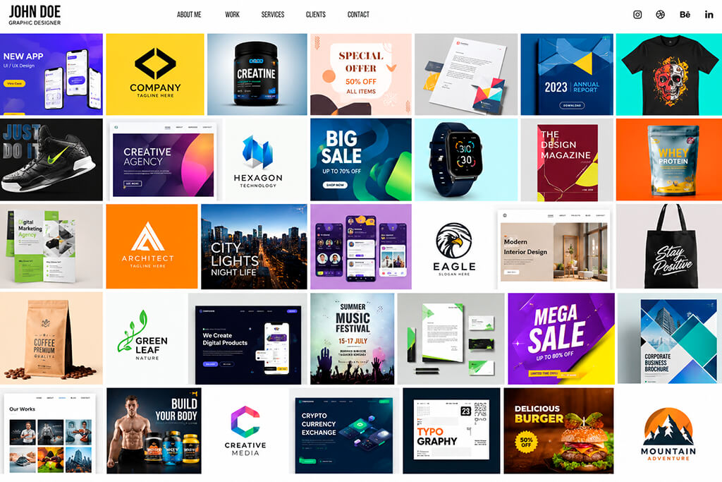
Most weak portfolios are not weak because the designer lacks taste or talent. More often, the problem is different: the works are poorly selected, hardly explained, or carelessly presented. Here are graphic design portfolio mistakes that catch my eye most often:
My personal red flag rule is simple: if I feel like apologizing for something in advance, I fix it or remove it.
“I know this project is old, but...”
“I understand the mockup isn’t the best, but...”
“I know this doesn’t really match the rest of the work, but...”
Usually, such phrases immediately show what exactly needs to be changed.
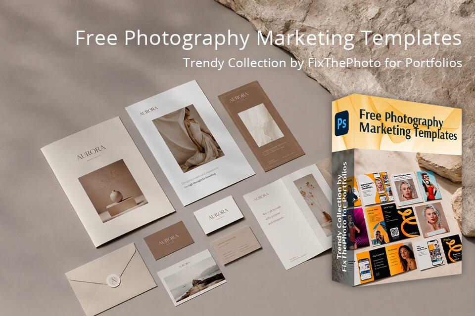
At FixThePhoto, we have prepared a set of free marketing templates that can be useful when creating or updating a graphic designer’s portfolio. The collection includes stylish flyers, price lists, Facebook covers, and other editable PSD layouts. They can be used for stronger portfolio projects, previews for social media, or client mockups.
I like to use such templates as a basis when I need to show how a design idea works in a real marketing format. Instead of showing only a logo or one static visual, you can adapt the template, replace the text and images in Photoshop, adjust the colors to your concept, and add the finished layout to the case.
These free templates are especially useful for beginners who need realistic graphic designer portfolio projects but don’t want to start a layout from scratch every time.




![9 Best AI Virtual Try On Outfits Tools in {{%year}} [100% FREE]](http://fixthephoto.com/blog/images/gallery/news_main__preview_29082.jpg)


![9 Best 2x2 Picture Makers [{{%year}} FixThePhoto Choice]](http://fixthephoto.com/blog/images/gallery/news_main__preview_29017.jpg)
![9 Best AI Audio Silence Removers [{{%year}} FixThePhoto Choice]](http://fixthephoto.com/blog/images/gallery/news_main__preview_29189.jpg)
![9 Best Higgsfield Alternatives [{{%year}} FixThePhoto Choice]](http://fixthephoto.com/blog/images/gallery/news_main__preview_29303.jpg)