When one needs to create a graphic design, take a photo, develop an architecture project, or improve an interior, they should understand how to use the main elements of design. Discovering how to combine them allows any designer to create eye-pleasing outputs and ensure that the advertised product will grab a viewer’s attention.
Whether you are an experienced designer or are just getting started, you need to find an answer to the question: “What are the 7 elements of design?” It will allow you to achieve the following tasks:
Learning how to use these principles will help you convey your ideas using visuals and make your designs easier to remember.
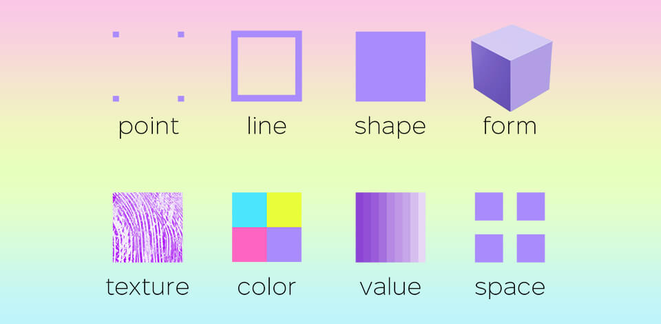
The elements of design are the main aspects of any visual design. They include shape, color, space, form, line, value, and texture. Graphic designers utilize them to create visuals that convey a specific feel and draw attention to a particular subject.
Elements and principles of design photography allow designers to create attention-grabbing compositions while achieving the right balance between all the components.
Many people wonder: “What are elements of design?” Artists and graphic designers use a variety of elements when creating visuals. It allows them to create interior designs, logos, ads, and website designs. Here are the main elements to consider:
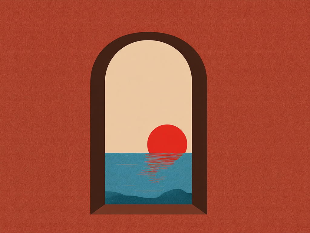
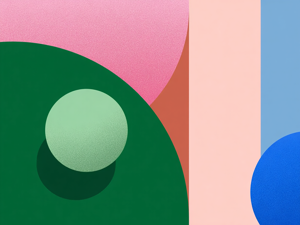
This design element allows one to create the right mood when working on a composition. You can experiment with all sorts of hues when creating a well-balanced photography composition. When light waves are reflected from an object, we perceive colors. Creative professionals use it to provide a more accurate representation of their subject.
Color allows designers to portray mood, light, and depth. Besides, it makes it easier to show a specific point of view. Designers rely on the principles of color theory and use the color wheel. It allows them to combine various colors and mix them to experiment with different color schemes.
Example: Using red to convey a sense of urgency when designing a sale banner. Blue is used to make financial organizations look more trustworthy through branding.

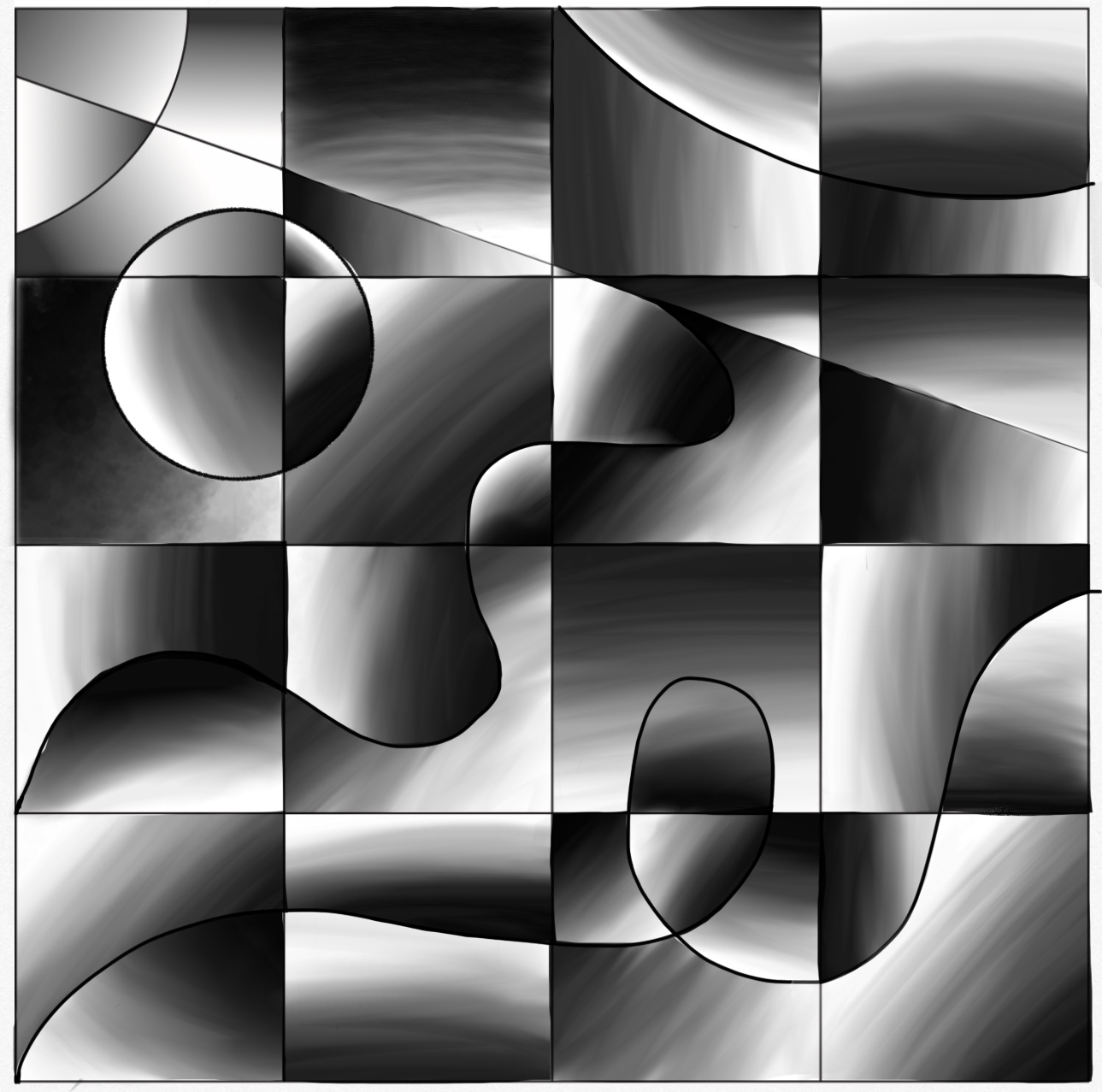
The term describes the way of connecting two points in space. One can use horizontal, diagonal, or vertical lines as leading lines in photography and design to guide a person’s attention to a specific element. You can use different types of lines besides straight ones to create texture. Curved or patterned lines suit this purpose best.
Example: Simple horizontal lines in a website header allow web designers to achieve a consistent effect and convey a sense of stability. Diagonal lines add a dynamic feel.
Among the seven elements of design, value describes the lightness or darkness of a color. Designers utilize gradients to achieve a specific effect by adding variations of a specific hue. Different color values allow them to add some volume to their visuals.
Example: Using high contrast between text and background makes the message easier to read.
Learning how to use space will help you guide your viewer’s attention so that they interpret your design correctly. The use of white space or negative space in photography and design allows one to achieve a specific effect. Positive space is taken up by a subject. By adding empty space, you can make your design easier to understand and ensure that the image does not look too crowded.
Example: Designers add a lot of empty space around a product image shoot for an e-commerce platform to attract attention to the main subject.
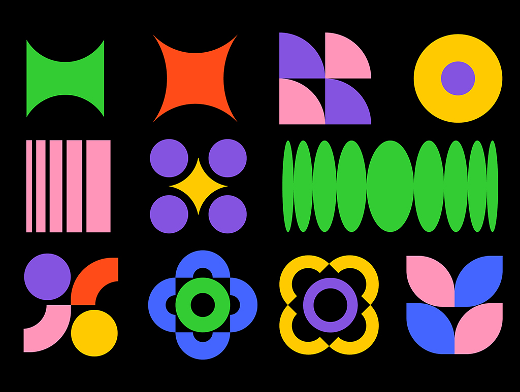
Shape is a simple 2D form defined by an outline. Graphic artists use it together with the other 7 design elements, including line, color, value, and shadow. It allows them to add another dimension to their shapes and give them a voluminous feel.
One can see three kinds of shapes. Organic shapes are natural. Geometric shapes have angles and stand out for their mathematical consistency. Abstract shapes represent objects that are difficult to visualize with high accuracy.
Example: A logo created with the help of basic geometric shapes for a clean, modern effect.
This element of design defines the relationships of an object of particular shape with space. Designers do not need to create a 3D physical shape. They can create a 2D form and give it a three-dimensional feel using light and shadows. They experiment with contours and negative space to highlight the position of an object within its surroundings.
Example: Designers use shading in visuals to make objects more rounded and realistic.
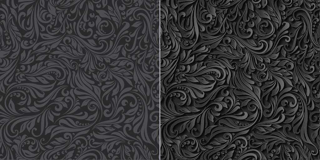
This is one of the 7 elements of design that allow one to understand how an object looks or feels to the touch. Texture is all about a tactical feel. Its surface can be smooth and polished or rough and rugged. However, when one discusses visual texture, they refer to illustrated texture that generates visual interest, drives a viewer's attention, and emphasizes a particular sensory experience.
Example: Adding a paper grain overlay to a digital poster for a handmade effect.

Once you learn the elements of design definition, you will understand that these components are quite tangible. You will notice a line, shape, color, texture, space, value, and form with ease. The principles of design are the techniques used by artists and designers to organize those components and achieve a specific goal. If you want to understand the difference between elements and principles, remember that the former are what you see, and the latter are how this result was achieved.
For instance, one can apply a color (an element) using contrast (principle) to highlight a specific detail. A web designer might put a bright yellow CAT button on a blue background to make it stand out. It’s also possible to use the same colors to achieve a well-balanced effect when creating a minimalist interior design.
You can perform color correction quickly with the help of the app built by the FixThePhoto team.


Likewise, one can use a line (element) and the principle of rhythm to show a viewer what objects on the page they should look at. This technique allows designers to guide a viewer when creating a layout and draw the attention from the headline to the image. One can also use texture (element) and emphasis (principle) to emphasize the high quality of a particular product. This approach is used by those who create ads for luxury brands and want to show texture in close-up photos.
When you compare principles of design vs elements of design and understand how to use various elements, it will be easier for you to create impactful designs that look attractive and tell a specific story. Use the elements and principles together to produce iconic designs.

Saul Bass (graphic designer) gained his reputation when he started to use bold, minimal lines to create movie posters like The Man with the Golden Arm (1955). He used abstract lines to emphasize a dramatic effect and guide a viewer’s attention to the center of the composition.
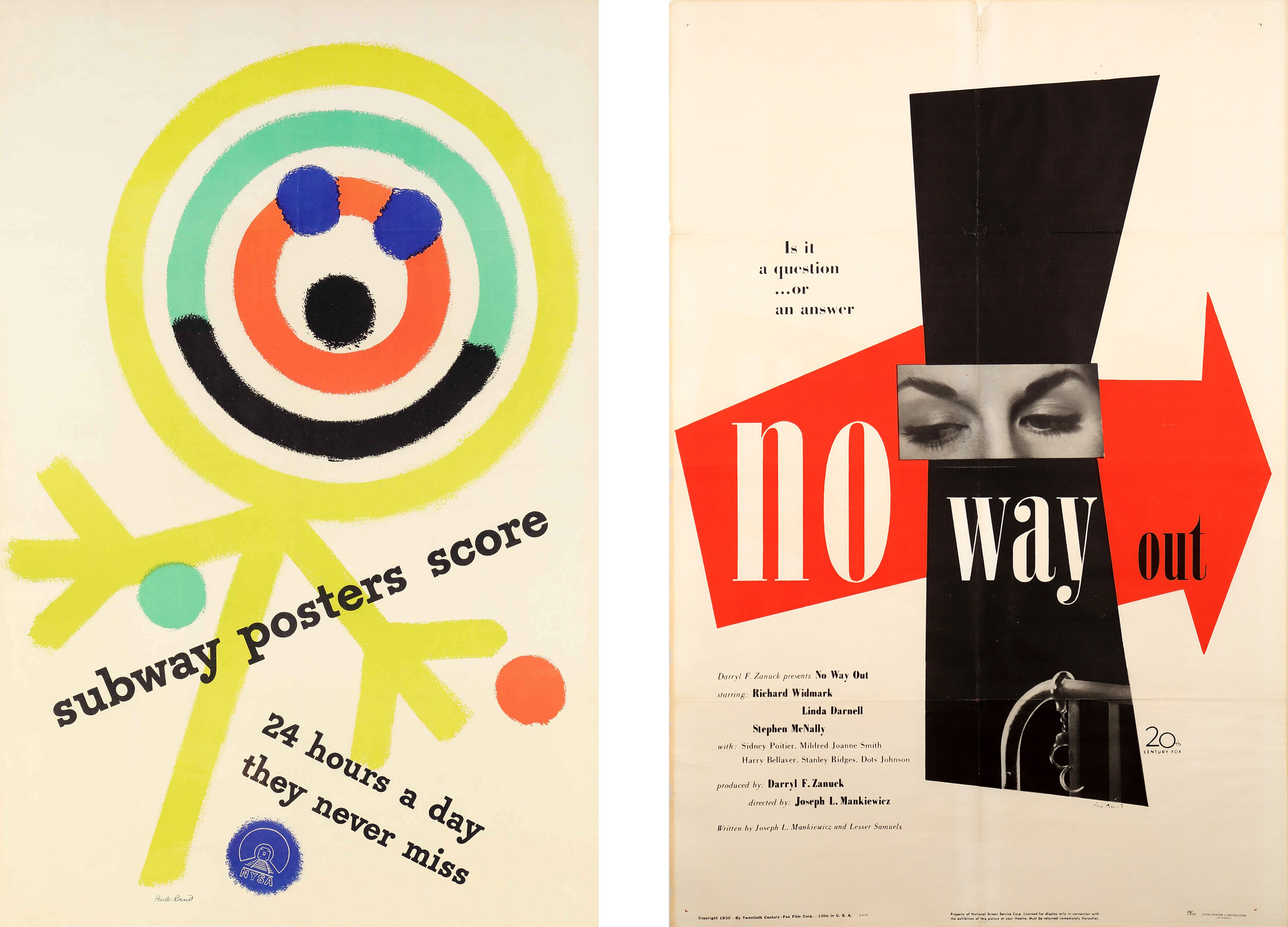
Paul Rand (logo designer) used basic geometric shapes when creating logos for IBM and ABC. In the IBM logo, he combined rectangular shapes with horizontal line breaks to achieve a modern, clean effect that’s easy to recognize.

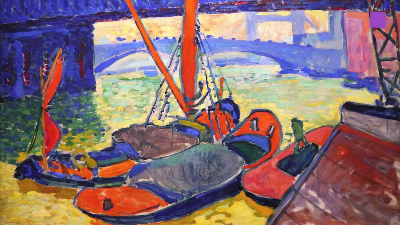
Annie Leibovitz (photographer) prefers to experiment with rich colors to create the right mood when working on her portraits. She used this method when taking her Vanity Fair photo of Whoopi Goldberg in the bathtub filled with milk. The usage of strong color contrast allowed the photographer to achieve a powerful visual impact.

Irving Penn (Photographer) discovered how to use tactile textures in fashion photography when he was working on his Small Trades series. He used worn clothing and rough backdrops to give a realistic feel to his works. The texture elements of design make the models look more authentic and natural.

Steve Jobs & Jony Ive (Apple design). Apple is famous for its use of ample negative space. The company used such techniques when creating ads for early iPod ads or taking Mac product photos. Due to the minimalist layout, viewers focused their attention on the main product.

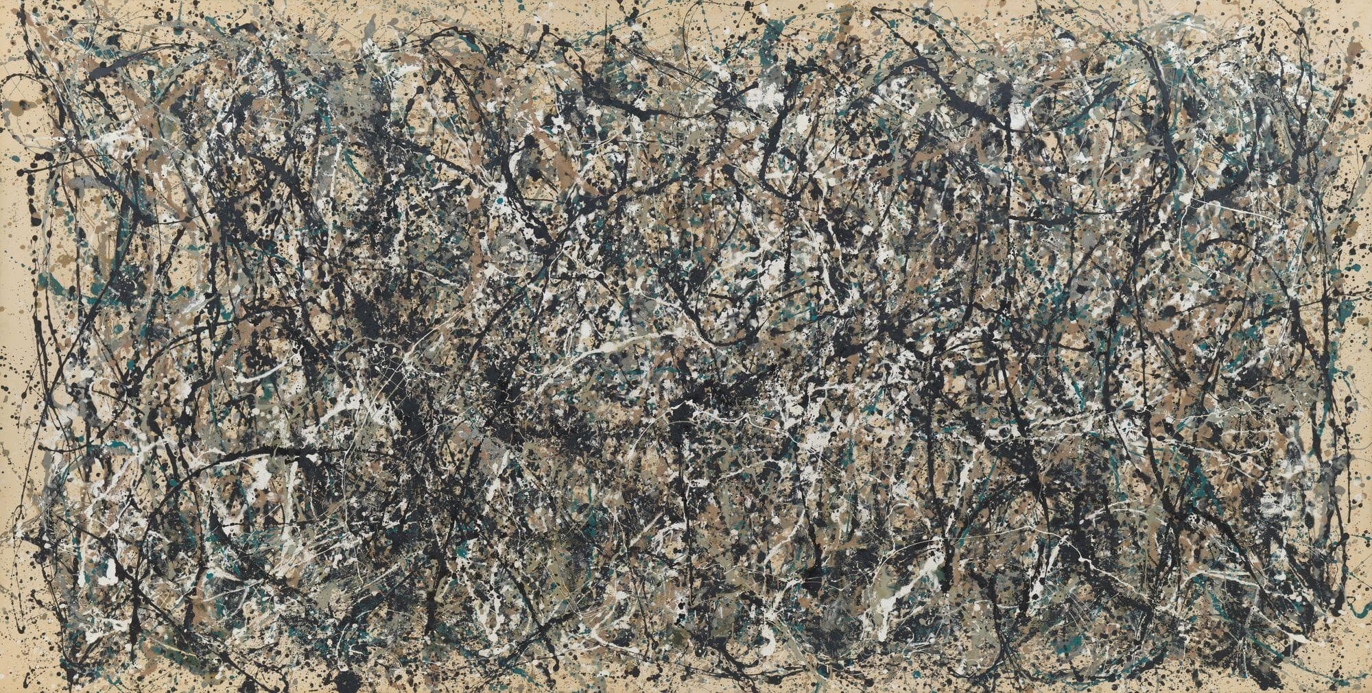
Ansel Adams (photographer) discovered how to use value in black-and-white photography. In his works like Moonrise, Hernandez, New Mexico (1941), he uses excessive tonal contrast, from deep blacks to bright whites. These basic elements of design allow him to add some depth to his images.
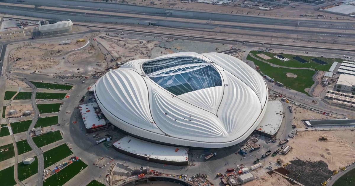
Zaha Hadid’s (architect) architecture projects, including the Heydar Aliyev Center in Baku, involve the usage of fluid, sculptural forms that have a dynamic feel about them. The moving curves make her buildings an organic part of their environment.
Line

Shape
Color

Texture
Space

Form

Value (Light & Dark)