Principles of design are the basic guidelines that help you arrange visual elements such as color, type, images, and space, into something clear and effective. You typically need to work with balance, contrast, hierarchy, alignment, repetition, and proximity. Together, they shape how a design looks and how easily someone can make sense of it. They also shape the path a viewer's eye takes across the page, so the key message comes through without effort.
Over the years, I've learned that skipping these basics is risky. Even visually impressive work can end up chaotic or hard to follow. That's why I treat design principles as non-negotiable. Following these basic rules, I know how to make clear and easy-to-navigate designs. They become even more critical on projects where communicating the message matters more than just making something look nice.
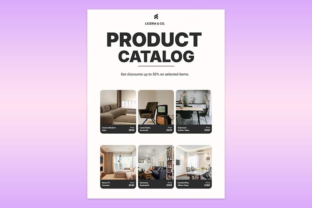
Balance is one of the basic principles of design. It makes a composition look solid and properly arranged, being responsible for how text, images, and empty space get spread across the layout. If you handle that distribution right, everything will look intentional and easy to scan. Balance also acts as a foundation for the other principles, since a well-balanced layout naturally reads more structured and clearer.
Designers generally work with two types: symmetrical and asymmetrical balance. Symmetrical balance mirrors content evenly on each side of a central line, giving the design a tidy, settled feel.
Asymmetrical balance takes the opposite approach. It mixes elements that look nothing alike but still carry matching visual weight, e.g., one large photo offset against a cluster of smaller text. The result is less rigid and more alive.
Tip: Turn the design upside down to notice which side is pulling more visual weight than the other.
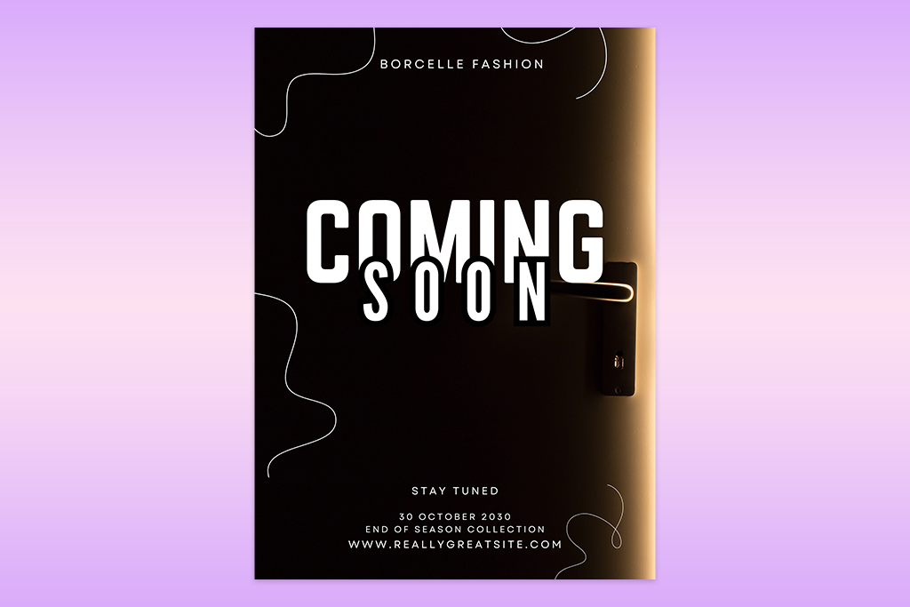
Customers sometimes say that a layout should be more "pop". Typically, they mean that it lacks contrast. Contrast ranks among graphic design's foundational concepts. It creates separation between components and pushes vital content to the foreground. Designers achieve this through variations in hue, scale, font choice, white space, or form.
I rely on contrast to guide the eye and boost readability. Pairing an oversized headline with smaller body copy, surrounding a bold call-to-action with breathing room, or placing dark shapes on a pale backdrop can instantly clarify a composition. Contrast in photography similarly builds visual ranking, helping audiences spot the essential details right away.
To my mind, contrast is one of the simplest principles of graphic design. You don’t need to master elaborate methods. Minor tweaks to weight, proportion, or spacing often produce noticeable results. Still, restraint matters as well, since piling on too many clashing elements can yield a messy design.
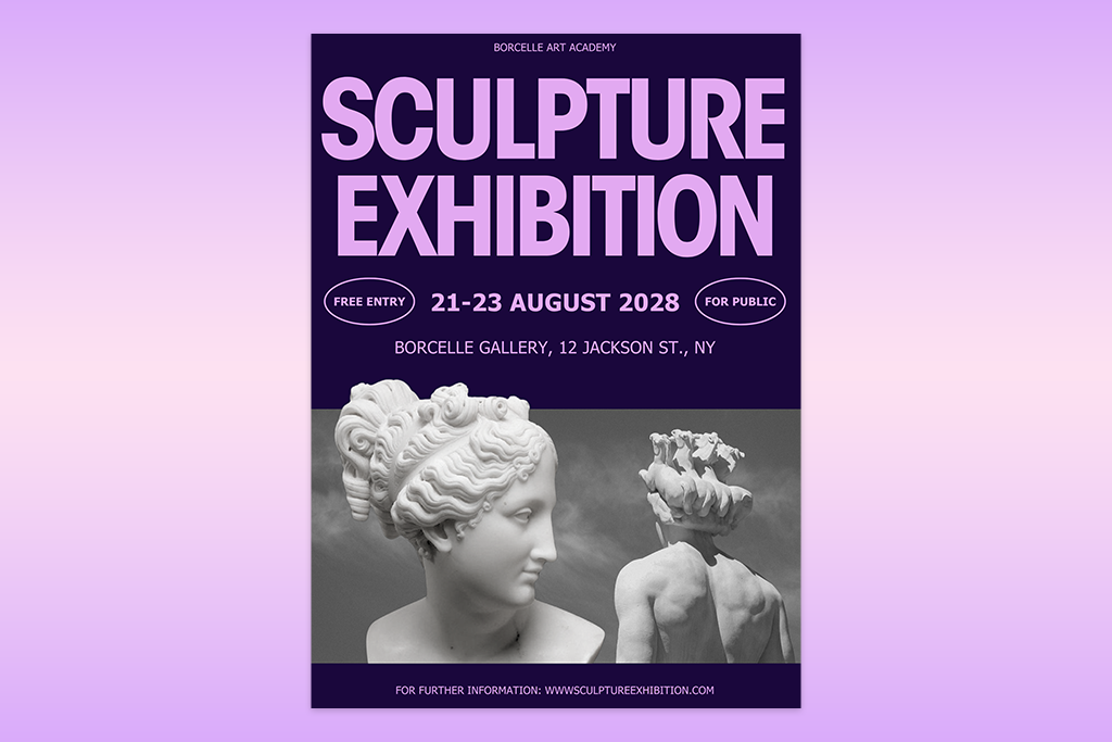
Among the core elements and principles of design I rely on, hierarchy stands out for steering an audience's eye across a piece and signaling which information deserves the most attention. It establishes a clear ranking of significance, making sure people absorb the central message before the finer points.
When working on graphic projects, I typically shape hierarchy using font styling, scale, color, and positioning. A bold, oversized title, for instance, naturally draws the eye ahead of smaller accompanying copy, and crucial details tend to sit toward the top of the composition. This approach keeps posters, ads, and social media visuals quick to skim and simple to follow.

Alignment is the unglamorous detail that, more than anything else, decides whether a layout holds together. As a fundamental rule in graphic design, it ties separate pieces into one visual system, giving a composition a tidy, deliberate, easy-to-follow feel. My process always involves checking that copy, graphics, and shapes follow the same edges or underlying grid. The payoff is improved clarity. Even busy layouts appear more controlled.
For instance, matching a headline to the border of a photo, or placing a caption precisely beneath its image, tightens the visual relationship between the two. Alignment doesn't demand perfect symmetry. I frequently lean into asymmetrical layouts, where pieces anchor to different points on the page yet still read as a unified whole. In this case, you get a design with more movement, without losing its underlying order.
Tip: I’ve tested multiple tools, and believe that Adobe Express speeds up alignment considerably, thanks to its smart guides and snapping features. I can instantly spot when pieces are centered or matched with one another, which prevents minor spacing slip-ups.

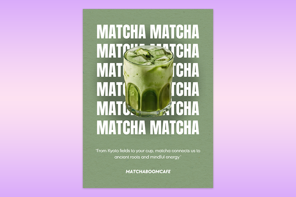
Repetition turns a layout into something cohesive instead of a jumble of unrelated parts. It's a fundamental design principle in art, built on reusing visual pieces like color, font, shape, spacing, or motif to give a composition structure and a sense of movement.
Working in graphic design, I'll regularly carry over certain details, e.g., a particular button look or a recurring accent color, so the audience can naturally pick up on how the layout is organized and how its components relate. This also helps the piece read as purposeful and lets people understand it quickly. However, repetition doesn't mean making everything uniform.
The goal is to construct a working system. I tend to settle on a short list of standards (paired fonts, a chosen palette, and a spacing rule) and apply them throughout the entire piece. Thus, my designs don’t look cluttered and help me move faster when making choices.
Even modest touches in spacing or alignment can build rhythm and enhance a design flow. This idea carries into repetition in photography as well, where echoed shapes, lighting, or objects within the frame produce a sense of visual cohesion.
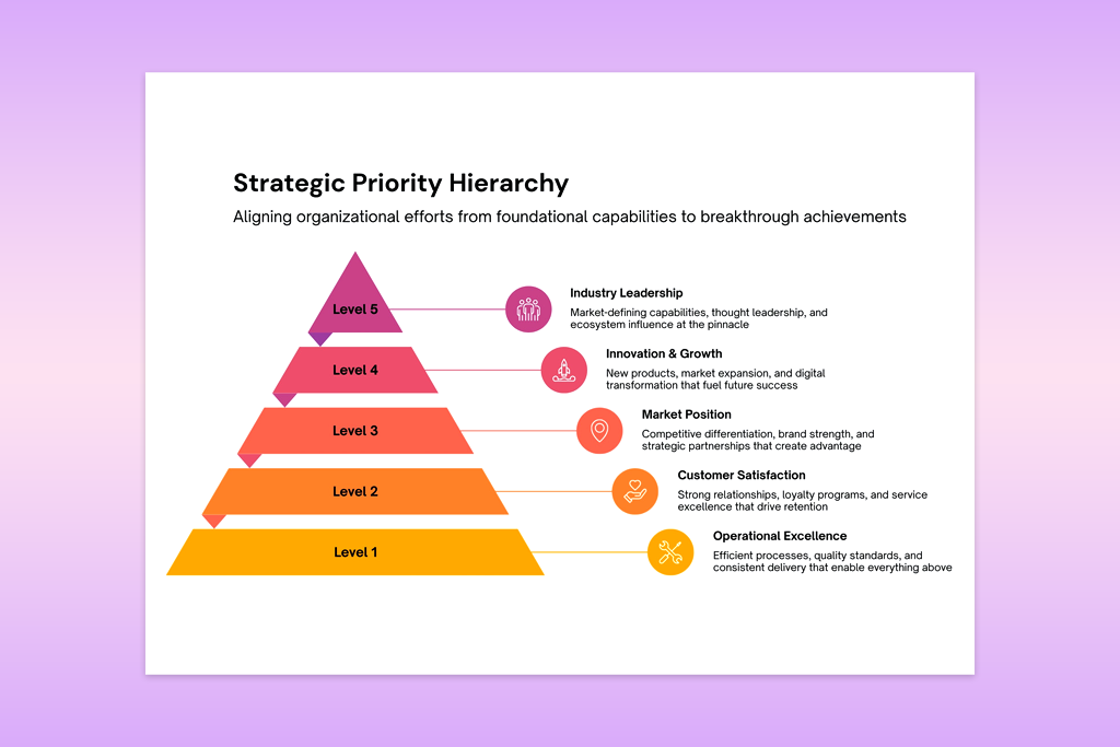
Proximity is one of the fundamental principles of design. It refers to how I use space to organize content. The logic is simple. Things placed close together read as a unit, while things pulled apart read as unrelated. This principle is so useful because it boosts visual clarity through positioning alone, with no need to touch color, fonts, or style.
I always experiment with proximity when laying out posters, app screens, or social posts. Titles, descriptions, and buttons get clustered into groups, while separate sections sit apart with breathing room so the eye can scan the page easily. Often, just adjusting this spacing is enough to clean up a messy design.

When making visuals, I see emphasis as the exact spot where a page tells your eyes to look first. This is a main rule of design. Without one main spot to look at, even a nice layout becomes messy.
To do this, I make one part stand out more than the rest. I usually do this by changing its size, making the colors pop, or putting it in a special spot. For example, a big headline or a main photo grabs your attention right away, while smaller details like prices or extra words stay quiet. Even small choices, like leaving empty space around an item, can make it pop instantly.
Tip: I step back and squint at the screen. If my eyes get pulled in three different directions at once, I know the layout is too busy. I immediately strip away distractions and sharpen that primary feature until anyone can spot it in less than a second.
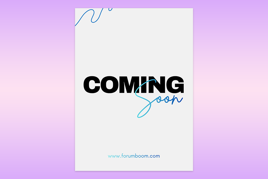
In graphic design, I treat white space (or "negative space") as an active structural tool. This is one of the key visual design principles that shape hierarchy, focus, and clarity. Spacing helps me separate concepts and avoid overwhelming compositions. Instead of reaching for more color or visual effects, I let the empty areas do the work of directing the eye toward what matters most.
For example, a headline surrounded by breathing room seems to be more important and far easier to absorb than one boxed in by competing elements. The amount of space also shifts the overall mood of a layout. Generous spacing appears calm and polished, while tighter arrangements feel urgent and dynamic. This same principle carries into negative space in photography. I apply it deliberately to evoke a particular atmosphere.
Tip: My team from FixThePhoto and I always assess whether each element has room to breathe. If something is cramped or visually trapped, we either widen the spacing or strip back nearby elements until the design is clear at a glance.
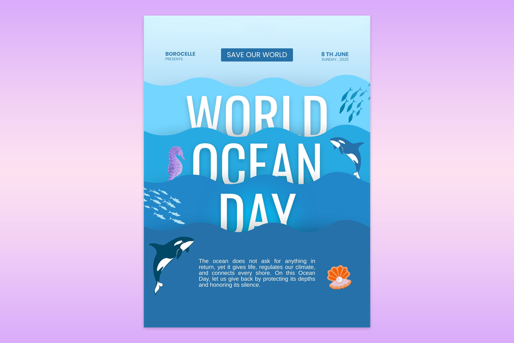
Movement governs the path a viewer's eye takes through a design. In other words, it is the sequence in which elements connect and unfold. As one of the foundational graphic design principles, it shapes the order in which information gets absorbed.
To establish this flow, I play around with size, placement, contrast, and spacing in combination. Most layouts I build follow a logical progression: headline first, supporting details next, then a call-to-action. Even in designs with no actual motion, diagonals, curves, and incremental scale shifts can suggest direction and momentum.
One of my favorite approaches is designing around Z- or F-shaped scanning patterns. When I understand where the eye instinctively travels, I can position important content right in its path. Thus, I receive a layout that is more natural to navigate and quicker to digest. When working digitally, a touch of animation or a well-placed GIF can also help steer attention exactly where it needs to go.
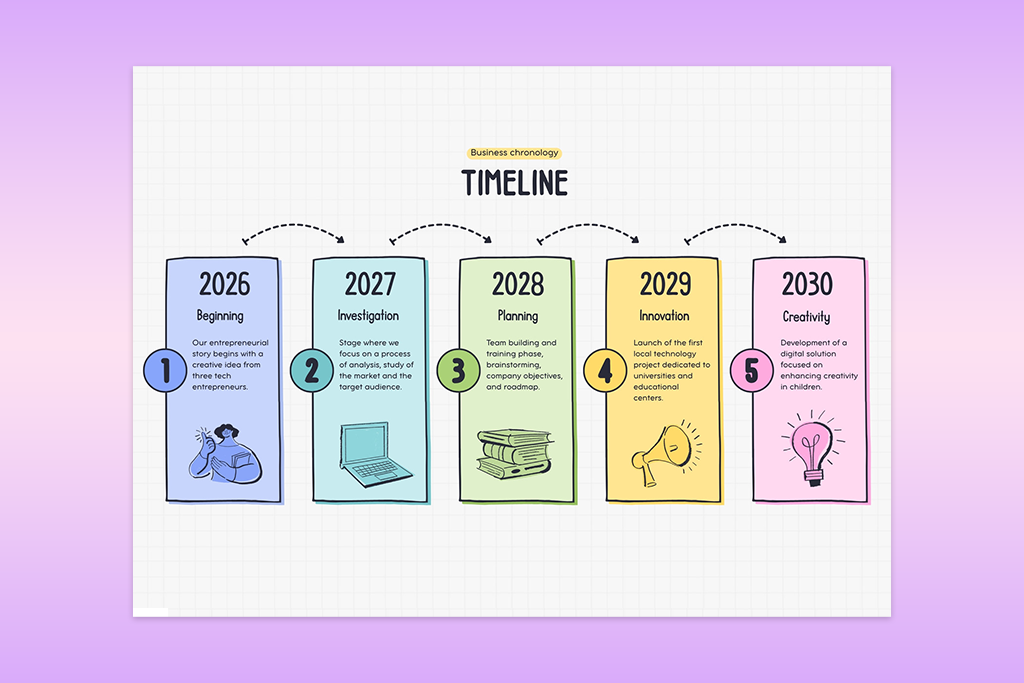
Unity is one of the core design principles I use to make sure no element in my project looks like it's operating on its own. Everything needs to belong to the same visual system. Rather than a loose collection of separate visuals, the aim is a single, intentional composition.
To get there, I keep color, typography, spacing, and alignment consistent throughout. The goal isn't uniformity, as elements don't need to look the same. They do need to share a common visual thread. Think of a poster pulling together multiple images and blocks of text. As long as they follow a matching style and rhythm, the piece comes together as one complete idea rather than a patchwork.
The same logic applies in principles of design photography, where unity comes from aligning lighting, tone, and composition. Such qualities give an image a settled, cohesive feel.

Proportion governs the relative size and visual weight I assign to each piece of a layout, making it one of the principles that decides whether a composition is grounded or unbalanced. Within graphic design, it's the tool I use to determine which element commands attention and which ones fall into a supporting role.
Scale plays an important role here. A large headline or image appears significant by default, while smaller pieces naturally recede into the background. That's hierarchy built without relying on any additional visual tricks. Every so often, I'll push proportion to an extreme on purpose, blowing up typography or letting one visual dominate the frame against minimal supporting elements. This way, I can inject more drama and personality into the design.
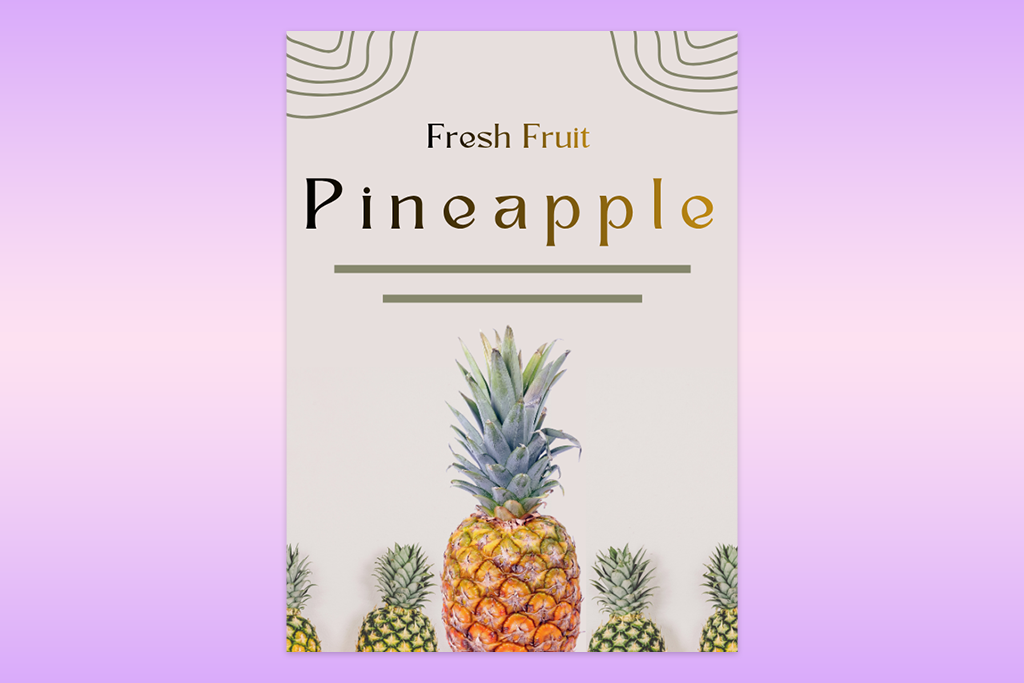
Dominance lets you control which part of a layout grabs attention first and fastest. It ranks among the essential principles of graphic design because it gives a composition a single clear anchor point, keeping different elements from pulling focus in too many directions at once.
To establish it, I turn to scale, contrast, or strategic placement, making an oversized headline, a striking hero image, or one bold color accent set against a deliberately quiet backdrop. The supporting elements stay subdued on purpose, so there's no question about which element of design is meant to lead.
Tip: I do a quick scan for a single standout element. If my eye keeps darting between two or three spots instead of settling, that's my cue to dial back the competing pieces or amplify the lead one until it claims focus right away.
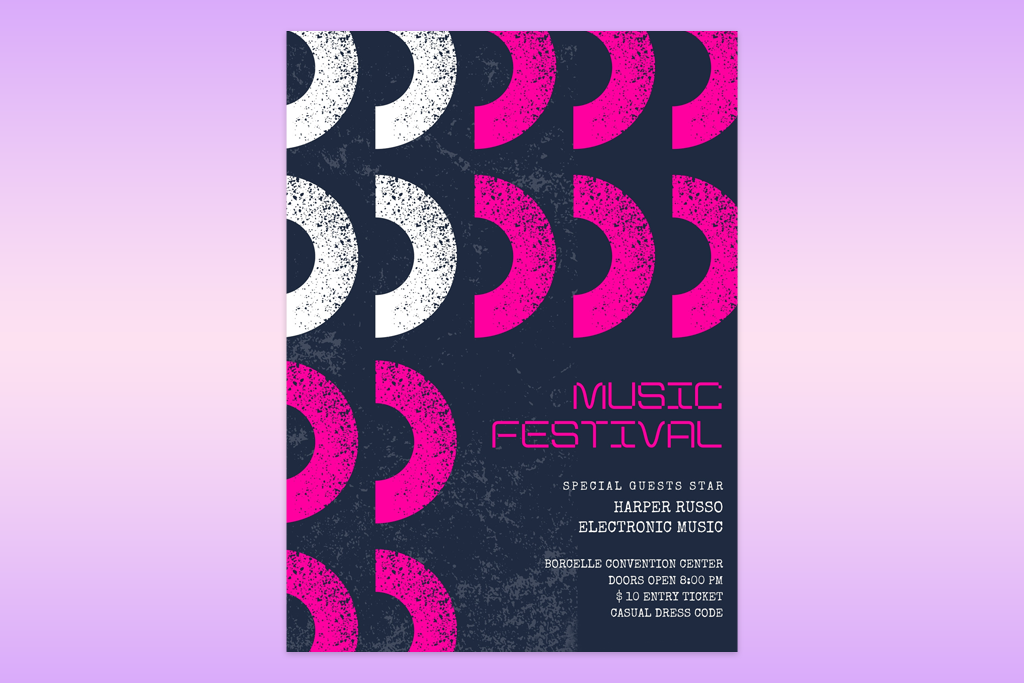
Rhythm is what turns a static layout into something the eye wants to travel through. I think of it as the principle responsible for stitching individual elements into one continuous flow, rather than leaving them scattered as disconnected parts. To build it, I draw on repetition, evenly judged spacing, and incremental changes in size or position.
Visually put, it is a set of images lined up with matching gaps between them, a heading system that reuses the same styling throughout, or pieces that scale up or down in small, deliberate steps. Each of the principles of design examples creates a sense of direction across the composition. Depending on the mood I'm going for, I'll sometimes hold the pattern steady and predictable for a calmer effect, or break it on purpose to make the design more charged and alive.
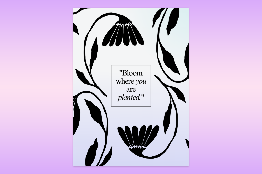
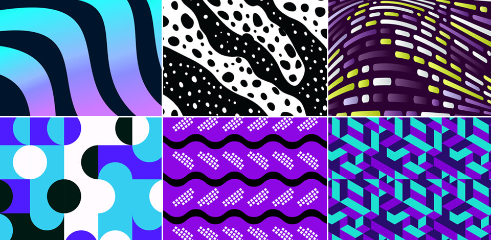
Pattern, for me, is about repeating visual elements until a layout settles into something consistent and orderly. Thus, I can convert separate parts into one connected system. I like that pattern is rather flexible. Sometimes it works quietly behind the scenes to direct attention, and other times it takes center stage as the composition's defining visual.
I generate patterns through repeated shapes, colors, icons, or layout modules. A grid of uniform cards in an interface or a texture that repeats across a poster can make a design unified almost immediately. Even everyday interface conventions like navigation bars succeed because they lean on patterns people have already internalized.
Tip: Anchor your pattern to a single clear concept and avoid stacking on excess variation. The moment too many variants pile up, structure gives way to visual noise.
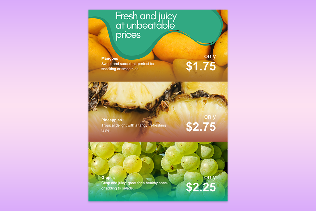
A design draws people in when it resists total uniformity. That's the role variety plays, injecting contrast and interest into a composition. I bring in that variety through shifts in color accents, typography choices, image treatments, or shape pairings.
Take a clean grid layout, for instance. It can still feel dynamic if I vary photo styles or adjust scale slightly across elements. The structure holds together, but the monotony disappears. The real key is restraint. Variety should be used to reinforce hierarchy and mood, not to spiral into chaos. Often, it's the small, deliberate that make a graphic design idea more attention-grabbing.
Before wrapping up and sending off any project, we put it through a short review process. The point isn't to dissect every pixel. It's simply to catch small slip-ups and make sure the work lines up with solid principles of good design.
“Hierarchy is well-understood. I check if viewers can immediately spot the most important elements.

“Alignment is equally important. Even small changes can distort the design look.
Tip: I quickly turn on grid/guides or overlay lines to notice misalignment.

“Contrast impacts readability. I double-check everything is easy to read and scan.
Example: If a button gets lost against the background, I boost contrast or add spacing instead of just changing color.”

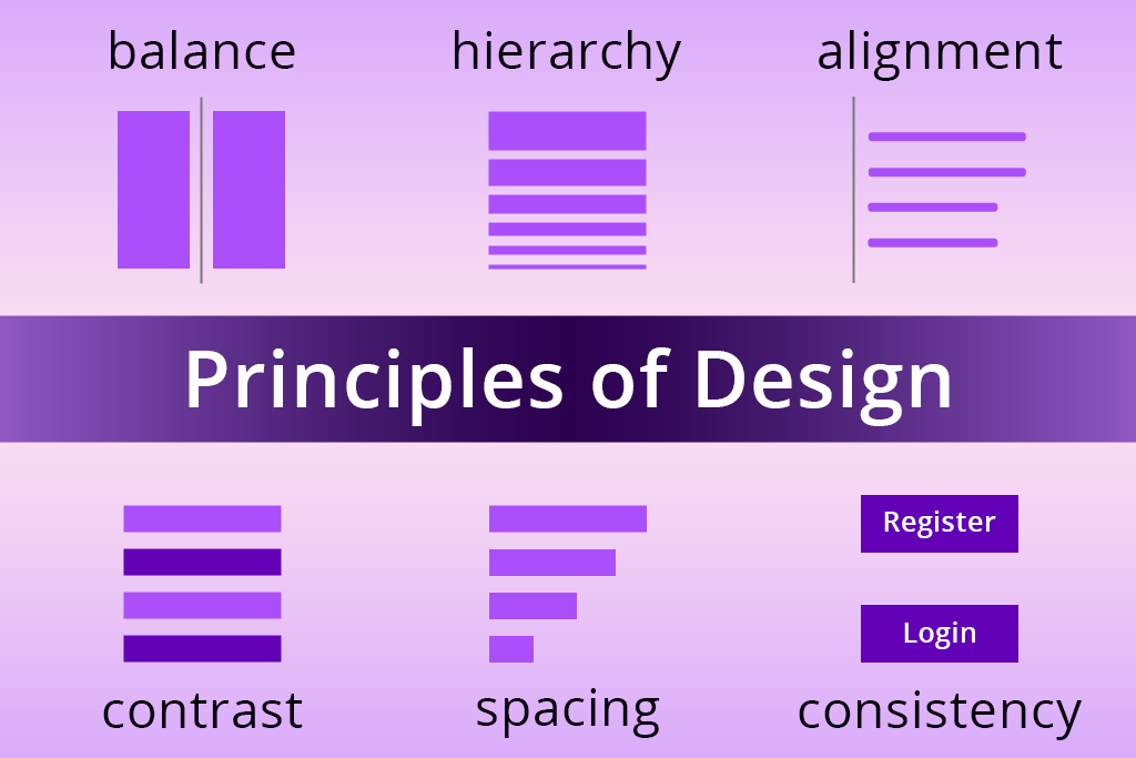
“Spacing has to be balanced. I analyze space and grouping.
Tip: I often zoom out. If the layout appears “heavy” on one side, it is necessary to adjust spacing.”

“Consistency across elements. I check if every item across the system is visually connected.
If something looks “different for no reason,” I simplify or align it with the rest.”

“Overall thumbnail analysis. I reduce zoom or evaluate the design in a small size.

Using this checklist, we can clearly see the strong and weak points of any design.
Design principles are the underlying rules graphic designers rely on to shape typography, color, imagery, and space into organized, compelling layouts.
They strengthen clarity, readability, and overall visual flow. Skip them, and a design can look chaotic or off-balance, regardless of how striking each piece looks alone.
Not at all. Each project calls for its own priorities. Posters often lean on hierarchy and contrast, whereas UI design depends more heavily on alignment and proximity.
No single principle takes the top spot. Still, hierarchy and alignment usually come into play early, since they shape structure and direct where eyes land.
No, the underlying principles hold steady whether you're working in print, web, or graphic design. But they can be applied differently based on context and goal.
Try shrinking the design down and viewing it at a glance. If it still communicates clearly and looks visually balanced, the principles are functioning well.



![9 Best AI Car Video Generators [{{%year}} FixThePhoto Choice]](http://fixthephoto.com/blog/images/gallery/news_main__preview_29281.jpg)


![9 Best 2x2 Picture Makers [{{%year}} FixThePhoto Choice]](http://fixthephoto.com/blog/images/gallery/news_main__preview_29017.jpg)