I'm part of the data team at FixThePhoto. I love my job and always feel intrigued by stats and trends in the world of photography. I study gear and software trends, the latest business developments, and other related topics.
But data can be intimidating, so I do my best to present it in a way that's clear and accessible. That's why I rely on charts and graphs. They're very helpful for explaining complex concepts in understandable ways in our blog posts.
I've been a loyal Adobe Illustrator user for many years when it comes to creating charts. It's a powerful program and I know how to use it to achieve particular results. Nevertheless, the world of technology is in perpetual flux. That’s why, I decided to study the latest software for making charts and pick the most impressive solutions.
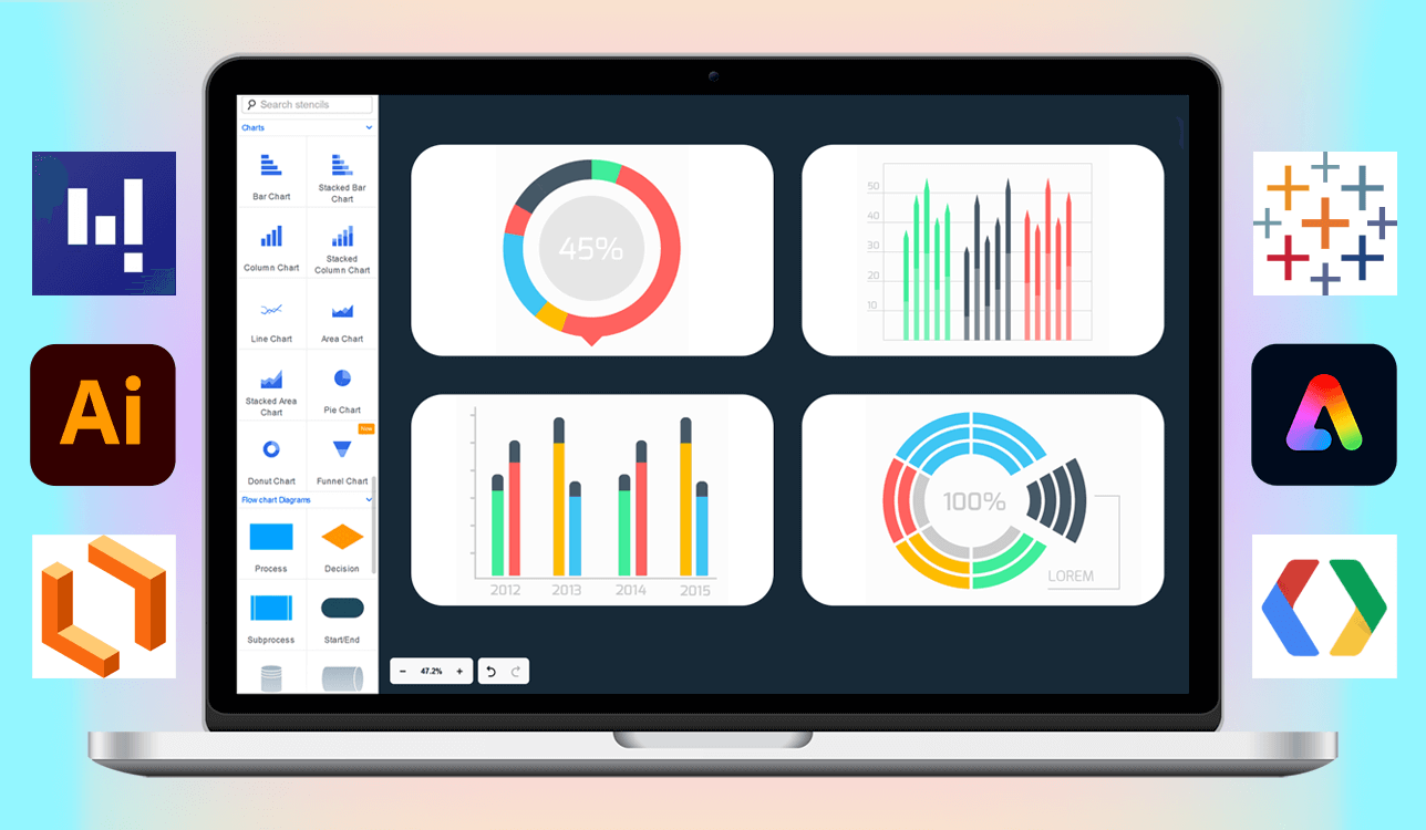
To compile a list of the top programs, I spent much time testing out over 20 different tools. I consulted with colleagues, read Reddit discussions, and googled the latest reviews. In the end, I've identified 7 exceptional tools. I described them briefly in the table below:
| Software | Main focus | User-friendly | Best for | Platforms | Free plan/trial |
|---|---|---|---|---|---|
|
Team collaboration & diagramming
|
★★★★☆ (4/5)
|
Teams, Collaborative projects, flowcharts
|
Web
|
✔️
|
|
|
High-end design & customization
|
★★★★☆ (4/5)
|
Professional designers, branded charts
|
Mac & Windows
|
✔️
|
|
|
Interactive web charts
|
★★★☆☆ (3/5)
|
Developers, web embedding, dynamic data
|
Web
|
✔️
|
|
|
Extensive chart library
|
★★★☆☆ (3/5)
|
Developers, business dashboards, wide variety
|
Web
|
✔️
|
|
|
Quick & easy charts & graphics
|
★★★★★ (5/5)
|
Beginners, social media, fast visuals
|
Web, Desktop, iPad
|
✔️
|
|
|
Business diagrams & integration
|
★★★★☆ (4/5)
|
Business users, excel integration, diagrams
|
Windows
|
❌
|
|
|
Data analysis & dashboards
|
★★★☆☆ (3/5)
|
Data professionals, analysts, interactive dashboards
|
Mac & Windows
|
✔️
|
|
|
Photo-based slideshow creation
|
★★★★☆ (4.5/5)
|
Real estate, photographers, blogs
|
Web, iOS, Android
|
✔️
|
|
|
Visual data reporting & tracking
|
★★★★☆ (4/5)
|
Photo studios, small teams, task tracking
|
Web, Windows, Mac
|
✔️
|
I defined certain criteria when testing these tools. In this article, I'll outline the features and functions I evaluated in each software. Besides, I'll explain how I optimized data visualizations for our FixThePhoto content. Keep reading to learn the details.
Best free organizational charts software
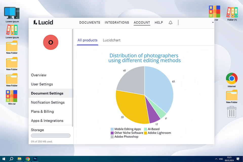
I learned about Lucidchart on Reddit. Photography and design professionals praised it for its collaborative capabilities. I paid attention to the online examples they shared, and I was eager to test the program myself.
From the moment I started using it, I really liked the intuitive design. The service is entirely web-based. So, you don’t need to spend time on downloads but can simply log in and start creating. Moreover, there are lots of templates, including stylish organizational chart templates. So, if you need org chart software, consider Lucidchart.
Lucidchart's collaboration features are awesome. I know that our FixThePhoto blog team can efficiently use it to share diagrams, discuss concepts in real time, and get quick feedback. Another advantage is the variety of diagram types. There are bar, line, and pie charts. You can easily create the needed diagram, import data, and customize colors, fonts, and other parameters. When it comes to arranging layouts, you just need to drag and drop items.
To my mind, Lucidchart is good free charting making software for creating neat diagrams, Still, they will look a little too cookie-cutter. When I need visuals that are unique and aligned with my brand, I prefer Adobe Illustrator. Lucidchart offers some customization, but it can't match Illustrator's flexibility for complex designs or branded projects. Another drawback is that it doesn't work with my Adobe tools.
Key features:
Pricing: Free plan, Individual plans from $7.95 per month
Best chart maker for pros
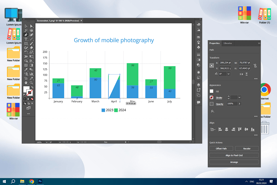
I think Illustrator is one of the most powerful tools for graphic design. When it comes to making diagrams, it is also a solid choice.
I primarily use bar charts to compare the popularity of different gear, editing apps, etc. Pie charts work wonderfully for displaying percentages, such as the proportion of photographers sticking to particular photo editing approaches. When I need to show shifts in trends over time, e.g., the uptick in mobile photography, I use this flowchart software for Mac and Windows to make line graphs.
I want to draw attention to the latest Illustrator Generative Fill updates. I used it to create unique backgrounds and design elements around my diagrams. By doing so, I wanted to make them more visually appealing.
For instance, it is possible to create a bar chart about camera lens types and use Generative Fill to quickly generate a subtle bokeh lens background for the graphic.
With Objects in Path, you can make your diagrams more dynamic. For instance, you can show the evolution of a particular camera. Instead of a boring straight line, you can use a “path object” to create a curved or angled line and then place icons of different camera versions along that line. Surely, people will like such a design more and can better understand the information.
Key features:
Pricing:
Completely free chart maker
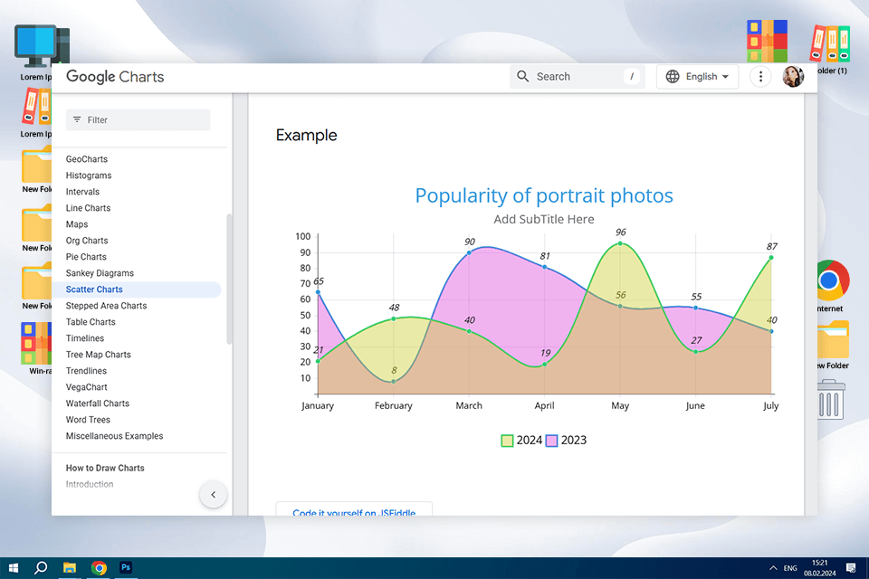
When I first came across Google Charts, I was actually looking for free graphing software for website charts. This platform fit the bill perfectly. The FixThePhoto blog is an online platform with lots of interesting content, so I thought it would be great to use this tool to add even more attention-grabbing visual data. However, I soon discovered that Google Charts is designed for developers, not for those who prefer a visual, drag-and-drop interface like Express. It requires coding in JavaScript to generate charts. I am not a coding expert, so I felt a bit confused.
Still, Google Charts is free and powerful. Besides, it offers interactive chart types, including simple bar charts, maps, scatter plots, and more. It is also possible to make interactive elements so readers can engage with the charts on our blog instead of just looking at them. I think it is paramount to diversify static images with something more entertaining.
I used this software for making charts and graphs to create an interactive map of photo studios and a line graph to track photography trends. You can customize anything, but once again, you can do it without coding. This may be a challenge for some users. Besides, the program isn’t as focused on design as Illustrator. The resulting charts can look a bit plain. If you want more professional and unique results, try Adobe Illustrator.
Key features:
Pricing: Free
Best for extensive chart type library
I was on the hunt for the best data visualization libraries out there. FusionCharts kept popping up in my searches. It seemed like a really comprehensive and professional graph making software. It is often mentioned in the same breath as Google Charts. The website looks very professional, so I decided to test whether it would be a good fit for creating content for the FixThePhoto blog.
The highlight of the program is the wide range of chart options. They have everything from simple bar charts to more complex visualizations like heat maps and funnel charts. Plus, there are some really niche diagrams. If you're into data visualization, it's definitely a cool tool to explore. While it uses JavaScript like Google Charts, FusionCharts seems to have a better focus on design. Thanks to the ready-made examples and clear documentation, it is easier to get started, even if you're not a coding pro.
I experimented with FusionCharts, using heat maps to analyze website traffic, funnel charts to understand customer journeys, and combo charts to track trends. While creating the charts wasn't as simple as drag-and-drop, the process was straightforward. With clear APIs, it was easy to customize things. Plus, they have manifold themes and customization options, including interactive elements.
Still, if you are looking for the best free chart making software to create content for commercial projects, FusionCharts can’t meet your needs. We had to buy a license for FixThePhoto. Surely, this isn’t as convenient as Google Charts. Plus, even though it's easier to use than writing code from scratch, the results aren’t as visually beautiful as with Illustrator or Express. You're working with code and settings and can’t directly change visuals. So, if you're used to a more hands-on approach, like in Adobe, this program may disappoint you.
Key features:
Pricing: Free for non-commercial use with watermark, Developer licenses from $499/year
Best online chart making software
When I need to make a simple chart or graphics, I choose Adobe Express. It's free diagram software with a user-friendly interface. Plus, it has templates for social media posts, flyers, and different kinds of charts.
Adobe Express is my favorite tool for making quick and easy charts. For example, when I need to prepare a blog post about the most popular tripod brands on Instagram, I use Express to create a simple bar chart. Thus, I can visually present the most popular options without loading readers with too much data.
Still, you have to put up with a trade-off. Your charts may look less precise. Besides, you shouldn’t expect detailed customization. Another limitation is the number of chart types. The problem looms large if you need materials for branding purposes. Illustration is more helpful in this regard.
Working with data and creating charts has become easier, thanks to the latest Adobe Express updates. There is the “Tables and Charts” feature, using which you can turn your data into comprehensible charts. Besides, thanks to embedded AI, you can understand any data better.
Now, when using Adobe Express, we can import photos directly from Lightroom. Thus, we can prepare visual content for our blog faster. Another advantage is the possibility to convert InDesign files into editable Express files. What’s more, the developers improved the resize and enhanced design features. Our charts look professional and engaging on any social media platform. With the color change, users can maintain brand consistency across a range of visuals.
Key Features:
Pricing: Adobe Express free plan, Premium plan for $9.99 per month
Business-oriented software for making graphs
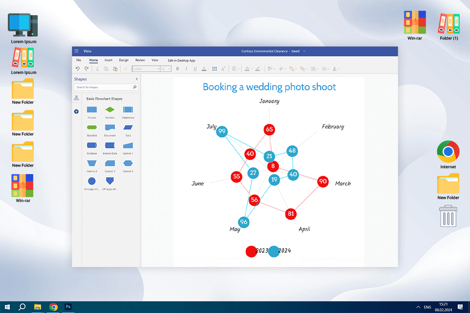
When I think about tools for making diagrams, Visio is the first program that pops into my head. It's been a staple in the Microsoft 365 world for ages, and for good reason. Visio isn't just for diagrams, though. It is a wonderful option with templates for flowcharts, floor plans, and more. At FixThePhoto, we've paid close attention to its features for making charts.
When evaluating it as software for chart making, I was impressed by its user-friendliness. There is a drag-and-drop interface and ready-made templates for a streamlined workflow. It is easy to manipulate shapes, connect them, and fix the formatting.
If you're working with data, the Excel integration will come in handy. Your diagrams will be updated automatically as your spreadsheets change. I used it to create histograms, line graphs, and workflow diagrams. Honestly, even if you're new to diagramming, you can understand the process quickly with Visio.
However, Visio may disappoint you if you're looking to create stylish diagrams. It is more about function than fancy design, unlike Illustrator. Another thing to keep in mind is that Visio isn't as collaborative as Express or Lucidchart. You can share files, but real-time teamwork isn't its strong suit. Finally, it's primarily a desktop program designed for Windows.
To my mind, Visio is like a hybrid among other diagramming tools. It's more versatile than dedicated diagram tools, but it is also more geared towards business use. If you compare Visio vs Illustrator, it's important to remember that Visio is less about design and more about functionality.
Key features:
Pricing: From $5 per user/month
Best for data analysis & dashboards
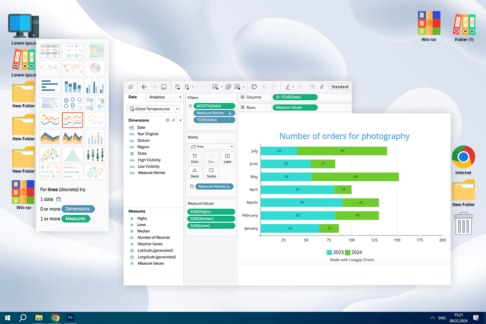
Tableau is a well-known name in the world of data visualization. It's a powerful data visualization tool preferred by many large companies. If you're interested in data analysis, you've probably heard about it. I decided to try it to figure out whether I could use it as software for making graphs and charts for the FixThePhoto blog.
Tableau is a popular data visualization platform that offers more than simple charts. You can use it for meticulous data analysis, processing massive datasets, creating interactive dashboards, and generating detailed reports. Tableau surpasses many analogs with its advanced data processing capabilities. Generally, it is a desktop application with cloud options. When you open Tableau Desktop, you get access to a variety of data sources. This is particularly important for FixThePhoto, as we plan to work with large datasets in the future.
Tableau has a drag-and-drop interface, so exploring data is easy. I just needed to drag data around and watch the charts appear. Another advantage is the selection of charts. There are standard ones, as well as more sophisticated visualizations and maps.
The program pleases with its interactive dashboards. They are particularly beneficial for filtering and exploring the data. I decided to test Tableau by creating a dynamic dashboard for photo data, a geographic map, and a scatter plot. I should admit the process was not only efficient but also fun. I could customize different elements and get the most out of interactivity features.
Unfortunately, the cost of Tableau can put off some users. Most subscriptions are very expensive. When preparing content for the FixThePhoto blog, we use high-quality tools but aren’t ready to spend a fortune. In addition, the app is mainly focused on data exploration and lacks design-centric unlike Adobe products. Using this data analytics platform, you can make charts, but mostly for data analysis. If you want to complement them with aesthetic touches, you need to edit them manually.
Key features:
Pricing: Free version, from $75 per user per month
No software to install
I've used PresenterMedia as my go-to chart-table creator whenever I needed organized slides that draw on numbers, categories, and icons all into one location.
They have table templates that aren't dull at all, since you can add animated rows, visual columns, and even pictogram-style headers. The software is web-based, so I simply login and select from business, educational, or infographic-style table graphs.
They resize well into PowerPoint presentations, and can be modified by me regarding colors, text, and organization without having to use design software. For team reports and comparisons, these templates are lifesavers.
Key features:
Pricing: From $49.95/year
Updates in real time
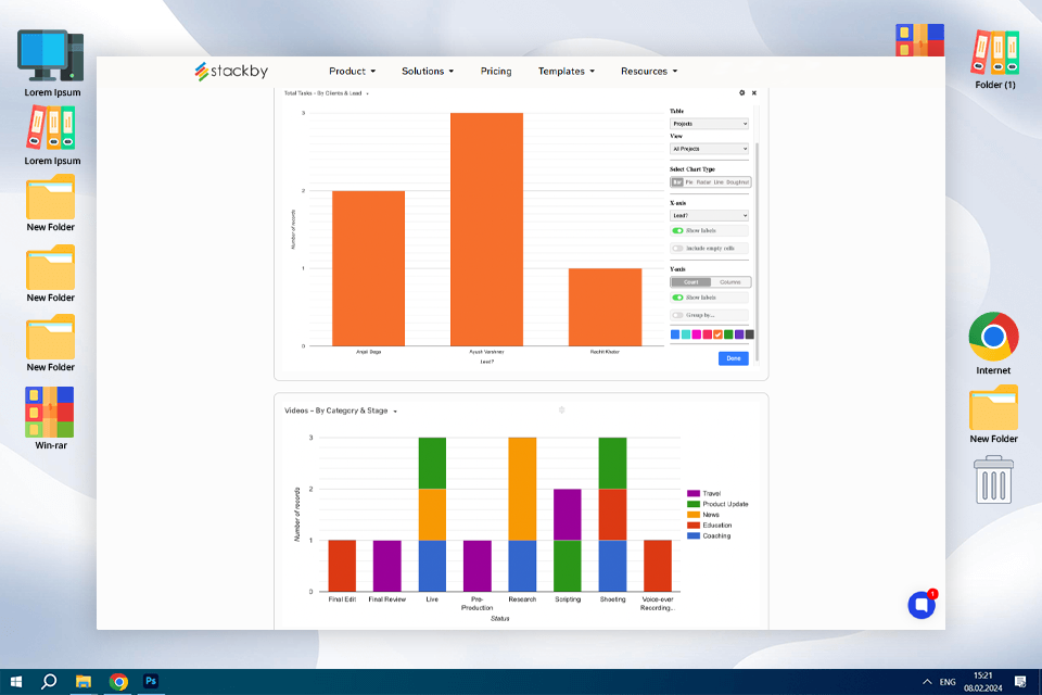
I tried Stackby to track completed photo editing tasks across clients, and it helped me get a quick overview of project status using bar and donut charts. It’s very simple to set up — just pick a column for categories and another for totals, then the chart updates as you edit the table.
For freelance or agency photo work, it’s useful when you need to visualize bookings, retouching progress, or delivery status — but don’t want to export data into external tools. It’s not super advanced, but does the job inside the same space where you already manage your data.
Key features:
Pricing: Free plan, Personal plans from $6 per month
Now you know my contenders for the title of the best software for chart making. Still, I wanted to share one more interesting thing I discovered while testing tools. It's something I started calling "Chart Crimes." Basically, even with all the advanced software out there, it's possible to create charts that are not so easy on the eyes or even kind of deceptive.
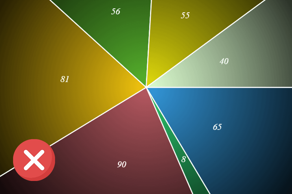
As I was testing different programs, I kept seeing the same "chart crime" patterns over and over - 3D pie charts tilted at some ridiculous angle. They might look "cool" or "modern," but they're of little help in understanding the data. It's nearly impossible to compare the different slices accurately because the 3D perspective messes with your perception. They're a classic example of style over substance.
I am rather confused, pondering how easy it is to create a chart that totally twists your data, even when you're using the best software. We all should remember that software is just a tool. It's our job to use it responsibly and never embellish or misrepresent the data.
That's why I've selected some tips to help you avoid committing these "chart crimes":
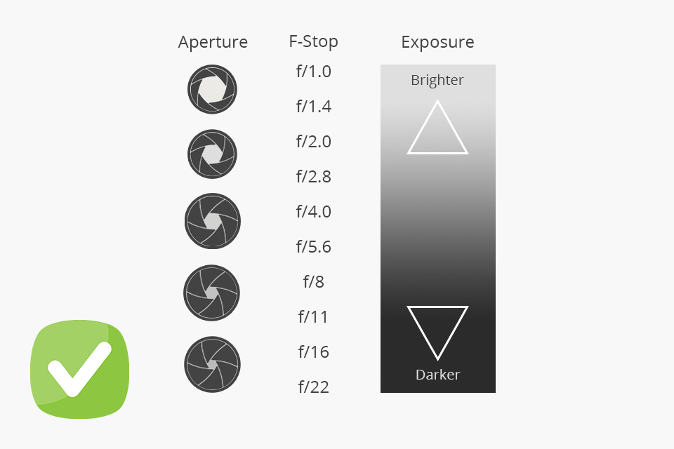
✔️ Keep away from 3D pie charts. They might look nice, but they actually make it much harder to see the real differences in the data. It's tough to compare the slices accurately. To get a clear picture of how the parts make up the whole, keep it simple. A regular 2D pie chart or even a bar chart will do the job much better.
✔️ Select color patterns thoughtfully. Create a color palette that's easy on the eyes and actually helps people understand the information. The colors should work with your data, not just be there for decoration. A good idea is to use color to draw attention to the most important parts of your chart.
✔️ Always start your vertical axis at zero. It may be tempting to chop off the bottom part of the chart to make small differences look huge, but that's a big no-no. It's misleading and can give people a completely wrong impression of the data.
✔️ Keep your scales true to life. In other words, don't mess with the scales to make things look more dramatic than they really are. Keep them consistent and logical so that the trends in your data are presented correctly. Stretching or squeezing the scale can totally distort the information and give people a false impression.
✔️ Share information clearly. It's easy to get carried away with super cool or trendy designs. However, stylish effects can actually make the data harder to grasp. So, always put clarity first. Even if it means your chart looks a little simpler, it's better if people can easily understand the key takeaways.
✔️ Represent your data honestly and fairly. Your charts should tell the truth. Avoid any design choices that could trick people or give them the wrong idea about what the data actually shows. Whether you mean to or not, a misleading chart can cause a lot of problems.
When testing multiple programs, I was determined to find the best chart making software that can satisfy the needs of FixThePhoto content creators and other users. I was not just looking for something with frills but wanted tools that are actually useful for showing photography data in a way that makes sense for our blog readers. I need to handle lots of data for FixThePhoto, so I considered how these tools maintained my daily workload and whether they could make a positive impact on our data storytelling.
To find the top software for making charts, I worked with my FixThePhoto colleagues and we zeroed in on five key things. Mainly, we assessed usability, the variety of charts and design options, customization extent, data handling & integration, and the cost. Over a few weeks, we tested wpDataTables, FineReport, Venngage, Infogram, EdrawMax, Creately, and many other tools.
Step 1. Assessing usability
Primarily, I checked how easy each charting tool was to use. I knew if a program was rocket science to figure out, it wouldn’t work for our busy blog creation. I jumped right in and tried to make some simple charts with each software. I considered how clear the menus were, how easy it was to find what I needed, and basically, how smooth the whole process felt.
Step 2. Evaluating chart types and design options
Next up, I checked out what kinds of charts each program could make and how good they looked right away. At FixThePhoto, we deal with all sorts of photography data, e.g., which headphones are popular, what photo locations are trending, and more. So, we need a charting tool, using which we can make more than standard bar graphs and pie charts.
I studied different chart types each program offered. Surely, I considered basic bar graphs and pie charts, as well as more complex ones like scatter plots and other specialized options. I also looked at the pre-made templates and styles, gauging whether they looked fresh and professional and could suit our blog.
Step 3. Customization and styling features
I was not just looking for any chart but wanted to make charts that look great and fit perfectly with the FixThePhoto brand. So, I needed more than basic chart types. I explored the customization capabilities to see whether I could:
Step 4. Checking data handling and integration
Data is the most important part of any chart, so I wanted to see how each chart making software handled it. I did my best to answer the following questions:
Step 5. Analyzing pricing and subscription plans
Before we start using any new software at FixThePhoto, we need to know the cost. So, I took a close look at the pricing for each charting tool. Here's what I checked: