A big part of my design work involves creating branding elements like logos, icons, and favicons for client websites. Because of that, I normally work with professional design tools that give me detailed control over the final look and export quality. But recently, several subscribers asked me how to create a favicon without complicated software or professional-level experience. That made me realize a lot of people are looking for a simpler, more practical way to do it.
To get a clear answer, I decided to personally test a wide range of favicon generators instead of trusting promotional claims and feature lists. I also invited the FixThePhoto team to join the process, so the review would feel more balanced and objective. Together, we compared how easy each tool was to use, how much customization it allowed, the quality of exported icons, supported file formats, and how quickly it could turn a simple concept into a finished favicon ready for a website.
The tools in this list stood out because they help solve real problems instead of just exporting basic icons. Some can create favicons from text, logos, or uploaded images, while others include ready-made templates, transparent backgrounds, multiple icon sizes, or quick downloads for different platforms. I picked these favicon generators because they save time, make the process easier, and create results that look clean and professional for personal websites, startups, and small business projects.
A good favicon should be easy to recognize, visually clean, and properly optimized for modern browsers. After testing different favicon generators, including AI-powered tools, I noticed that the best results usually follow the same practical principles.
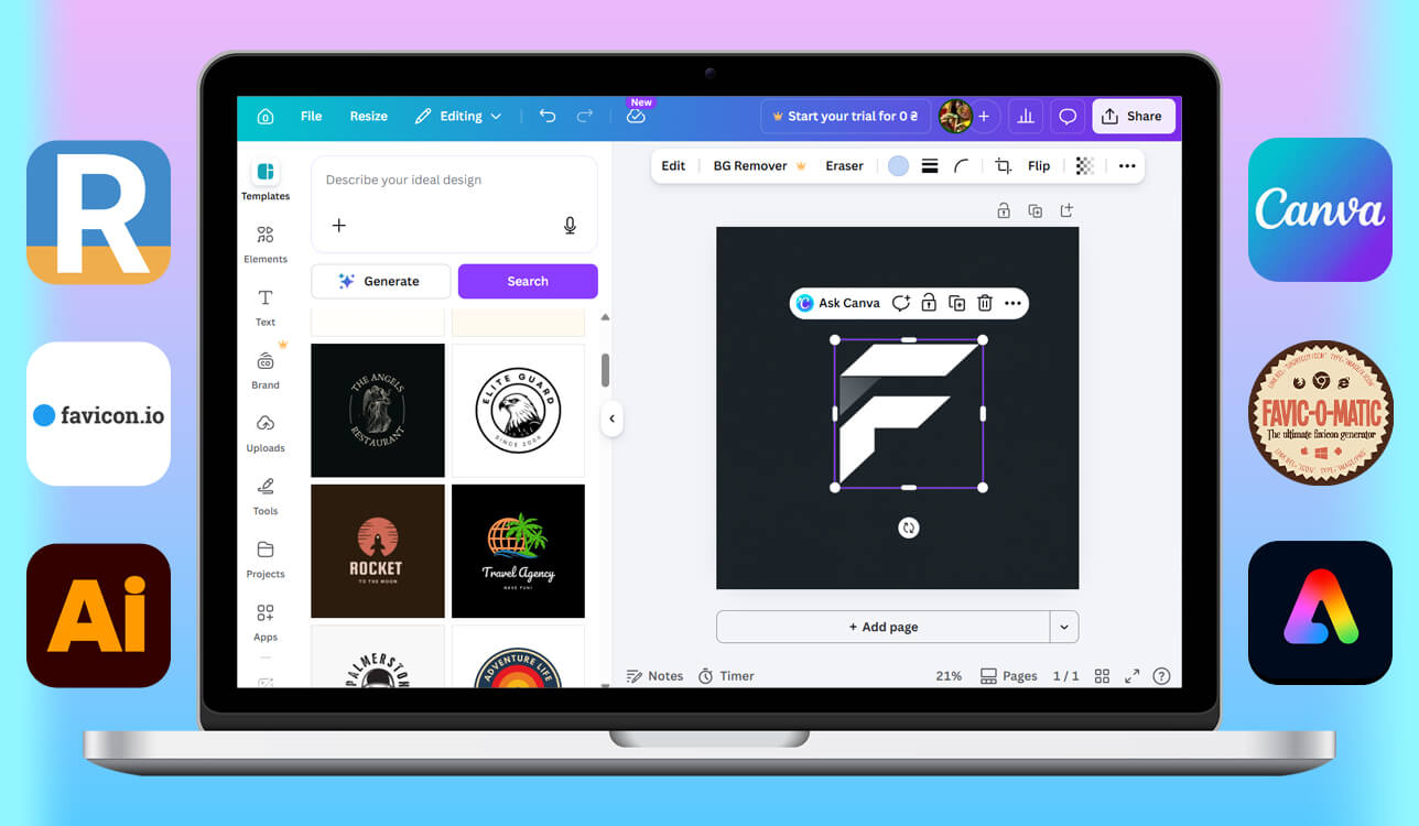
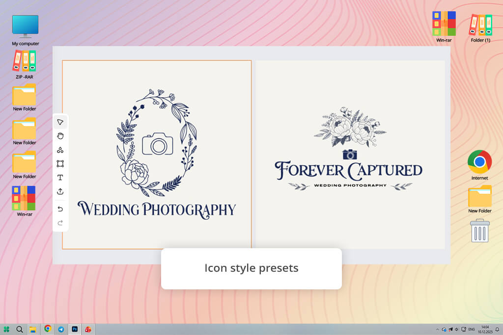
RealFaviconGenerator is built specifically for favicon creation, so it easily performed better than many general AI icon generators I tested. Instead of trying to create a design from scratch, the tool focuses on making sure an existing logo or icon works correctly across real browsers, devices, and platforms.
I uploaded an SVG logo from a recent client project, clicked Generate your Favicons and HTML code, and immediately understood why so many developers still rely on it. The platform approaches favicons as a technical optimization task, not just a visual design feature.
“I usually use RealFaviconGenerator when the logo is already finished, and I just need favicons that work properly across different devices and browsers. It saves time by automatically creating all the required icon sizes. I also like that it instantly provides the HTML code, which makes things easier for developers.”

What really stood out to me was the platform-specific control. During setup, I went through separate sections for Apple phones, Android browsers, Windows tablets, and Safari pinned tabs on Macs. In the Apple section, I tried a see-through icon and found a feature to add a plain colored background - this stops the icon from looking messy on iPhones or iPads.
On the Android side, I changed the padding to keep the logo perfectly centered inside different shapes. That kind of fine-tuning saves a lot of time, especially when a logo has tight spacing between its parts. The design looks a bit old compared to newer smart tools, but everything is laid out so clearly that I never felt lost.
At the end, the tool gave me a single ZIP folder with everything I'd normally have to make myself - all the different image sizes, setup files, and even ready-to-copy code for my website. The coolest part was the live preview. It showed me exactly what my icon would look like in Google search results and browser tabs before I even finished.
For designers who want things done right - not just looking good - this tool feels like the final polish before hitting publish. I'd definitely come back to it whenever I need my icon to look the same on every browser, and I'm not in the mood to mess around with creative experiments.
The FixThePhoto team already uses Canva regularly for quick client mockups, social media graphics, and urgent branding tasks, so testing it for favicon creation felt like a natural step. Instead of uploading a ready-made logo, I decided to start from zero to see how beginner-friendly the workflow actually was.
I searched for Icon templates, opened a square canvas, and within minutes had several editable designs ready to customize. For people who want a simple workflow without learning professional favicon converters, that quick and easy starting point makes the whole process much more approachable.
“The template library is really useful when you need inspiration or a quick starting point instead of working from a blank canvas. I just make sure to preview the icon at a small size before exporting, since some designs include too many details for a favicon.”

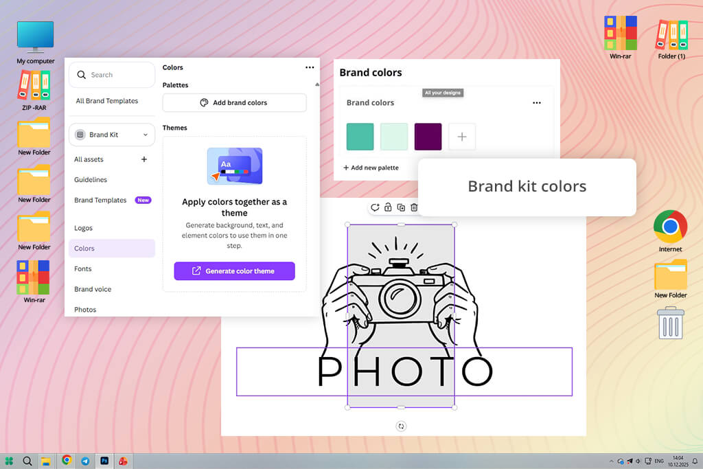
Most of my testing happened inside Canva’s visual editor. I switched out the original icon, updated the colors to fit a client’s branding, and reused saved Brand Kit elements so the design stayed visually consistent. I also tried the Magic Grab feature to isolate part of the graphic and adjust its size and position more easily.
What I like about Canva is how simple and fast the whole process feels. Nearly everything happens directly on the canvas, so I never had to dig through confusing menus or technical settings. The only thing I had to watch carefully was resizing. Some templates looked great at full size but became cluttered or blurry once reduced to tiny favicon dimensions.
Before exporting, I checked how the favicon looked at a very small size to make sure it still stayed clear and readable. After that, I downloaded both PNG and SVG versions for different use cases. I also really liked how easy it was to share the design with teammates and leave comments directly inside Canva, since that matches the fast collaborative workflow our studio often uses.
Even though Canva isn’t built specifically for technical favicon generation, it does a surprisingly good job when you need something that looks modern, branded, and ready to use in just a few minutes.
You might be wondering why Adobe Illustrator is on a list of favicon makers. It's certainly not the easiest choice. If you've never used it before, the interface can look pretty intimidating. But don't write it off just yet.
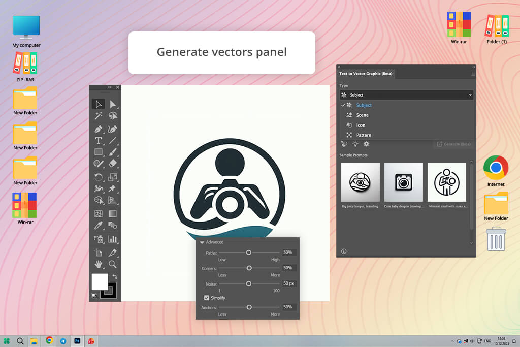
Illustrator now has an AI vector icon generator, and that makes a big difference. I started with an empty canvas, went to Window > Generate Vectors, and tried to see if it could whip up favicon-ready graphics faster than most online tools.
“For me, Illustrator is still the best when I need to make a favicon with perfect shapes. I can get an idea from AI, then fix every curve by hand in a few minutes. It's not the fastest for beginners, but for real work, it's reliable.”
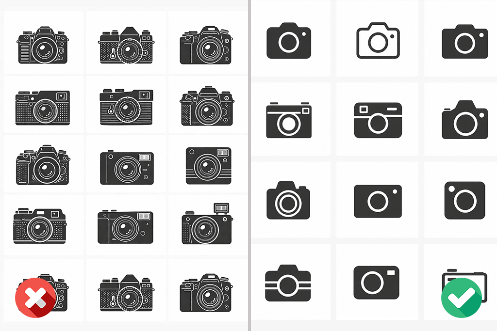
I typed a short description: minimal camera icon for a photography brand. A few seconds later, several vector designs showed up in the sidebar. What I liked right away was that these were actual vectors I could edit, not just static images. I picked one, then used the recolor tool to try darker and lighter color versions to see which showed up best in a browser tab.
Then I opened the layers panel and tweaked individual pieces to make the icon simpler for a very small screen. This is where Illustrator really shines. The AI gives you a quick starting point, but the real power is how much control you have to fix and improve things afterward.
Here's the downside before you even start. Illustrator is still professional software - it takes time to learn, costs money each month, and has way more features than most people need just to make one icon. If your only goal is a quick browser icon, I wouldn't recommend it. But if you already use Illustrator for other work, there's really no need to look anywhere else. You can come up with a design, polish it, export it in SVG or PNG, and deliver a high-quality favicon - all without leaving the program.
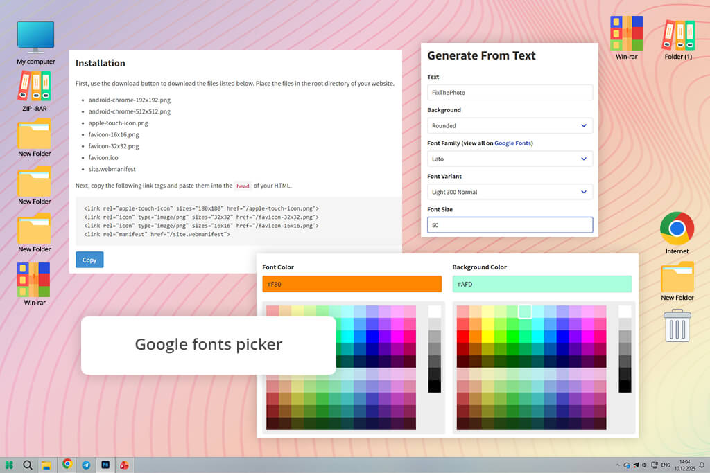
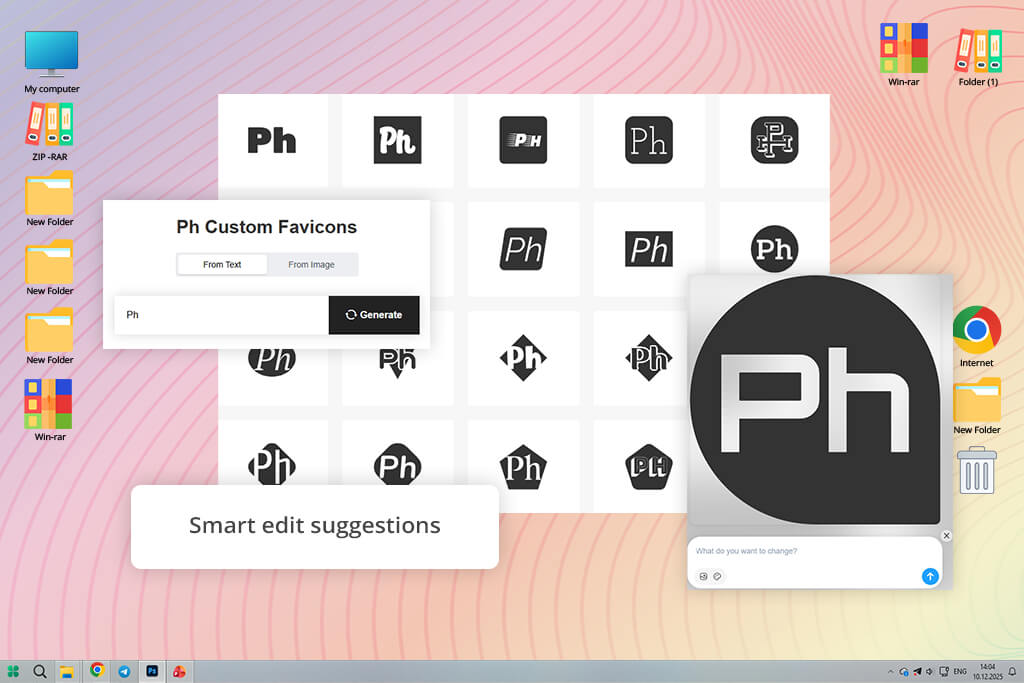
My coworker Tetiana told me about FaviconIO. She used it to make a favicon for her portfolio and said it took less time than deciding what coffee to get. I had to try it myself. Instead of uploading an image, I opened the text generator - this tool is really made for quick icons using just letters, and honestly, that's what most personal brands actually need help with.
“I used this tool for my portfolio because I only needed a simple letter icon, not a full logo. It took me just a few minutes to test different fonts and colors until I found something that worked. For personal websites, that kind of speed and simplicity is really convenient.”

I typed just one letter, picked a thick font from the Google Fonts menu, and then cycled through circle, square, and rounded backgrounds. The preview changed right away, which made trying different options surprisingly fast. I adjusted the color codes to match a soft beige-and-black portfolio theme, and the final icon already looked nicer than many overly fancy AI-generated ones I'd tried before. What really impressed me was how clear it stayed. Even at a very small size, the letter remained crisp instead of getting blurry.
You get a standard favicon set when you download the package, along with larger Android PNGs. Don't expect many advanced controls here - technical users who need custom manifests or deep platform adjustments will hit limits fast. Still, for bloggers, writers, consultants, or anyone launching a simple site with their own brand, this tool removes a real headache with almost zero fuss. Do you prefer speed over complexity? Then I'd recommend FaviconIO without hesitation.
I stumbled across Favic-o-Matic while scrolling through a Reddit discussion about overlooked web tools. At first, it looked a bit outdated - that usually makes me hesitate. But sometimes those random little utilities hide unexpectedly useful features.
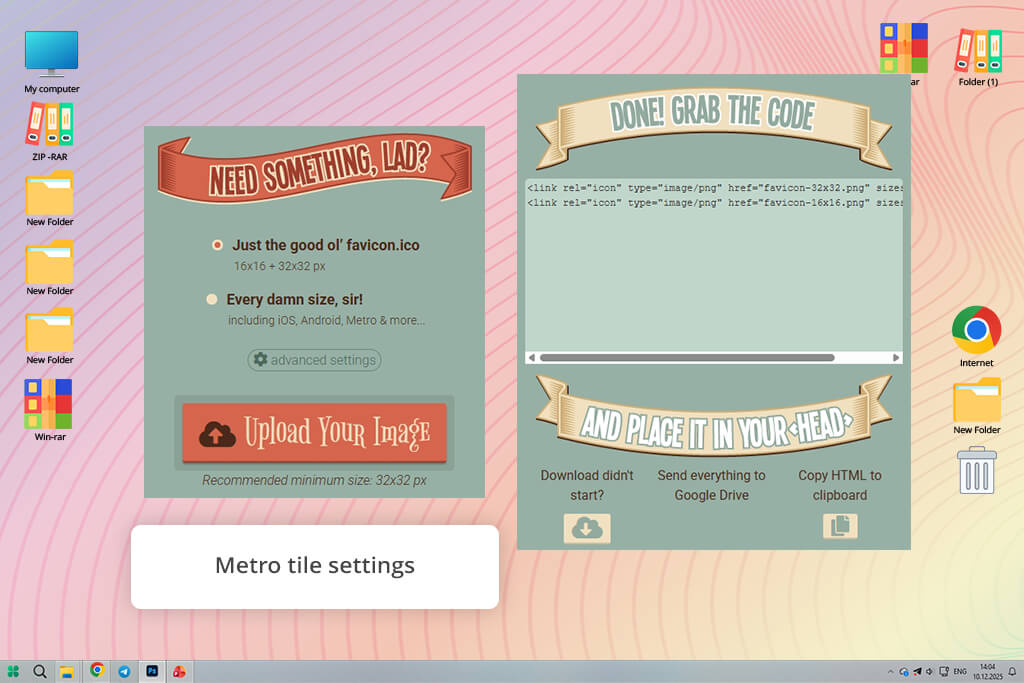
So, I decided to give it a try with a PNG logo that was already web-ready. The whole process turned out to be pleasantly straightforward. After uploading the image, I had two choices: the standard favicon.ico option, or a package with a much funnier name - Every damn size, sir!
I picked the complete package and then peeked into the advanced settings to see what was tucked away. That's when this free favicon generator got more interesting. Without clicking through endless menus, I could adjust Metro Tile options, pick a custom background color, and tweak output settings. It also produced the HTML code needed to install everything - a nice time-saver when passing files off to a developer. Sure, the interface isn't sleek by today's SaaS standards. But it's fast and never slows you down.
One thing was missing - an editor inside the tool. I noticed a tiny spacing issue with my icon, but I couldn't fix it in the browser. I had to change the original file and upload it again. Still, if you already have a finished logo and just need all the favicon sizes for free, Favic-o-Matic works better than many prettier tools. This icon maker feels like it was made by people who care more about good results than good looks.
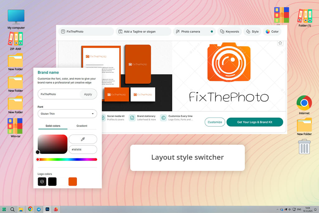
Yes, this is another Adobe tool, but Adobe Express is very different from Illustrator. Illustrator feels like a complete production studio, while Express is made for speed, teamwork, and quick ideas. I opened it thinking it would feel like a lighter version of Canva. Then I wanted to see if it could actually handle real favicon work - not just social media graphics. So, I started with an empty square canvas and went straight to the Text to Vector Graphic.
“Adobe Express is really handy when I need a quick idea before switching to more advanced software. I can try out different colors, generate a few options, and share them with a client later that same day. It's more useful than most people realize.”
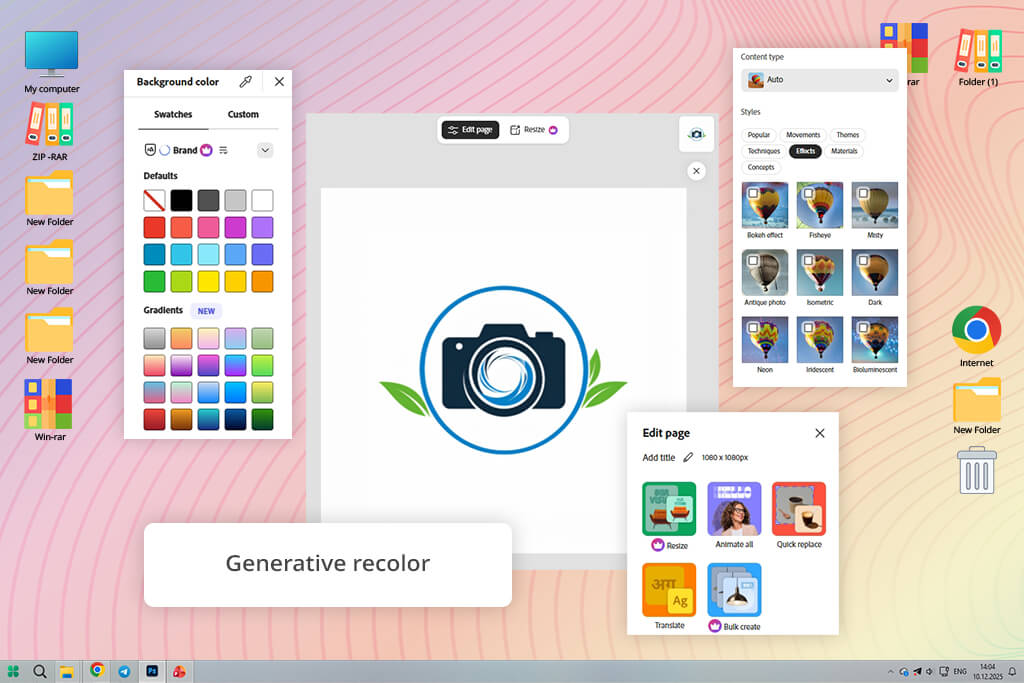
I asked for a simple finance shield icon, and within seconds, I had several clean designs to pick from. What really helped wasn't just the generation but how easy it was to tweak things afterward. I resized parts, cleaned up extra details, and used Generative Recolor to test different color combinations for light and dark branding. That saved me time, because bad contrast is usually what ruins a favicon. The only downside came when exporting. You only get SVG files if you're on a paid plan - otherwise, you're stuck with PNG.
The best thing about Express is how it fits into your workflow. I can make an idea fast, share it with a client, and later open it in Illustrator if I need to do more detailed work. That connection between easy AI design and professional editing is really smart. So, when I need branded favicon ideas quickly - and don't want to worry about copyright like with many other AI tools - I choose Adobe Express.
My coworker Ann found Zoviz for this test and said it looked like a good fit for quick brand assets. I'd never used it before, so I tried it the way any new user would: open the tool, pick a favicon idea, and see how much control it offers without any extra setup. Right away, I liked what I saw - clean, modern, and built around customization instead of confusing technical terms.
“I liked Zoviz because the workflow felt simple and uncluttered. I could quickly adjust colors and layout without wasting time searching through complicated menus. For small business owners who just need a clean, professional-looking favicon, that kind of simplicity is really useful.”
I changed the colors to match a beauty brand, then tried a few different layouts to see how the icon looked in a small square space. That worked really well - switching styles didn't force me to start over, which saved time. I also liked that the design stayed bold and simple instead of getting too busy, which a lot of AI tools get wrong. When I previewed the smaller sizes, some lighter colors didn't stand out enough. So darker shades worked better for browser tabs.
After finishing the design, I exported transparent PNG files in several sizes, which worked well for websites, app shortcuts, and general web use. Zoviz feels built for people who want a polished, branded look without learning complicated design software. It doesn’t provide the same level of technical packaging as developer-focused favicon tools, but for startups, freelancers, and small businesses that need a clean favicon quickly, the overall experience feels simple, smooth, and beginner-friendly.
I normally use Photoroom more for eCommerce product photos and as a general AI tool for designers, so favicon creation wasn’t the first thing I associated with it. But after working with many client logos placed on messy or textured backgrounds, I realized it could actually solve one very common favicon problem much faster than traditional generators. To test it, I uploaded a rectangular client logo with a textured background and immediately started using the cleanup tools.
“I normally use Photoroom for product photos, but it actually worked really well for logo cleanup too. I tested it on a logo with a busy background, and the AI removed everything much faster than I could have done by hand.”
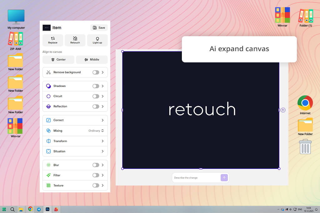
The first thing that impressed me in Photoroom was how clean the background removal looked. The edges stayed sharp even around thin lines, which usually cause messy white outlines in browser tabs. I also tested AI Expand to turn a wide logo into a square favicon without stretching it. Instead of distorting the design, this favicon maker added extra space around the logo so it fit the favicon format more naturally.
I also turned on AI Shadows for a basic symbol. The gentle depth gave it a fresh feel, though I'd use that feature sparingly - adding too much flair can hurt how well it reads when scaled way down. That said, Photoroom isn't a full solution for making favicons because it won't output ICO format on its own. But as a cleanup step before the real work, it's quite handy. If your starting logo has awkward spacing, messy borders, or an odd backdrop, this tool can save it in no time.
I approached LogoAI more as a branding tool than a traditional AI logo generator, since its main focus is clearly to turn an image into a favicon. Because of that, I was curious to see whether its AI-generated designs would still work well once reduced to tiny favicon sizes. To test it realistically, I followed a simple beginner-style workflow: entered a brand name, selected an industry category, and let the AI automatically create logo concepts from scratch.
One thing I really liked about LogoAI was how it helped refine designs automatically. I chose a coffee-inspired logo, and the platform suggested small improvements like cleaner lines, slight shape adjustments, and extra visual details to make the icon stand out more clearly. Those kinds of tweaks become very important when a logo is reduced to favicon size. After choosing the final version, the system automatically optimized the layout and generated a full ZIP package with all the necessary favicon files, including Apple Touch icons, Android Chrome sizes, and standard browser formats.
This online favicon generator understands branding users who need more than just a small browser icon. The platform is built around creating a full visual identity, and I noticed useful guidance about square layouts and search visibility that many simple favicon generators never mention. At the same time, some AI-generated concepts started out slightly too detailed. I had to simplify one logo before it stayed sharp and readable at a tiny 16×16 favicon size.
RecraftAI stood out to me because most AI image generators still create pixel-based images first, which isn't great for making favicons. I wanted to see if a platform built around vectors could save me time, compared to creating an image somewhere else and then tracing it by hand later. So, I jumped right in with a request: simple triangle-shaped fox face, solid orange emblem.
I chose the Icon style instead of the normal Illustration mode. That small change really helped. The designs came out much cleaner - simpler shapes and no extra fuss. Most AI tools give me the opposite. Then I opened one design, adjusted its size and shape, and exported it as SVG. I also tried their AI Image Vectorizer. It worked well, except for one tiny corner. That needed a quick manual fix.
I also liked that I could sketch an idea, keep it easy to edit, and then turn it into a favicon right away. RecraftAI is great for designers who want clean files. It's not as fun and simple as template tools. But if you need vectors that can scale to any size, this tool fixes something most AI favicon makers still get wrong.
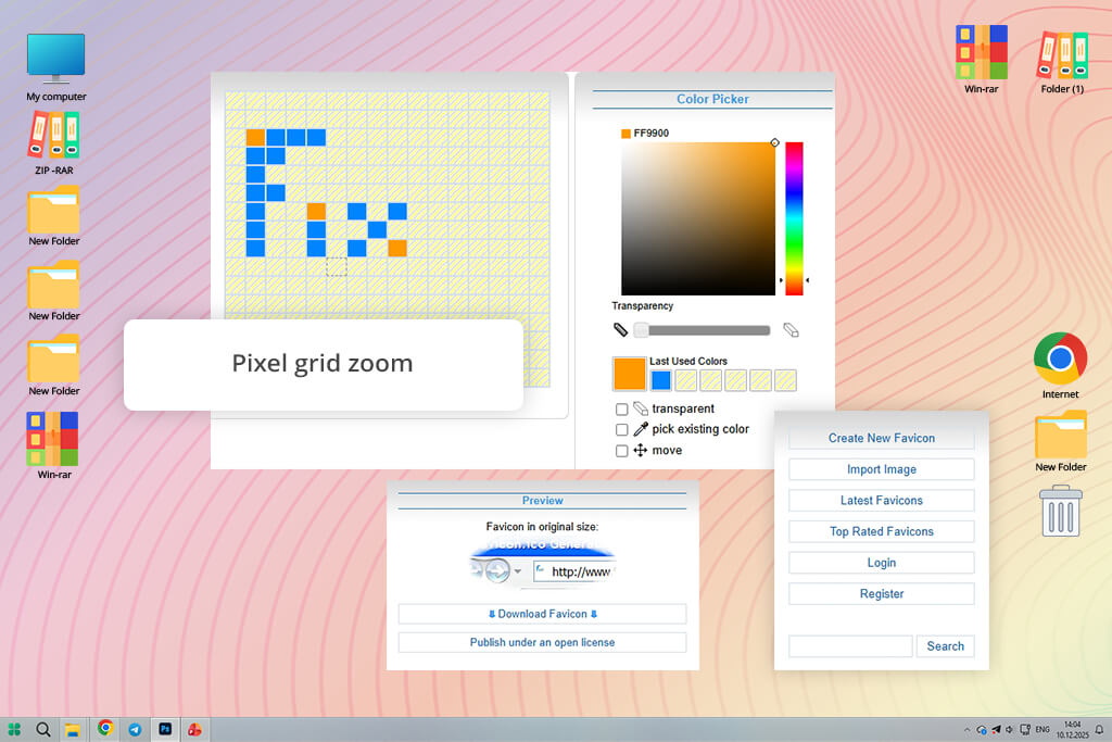
FaviconCC feels old-school - and that's a compliment. These days, most platforms rely on AI to do everything for you. But this one just hands you an empty pixel grid and puts you in charge. I thought I'd only test it quickly, but I actually had fun. It turns making a favicon into a real, hands-on design instead of letting a machine do all the work.
I started with the classic 16×16 canvas, chose a dark teal color, and built a small camera icon pixel by pixel. The zoom feature made it much easier to work on tiny details like corners, spacing, and line alignment. The process is definitely slower than using AI-based tools, but the level of control is hard to match if you want every element placed exactly where you need it.
After exporting the favicon, I explored the community gallery and found a lot of creative retro-style icons built with only a few pixels. That gallery adds inspiration and makes the platform feel more engaging than a basic favicon editor. The biggest limitation is export flexibility, since the tool mainly focuses on the traditional 16×16 ICO favicon format.
To properly evaluate favicon generators, the FixThePhoto team approached them as real production tools rather than simple novelty apps. Even though a favicon is a very small graphic, it still affects brand recognition, browser visibility, mobile shortcuts, and overall website appearance in search results. That’s why we tested each platform with the same practical objective: to create a favicon that stays sharp, works correctly across devices and browsers, and meets modern web standards.
The first thing we tested was how well the favicons held up at very small sizes. Many designs looked great in large previews but became unclear once reduced to 16×16 or 32×32 pixels. We checked whether the icons were still easy to recognize, if the text stayed readable, and whether important details disappeared after scaling down. We also paid attention to things like spacing, contrast, and how balanced the design looked inside a small square canvas.
After that, we looked at how smooth and easy each tool was to use. Tetiana checked how fast a beginner could get started, whether the editor made sense without instructions, and if important settings were easy to spot. For AI-based platforms, she tested how well the prompts worked, how much freedom you had to change things afterward, and if the results required a lot of fixing. For manual editors, she focused on control, how quickly the tool responded, and how simple it was to adjust very small details.
Ann Young also focused on export quality and technical usability. She checked which file formats each tool supported, including ICO, PNG, and SVG, along with available icon sizes, transparency support, and whether the exported files were ready to use on a real website without extra cleanup. When possible, she also reviewed generated HTML code, manifest files, and browser compatibility features.
In the final stage, we focused on real-world usability. Some tools were perfect for quickly launching a website, while others gave designers and developers more precise control over the final result. I compared how fast and easy each platform felt, how much customization it offered, and whether the free versions were actually practical to use. The rankings came from hands-on testing, not promotional claims. The main question was simple: which tool could reliably create a favicon that looked professional and was genuinely ready for a real website?


![Top 7 Bookmark Makers [Printable & Custom]](/placeholder-450x300.svg)


