For me, as a photographer, Instagram works as my main online portfolio. Most potential clients check my profile first, scroll through a few posts, and quickly decide whether my style suits them. While my feed looked strong, the highlight section told a different story. So, finding an Instagram highlight cover maker that fits my visual aesthetic became a priority.
Because first impressions are so important in photography, that messy look felt unprofessional. My covers didn’t match, the colors were inconsistent, and the icons didn’t clearly represent my work. That’s why I decided to test 40+ Instagram highlight cover makers recommended by colleagues and forum users.
I wanted my highlights covers to look simple, minimal, and timeless rather than busy or overly decorative. Because these icons appear very small on a profile, each symbol had to remain clear and easy to recognize. I also wanted precise color control so the shades could align with the tones in my photography and overall brand identity.
The goal of the project was to organize my work so potential clients could easily understand it. I planned separate highlights for weddings, portraits, behind-the-scenes shoots, client feedback, and travel projects. Each cover needed a different icon, but they all had to follow the same visual style.
Ultimately, I needed a tool that allowed one design style to be used across all highlight icons. I wanted to copy a layout, replace symbols, and change color tones quickly without rebuilding each cover.
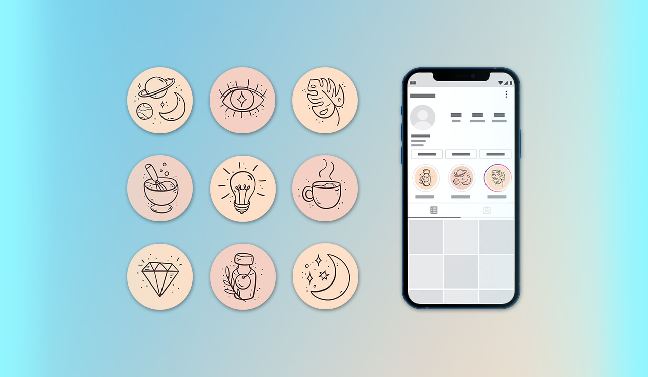
Size & aspect ratio. Instagram highlight icons appear as circles on your profile, but they should be uploaded as square images. The ideal size is 1080 × 1080 pixels with a 1:1 aspect ratio, which keeps the image clear and prevents important elements from being cropped.
Safe zone (very important). When Instagram turns the image into a circle, only the middle part remains visible. To avoid losing important details, place icons, text, or symbols within the central 60–65% of the design. Elements near the edges may be trimmed off.
File format. The most suitable formats are PNG and JPG. PNG works best for clear icons and transparent backgrounds, while JPG is fine for simpler visuals. If you want sharp edges or flat symbols, PNG is usually the better choice. Also, avoid strong compression so the image stays clear and not blurry.
Icon & text size. Because highlight covers appear very small on mobile screens, it’s best to keep the design simple and bold. Small text, thin lines, or detailed graphics are difficult to see. A single clear icon or simple symbol is usually the most effective choice.
Color & contrast. To keep the cover easy to see, use a strong contrast between the background and the icon. Soft pastel colors can work, but the icon still needs to stand out clearly. It’s also a good idea to check how the design looks in both light and dark Instagram modes.
Visual consistency. Keep all highlight covers in the same visual style. Use similar colors, icon line thickness, and background types for each one. A consistent look makes your profile appear more professional and well-organized, while mixed styles can make it seem cluttered.
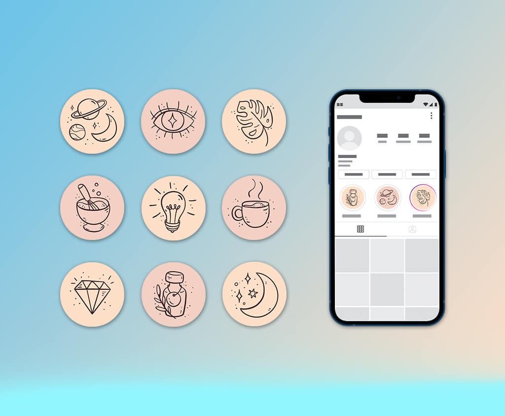
Branding alignment. For a personal brand or business account, highlight covers should match your brand colors and overall style. Even very simple designs should connect visually with your feed and profile picture. This helps create a clear and recognizable identity.
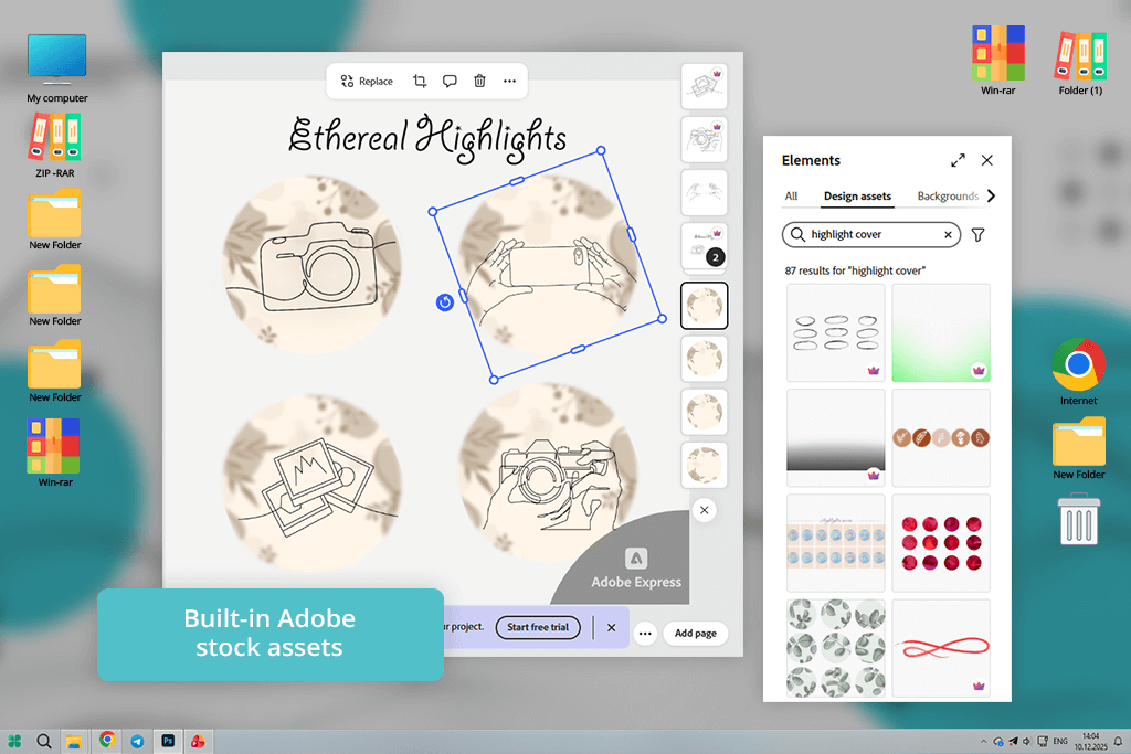
Right when I opened Adobe Express, I could tell it was made for people who want things to look good quickly and don’t want to struggle with complicated tools. I picked a simple circle template and instantly changed the colors to match my photography brand.
The color tools were super easy to use and really accurate - no messing around with color codes. What I loved most was the preview. I could see exactly what the icons would look like in those tiny Instagram circles, so there were no ugly shocks later.
When I created covers for different categories like weddings and portraits, the minimal icon library became my go-to. It kept everything looking clean and put together. I could quickly group my projects and copy styles. The export process was hassle-free, and I was happy to see the image quality stayed perfect, even after Instagram compressed it.
“The templates were already nice and simple, so I basically just picked my colors and icons. The best part? The quality didn’t drop after uploading to Instagram.”

What also stood out was the built-in design help. When I made a graphic that felt too busy, the Instagram highlight cover creator offered suggestions to fix the spacing and alignment. It basically guided me toward a more professional look without being pushy. This was a lifesaver whenever I doubted whether an icon would be clear at a smaller size.
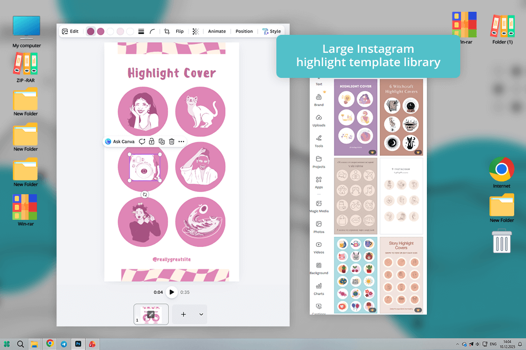
Right away, Canva felt easy and familiar. I went straight to the highlight cover section and found lots of styles that matched my photography look. I didn’t have to search around for icons - everything was organized so I could quickly try different ideas. It was simple to add my own brand colors and swap things out until it felt just right.
The real fun during testing was playing with layers. I could take a simple icon, put a soft circle behind it, and lower the opacity - just small tweaks that made the whole thing pop. The tool was flexible enough to let me experiment freely, but simple enough that I never felt lost. Instant previews meant I never lost my creative rhythm.
“I was impressed by all the icons available, and it was a breeze to match my feed’s colors. Had a full set done in under 15 minutes.”

I ended up making a few versions of the same cover for different series on my page. Copying designs and switching icons was very simple. It made all my highlights match perfectly, which really helped make my profile look cleaner and more organized. Saving the covers was also very simple - just one click, and they were ready to upload to Instagram without extra steps.
I tried Fotor because I wanted something focused on photos, and its highlight cover maker worked really well for that. I started by uploading some of my own icon designs and used Fotor’s enhancement tools to clean them up before placing them in circular frames. The image quality stayed high, even after I resized and layered them.
While checking out templates, I came across styles that really clicked with my brand. The variety was great - some bold, some softer - so I could easily match covers to specific themes, like weddings or portraits. Color adjustments felt natural, and the shadows and overlays added a nice touch that made the icons look more intentional and connected to the design.
“Fotor’s customization options let me adjust contrast so the icons stayed clear inside those tiny circles. It took a little more tweaking, but the end results looked more professional.”
I was surprised by how simple it was to test different contrasts. In just a few seconds, I could swap backgrounds from light to dark or try different colors. It saved me from that common problem where something looks fine on a big screen but gets lost at a small size. Plus, the exports stayed crisp; no blurriness after Instagram compressed them.

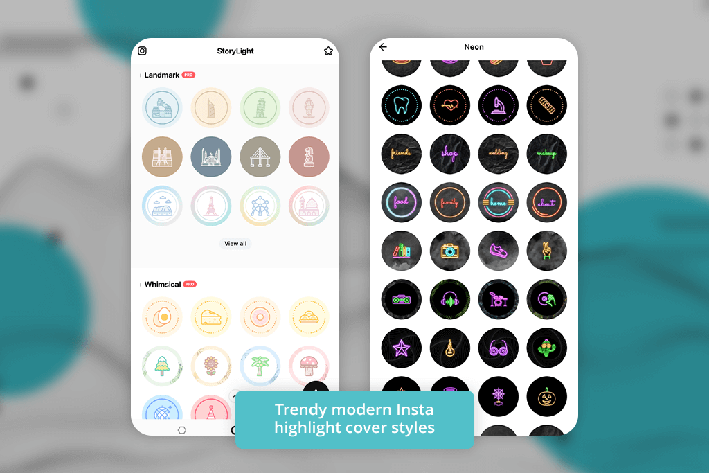
StoryLight honestly felt like it was built for people like me who create social content but don’t want to stress over design. Right when I opened it, there were all these clean templates already, the exact size for Instagram highlights. Way better than starting with a square and trying to cram it into a circle later - I could just build on something that already worked.
I tested it by building covers for different categories like Weddings, BTS, Reviews, and Travel. What made it fast was how easy it was to swap icons - one click replaced the symbol while keeping everything else in place. That speed mattered when I was working on dozens of covers at once for a full profile update.
“This was perfect for when I wanted something simple and story-driven. You could tell the designs were made with Insta highlights in mind - no resizing, no guessing how they’d turn out.”

Overall, this app for Instagram Stories turned out to be a good option for creating quick, social-ready highlight covers without needing advanced design skills. It isn’t the most powerful editor, but it makes it very easy to produce clean and stylish covers. That’s exactly what I needed when I didn’t want to spend too much time thinking about every small detail.
When I opened Lovart, I immediately noticed its templates felt creative and full of style. I wasn’t searching for simple pictures - I wanted my covers to have some personality, and this Instagram photo editor gave me that feel. I picked a few abstract backgrounds and placed simple symbols on top that stayed easy to see even when scaled down.
What I enjoyed was experimenting with textures and background gradients until the look felt right. Some templates used light and shadow creatively without becoming overwhelming. That added extra life to categories like “Travel” and “Behind the Scenes.” It was a nice break from the usual generic icon designs.
“Lovart’s icons felt artistic and not like everyone else’s. Sure, it took an extra minute to land on the right one, but the end result felt super personal.”

One thing that made Lovart one of the best Instagram highlight cover makers was how simple it was to build themed sets. If I wanted one series to feel dramatic or moody and another to be bright and playful, I could do both in the same app. That flexibility made a big difference in keeping my brand consistent across different types of content.
This content creation app feels designed specifically for creating beautiful highlight covers. When I started using it, the process was very simple - choose a style, customize the icons, adjust the colors, and the design is ready. There’s no complicated learning process or hidden tools, just a clear and easy workflow.
“This tool felt very simple and focused. I selected an icon, adjusted the color, and exported the cover. It’s not packed with advanced features, but it works quickly and efficiently.”

I tried different visual directions, from soft pastel minimal layouts to bold graphic sets. No matter the style, the tool automatically positioned everything neatly in the center of the circular frame. It may seem like a small detail, but it makes a big difference when the covers appear on Instagram.
Using Kittl felt like opening a small design studio directly in my browser. With free vector graphics software, I had far more control than expected and could even create a custom Instagram highlight cover from scratch. By starting with basic shapes and text, I built simple motifs, and the designs stayed perfectly sharp even at small sizes.
“The typography and icons looked very polished, which works well for brand-focused profiles. The tool feels more design-oriented, so I spent extra time refining details.”

The illustration and font collection was one of my favorite things, definitely more creative than the usual stock stuff. I could remix things, and it actually felt unique, not like I was just filling in a template. Plus, exporting sharp PNGs with transparent backgrounds? Awesome. Makes them ready for merch or other brand stuff down the road.
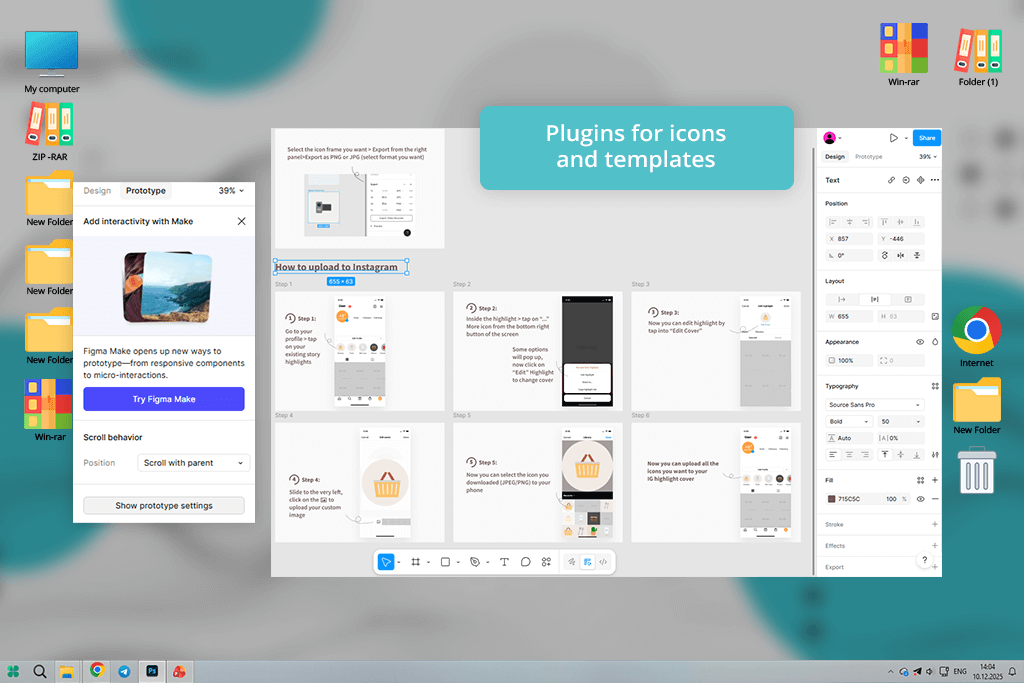
Figma isn’t made as Insta highlight cover maker - it’s primarily part of the web design software. However, that gave me complete creative freedom. I began by placing a circular frame as the base and then built icons from scratch using vector tools. While it took a bit more effort at the start, the accuracy was impressive - every element aligned the way I wanted.
“If you want full creative control, this is it - but it comes at the cost of speed. Perfect if you already have a strong brand identity and don’t need hand-holding.”

The real fun was creating reusable components. I’d design an icon once, save it, and then drag it into any new cover. That kept my whole set consistent without all the manual copying and pasting. And when I wanted to make changes later? Just update one component, and it automatically updates everywhere.
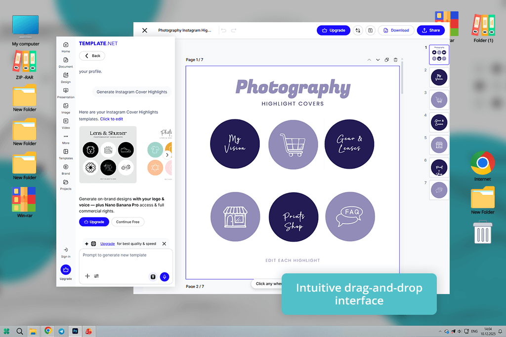
Opening TemplateNet felt like stepping into a massive collection of graphic design ideas. I scrolled through many highlight cover sets and quickly found several that fit my brand’s feel right away. It was enjoyable to browse and sample different styles without having to start from a blank page.
“Great pick if staring at a blank canvas isn’t your thing. The templates were nice and clean, and tweaking them was a breeze.”
Once I settled on a style, customizing felt smooth - changing colors, swapping icons, and adding text all flowed easily. I appreciated that the templates didn’t feel generic; they seemed like thoughtfully curated sets that actually worked together. That saved me from staring at a blank screen, wondering where to start.
Visme came across as an app made for carefully planning your message. I began by roughly drawing concepts for different highlight groups, then brought those drafts into the software. Its alignment guides made arranging text and pictures feel natural, even before I checked the Instagram-sized preview.
“Adjusting elements was simple, and the colors stayed accurate after export. It worked well for creating a full set of highlight covers that matched my feed and looked polished.”

Being able to store color palettes and apply them across different designs made branding much easier. I didn’t have to choose the same colors again each time, and everything stayed visually consistent. As a result, the highlight set looked cohesive and thoughtfully planned rather than random.
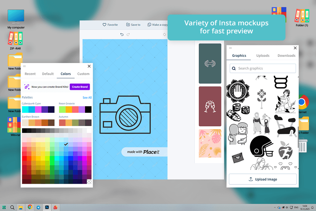
What I loved about Placeit was the mockup-first approach. No more designing icons in isolation using free Adobe software - I could preview them right away on realistic mobile UIs. That real-world view made every adjustment feel purposeful. Getting the spacing, contrast, and size right becomes much easier when you can see the design in context.
“This highlight photo maker focuses on speed and quick previews. The customization options were simple and easy to use.”

I began testing with a few pre-made sets that fit my photography style. I swapped out the placeholder icons for my own symbols and matched the colors to my brand. The presets took care of alignment and spacing, so I didn’t have to guess. It felt like the hard work was already done for me.
We tested the best Instagram highlight cover makers the same way any creator would. Our main focus was on three things: whether they helped maintain a consistent brand look, how simple they were to navigate, and the overall quality of the finished covers.
The FixThePhoto team - Tani Adams, Eva Williams, and Nataly Omelchenko - each brought a unique perspective from photography, social media branding, and graphic design. That combination allowed us to assess every tool from multiple angles and stay unbiased.
We began by setting up a realistic task: creating a complete set of highlight covers for a personal brand Instagram account. Every tool was judged on template quality, icon libraries, color options, text control, and how well designs stayed clear in Instagram’s small circular format.
For instance, we looked at how Adobe Express and Canva handled scaling icons and contrast, while apps like Placeit and story-focused tools were tested for real-time previews and speed.
Next, we checked how fast and flexible each platform was to work with. Some tools we tested for quick, template-based designs, while others we pushed further by building custom covers from scratch.
Eva looked at how well each tool kept the look consistent across different highlight categories. Tani tested, how quickly someone with no design background could finish a full set. Nataly focused on export quality and how the covers actually looked after being uploaded to Instagram.
Finally, we uploaded every design to test accounts and saw how the covers actually performed in real life. We checked sharpness, color accuracy, and whether the icons stayed clear on different screen sizes.


