What separates the members of the vibrance vs saturation battle? Which tool you should tweak in which situation? Which one is better for color grading? In simple terms, saturation is responsible for improving all the colors while vibrance is its more nuanced counterpart.
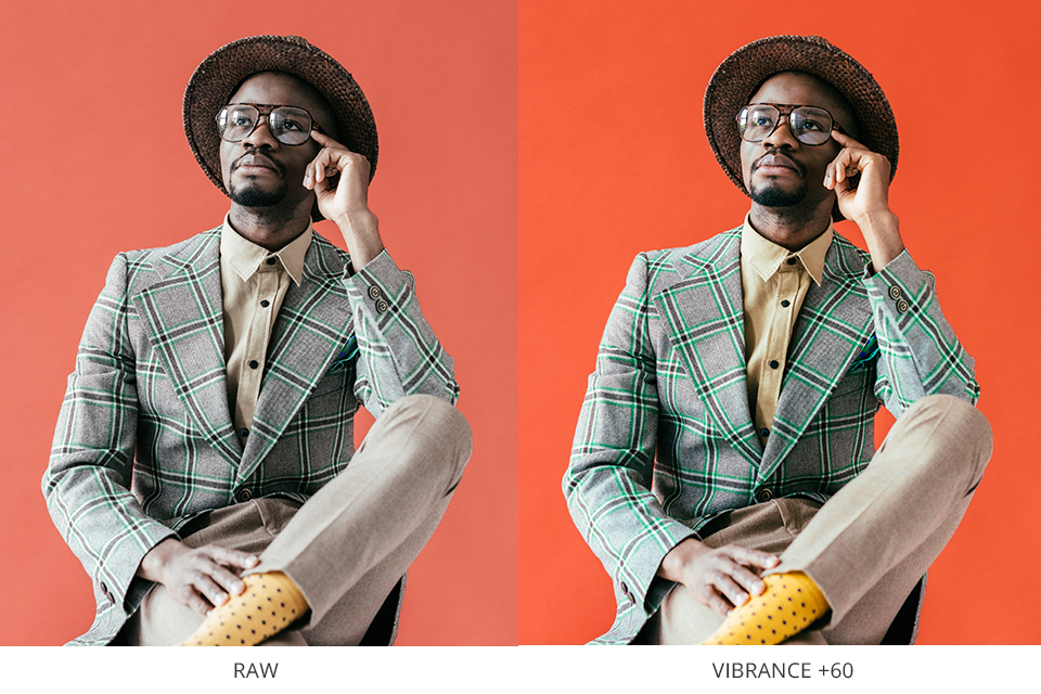
Vibrance is an intelligent feature that boosts the intensity of duller tones while leaving the already saturated colors unchanged. This tool is also useful for ensuring the skin color remains properly saturated and looks natural.
Essentially, by adjusting the Vibrance setting, you can boost the intensity of blander colors without affecting the parts of the photo that already have rich, crisp colors.
How efficiently you use this tool depends largely on how robust your software is. Adobe Lightroom is a terrific piece of software that is used by professional photographers all around the world.
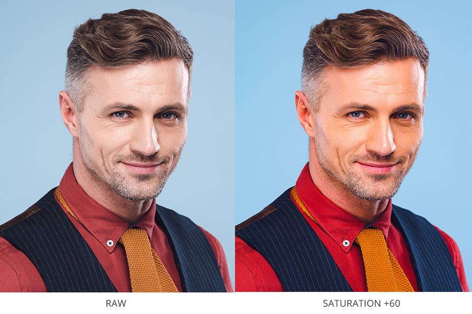
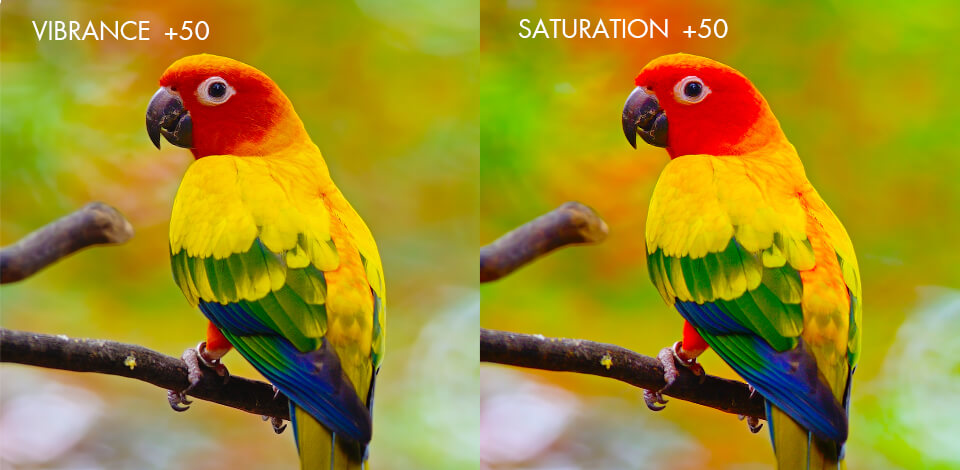
The simplest way to describe Saturation is that it affects all the colors present in a photo regardless of their current intensity. In contrast to other color correction tools, this one increases or decreases tone intensity equally on all areas of the image.
As a result, you need to adopt a mindful approach when using Saturation since if you go overboard with it, the result will look unnatural and jarring.
Adobe Lightroom is available as desktop and mobile software, with both options being equally robust. The task of adjusting color intensity in Lightroom is also pleasantly simple and intuitive.
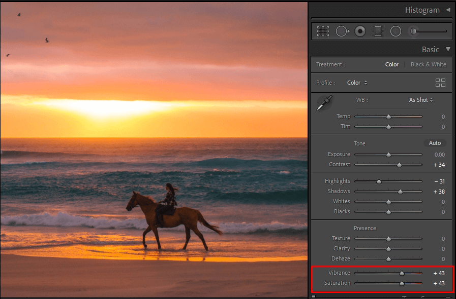
Once you’ve imported a photo, go to the Develop tab and find the Basic toolbar at the rightmost side of the workspace.
The Basic menu includes multiple adjustment sliders with the bottom two being Vibrance and Saturation. By moving either one of them, you can boost or reduce the color intensity to make your photos look more appealing and professional.
Complementary colors in photography are a fascinating and important concept that all professional photographers have to keep in mind. Color theory discusses how different colors are perceived by a person’s psyche.
All colors can evoke a specific reaction or connotation from the person viewing it. For instance, vibrant red usually provokes excitement while light blue is more relaxing.
The colors you employ for aesthetic photography will affect how the audience perceives your images. If the colors in your photos will be oversaturated despite it being a more solemn scene or if your exciting image lacks lively colors, the message of your work will be lost on the viewers since the depicted colors will contradict the subject.
The ability to utilize both tools described in this vibrance vs saturation comparison correctly can have a huge impact on your success as a photographer. The least you can do is follow these two rules:
However, if you don’t have the time to edit the photos yourself and you need a higher quality result, I suggest you make use of a color correction service that is designed for photographers that want quick professional results.
If you can’t spare the time or lack the skills to adjust shadows and highlights, fix white balance, and tweak other color settings of your images, FixThePhoto can fulfill all your needs with maximum speed and efficiency.
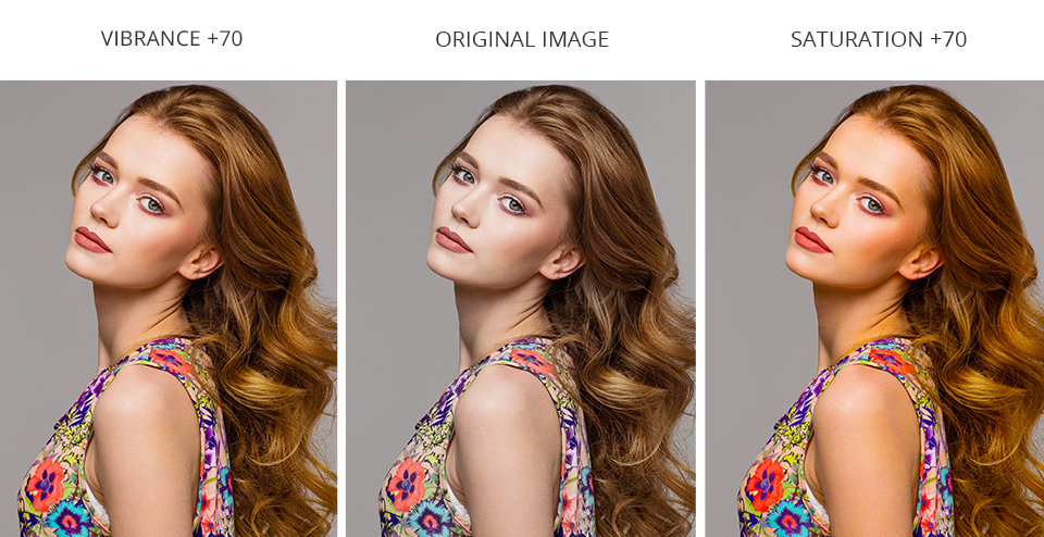
The Saturation tool affects the color intensity and encompasses all the tones of a photo. The Vibrance tool is a more fine-tuning-oriented feature that only increases the saturation of image areas that lack color, ensuring all tones are equally vibrant and boosting the intensity without overwhelming the composition.
Once you get to know both participants of the saturation vs vibrance battle better, you’ll learn how to use both tools efficiently. You’ll also figure out which feature is more useful for your specific photography style and retouching approach.
For instance, portrait photographers tend to prefer the Vibrance tool since it keeps the skin color intact. Meanwhile, many macro photography ideas require the Saturation tool to ensure all details of the subject stand out equally.
Instead of editing your photos manually, including adjusting the vibrance and saturation, I suggest using these presets. This package is universal and can be used for all main types of photography.
The bundle contains over 500 filters that can be used for editing RAW and JPEG photos. You can use them in Lightroom 4-6, CC, Classic, and Lightroom Mobile.