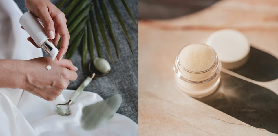
Catalogue photography is a subgenre of product photography that focuses on taking pictures that are later included in digital and printed catalogues.
Its goal is to produce photos that attract and keep the attention of the viewer, generate interest in a product, and look more eye-catching than what the competitors can offer.

A popular suggestion that is included in every product photography tutorial, is that you have to adjust your catalogue ideas to match and attract your target audience.
For instance, B2B (business-to-business) and B2C (business-to-consumer) catalogues should be done in drastically different styles.
Catalogues targeting younger audiences won't have the same style of photos as catalogues for the older demographic. The viewers need to feel a certain affinity to your catalogue images, as they have to resonate with some part of their personality or needs.

Needless to say, it’s incredibly important to choose product photography backdrops
that make your product more appealing rather than detract from it. Stick to an empty white backdrop if you’re doing Amazon product photography.
Some subjects look better against a dark backdrop or a specific color that goes well with your brand’s identity. If your brand is associated with fun, you can consider choosing some brighter colors.
If you’re a fan of retro glamour, you might want to choose a B&W or sepia tone. The backdrop color can stir different emotions so think carefully about what you want your potential customers to feel. For instance, a well-chosen background can ensure your makeup product photography looks expensive, while a poorly-chosen backdrop will make your products come across as tacky.

It might be a good idea to add product photography props or decorations to make your product more appealing or showcase your brand’s identity.
Some plants can breathe new life into your catalogue photographs while adding a sense of freshness to them. Alternatively, if you're selling something like sustainably-produced soaps, placing your product on a wood dish, or another similar item, you can convey the connection your products share with nature.
If you’re taking photos of small subjects or ones that can’t stand up on their own, add a prop to support them. Such a trick is particularly relevant when photographing jewelry. For instance, you can hang earrings on a jewelry hook or put a box behind books to keep them propped up.
Pro Tip
When choosing props for your catalogue photography, don't go beyond three objects. If you add more props, your photos will look too busy and detract from the product which should be the sole focus of the user’s attention.
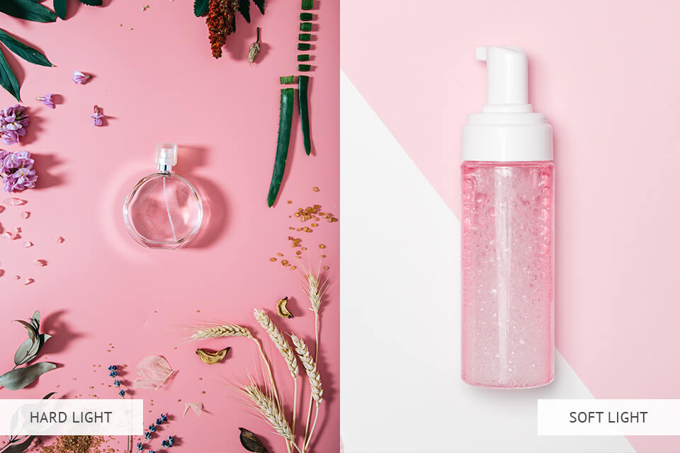
It doesn’t matter how expensive your gear is – if you take photos in poor lighting, your photos aren’t going to look catalogue-worthy. Keep in mind that a studio lighting kit allows you to create one of two lighting setups:
Soft lighting – this type allows you to enjoy a subtle halo-like effect that illuminates the product from all sides. Such lighting is great at emphasizing all the details of an item and getting rid of rough shadows that can obscure different elements and edges of the object. Soft lighting is a particularly great fit for 360 product photography.
Hard lighting – this type creates a starker contrast between the light and the shadows. Harsh lighting adds more profound edges to the subject’s shadows and makes them more defined. This style is a good choice if you want to make your photos more dramatic or dynamic.
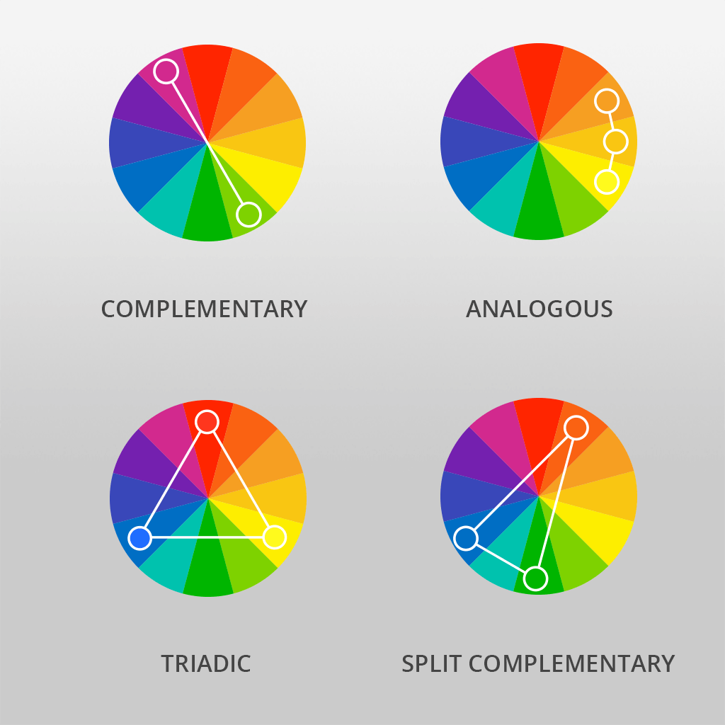
Color theory is an essential tool for lifestyle product photography, as it can be used for attracting your target audience by taking more aesthetically pleasing photos. With the help of the color wheel, you can pick between 4 color combination types for your catalogue photoshoot.
The complementary method involves you choosing hues opposite to each other. As a result, you'll put together a dramatic and dynamic color scheme that you can use to add a lot of contrast when taking product photos.
Split complementary is similar to the complementary but isn’t as daring and easier to create. Once you choose a pair of opposite base colors, also add a pair of adjacent hues to the original ones.
The Triadic method employs tones that are evenly spread out across the color wheel. The result is a variety of vibrant hue swatches that look eye-catching and lively.
Analogous style includes colors that are located nearby on the color wheel. This method allows you to put together a color palette that evokes the feelings of comfort and harmony.

Customers pick one product instead of another because they believe they’ll be happier by paying their hard-earned cash by acquiring that specific product or service.
Cultivating interest in your product and enticing potential consumers to purchase it means you have to speak to the client’s desire to attain a specific lifestyle via your lifestyle product photography.
Let the consumers see how your product can enhance their lifestyle and you’re bound to witness a dramatic increase in sales. Structure your catalogue photography around a specific lifestyle or concept. This can be done by either incorporating an overarching theme or dividing the catalogue into separate mini-themes.

Another technique you can use during your catalogue photoshoot relies on including negative space in your shots. Negative space photography lets the subject breathe and makes it easier for you to compose more balanced, eye-catching shots.
The most important thing to remember when adding negative space around your product is that it’s your job to ensure the subject remains the primary focus of the composition and isn’t overpowered by the emptiness around it.
Additionally, the negative space included in your product photography ideas can later be used for adding graphics, text, and other visual elements designed for promoting your offer. When browsing through a magazine next time, pay attention to the product’s placement and how negative space is employed for providing brand-relevant info.
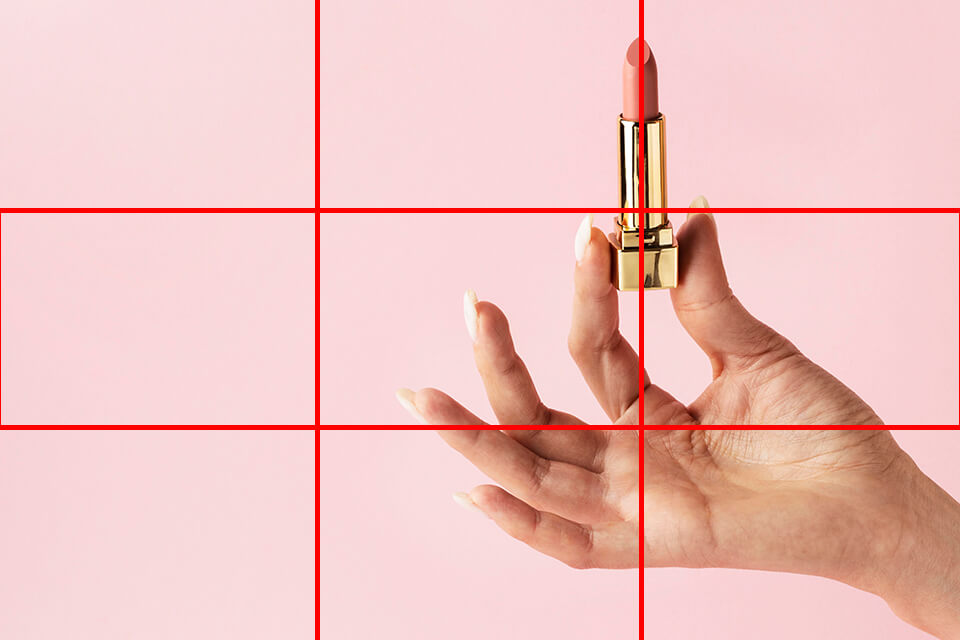
You can create the perfect composition by placing the product in a location that is bound to instantly grab the customer’s attention. Employ the rule of thirds in photography principle, which entails breaking up the photo into 9 equal parts and then placing the subject at one of the 4 intersection points.
As a result, you’ll produce a nicely-balanced picture that invites the viewer’s eye to naturally explore the photo. The majority of modern digital cameras are equipped with a feature that allows you to break up the image in the viewfinder into the aforementioned 9 parts.
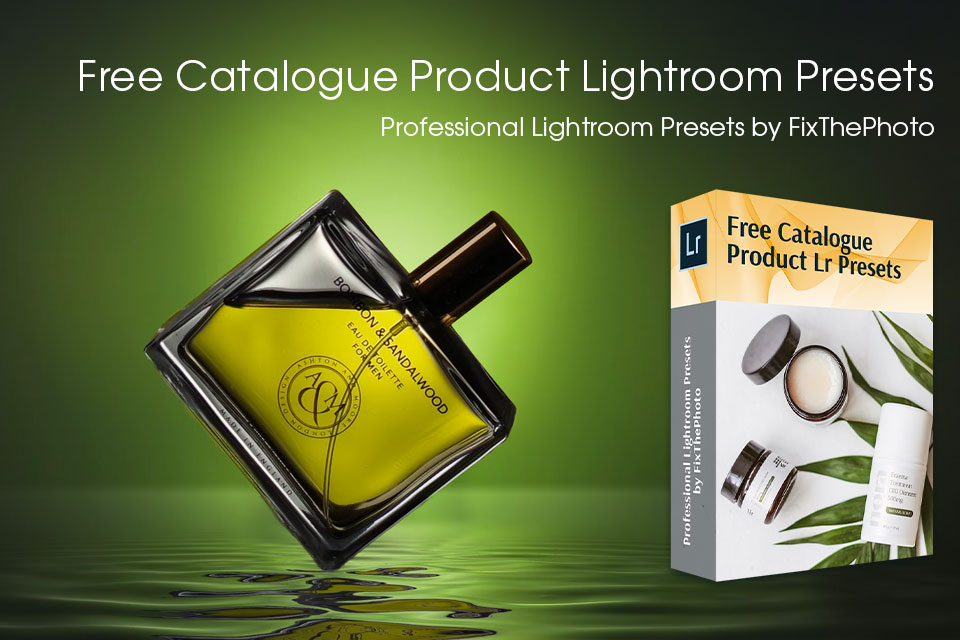
You can take advantage of the provided tools to improve the lighting, improve colors, adjust white balance, tweak the contrast and shadows, and much more. In just a few clicks, you’ll ensure your catalogue photographs look professional, natural, and eye-catching.
Given the ability to batch edit in Lightroom, this bundle offers a time-efficient and convenient method for quickly enhancing large collections of product photos that were taken in similar shooting conditions.