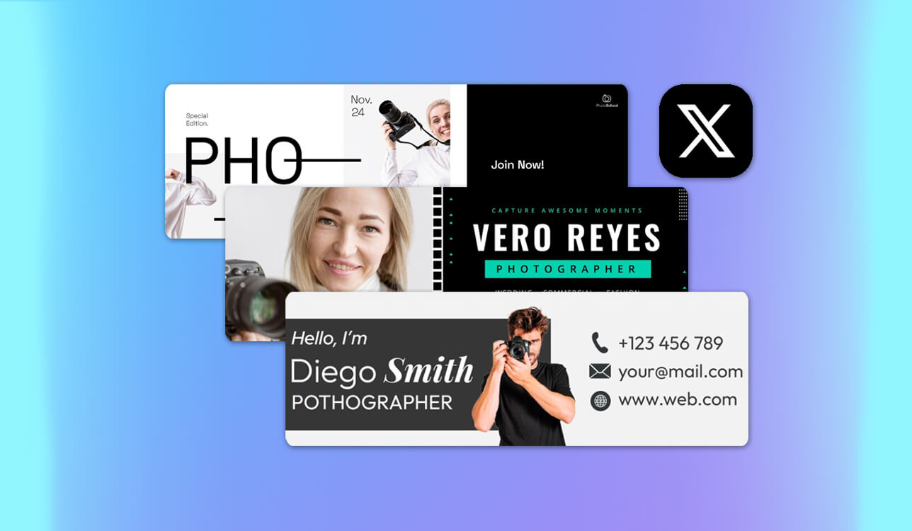
I realized that I needed a good Twitter banner maker when I eventually noticed that my old banner didn’t reflect my personal brand anymore. As I developed a small but steadily growing online marketing project and shared tips, mini-guides, and insights, my profile needed to appear polished and professional.
Unfortunately, my old banners were often blurry, poorly positioned, or inconsistent with the look of my content. I needed a design that could represent my brand instantly. That’s why I asked me team for help and together we tested 40+ Twitter banner makers recommended on Reddit and other forums.
For the project, the banner had to feature my logo, tagline, and several highlight elements in a layout that stayed clear on desktop and mobile. I was looking for custom fonts, high-quality output, and responsive templates to avoid cropping when X updates its interface. I also needed a tool that made fast adjustments easy because I often try new colors, textures, and styles.
Speed and simplicity were also important. I didn’t want to spend hours learning complicated design software. The tool needed to let me combine images, add text, and adjust elements quickly. Pre-designed templates that could be customized without losing quality were a big plus. Real-time previews were also essential so I could finish the banner in one session.
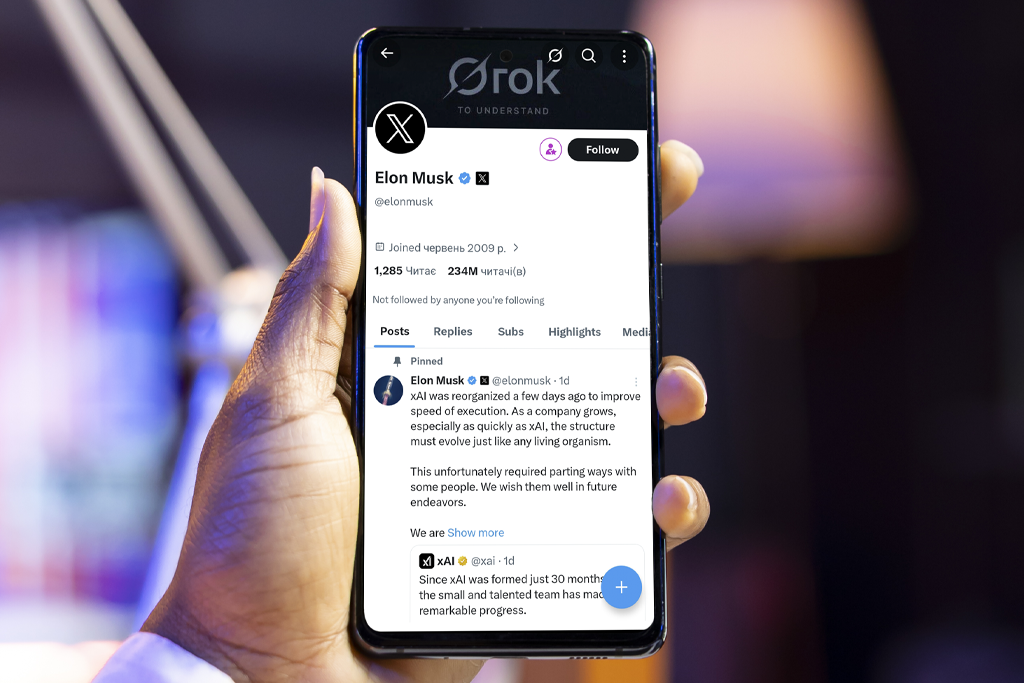
Right dimensions:
Mobile and desktop visibility:
Readable text:
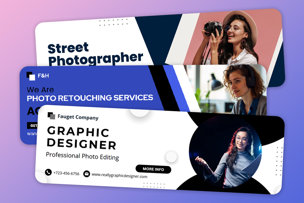
Branding consistency:
File format and quality:
Visual focus and composition:
Size optimization:
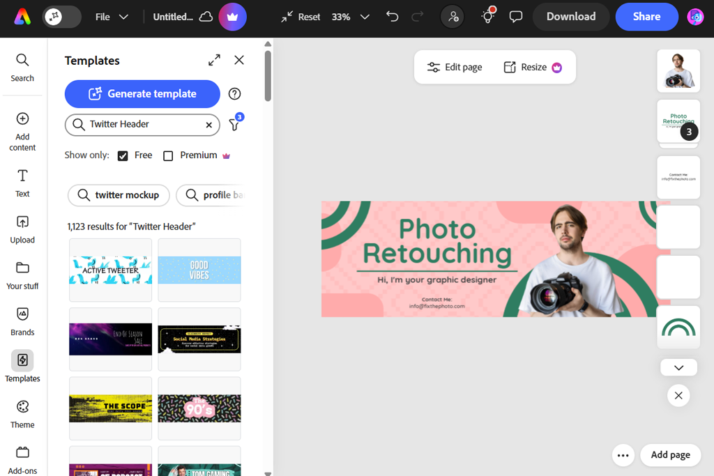
My first experience with Adobe Express was surprisingly smooth. After uploading my logo and adding a tagline, I quickly found a layout that worked well. The live preview made it simple to see how the banner would appear across devices, and adjusting colors or typography felt straightforward and intuitive.
When I began testing more advanced options, I layered various graphics and icons to create a design that matched my brand. This Twitter banner maker handled alignment smoothly. Its stock assets, patterns, and shapes, fit together cleanly without pixelation. Seeing the banner export in high resolution was reassuring, especially since X often compresses headers.
“I needed a banner and didn’t want to deal with sizing or layout. Everything already fit perfectly - I just changed the text and colors. It looked clean on both desktop and mobile.”

I tried changing the size for other platforms too, and every time the design still looked good. Nothing got stretched or bent out of shape, which happens a lot with other apps. Saving the image was quick, and I could pick from a few quality options depending on where I wanted to post it. Having those choices made me feel like I didn’t have to stick with just one style.
What I liked most was the variety of templates. Some were clean and minimal, while others were bold and attention-grabbing, making it easy to find a design that fit my style. They work equally well for personal profiles and business pages, with modern layouts and brand-focused styles. Everything can be customized to match your brand identity in minutes.
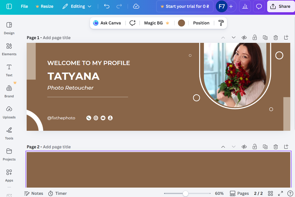
Starting with Canva, I browsed through its X banner templates and was pleasantly surprised by the variety. There were sleek professional layouts, creative compositions, and abstract styles that still felt refined. I picked several designs that aligned with my brand colors and edited them right away, adding my slogan and replacing the stock photo with my own.
I then focused on improving the overlay text and positioning. Using the drag-and-drop editor, I could move elements quickly, and they snapped into place automatically. By experimenting with shapes and icons, I created a clear visual hierarchy. The X layout preview confirmed that the banner would appear correctly after uploading.
“The interface was beginner-friendly from the start. I could quickly try different fonts and layouts without dealing with confusing tools, which made experimenting fast and simple.”

After that, I tried importing my own graphics and fonts. This custom Twitter banner maker managed the custom assets without any issues or quality loss. The cloud-based storage also made it easy to access and adjust the design later, which is convenient when updating banners for new campaigns or seasonal changes.
Saving the file was fast and easy, and the banner came out looking clear on both computer and phone screens. The only small problem was picking which design to start with - there were too many good ones to choose from. If you need nice-looking banners with a professional style and lots of options, this tool seems made for that.
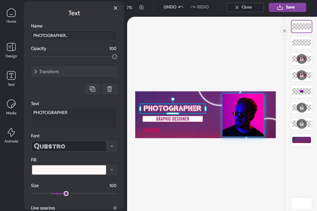
When I tried Pixlr, I expected a simple Twitter banner design tool, but it surprised me with its flexibility in handling layered visuals. I started with a blank canvas set to the X banner size and added background elements aligned with my brand. The precise opacity sliders were useful, letting me soften the text so the slogan blended better with the background texture.
After that, I experimented with typography settings like spacing, line height, weight, and outline strokes. The controls went beyond simple font sizing, letting me adjust subtle details that gave the banner a more custom feel. Even at higher zoom levels, the graphics stayed clear without any noticeable blurring.
“I paid extra attention to how it looked. The picture stayed clear after saving. It was easy to move around photos and words.”

The best part was being able to hide parts of my design without deleting them. This let me try new ideas without worrying about ruining my work. Other apps make this hard to find or tricky to use.
I could save files with clear backgrounds and pick how good I wanted them to be. I uploaded one to X, and the colors stayed perfect. For people who want to control every little thing, this isn’t just a basic design app - it’s a powerful Twitter cover photo maker. That felt really cool.

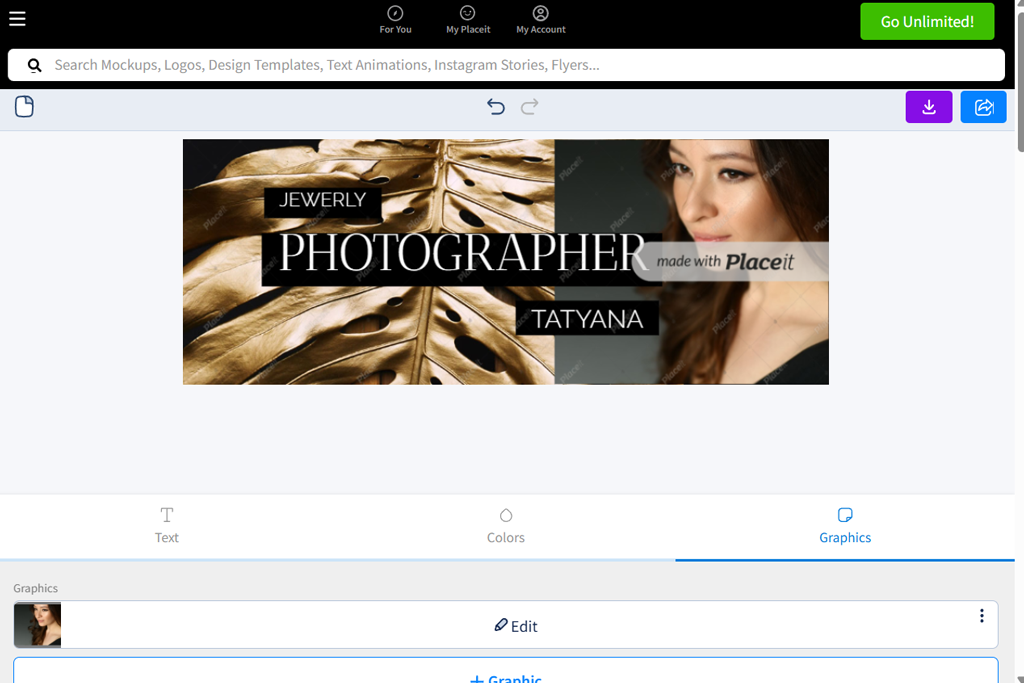
Creating a banner Placeit is very fun and easy. I typed in keywords related to my brand and immediately saw many matching, professionally designed layouts. Many of them looked like something you would see on influencer profiles or startup pages - clean, modern, and useful for building my own brand on social media with photography.
I added my logo and switched up the colors to fit my brand. What I liked most was that it all stayed clean and balanced. The text stayed readable, and the icons didn’t take over. Looking at the previews, I felt confident it’d look awesome once it was live.
“My favorite part was how quick it was. I just picked a design, changed the words, and I was done. No stressful choices. It’s perfect for updating your brand fast.”
Next, I added small design touches like shadows on the borders and some angled lines. They made the banner feel like it had movement, but they weren’t too busy. It didn’t take any special skills - just a few clicks and small adjustments.
Saving my work was easy, and the final banner looked sharp on both computer and mobile views. It looked professional on purpose, like I hired a designer, but without paying for one. For fast, great-looking banners with little work, this tool was a winner.
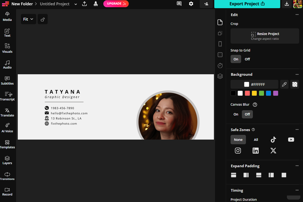
I started testing by dragging a banner image into this Twitter header banner maker and quickly noticed how easy it was to work with layers. I added bold text, icons, and transparent background shapes to make my tagline stand out. Everything was flexible - moving and adjusting elements felt smooth and simple.
I played around with animated text for a tweet preview. It moved just a little - not too much or cheesy. X banners are static, but seeing them move helped me figure out spacing and rhythm. A cool way to feel out the layout before locking in the final version.
“I was glad the templates didn’t feel outdated. I swapped fonts and colors, and it all still looked good. Made my profile way more professional with hardly any effort.”
It was easy to add my own images, and Kapwing kept my high-quality files clear without shrinking them weirdly. That’s a problem I’ve had with some open source photo editors. When I saved the banner, it looked exactly like it did while I was working on it - sharp and clean.
Because it works in a browser, I could design on different devices without any trouble. I switched from my laptop to my desktop and kept right on editing - nothing got out of sync. For an online editor that does more than just basic drag-and-drop, this worked really well.
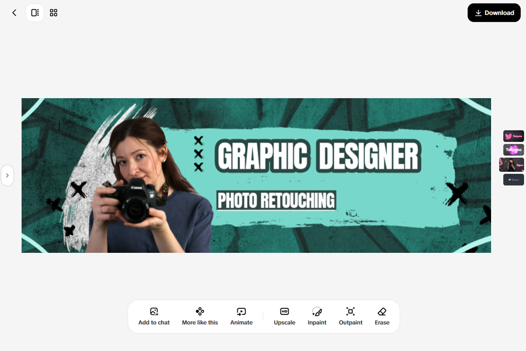
I began with a clean, modern template and really liked how fresh it looked. What made Pippit special for me was how much attention it paid to text layouts - the fonts were sharp and well-chosen, even before I changed anything. When I added my own words and brand name, everything still felt balanced.
Then I tried out different color themes from the built-in palettes. Every change looked like it belonged - no clashing colors or faded effects. The editor suggested color pairings that actually looked good together, which helped when I wasn’t sure what to try next. It almost felt like having another designer looking over my shoulder.
“This Twitter banner maker was fun to use. I added graphics and text without the editor slowing down. It felt more creative and playful than basic tools”

I also added simple icons and dividers to make the layout clearer. These small touches helped guide the eye without overpowering the text. That was exactly the professional look I wanted for my X profile. And the best part? I didn’t even need to use any free graphic design software to do it.
Exporting was a breeze, and the banner looked great on desktop and mobile. The tool just gets it - makes nice designs happen without any headache. If you’re after clean banners with thoughtful typography, this one’s a winner.
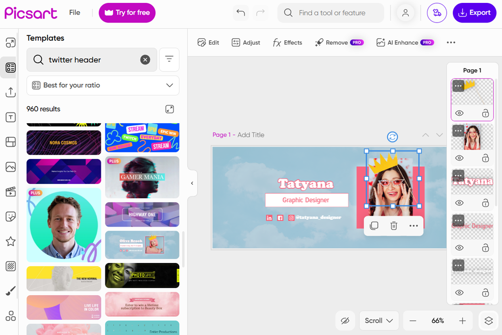
I used Picsart before as an Instagram photo editor, so I decided to try it for making an X banner. Using it felt like being in a creative studio - it was less strict and more fun than other tools. I started by putting text over a soft, blurry background and added some subtle brushstrokes to give the banner more texture. The effects didn’t look cheap; they had real depth.
Then I played with blending modes to make the text and graphics flow together better. Everything looked like it was part of the same story, not just slapped on. A little tweak to transparency and layering, and my brand name popped without throwing off the harmony.
“I liked the creative freedom this tool gives. Stickers, effects, and layered text helped make the banner more eye-catching. The final banner looks very unique.”

I also tried cropping and moving elements with this X banner generator, and everything worked smoothly. Dragging items around felt easy and natural, which made me want to experiment more. Because of that, I tried more creative layouts than I usually do.
The exported banners looked bright and vibrant in previews. Even in the X layout mockups, everything fit perfectly. For creators who enjoy a more artistic and expressive style, this editor feels like a place to experiment creatively, not just a simple template tool.
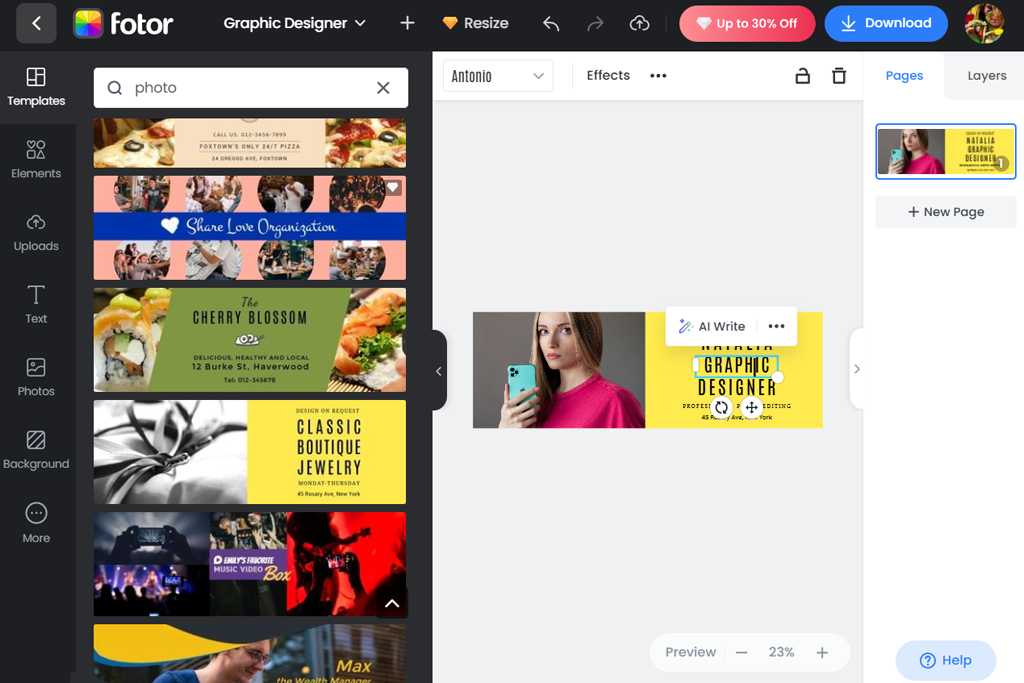
I started by looking through Fotor’s professional banner templates, and the clean, business-style layouts immediately caught my attention. I chose one that matched the style of my project and quickly added my slogan. The fonts looked elegant without being too much, and the shadows helped the text stand out against detailed images.
When I replaced the background with one of my own photos, the Twitter header maker kept the image clear without any blur or distortion. That consistent quality was a big advantage. I also added simple overlays, like semi-transparent bars behind the text, to make it easier to read, and it worked very well.
“I wanted a design that was simple but still clean and professional. The editor helped keep everything clear, readable, and well-balanced. It’s great if you prefer minimal designs.”

Then I adjusted the colors to match my brand. Everything updated right away, so I didn’t have to wonder if a shade would look good or not. Seeing the results instantly saved me from frustration and made the whole process much faster.
Exporting at the correct size was a breeze - it fit perfectly right away, no extra resizing needed. For anyone after clean, pro-looking X banners without the heavy lifting, this tool totally delivered.
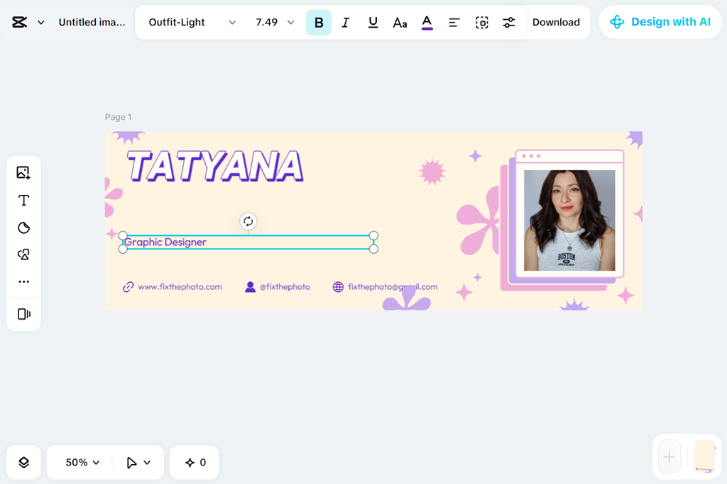
I thought CapCut was just for videos, but it actually has great tools for graphics too. I dropped in a photo and messed around with bold text and shapes. Rearranging stuff was fast and kind of playful.
Next, I tried some animated clips just to check the flow and spacing, even though the final banner wouldn’t move. That actually helped me understand the visual rhythm better. I also played with opacity and layering to make sure the text stayed easy to read, and everything felt balanced.
“This felt familiar since I work with short content. Dragging stuff was smooth, and aligning was simple. Ended with a sharp, modern banner. Nice for content creators.”

Moving things around was really easy. Just drag and adjust until it looks good. The design felt natural, and updates showed right away with no waiting.
When I saved it, the process was fast. The final banner looked sharp on both computer and phone screens. I usually use this AI Twitter banner maker for short videos, so I was surprised it worked so well for banners. If you want to make nice-looking banners quickly without using a computer program, this is a good choice.
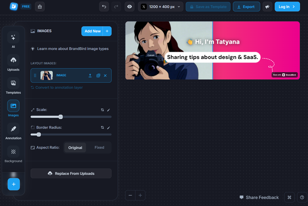
From the start, this online Twitter banner maker felt designed for people who care about clear messages and good typography. I added my tagline and focused on how the text looked before choosing colors. What stood out was the balanced letter spacing and line breaks - it almost felt like the tool naturally understood good design.
Then I added simple icons and a few brand elements. The layouts felt open and clean, not crowded, and every element had a clear purpose. Changing colors was easy, and the tool suggested color combinations that worked well together.
“This worked very well for a business-style profile. The layouts looked clean and well-organized. Adding branding elements was fast and easy.”

Playing with the structure - big title, smaller subtitle, soft icons - gave me a pro-looking banner with zero effort. I didn’t have to adjust every little thing; the default settings were already good. When I saved it, the quality stayed high. No strange compression or color changes. For anyone who wants clear and smart-looking banners, this tool really got it right.
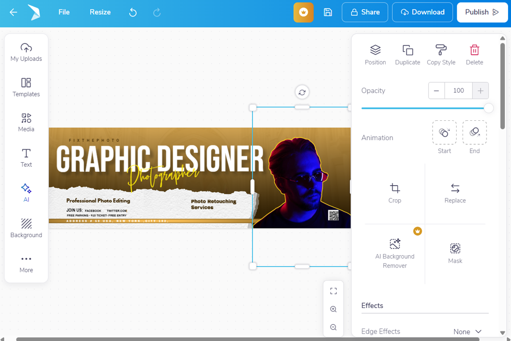
I started with a few clean banner templates and quickly saw that they were suited for social media and professional profiles. The X layouts didn’t look generic - they were clearly designed to balance text and graphics nicely. I changed the fonts and color accents in just a few clicks, and the banner already looked like something I’d confidently use as my header.
After that, I included icons and badges that matched my campaign theme. Even with several elements added, the design stayed clear and organized. The spacing looked well-balanced, and moving items around with drag-and-drop felt effortless.
“I was surprised by how many templates there were. I tried a few styles before picking one. Even after changing a lot, the design still looked balanced. Great for testing many ideas.”

Having many templates made it easy to try different looks without starting from zero. I could test several versions and choose the one I liked best. That saved time and gave me ideas I wouldn’t have thought of on my own.
When I exported the banner, it looked sharp and fit perfectly in X’s layout - nothing was cut off or out of place. For anyone who wants polished banners without much design work, this flyers software gave consistent, professional results.
We wanted to see how well each Twitter cover photo maker handled everyday tasks like adding logos, taglines, background images, and layered text, while keeping everything clean and easy to read on different devices.
Following FixThePhoto team’s thorough testing approach, each banner maker was tested for template quality, how much you could customize designs, control over layers, export quality, and speed. We also paid attention to how easy the editor was to use, whether for quick touch-ups or creating more refined brand designs.
Nataly Omelchenko focused on banners for personal brands and creators. She tested templates by changing the text, adjusting colors, and moving logos to fit different brand styles.
Some tools made alignment easy with smart snapping, while others needed manual tweaks. Nataly found that editors with good typography controls and real-time previews created the most balanced and professional-looking banners.
Tetiana Kostylieva tested marketing and campaign-style banners. She added multiple layers like headlines, icons, background images, and call-to-action text to see how well each editor handled visual hierarchy.
She also checked how easy it was to update banners for seasonal promotions without starting over. Tools with good layer management and fast design changes worked best in her tests.
Kate Gross reviewed how smoothly each tool handled the creation process when producing several banner versions. She worked with the same layouts, changed visual elements, and saved multiple variations to see how quickly and reliably the tools performed.
She also checked whether the images stayed crisp and properly arranged after being published on X. Platforms that produced clear files, kept the structure intact, and allowed fast results proved to be the most dependable choices for both solo creators and professional groups.