In my work, I often create personalized graphics for clients, including SoundCloud banners designed to match different music genres and artist identities. I usually depend on advanced design programs to get precise, flexible, and high-quality results.
Recently, though, some of my subscribers have been asking about easier SoundCloud banner makers without needing strong design skills or complicated software. To better understand what tools are available, I started researching different tools.
I didn’t test them randomly. Instead, I treated it like a real project and invited the FixThePhoto team to join me in comparing several options side by side. During testing 30+ SoundCloud banner makers, we focused on ease of use, visual quality, customization features, and how suitable each platform was for beginners.
The tools in this list proved to be more powerful than I expected. Many of them include ready-made layouts, drag-and-drop editing, adjustable text styles, and built-in graphics that make designing much easier. Some platforms also offer smart automation features that help create banners more quickly while still keeping the final result clean and professional.
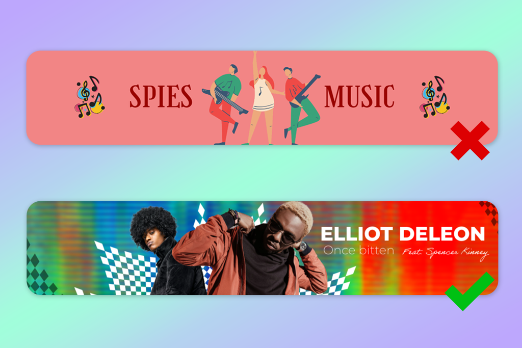
Creating a SoundCloud banner is more than just adding an image to the top of your profile - it’s about shaping a visual style that matches your music.
The format is wide and horizontal, so you have limited space from top to bottom compared to many other standard banner sizes. Because of this, I always suggest planning around “safe areas.” A banner might look balanced while editing, but important parts can get cut off after uploading, especially when viewed on different devices.
One rule I always follow is organizing elements by importance. A good banner shouldn’t try to show too many things at once it should focus on one main feature and use smaller details to support it. Usually, the artist’s name or logo becomes the center of attention, while textures, colors, and background visuals stay in the background.
Another detail people often forget is how the banner fits with the SoundCloud interface. Parts of the screen, such as profile icons, buttons, and overlays, can cover sections of your design, especially on phones. To prevent this, I usually place key elements a bit higher than the center and leave the edges mostly clear.
Keeping a consistent look is what often makes a banner stand out from average ones. The visuals should connect with your music style and overall brand image. For example, if your songs have a dark and moody vibe, your banner should show the same feeling through its colors and layout.
One important mistake people often missed is not paying attention to file quality and resolution. Even a nicely designed banner can look poor if it turns blurry or pixelated after uploading. I always check the export settings and preview how the banner looks on different screens.
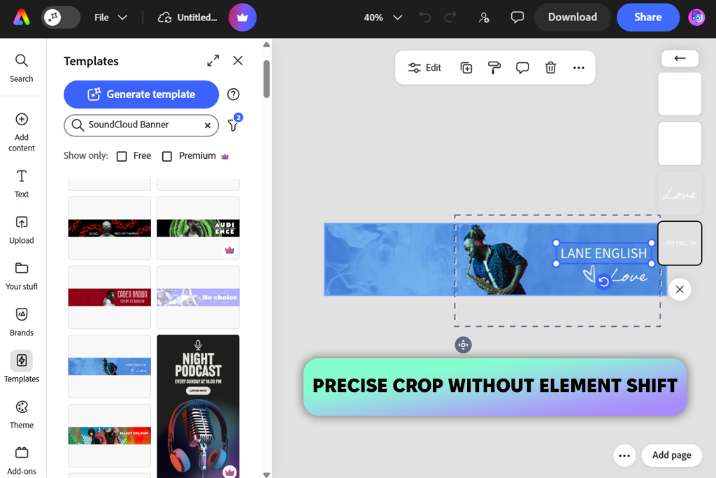
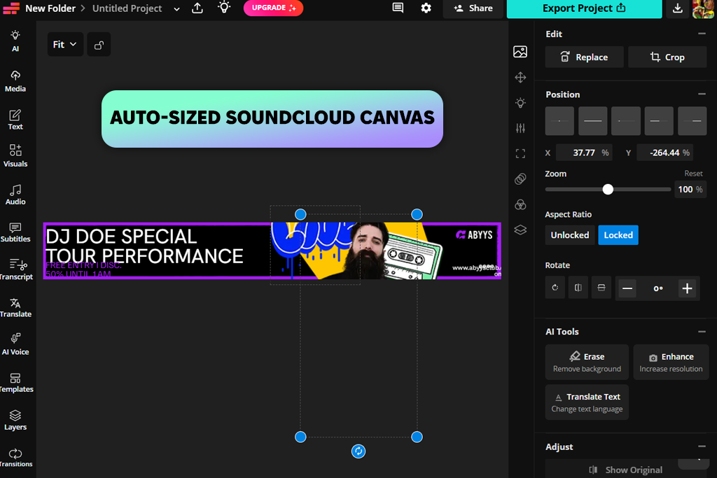
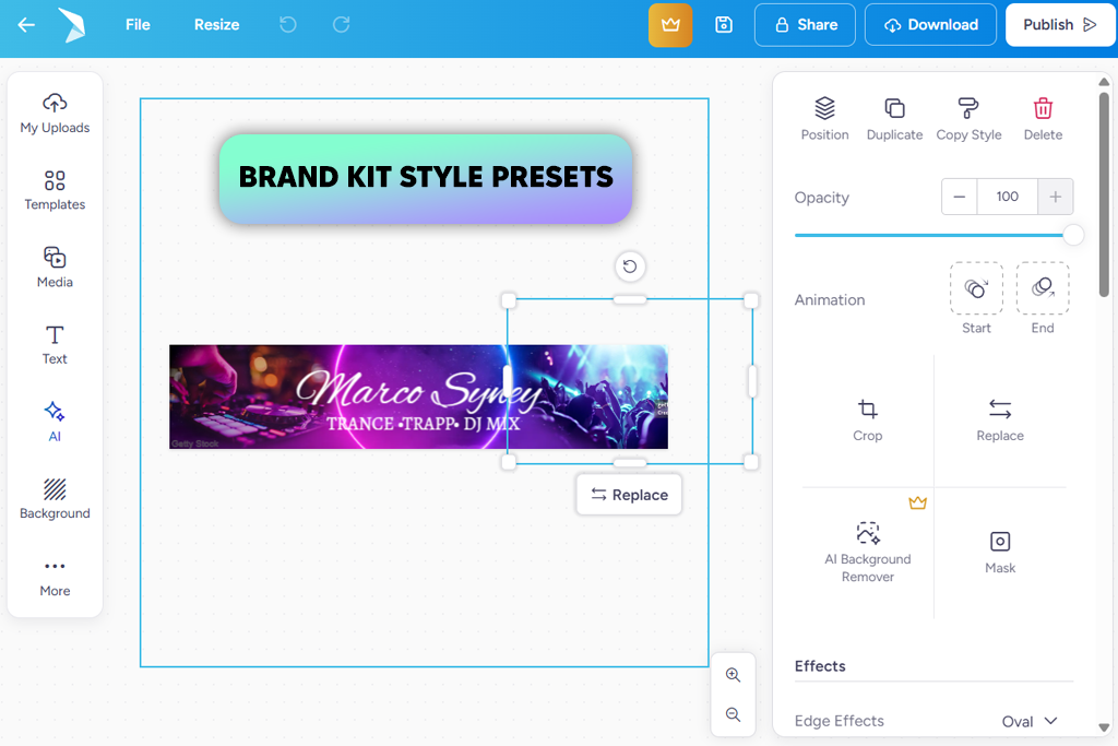
I’ve used Adobe Express for a long time when I need to create designs quickly. Recently, I became interested in their updated Crop & Resize tool. I created a SoundCloud banner to test it, and it allowed me to set exact crop sizes without moving or stretching the elements.
Unlike tools that shift items and ruin the layout, this one kept everything in the same position. For banner design, where alignment is very important, this made the workflow feel much more reliable.
“The updated crop option has been helpful because I no longer need to fix element placement after changing sizes. For quick projects, it helps save time.”

Later, I tested a few light motion effects on the text, although for SoundCloud banners, I prefer to keep them very minimal. One thing I really appreciated was how easy it was to reuse the same design in different sizes. I copied the banner, adjusted the dimensions for other platforms, and kept the same overall style across each version.
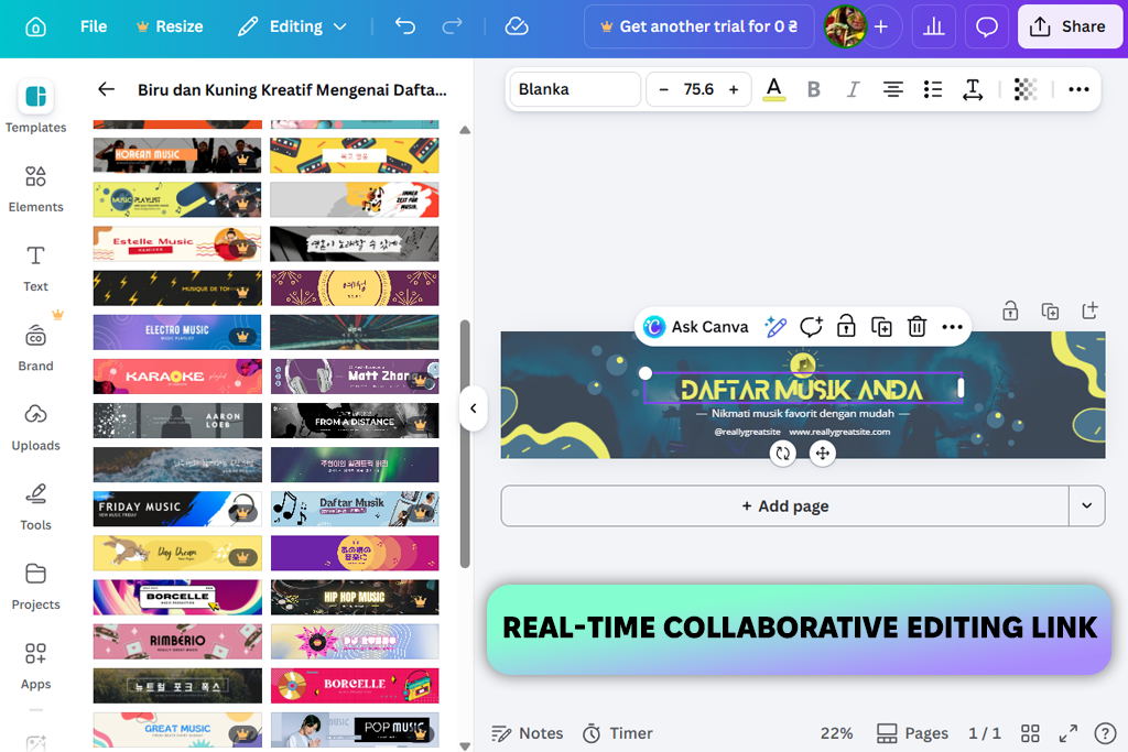
In our team, Canva is one of the custom SoundCloud banner creators we use often, mainly because it makes teamwork very easy.
When I created a SoundCloud banner with it, I didn’t work alone. I built the first version, then shared the project through the Share option, so a colleague could open it and add photos from a recent shoot. The process felt smooth and natural, almost like we were editing the same file at the same time, which not every banner tool supports this well.
“There are lots of templates to choose from, but I always change them enough so the final banner looks more unique and less like a standard design.”

To begin the design, I looked through the SoundCloud banner templates available in Canva. There were many different styles to choose from - from bold grunge looks to softer indie layouts - so finding one that matched the mood didn’t take much time.
After choosing a base layout, I changed most of its elements by adding new images from Canva’s media collection, updating the colors, and trying different font combinations. The drag-and-drop editor made these updates fast, and it was easy to test several versions without interrupting the workflow.
Another thing I like is that the platform works well on different devices. I opened the same project on my phone to check how it looked and made a few small changes without any problems. One thing to watch out for is the large number of design elements available. With so many choices, it’s easy to add too much, so keeping the layout clean takes a bit of self-control.
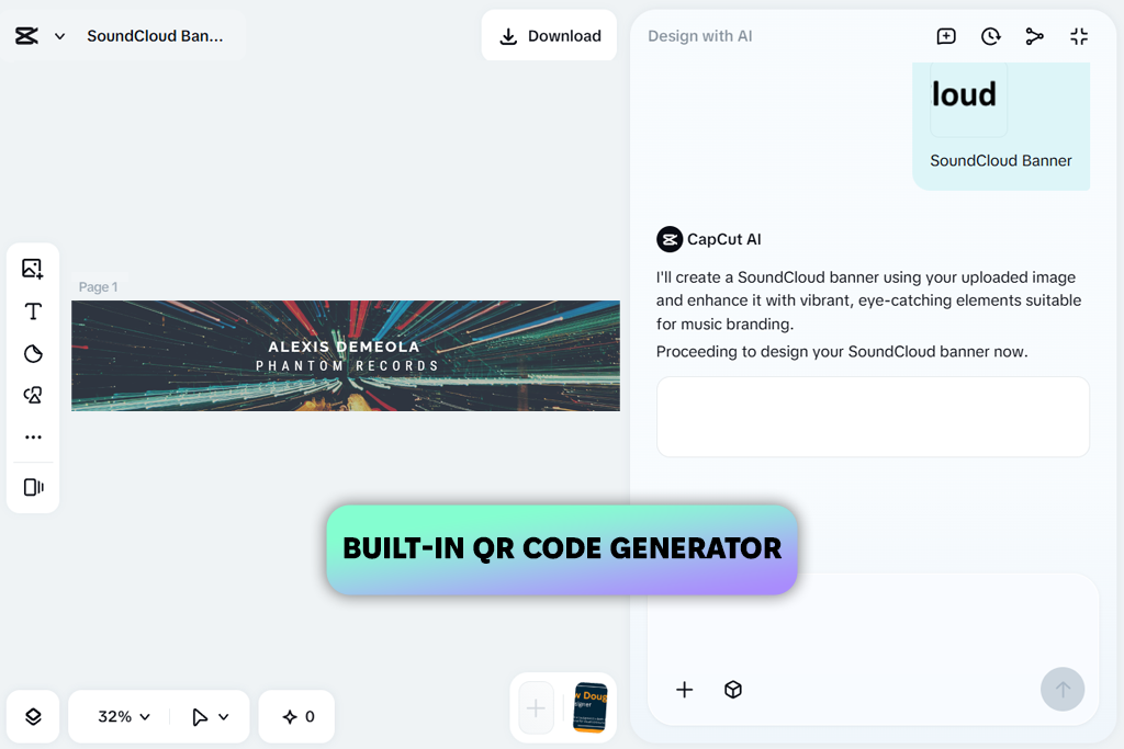
I’ve mostly used CapCut as a video editing app, especially for quick edits, short clips, and social content. So, when I found out it also had features for creating things like SoundCloud banners, I wanted to see how well it would work for still images.
I opened the editor, searched for “SoundCloud banner,” and chose one of the available templates to test how much I could customize it. Rather than using it like a standard banner tool, I focused on layering visuals, which is where CapCut really stands out.
I selected a collage-style layout, added album artwork, placed a textured background, and included a few graphic details. After that, I adjusted the placement to make sure the content stayed clear and easy to read. The workspace feels much like a video editor - you can move items freely, stack images on top of each other, and fine-tune their position without strict limits.
I also tried adding a QR code, which could help link directly to a song or profile. It’s not something I’d include every time, but it’s a useful feature to have. What sets CapCut apart is its more creative and experimental style. At one point, I tested a monochromatic banner that used only a single color theme, and it turned out to look very unified and clean.
However, because this online banner maker is mainly built for video work, some positioning tools don’t feel as exact as those in traditional design programs. Still, if you enjoy trying layered or more artistic ideas, it gives you plenty of creative freedom.
My colleague Tati suggested Kapwing to me as a handy option for making quick visuals, especially when you don’t want to spend much time on setup. I used this visual effects app to create a SoundCloud banner and see how it performs in a real design task, not just simple edits. The first thing that stood out was how easy it was to get started.
“I usually suggest Kapwing when someone needs to start quickly without dealing with setup. It’s not the best for detailed projects, but for basic banners, it does the job well.”

To begin, I opened the editor and selected one of the ready-sized banner templates, so I didn’t have to worry about dimensions, which saved time right away. I customized the layout by updating the background, adding my own image, and adjusting the text styles using the drag-and-drop tools.
One thing I really liked was how easy it was to reuse the same design for different needs. I created a banner to promote a new release by adding a short tagline, adjusting the spacing, and keeping the layout clean. That said, the editing options can feel a bit limited if you want something very detailed or highly styled - but for quick and tidy banners, it works really well.
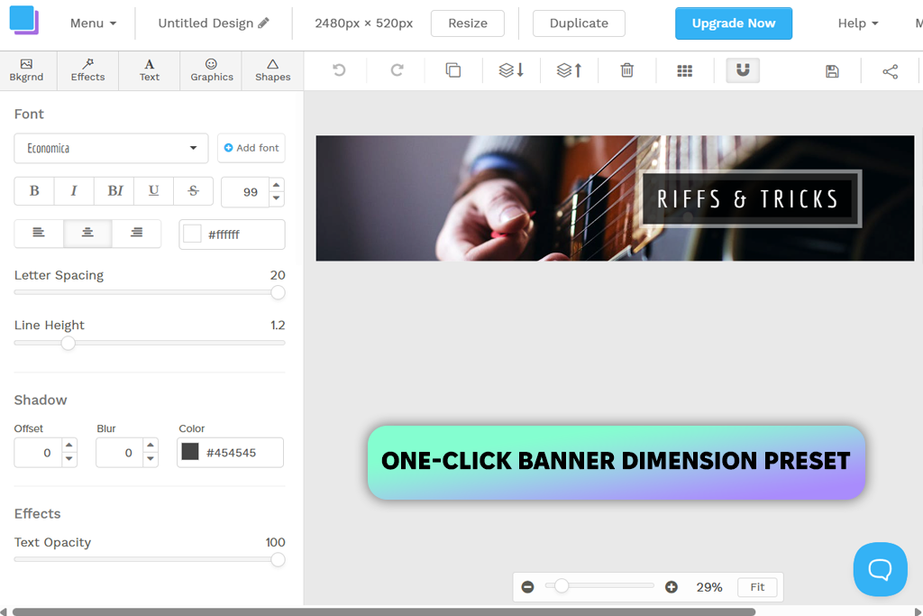
Snappa impressed me right away because of the large number of free visuals it offers. I expected the library to be quite small, but instead found a good selection of high-quality images, graphics, and templates that looked fresh and modern. For anyone who doesn’t have their own pictures prepared, this can make creating a SoundCloud banner much easier.
To begin, I selected the “SoundCloud Banner” preset, which automatically set the right size, so I didn’t need to adjust dimensions myself. Next, I picked a template and started customizing it - changing the background with an image from the built-in stock library, editing the text, and adding a few shapes to organize the layout.
The editor feels simple and steady. Compared to tools discussed in Snappa vs Canva, it has fewer distractions, which actually helps you stay focused instead of getting overwhelmed by too many options. In the end, I was able to create a neat banner in only a few minutes and then check how easily the same design could be reused for other platforms
The main drawback I noticed is the limit on the free plan - you can only download a small number of files each month, which can slow things down if you’re testing several versions.
I discovered PosterMyWall while searching online for less popular design tools. To begin, I opened this online SoundCloud banner maker in my browser and went directly to the template library to explore the available designs.
“PosterMyWall offers many tools in one place, which is helpful, though the interface can feel a bit crowded when you first start using it.”
To begin, I searched through the large collection of designs, since most of them weren’t made specifically for SoundCloud. After finding a layout that could work as a banner, I started modifying it to fit my needs. I added my own image, changed the text styles, and tested several color options.
The editor includes many tools, such as stickers, font choices, and even audio or video features. While this may seem unusual for a static banner, it also gives you more freedom to experiment with different ideas. With the Brand Kits feature, I added a consistent color palette and font style to see how easily I could maintain a unified look across designs.
It worked well, especially if you’re creating multiple assets for the same project. There’s also an option to generate AI captions and even schedule posts, which goes beyond banner creation and leans more into content management. However, with all these options, the interface can feel slightly overloaded at first.
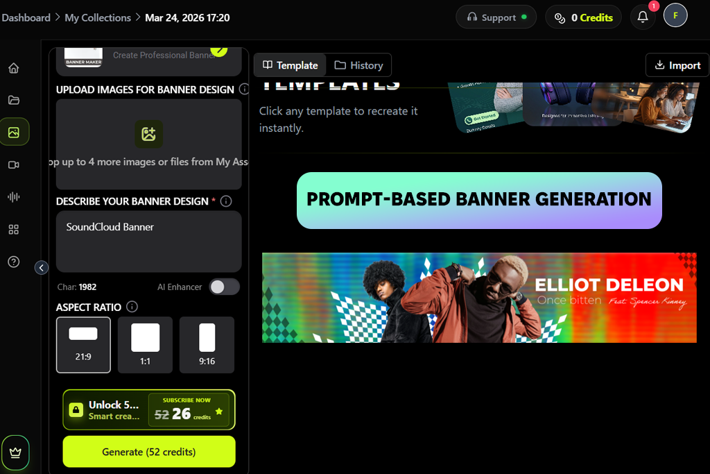
In Pixazo, I started by typing a short description that explained the mood, colors, and overall style I wanted for a SoundCloud banner. After a few seconds, this tool for SoundCloud banner design produced several designs, each with its own look. This approach saved time because I didn’t have to build every idea from the beginning.
To refine the design, I used the sliders to adjust colors, contrast, and layout until the text remained easy to read and didn’t feel overcrowded. I also explored the typography settings, changing spacing and alignment without dealing with layers like in traditional editors. When I created several versions using the same “artist style”, the results stayed consistent.
The exported banners come in the correct sizes, and many of them are already adjusted to look good on darker interfaces, which fits well with SoundCloud’s style. One drawback I noticed is that, while it provides a solid starting design, you still need to give clear directions - otherwise, some results may end up looking too standard.
To test AI SoundCloud banner generators properly, FixThePhoto team and I didn’t judge them just by how they looked at first. Instead, we used each one as if we were making a real banner for a client - starting with the idea and finishing with the final upload.
One of the key areas I focused on was layout control. Since SoundCloud banners have fixed sizes, I checked how well each tool managed spacing, positioning, and cropping. I paid close attention to whether elements stayed in the right place after resizing or if the layout fell apart.
I also tested how simple it was to keep important text and images inside “safe areas”, so they would stay visible on different screen sizes.
Another important area we reviewed was customization. Eva tested how flexible each editor was when changing text styles, colors, backgrounds, and the overall layout.
Instead of simply using templates as they were, she made noticeable changes to see if the tools allowed more personal and unique results. She also paid attention to how easy the interface felt - checking whether simple actions like moving items, editing text, or adding images could be done quickly without extra effort.
Tati also focused on the availability and quality of built-in assets. She checked the included image libraries, graphics, icons, and textures offered inside each tool. Her goal was to see whether these visuals looked modern and practical or if they seemed repetitive and outdated.
This is especially important for users who don’t have their own images, since the built-in materials can strongly influence the final design.
The last thing I reviewed was export quality and real-world usability. After finishing each banner, I downloaded the file and checked how it would look on an actual SoundCloud profile. I paid attention to image sharpness, available file types, and overall clarity. Even if a tool feels smooth during editing, it isn’t very useful if the final image looks blurry or poorly aligned.


![11 Best AI Tools for Content Creation [Free & Simple]](/placeholder-450x300.svg)


