Picking the right banner size is a lot more important a decision than it may seem, regardless of whether you’re working on a store promo, social media ad, or a showcase event. The banner primarily serves to announce something while combining imagery, typography, and branding to instantly convey the necessary information.
From small 2′ by 4′ prints to bigger 728×90 web leaderboards, there’s a purpose behind all standard banner sizes, and picking the optimal one for your specific project can be the difference between a successful and failed marketing campaign or event.
As a long-term member of the FixThePhoto team, I’ve always enjoyed working on banners. I design them for all kinds of projects, from web-based workshops on image retouching to seasonal discounts on our photography services.
During the early stages of my career, I found out that even captivating designs can go to waste if you don't choose the right dimensions. An incorrect size can crop the text, distort images, or lead to the banner being ignored entirely since it wasn’t a good fit for the platform.
I’ve prepared a guide to go over all the most popular banner sizes for print and web, covering their purpose and providing recommendations on how to choose the dimensions, design your banner, and export it properly. It will help you produce professional results in any scenario.
When helping newly hired designers and marketers at FixThePhoto, I begin by stating one rule: “Never design a banner before you decide its size.” It may feel obvious to you, but a lot of people completely ignore this recommendation.
By choosing one of the standard banner sizes, you establish a predictable framework while resting assured that your design is compatible with popular online platforms, devices, and print mediums.

For web advertising, the Interactive Advertising Bureau (IAB) defines the average banner dimensions as 300×250 or 728×90 pixels, which are resolutions used for everything from Google Ads to Facebook.
These “standard” dimensions ensure the ads are shown properly and aren’t rejected or resized by the platform you’re uploading them to. The easiest way to set the proper sizes is to use free pre-made banner templates.
For print, standardization is tied to practicality. Printers and signage enterprises have adjusted their materials, vinyl rolls, and pricing to standard photo sizes and popular banner sizes in inches (3′×6′, 4′×8′, and 6′×12′). If you choose one of those options, you’ll cut costs, prevent trimming problems, and guarantee your design scales perfectly from screen to fabric.
The main benefits of using normal banner sizes include:
If you try to experiment, you risk running into issues like:
That’s why you should determine the size before you even start working on a banner. That’s the first brick you have to lay down.
Allow me to provide an example of a photography workshop banner that I made recently. FixThePhoto created a digital campaign and a bunch of printed vinyl banners to advertise a free “Portrait Retouching 101” class.
For the web, we prepared 300×250 rectangle ads that offered a 2.3× better click-through rate than the non-standard ads we tested. The printed 3′×6′ vinyl banner was presented outside the studio. It offered the optimal balance – big enough to be read from a distance, yet small enough to be transported to future events.
This is important because:
Picking fitting banner dimensions is essential for properly conveying your message without requiring the viewer to squint or scroll.
Before you get to work, I recommend visualizing a banner-size chart in inches, feet, centimeters, and pixels, so that you’re covering both print and digital usage cases. I tend to have such a chart at hand when working on marketing assets for our photo workshops or social media campaigns.
| Web banner type | Pixels | Inches | Use case/placement |
|---|---|---|---|
|
Leaderboard
|
728 × 90 px
|
10.1″ × 1.25″
|
Header or footer on sites, forums
|
|
Large Rectangle
|
336 × 280 px
|
4.7″ × 3.9″
|
In-article or post-end display ads
|
|
Medium Rectangle
|
300 × 250 px
|
4.2″ × 3.5″
|
Sidebar, blog, phone-friendly layout
|
|
Wide Skyscraper
|
160 × 600 px
|
2.2″ × 8.3″
|
Vertical sidebars or scrollable layouts
|
|
Mobile
|
300 × 50 px
|
4.2″ × 0.7″
|
Mobile apps, lower/top screen bar
|
|
YouTube
|
2560 × 1440 px
|
35.5″ × 20″
|
YouTube header, social media branding
|
I tend to show this chart to all new employees, particularly if they’ve been assigned to create multi-format campaigns that repurpose designs across different print and digital mediums.
| Printed | Inches | Feet | Cm | Visible up to | Use case |
|---|---|---|---|---|---|
|
Small vinyl
|
24″ × 60″
|
2′ × 5′
|
60 × 150
|
15 ft
|
Indoor signs, window displays
|
|
Medium vinyl
|
36″ × 72″
|
3′ × 6′
|
90 × 180
|
25 ft
|
Storefronts, booths, sales ads
|
|
Large vinyl
|
48″ × 96″
|
4′ × 8′
|
120 × 240
|
40 ft
|
Exteriors, high-traffic zones
|
|
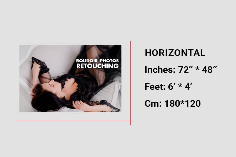
Horizontal
|
72″ × 48″
|
6′ × 4′
|
180 × 120
|
40 ft
|
Fences, stages, horizontal displays
|
|
Vertical
|
96″ × 24″
|
8′ × 2′
|
240 × 60
|
35 ft
|
Entrances, indoor columns
|
|
Retractable
|
33″ × 81″
|
2.75′ × 6.75′
|
84 × 206
|
20 ft
|
Trade shows, lobbies, events
|
|
Pole
|
24″ × 48″
|
2′ × 4′
|
60 × 120
|
25 ft
|
Street poles, campuses, fairs
|
|
Outdoor billboard
|
72″ × 144″
|
6′ × 12′
|
180 × 360
|
100 ft
|
Billboards, highways, stadiums
|
Now let’s examine typical banner sizes more closely. These are the dimensions I tend to use most often when creating marketing assets for FixThePhoto.
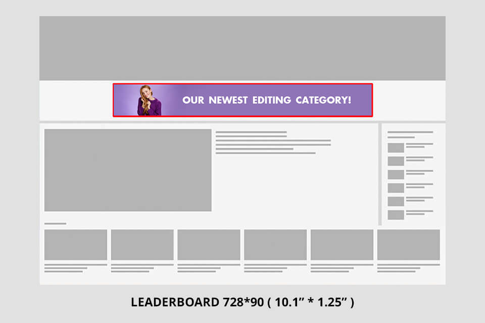
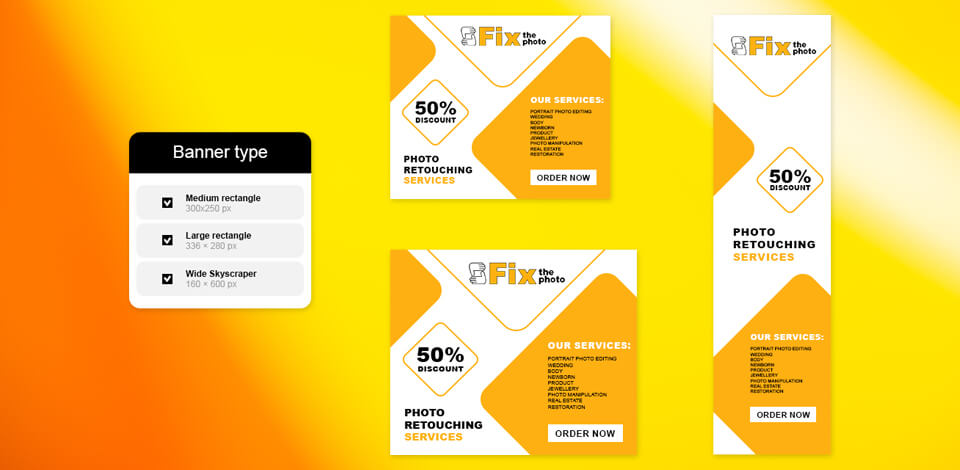
Leaderboard – 728×90 px. This is an internet staple. You’ll usually find it at the top of a webpage, grabbing your attention before you even begin scrolling. I tend to employ it for promoting free retouching workshops on the FixThePhoto website.
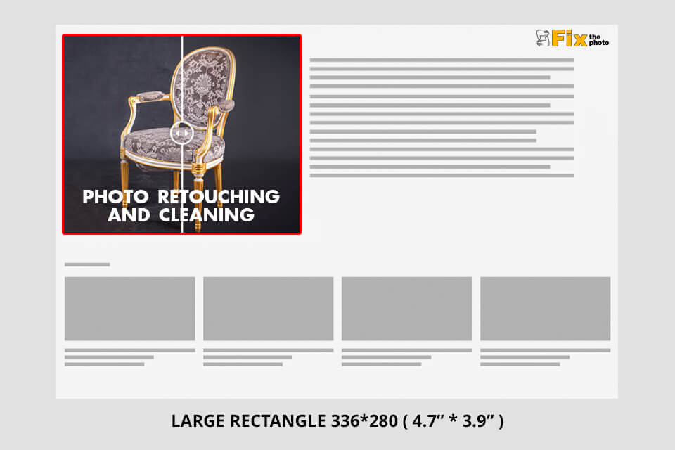
Large rectangle – 336×280 px. If you’re going for a striking and balanced ad block, you should consider this banner size. It’s perfect for product highlights or showcasing before/after image editing examples.
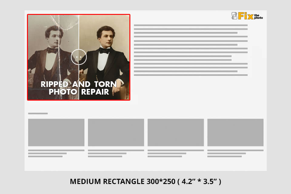
Medium rectangle – 300×250 px. I think it’s the most efficient option for web content. It looks great on phones, laptops, and PCs alike and delivers great results on all ad networks.
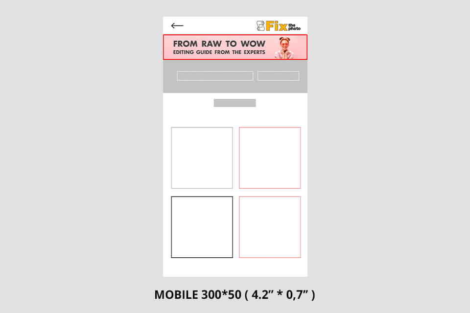
Mobile banner – 300×50 px. This small banner size is perfect for phones. While it doesn’t give you a lot of room to work with, you can utilize it to increase brand awareness as long as your design is clean and balanced.

Wide skyscraper – 160×600 px. This tall, vertical format is ideal for sidebars or content-rich sites. I employ it when making promotional banners for FixThePhoto’s seasonal discounts.

2′×5′ (24×60 in / 60×150 cm). Small and easy to transport, which is perfect for indoor events like photography meetups or small booths.

3′×6′ (36×72 in / 90×180 cm). My go-to choice. This standard banner size is suitable for the majority of possible scenarios, from store promotions to outdoor markets.
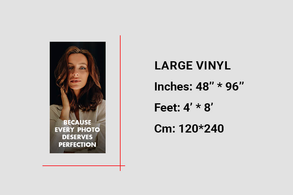
4′×8′ (48×96 in / 120×240 cm). A large-scale banner that instantly catches the passerby’s eye – ideal for big events and product releases.
6′×4′ (72×48 in / 180×120 cm). In many ways comparable to 4×8 but with flipped orientation. Perfect for wide storefronts or fences.
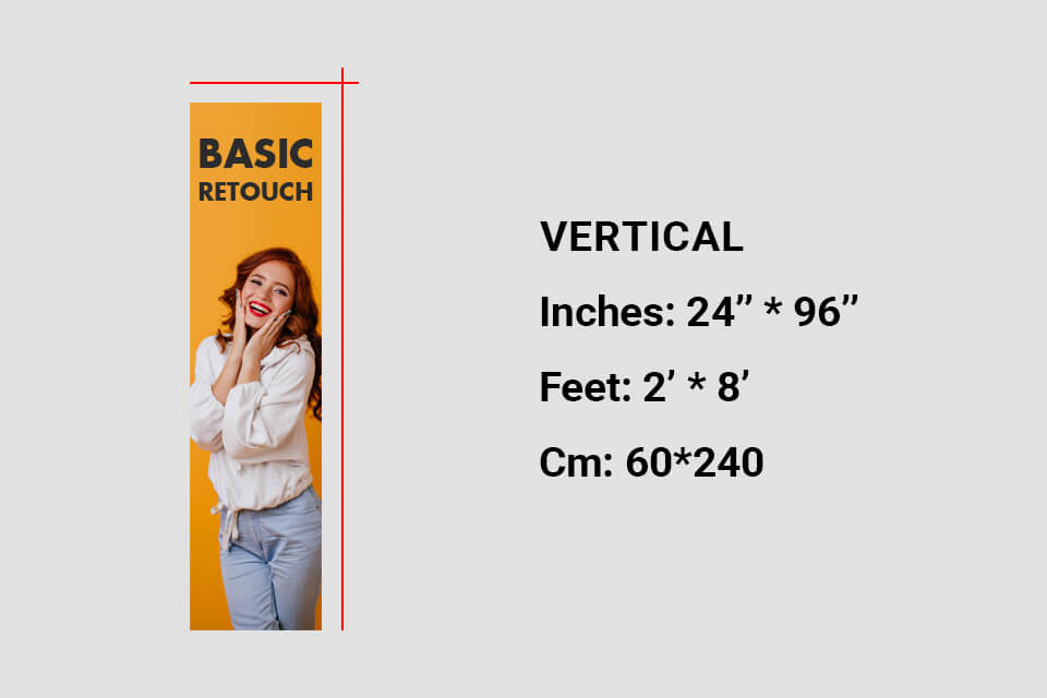
8′×2′ (96×24 in / 240×60 cm). This long vertical layout looks elegant and is a great choice for indoor spaces.
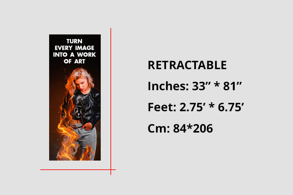
Retractable banner – 33×81 in. If you ever see a FixThePhoto booth at an event, you'll notice that we use such a banner a lot. It's compact, transportable, and requires minimal setup.
Why I love it: It can be rolled up, stored, and reused.
Best for: trade shows, pop-up workshops, and photography contests.
Design tip: Keep the logo at eye level and leave around 10-12” of visual “breathing room” at the bottom (the retractable base can somewhat obscure it).
Pole banner – 24×48 in. Perfect for the outdoors. We chose it to promote local workshops on lamp posts.
Best for: streets, campuses, or festival branding.
Material tip: use double-sided printing and pole pockets, which help improve wind resistance.
A quick comparison I often show clients:
| Use case | Best banner type | Common size | Recommended format |
|---|---|---|---|
|
Online promotions
|
Digital
|
300×250 px
|
PNG, JPG (RGB, 72 DPI)
|
|
Outdoor sales
|
Vinyl
|
3′×6′
|
PDF, TIFF (CMYK, 300 DPI)
|
|
Trade shows
|
Retractable
|
33×81 in
|
PDF, PSD
|
|
Street advertising
|
Pole
|
24×48 in
|
PDF, JPG
|
|
Website header
|
Leaderboard
|
728×90 px
|
PNG, HTML5
|
|
Indoor event
|
Small vinyl
|
2′×5′
|
PDF, PNG
|
A standard banner size isn’t always the answer. Some expo booths have weird layouts, or a client can ask for a panoramic banner that covers the entire wall. This is when custom sizes come into play.
When planning FixThePhoto events, we sometimes have no choice but to experiment. For instance, we made a 10′×3′ panoramic vinyl banner for our studio façade. While the proportions aren’t standard, it’s still eye-catching and effective at drawing in clients.
However, you should still follow this rule: Always start from a standard ratio.
Whether you scale up or down, stick to aspect ratios like 3:1, 4:3, or 16:9. This ensures the design looks balanced and doesn’t distort logos or faces.
Pros of custom banner sizes:
Cons:
When working on custom-sized banners, do all the measurements twice and check the resolution. A 6′×10′ banner printed at 150 DPI will demand an image over 10,000 px wide.
If a client of ours helps us to help them choose the optimal banner size for printing or digital use, I mention these 5 steps:
1. State your purpose. Ask yourself: “What am I advertising?”
2. Measure the display area. Take a tape measure, or, if you’re making a digital banner, study the platform requirements. Oversized designs look unprofessional if they don’t fit the space they’re in.
3. Consider the viewing distance. The basic rule of thumb when calculating the banner size in inches: 1 inch of letter height = 10 feet of readability. So if the viewer is 50 feet away, the letters need to be at least 5” tall.
4. Choose the printing material wisely. Outdoor vinyl banners need to be weatherproof and UV-resistant. For indoor banners, fabric or matte finishes on photo paper look more appealing under soft lighting.
5. Budget wisely. Bigger banners and custom finishes (like double-sided printing) can be significantly more expensive. Meanwhile, printing multiple standard 3′×6′ banners is generally more cost-efficient than a single large custom design.

Having designed hundreds of banners over the years, from social media promos to huge 4x8 vinyl showcases – I’ve established a smooth workflow that helps me produce high-quality, print-ready results. Regardless of which banner design size you choose, the same rules are still relevant.
Simplicity is key – one message, one image. All efficient banners have a clear focus. A banner isn’t a brochure. It needs to convey all its information within 3 seconds.
Golden rule: One image. One headline. One clear call to action (CTA).
If the banner requires the audience to pause and think, you lost the battle before it even started. I tend to choose clean, high-contrast backgrounds and a single dominating visual. For instance, a retouched picture that clearly conveys the subject.
Keep the branding consistent across all materials. A cohesive style helps raise brand awareness. Whenever someone stumbles upon your banner, it needs to share the visual language with your site, flyers, and social media pages. At FixThePhoto, we adhere to a consistent style by using:
If you’re creating visuals for an entire marketing campaign, check the standard flyer size or business card size layouts to ensure the typography and alignment are done right. Such consistency can help make even a smaller banner look professional.
Prioritize readability and hierarchy. Banners are typically seen for only a second or two – be it from a distance, on a screen, or when walking past them. This is why it’s essential to remember about visual hierarchy:
For outdoor banner sizes, stick to the “1 inch per 10 feet” rule. For instance, if the banner will be usually seen from 40ft away, ensure the headline text is 4” or taller. Some typography tips:
Leverage composition and balance. A balanced layout sets the great banners apart from the mediocre ones. All components need to guide the viewer’s eye – from the image → headline → CTA. Consider these tips:
For vertical banners (like retractable banners or pole banners), I prefer to “stack” elements vertically while sorting them by relevancy. For wide ones (like leaderboards or 4′×8′ vinyls), I stick to a horizontal “flow” from left to right.
Pick the optional colors and mood. Colors aren’t just window dressing – they affect the viewer’s emotional response and conversion rates. I employ color psychology with purpose:
| Color | Effect | Best for |
|---|---|---|
|
Red
|
Urgency, excitement
|
Clearance sales, CTAs
|
|
BlueBlue
|
Trust, professionalism
|
Corporate or service banners
|
|
Green
|
Eco-friendly or wellness promos
|
Eco-friendly or wellness promos
|
|
Yellow
|
Energy, optimism
|
Announcements, special offersAnnouncements, special offers
|
|
Black & white
|
Elegance, minimalism
|
Premium photography services
|
Remember to check how your chosen color palette looks both in natural and artificial lighting – vinyl banners tend to seem darker when printed.
Stick to high-resolution photos and vector graphics. Don’t upscale low-res images. At FixThePhoto, we only use vector logos (SVG, EPS) and retouched photos to prevent pixelation.
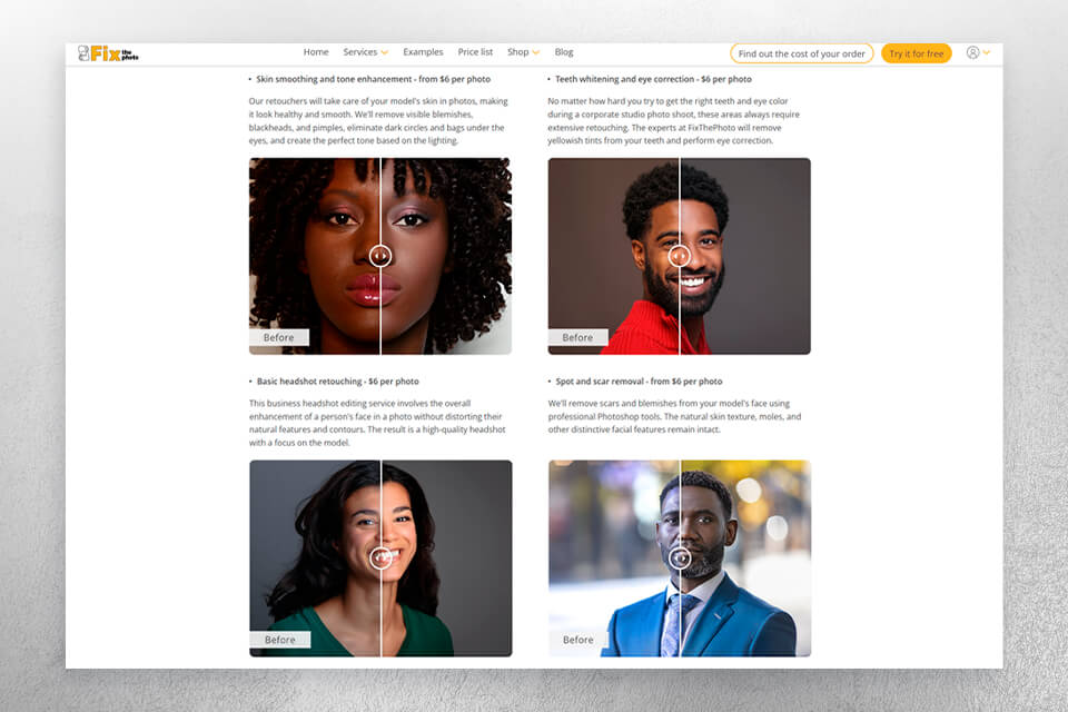
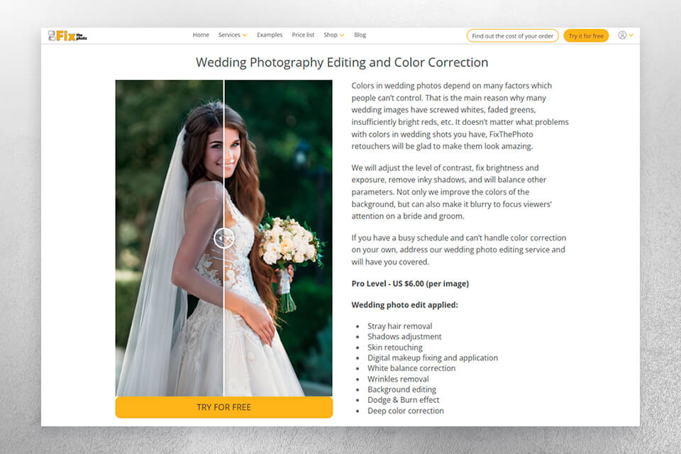
If your banner contains photos, consider having them retouched by a professional service first, since enhanced lighting and colors can significantly increase their quality.

Test, export, and proof. Before you sign off on any design:
My last rule. “If you can’t read everything in 3 seconds, it’s a bad design.” I have this post-it above my monitor. Whether you pick a standard banner size for a sales announcement or custom dimensions for a wall-sized event backdrop, your design needs to convey the intended message quickly and clearly.
I prefer to employ Adobe Express to enjoy a smooth and efficient workflow. Even with the Adobe Express free version, I can conveniently resize designs for several platforms while also brainstorming various ideas.
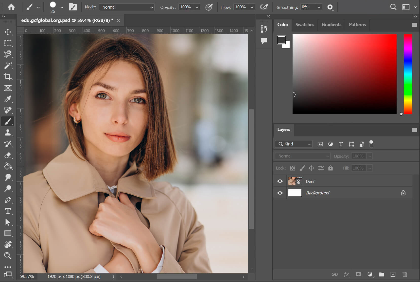
If you want to have even more control over your digital and vinyl banners, Adobe Photoshop is still the best option on the market. You can fine-tune the tiniest detail, employ masking, and create smart objects to scale different elements.
Adobe’s software also includes (for vector files) and Lightroom (for tone-matching visuals), streamlining the task of producing cohesive imagery.
Vinyl banner sizes aren’t the only thing I have in mind when I start to work on a new project. For example, for the “Free Portrait Retouching Webinar” promo, I created both digital and printed banners, preserving the same color palette and fonts for visual coherency. My workflow usually follows these steps:
Step 1. Choose the right canvas. In Photoshop, select File → New → Document and pick the desired banner dimensions (for print, 300 DPI CMYK; for web, 72 DPI RGB).
Step 2. Leverage grids and safe zones. Ensure the text and logos are at least 1″ away from edges to ensure they aren’t trimmed out.
Step 3. Only use high-quality images. Stick to the highest quality image formats available, RAW or TIFF if possible. Don’t add low-res JPGs.
Step 4. Stylize the message. Employ contrasting tones and never go above two fonts. If you’re struggling with typography, Adobe Express offers premade “font combinations” that can serve as a fantastic foundation.
Step 5. Export with intent:
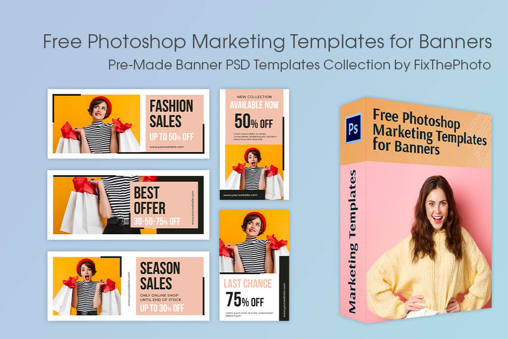
If you need to design promotional or event banners, you’ll appreciate this collection. FixThePhoto provides a hand-picked selection of free Photoshop banner templates, which you can start using and personalizing straight away.
Whether you’re deciding the optimal banner size in feet for a grand event opening, or working on a little promotional banner to post on Facebook or Instagram, these templates will help get you started, providing professionally-designed layouts and color palettes, while ensuring there’s enough free space to prevent edge trimming. You can use them with all modern Photoshop versions to create both print and digital designs.
3′×6′ is widely regarded as the most widely used format. It’s big enough for visibility yet compact enough to be used indoors. For digital use, 300x250px is the go-to choice for many marketers.
Popular options are 24×60 in, 36×72 in, and 48×96 in for print, and 728×90 px for web use.
A 3′×6′ vinyl banner is ideal for most business promotions. It balances visibility, portability, and cost.
Outdoor 4′×8′ (10x20cm) and 6′×12′ (15x30cm) banners are often used for roadside or large-venue promotions since they preserve legibility even at a distance of 40 feet or more.
Dimensions like 2′×4′ and 24’×48’ are a good choice for booth tables, indoor walls, and reception areas.
Retractable banners around 33×81” are the industry norm. They offer great portability and height while also being convenient to transport.
Yes, but you should still stick to standard aspect ratios (3:1, 4:3, etc.) to ensure the design doesn’t get stretched out or distorted.