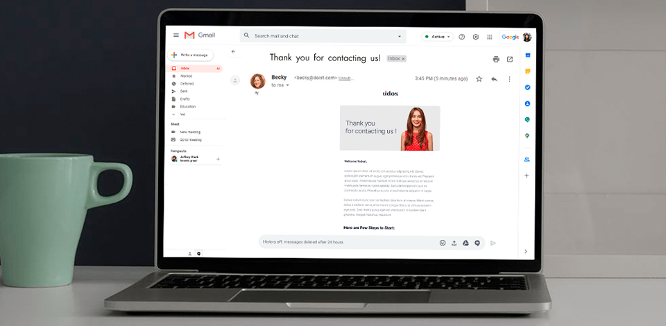
The importance of using graphic icons, visual elements, and images for emails is indisputable. People are used to perceiving information visually. If you think that it will be enough just to download any picture from the Internet and add it to the email you are mistaken. Each visual element has to have a high image quality, unique, match your brand style, and most importantly convey the meaning of your email.
Now, there are different platforms, email generators, which allow you not only to edit images, adjust their color, add text to them, but also use a completely ready-made email template.
In this article, I will explain to you why we have to use more images and pictures than text, what picture requirements we have to remember about, and what kinds of images are worth to be used in your emails.
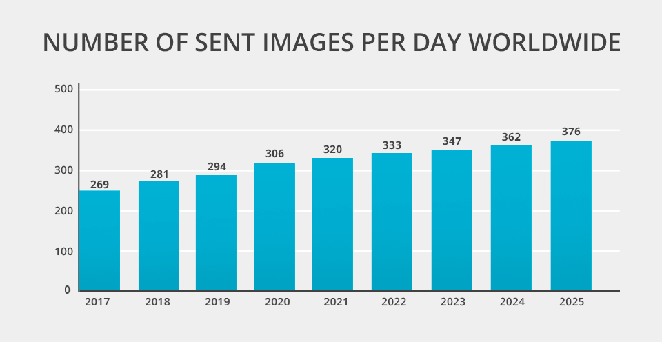
Nothing tells more than numbers. That is why I decided to show you some statistical data and facts that will make you sure about the high importance of using picture integration.
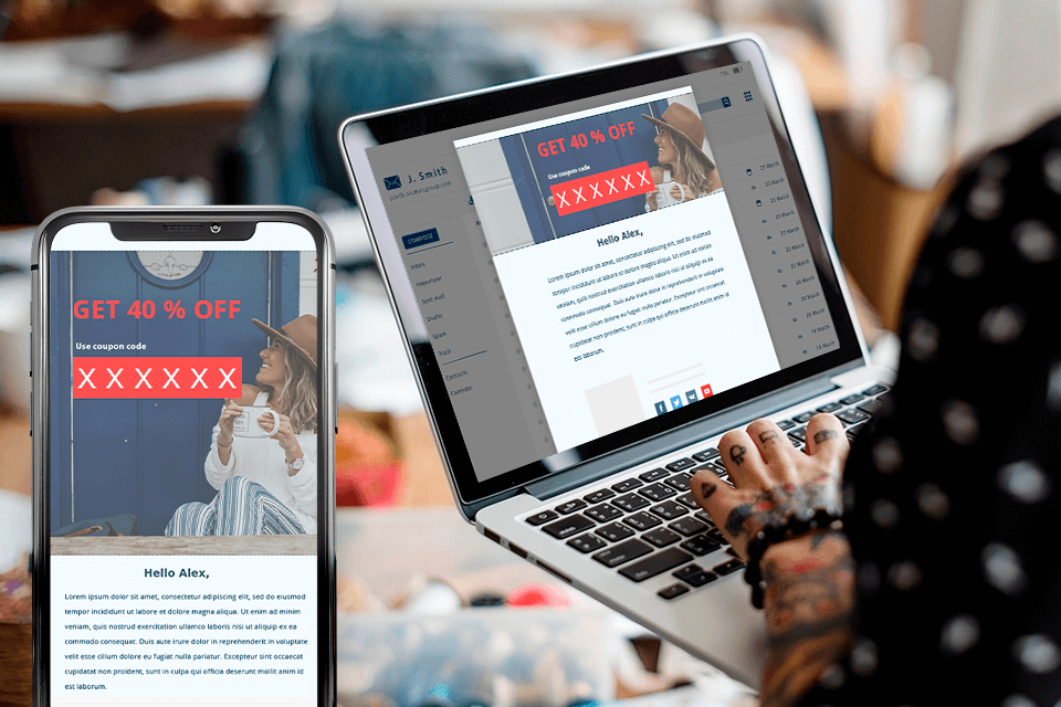
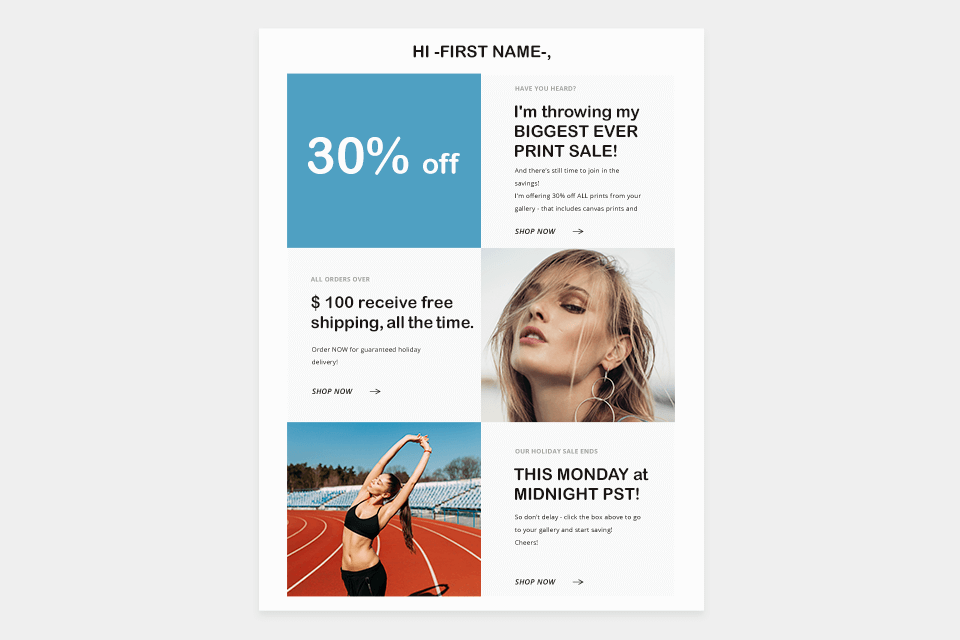
When sending out images using bulk image senders, you need to comply with certain rules and standards to correctly add pictures to your email. You may trust one of these free SMTP services to navigate your email sending and forget about delays. If your picture or image will not be displayed it can push a client away or even make people want to unsubscribe. Let’s look at the main requirements in this topic.
There are 3 popular image formats that we use in emails. These are JPEG, PNG, and GIF. Each of them has its pros and cons.
JPEG is highly used when you need to save specific colors. This format maintains about 256 colors and it is comfortable for small-size images for emails and photos. But it does not maintain the animation, possible loss of quality when scaling, and you can’t use it from logos;
PNG files have the advantage of maintaining transparency, being suitable for logos and text images, and image compression does not lead to quality loss. But you can’t use it when your image is too large because the size will be large for adding to the email. Also, it can’t be animated and it is not supported by all web browsers. Also, the email loading process may take more time;
GIF format is a simple way to add some animations to the content of your email. It maintains transparency, suitable for text images, and is compression lossless. But you have to remember that this format has a large image size and is not suitable for photos;
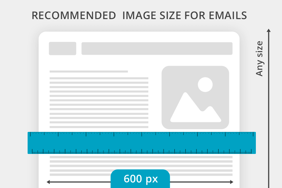
The image size of your email depends on the format and design, the background images number, and the number of the column as well. It is recommended to use the images with 600 pixels width having standard email width.
There are 3 main variations for image size:
When your clients get problems downloading the email full version, you have to introduce the alt-text that will be displayed in the text version of the email content.
You need to mention a few important points implementing the alt-text:
Reminder. The alt-text should be in harmony with the rest of the text and other email elements. Therefore, write the same or combined style properties for alt-text: color, font, and size.
Try not to use stock photography sites. Only 29.5% of marketers still use stock photos according to the research. Unique visual elements, client photos, video reviews are prevailing in 2026. Your clients may have previously seen the stock visual element you use in your email, and it can push them away from reading or following any links;
It would be much better if you can spend some time and financial resources on creating special or even personalized visual content for your email. The uniqueness can increase the CTR (Click Through Rate) and the engagement rate of your newsletters.
For now, let’s have a deep look at the types of visual elements that we can use to increase the valuable marketing indicators of our email campaign.
The header is the top part of your email which people see at first when they open it. It may contain the company’s logo, navigation menu, social media links, different types of buttons, phone numbers, etc.
Also, we can add some visual elements there. The logo is the most common visual element we can see in different email headers.
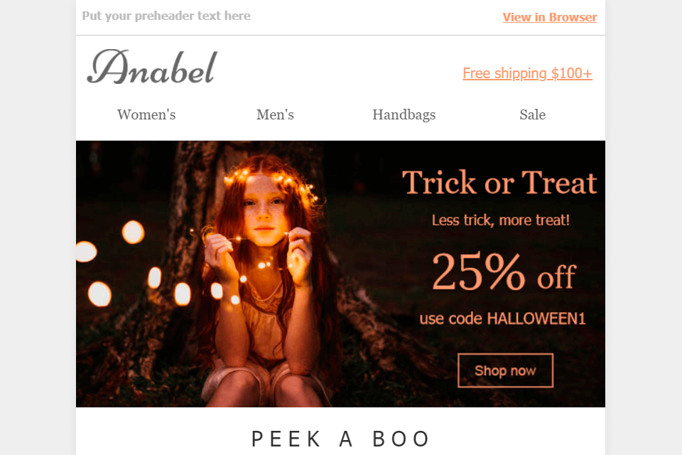
In other cases, you can add the images related to the email content or your offer at all.
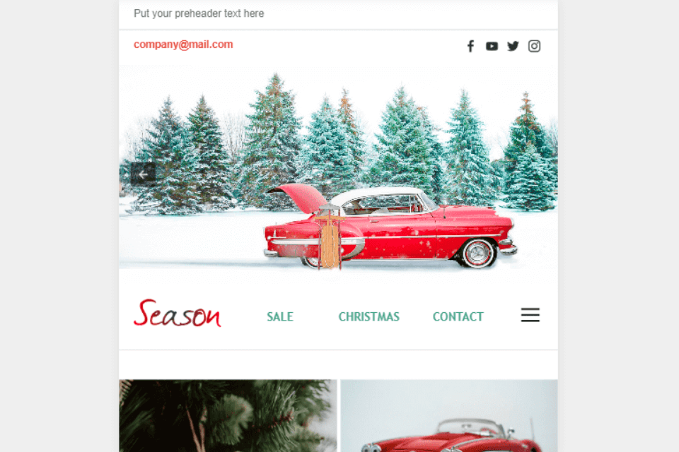
In this way, when your clients open an email they see something that they can associate with the information written in the subject line or your offer.
Placing the visual element related to the topic of your email above the navigation menu you heat up the client’s interest for further reading and getting information from your content.
Another advantage of using the image in the email header is the fact that most competitors are adding only the logo, contact information, social media links to the header. At the same time when you can surprise them by not showing the regular form of the header but letting them see something new and special.
Holiday header customization is also a nice time to use the images in emails.
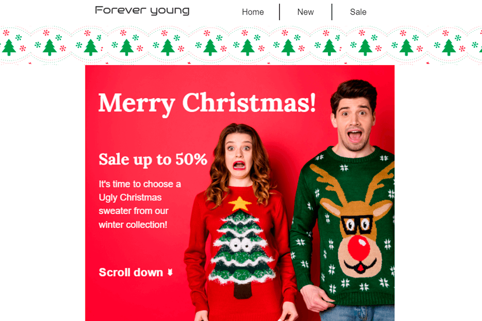
Adding those things that remind people about the coming holiday or important event in the form of visual elements evokes positive emotions. Customization is an excellent and pretty simple way to catch a client's attention.
The images in the email’s body are illustrating the product from the best side. We have to use this place correctly because it’s limited.
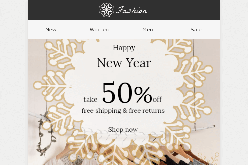
The best way, in this case, is to add some real pictures of your product and then add the necessary texts and CTA (Call To Action) on them. Nowadays it is not enough to say that you have some discounts for something that you sell and name it. You have to show the items you sell in the way people would see them in real life. That is why real photos are the best option for this.
You do not have to show all the products you have. The ideal situation is when you have only a few direct products to show. Remember that the space on the main part of your email is not endless as well as the client's attention.
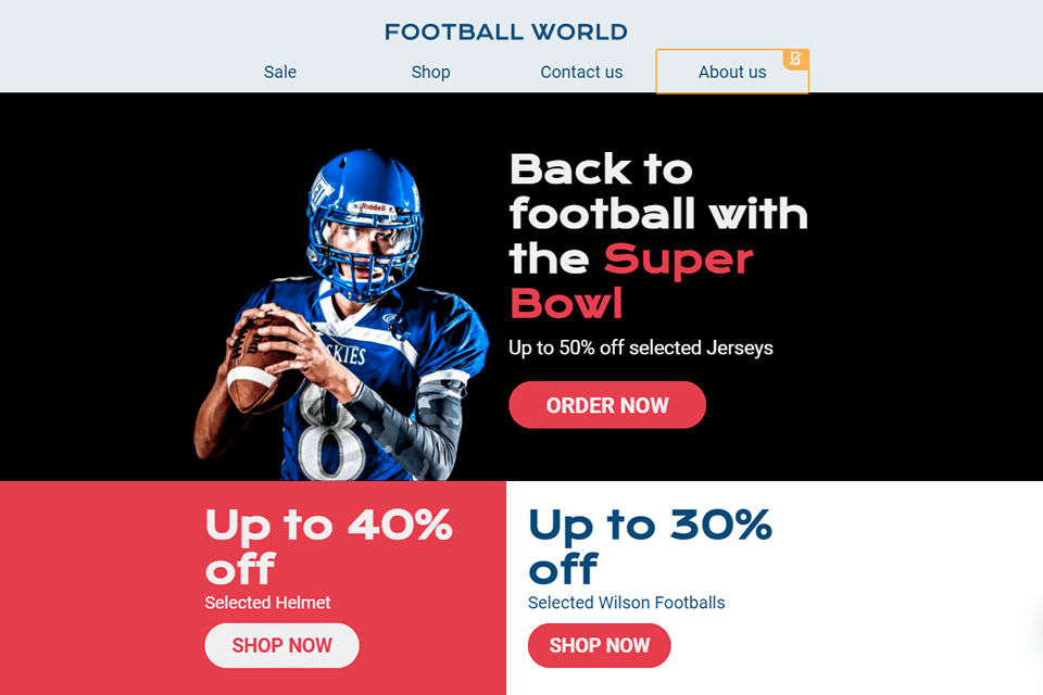
Two or three product photos added on the background that are in harmony and do not merge with the color of the goods can make clients be focused on the direct offers.
When the client's eyes become familiar with the products it motivates them for further reading. Sometimes correctly added product photos or images in emails can lead a client to a prompt purchase without any need for additional information.
Images set or carousel with product photo is an effective way to show a few visual elements saving the email space. When you need to show a number of photos or other images for emails on one screen you can use this tool.
Email marketing software usually has various photographer email templates, as well as templates for other businesses that make it easy display images in a visually-pleasing way.
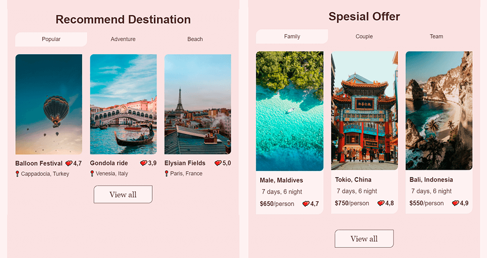
Here you can see that 6 trip offers were shown separated with different descriptions. In this way the size of the email may become larger as well as the time of the loading of such email may be longer than required.
And now look at another way how the photos can be located on your email without taking up a lot of space.
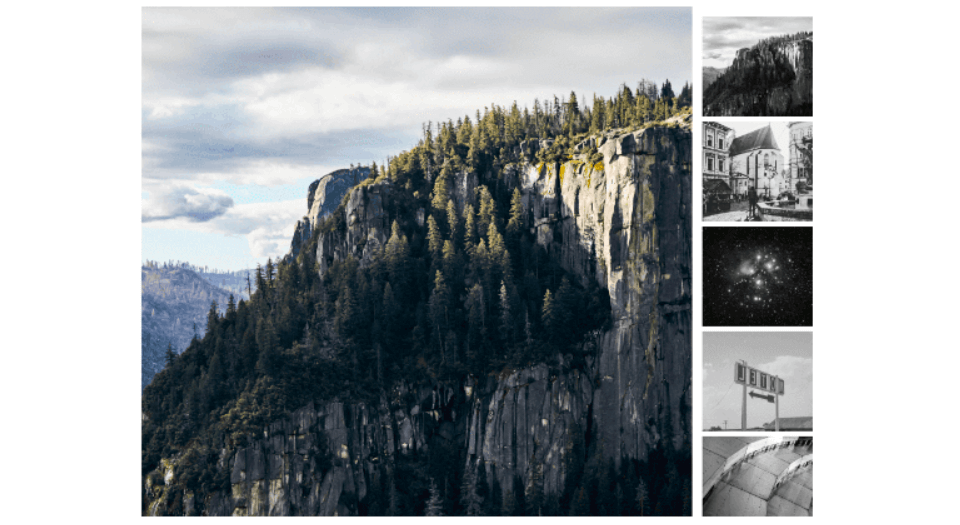
Here we can mention that pictures are placed on one screen and clicking the needed visual element appears with a larger scale. Saving the space of your email makes it shorter and we save clients’ time as well.
Another good way to increase the uniqueness of your email is using GIF animations. The difference between such a form and a simple picture is obvious. GIF is animated content at the same time when simple images and photos are static.
Such content is becoming very popular in the last few years because it is easy to implement in the design of your email and it engages people effectively.
By the way, for October 2021 the market position of GIF is higher than SVG, PNG, and JPEG according to W3techs.

Free GIF makers, like Photoscape can help you quickly make unique GIFs to improve your emails. The only thing you have to mention using GIF animations is their large size and longer loading time as well. That is why if you decide to improve your content with GIFs, try not to add other visual or texting elements in the email. It would be better to place all the offers and content you want to show inside one GIF.