Did you ever experience an issue where the colors in your pictures looked different when viewing them on different screens or in print? If you want to know why that’s the case, you have to learn about the basics of different color modes that directly affect how a photo is displayed on a screen.
The representation of different tones depends on the number of channels included in a specific Photoshop color mode. The post below goes over all color modes included in Adobe's editing program and offers advice on how to use them.
Each Photoshop color mode offers a different degree of color detail and file size. Whenever you’re planning to edit a photo that will be posted online or printed, it’s important to decide what color mode you’re going to use and why.

Best used for: social media, web, and presentation purposes
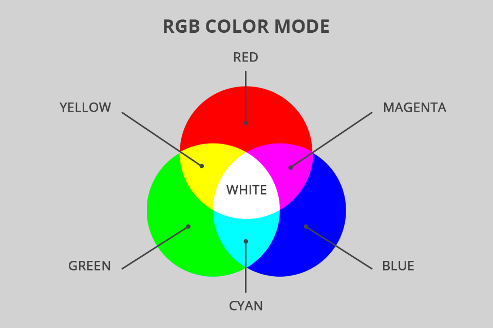
RGB in Photoshop is a color mode that includes Red, Green, and Blue tones that are mixed and matched to achieve a huge variety of other hues. This mode is designed solely for digital screens and serves best for viewing images on PC monitors, laptops, TVs, and smartphones. It’s considered to be the standard color mode and one that is most often used by photographers.
While RGB support is included in the majority of modern devices, the produced color elements differ from screen to screen. The photo you see on your Mac will look slightly different on your colleague’s HP laptop. Hence why it’s advised to get a professional Adobe RGB monitor like the BenQ PD2720U 27".
Rather than relying on ink to show colors, the RGB color mode employs an additive process that blends light to produce hues. This is the direct opposite of what we usually achieve when combining ink or paint.
If all RGB tones are present simultaneously at 100% intensity, you’ll see a completely white screen while the lack of color results in a pure black image. That’s why your screen goes completely dark when you turn off your monitor or laptop since all previously produced RGB base hues have been removed. Remember that it’s also important to know how to change PPI in Photoshop if you want to ensure the images you post on social networks are of the highest possible quality.

Best used for: all types of printing
If you decide to learn how to print photography, the first aspect you’ll be taught to look at is the chosen Photoshop color mode. Similar to JPG being the best image format for printing, CMYK is the unanimous color mode for making prints. CMYK is the abbreviation of the words Cyan, Magenta, Yellow, and Black, as these colors represent the traditional ink hues used for printing.
By mixing and matching the provided colors in different combinations and amounts, this mode can produce an enormous number of hues. This process is employed by printers, magazines, photographers, and other creatives that rely on dyes/pigments to produce color. In some cases, a printing establishment or publishing house can refuse to complete your order unless your files have been set to CMYK.
If you're working with an RGB photo, it's advised to do the bulk of the editing in RGB mode and then convert it to CMYK once you're nearly done. Such an approach yields better results because the RGB gamut (screens) is significantly broader than the CMYK gamut (ink) and the conversion process can make some hues look different.
Colors in this mode often appear duller and less saturated simply because certain hues cannot be printed. You should also keep in mind that CMYK images take up more storage space because they employ 4 channels rather than 3.
Best used for: for color reference, branded products
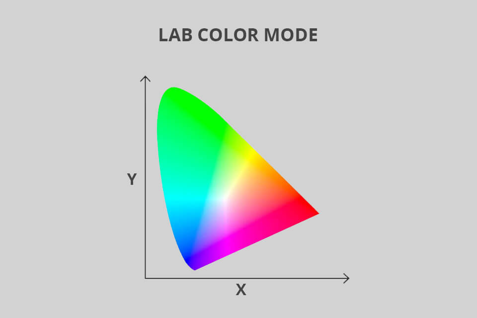
The LAB color mode, often referred to as CIELab, is focused on the human perception of colors. This mode relies on a single channel for Lightness (L) and a pair of color channels (A and B). The L channel can have any value between 0 and 100 while the Green-Red (A) and the Blue-Yellow (B) channels can go from +127 to -128.
This Photoshop color mode is designed to be device-independent, meaning it simplifies the task of having identical colors on different screen types and in print. Color management systems rely on LAB as a reference point to convert tones between color spaces with a predictable result.
If you’d like to create a branded t-shirt, mug, or banner that features your images, then the LAB color mode can be instrumental in ensuring the hues look exactly as you want them to. Another benefit of using this mode is that it’s great at making the colors in your photos look more popping and natural.
Best used for: multimedia presentations, web pages, mobile apps
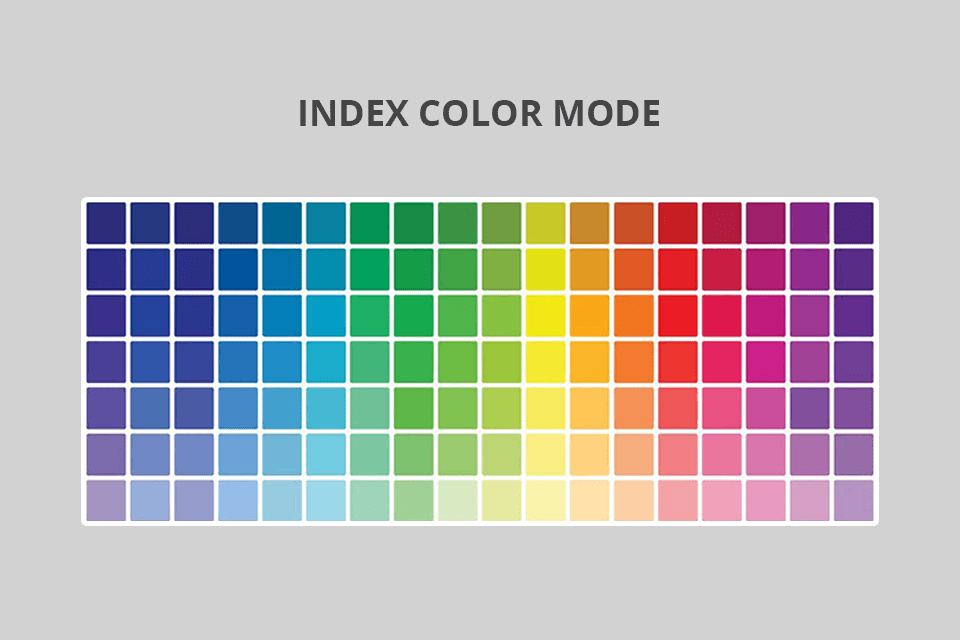
The Index color mode for digital images displays them in 8bit and can reproduce up to 256 colors. Since it’s a digital-only mode, you should only use it for photos that are meant for PC screens, smartphones, and TV broadcasts.
When transforming an image to be displayed in this mode, Photoshop creates a color lookup table (CLUT) that contains the index data of all included colors. If a specific color that is present in a different mode isn’t available in Index, the software will automatically pick the most similar alternative or employ dithering to emulate the hue with the help of available tones.
Despite having a smaller color palette, the Index color mode is very useful if you want to minimize file size while preserving the high visual quality that is required for online presentations, web posts, etc. Thus, this mode can be considered the perfect option for image optimization. Since your image editing freedom is quite limited when using Index, convert the photo to RGB colors if you want to perform some in-depth retouching.
Best used for: for digital and print photos and designs
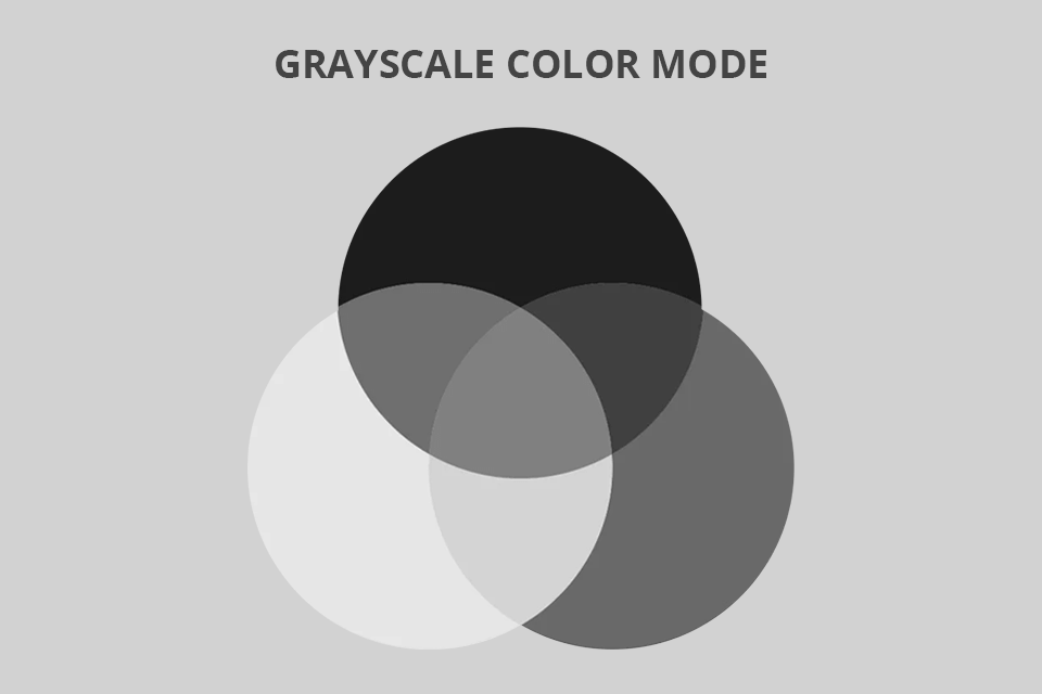
Unlike all the previously discussed color modes in Photoshop, Grayscale only displays photos in shades of gray. When viewing 8bit pictures, the system can reproduce up to 256 distinct shades of grey with each pixel being assigned a value between 0 (pure white) and 255 (pure black). For printing, grayscale values are represented in black ink percentages (0% - white, 100% - black).
Grayscale can be useful for both digital and printed photos. For digital photography, this mode can be of great help when you want to establish a specific tone or mood. For printing, Grayscale allows saving costs and reduces the amount of ink that you have to use.
Best used for: line drawing designs
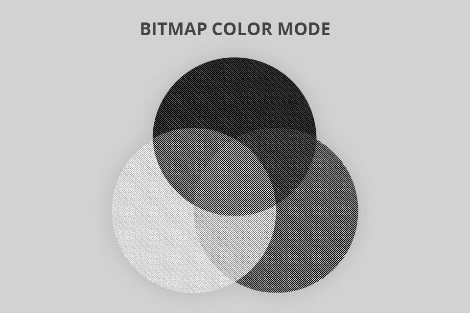
The Bitmap mode, also referred to as line art, only displays black and white pixels without any shades of grey in-between. Line art can be employed for both digital images and printing. When displaying a digital photo, black and white values are assigned to each pixel of the picture. When printed, this mode leaves all the white pixels blank (since the paper is already white) and only uses ink for the black areas.
Bitmap can be an interesting choice for both digital and print media, particularly if you want to emulate the look of a line drawing or a hand-drawn illustration like the ones you used to see back in the good old days. Even though such pictures may appear to have jagged edges when viewed digitally, the printed results always look crisp and clean as long as the resolution of the image is large enough.
Best used for: bringing out middle tones and highlights of an image
Duotone is among the least used color modes in Photoshop. One of the reasons behind that fact is that this mode can only be accessed if you transform your photo to grayscale first since otherwise it can’t even be selected.
To convert your photo to greyscale, pick Image > Mode > Grayscale. Keep in mind that only 8bit greyscale pictures can be set to Duotone. As long as you have that covered, you can click on Image > Mode and there you’ll see the Duotone setting.
The key distinguishing feature of this color mode is that it gives you the option to enhance your photo with 1 of 4 ink colors that are applied as a tint. The potential ink colors include Cyan, Magenta, Yellow, and Black (CMYK). Such an approach allows you to make your formerly grayscale photo a tad warmer or cooler by adjusting the color balance in the provided window.
Best used for: only for specialized printing
The Multichannel mode was created for storing masks and specialized printing rather than regular printing needs. If you set a photo to Multichannel mode, you’ll no longer be able to edit a composite channel since each channel will have to be adjusted separately.
This Photoshop color mode contains 256 grey shades in every channel with each pixel consisting of 8bits.
Here are the guidelines you have to keep in mind if you want to set your photo to this mode:
You can switch a photo to a different Photoshop color mode rather easily but keep in mind that once you do that, you will permanently alter its color values. For instance, if you transform an RGB file into a CMYK one, its RGB tone values that don’t fall into the CMYK palette will be replaced with similar values within the chosen gamut.
This means that the conversion process can lead to a loss in a portion of the original image data that won’t be restored even if you transform the photo back to RGB mode. That’s why it’s essential to do all the editing you want before the conversion process, particularly if you’re working with multiple layers since the color interaction of the different blending modes is altered along with the color mode.
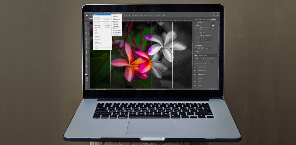
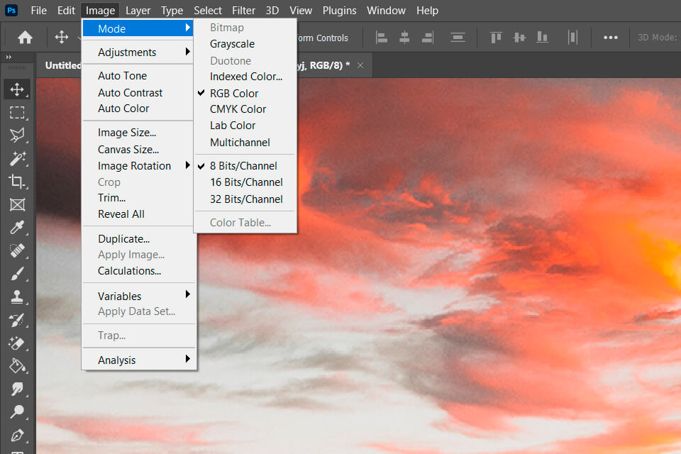
Go to Image > Mode and pick the desired mode. If some options aren’t available for the current mode, they will be shown in a dimmed grey color. Remember that if you change the mode of a photo to Multichannel, Bitmap, or Indexed, the layers will be merged since these modes don’t provide layer support.
Pro Tip
Create a backup for the photos you want to convert. This is especially important for layered files since you might want to make some adjustments once the conversion is done and you don’t want to lose the editing flexibility offered by the image’s original color mode.
Whenever you’re copying photos between devices, it’s a good idea to take advantage of Photoshop’s color mode functionality. By picking the optimal mode for both devices you can guarantee the colors on the new screen will be as close to the ones you’re used to as possible.
Not quite. While both color spaces have the same number of colors, sRGB’s range is about 35% smaller, meaning such images have fewer hues and aren’t as vibrant.
Employ CMYK for photos that you plan to print and stick to RGB for images that you’re only going to view or post digitally.
8bit images can contain 16 million colors while 16bit pictures bump that number up to 28 million. That said, 8bit remains the standard color depth in most industries to this day. Even though some computer screens can produce an even larger bit depth, the significantly bigger file sizes make it a poor tradeoff.