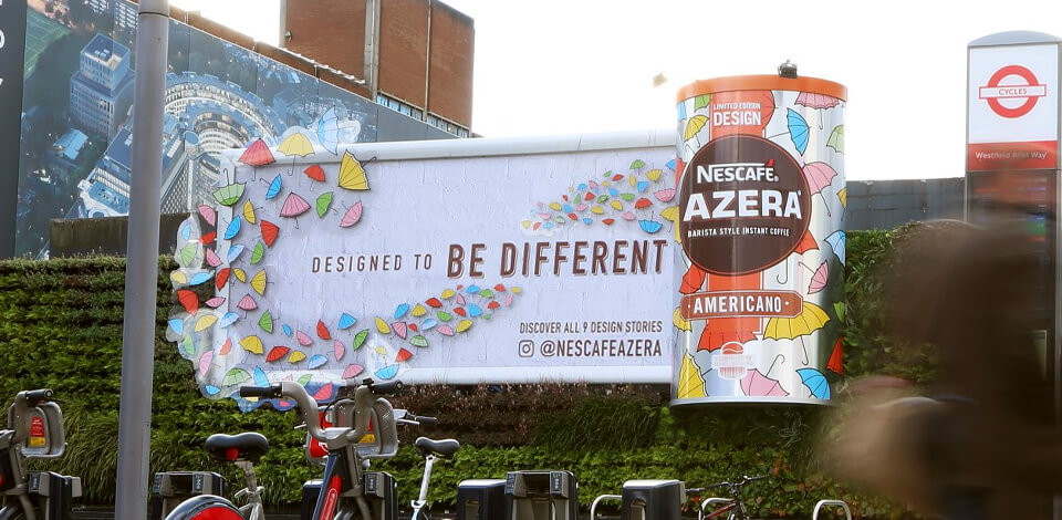
Billboard advertising is probably the easiest way of visualizing some concepts and attracting attention to particular products/services in an unobtrusive manner. There are multiple billboards located along roads, but few of them have a really catchy design that will stay with commuters, travelers, and locals for a long time.
If you strive to create something one-of-a-kind that will immediately catch viewers’ eyes and make them stare at the billboard for at least a couple of minutes, this article may come in handy. I’ve collected the most creative billboard design ideas, which can serve as a basis for your own experiments.
There are actually 3 main elements of a winning billboard design – a clear message, impactful styling, and a call for action. I’ve looked through the works of famous graphic designers, who perceive regular things in a unique way, thus create mind-blowing designs. Check them up for inspiration!

Using shadows in a billboard can result in great outdoor advertising. The most notable sample is the Dracula billboard created by the BBC. In the daytime, there are only multiple stakes arranged across the surface, but when the sun is setting, these stakes cast shadows that make up the face of the famous vampire. Such an implementation is suitable for evoking particular emotions, namely, horror.

Another cool example of how you can incorporate shadows is the billboard by McDonald’s chain in Chicago. There is a uniform red background and several typical dishes you can find on the menu.
Each item has a number next to it, and while the sun is changing its location during the day, a special fork-shaped structure casts shadows on different dishes, thus inducing people to buy them to appease hunger.
Sometimes, to show the best properties of your product, you need to put it in the natural environment. This is a nice analogy that helps viewers grasp your concept better and tie it up with their life.
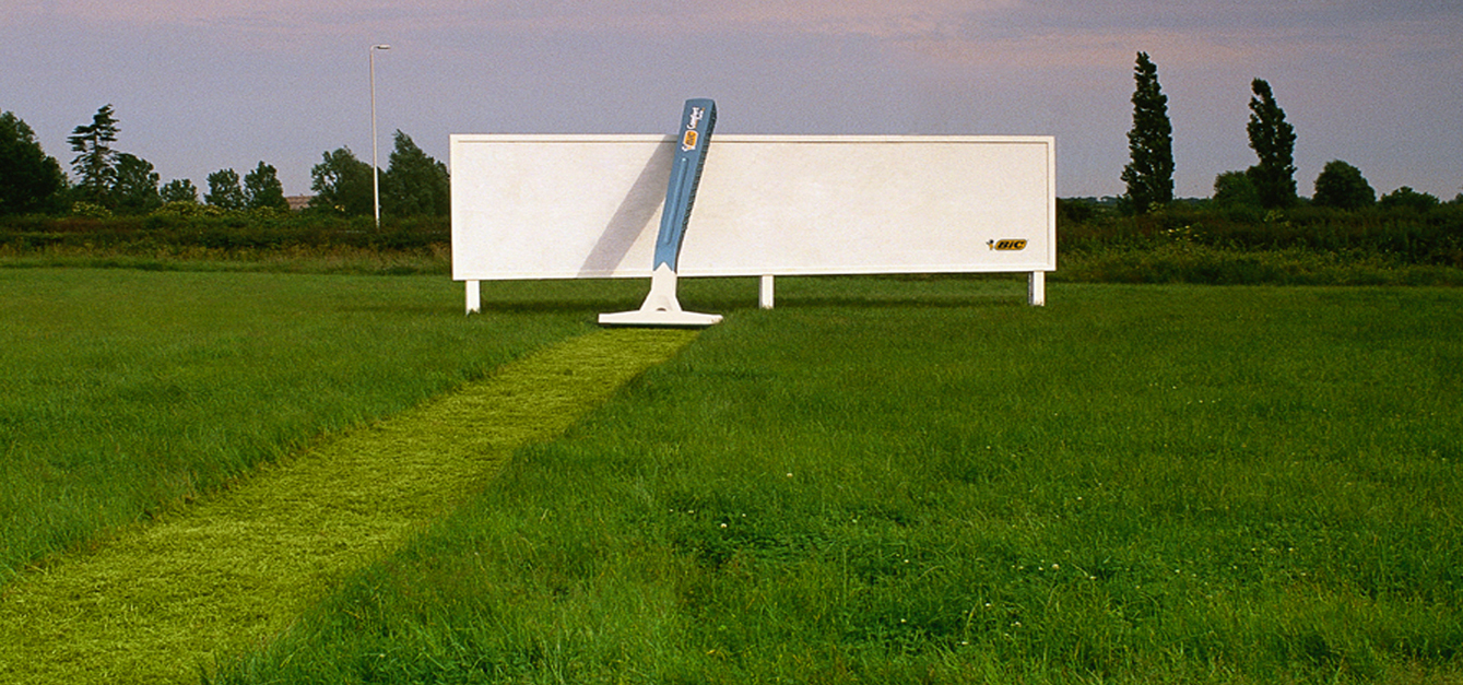
As a guideline, you can use Bic advertisement in Japan that shows a large razor shaving a path in the grass, which ends in a white billboard with the company’s logo. This is a wonderful example of a creative billboard that perfectly serves the defined idea – make people think that this razor is super sharp.

Another vivid sample is the billboard of Berger Paints, the agency engaged in the production of natural finish colors. Here you can see a painter who uses the paints produced by the company to cover the canvas. The paints are so quality and beautiful that they actually merge with the sky. Hardly can a person resist the desire to buy this paint after looking at this ad.
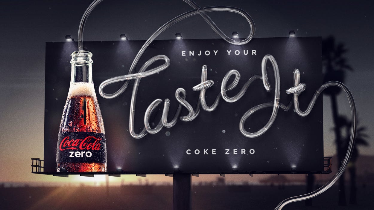
A billboard campaign that involves the distribution of some freebies is sure to appeal to clients and make them remember your brand. Coca Cola has located a large “drinkable” billboard with the “Taste It” slogan near public fountains and let passers-by savor their product. There are tubes connecting the board with fountains so anyone can take a sip. Undoubtedly, people will appreciate this move.

The same approach was used by Cooch Creative to let buyers know about their sunscreen. They located sunscreen-dispensing billboards in Western Australia as a part of their Sun Smart Cancer Council campaign to warn people about a harmful effect of the sun and possible ways of protecting their bodies. There is a special cut-out in the area of the skin marked for cancer removal, which helps convey a really serious message.

The Frontier company decided to transform a regular billboard into impressively large floor graphics, which look very meaningful when looked at from above.
It seems that people walking across the floor are ticks and fleas that disturb a poor animal, and the “Get them off…” slogan fully coincides with what we see. This is a perfect way to integrate the surrounding in the theme without fully re-working your ad campaign.

Identical juxtaposition can be traced in the plastic surgery office with Michelangelo’s The Creation of Adam painting on the wall. Every time a client reaches an elevator button, it seems that he/she tries to touch the finger of God. Such an advertisement looks truly powerful.

Experimenting with different forced perspective photography ideas is actually a rewarding experience. This is a billboard from Anando Milk, in which they relied on an optical illusion in order to attract children’s attention. Knowing that kids perceive everything in their own way and believe in superheroes, the company claimed that children can also get some superpowers if they drink their milk.

In fact, many companies use such billboard design ideas. For instance, Miele shows the power of their vacuum cleaners by attaching the end of the hose with the beginning of the tunnel. Since the billboard is located above the tunnel, it looks like all cars are sucked into the vacuum cleaner. Though the idea may be slightly exaggerated, every driver is bound to remember this billboard.
There are many great billboards that are located in a smart way so that surround objects make the products advertised even more noticeable. In this case, electric wires are arranged to form the hair that sticks out of a nose. That’s really interesting advertising of hair trimmers.

The Law & Order billboard is another brilliant example of how to use everyday objects to match the ad scene. There is a large outdoor lamp, which is used for mimicking the Police interrogative process. The main thing here is that the advertisement gets noticeable at night, which adds a special mood.

While choosing billboard design ideas, don’t limit yourself to standard billboard space. It is OK if you manage to break the lines of the frame and use a larger environment to express your concept. This helps attract a larger audience, since people are subconsciously interested in the novelty and instantly notice items that are out of regularities.

Have a look at this Oreo billboard. They pretended to drop an Oreo cookie into milk so that there appear splashes that go far beyond the regular borders of a billboard frame. People can’t but notice such a design.

In addition to regular static billboards towering across the city, you can also use practical elements as a part of your advertisement campaign. Think about the purpose of your product and how you can make clients “feel” the benefits they’ll get using it. For example, IBM not only shows their products but also lets people derive benefits from them.

Since they specialize in city planning and design, they displayed their strong points by creating ramps and shelter-like billboards that perfectly blend into one whole. That’s actually the main thing you need to bear in mind – the aesthetics and practical nature of your billboard must coincide.

Since people are subject to impulse-buying and often their desire to get something is affected by their deep feelings (both positive and negative), you can use such a feature of human nature to bait them to purchase your products. The most impressive example is how the Ponds used embarrassment as a driving force for people with problem skin to spend money on their cream.
The “outer” layer of the ad implies that people can clean their pores and get rid of pimples if they use this cream. However, there is an inner layer, which appeals to our emotional component, making us believe that we will also become more confident about our appearance.

The best billboards are those where both the upper graphics part and the supporting structure form a balanced whole. Actually, using a billboard’s pole as a part of a design may give a very interesting outcome. Denver Water perfectly brought this idea to life by turning the pole into a knotted hose trying to persuade people to use water rationally.
Dewalt, a company that sells building instruments, developed an entire advertisement campaign taking this concept as a basis. They made a pole look like a nail and depicted different tools in the billboard to show how people can use them for work.
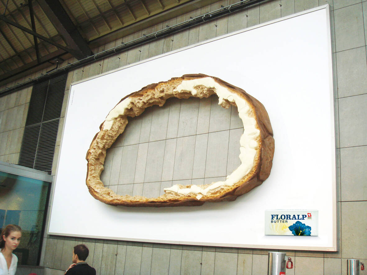
If you need to make a creative billboard to advertise food, it makes sense to appeal to human taste receptors. Have a look at the 3-D Floralp butter billboard to understand what I mean.
There is a piece of bread with traces of butter on the sides. It is obvious that the inner part covered with butter was eaten straight away. Thus, people think that the butter is so tasty that you don’t want to eat top crust that lacks it.

The same principle was used to show that Capsico sauce is extremely spicy. They burned a hole in the billboard to highlight its taste.
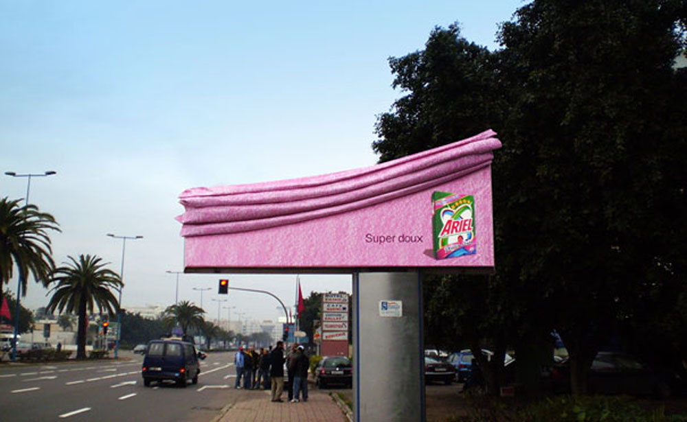
People, who drive past billboards have on average 5-10 seconds to notice what is depicted there. Of course, there are many signs along a road, so you need to create unique designs to catch and retain their attention. In this case, the Saatchi & Saatchi agency took the risk of using creative product photography ideas to illustrate the special softness that Ariel washing powder creates.

I have already mentioned Miele, a company that produces vacuum cleaners. They always create great billboards, which is why their products are so demanded. This time they accentuated the power of their vacuum cleaner by pretending it has pulled a hot air balloon out of the sky.
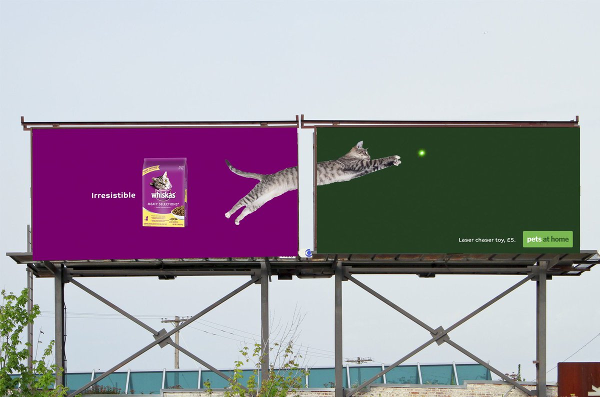
When it comes to realizing unique graphic design ideas, you may need to cooperate with another brand engaged in the same sphere.
For instance, Whiskas worked together with a laser chaser toy company and created a double billboard where a cat is chasing a toy and jumps from one part of the billboard to another. Finding a partner within a single niche is amazing, as you can easily extend the range of your clients.
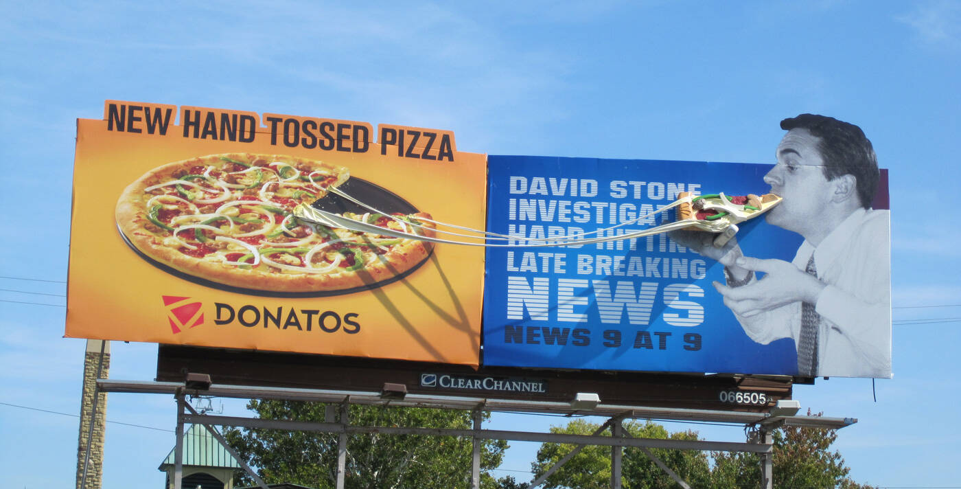
Another successful alliance involves pizza Donatos and a newscaster. They located 2 related billboards near each other to show that pizzas are so delicious that even reports take a break to have a piece.

Billboards that have a humorous constituent are always attention-grabbing. People not only notice them but also photograph to show to their friends and relatives.
Silberman’s Fitness Center decided to adhere to this principle to make people learn about their services and become their clients. The main idea of this billboard is that overweight people should go to the gym unless they want to be like a man depicted, who tilts a metal structure.

To see how your billboard design ideas will look in reality, you may use poster design software. A hair salon also used funny visuals, advertising its services. There is a man with very long hair, and each time you pull off a piece of a poster with a written number, you open a bit more of his face.
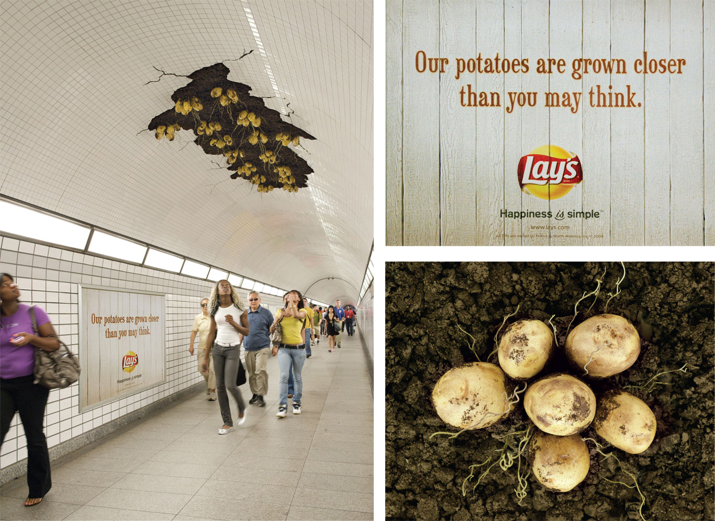
To support your brand, buyers need to understand your social position and what you think is right. Potato chip maker Lay’s treated this topic seriously and created an installation on the ceiling of the Jackson Tunnel in Chicago in order for subway riders to see how they grow their potatoes.
Another message of the campaign is revealed in the slogan - “Our potatoes are grown closer than you may think”. This way, Lay’s declares its support for local potato farmers.

While pondering on new billboard design ideas, remember the 3 core elements of a successful design I described above. For the audience to fully grasp a message, you need to use the available space reasonably without adding too many small items.
No clutter and confusion! Everything should be as straightforward as possible. With the help of free graphic design software, you can better understand how to use the negative space creatively.

If you are after traditional horizontal billboard designs, you still can jazz them up by using a 3D effect. If there is a row of flat boards and yours contains an unexpected 3D finishing, drivers will definitely notice it.

A cool example of a 3D effect is a billboard for a facial scrub and pore cleaner, which shows a large pore where a man removes dirt and grease, imitating the way this product handles skin.

People really like ads that display the qualities and effectiveness of a product in detail. Though this isn’t suitable for all products, those intended for practical use, can be advertised this way.
The sample billboard shows that the edges of a canvas are fixed with the tape adhesive, implying that it is so strong that can hold even large and weighty pieces. You can also check out construction banners by Platon Graphics. They focus on highlighting strong materials and vibrant designs that withstand outdoor conditions.

If you have read graphic design books, you probably noticed one common tip – don’t write all your contact info on a billboard no matter how tempting it is.
It is really frustrating to come across billboards with the needed services/products but fail to read contacts because there are too many words and they are all written in ridiculously small print. To make your billboard serve its advertising purpose, you need to keep information concise and big.
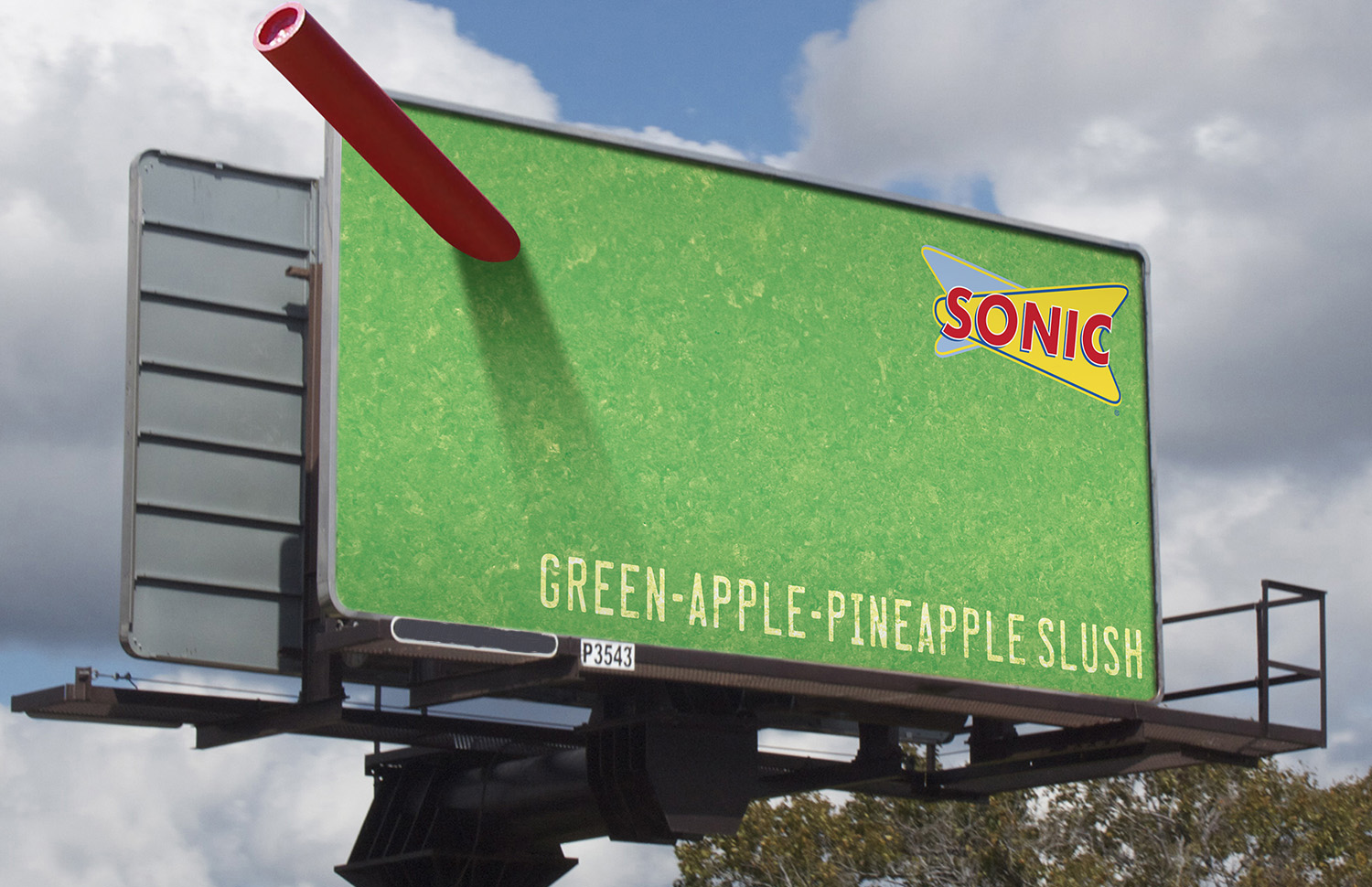
Great billboards are designed slightly differently than printed ads. The main thing here is to choose contrasting colors for the background and the text in order to achieve readability.
The best combinations are black & white, black & yellow, blue & yellow. You’d better avoid brown, pastel, and earthy tones.