Recently, I set up and ran my online store using Adobe Commerce (formerly Magento). Now, drawing from that experience, I can share some Magento website design tips with you.
Following them, you’ll be able to avoid mistakes and make your website more attractive and functional, thus, receiving happier customers and increased sales in the long run.

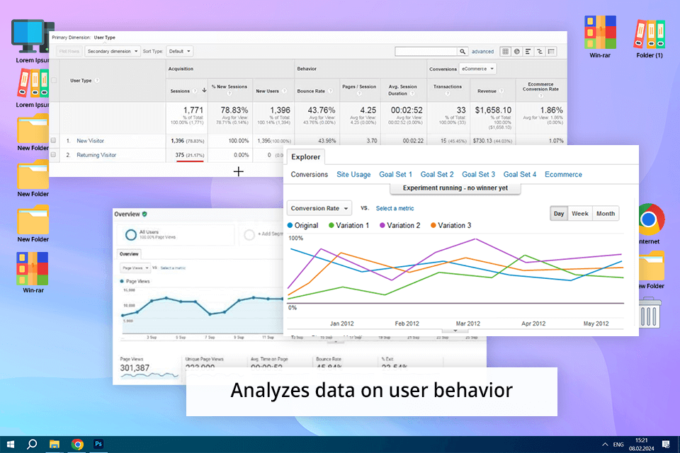
According to the latest trends in website design and user experience, it is paramount to focus on users when making design choices. First off, if you already have a website and want to make it better, begin by checking out data on user behavior, leveraging Google Analytics or similar tools.
Also, get a grip on how users navigate your site, where they leave, and what prompts them to buy your products. Knowing these details, you’ll be able to adjust your Adobe Commerce website to match what users expect.
Using search engine optimization (SEO) is one of the most frequent Magento website design tips. It's a strategy that takes time to work, but the extra visitors it brings to your website are really valuable. You may want to learn about it yourself or hire someone who is good at SEO. But either way, the results will be worth the effort.
Make sure to use the following SEO practices:

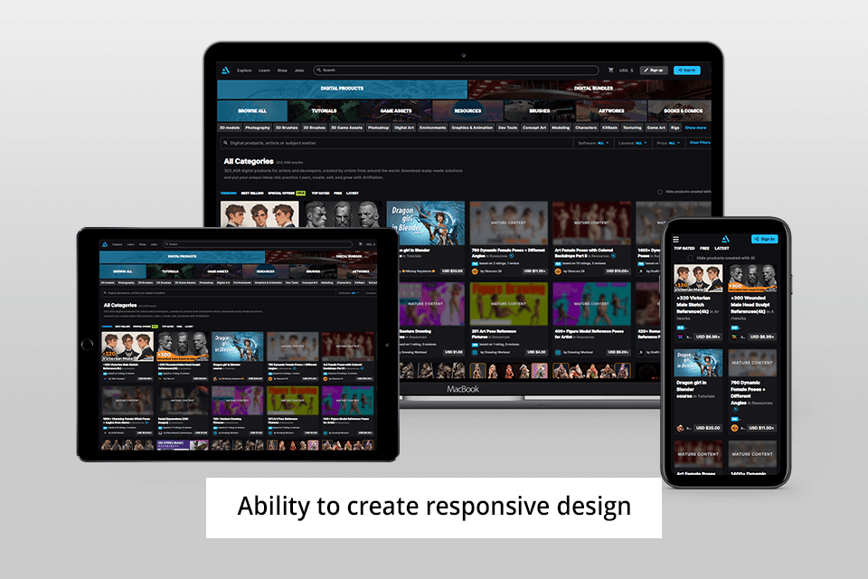
Since customers use different devices to visit your website, it's crucial to ensure that your Adobe Commerce page looks great on all of them. Responsive web design is beneficial for Adobe Commerce e-commerce business in several ways. It can boost sales, make it easier for people to find your site in online searches, and more.
Use responsive design to adjust content and make it look great on any screen. Take advantage of such Adobe Commerce features:
Top-quality images are crucial for attracting users and retaining their attention, particularly in the online retail sector. The quality of product photos can significantly impact the success of your store listings. Therefore, it's vital to utilize the highest quality photos available when presenting your products.
As for ecommerce image optimization, the problem is that high-quality digital photos use up a bunch of space on your website's server. Thus, they slow down page loading. This can cause issues since most people want websites to load in just three seconds.
Another important Magento website design tip is to choose the right theme. Opt for a theme that is responsive and can be customized according to your needs. For your ecommerce store to operate efficiently, it's crucial to integrate different third-party tools and ensure such combinations work lag-free.
If you like a theme that isn't very popular, you can still use it. Just dig a bit deeper and check how many third-party apps it can work with. If it integrates well with several apps, then you're good to go.

Dynamic blocks are content sections in the layout of an Adobe Commerce website, such as images, text fields, or videos. These sections can be automatically updated from the store's backend based on rules and conditions set by a site administrator.
I created such blocks for my website and that was a really smart decision. Now, I can quickly personalize the website, by sending bespoke messages to every client and offering them unique deals.
Dynamic blocks work best for sections about products, like showing the distinctive features or comparing them. You don't need to know how to code to use them, and they're easy to change when you're making Adobe Commerce designs.
When you add social sharing buttons to your Magento website design, users can easily share products, deals, and content with their friends on social media. This is a kind of free advertising method when more people can learn about your brand.
Moreover, when you include user-generated content, like reviews, ratings, and testimonials, it makes your Adobe Commerce site seem more genuine and trustworthy. People are more likely to believe recommendations from their peers. It can lead to an uptick in sales and loyalty.
Also, many of my customers say that thanks to social login options on my website it is easier for them to sign up and log in. When users can log in with their social media accounts on Adobe Commerce websites, the overall shopping experience becomes faster and more enjoyable. Besides, store owners can gather useful data for personalized marketing.
After just setting up an online shop using the Adobe Commerce eCommerce platform, I've come to see how important it is to have clear CTAs that tell customers what to do next. You can't assume customers already know what to do. They need prompts throughout the buying process.
You need to make CTAs across the site easy to see. Besides, make them simple and straightforward. Remove distractions and double-check that all links are functional. This way, you can improve the user experience and increase conversions effectively.
Think of your online store as a digital showroom, where every click, scroll, and interaction influences how customers see your brand. Now, accept the fact that a potential customer arrives on your website, looking for more than just a product — they want an unforgettable experience.
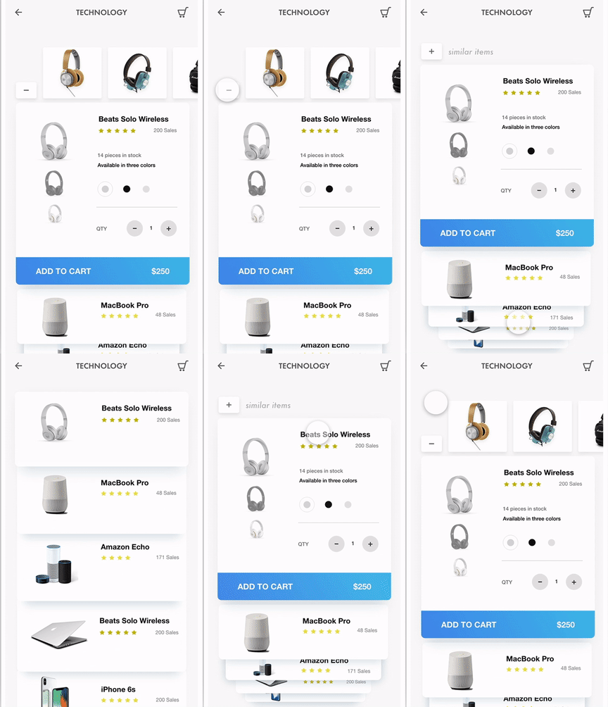
To achieve this, focus on richer product presentation and interactive elements that feel natural to explore. If needed, services like Amasty Magento website development can help implement these elements professionally without hurting performance or layout quality.
Think of this table as your plan for building an interactive display on the site. Include vivid descriptions that bring sensory experiences to mind and innovative features like augmented reality. Each component will add to a pleasant online shopping journey, transforming it from ordinary to exceptional.
|
Product descriptions |
Detail exact dimensions, materials, and care instructions |
|
Images |
Showcase the product from every angle |
|
360-degree rotating feature |
Make it possible for customers to view the product from all perspectives |
|
Augmented reality feature |
Allow customers to visualize the product in their space using AR technology |
|
Assembly instructions |
Provide video or written instructions on how to assemble the product |
|
Filtration system |
Allow customers to filter products by different categories for easy browsing |

These presets are designed for editing ecommerce product photos. I used them to adjust the white balance, to brighten and remove unnecessary shadows from the photos. In addition, they are capable of raising brightness, saturation, sharpness, and embellishing pictures with an HDR effect.
All presets in the package are in .lrtemplate and .xmp formats. If you haven't used them before, I recommend learning how to add presets in Lightroom first.
Adobe Commerce, previously known as Magento, is a top-notch e-commerce website builder. Businesses can use it to make their own online stores just the way they want. It is in demand in the eCommerce sphere because it has features for managing products, handling payments, and improving user experience.
To improve user experience, concentrate on creating a design that adjusts well to different screen sizes. Thus, it will be easy for users to find what they need, load pages quickly, and locate particular products. Get to know your audience's preferences and how they interact with your site so you can customize their experience accordingly.
You can integrate social media into your site by including buttons for sharing content, showcasing social media feeds, and offering social login features. This fosters user interaction and boosts brand promotion across various platforms.
Make sure your CTAs are understandable, compelling, and located in the right spots on your site. Use words that tell people what to do, colors that stand out, and good deals to encourage visitors to do what you want, like buying something or signing up for emails.
Opt for a responsive design and try it on different phones and screens. Make pictures smaller and text shorter so it loads faster on phones. Also, add features like touch-friendly navigation and mobile payment options.