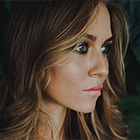
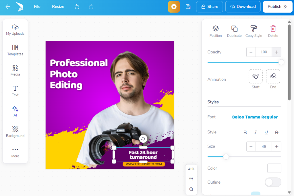
I was launching a small lifestyle brand on Instagram when I noticed my profile still looked incomplete. My posts were fine, but the highlight covers and promo headers didn’t fit the style I wanted.
That’s when I decided to find an Instagram banner maker to make clean, nice-looking graphics quickly - without spending forever on design. Hiring someone wasn’t possible because I had almost no money and very little time.
The project was about promoting regular releases and collaborations, so the banners needed to look modern while still matching my brand style. My main priorities were:
I reached out to my colleagues from FixThePhoto, who have a lot of experience creating professional graphics for Instagram promotion. I asked them to share their experience with different tools they use in their work. Some of my colleagues even agreed to help me test 50+ Instagram banner makers, and I was happy to accept their help.
Bold, minimal typography. Designers are focusing on large, clear text that stands out without too many extra elements around it. Short phrases, single words, or bold taglines are popular because people can read them quickly while scrolling. Bold typography, strong contrast, and simple backgrounds help grab attention without adding visual noise.
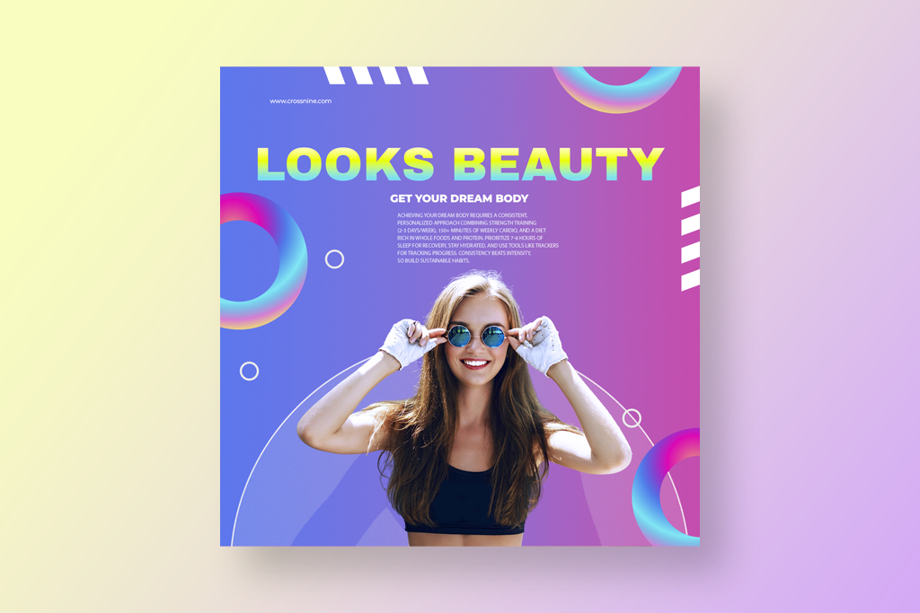
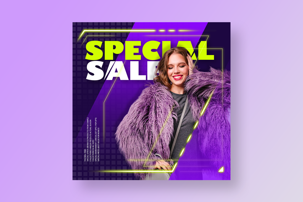
Bright gradients & color blocks. Color gradients - where two or more colors smoothly blend together - are very popular, especially when used with solid shapes behind the text. These bright color combinations give banners a modern and energetic look. They are great for announcements, product launches, or seasonal campaigns.
Layered graphics & depth. Instead of completely flat designs, many creators add depth by using layers, shadows, and overlapping elements that create a slight 3D effect. This makes text and icons stand out more and gives banners a more lively look. Even small touches like soft shadows or light glows can make a big difference.
Authentic, unfiltered photos. Natural, everyday photos are becoming more popular than perfectly polished stock images in banner designs. These visuals feel more authentic and relatable. Designers often combine them with bold text overlays to keep the banner clear while still showing personality.
Animated elements (for Stories & video headers). Even simple banners now often include small motion-inspired details, such as subtle GIF-like elements or repeating shapes in stories or video headers. These light animations add energy to the design while keeping the focus on the main message.
Asymmetrical layouts. Perfectly aligned grids are becoming less common, with many designers choosing more uneven and playful layouts instead. Off-center text, overlapping shapes, and unusual spacing help banners look more interesting and grab attention.
Hand‑drawn or organic elements. Sketch-style details, hand-drawn frames, and free-form shapes are gaining popularity because they give banners a more personal, artistic feel. These touches make the design appear unique and less like a typical template.
Textured backgrounds & subtle patterns. Solid color backgrounds are often being replaced with soft textures or light patterns, such as paper grain, brush marks, or subtle noise. These details add warmth and visual depth without taking attention away from the main message.
Muted & earthy color palettes. Along with bright gradients, many designs now use soft, natural colors such as terracotta, olive green, beige, and dusty blue. These shades are especially popular for lifestyle, eco, and wellness brands because they create a calm and stylish look.
When I first tried Adobe Express, I liked that I didn’t need to begin with a blank page. I just chose a ready-made design and changed the words and colors to fit my brand, and it already looked neat and professional. The layout seemed to “get” how Instagram banners should look. Everything is sized for different screens, so I didn’t stress about parts getting cut off on mobile.
I put together one main banner for a campaign, then just copied it for other posts. All I did was switch up the background and headline - the rest stayed put, which saved me hours. With the templates and brand settings ready to go, things moved way quicker. Honestly, I felt like I could whip up fresh banners every week without even trying.
“I needed a picture for a sale post fast, and it was super easy. I grabbed a design, changed the words and colors, and it looked great right away. It took me less than 10 minutes.”

I was really impressed that the text stayed easy to read, even on crowded pictures. I tried out different font styles and designs, and everything came out just right. The tools for spacing and lining things up made sense right away - nothing felt squished or weird.
By the end, I could tell this might become my regular Instagram profile banner maker for the future. It’s quick, easy, and great for keeping my Instagram feed looking the same. I can see myself using it for weeks of making posts without any headaches.
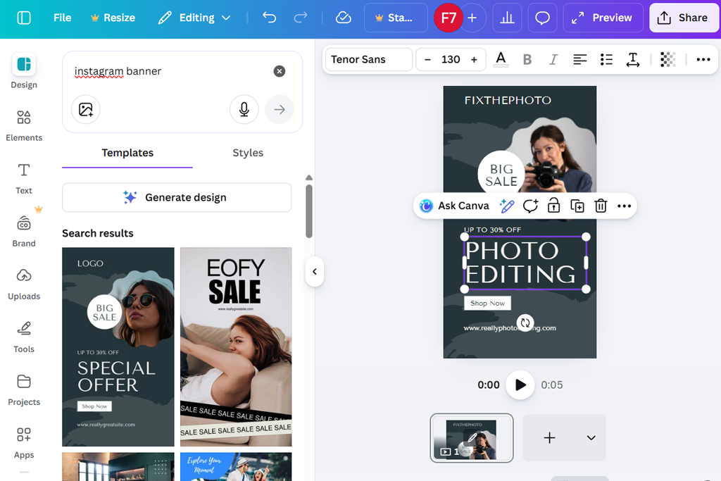
I started using this AI Instagram banner maker expecting a simple drag-and-drop workflow, and that’s exactly how it felt. I experimented with different fonts, backgrounds, and layouts until the design matched my style. The interface was clear and not overwhelming. Canva made it easy to combine text and graphics while still keeping full control over the layout.
After that, I started experimenting with greater changes to the layouts. Some designs adjusted smoothly, while others required small tweaks to keep the composition looking right. I enjoyed that flexibility - it felt more like exploring new visual ideas than following a strict template.
“Moving things around felt smooth, and the text styles looked up-to-date. I could play with different setups without messing anything up, which made trying new things enjoyable.”

Making different versions of banners went much faster than I expected. I would copy a design, update the words, and have a fresh one done in no time. The live preview let me spot errors before saving, which saved me a lot of time.
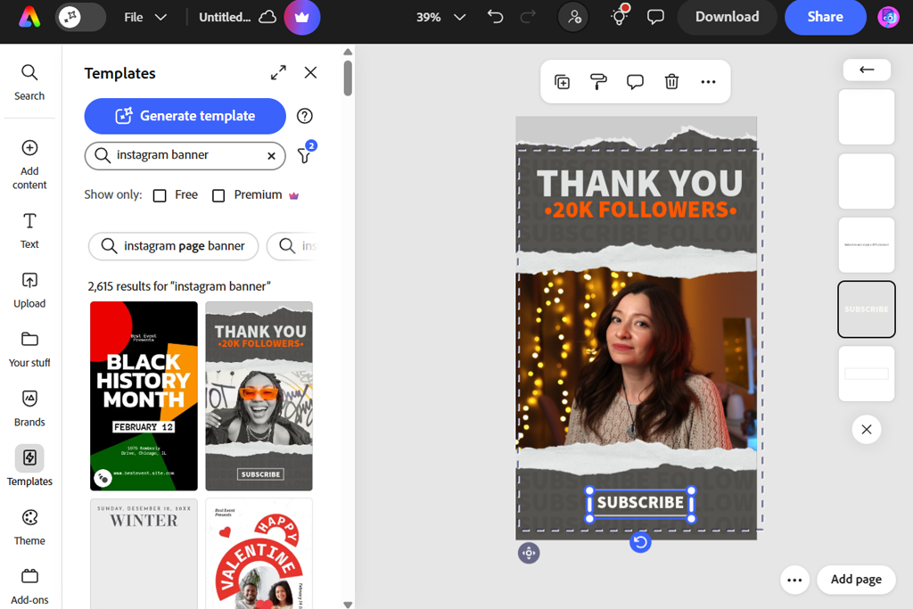
When I first tried Soshie, I thought it would be very basic, and it was exactly that. The screen was uncluttered and simple. I placed a ready-made layout, added my own colors and lettering, and quickly had something good to go online. It worked so smoothly, almost like the app for Instagram Stories knew what I wanted without me having to explain.
I then tried stacking text, small symbols, and little design pieces. Everything lined up neatly on its own, so I didn’t have to spend time fixing positions. Even when I put more things on top or changed their size, nothing got messed up or looked strange.
“I mainly worked with pictures, and I was happy that the quality stayed good after saving. The templates gave me a good base to start from, but still let me be flexible.”

I also tried making several banners for a small campaign in this Instagram banner design tool. Copying a layout, updating the words and backdrop for each one, and saving them went way faster than I expected. And the final files came out crisp on both phone and computer screens, which really matters for Instagram.

I made a few standard-sized banners for various promotional posts in MySocialBoutique and noticed how neat the whole process felt. The tool helped me keep all my designs in order, and updating the text wasn’t a hassle. I never had to wonder if things were positioned correctly.
“This was great for fast changes. I picked a design, put in my brand colors, and it was good to go. I didn’t need to stress about size or lining things up. It saved me tons of time.”

Keeping a uniform look across different banners worked really well. Even when I swapped backgrounds or fonts, everything still felt like it belonged to the same brand. That’s been hard for me to do on other sites. This tool is not super fancy, but all the results come out clean and sharp. For organized projects, this Instagram banner creator is a huge help.
I began using PosterMyWall by exploring its large template library, and the number of choices was impressive. I selected a few designs that matched my brand style and quickly replaced the text and images. It was one of the first times I felt I could create a banner without thinking about technical details - everything seemed to fall into place easily.
Then I experimented more with layout changes in this Instagram photo editor. I repositioned text blocks, resized images, and added extra graphics. A few templates were less flexible, but most adapted very well. I also liked that the editor stayed stable and responsive even after adding several layers.
“What impressed me most was the large selection of templates. Even after changing the text and images, the layouts still looked balanced and professional.”

I also checked how the Instagram cover banner maker worked with several banner versions. I needed a series for different promotions, and copying designs was fast and simple. Updating each version took only a few minutes, which saved a lot of time compared to creating every banner from the beginning.
I normally use CapCut for videos, but I tried it for Instagram banners. It actually worked great for still images, too. I just treated the banner like one frame from a video, and adding layers felt natural. Moving text, photos, and icons around was really easy.
I tried adding some moving effects and then took them away to keep things simple. The tools for arranging everything still worked great, so all my designs lined up just right. This picture animation app gave me a lot of options - it felt like I had more control than in most basic banner tools.
“This app was surprisingly fun. I played around with stickers, icons, and layered text, and nothing slowed down or messed up. The banners came out looking cool and professional.”

I also tried making a few different versions of banners. Copying a layout and changing the content for other campaigns went quickly. I could check how everything looked on a phone screen to be sure it was good.
Overall, I’d say this banner maker for Instagram is great for people who usually make videos but also want to create banners. The final banners came out looking fresh and eye-catching, and I actually had fun making them.
I started using Visme, hoping it would be well organized, and it really was. The designs felt thoughtful, not thrown together, so it was easy to figure out where to place titles, icons, and pictures. It worked really well for banners that needed to share information, not just look nice.
While trying it out, I saw that the spacing and order of things were managed nicely. Titles, smaller text, and images all stayed in good balance without me having to fix them all the time. It felt like the app helped me create better designs, but without being pushy about it.
“This tool made it effortless to keep fonts, colors, and spacing identical across all banners. I just duplicated a design and swapped the text for each new promo.”

Keeping my brand style consistent was simple, too. The colors and fonts stayed the same across different banners, even when I changed templates. After using it, I could tell this Instagram banner generator is ideal for organized projects. For banners that teach, promote, or share information, it works great.
I went into Piktochart expecting it to be mainly for graphs, but I was surprised by how good it was for banners. I made a few banners with lots of text and info graphics, and everything stayed neat. The layouts worked really well when I had more words to include.
While I was editing, I tried out different setups and saw that the spacing and alignment seemed to happen on their own. Nothing looked squished, even when I added multiple pieces. I liked that it offered guidance but still let me be in charge.
“I liked how easy it was to change the size of the design. I could make a banner for a post and then adapt it for a story or highlight cover without breaking the layout.”

After that, I focused on keeping a consistent style across different banners. Even when the content changed, the fonts and colors stayed the same, which made everything feel more like a real brand. That’s a big deal for Instagram campaigns.
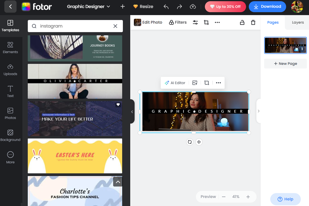
I started testing Fotor with photo-focused banners since images play a big role in my brand style. What stood out first was how easy it was to improve photos directly in the editor. I could adjust brightness, sharpen details, and remove distracting backgrounds without leaving the Instagram story banner maker.
I quickly moved on to adding text and icons over the images, and the controls felt very simple to use. Adjusting contrast and brightness behind the text helped keep it readable even on busy backgrounds. I also tried different font combinations and shadow effects to test the possibilities, and everything still looked clear and well-balanced.
“It felt very easy to use, even without design experience. The templates provided a strong starting point, and adjusting colors and text was simple.”
Making a series of banners was where Fotor really shone. I just copied my first design and swapped out the headlines, images, and accent colors for each new post - and the layout never broke.
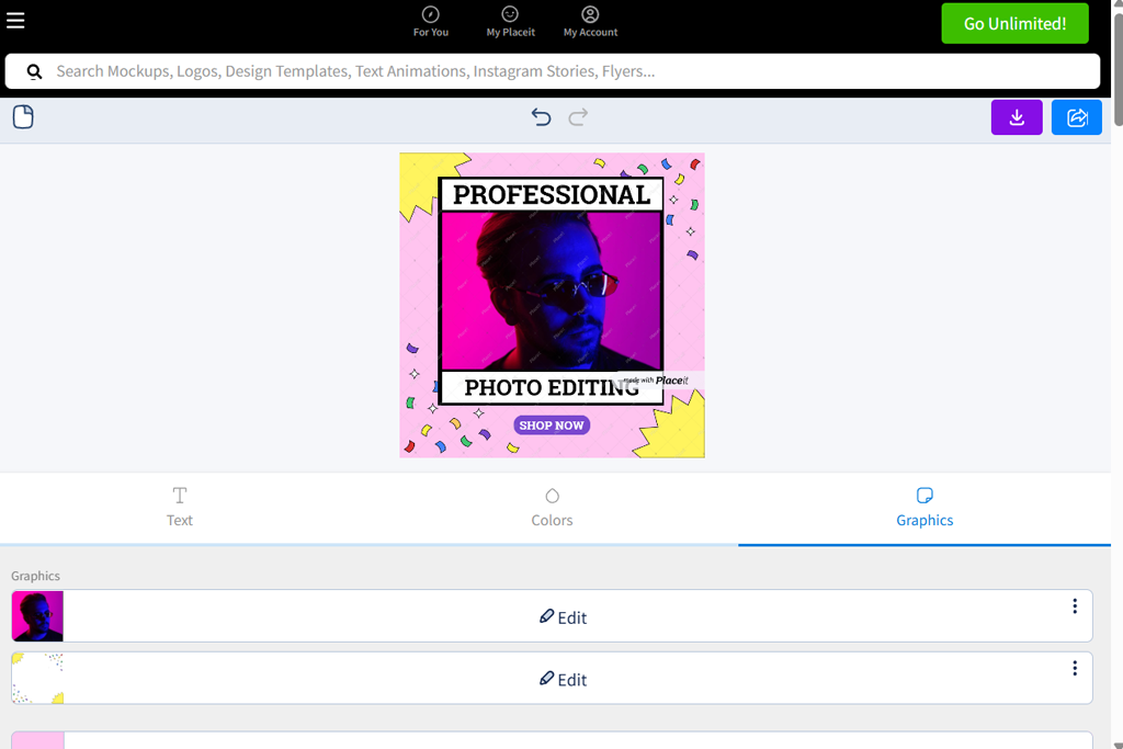
When I first tried Placeit, I was impressed by how polished the templates looked right away. I just entered a few words about my brand, and immediately saw designs that seemed perfect for me - simple, up-to-date, and easy to tweak. Adding my own logo and tagline took just seconds, and I really liked how everything fit together without looking odd or misaligned.
As I played around more, I tried mixing things like background designs, titles, and icons to give each banner its own style. What stood out was how everything still looked balanced. I didn’t have to waste time moving stuff around to make it look right - the free graphic design software just seemed to keep everything in good shape for me.
“I tried out different styles to see what fit my brand best. Even after making lots of changes, the design still looked clean and professional.”
Next, I tried making a bunch of banners for different types of posts like “New Drop,” “Weekly Spotlight,” and “Behind the Scenes.” I just copied one design and updated the text for each one, which was quick, and the whole set still looked consistent.
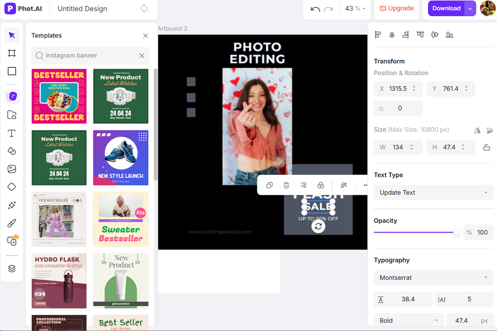
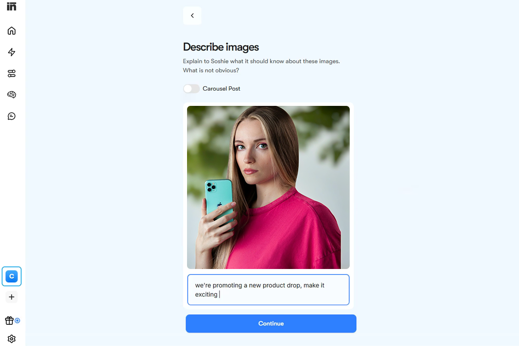
PhotAI was easily the most advanced AI Instagram banner maker I tried. I just gave it a few details about my brand, like style, colors, and vibe, and within seconds, it created several banner designs. Some were exactly what I wanted, while others sparked ideas I hadn’t thought of before. It felt like having an AI helper right there with me, throwing out concepts to build on.
When I tried out this AI tool for designer, I made some small changes to the layouts it created, like moving text around and swapping out pictures. What surprised me was how well the AI had already taken care of the spacing and structure, so I hardly needed to fix anything. Even with bright colors and lots of different elements, nothing felt too busy or messy.
“My main priorities were speed and clear visuals, and this tool handled both well. Adding text and graphics felt smooth, without any awkward controls.”

I also made a bunch of banners for different campaigns to see if my brand style would stay consistent. Even when I used different prompts, the AI kept everything looking like it belonged together. That was a big deal for Instagram, where a feed that doesn’t match can feel all over the place. It made putting together multiple posts in one sitting way easier.
To identify the most effective Instagram banner creators, our FixThePhoto team organized a practical testing process. The aim was to evaluate how well each platform could create visually uniform graphics that look good on smartphones while remaining quick and simple to operate.
We examined layout libraries, editing freedom, combining text with images, output clarity, and how easily designs could be reused for multiple promotions. Every participant selected several platforms and individually produced banners for a mock lifestyle brand debut.
Eva Williams began by exploring platforms that give users more creative flexibility. She worked with various layouts, replaced pictures, and changed color schemes and fonts.
In one test, she produced several graphics for a marketing series. During the process, she tracked which services helped keep the same brand style across all visuals with little extra work. Some programs needed manual fixes to line things up, while others handled the layout balance automatically.
Robin Owens tested how easy the tools were to use every day. She copied designs for different promos and just changed things like text and backgrounds. She wanted to see how fast she could make five different banners for a whole week of posts.
Tools with smart templates and saved brand colors helped her complete the work much faster. Others that didn’t let him layer things easily slowed him down. She also checked image quality - comparing how banners looked on phones versus computer screens before saving.
Tati Tailor focused on how tools worked on phones and how much she could play around with designs. She added lots of text, icons, and graphics to see if everything stayed readable. She also tried resizing banners for Instagram Stories versus profile headers.
Some apps made resizing easy without breaking the design, while others forced her to start over. The best tools let her make changes fast and keep the same look everywhere.
After our testing process, we found that some Instagram banner makers are perfect for beginners who just want to grab a template and go, while others are better for creators who need more control and options to build their own designs.