In the United States and Canada, the standard size for a business card is 3.5 inches wide and 2 inches tall. This might seem like a small thing, but using the wrong size can cause problems: parts of the text or the design could get cut off, or the card might not fit in wallets, card holders, or card scanners.
Printers also expect the card to be the right size, so if it’s different, the design might be distorted. Even if a card was designed nicely, the wrong size can make it look unprofessional, hard to handle, or easy for someone to throw away.
That’s why it’s important to start with the right size and follow the rules for bleed, margins, and resolution from the beginning.
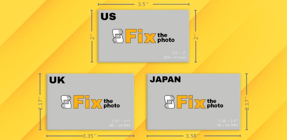
Although 3.5" x 2" is standard in the United States and Canada, the dimensions of business cards are a little different in other countries. This is due to printing standards, paper sizes, wallet and card holder sizes, and even cultural design preferences, which can change from place to place.
For example, many European countries follow the ISO paper size system (like A4 or A7), and countries like Japan and China often design cards based on their local paper sizes or character spacing. In some places, people like slimmer cards for a simple look or so they fit better in local wallets and holders.
| Region | in | mm | cm | Pixels | AR |
|---|---|---|---|---|---|
|
US & Canada
|
3.5"×2" |
89×51 mm |
8.9×5.1 cm |
1050×600 px |
1.75:1 |
|
UK & Ireland
|
3.35"×2.17" |
85×55 mm |
8.5×5.5 cm |
1012×650 px |
1.55:1 |
|
Japan
|
3.58"×2.17" |
91×55 mm |
9.1×5.5 cm |
1074×650 px |
1.65:1 |
|
South America
|
3.54"×1.97" |
90×50 mm |
9.0×5.0 cm |
1062×591 px |
1.8:1 |
|
China
|
3.54"×2.13" |
90×54 mm |
9.0×5.4 cm |
1062×638 px |
1.66:1 |
|
India
|
3.54"×2.16" |
90×55 mm |
9.0×5.5 cm |
1062×650 px |
1.64:1 |
Using the standard size for a business card makes the design and printing process easier. Most printers and online business card printing services are set up for this size. Also, most design templates, mockups, and layout examples (especially in Adobe Express or Canva) are already made for it. This saves time and helps avoid technical problems.
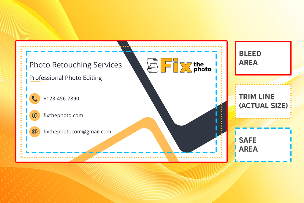
When making a business card for printing, you need to think about three main areas:
Trim line (final size). This is the actual size of the card, 3.5 x 2 inches. The printer cuts along this line, so all important parts of the design should be inside it.
Bleed area. This goes 0.125 inches (3 mm) beyond the trim line on all sides. Any background color, image, or design touching the edge of the card should go into this space so there are no white edges after cutting.
Safe area. This is 0.125 inches (3 mm) inside the trim line. Keep all important text, logos, or icons here so they don’t get cut off by mistake.
If you follow these size rules and keep each area in mind while designing, your business card will print neatly and look professional without extra costs or reprints.
“Your logo isn’t just decoration. Place it to guide the eye, not disappear into the design.”

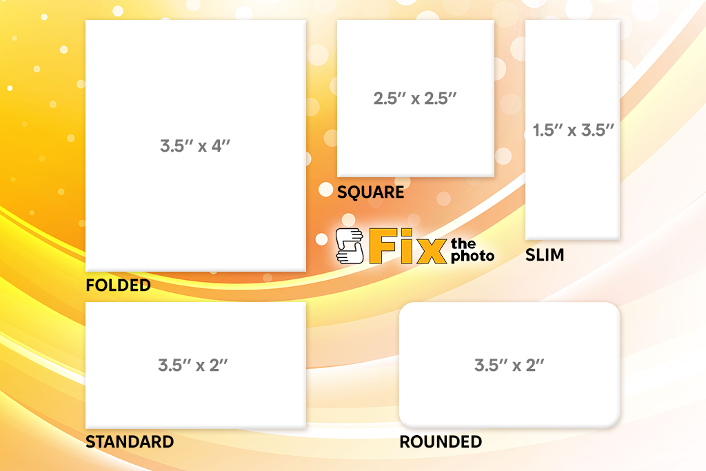
Normal business cards are classic, but using different shapes can help your card stand out and show your brand’s character. These unique designs work best when you want people to remember your card, start a conversation, or match your card’s look to your type of work.
Square business cards. Square cards (usually 2.5" x 2.5" or 2" x 2") look bold and trendy. They are great if you want your logo or a picture of your product to be the main focus. They work especially well for photographers, designers, or artists, because the shape can match a creative style.
The only downside is that they might not fit into regular wallets or card holders. You’ll need to decide if looking unique is worth that small inconvenience.
Folded business cards. A folded business card size is usually 3.5" x 4" before folding, and around 2.5" x 3" once folded vertically. These kinds of cards give you more space for information, but still fit like a regular card.
You don’t want to fill a business card with too much text, but a folded card gives you extra panels to add fun wording, extra design elements, or small details about your business. They are a popular choice for dental offices, salons, or clinics, which often use them as appointment reminder cards — combining branding with useful info in one item.
Rounded corner business cards. These cards are the same size as a standard card, but with corners rounded by a quarter inch. This small change makes the card look stylish and helps it stand out when mixed in with other cards.
Slim business cards. Slim cards are usually 1.5" x 3.5". They are modern and different but still small enough to carry easily. They work best for simple information like your name, title, and maybe a QR code. Slim cards are a good choice for consultants, stylists, or creative professionals who prefer a simple design.
Here are some essential design details I always recommend to clients when creating business cards at FixThePhoto:
Business card depth (thickness). The thickness of a business card is called its depth, and it’s measured in points (pt) or gsm. It’s one of the first things people notice when they touch your card.
Portrait or landscape orientation. When you make a business card, the shape matters more than you might think.
If you want your card to stand out, portrait is a better choice. However, if you work in a field that values tradition, landscape is the safer option.
Stock types & finish. The type of paper can change your card to convey a certain feeling.
If you give out cards a lot, choose a finish that doesn’t smudge or show fingerprints.
“If your design looks blurry on the screen, it will look worse when printed. Always save and export your design at 300 DPI for the best quality.”

My FixThePhoto colleagues and I have tested lots of business card design tools, from complex design programs to simple online platforms.
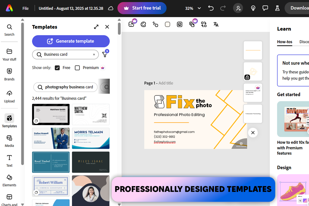
Out of everything, Adobe Express was one of the easiest to use to create a standard-size business card that still looked professional. It’s great when you want to make a good design without spending hours learning how the software works.
For more advanced designs, I also use Adobe Illustrator (for creating vector graphics) and Adobe InDesign (for page layouts and print preparation). But when I need a card quickly for online sharing or small printing batches, Adobe Express is my number one.
Adobe Express makes it easy to:

Here’s how I make standard-size business cards in Adobe Express:
Step 1. Start for free. I open Adobe Express, which is a free business card software that works on both the computer and phone, so I can switch between them easily.
Step 2. Pick a template or start blank. I look through the many business card templates to find one that fits my style. If I want more control, I start with an empty canvas.
Step 3. Add images and graphics. I upload my logo and other brand visuals. Sometimes I also use Adobe’s stock images for backgrounds or icons.
Step 4. Customize with brand fonts and colors. When I design standard-sized business cards for our colleagues, I try to keep the design looking like it belongs to FixThePhoto. I change the fonts and colors to match our style.
I also uploaded the official logo, used the brand colors, and chose fonts that fit the overall look. This makes sure all the business cards look the same and work well together.
“If you have Adobe Express Premium, you can make a brand kit, which saves your fonts, colors, and logos so they’re ready to use for any project. It’s very handy when working on many projects at once.”

Step 5. Finalize and download. I preview my design, making sure everything is lined up and easy to read. Then I download it as a PDF for printing or as a PNG/JPG for sharing online.
Step 6. Order printed cards. If I want physical cards, I can order them directly in Adobe Express (on desktop, US and UK). The quality is good: the paper is thick, and the colors are bright.
Since I work in photography, I know how important it is for a business card to look both professional and creative. At FixThePhoto, we also tested many different business card templates, from designs that were too complicated to ones that were too plain, and chose the best ones for different types of photography.
These templates are made to match the style of a photography business, whether you shoot weddings, portraits, real estate, or commercial photos. They’re neat, trendy, and easy to change to match your brand. All templates come in PSD format and work in Adobe Photoshop CS4, CS5, CS5.5, CS6, and CC.
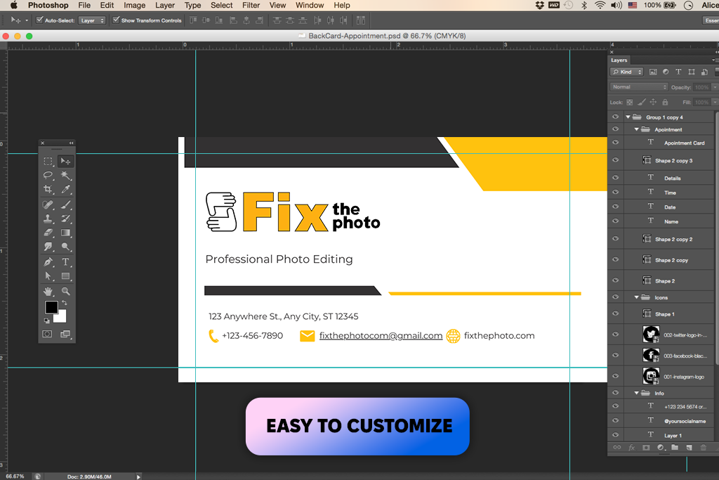
Step 1. Choose the right template. I started by choosing a template that fits the type of photography I do.
Step 2. Open the PSD in Photoshop. When I had the template, I opened it in Photoshop. The file’s layers were already organized and named, so it was easy to find what I needed, even though I’m not an expert in Photoshop.
Step 3. Customize the design. I updated the background, changed the colors to match my brand, and picked fonts that suit the style. Most templates have “smart objects” and text layers you can edit quickly.
Step 4. Add the info. I typed in my details: name, role, type of photography, email, phone number, website, social media accounts, and location.
Step 5. Export and print or share digitally. Once the design looked good, I saved it in high quality and exported it as a PDF for printing and as a PNG for sharing online. These cards look great both on screen and when printed.
Use sharp, clear pictures. Make sure your logos and images are high resolution (300 DPI). Blurry logos can make the whole design look bad.
Have one main focal point. It could be your name, your logo, or a short phrase. Don’t fill the card with too much text or too many things to look at.
Pick fonts that are easy to read. Use no more than two different fonts. Choose modern styles that are simple to read and keep the size big enough (at least 7–8pt for print).
Keep colors simple. Stick to 2–3 main colors that match your brand. Using too many colors can make the card look messy.
Follow printing rules. When designing, remember that the bleed area is extra space for cutting (about 0.125"). Put important words and images inside the safe area, and keep in mind that the trim line is where the card will be cut.
Think about online use too. Even printed cards can be shared online. Save web-friendly versions, so you can post them on Instagram, email them, or put them on your website.
Less is more. You don’t have to write every single detail about what you do. Focus on making a clean design that catches attention and makes people want to contact you.
“If a card looks too busy, people will throw it away. A clear design with enough space makes people stop and read it.”

Using the standard size for a business card means your card will fit easily in wallets, organizers, and card holders. If you pick a different size, it might stand out, but it could also get lost or bent if it doesn’t fit where people usually keep their cards. Printing is often easier and cheaper with standard sizes because most print shops are set up for them.
NFC chips are tiny, so they can fit in most standard business card sizes. Many printers suggest sticking to the normal 3.5” x 2” size so the card still fits in wallets and card holders. Unusual sizes might make the NFC chip harder to use or carry.
The classic rectangle is the most popular shape. But there are other shapes, like square, slim, folded, or cards with rounded corners. These can make your card look different, but standard shapes are the easiest to carry and print.
For main details like your name and job title, the font is usually between 10 pt and 16 pt. Smaller details like your email or phone number should be at least 8 pt so people can read them easily.
If you’re designing on a computer, a standard business card dimensions are usually about 1250 × 600 pixels at 300 DPI (dots per inch). This gives you good print quality.
Yes. You can make one using a dynamic QR code generator and add it to your card design. You can change its size, move it around, and add a border. QR codes are a good way to link to your website, portfolio, or social media.
Start with the most important things: your name, job title, logo, and best way to contact you. You can also add your social media accounts, a short slogan, or store hours, depending on what you do. If you work in a creative job, you can show some personality but keep it neat and professional. You can also use both sides of the card to spread out the information.


