Animation in web design plays a huge role because it helps attract and direct users’ attention, ramp up their interaction with the platform, and even impact their behavior. By using animation with bright colors, smooth movements, and exciting effects, you can create an exceptional user experience, which is extremely important in today’s digital environment.
We have described the best website animations techniques that you can quickly master in HTML5 animation software. However, some of them require more time and effort to grasp.

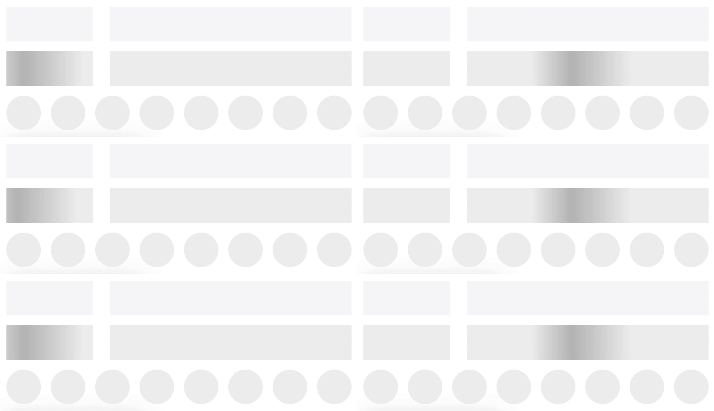
People usually get irritated when they have to wait for website content to load. While it is not always possible to make this period shorter, you can use loading animation to engage visitors and refocus their attention.

By embedding an interesting loading animation, you may create the illusion that the waiting time is actually short.

Reputable web development companies often choose this technique when they want to motivate visitors to interact more actively with on-site content.
The animation is executed in the form of blank pages where info appears gradually. While seeing such animation, users can comprehend information at a convenient tempo.
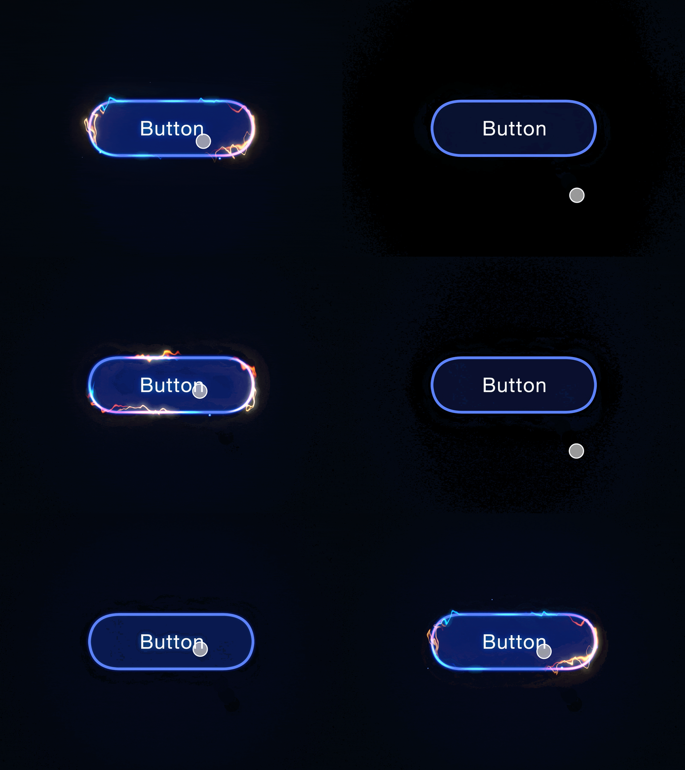
Hover animation websites effects are particularly suitable if you want to denote that certain objects are clickable. Usually, such buttons can change colors or shapes, light up, or display glowing hints.
To create such an animation, you need to manipulate JavaScript in a code editor. Companies like such an effect because it allows them to see whether a visitor did what was expected. For instance, they may discern whether a person pressed the button.
Unfortunately, such animations don’t work on mobile devices. So, you’ll have to use elevation animation for the same effect.

This animation ticks several boxes simultaneously. First of all, it draws users’ attention to particular elements. Secondly, it reinforces visitors’ actions. So, if you want to encourage people to do something specific on your site, you should try this method.
The biggest advantage of an animated response is that it’s very subtle. So, you can use it for website forms, CTAs, feedback, menus, and other visual content marketing objects implicitly.
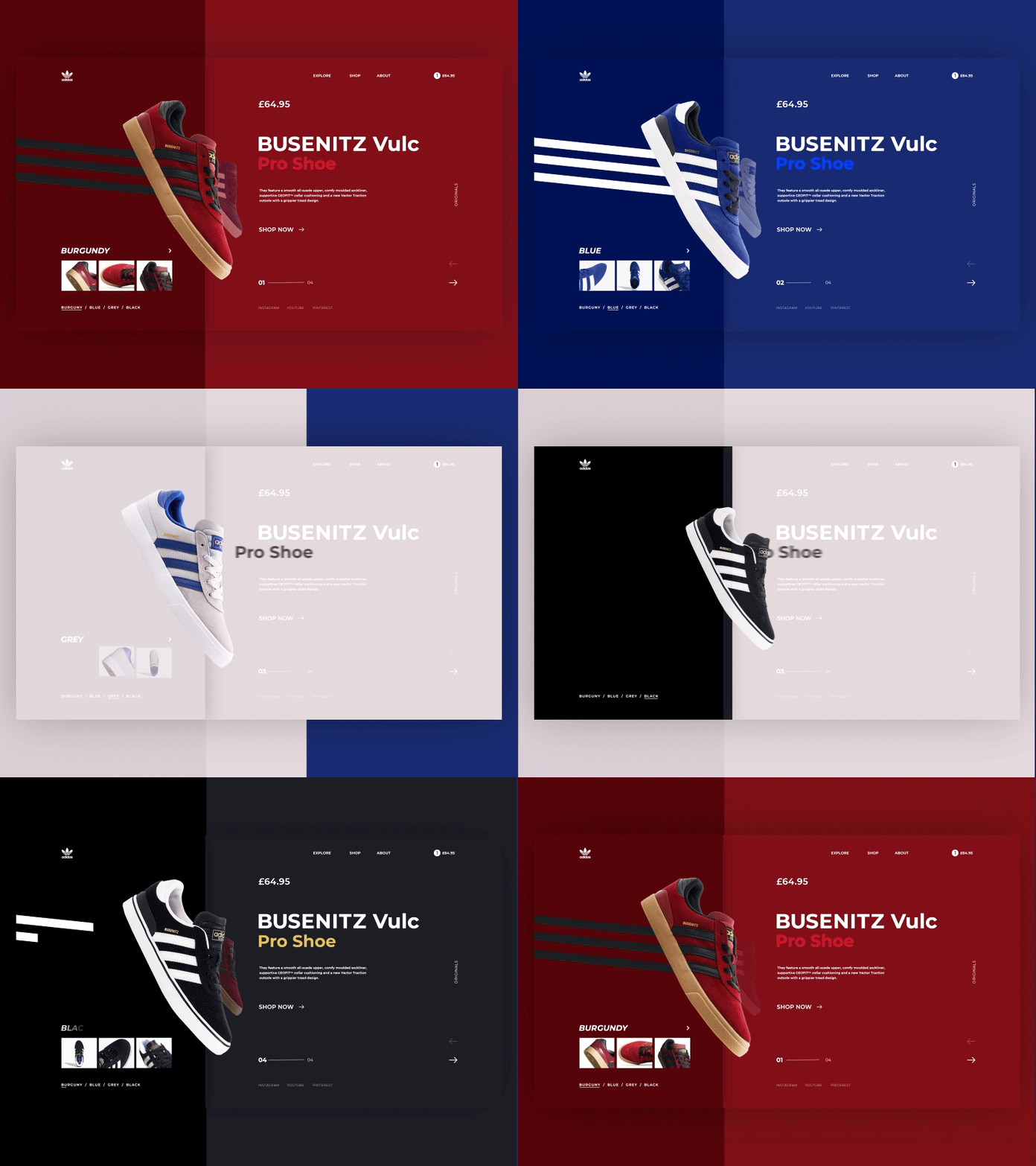
The hard cut is a customary transition variant when a scene is moving from one end to the beginning of the next piece without any alterations.
Creating such a transition is a no-brainer task using any HTML editor. However, many companies steer clear of this animation type because it feels too abrupt and puts off users.
Transitions should be smooth and gradual for people to understand that there will be a change in state. Thus, you’d better opt for subtle animations for websites. Viewers can click a link and open a new section without leaving the page.

Lots of web design companies treat “above the fold” content with special care. However, in reality, people pay more attention to the information presented below the fold.
Therefore, it is paramount to use scrolling animation in web design to boost interaction. People are more inclined to study the content of the page if it is presented in an engaging manner with scrolling elements.

Instead of adding multiple images, graphic objects, and tables to your site, you can turn them into interactive pieces, thus, spike users’ interest from the get-go. This is a very handy approach if you want to locate several visual elements on one page.
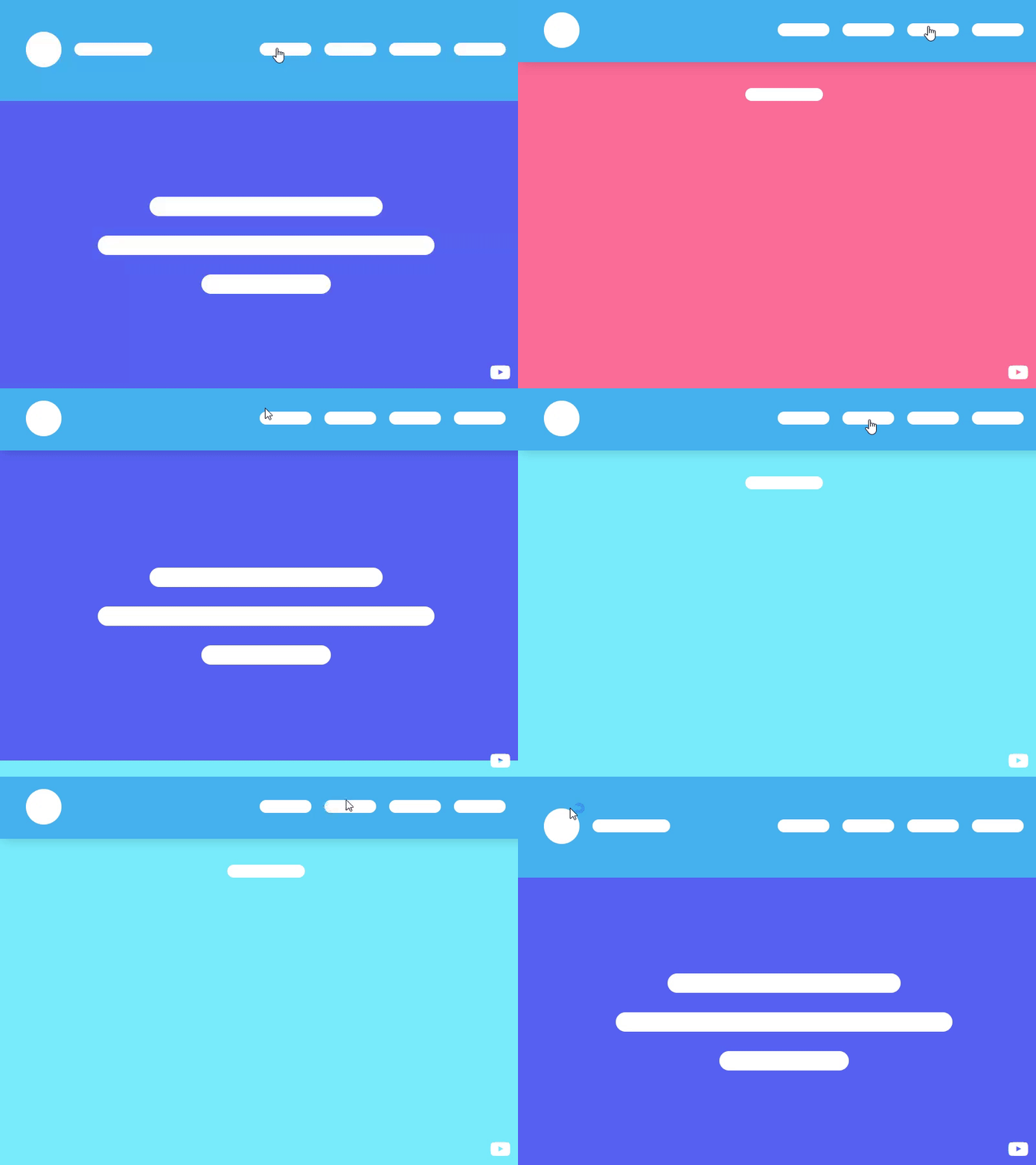
This is one of the best website animations techniques if you need to add a visual appeal to your platform. Besides, going this path, you can “tell” the story of your company, demonstrate your products in action, and touch upon your company’s values in a more captivating manner.
Real estate websites and photography blogs frequently feature such animations.

When a person first opens your site, there must be a catch that will amaze him/her and encourage to navigate the website further. 3D animations that respond to finger movements, mouse clicks, and button clicks can serve as terrific catches.
Such animations are known as onboarding and mainly serve for welcoming visitors and introducing a brand creatively to the audience.
Web designers prefer these animations when they need to make lifelike, advanced visuals that will add value to the customer experience. Some experts even go the extra mile and combine 2D & 3D animations using 3D animation software. Such mixtures lead to more sophisticated experiences.
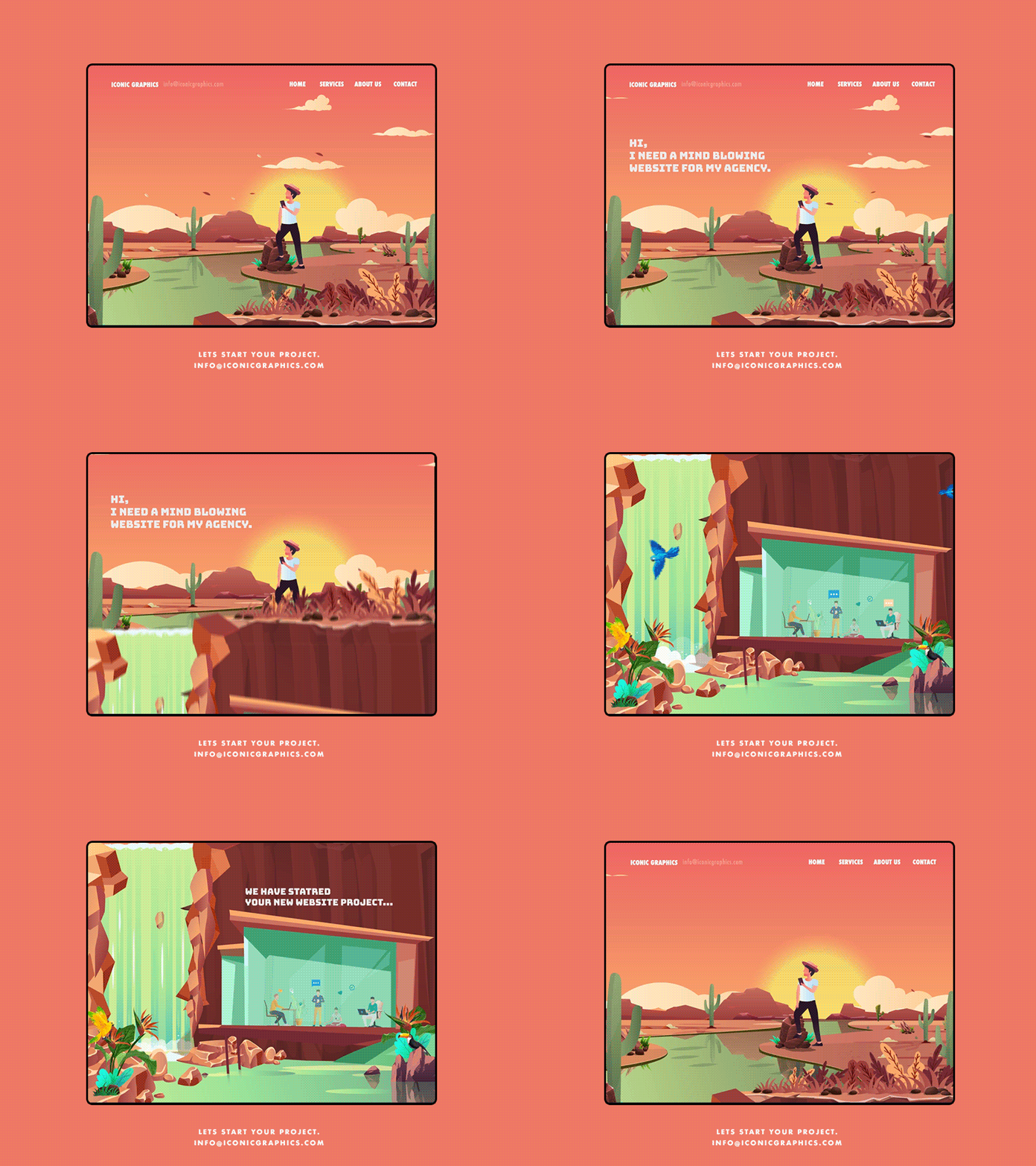
Animations for websites have an integral storytelling component, which can bring fantastic results when used skillfully. By telling a story of your brand in the form of animation, you can spur more user interest in your products and services.
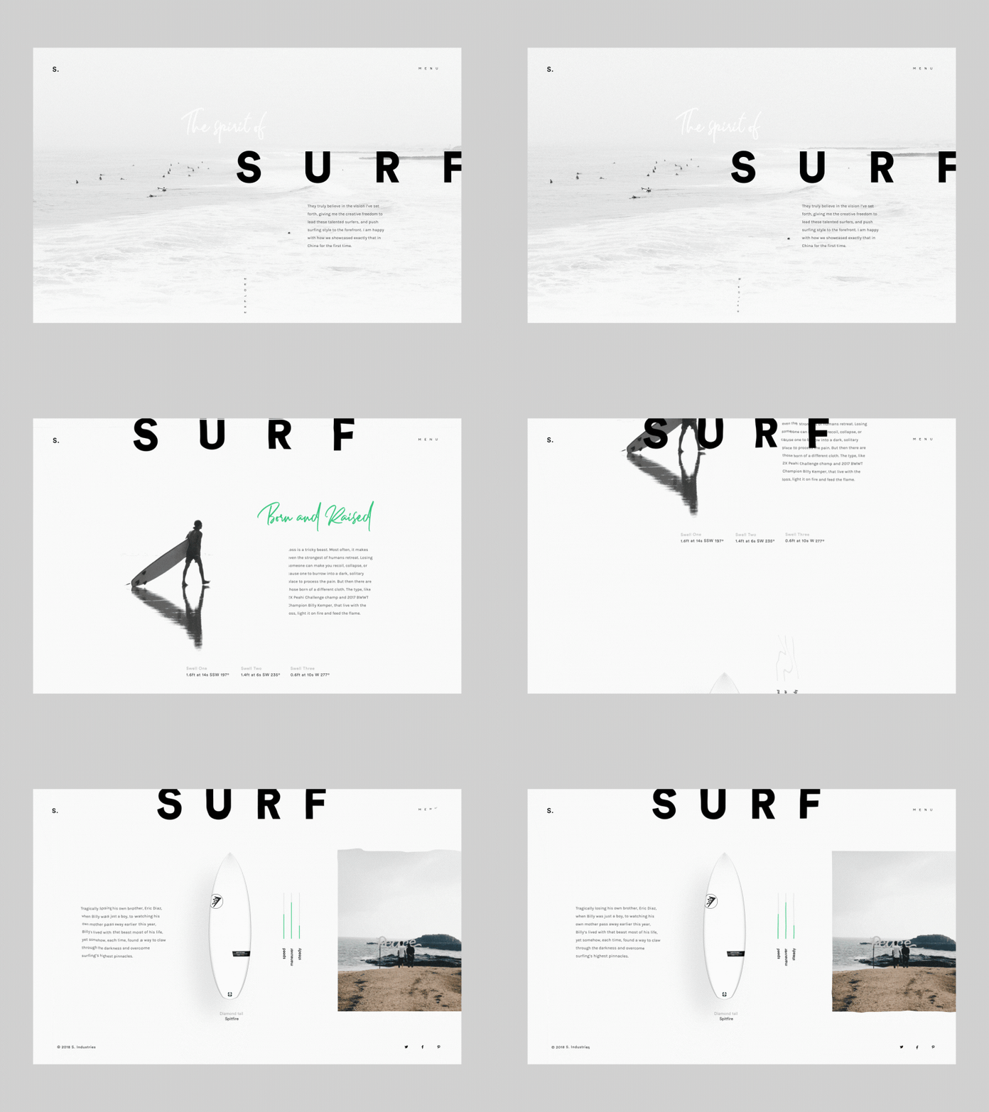
Storytelling animations are best fitted for longreads because they allow presenting a lengthy story in a succinct way. Thus, instead of writing a long article about your progress, you can show it to clients.
Any text can stay on par with visual experiences. Creating those is easy by using such frameworks as Bootstrap or Dreamweaver.
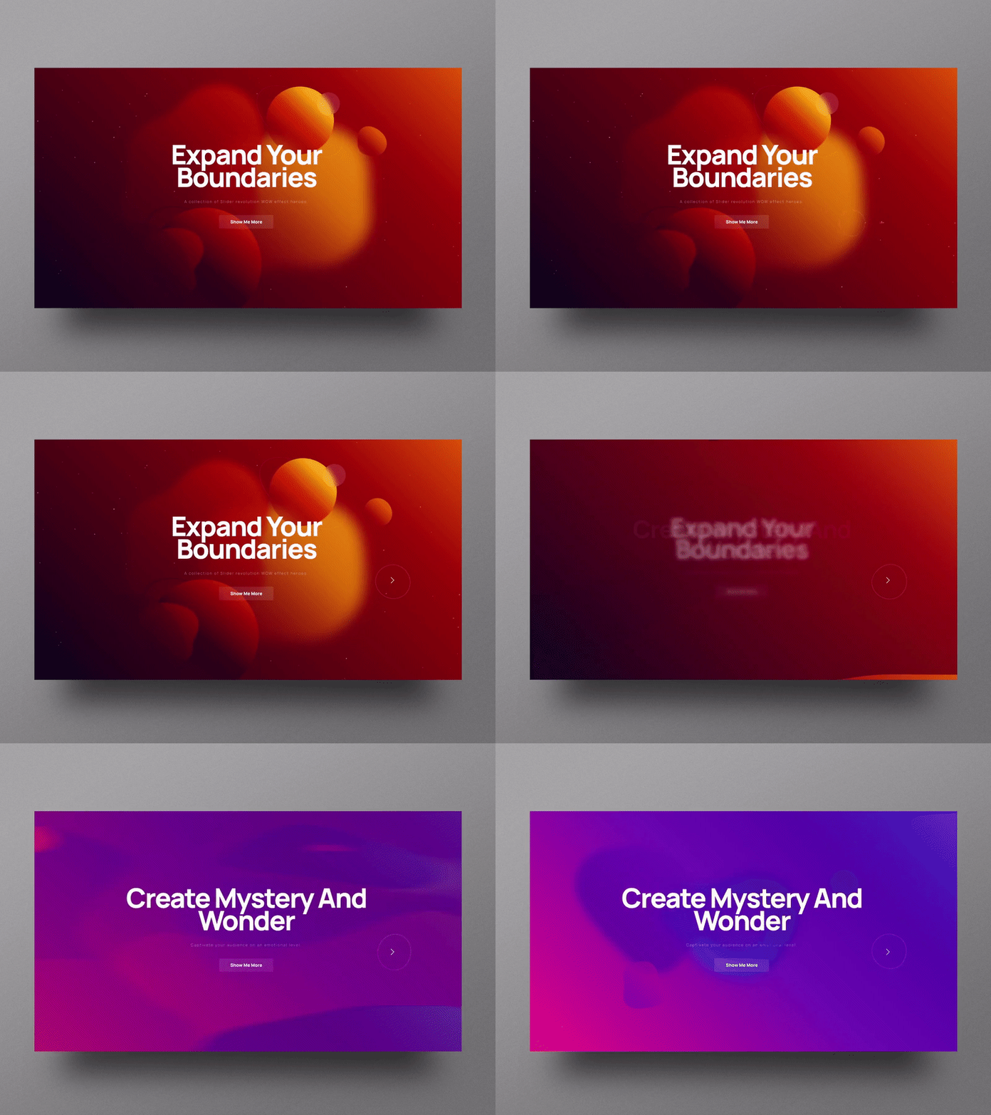
Dynamic backgrounds are one of the most popular website animation types. In addition to establishing a quick connection with users, they make the entire website journey more memorable and emotive.
The main intricacy to remember is that such background must complement the existing content of a site rather than become the centerpiece of a platform.
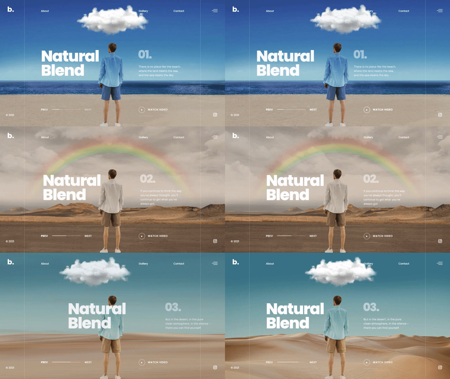
Besides, you need to maintain a proper balance between compelling content and distracting content. You may need to try several background variants to figure out which option makes a site interesting rather than heavy. If you need professional advice, you can always reach out to UI/UX design agencies.