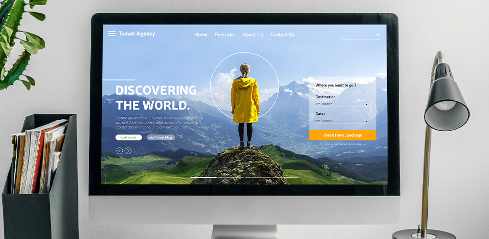
A hero image is a picture or a looped video at the top of a landing page. It usually includes both text and visuals, which allows it to bring a company’s message across. Hero images are located above the fold and include CTA elements to drive people to explore more about products and services offered by a website.
Trusted web development companies know that the main purpose of this image is to make the landing page more engaging and attention-grabbing. It should accurately convey the values of a brand and the purpose of a platform. After seeing such images, people should feel compelled to explore the website further.
In this article, I will describe two ways of creating a hero image meeting the following criteria:
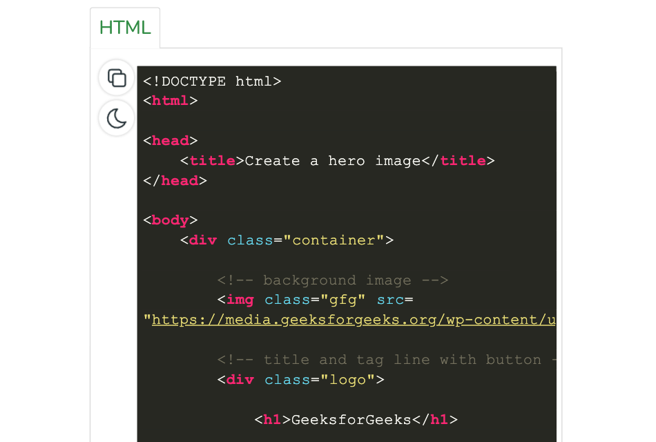
To make your page well-structured, you should edit the HTML code. There is no need to use CSS to select the position of a hero image. However, you may use CSS to make the image more visually appealing.
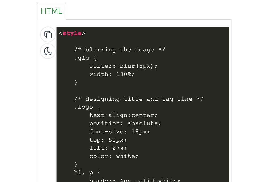
To make your website more eye-pleasing, you need to edit the CSS code. By changing CSS properties, you can make your hero image more noticeable.
As a hero image is the first element of a page that people see when opening a website, it’s important to make it as attractive as possible, especially if you’re building a one page website. Below, I have outlined the approaches used by world-known companies for designing a hero image website.
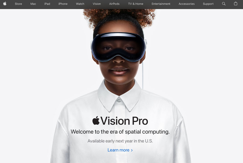
If you visit the official website of Apple, you will see a typical example of a hero image. This full-screen image focuses on the product and includes its key selling points. Apple utilizes "chromeless" images without borders. They typically have a transparent background.
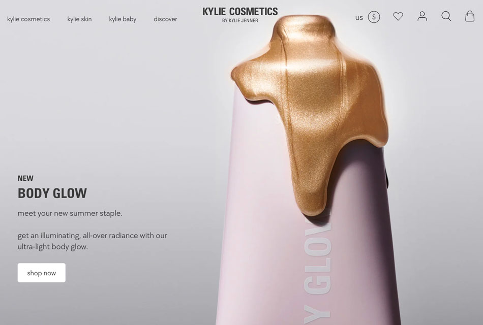
When analyzing the hero images used on different websites, you will see that they emphasize products. Companies show the best sides of their products hoping to drive visitors to learn more about them.
The best example of this is the site of Kylie Cosmetics by Kylie Jenner. For creating hero images, you can use the best product photography techniques. After seeing your hero image, visitors should feel compelled to explore information about your products.
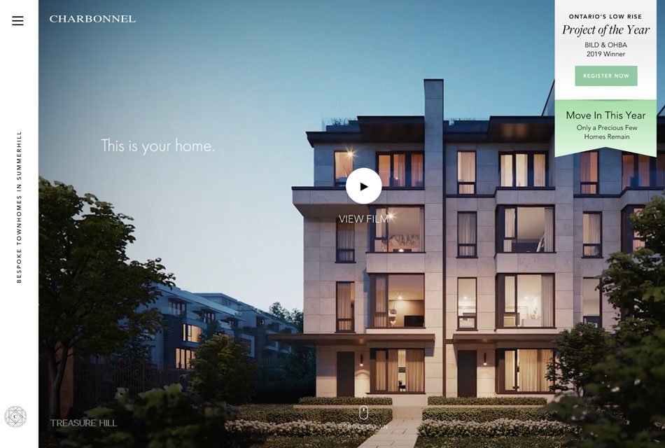
Charbonnel Town is a perfect example of a real estate website with a professionally-looking hero image design. Here, you will see a dynamic home page video with a lot of interactive elements.
The hero image refers to the services provided by the website and includes architectural elements with well-balanced colors and carefully selected fonts.
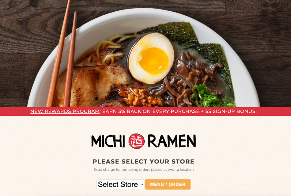
This is an official website of a restaurant with a well-thought-out top section of the landing page. When taking a look at it, visitors understand right away how they can place their order or make a reservation.
The hero image is designed to provide easy access to information about the services and boost conversions. Visitors can see a brand name and a short description of the ordering process. By following the instructions, they can select the closest store for ordering food and avoid paying fees.
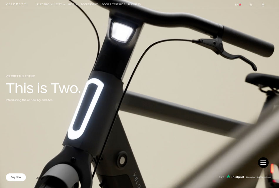
Many web designers also include videos in hero images. The Veloretti brand specializes in selling bicycles. Its hero image allows a viewer to see their product from all sides and decide whether they want to purchase it. Using such hero images, you can improve your conversions.
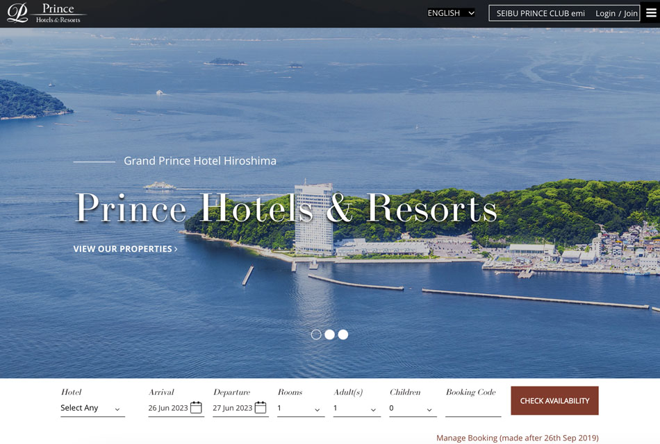
On their site, you can see a carousel of pictures showing Prince Hotels and Resorts in all their glory. Due to carefully-selected and well-balanced colors, every visitor can see that this is a luxury brand. They convey the feeling of power and prosperity.
The lighting in some shots is quite peculiar, which gives the photos an unusual feel. The text is white, which makes it easier to see it against the brown background.
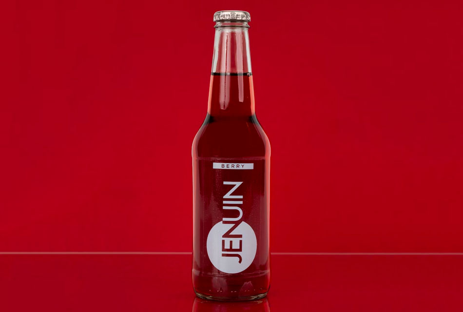
A visually-appealing hero image can create a positive impression of your brand. This is why it’s important to use a picture in the highest quality image format to demonstrate that you value the experience of your clients.
Besides, a hero image might help you improve the recognition of your brand. You just need to think about how to use it to promote your brand and show its strongest points. Think about the emotions that you want to invoke and how this image could help you define your unique selling proposition. This image should also be a part of the context and drive visitors to explore the information on your site.
Web design companies take into account the fact that the main purpose of every hero image is to grab the attention of potential clients. They know that the most important thing is to convey your main message correctly.
You have a few seconds to engage your client and make them want to stay longer on your site. This is why the meaning of your hero image should be easy to understand. People should not struggle to get what it is about. If you doubt your image conveys the message straight away, you can choose several options and send them to your friends and relatives so that they can pick the best one.
If you want to create a website hero image and give it a professional feel, you may need to hire an experienced product photographer to take photos of your items. A good photographer knows how to select the best angle and use the right lighting. They will allow you to show your product in the best light and increase your sales.
Another advantage of hiring a professional photographer is that you will get high-quality images without any blur. You can use them for your hero banner without enhancing them beforehand.

You should be aware of the fact that the main purpose of your platform is to convert leads to sales. This is why you need to make your CTA elements noticeable to ensure that they will help you increase your conversion rate. Otherwise, you won’t be able to boost your sales if people don’t click on anything on your site.
By selecting the right place for CTA buttons, you can make it easier for your visitors to interact with the content of your platform. To increase their visibility, you can adjust their contrast. It will allow you to emphasize them without making them look too distracting.
To ensure that your website hero image looks the same on different screens, you need to select the right size. Keep in mind that the size of a hero image should be different for mobile and desktop devices.
Besides, you need to use a responsive design for your web page to ensure that its size will be automatically adjusted when viewed on different screens.
Even if you are fully satisfied with your website hero image, get ready to replace it with an even better version. You will need to update it regularly to advertise new products and engage your clients by offering them deals and discounts.
On some platforms, it makes sense to create a hero image slider with multiple pictures containing information about different products. It’s a great option for companies offering holiday deals. You can also use it as a part of your photography marketing strategies if you have several offers for your clients.
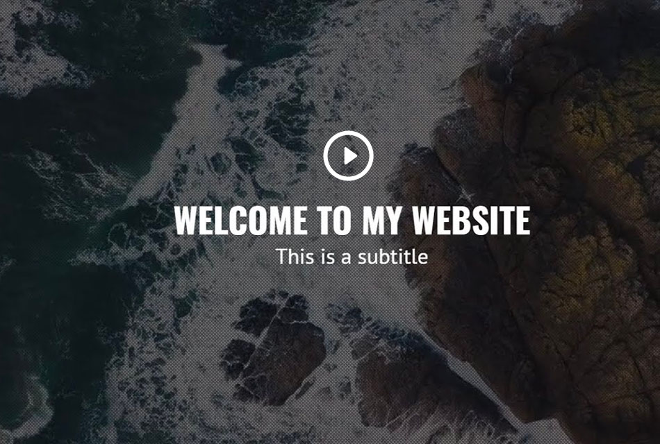
If you want to make your site more engaging, try creating a soundless looping clip or GIF and using it as your hero image. According to stats, 91% of clients want to see more brand videos. This is why it will be a perfect idea to use a looping video as a part of your hero image design.
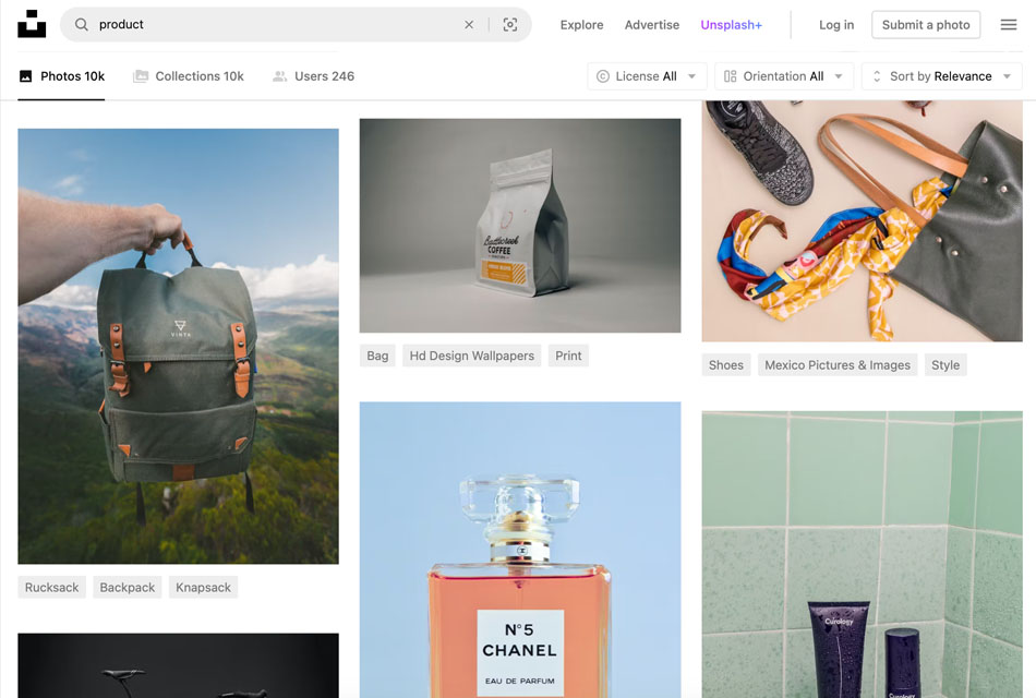
If you don’t have loads of money to spend on your hero images, you may try using some popular stock photo sites to get high-quality photos.
Shutterstock. Shutterstock has a huge collection of over 300 million pictures taken by photographers from all over the world, which makes it a great service for those who are interested in travel photos.
Adobe Stock. This platform by default integrates with Adobe’s software for professional designers. Adobe Stock allows you to access thousands of stock images, design templates, clips, vector graphics, and illustrations.
iStock. iStock belongs to Getty Images, which is why you may find some similar pictures on these platforms. What makes iStock different is that it lets photographers sell their images on other services, which is why it lists more pictures than Getty.
A high-quality hero image is a must for every eCommerce platform. The hero image meaning should be easy to understand. Such images grab the attention of potential buyers and help you increase the conversion rate. It should accurately convey your brand’s values and help you bring your message across.
The perfect width for a full-size hero image is 1,200 pixels. It should have a 16:9 aspect ratio. If you want to design a banner, its size should be 1600 x 500 pixels. To ensure that your hero image won’t be blurry when your potential clients look at it on large screens, you can use a 1,800-pixel picture.
The hero image should match the values of your brand and tell its unique story. You can replace it as often as you want. The main thing for it is to reflect the meaning of your brand.
The hero section is the first part of your landing page that your visitors see. It is located at the top of the page, which is why it must be attention-grabbing and informative.