In my work as a retoucher at FixThePhoto, I frequently use layers and masks, and I've learned that a clear distinction between opacity vs transparency is crucial. Though often confused, these concepts control an element's visibility in fundamentally different ways, and misunderstanding them can dramatically change an image's final appearance.
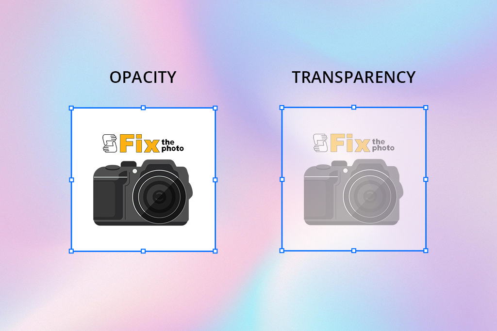
A common mistake among both novice and seasoned editors is using opacity and transparency interchangeably. However, they function differently: opacity adjusts a layer's overall visibility, whereas transparency determines if specific areas are completely see-through. This confusion causes practical problems, such as reducing opacity when a transparent element is needed, choosing incorrect file formats, or misjudging how an effect will print. Ultimately, these technical errors can produce photos that look flat, artificial, or inconsistent.
So, what’s the difference? Opacity determines how dense or visible an element appears - at full opacity, it’s completely solid, while lowering it makes the element increasingly translucent. Transparency, on the other hand, refers to areas that contain no visual information at all, fully revealing whatever lies beneath. Understanding how to control both is essential for achieving smooth, realistic, and polished retouching effects.
Understanding the Essentials
Opacity – describes how much you can see through an object or layer. When it’s set to 100%, the item is completely visible and hides anything behind it. At 0%, it disappears entirely. For instance, thick curtains that stop sunlight from passing through are opaque.
Opacity isn’t just about how much light something blocks - it also affects how heavy or strong it looks in a design. Things with high opacity seem bold and near, while things with low opacity look lighter and farther away.
In photography, opacity decides how much a layer, filter, or change shows on top of the main image. By lowering or raising it, I can make gentle improvements like smoothing skin, mixing colors, or adding light effects without taking attention away from the subject. It’s an important way to make photos look clean and natural while staying in charge of how each layer affects the picture.
How I apply opacity in photography:
- To fine-tune color or brightness through layer adjustments
- For gentle skin retouching with dodging and burning
- To add soft overlays, such as textures or light flares
- When blending images or smoothing edges together
- To build atmosphere and depth while keeping the subject unchanged
Transparency – means you can see right through something. A transparent area isn't just faded; it's completely clear, like an open window that shows whatever is behind it.
In photography, transparency means parts of an image that allow the background or layers beneath to be visible. It’s important for making composites, overlays, logos, or watermark designs. Using transparent sections helps photographers smoothly combine elements, apply textures or visual effects, and create flexible images suitable for digital, print, or artistic work.
I use transparency in photography:
- To separate and highlight subjects in product shots or create clean cut-outs
- For designing logos and watermarks used in branding
- To layer textures or backgrounds without hiding the main subject
- In web and UI design for glass-like or subtle overlay effects
- To combine multiple layers while maintaining transparency between elements
In digital media, transparency goes beyond mere visibility, as it conveys a message. Transparent visuals can represent values like trust, simplicity, and openness in brand design. Within UX and UI interfaces, semi-transparent layers help build a sense of dimension and space without overwhelming the layout, a concept often seen in glassmorphism aesthetics. Technically, transparency relies on the file type - for instance, PNG and TIFF preserve it, whereas JPEG cannot.
What Sets Opacity and Transparency Apart
In photo editing, design, and everyday objects, people often mix up the words opacity vs transparency, using them as if they mean the same thing. But they actually describe opposite effects. Knowing the real difference between them is a fundamental skill for making your edits look believable and your designs look professional.
1. Nature of effect
- Opacity in photography refers to the degree of solidity or how much an object blocks visibility.
- Transparency indicates areas that are open, clear, or completely see-through.
2. Control
- Opacity can be modified (ranging from 0% to 100%) in most photo editing software for PC.
- Transparency is typically absolute (a pixel is either visible or invisible), although certain file types, such as PNG, allow for partial transparency.
3. Application
- Opacity is commonly applied to brushes, layers, and various blending techniques.
- Transparency is typically utilized for backgrounds, image cut-outs, watermarks, and overlay designs.
4. Output/Export
- Opacity controls how layers blend within editing software and is independent of the file format.
- Transparency determines how the final image appears against various backgrounds or in print, and it needs compatible formats such as PNG, TIFF, or PSD - formats like JPEG do not support it.
5. Perception
- Lower opacity = lighter appearance, but still visible.
- Transparency = completely absent, area fully open.
6. Inverse relationship
Think of opacity and transparency as being on opposite ends of a seesaw. When one goes up, the other must go down.
“If something is transparent, light travels straight through it, allowing you to see what's on the other side. If something is opaque, it blocks the light completely, so you cannot see through it.”
Ann Young
Retouching Guides Writer
How to Change Opacity in Post Processing
In digital editing, opacity is a simple yet powerful feature. It’s not just about making things see-through - it helps add depth, realism, and a professional touch to your work.
Changing opacity is easy in most photo editing programs. We tested many tools, such as Affinity Photo and GIMP, and found that Photoshop is the best opacity editor. Learning to change opacity in Photoshop is an essential skill for editors and designers. It lets you control how visible a layer, brush, or effect is, helping you create soft and polished results.
Want to Fix and Correct Opacity in Your Images?
Easily adjust opacity in Photoshop to blend your edits. Just change the transparency of layers and brushes for a smooth, natural finish.
There are several ways to fix opacity in Photoshop. Here’s how I do it in my workflow:
1. Adjust Layer Opacity
- Open your project in Photoshop.
- In the Layers panel, select the layer you want to edit.
- Find the Opacity slider at the top of the panel.
- Drag the slider left to lower the opacity (make the layer more transparent) or right to raise it (make the layer more solid).
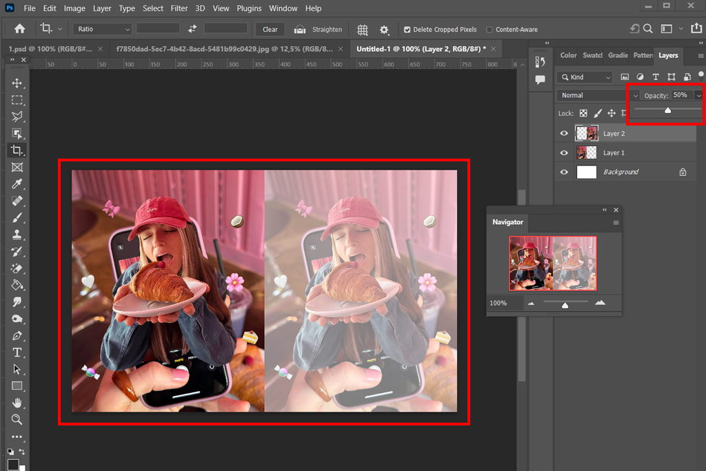
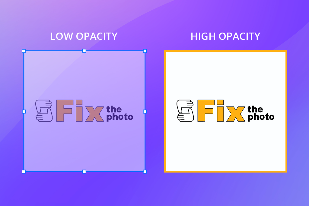
A layer at 100% opacity is completely solid and hides what's below. Reducing the opacity to 50% makes it semi-transparent, creating a blend with the layers underneath. At 0% opacity, the layer becomes fully invisible, revealing the image below completely.
2. Adjust Brush Opacity for Retouching
- Choose the Brush Tool (B) from the toolbar.
- Locate the Opacity setting for the brush in the top options bar.
- Input a value or use the slider to adjust the brush's transparency.
- Apply your brush strokes to the specific areas you wish to improve or modify.
Tip: You can quickly set the opacity by pressing the number keys 1 through 0 (1 for 10%, 5 for 50%, and 0 for 100%).
3. Adjust Fill Opacity
- The Layers panel in Photoshop also includes a Fill slider.
- The key difference is that Fill changes only the layer's actual pixels, not any added layer effects like shadows or glows.
- This is ideal for making subtle tweaks when you want to combine transparency with visible effects.
4. Blend Modes + Opacity
- To achieve creative color grading, pair a reduced opacity with blend modes like Soft Light, Overlay, or Multiply.
Example: Adding a warm-colored layer set to Soft Light blend mode at 25% opacity can give portraits a natural glow while keeping the image's depth.
Quick Tips:
- Begin your edits with a low opacity and slowly increase the effect.
- For complex results, use several layers, each with its own opacity level.
- Remember to check your work at 100% zoom to make sure all adjustments appear seamless.
“For techniques like skin smoothing or dodging and burning, a brush opacity between 20% and 30% is ideal. This lets you build up corrections slowly, which preserves natural skin texture and prevents a fake, over-edited look.”
Robin Owens
Senior Tech Writer
Tools for Changing Transparency
Most free Adobe software and design programs give you easy ways to make things see-through. The easiest way to control visibility is with the Opacity slider - in Photoshop’s Layers panel or Illustrator’s Transparency panel. This tool allows you to set how strongly a layer, object, or brush mark appears, letting you choose how much of it remains visible.
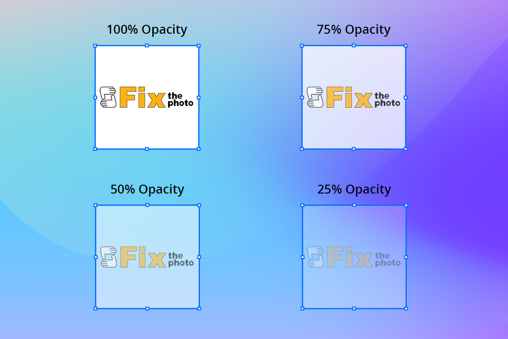
Another useful feature is the Gradient Tool, which lets you apply gradual transparency transitions - perfect for softly merging a subject with its background. In Illustrator, you can achieve a similar effect using Opacity Masks, which fade portions of an object away smoothly.
For more complex effects, Adobe apps have panels for Effects or Transparency. These tools offer styles like blend modes, soft shadows, and a glassy look (often called "glassmorphism" in web and app design). These all use transparency in photography to make designs feel deeper and realistic.
- How to create a transparent image (quick guide):
- In Photoshop, choose a layer and move the Opacity slider at the top of the Layers panel.
- To make a smooth fade, add a Layer Mask and use the Gradient Tool (black to white) over the mask.
- In Illustrator, open the Transparency panel (Window > Transparency), then change the opacity or use an Opacity Mask to create gentle fade effects.
- To make background transparent in Photoshop, first unlock the main image layer. Then, carefully select your subject using tools like Select Subject or the Pen Tool. Once selected, add a layer mask. This will hide the background, revealing the checkerboard pattern, which means it's transparent. Finally, save your image as a PNG file to keep the transparent background for use on websites, in prints, or in other designs.
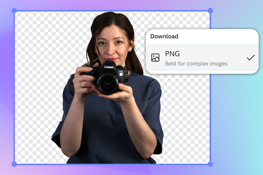
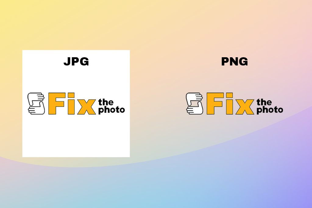
“I always confirm the file format when saving images with transparency. It's important to remember that PNG files preserve transparency, but JPEG files will replace it with a white background. For things like logos or product images, using the correct format is crucial.”
Tetiana Kostylieva
Photo & Video Insights Blogger
If you need a quick edit, several online transparency editors such as Pixelcut and Canva allow you to adjust transparency directly online without any software.
Common Mistakes
Even though opacity and transparency are simple ideas, they are often used incorrectly. These mistakes can result in dull-looking edits, file problems, or work that seems unprofessional.
Confusing “layer opacity” with “transparent background”. Many new users think that lowering opacity of the image is the same as creating a transparent background. However, a see-through layer just makes the image fainter - the pixels are still there. A truly transparent background means the area is empty, so whatever is behind it will show through. Mixing up these two ideas can cause issues when you export things like logos or product images.
Using 100% opaque overlays that destroy detail. Many people apply textures or light effects at full strength (100% opacity). This completely covers the subject and washes out important details. Professionals avoid this by using a low opacity, typically between 10% and 40%. This lets the effect blend in softly, improving the photo without overwhelming it.
Misunderstanding transparency in export formats. A common error is saving an image with a transparent background as a JPEG. JPEG files do not support transparency and will fill any clear areas with a solid white or black color. To keep your background transparent - for things like logos or product photos - you must save it as a PNG, TIFF, PSD, or WebP file. Using the wrong format can ruin a file for professional projects.
Pro Tips from FixThePhoto Retouchers
Working with the team at FixThePhoto has taught me a valuable lesson: minor opacity adjustments often create the most professional retouching results. These are the specific techniques my FixThePhoto colleagues and I use in our daily workflow.
Want to Perfect Opacity and Transparency in Your Photos?
At FixThePhoto, our expert editors use opacity and transparency to create natural-looking photos—refining skin tones, perfecting transparent backgrounds, and blending effects smoothly. We also offer color correction, photo retouching, and background changes.
For realistic skin, always use a soft brush. I never retouch at full strength. Instead, I set my brush to 20-30% opacity. This lets me make small, gradual corrections that keep the skin's natural texture and prevent a fake, plastic look. For example, when reducing redness, a soft brush gently evens out the color without removing healthy variations.
Use see-through layers for effects. I often add textures like light leaks or dust to create atmosphere in a photo. The secret is to make these layers partially transparent. Setting a texture layer to 30-40% can create a nice mood while keeping the main subject in focus. If you don't adjust this, the effects can look fake and take attention away from your photo.
Test exports with and without transparent backgrounds. Always save two versions of your final image: one with a see-through background (PNG) and one with a solid-colored background (JPEG). This is crucial for product photos and logos. It ensures your client always has a usable file. For example, a logo with a transparent background can easily be placed on both a white website and a dark poster.
Blend modes + opacity for creative color grading. One of my favorite methods is using blend modes with low opacity. For example, I add a "Soft Light" layer with a warm color, set to 20% opacity. This gives portraits a soft, golden glow. Changing the blend mode and opacity together lets me create unique color looks without using strong, unnatural filters.
“For exact control over transparency, I use layer masks instead of the eraser tool. Painting with black, white, or gray on the mask lets me hide or reveal parts of a layer smoothly. This allows me to create soft fades and make changes without permanently deleting any pixels.”
Ann Young
Retouching Guides Writer
FAQ
- • What’s the simple difference between opacity and transparency?
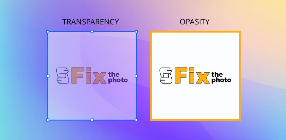
Opacity is how solid something is. Transparency is how see-through it is. If opacity is high, transparency is low, meaning you can't see through it.
- • Is 100% opacity transparent?
No, 100% opacity means the layer is fully solid and hides anything beneath it. To make something completely see-through, you’d need 0% opacity or genuinely transparent sections.
- • Is higher opacity more transparent?
No, higher opacity means it’s less see-through. For example, something at 80% opacity looks more solid than at 30%.
- • Can a layer be both transparent and opaque at once?
Yes. By using tools like masks, you can control the visibility of a layer in specific areas. This allows parts of it to be completely solid while other sections remain see-through.
- • Why does Photoshop use “opacity” instead of “transparency”?
Photoshop uses opacity because you're controlling how solid the layer is. Transparency is better for describing a clear, see-through background, not for adjusting a layer's visibility.
- • How do opacity and transparency affect design and retouching?
Opacity allows for gentle adjustments without permanently changing the image, such as softening skin or adding light color tones. Transparency is important for precise cutouts, logo design, layered graphics, and interface elements like glass or shadow effects.
- • Which one is simpler for beginners to use - opacity or transparency?
Changing the opacity of image is generally simpler, because it only needs adjusting a slider. Transparency can be trickier, as it often requires using masks, selections, or saving files in specific formats.