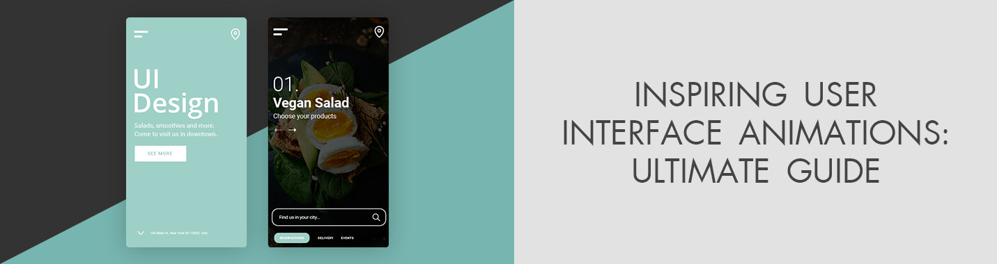
25 Inspiring User Interface Animations: Ultimate Guide
When you purchase through affiliate links on our site, we may earn a commission. Here’s how it works.
The UI animations are no longer something impressive, they are rather a necessity used to help a person navigate or notice important elements in due time. In this article, you will find 25 efficient and user-friendly examples of such animations and a guide to applying them.
25 User-Friendly UI Animations
Here, you will find some animated user interface examples. Any interface can be made smarter with several helpful and pleasant animations. Below, you will see options from different customizers for dashboard navigation.
1. Discounts Page
If you are an active outdoor enthusiast, you have definitely dreamt of an opportunity to get the highest-quality gear for a low price. The employed designer concentrated on building an inspiring atmosphere forusers, who were investigating the conditions of the Premium Komoot subscription.
2. Tesla Cybertruck
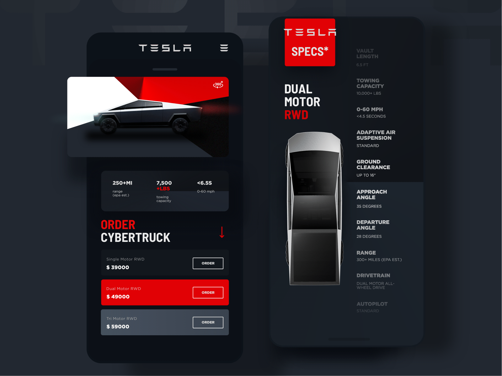
This model is an electric pickup car in the cyberpunk style designed by Tesla. One of the goals of the Cybertruck project was to create an absolutely original electric car. This animation also became original, as the car itself. This is a cool 3D car model, where you can also see the main characteristics.
3. Sneaker App
This novice author claimed to have never worked in UI design software Adobe XD before so the design was the result of continuous hours of struggle in an attempt to learn the features and recreate the idea. This is pure UI animation inspiration and something you can also achieve if you are equally crazy about interface design and the objects involved in it.
- Discover the best free VFX software.
4. Mango Online Shop

This is an animation that allows you to zoom in and examine the goods in detail and then swipe left to see the next item. It is very convenient, just what you need for picking a product on a mobile device.
- Address our corporate video editing service for professional videos for your website.
5. Skateboard Customizer
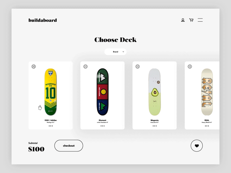
The animations were designed through Cinema 4D and After Effects for a specialty skateboard shop. Everything is concentrated on creating an intuitive engine for customizing skateboards.
- Check out the best free animation software.
6. Omega Nato - Mini Website
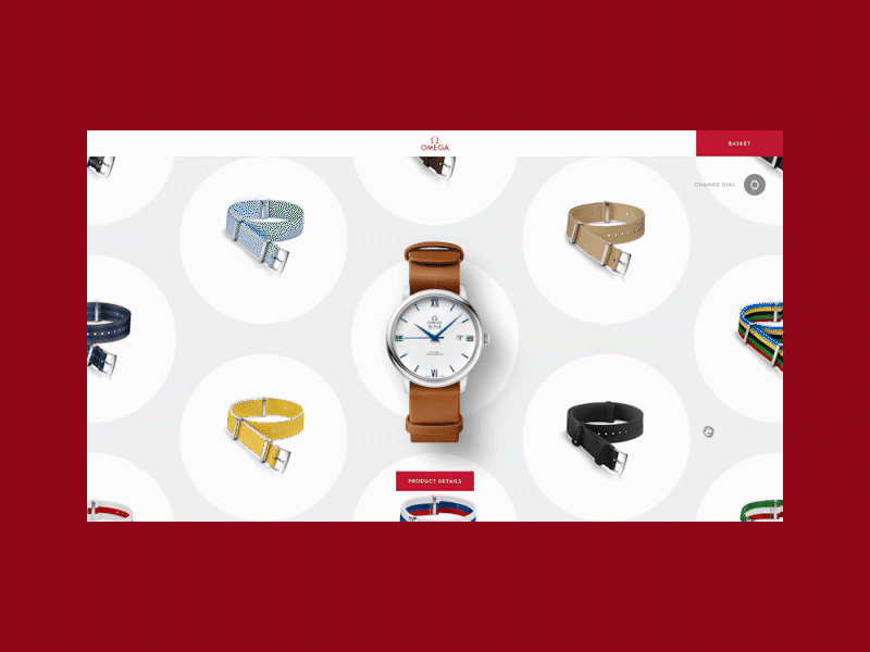
This original and very engaging animated UI was developed for the manufacturer of watches and watchbands. The main feature is a clear and simple design with the ability to quickly view the desired products.
7. Luscious - Parallax Website
Users are tired of browsing static websites. This experience should be made more engaging and entertaining regardless of the devices viewers use. Where the content does not largely consist of text, scrolling can be made fun, interactive, and informative, to help users enjoy the experience of browsing your page, not only using your services. This is a very unique design, don’t you agree?
- Check out our video editing service to make your videos more vivid.
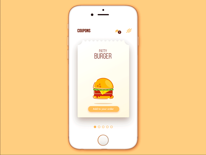
8. Donut Store
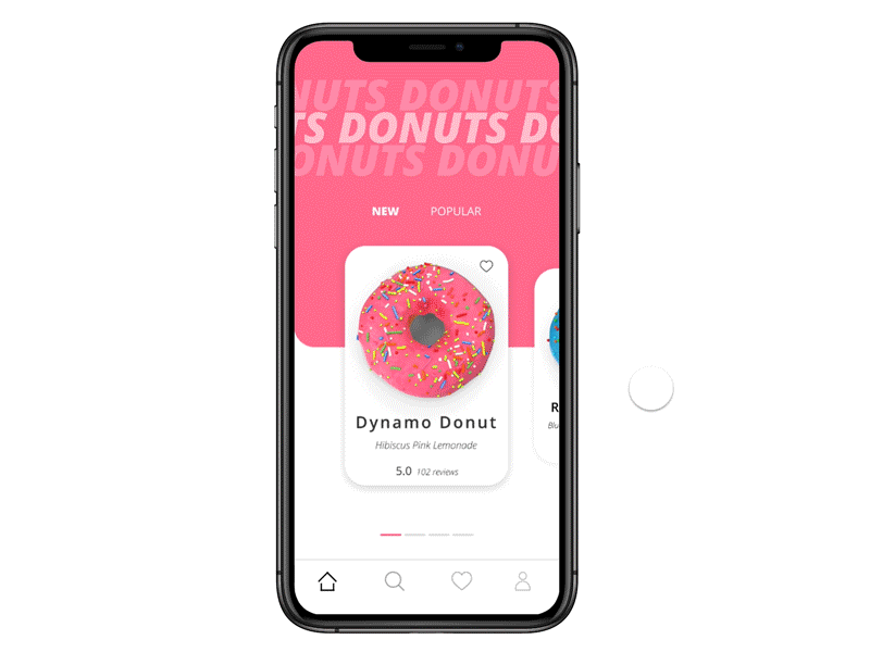
This animation is meant to involve people more in what they’re selecting and give a deeper feel for each particular item. Interesting transitions between customized looks for every donut that you see in this example is a labor-intensive project but one worth the money.
9. Bear Plant
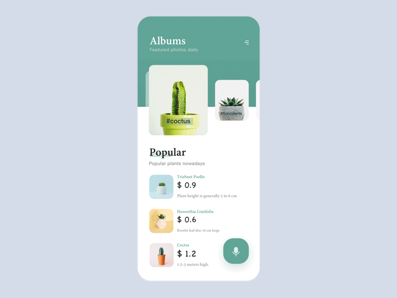
As technologies are advancing, it is not a bad idea to introduce better ways of interaction like the voice search option incorporated in this website for green plants. In addition to the voice search option, the website's interactive animation UI takes user engagement to new heights. By incorporating GIFs to create clearer and more dynamic videos, the platform delivers captivating and informative content that captures users' attention and drives their curiosity.
10. Bank Balance
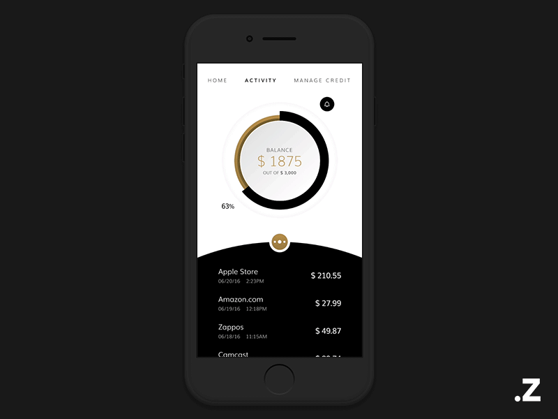
This peculiar idea has been incorporated in a card-holder app. In it, you can keep numerous cards for all uses and the animations are exceptionally smooth.
- Select the best free video editing software.
11. Delete Item

According to the statistics, people browsing from their phones are less tolerant and want everything to be evident, easy to do, and taking no time.
12. Space Tourism

This studio is future-oriented so their decision was to start developing the concept of a Space Tourism site now. This way, when the possibility becomes real, they will be all ready to deliver stunning designs to their customers.
13. Money Balance

If only managing your money was as flawless as this animated user interface is, just see how the statistics unfold playfully following your swipes.
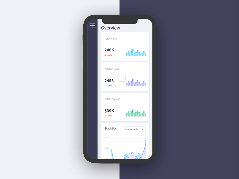
14. Dashboard of Bidease

The design of dashboards that combine various bits of statistics data is especially important for understanding the info. With a design like this, everything is easier to understand or explain to others.
15. Smart Home

Managing your home can be even easier! This animation is simple and very stylish. You can adjust the air temperature and lighting in each room.
16. Craftdo for iPad

This app is a great tool created to work across all Apple devices and help users keep their notes structured. The design is so great, it is immediately understandable, perfectly optimized for the system, literally placing all the options and capabilities at the tips of your fingers while using in a smart way such features as Split or Slide Over View, the drag&drop interaction, and more.
17. Fitness Apple Watch App
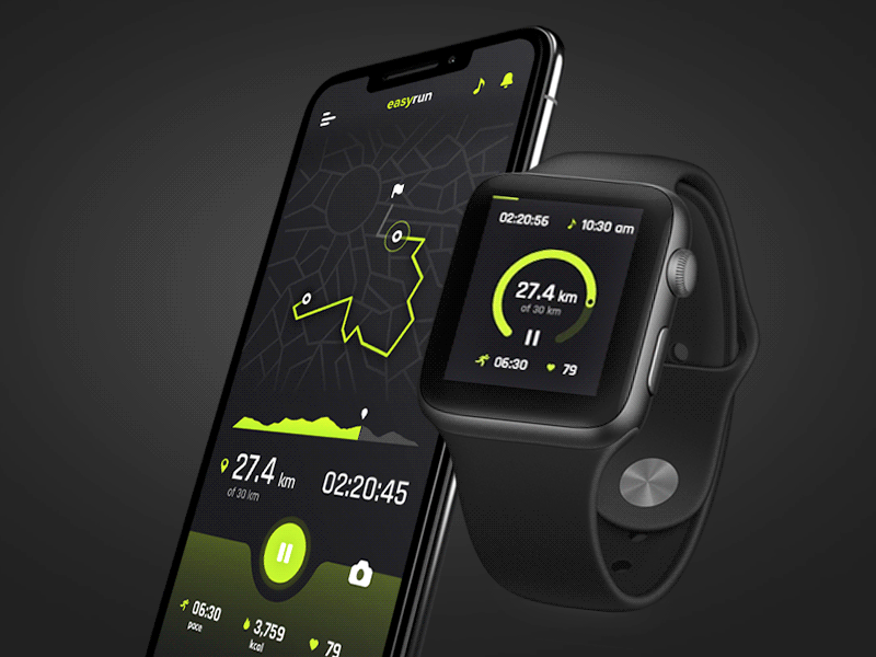
This is possibly the best UI design for a smartwatch. It has great transitions, high speed, and an unarguably stylish look.
18. Create New

For creating something new, just make a simple move and voila! Creating new things has never been so easy.
19. Birthday Input Field
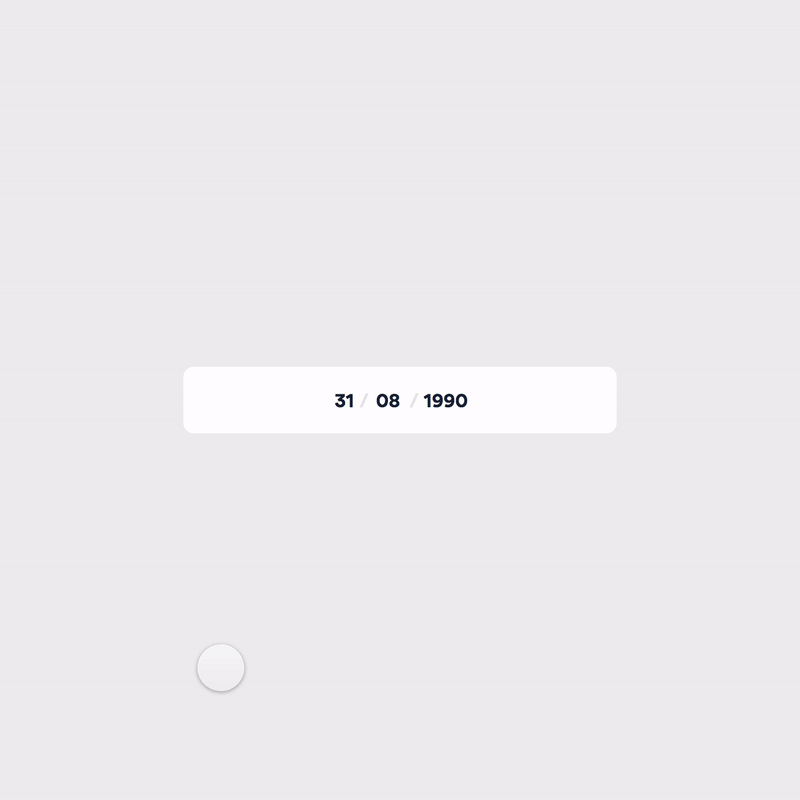
Here is a playful birthday input field that is meant to disclose your zodiac. The concept was developed with the help of After Effects.
- View more After Effects scripts.
20. Label

Great visuals. It seems like nothing special, but it is definitely worth your attention.
21. Password Guide

The various 'high standards' of account protection passwords are so confusing. That’s why, we all need a design like this to understand what is what.
22. Dashboard Navigation
The UI animations you see here are a segment of the interaction library. You can easily share such an example with your client to improve understanding.
23. Calendar Component

Depending on the Height and Width values, the widget will change its look and mode of operation for the highest efficiency which provides the best user experience.
- Examine Adobe Animate alternatives.
24. Responsive House
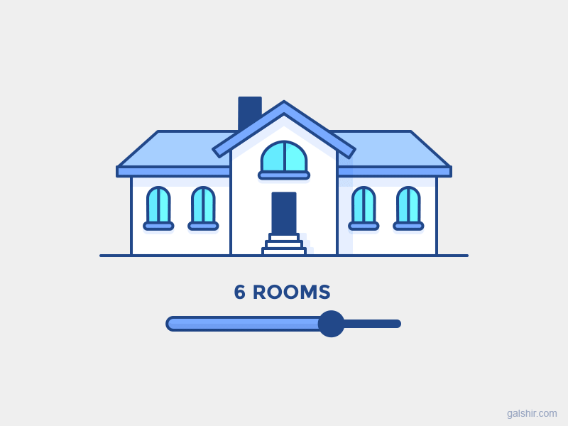
This simple animation is so energetic and uplifting that you can just play with it endlessly and not think of the amount of detail that went into the design.
25. Exclusive Cars Rental
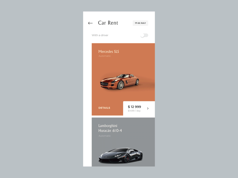
This little ad for a unique car rental app shows you how easily and quickly you can customize your order from the model to its year and color, filtering out the price range or availability.
Ultimate Guide to Use of Animation in UX
It is now difficult to impress users with a front-end animation or UI design concept. Studying the subject, I could only find information that was either too general, or too concentrated on a particular case. Since nothing was truly helpful and informative, I made a compilation of my own recommendations that you can find below.
1. Speed of Animation
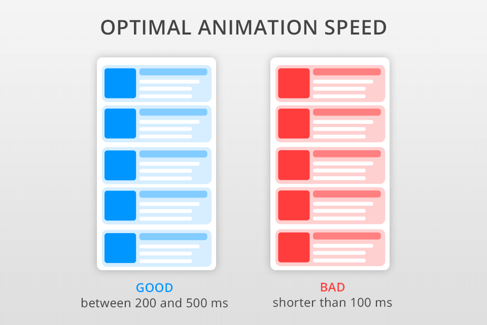
To determine the precise interval for the animation to last, you have to find the optimal balance between it moving too fast to be registered by a user and causing irritation due to it moving too slowly.
Make several tests and see what would be the best speed for each occurring motion. At any rate, avoid making them needlessly long that a user will feel slowed down. If you want to be guided by studies, then make your UI animations fit between the limits of 200 to 500ms, the numbers being derived from the tests on human brain qualities.
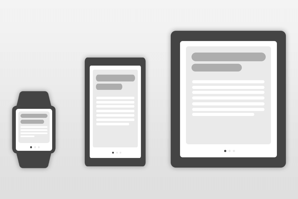
2. Animation Duration
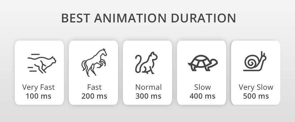
The Material Design Guidelines indicate the appropriate duration of animations on phones within the 200–300ms time frame. For tablets, it is acceptable to prolong the duration by a third because a larger screen makes an element travel a longer way.
The same logic guides the recommendations for wearable devices like watches. Their screen being smaller, the motion should respectively last for a third less than on a phone.
3. Influence of the Device on Animation Duration
The duration of the animation will depend not only on the distance that the object travels, but also on the size of this object. Small items move faster. Minor changes in the location and orientation of objects also occur quickly.
And vice versa: if large objects move, or the location of the object changes dramatically, the animation should last longer.
If several objects of the same size move, the object that has traveled the smallest distance should be the first to stop.
Small objects - compared to large ones - move slower, because the ratio of their size to the distance traveled is greater.
4. No Bouncing Effects
Modern design is razor-sharp and such a thing as motion blur is absolutely inapplicable. The simple reason is that tiny devices don’t have enough capacity to reproduce it in full beauty so keep your front-end animation free from it.
5. Don’t Use the Blur Effect
The delay is even less tolerable in the list items (news cards, email contact lists, etc.). No more than 20-25ms should pass between one item changes the other on the screen. If your animated UI elements take longer, you are bound to annoy a user.
6. Use Slow Motion Animation
There are several physical forces that can influence the movement of an object, without which it would move at an entirely constant speed. Such a mode of movement would seem unnatural to our brain, which is used to the real-world uneven motion.
7. Use Attenuation
This effect helps make the motion of a digital object mimic that of a real one, which looks more satisfying to a user. Even in the book “The Illusion of Life: Disney Animation,” the work of two most renowned Disney animators, this is mentioned as one of the key principles.
It is not advisable to produce mechanical animations, they should be moving in the most natural way like the real-world objects performing a similar motion would.
8. Ease-in-out or Standard Curve
According to the aforementioned guide, the asymmetric curve is the designer’s best friend which turns his/her digital transitions into something moving quite naturally. While setting it, try to make the end more pronounced than the start, slightly outstretching the final deceleration at the initial gain of the element’s speed. This trick will concentrate the user’s attention on the final state of the element that has been moved.
This curve causes objects to pick up speed initially but then gradually bring it back to zero. This is what you notice in any example of front-end animation. Whenever you doubt which type of motion to use, go for the standard curve.
- Find out more about Adobe Animate torrent.
9. Linear Movement
The linear UI movement has a specific type of transition when it is highly beneficial – when the size of the object is being changed proportionally. This simplifies the design tasks to such an extent that the standard curve is generally disregarded. Consider some real-world application examples, you will see the dominance of linear motion.
10. When Moving Objects Must Not Pass through Each Other
Because our brain perceives the elements of the interface as being placed on the same plane, it is not advisable to have them pass through each other or otherwise conflict on their intersecting paths. Make sure that all elements leave enough space for the movement of others by slowing them down or accelerating. Repelling actions can also help.
You can create a more complicated effect by moving an element visibly over another one with a hovering animation. In the real world, the laws of physics prevent solid objects from penetrating each other so follow the same concept.
- Discover the best free drawing software.