Cake
Verdict: Cake was my handy assistant when I needed to create a professional and visually appealing resume to demonstrate my skills and experience as a landscape photographer and editor. With the help of this resume writing software, I managed to impress companies with a perfectly built CV that stands out among others. The program offers helpful templates, which allow for creating a resume from scratch.
The whole process from registration to completing my resume was extremely efficient. I needed approximately one hour to finish this task. I appreciated the ability to add images and links to my social media accounts to a file to make it more dynamic and engaging.
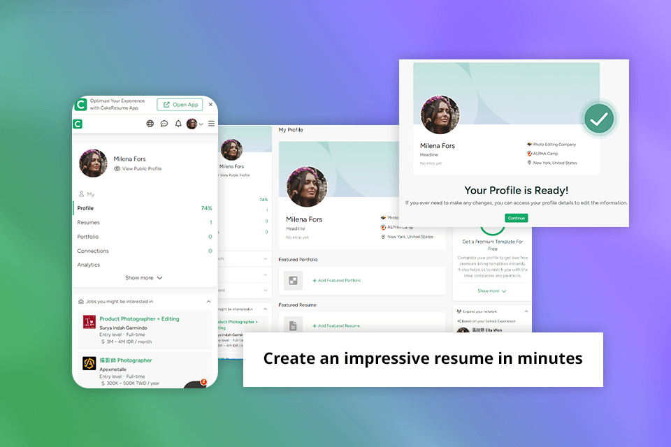
As Cake offers responsive web design, anyone can open my resume and view it on virtually all devices, desktop and mobile. CVs produced in the program are fully optimized for the Applicant Tracking System (ATS), so the chances are that my resume will successfully pass the initial application screening.
Nowadays, more than 7 million users from around the globe use the platform. Besides, CakeResume collaborates with more than 8,000 well-known companies such as Google, L’Oreal, AWS, TSMC, and HSBC, among others.
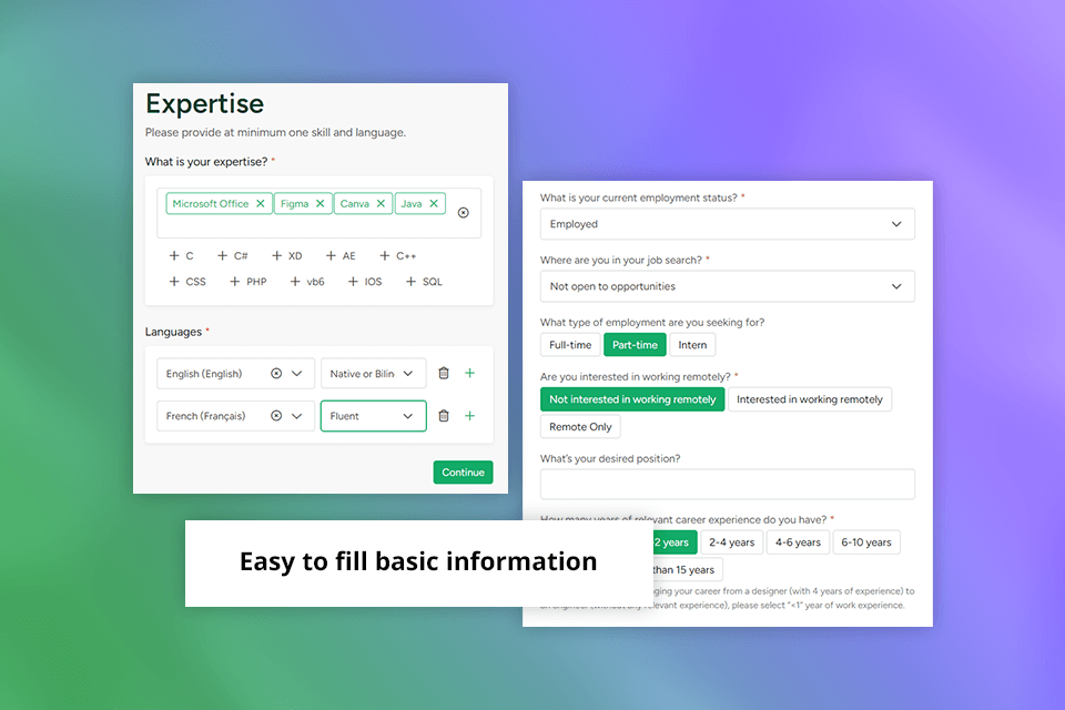
The authorization process was effortless. I needed to provide some basic details like the desired job, professional experience, education, and expertise to create my profile. I also provided the URLs of my pages on such social media networks as LinkedIn and Instagram.
I needed to use grammar checker to make sure that my text was error-free, as there is no such tool on the platform. After creating my profile, I selected the "Job Seeker" option.
The program offered me to upload an existing resume or import the info from LinkedIn, but I did not want to stick to these automated options and decided to continue manually to make certain that my resume satisfies all my needs and wishes.
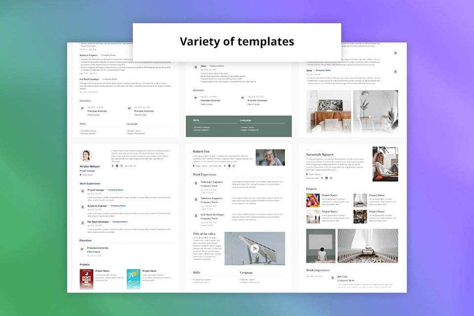
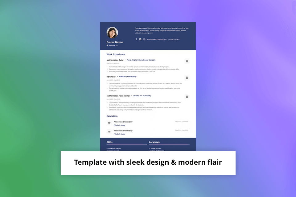
The modern professional template appealed to me most of all. It was both functional and visually appealing, as well as allowed me to perfectly demonstrate my identity as a landscape photographer. Thanks to a clean and contemporary design, I managed to put my work at the center and clearly present my skills in well-built sections.
When I selected the template, the program took all the needed details from my profile to fill in the resume. This is a real-time-saver, as all the important details like my contact info were accurately transferred without the need to enter all the data manually again.

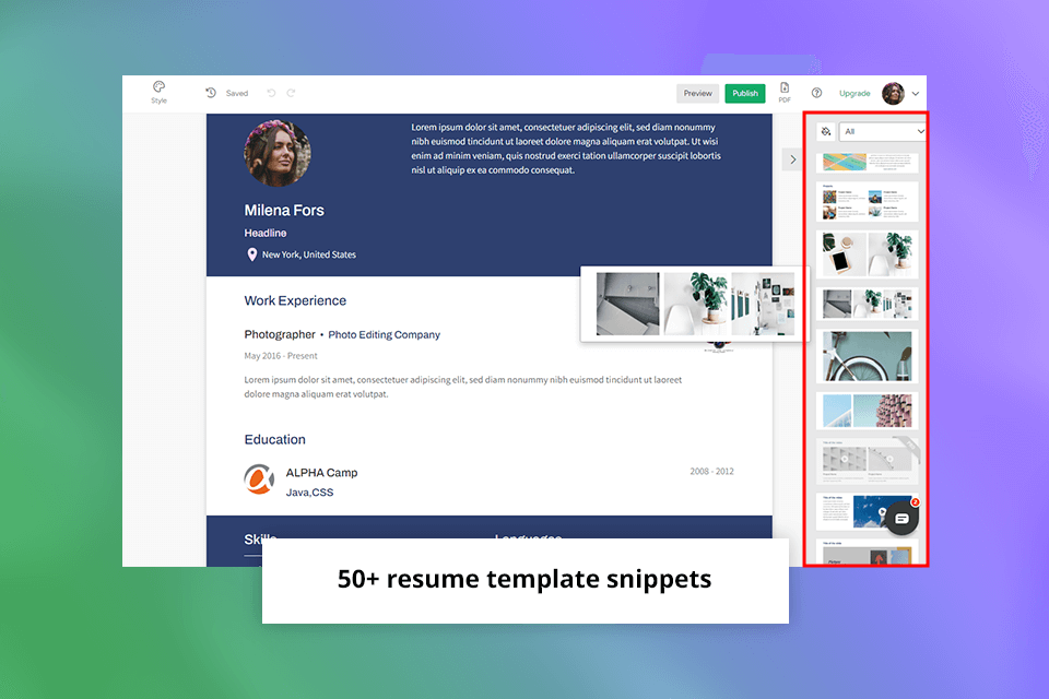
Multimedia integration: I decided to make my CV more engaging by adding pics and a portfolio section to it. I also produced a video introduction to describe my passion for photography and why I wanted to start a photography business.
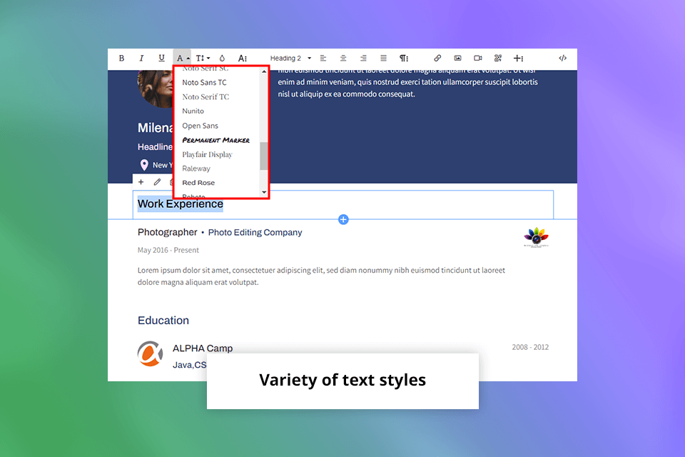
Text and Fonts: I had no trouble customizing the font and text styles. I preferred a clean and professional font for the main part of my resume and selected a bold and more eye-grabbing font for section headers to present information more efficiently.
Styling Elements: To highlight the most important info like the key accomplishments, I leveraged such styling elements as bold, italics, and bullet points. Besides, I used bullet points to describe my skills and duties to make the content easier to read and comprehend.
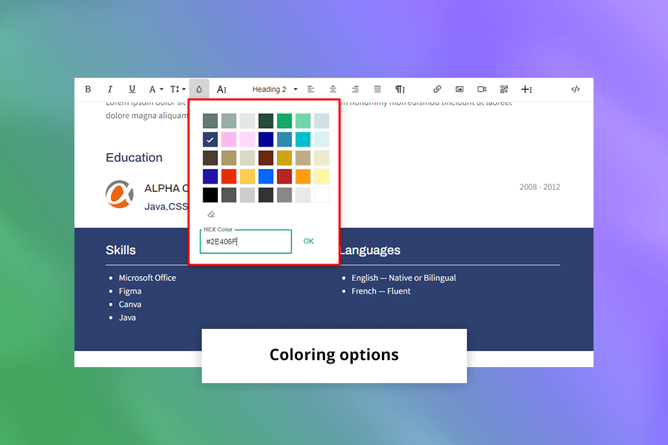
Colors: Selecting the right color scheme to highlight my brand identity was important as well. I picked professional colors like navy for the main part and emphasized the key points with other colors.
Layout: To deliver the info more efficiently, I tinkered with different layouts. By using columns and sections, I divided different types of data, making the text more readable. Besides, I also added the white space between resume parts to help a reader navigate through a document without getting lost in it.
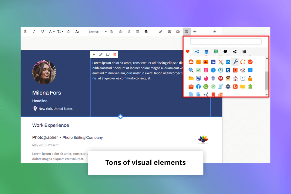
Visual elements: Incorporating visual elements such as icons and lines added a touch of creativity and helped break up the text. Icons next to section headers, for instance, provided a quick visual reference, while lines between sections added structure and visual interest.
To add a touch of creativity to the text and increase its readability, I included various visual elements like icons and lines. By putting icons next to section headers, I added handy visual references for a quick search, whereas the lines between different document parts helped structure my resume properly.
After adjusting and customizing my resume template, I previewed the resulting file. It was satisfactory, so I did not have to look for proofreading software.
Cake has a handy preview feature for evaluating the look of my resume and checking how potential employers and clients would see it. This is an invaluable option that provided me with a piece of mind that the document is perfect and the info is presented in the greatest possible way.
With Cake, sharing my resume was a piece of cake. Once the document was completed, I created a sharable link with the ability to change privacy settings. It is possible to download the resume either as a Word or PDF file.
Having a sharing link, I could easily send my resume to employers, potential clients, or anyone from the professional niche.
At first, I checked the free plan that allows downloading one basic resume. However, if you need to build many resumes using multiple templates and features, upgrading to a paid package is a must.
The advanced plan that costs $8/mo provides access to basic and over 20 premium resume snippets, unlimited resume creation capabilities, and the ability to remove Cake branding.
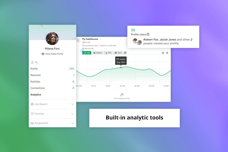
If you need to track the responses to your resume, think of purchasing a Pro plan for $12/mo, which provides Google Analytics info and premium support.