Dealing with magazines, photographers, and publishers daily, I’m permanently involved in the realm where images meet text. The question I get asked the most by my clients and followers is: “What is editorial design exactly, and what makes it different from other kinds of graphic projects?” Good editorial design is the visual foundation of most print and digital publications.
Determining the shape and presentation of content is the main meaning of editorial design, as it encompasses article layouts, picture spreads, and all relevant typography elements that you’ll see on a site or in printed media.
When it comes down to it, editorial resign is the result of the synergy between storytelling and visual structure. It can be a fashion magazine cover, the arrangement of website icons, or the individual page layout of an art book – the main goal is to convey a cohesive, visually appealing message that keeps the viewer/reader engaged.
Whereas ad design promotes a product, editorial design acquaints the audience with a story or concept. You can get some fantastic results using free graphic design software, which is often relied on by students, bloggers, and smaller online publications.
The editorial design definition doesn’t stop at simply adding text and pictures to a page. It also deals with visual hierarchy, page balancing, cohesive styling, and smooth navigation.
Even the best-written article or the most beautiful photos can look unappealing when placed on a cluttered layout or used with weird fonts. You can compare the work of an editorial designer to that of a curator or architect.
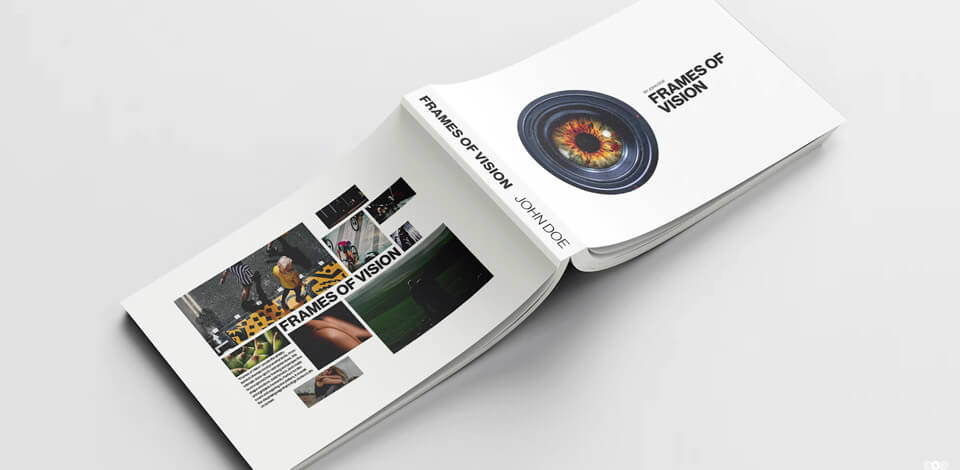
For instance, when I was helping our company make a layout for a photography magazine for aspiring fashion designers, for example, when we created a layout for a photography zine featuring emerging fashion artists, our editorial graphic designer prioritized getting the type weight, image bleed, and white space right.
One spread featured full-bleed portraits with big pull quotes, while another had a muted grid to emphasize behind-the-scenes photos.
Choices like that are always intentional, as you have to think about the margins, column width, and caption arrangement. You never notice when a layout is good, but you’ll instantly see if someone did a poor job. That’s why an editorial graphic designer needs to possess both good aesthetic taste and technical skills, mastering the grid while telling an engaging story.
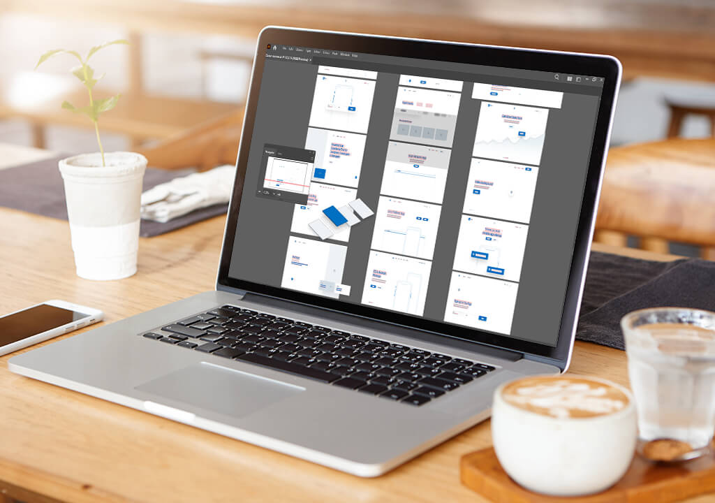
You can’t do any of that if you don’t have the right gear. It’s important to get a computer for graphic design with terrific color reproduction, a powerful graphics card, and sufficient RAM to process high-resolution files and InDesign projects. If your setup isn’t powerful enough, it will be hard to get a good result regardless of how skilled you are.
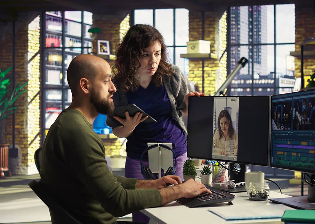
As I mentioned before, it’s an editorial graphic designer who is responsible for putting all these different aspects together. I frequently work with our designer to prepare retouched photos for print or online use. They are responsible for art direction, layout preparation, typography, and image arrangement.
A professional editorial designer is more than a regular layout maker, as they also need to master pacing, atmosphere, and audience psychology. A freelancing partner of our company made an image-rich feature on Ukrainian street photography. She added grayscale backgrounds, intricate serif fonts, and deep margins to make the reader feel like they’re going through a museum-style experience, evoking a contemplative mood.
A lot of famous graphic designers, including Neville Brody, David Carson, and Paula Scher, have been instrumental in shaping how editorial designs look today. They went beyond the norm and inspired future generations to combine emotion with professionalism, while remaining reader-friendly.
When working on an editorial project, you have to pay attention to:
Whether you’re designing a print catalog or a web-based editorial on modern photography, the designer shapes the general aesthetic and mood of the experience.
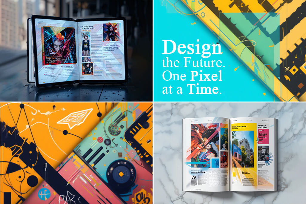
Recently, I’ve seen examples of fantastic editorial design layouts that go against the norm. Just because you’re creating an editorial project, it doesn’t mean you have to stick to boring columns and Helvetica.
When I was retouching images for a fashion article, the graphic designer employed diagonal lines, overlapping captions, and unconventional cropping to optimize the layout. It looked visually striking and matched the magazine perfectly.
A fantastic example of impressive editorial design was a digital publication on environmental activism that had to be scrolled horizontally rather than vertically. Captions appeared over satellite photos, and timelines were built into the navigation menu.
The entire page felt like an unconventional exploratory experience. However, even such a norm-breaking design still follows the main principles of design photography, including balance, contrast, alignment, and rhythm, ensuring your gaze follows the direction intended by the designer.

As I mentioned once before, when done properly, editorial design is unnoticeable. It’s there to present content without attracting your attention, as you’re flipping through a fashion magazine or reading an essay online at your leisure.
When looking at different types of graphic design, editorial layouts stand out with how they prioritize telling a story through typography, image arrangement, and structure to arrive at a cohesive reading experience.
“Plan the layout around the reader’s eye flow. Clarity is always more important than fancy design elements.”
Despite living in a universe dominated by videos and social media, editorial design is still essential for smart visual storytelling. For as long as we continue to share ideas, there will always be a place for editorial designers who will present those ideas most appealingly and engagingly.
| Feature | Print editorial design | Digital editorial design |
|---|---|---|
|
Format
|
Fixed-size pages, spreads
|
Responsive, scroll-based
|
|
Interaction
|
Static (page-turning)
|
Interactive (clicks, hovers, scroll effects)
|
|
Visual assets
|
High-resolution CMYK images, strict bleeds
|
RGB pictures, optimized for screen
|
|
Typography
|
Controlled kerning, print-safe fonts
|
Web fonts, dynamic scaling
|
|
Tools
|
Adobe InDesign, Illustrator
|
Figma, Adobe XD, Canva
|
|
Distribution
|
Physical print, direct mail
|
Online platforms, apps, social media
|
Print design for editorial projects ensures you can fine-tune every single visual detail, implementing your idea down to a tee. That said, this format has limited space and the materials you can use, which can feel rather constraining.
Hence why I prefer to preview the layout in photo printing software to make sure I’m happy with the photo quality, bleed parameters, and color precision, and can be certain they will look good on paper.
Meanwhile, digital editorial design revolves around interaction, motion, and versatility. You can add dynamic scrolling, include videos, design responsive layouts, and control how exactly users perceive and navigate your content. However, the digital format requires more cross-platform testing to ensure everyone can enjoy a smooth experience.
Regardless of how much you work on your editorial layout design, it will only feel complete if you use high-quality images. You need to ensure the reader enjoys an uncluttered visual experience that doesn’t have any distracting elements and doesn’t feature images with inconsistent colors or poor lighting.
I’ve created dozens of magazine spreads and web-based essays, so if there’s one thing I’m certain of, it’s that you need to properly retouch your images before you add them to your designs.
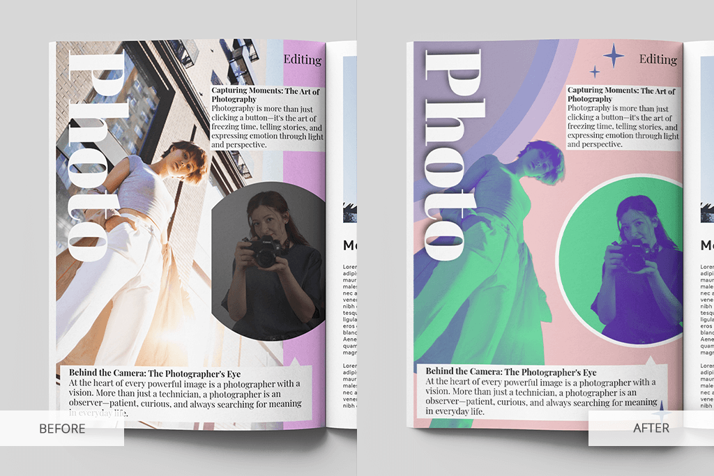
For instance, I created a street fashion feature recently, which leveraged negative space and serif fonts to let the photos shine. I started by combining different typefaces with the help of the best typography apps until I was happy with the established mood and ensured the layout looked good on both mobile and tablets.
When I imported the images, they suffered from rough shadows, unnatural colors, and busy backdrops. Instead of trying to fix such serious issues with a lazy filter or aggressive overlay, I delegated that task to a dependable team.
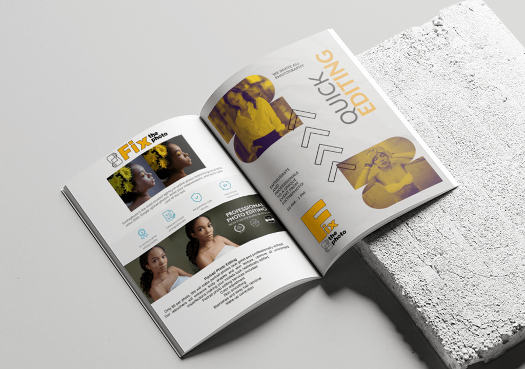
I employed the FixThePhoto App to upload all the photos that were going to be added to the street fashion publication. The results were delivered to me quickly and impressed me with their quality. The skin tones were improved, all distracting elements were deleted, and the colors looked crisp and natural. I was finally happy with the overall design.
I also recently prepared a gourmet editorial for tablets. The images I had to work with had inconsistent lighting, as the photographer spent hours taking pictures while relying solely on natural light, which led to noticeable color shifts.
I managed to make the photos look cohesive by ordering batch color correction and object removal from the FixThePhoto app. The delivered images finally felt like they belonged next to each other on the same page, allowing me to finalize my layout.
The benefits of outsourcing retouching for creating editorial layouts include:
If you’re working on an editorial layout that puts a premium on every little detail, consider contacting FixThePhoto to take advantage of their professional, editorial-optimized retouching approach. With photo retouching being taken care of by a third party, you can focus on other aspects of your work – layout enhancements, typography, and narrative cohesion.
From my experience doing creative editorial designs, I can say that typography can make or break a layout. The fonts you use aren’t only about visuals; they can also affect the way you tell the story. At FixThePhoto, we test editorial layouts by filling them with actual content, which allows us to quickly detect possible typeface problems.
Here are a few things I’ve learned from experience:
This doesn’t mean you have to pick eye-catching fonts to send the message you want. When it comes to editorial graphic design, structure is always as important as the visuals. Fine-tune the typography properly, and everything else will fall into place.
No, I tend to prepare editorial layouts for digital projects as well, including blog posts, web-based magazines, and social media carousels. However, traditional photography magazines are still the most rewarding medium for showcasing all your layout and presentation skills.
I primarily employ Adobe InDesign for print and Figma or Adobe Express for digital projects.
It’s highly recommended. Powerful visuals and retouched images are often essential for telling the story behind your project.
It’s possible, but it will be difficult to achieve a satisfying result if you don’t learn the main layout rules, type hierarchy, and the basics of visual storytelling.
I select fonts that match the mood of the project while still being easily readable. A serif type is usually a good option for a literary piece, while striking sans-serif fonts have a more trendy, clean aesthetic.


![25 Best Pregnancy Announcement Ideas [Tips from an Expert]](/placeholder-450x300.svg)


