Discovering the rule of thirds in videography completely transformed the way I shoot and edit. Back when I was just a kid with a cheap camcorder, I couldn’t figure out why my home videos felt dull and lifeless compared to the movies I admired.
Years later, even after upgrading to a better camera and creating social media videos for FixThePhoto, I still felt like something was missing.
I finally understood when I learned about a very old rule for arranging a picture. Painters used it long before movies existed. The idea is simple and smart: you set up your picture so that a viewer’s attention goes straight to the most important part. This method works for everything, from a huge Hollywood movie scene to a short video on TikTok.
Now, I can’t imagine framing a shot without it. Once you grasp how to apply it, your footage immediately feels more purposeful, balanced, and cinematic, even when filmed on a phone.
The rule of thirds in photography and videography is a guide for taking pictures and shooting video.
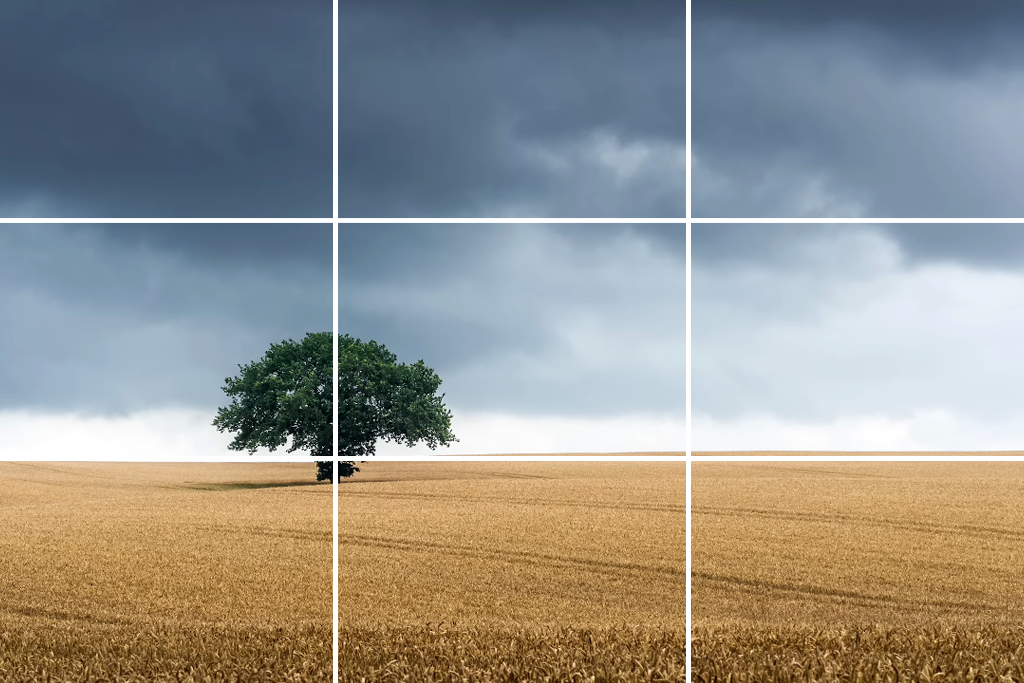
Picture a 3x3 grid over your screen - two vertical and two horizontal lines creating nine equal parts. The basic, practical rule is to position your main subject or the important parts of your scene along these lines or, ideally, at the points where they intersect. In my work, I rely on the grid to accomplish three key goals:
From the editing side, the grid is my quickest way to check composition: if the subject is stuck in the center and the shot looks stiff, I tweak the crop, shift the frame slightly, or adjust camera placement so the subject falls near a third.
When subjects are in motion, the grid helps with planning - positioning them on the left third while they look into the frame creates space for the viewer to sense movement; do the opposite, and the shot feels restricted.
Quick checklist:
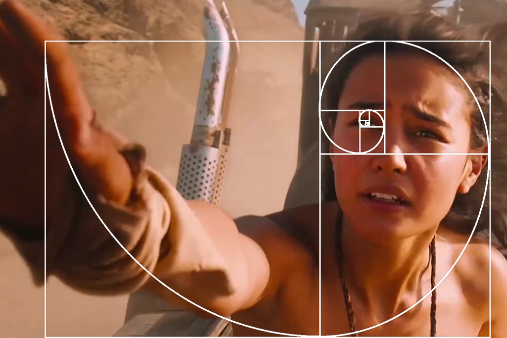
The golden ratio (roughly 1.618:1), derived from the Fibonacci sequence, creates a more natural, spiral-like composition instead of a standard grid.
I use the golden ratio in graphic design and videography as a subtle and creative guide. It works especially well for certain types of shots: architecture, portraits that have a sense of depth, and any composition that you want to look “intentionally designed” and unique.
The 3×3 grid (rule of thirds) is simple and quick: it offers editors and camera operators a reliable shortcut when there isn’t time to carefully design a spiral.
Practical difference:
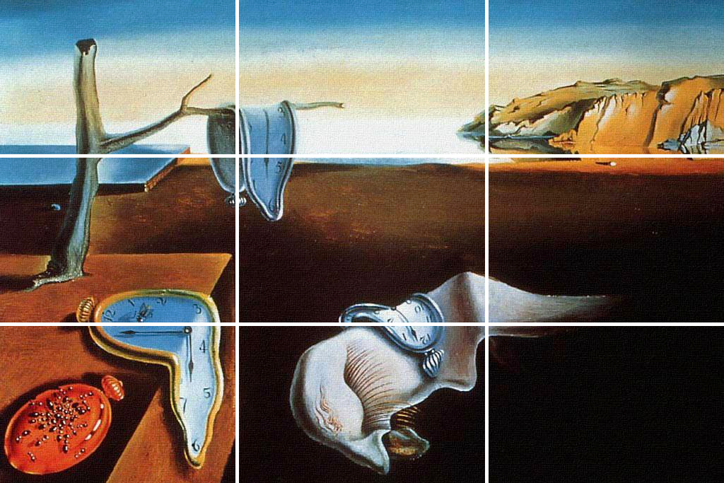
The main idea behind the rule of thirds works for any screen size or shape, like 4:3, 16:9, 2.39:1, or a vertical phone video 9:16. The rule still gives you good guide points to place your subject.
The only thing that changes is the amount of space inside each section of the grid. This also changes where the viewer’s eye is naturally drawn. Practical video editing tips for beginners I use when shooting videos:

My professional work in photo editing has led me to view the rule of thirds in film as a guideline for efficient visual communication rather than an absolute law. The viewer processes images composed this way more quickly.
The rule of thirds helps because it makes the main subject easy to spot right away, turns the background into a pleasant setting rather than a distraction, and does all this quickly, which is key on social media, where you have less than a second to get someone’s attention. In practice, the grid excels at three things:
I’ve noticed this on set: positioning a subject on the left third facing right allows space for movement, while placing them on the right third facing outward creates unease - both serve as storytelling techniques.
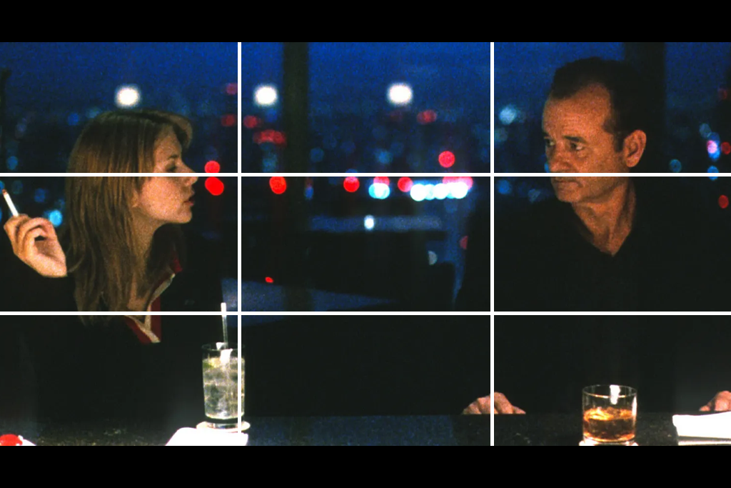
Filmmakers use off-center framing to hint at future events, to make a character seem alone, or to show how a person connects to the world around them. In movies like Lost in Translation and Drive, placing the subject away from the middle makes the atmosphere and feeling just as important as the character. Isolated frames allow the mood to drive the narrative.
Quick benefits checklist:
I use the rule of thirds in cinematography as a simple guide, not a strict rule. When filming, it helps me plan the story in motion - I consider the subject’s starting point, their path through the frame, and create a natural point for the audience to focus on.
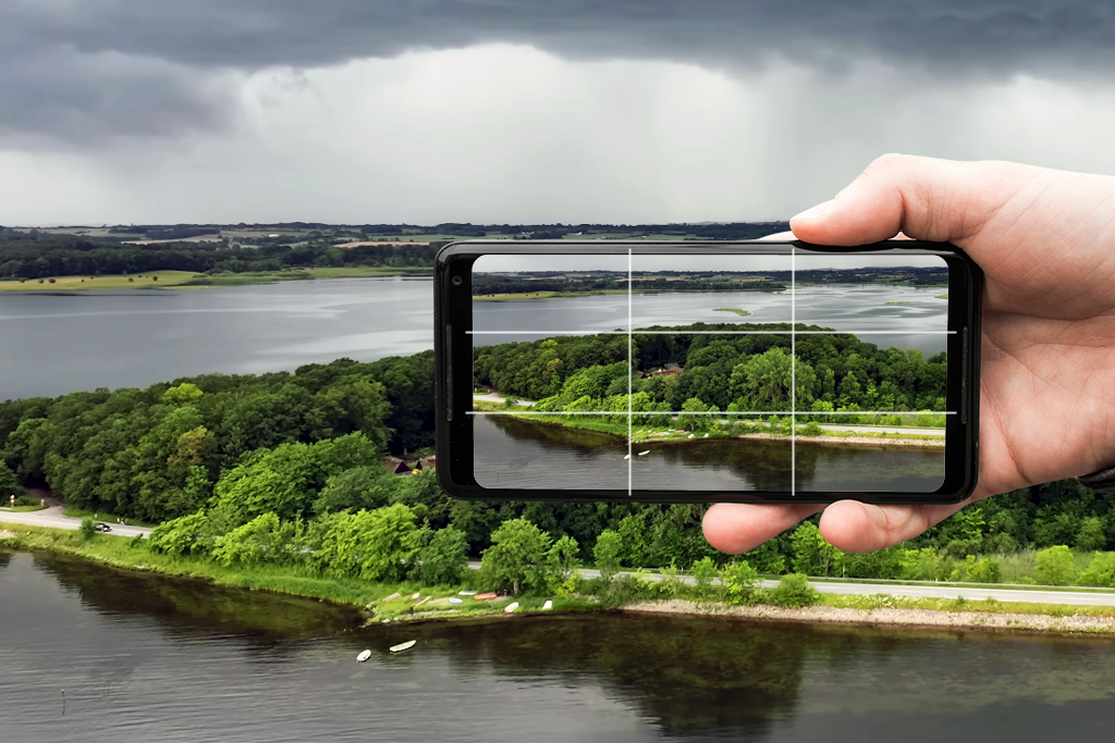
Turn the grid on. Nearly every budget filmmaking camera and even most smartphones come with a built-in 3x3 grid. I always turn this on, as it’s the quickest way to set up your shot, whether you’re positioning people or framing an object. If your camera doesn’t have the grid, just picture the lines in your mind before you start recording.
Respect looking/lead room. If a person is looking or moving to the right, leave more empty space in front of them to the right. This “looking room” makes the shot feel comfortable and easy to understand. If you don’t leave that space, the frame feels cramped and tight. You can use that cramped feeling on purpose to create a certain mood, but it should be your choice.
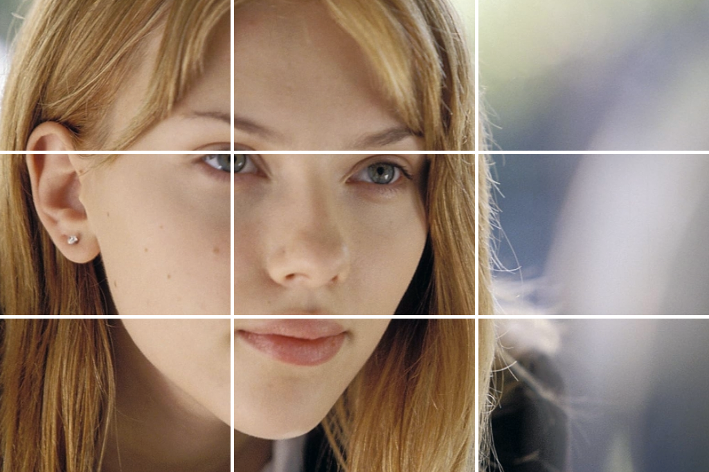
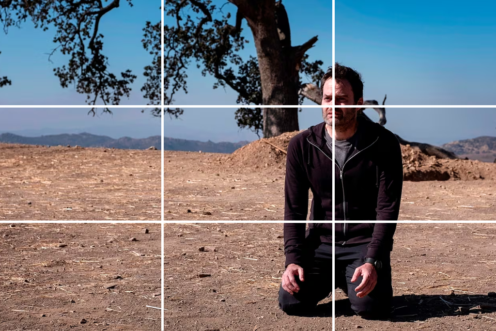
Position power points with purpose. Align eyes, horizons, doorways, or important props with the grid intersections.
Anticipate motion across thirds. When filming moving subjects, frame them so they enter, travel through, or exit along the rule-of-thirds lines that enhance their motion. If you’re using a dolly or gimbal, set your starting and ending positions with the thirds grid in mind to ensure the subject’s movement flows smoothly and feels natural in the edit.
Use empty space to tell your story. Space isn’t really empty - it can show ideas like thinking, distance, size, or danger. To create a feeling of loneliness or scale, I usually place the subject on one side and let the rest of the scene speak for itself.
Reframe for platform delivery. When you film, try to capture a wide shot. Later, you can crop it in editing software like Premiere to make square or vertical videos. But remember: every time you crop the video, look at it again using the rule of thirds grid. A shot that looked good in 2.39:1 format might not work in 9:16 format unless you move it around.
Combine the rule of thirds with leading lines and depth. Use natural lines, such as roads, railway tracks, or rays of light, to guide the viewer’s eye toward your main subject.
I use this filmmaking technique by arranging different layers of the scene (the front, middle, and back) along the grid lines. This adds a sense of depth and makes the shot more interesting, helping to keep the audience’s attention.
Try experimenting. Film the same moment three different ways: centered, on the left third, and on the right third. Then compare the edits - you’ll notice how each variant changes rhythm and emotion.
I see the rule of thirds grid as a helpful guide, not a strict rule that limits you. From my years of experience taking and editing photos for FixThePhoto, I’ve learned that sometimes breaking this rule is the most powerful way to tell a story and to make a viral video. But the key is that you must have a good reason to break it. You should do it on purpose, not by accident.
I’ve seen countless movies over the years (from timeless classics to today’s biggest hits), and the rule of thirds is almost always at the heart of their visuals. It’s amazing how directors use it not just to make shots look good, but also to guide emotion and tell the story in subtle ways.
These are a few examples that have really inspired me in my work as a videographer and colorist at FixThePhoto.
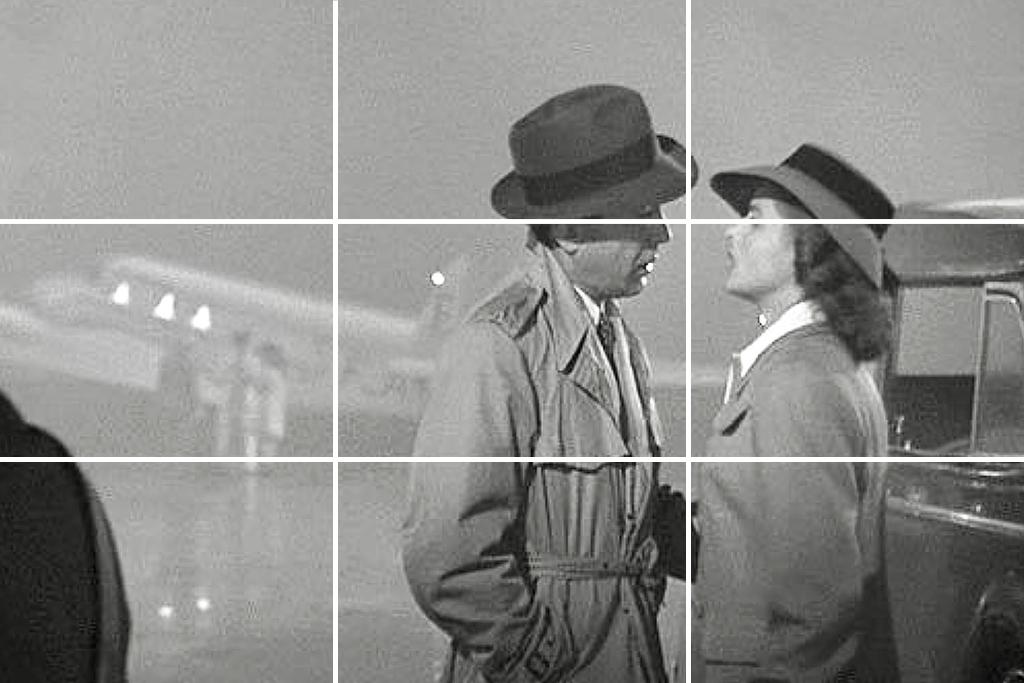
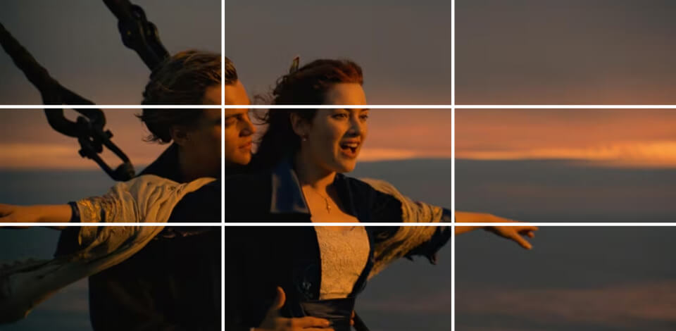
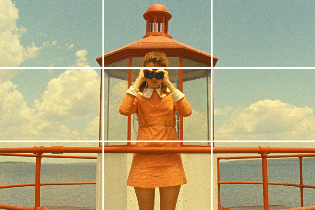
In Casablanca, off-center framing highlights emotional distance. A great example is the famous foggy airport scene. Rick and Ilsa are almost never shown sitting right in the middle of the frame together. By placing them off to the side, the shot makes them feel separate and distant, even though they are sharing the same scene. This is a classic technique used in old Hollywood films.
As a wedding videographer, I use this technique to edit couples’ videos: I move one person to the left side and the other to the right side to show tension or distance between them.
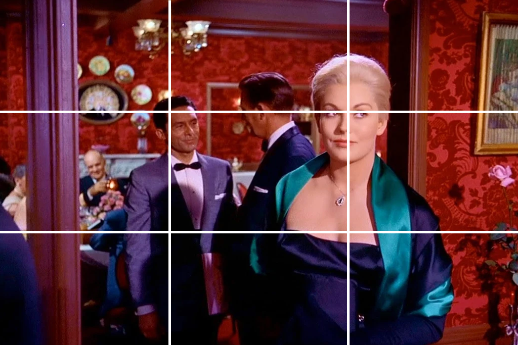
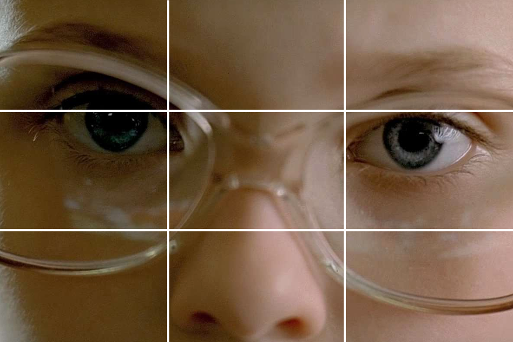
Vertigo (Hitchcock) - eyes, spirals, and uneasy eyelines. Hitchcock often frames a character’s eyes on the top third, leaving the lower two-thirds to show the space they might descend into - physically or mentally.
To create suspense like in the film Vertigo, place the subject’s eyes along the top grid line and leave plenty of empty space below them. This makes the viewer feel tension, as if something is about to happen - even when nothing is moving yet.
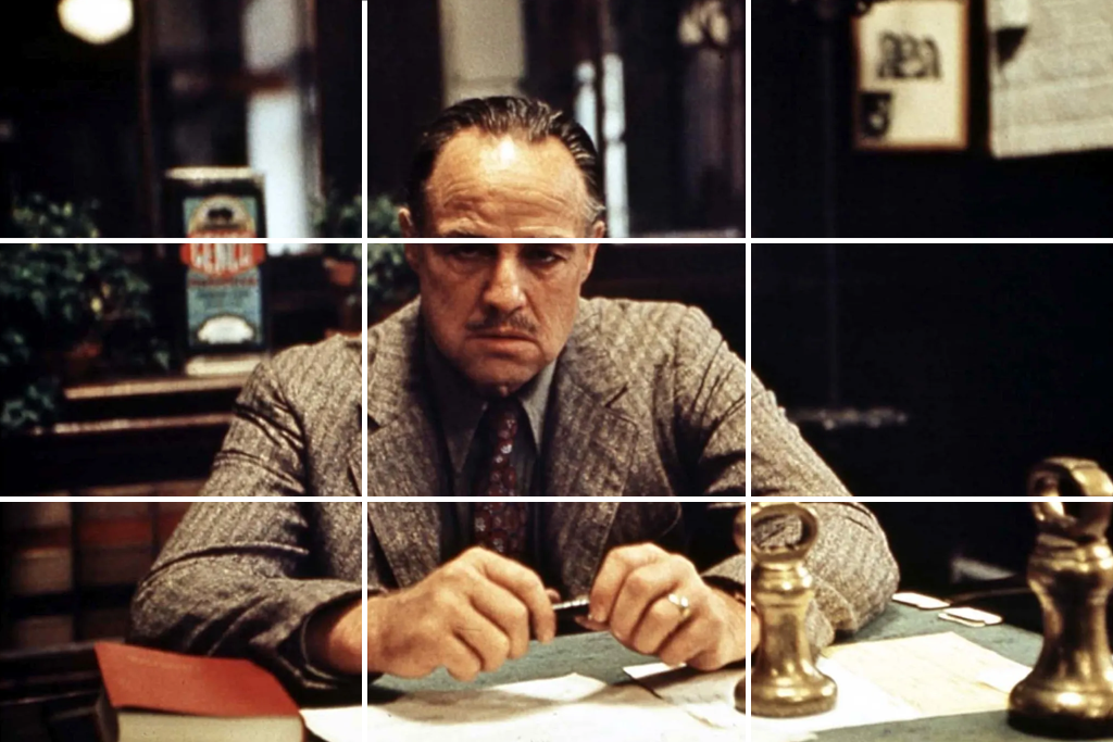
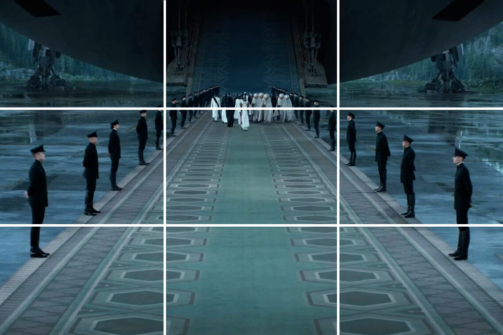
The Godfather - power and presence via offset framing. Coppola places Don Corleone slightly off-center in the frame to show his quiet power. By not centering him and letting the room around him feel spacious, the Don appears calm, controlled, and naturally powerful - without any need for dramatic exaggeration.
On set, I do the same: I place the leader slightly in one third of the frame and the others in the rest. It shows hierarchy without needing words.
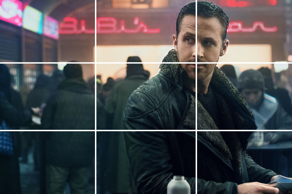
Blade Runner 2049 - isolation in wide, neon-lit frames. To show a character feeling alone, Roger Deakins (and Villeneuve’s choices) often places them on the left or right side of the frame. The rest of the shot is filled with a big, empty, neon-lit space. This isolation trick is very effective and looks especially beautiful in dark scenes after color grading.
When I realize YouTube video ideas, I often use this simple method: I place the main person slightly off to the side. The rest of the frame is filled with city lights or an urban background. Then, when I edit the colors, I increase the contrast to make those background lights really stand out and look vibrant. This makes the empty space around the subject atmospheric.
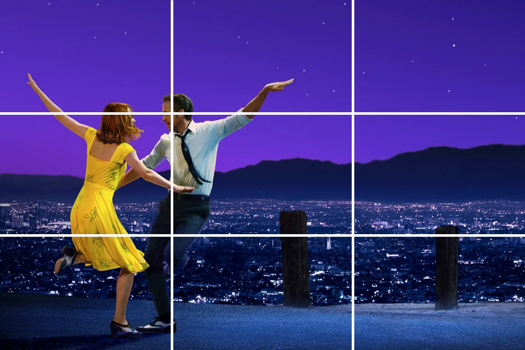
La La Land - romantic balance between foreground and skyline. In Damien Chazelle's musicals, he uses the rule of thirds to create a perfect balance between the people and their setting. For example, he often places dancers on the bottom third of the screen, with a large city skyline filling the top third. This makes the scene feel both huge and romantic at the same time.
For a branded reel, I place the performers across the bottom of the frame and keep the skyline in the top third. I use a shallow depth of field so the subject stands out from the background.
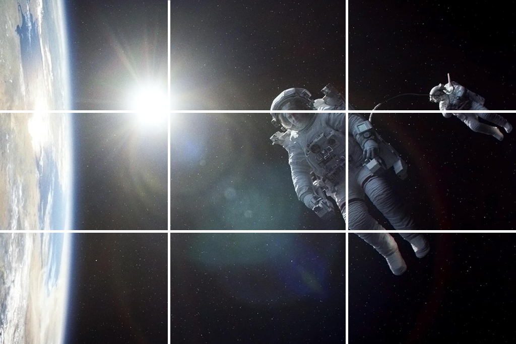
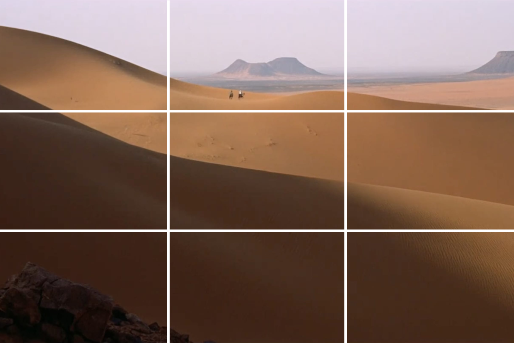
Gravity - tiny subject, huge emptiness. In Alfonso Cuarón’s space movie, the astronauts look tiny against the huge emptiness. Placing them on one-third of the frame and leaving the rest open makes them seem even more vulnerable.
I use this in product or travel videos when I want the subject to feel delicate or alone - make them appear small in the frame and let the shot create the emotion.
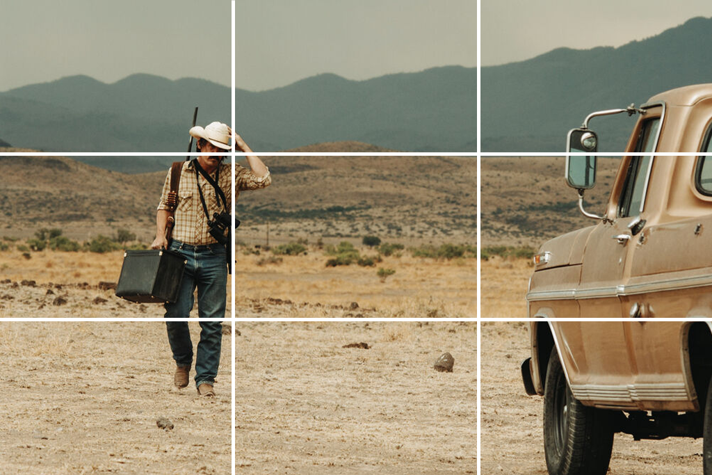
No Country for Old Men - tension via off-balance compositions. The Coen brothers often frame their shots in a way that feels slightly off. They place a character a little too close to the edge of the screen. This makes the viewer feel uneasy because the empty space beside the character makes you expect that someone or something is about to enter the scene.
For suspense, I avoid perfect balance, leaving a doorway, a truck, or even a shadow in the “empty” thirds so the audience feels like something might enter.
Quick takeaways:
Yes, you can definitely use the rule of thirds in videos of vertical format. The rule works the same way for tall videos as it does for wide ones. It helps you avoid just placing your subject in the middle of the screen, which can often look boring when people are watching on their phones.
Not always, and not in a strict way. The rule of thirds is a great guide to start with, but sometimes the story works better if you break it. For example, close-ups, balanced frames, or fast action scenes may need different framing. What matters most is knowing the rule so you can choose when to follow it and when not.
Fast action makes it tricky, but I try to guess where the subject will move and frame a bit wider. This helps keep them in one of the thirds instead of getting stuck in the middle or at the edges. If you’re shooting handheld or on the go, trust your gut, then check your shots afterward - a small crop in editing can often fix the framing.
Most cameras and phones let you turn on a grid on the screen, which is very helpful for composition. Video editing software for Windows and Mac, such as Premiere Pro and DaVinci Resolve, also allows you to add guide lines to check your framing.
Yes. Color and contrast can guide the viewer’s eyes and make your composition stronger or weaker. Sometimes I adjust colors or lighten spots near the key points on the thirds grid to make sure the viewer looks where I want.
The rule works for anything you want to show clearly - people, objects, landscapes, or even text on screen. I’ve used it in product videos, food photos, city shots, and even moving graphics. Anytime you want to guide the viewer’s eyes naturally, the rule of thirds is useful.
When you have several subjects, place them on different grid lines or intersections to create balance or show tension, depending on the story. For example, two people on opposite thirds can highlight distance or conflict. In a group shot, you can put the main people on intersections while others fill the empty space. The goal is to lead the viewer’s eyes through the frame with purpose.
Centering works well when you want to show symmetry, formality, or power - do it on purpose. It’s also a good choice for close-ups where filling the frame makes the emotion stronger. The main point is to center with intention, not by mistake.