As a visual design expert at FixThePhoto, I’ve always been interested in how technical skills and visual balance work together.
My job involves designing visuals, adjusting layouts, and editing photos to look good and match brand styles. I kept seeing the same question from our audience: Why is the golden ratio in graphic design so important? Whether we shared retouching tips or trend updates, people always asked how to make their work look more “balanced” or “pleasing” to the eye.
I and my FixThePhoto colleagues decided to explain the Golden Ratio in simple, practical terms and we're offering you to download Golden Ratio templates for free to try it yourself.
We noticed many designers face the same issues: layouts that look “off”, uneven cropping, or designs that seem unbalanced despite being technically correct. The Golden Ratio solves these problems by providing a classic system for arranging elements in ways that automatically look pleasing.
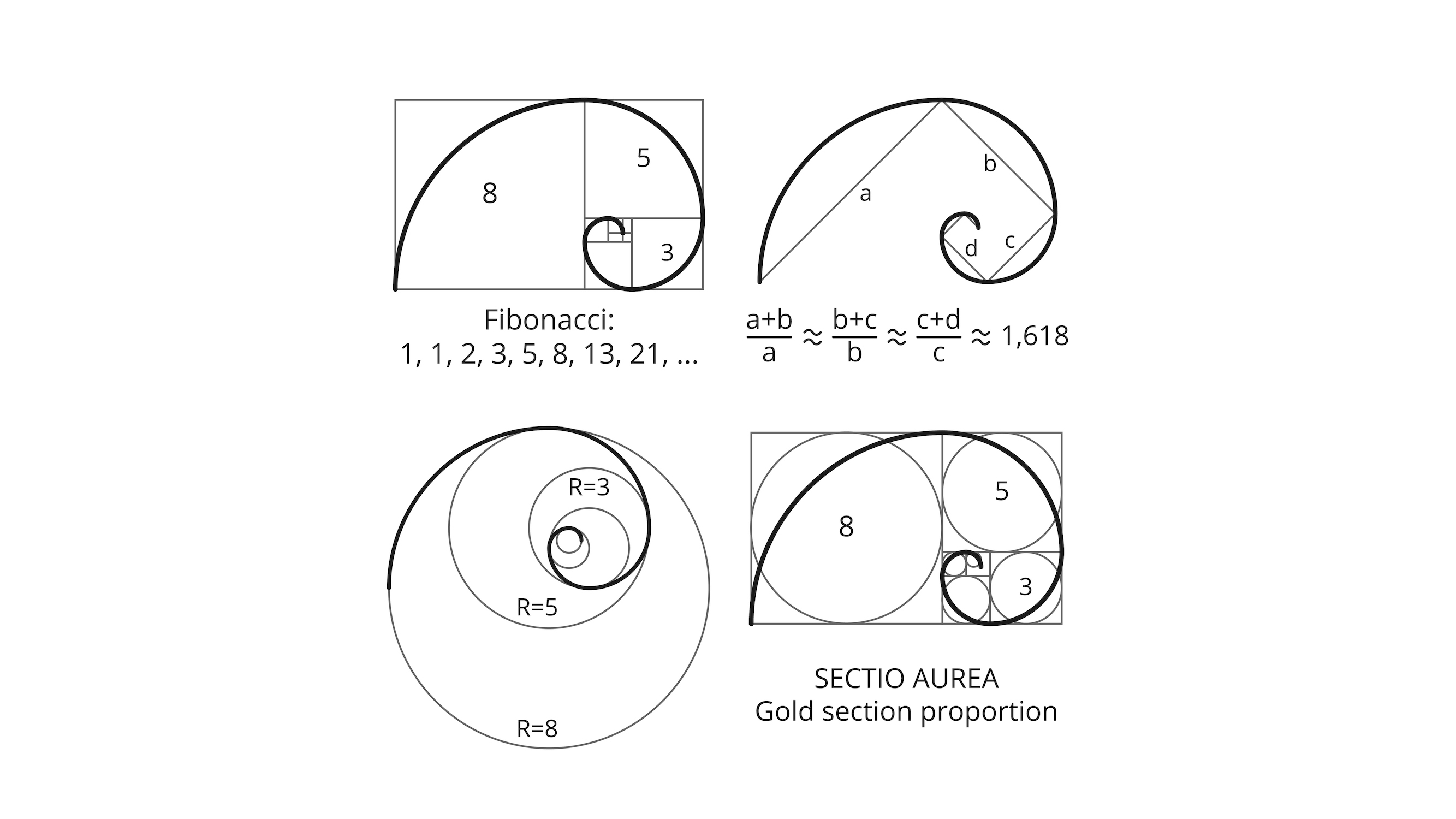
The Golden Ratio (about 1.618) is a special number in math, also called the “divine proportion” or “phi” (φ). It’s closely tied to the Fibonacci sequence – a number pattern where each new number is the sum of the two before it (0, 1, 1, 2, 3, 5, 8, 13...). As these numbers grow, the ratio between them gets closer and closer to 1.618.
The connection between the Golden Ratio and the Fibonacci sequence was discovered in the 1200s by mathematician Leonardo of Pisa (nicknamed Fibonacci). He showed how this number pattern appears naturally in plants, animals, and shapes, explaining why we still use it so frequently today.
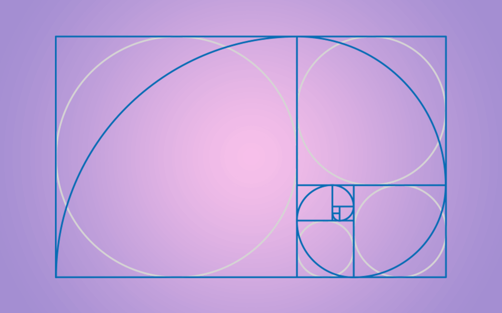
The Golden Ratio is famous for helping create beautiful, balanced designs. Artists, architects, and designers use it to arrange elements in paintings, buildings, graphics, and photos, making compositions that look natural and pleasing to the eye.
I've learned that strong design requires both imagination and organization. The Golden Ratio for appealing graphic design has become my secret weapon for creating naturally balanced, clear compositions especially when starting a new project or refining layouts for FixThePhoto projects.
For example, I often use the Golden Ratio in graphic design of banners for social media networks. Positioning key elements (a face, logo, etc.) where the spiral lines meet creates a more natural visual flow. When I redesigned a client’s website banner using the Golden Ratio, just adjusting the placement made the whole composition more balanced.
I even use the Golden Ratio in photo retouching: when I'm doing creative beauty edits and want to subtly adjust facial features. The goal isn't to make everyone look the same but to use this classic principle to create more balanced, natural-looking results. For me, the Golden Ratio is a helpful guide, not a strict rule - it’s a way to make designs look naturally balanced and pleasing.
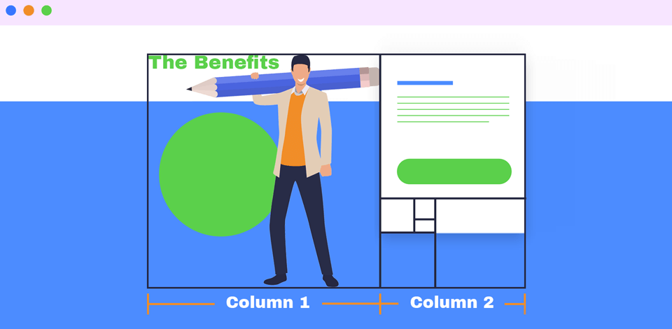
For website layouts or marketing designs, I use the Golden Ratio to organize space cleanly and guide the viewer’s eye. One practical method is splitting the design with golden rectangles: this instantly shows where key elements should be placed for maximum impact.
I use the 1:1.618 ratio to size columns in layouts. This makes pages look balanced and guides viewers' eyes right to the desired area.
FixThePhoto Tip: Use a Golden Spiral overlay (available as downloadable grids in Photoshop/Illustrator) to position key elements such as logos, featured products, or CTAs closest to the spiral’s center point.
I also use the Golden Ratio in typography to pick font sizes that look balanced. First, I choose a body text size (like 12pt), then multiply it by 1.618 to get a good headline size (about 19pt). You can use this approach for online and print designs, as it keeps text organized and comfortable to read.
Logo design is probably the greatest application of the Golden Ratio in graphic design. When clients approach me with preliminary logo concepts, I employ Fibonacci circles and grids to transform their initial sketches into polished, geometrically balanced final designs.
The Twitter logo demonstrates this perfectly: its design uses multiple circles arranged with the Golden Ratio. When I apply this same approach to circular or spiral logos, the finished logos always look refined and distinctive.
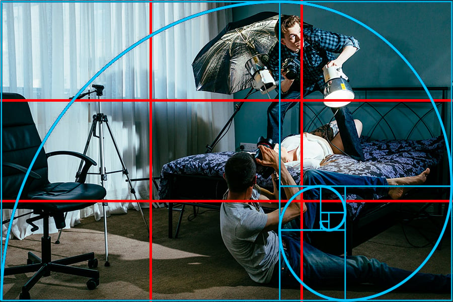
In all my design work, including social media graphics, photo edits, or blog layouts, I regularly use the Golden Ratio grid to enhance the photography composition. For photo shoots, I often frame shots with the phi grid, intentionally positioning subjects off-center using the 1:0.618:1 ratio rather than the standard rule of thirds.
Many current cameras have sensors near this ratio, so little cropping is required. This small tweak makes photos more naturally appealing with less work.
FixThePhoto Tip: Apply the Golden Ratio to balance your image size and placement with text sections. This ensures clear readability while making visuals pop - striking the perfect balance between graphics and message.
I often use the Golden Ratio to make designs look balanced and pleasing. It's not a must-follow rule, but it's a great helper when I work in programs like Photoshop or Illustrator.
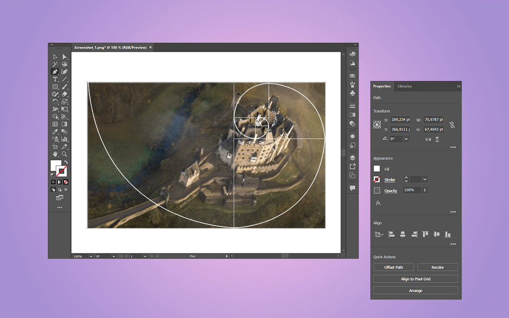
In Adobe Illustrator, I typically begin by crafting a Golden Ratio rectangle: first drawing a square, then expanding one side by 1.618 using the software’s precise measurement tools. Once created, I lock this rectangle as a guide to structure my entire composition, from text spacing to image cropping and layout balance.
When working in Photoshop, I add Golden Ratio guides (spirals or rectangles) as custom shape layers. These help me position important elements like logos, text, or photo focal points in a balanced, eye-pleasing way. This method works particularly well for ad designs and social media images, where smooth visual flow matters most.

The Golden Ratio in design works like the rule of thirds - it's not a strict rule but a helpful guide. I use it to fix spacing, align elements, and make layouts look naturally balanced. Whenever I'm deciding where to put a headline, photo, or logo, the golden rectangle or phi grid usually shows me the perfect spot.
I love that free Adobe’s products let me fully adjust grids, shapes, and sizes. This makes it easy to use the Golden Ratio in flexible ways that fit each project's needs.

You'll see the Golden Ratio in nature and human designs, where it helps create beautiful, balanced proportions. It shows up in nautilus shell spirals, how flower petals grow in Fibonacci patterns, and even in human body measurements like the length of your forearm compared to your hand.
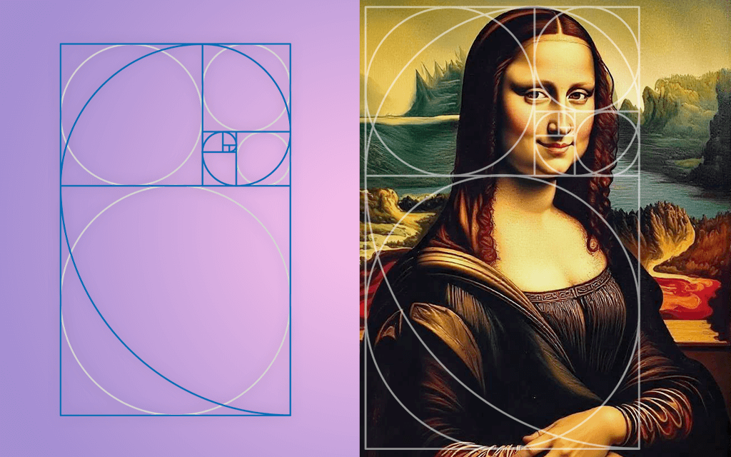
Artists and architects have used the Golden Ratio for hundreds of years to create balanced designs. Many experts think Leonardo da Vinci applied it in the Mona Lisa - the face measurements and feature placement seem to follow phi proportions. Ancient buildings like Greece's Parthenon also appear to use this ratio in their column spacing and front design, which may explain why they look so perfectly proportioned.
“I begin every design by setting up a Golden Ratio grid. This straightforward yet effective method keeps all elements properly spaced and proportional. Whether designing a website or a flyer, it makes the designs feel naturally well-proportioned.”

“I love applying the Golden Ratio to text in my designs. Here's how: if my body text is 14 or 16px, I multiply that by 1.618 to get the perfect heading size. This creates a nice visual difference between text sizes while keeping the layout balanced.”

“For logos or posters, I often use a Golden Ratio spiral overlay. This helps direct the viewer's eye naturally. I start by placing the main focus at the spiral's center, then arrange other elements around it, creating a smooth, balanced flow.”

“Good spacing makes all the difference. I benefit from the Golden Ratio to set margins and gaps in my designs to keep layouts clean but connected. It’s perfect for column spacing or framing important elements with just the right amount of empty space."

“When I need to calculate Golden Ratio proportions, I use online tools. We tested several options and the following worked best: OMNI Calculator, CalculatorSoup, and Atrise Golden Section. They give me exact measurements fast, especially when my free graphic design software can't automatically figure out the 1.618 ratio for me.”

“I use the Golden Ratio as a guide, not a rule. If a design looks wrong, I check the sizes and spaces using phi. Small changes based on the ratio can make a big difference.”


![Best Music for Real Estate Video Background [{{%year}} UPDATE]](/placeholder-450x300.svg)


