When making Instagram Reels, you’ll soon realize how important it is to pick the best color for subtitles possible. I uploaded two clips that shared a similar structure, pacing, and delivery, but their performance ended up drastically different. Once I viewed them on my phone, I understood why.
The Reel that had fewer views had light gray subtitles with no outline. When I was editing the video, they looked clean and trendy, and I could easily read them on my laptop. However, on my phone, particularly in daylight, they blended into skin tones and the background. I had to “search” for the text, which felt noticeably more inconvenient.
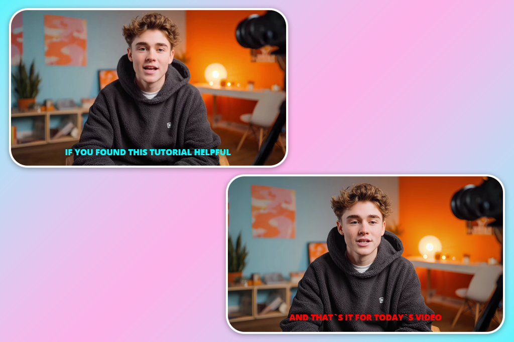
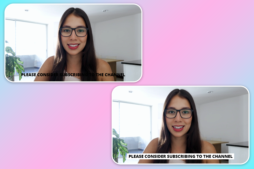
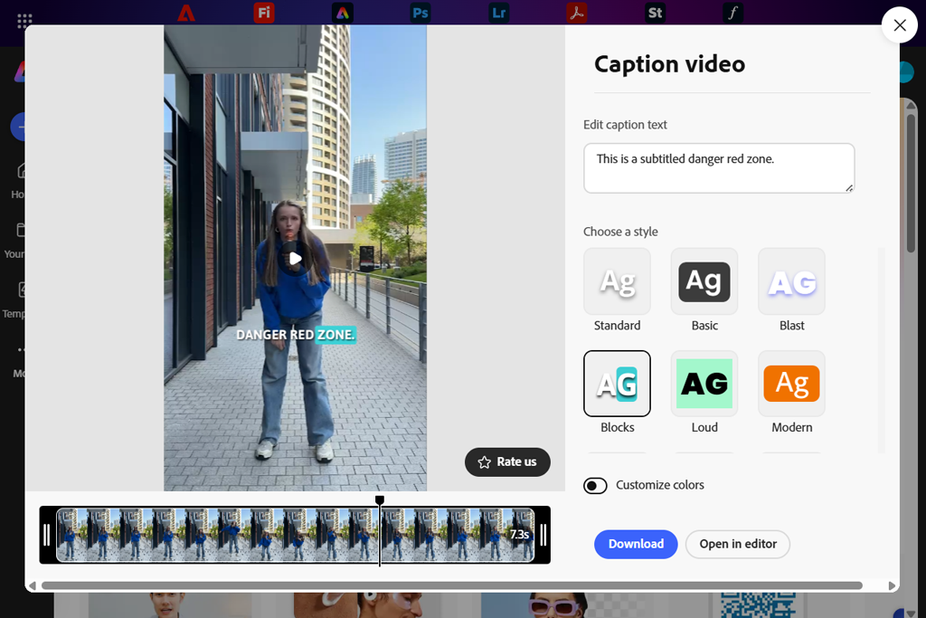
The better-performing video included white subtitles with a thin black outline. The text remained readable regardless of the conditions: facial movement, lighting shifts, or quick cuts. I didn’t have to think about finding the text. I just started reading it.
The most important thing I learned about choosing the best subtitle color for readability is that your video needs to be prepared for all possible scenarios.
Reels and TikTok videos are seldom viewed in optimal conditions. People watch them outdoors, on the go, with screen glare, or when multitasking. If your subtitles look readable only in the perfect environment, it means they’re not suitable for real life, hence why the best subtitle software prioritizes contrast over decorative color options.
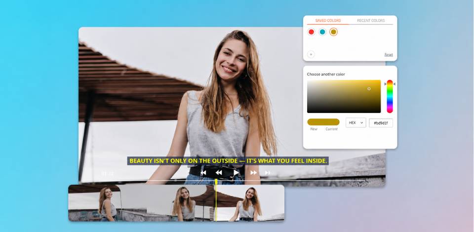
It’s also vital to understand that outlines and shadows play a bigger role than the color itself. Pure white text can easily become unreadable if it doesn’t have enough contrast to stand out against bright footage. By creating even a slim black outline, you can significantly enhance readability without making the text look bulky or distracting.
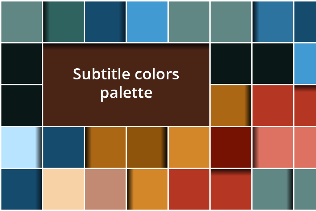
| Subtitle color | Why it works | Best use case |
|---|---|---|

White with black outline |
Maximum contrast, stays readable on any background
|
Reels, TikTok, mixed lighting
|

Yellow with black outline |
Great visibility on busy or bright scenes
|
Fast-cut videos, dynamic visuals
|

White with soft drop shadow |
Clean look with dependable readability
|
Talking-head videos
|

Light gray with dark outline |
Easier on the eyes, great for HDR footage
|
Cinematic and longer edits
|

White on a semi-transparent |
Separates text from complex visuals
|
Vlogs, documentaries
|

Black text on a light background box |
Clear and stable on bright scenes
|
Tutorials, screen recordings
|

Warm off-white with shadow |
Less rough than pure white, still legible
|
Lifestyle and aesthetic content
|
For Instagram and TikTok, consistency is essential. Unless you have a clear purpose in mind, changing the subtitle colors mid-video will disrupt the visual flow. Viewers subconsciously accept a single style. If that flow is broken, attention drops.
Lastly, platform behavior is important. When it comes to TikTok and Instagram Reels, subtitles tend to be the first thing viewers pay attention to before they even start paying attention to the visuals. That’s why the best subtitle color for short videos is one that feels unobtrusive, not because it’s unreadable, but because it doesn’t create any friction.
Certain colors only work within the context of your video editor. Once you export the clip and watch it on an iPhone, the subtitle color flaws become instantly apparent.
Light grey letters without an outline are a very commonly chosen yet poor subtitle style. It’s supposed to be minimalistic and trendy, but it tends to blend into skin tones and soft backdrops, which makes the viewer avoid reading the text altogether.
Neon colors are also a mistake. Bright green, pink, or blue succeed at attracting attention, but they make the viewer completely neglect the visuals. Additionally, they lead to eye fatigue and feel distracting.
Avoid these subtitle colors for mobile screens:
It’s impossible to pick the single best font color for subtitles that is going to fit every video ever created.
However, you can still get consistent results by choosing a small, intentional palette, which includes tone that match your visuals and the way your videos are typically viewed, regardless of whether you’re working on them on your PC or relying on the video editing app for iPad to produce content on the go.
You first need to think about your content as a whole. If most of your footage is bright and recorded in daylight, then softer whites or light grey subtitles with subtle outlines are usually the optimal choice. For darker, more dramatic videos, I recommend going with pure white with a thin black outline.
A well-chosen palette is simple. A single primary subtitle color, one outline or shadow tone, and sometimes one accent hue for emphasis. Using more colors tends to negatively affect readability.
As mentioned before, another important aspect is consistency. Your followers need to recognize your subtitle style instantly without having to adjust to it every time. Such familiarity subconsciously enhances comfort, retention, and the overall viewing experience.
Short clips tend to have extremely dynamic visuals. A Reel can transition from shadow to direct sunlight within a single cut, which makes it very hard to pick a subtitle color for short videos that would fit both environments. The text might be readable one moment and feel invisible the next.
Following the basic “dark background” or “light background” rule isn’t as simple when it comes to short-form content. Even if the majority of the footage is dim, a single bright frame can already break readability. That’s why the color you choose has to be flexible and protected from abrupt lighting shifts.
After doing a lot of experimentation, I concluded that outlines and shadows matter more than the base color. A slim black outline stabilizes subtitles for scenes that are dominated by either highlights or shadows, while a subtle drop shadow helps separate the text without making it look distracting.
Semi-transparent background boxes come into play if the video is visually complex, featuring a lot of people, textures, and high-contrast environments. They allow you to establish a dependable contrast without obstructing the video as long as you set the correct opacity.
The chosen subtitle color can feel drastically different in motion compared to how it looked against a still image. It might be easily readable when the footage is paused, but it does not have enough contrast to maintain legibility once the scene begins moving. Quick cuts, camera shake, zooms, and lighting shifts all reduce readability.
This was particularly evident to me when I was working on a Reel recorded outdoors. When paused, light grey subtitles felt clean and balanced. However, the moment I played the video, the backdrop kept changing from sky to skin tones and bright pavement. For a brief moment in every cut, the subtitles blended into the background and were harder to read, even if the color was technically chosen properly.
The moment I chose a white color and added a slim black outline, the subtitles instantly became more readable. I could easily see the text even during movement, camera transitions, and lighting shifts. All I had to change was contrast, not the font, size, or timing.
This type of problem isn’t something you’ll notice in editor previews. Static frames don’t let you see motion-related contrast loss clearly. Only by playing the video on your phone can you ensure the subtitle color can endure fast pacing and visual noise.
As such, testing subtitles in motion is more important than static editing. If you can still read them when the backdrop is shifting, the lighting is changing, and people are moving around, then they’ll look great in real viewing conditions as well. However, if the text only looks good when paused, there’s no guarantee that will be the case when the viewer actually watches your Reel.
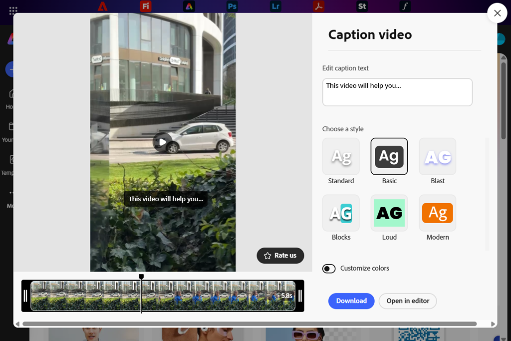
After a while, I decided to stop making random guesses and use Adobe Express to pick a subtitle color for Instagram Reels instead.
I imported a talking-head clip that had shifting lighting and quick cuts. I started by choosing light grey subtitles without an outline. In Adobe Express, they looked easily readable and professional. However, once I viewed the video on my phone, the text blended into the skin tones and brighter parts of the background, drastically decreasing legibility. After that, I started tweaking the subtitle styling:
I didn’t touch anything in the video itself. The video got 180K+ views, which is significantly better compared to similar content I uploaded to Instagram in the past. The subtitles remained readable in both dark and bright environments without drawing too much attention.
What makes Adobe Express the best app for video captions is speed. I could conveniently try out various subtitle colors and contrast settings, preview the result on my phone, and save the result without rebuilding the edit.
Even though Adobe Express wasn’t developed for in-depth subtitle customization, it offers dependable performance and is a great solution if you value readability more than decorative elements.

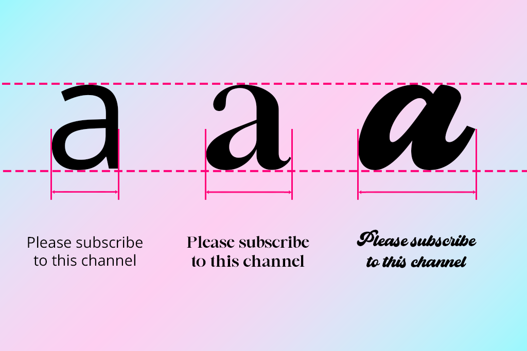
Regardless of which subtitle color for video editing you pick, the text can still look terrible if the font isn’t suitable for a phone screen. On a smaller screen, subtitles are read quickly and without a conscious effort, meaning the text needs to be immediately recognizable and easy to scan.
For our daily tasks, the FixThePhoto team adheres to a simple principle. When making images or video content, we stick to clean sans-serif fonts that are readable after being compressed. Fonts like Inter, Helvetica, Arial, Roboto, or Montserrat preserve their shape and spacing, even on smaller smartphone screens.
Serif fonts and decorative styles are typically a poor choice for subtitles. Thin strokes, elaborate curves, or sharp details become visual noise after the footage is compressed by social media platforms. What looks impressive in the editor tends to become blurry or chaotic on a small screen.
Font size is also very important. For Reels, subtitles need to be big enough to read without focusing, but not so big that they dominate the scene. Usually, I recommend:
Spacing is also very important. Subtly bigger spacing tends to enhance readability for fast-talking segments, while tighter spacing makes it harder to read words.
The optimal approach is to use a clean sans-serif font, medium weight, comfortable size, and test the subtitles on your phone. If you can read the text instantly without focusing solely on it, then you made all the right choices.
Subtitle color and placement are both tightly connected. Even a well-chosen subtitle style can be distracting if you don’t place the text in the right position.
When it comes to Reels and TikTok, the lower-third arrangement works best in most situations, but you have to make sure it doesn’t obscure UI elements, captions, or buttons. If subtitles cover faces or important visuals, viewers can experience visual overload, even as they try to read the subtitles.
A small upward shift or shifting positioning can ensure the subtitles are better integrated and less invasive, particularly when added to talking-head clips or interviews.
The subtitle color and contrast can’t guarantee success if the text is too long. When viewing videos on short-form platforms, people don’t read – they scan. If the line takes more than a millisecond to process, it competes against the footage rather than supplementing it, which is a factor that experienced subtitle translators account for when adding dialogue to fast-paced shorts.
Personally, I think that breaking speech into shorter lines enhances readability a lot more significantly than reducing font size or picking a different color. Two short lines are usually easier to read than a single long one. This ensures the subtitles don’t take up too much space on the screen and are simpler to scan at a glance.
Line length also influences how stable subtitles look. Lengthy lines stretch across the screen and draw attention to themselves, while shorter lines are placed tidily in the shot and feel less distracting.
People tend to worry about subtitle color accessibility so much that they completely ignore timing, even though it has a huge effect on readability. Scanning text can feel exhausting if it pops up too late or disappears too soon.
When it comes to Reels and TikToks, viewers don’t read the subtitles properly – they glance at them in motion while browsing. As such, timing has to feel natural and consistent. My tests suggest that these are the optimal timing ranges for different scenarios.
| Scenario | Subtitle on screen |
|---|---|
|
Short phrase (1–3 words)
|
1.0–1.5 seconds
|
|
Medium sentence (4–7 words)
|
2.0–2.5 seconds
|
|
Long sentence (8–12 words)
|
3.0–4.0 seconds
|
|
Fast speech
|
Appear 0.2–0.3s before speech
|
|
Dialogue across cuts
|
Stay visible through the cut
|
|
Talking-head videos
|
Stable, no flicker
|
|
Key message or hook
|
Slightly longer display
|
These recommendations aren’t universal, but they can give you a good idea of what feels convenient to read on a phone. Short clips are very fast-paced, and subtitles need to be displayed long enough to be scanned without making the viewer pause.
Making the subtitles show up slightly before speech is particularly relevant for Reels and TikTok, which many users browse with the sound off. A subtle timing adjustment ensures the subtitles are easier to follow.
It’s also important to facilitate consistency. Flickering subtitles or uneven timing can disrupt the reading flow and cause unwanted strain. Ensuring the timing is predictable allows you to make the subtitles feel immersive.
If the subtitles come across as rushed, increasing the display time is generally the better approach compared to decreasing the font size or changing color.
Even a well-chosen subtitle color for TikTok videos won’t save you if you get the placement wrong. Platforms like Instagram and TikTok have very limited space to fit all the UI elements, buttons, captions, usernames, progress bars, etc.
Forgetting about all these elements can lead to your subtitles looking cramped or obscured, which you will only notice when previewing the video during testing when subtitles are viewed on your actual device rather than the editor.
For Reels and TikTok, subtitles located too low tend to fight with the interface. Even if you can still technically read them, the experience feels uncomfortable. By raising the height of the text just a bit, you can enhance clarity and minimize visual clutter.
It’s also important to create a horizontal safe zone. If the subtitles are located too close to the edges, they can be harder to read on smaller screens. By adding a small margin on both sides, the text will look more balanced and intentional.
Whether you’re choosing a subtitle color for YouTube videos or TikTok, you need to set up a proper testing environment. Editors are a safe, tidy space, while real-world viewing conditions are anything but.
When you read the subtitles in the editor, you already know the content of the video, and your brain is trained to find the text since you’re the one who added it. Viewers are in a different situation. They will only watch your clip once and decide if it’s worth viewing till the end within a second or two.
This is why previewing the subtitles as a regular person is so important. Before posting, I always view the video on a phone, boost the screen brightness, mute the audio, and scroll past the video naturally, imitating the behavior of an actual user.
In many scenarios, the text that looked good in the editor appeared “slow” or unclear on my phone. It might blend into a bright area, or the font can be too slim. Such drawbacks create unnecessary friction.
This approach to testing also helps you find issues created by compression and the platform’s interface. Once you start watching your content as a part of your audience, you’ll have a much easier time solving the problems that matter the most.
Animations, color transitions, and VFX might sound tempting when you’re editing, but subtitles aren’t about visual flair. They are supposed to serve as a reading tool.
If you go overboard with styling, it can get in the way of the reading experience, hence why it’s important to look past eye-catching presents and try to find CapCut alternatives that provide more granular control over readability.
Delayed readability. Animated subtitles that pop up word-by-word, slide in, or bounce can look engaging, but they delay the time when the user can see the entire sentence. For short-form content, missing the first word can already be enough to miss context.
Increased cognitive load. Motion, color transitions, and VFX make the viewer process several signals simultaneously. Rather than focusing on the text, the brain wastes power tracking animation and visual shifts. Even if you pick the best color for subtitles for a dark background, the visual overload will still feel distracting.
Unstable reading rhythm. When the subtitles change color, size, or animation style mid-footage, your content won’t feel consistent anymore. Reading becomes more difficult and can even cause a bit of fatigue.
What works better. By making the entire line appear instantly or adding a very subtle fade, you can ensure the subtitles are easy to scan from the first frame. A consistent color scheme, predictable placement, and minimal movement let the viewers pay attention to the content instead of the formatting.
Good subtitles remain visually unobtrusive. They don’t try to take away attention from the footage, but rather help understand the context for it in a clear, predictable manner.
Text-only videos aren’t a rarity anymore, but rather a separate genre. Thousands of TikTok videos and Reels go viral even if they don’t have any audio at all, depending solely on subtitles to convey a message, catch the viewer’s attention, and provide the necessary context.
If the subtitles in your video replace speech, they aren’t a supportive tool anymore, as they become a part of the main content. This transforms how they need to be treated and synced on screen, which is why subtitles synchronizers are important when dealing with footage that doesn’t have any voiced dialogue.
What sets text-only subtitles apart
As such, over-the-top styling can be an even bigger issue here. Vibrant colors, bulky fonts, or animated effects can still work for videos with audio, but here they easily become overwhelming and make the viewing experience a lot more uncomfortable.
Subtle, stable subtitle styling is highly recommended for text-only videos. The best subtitle colors for light backgrounds are neutral, high-contrast tones applied to clean sans-serif fonts, which are backed by predictable placement that lets the viewers read the text at their own pace. Rather than trying to keep up with disappearing captions, they can focus on understanding the context.
Hierarchy is important here. A short hook at the start can be a bit bigger or bolder, while follow-up lines should look lighter and more neutral. This sets a visual rhythm without involving distracting motion or color shifts.
White text with a slim black outline or soft shadow usually works best. It remains readable across both dark and bright backdrops and looks great on phone screens, regardless of which video editing software for Windows you’re relying on.
Yellow subtitles with a black outline can enhance visibility when you’re dealing with busy or bright videos, but they tend to look too aggressive. White is typically a safer bet for the majority of videos out there.
In the majority of situations, no. Changing colors disrupts visual consistency and distracts viewers unless it’s employed with the intention of highlighting multiple speakers.
Tidy sans-serif fonts like Inter, Roboto, Helvetica, or Arial with medium weight offer superior performance. Decorative or thin fonts aren’t as readable on small screens.
For vertical footage, subtitles need to take up about 5-7% of the video height. If subtitles look small, split lines instead of reducing font size.
Not really. Animations tend to delay readability and raise cognitive load. Meanwhile, subtitles that appear instantly or have a subtle fade are a lot more natural fit for fast-paced short-form clips.
After you pick a subtitle color for your video, watch it on your smartphone with the audio off and brightness up. If you can scan the subtitles instantly while scrolling, they’re well-made.