
I’ve created a real estate banner below to show you a clear example of how to add it in Photoshop quickly and efficiently.
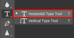
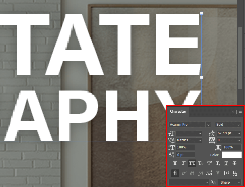
You’ll have to add a Text Layer, and then pick it to apply a Drop Shadow. Go to the toolbar on the left and select the Horizontal Type Tool to add a text box.
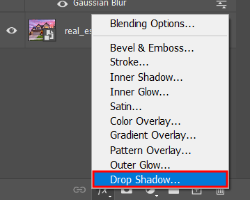
Go to the Layers panel, select the FX icon at the bottom of the menu and you’ll be greeted by the Blending Options screen that has a Drop Shadow option.
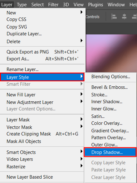
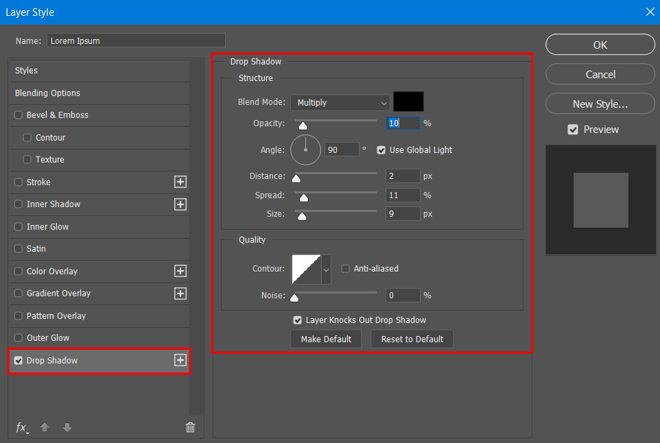
After picking “Drop Shadow”, you’ll be presented with a menu that allows you to tweak the effect’s parameters as well as to choose any other Photoshop text effects you might want to add.
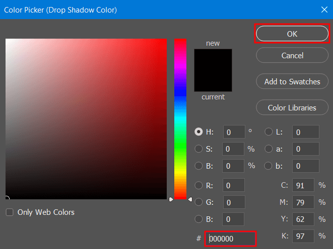
You can set any color you want for your drop shadow before clicking OK. For my image, I went with pure Black.
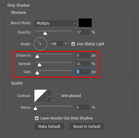
After you learn the basics or the main version of the software, you can move on to tweaking other parameters like Distance, Spread, Size, and Opacity. Keep in mind that rough, overly black shadows can often look artificial.
Experiment with different settings but keep in mind that realistic shadows are usually soft and don’t draw too much attention to themselves.

Once you’re satisfied with the look of your creation, press OK to close the Drop Shadow menu, and you’re done. If you’d like to apply an identical effect to other projects, you can save it as a preset, which is great for ensuring you can be more time-efficient in the future.

Of course, Photoshop lets you layer shadows by duplicating the text layer and trying out different shadow parameters for every iteration. Tweak their distance, angle, and color until you’re satisfied with the final look.
If you want to make the drop shadow more pronounced, you can edit its Spread and Distance. By raising the spread, the shadow will appear denser while the distance helps separate it from the text a bit. You can also slightly tweak the color to make it stand out from the background more.
Even though Photoshop doesn’t allow you to add textures to shadows in an easy way, you can transform the shadow into a layer (right-click the effect and pick "Create layer" or employ the Ctrl+Shift+N Photoshop keyboard shortcut), then add any texture or gradient overlay you’d like.
Determine the location of the light source in the photo and adjust the shadow angle to match it. Consider employing a low-opacity color to imitate natural light even better. If the light is warm, the shadow should have a subtle warm tone to it to look more realistic.
Muted, monochrome tones usually provide the most professional look, like a shade of grey behind black text. If you want to get more creative, try making a drop shadow in a complementary color. For instance, a dark blue shadow behind a white caption makes it look more elegant without being as jarring as pure black is. Try to balance out the text and shadow tones until the result satisfies your eye.