If you're running a WooCommerce store, then you know how important it is to have high-converting email templates. After all, your email list is one of your most valuable assets. But what if you could take your WooCommerce email templates to the next level?
With YayMail - WooCommerce Email Customizer, you can easily edit your WooCommerce email templates by using various visual elements such as icons, banners, videos, etc. This can help you increase your click-through rates and conversions.
In this blog post, I'll show you how to customize WooCommerce email templates using YayMail and share some tips on how to get the most out of this plugin.
YayMail email designer interface works in a drag-and-drop fashion. You can add different design elements using the drag-and-drop features, and then customize their colors, add columns, dividers, images, videos, texts, headings, logos, social share buttons, etc.
To get started, jump right into WooCommerce » Email Customizer » Elements. Clicking on the tab Element will display all the basic elements of designs which includes image and video options, buttons, texts, social icons, image lists, dividers, columns, tables, and so on.
The purpose of a marketing email is two-fold: to increase sales and to boost customer engagement. If you only include a link to your website in the body of your email, you might miss out on the opportunity for your customers to follow you on social media.
That’s how the Social Icon element can help. This allows you to add social media icons for email, set their links, and visualize them in the way you want. Here's how to use it
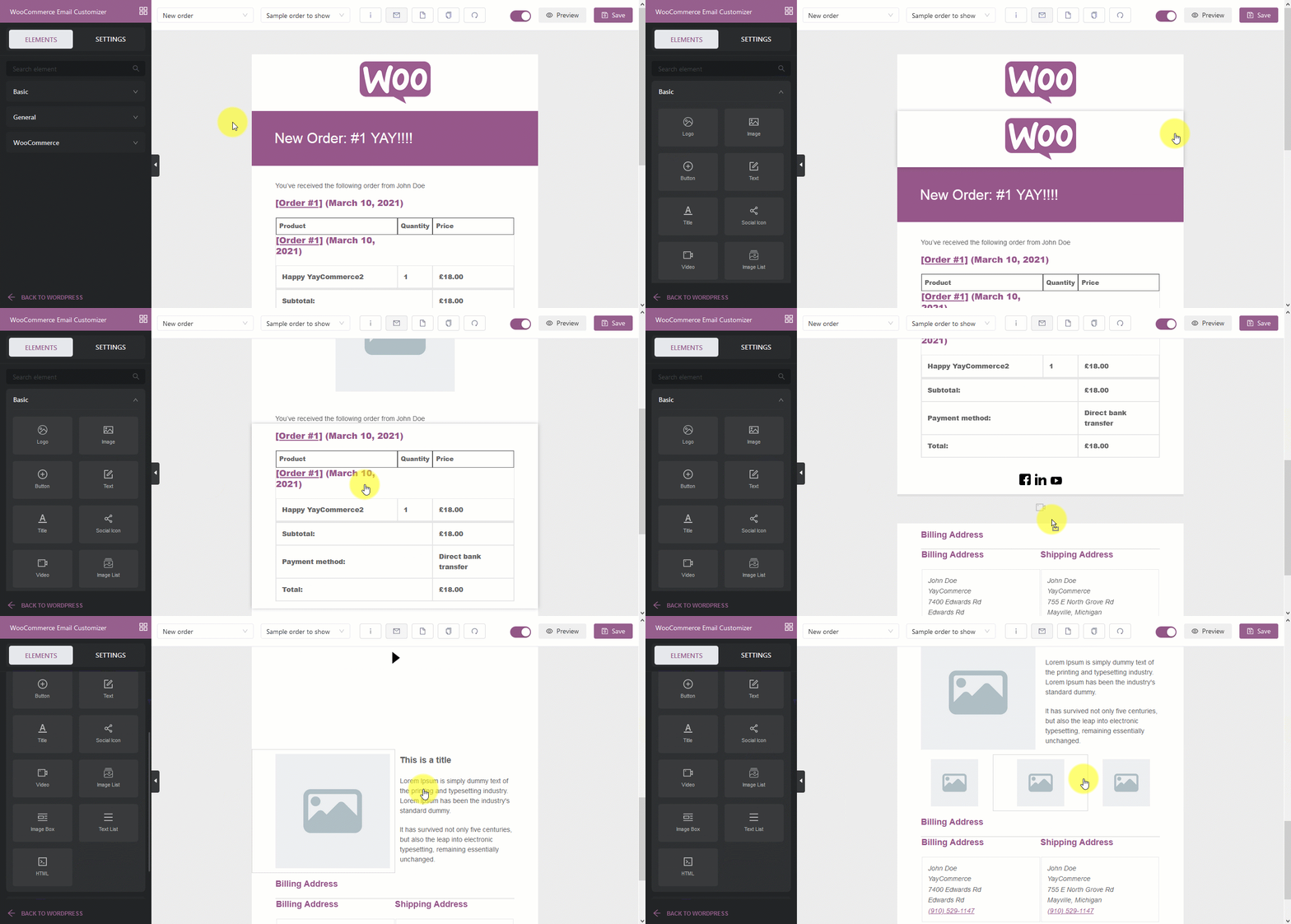
STEP 1. Add a social icon to your email. Drag the social media element from the Element Section into the row you have defined. The sample icons will then be displayed in your email.
STEP 2. Arrange and format the row.
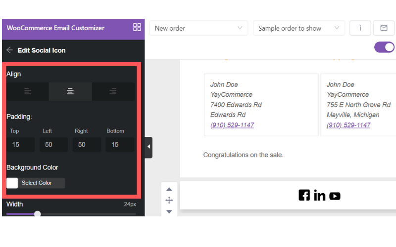
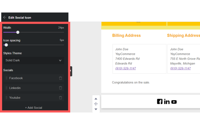
STEP 3. Customize the icon. Modify the width and icon spacing with a slider.
Below are some tips that you should bear in mind when customizing the social icon in the email templates if you want to start photography business with WooCommerce, or any other kind of business.
Since getting a new like or Twitter follower isn’t typically the focus of your email, it’s better to put these icons in the email footer, so readers aren’t distracted from the goal of your email. In other words, make your social media available to your subscribers, but don’t throw it in their faces.
Incorporate a call-to-action (CTA) with your social icons. You can create such elements earlier in popular icon makers. Instead of just slapping them in your footer, give your readers an incentive to follow you on these other channels. Below are some examples:

Below you can see the approach Fusion uses for a daily newsletter:

All options listed above should suit your brand and fit with the look of your email.
Shape. If your visual brand incorporates angles, edges, and corners (e.g., in your lettering or in the cropping of images, etc.), then you will probably follow suit with your social media buttons.
It’s easy to see how the boxy, angular social icons fit perfectly with WIRED’s visual brand.
Color. The color of social media buttons typically falls into one of three categories: traditional colors (like blue for Facebook, red for Pinterest, etc.); neutral monochromatic colors (all black, white, or grey); or brand colors (customized to suit your particular brand color palette). In an email, your social media button color choice will depend heavily on the colors used in the email itself, and to what degree you’d like the buttons to stand out. Pay special attention to how well colors match up when you customize WooCommerce email templates.
Type of social media. The most popular social media buttons are Facebook and Twitter. After that, it depends on your brand content and your audience. If your content is super visual, and you release weekly videos or daily Instagrams, then YouTube and Instagram should be a priority on your list.
If you’re trying to grow your audience on a particular platform or have recently invested resources in building up, say, your Pinterest content, then try increasing that particular button’s prominence in your emails and measure what happens. It will be different for everyone. With social sharing buttons that are included throughout an email, brands tend to be more minimalistic, which is smart.
With the YayMail framework, it’s also super easy to add multiple custom columns to any email template.
So right from the start, when sending the New Account emails, you can use the chance of leaving some additional messages to your audience.
STEP 1. Go to Email Customizer » Elements » General. There you can see all the possible column layouts for your emails. Simply add one of them, for instance, here I choose the option of two columns in one row.

STEP 2. Then go ahead and adjust the column width and put in the suitable content. In this case, I visualize the first box with the Image Box element. This element allows me to insert an image and some custom text.
STEP 3. Next, I duplicate the format to another box to complete the 4-box “Why choose” section.
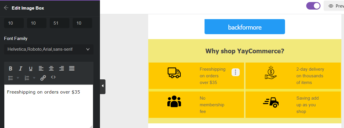
And Ta-da! My email template now looks more informative and intriguing than it used to be, right?
I have described several simple yet efficient tips to follow if you want to customize a banner in the email templates for your WooCommerce site.
Just make sure that you use all elements, including visual and textual content, background colors, images, call-to-action buttons, etc., to the best of your ability to create an on-brand, attractive banner.
We always recommend testing your emails before sending them, especially when you use full-width banners or when they exceed 700 pixels. Figure out the email service providers mainly used by the audience and test the email so that you are sure it will look great to the reader.
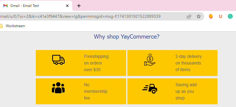
Fonts are a great way to be creative, but email clients do not support a wide variety of them. Try to stick to the safe options so that the readers can view them as intended.
Crack the length of the text so that the banners do not look too wordy. The recommended characters per line are between 45 to 75, and it works for both desktop and mobile screens.
According to the stats, including videos in your marketing emails can increase open rates by 19% and click rates by 65% while reducing unsubscribe rates by 26%. So, it should come as no surprise that at least 77% of marketers reported an increase in email engagement when using video.
Video in email isn't something entirely new. However, the staggering numbers on video marketing statistics in the past few years have fueled the implementation of videos in email. Today, video content has become a critical factor in running winning email marketing campaigns. It will not only help you boost the open rates but also make it easier for you to engage subscribers, making them stick around for quite a long time.
Element Video in YayMail has powerful customizable features to help you take full advantage of videos in your email template. Take these steps to edit WooCommerce email template and complement it with a video.
STEP 1. Drag the Element video into a certain row. (Tip: you can also use Image Element to upload a visualized animated gif)
STEP 2. Modify Padding and Background color
STEP 3. Choose an image overlay as a thumbnail for the video and adjust the width and height
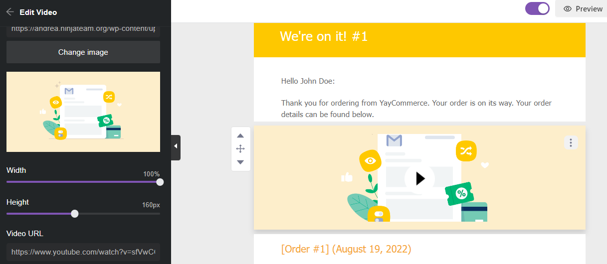
STEP 4. Input the video URL Link for the Pop-up Video
Just like other marketing strategies, there are some pretty definitive 'rules' you should stick to in order to make the video in the email template effective. Get them wrong, and video email marketing can only be more hindering to you than profiting.
Therefore, we've listed some of the best quick tips for optimizing the video that you will include in your WooCommerce email template. There you go:
Including the word "video" in an email subject line can increase open rates by 6%. So, it's always better to make your subscribers understand that you've sent them a video right after you click the send button.
Don't ever forget to place a clear call-to-action element to guide subscribers on what they should do next. You can say it on the video or write it in text form.
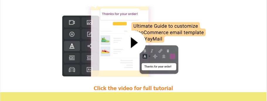
Utilize strong messaging first, and then you can embed your video to increase overall email performance. Remember, your video is supposed to make your email clearer and more well-put, not to distract from your main message.
A stunning video thumbnail created in feature-rich thumbnail makers can ramp up subscriber engagement by almost 41% when it's included in an email. Showing a catchy thumbnail can spark subscribers' curiosity and convince them to click on the video.
However, even though videos are compelling and powerful, that doesn't mean every email should contain a video. For instance, you can show how to use shipping plugins from PluginHive embedded on your site or demonstrate the ordering process step by step by creating a how-to video instead of describing these activities, using solid text. If you overdo it, the novelty wears off, and your subscribers get bored and uninterested.
YayMail is a full-fledged WooCommerce email customizer and email builder framework, just like Elementor is a versatile website page builder. In the above tips and tricks, I’m using the free version which already fills my needs. YayMail is totally free for anyone to use. I discovered how great it is, and now you can too!
Moreover, if you desire to apply these advanced email customizations to other WooCommerce email templates, please note that YayMail has plenty of add-ons. Depending on which WooCommerce extensions you're using in your online store, you can find all the available dedicated email customizer add-ons here.
What would you like to know about email templates and crafting successful email messages? Let me know! I’d love to hear your point of view and the sorts of questions you run into.