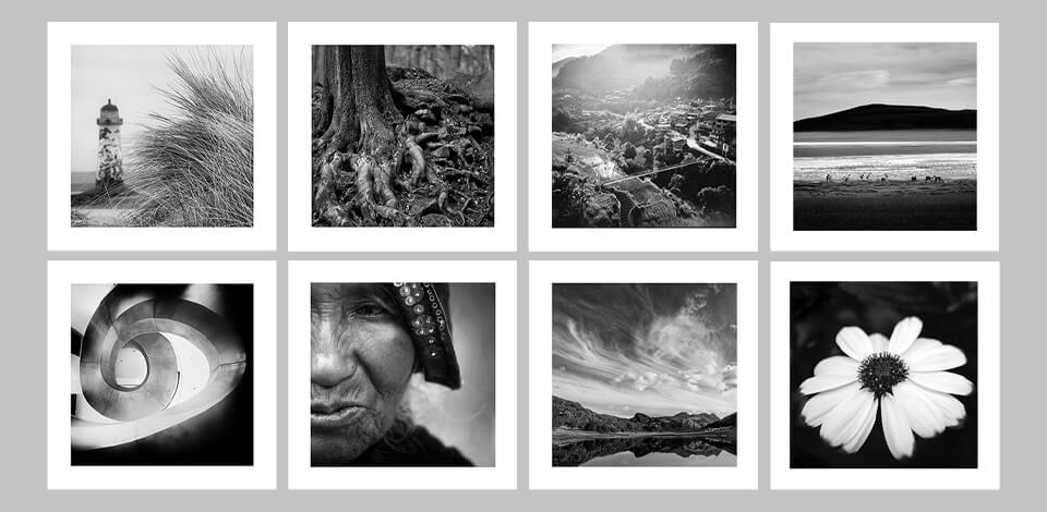
Square format photography is attracting more and more people mainly due to its popularity on Instagram and other social networks. Camera manufacturers do their best to satisfy the growing demand for cameras capable of shooting in medium format, so you can find feature-rich devices by Fujifilm and Mamiya.
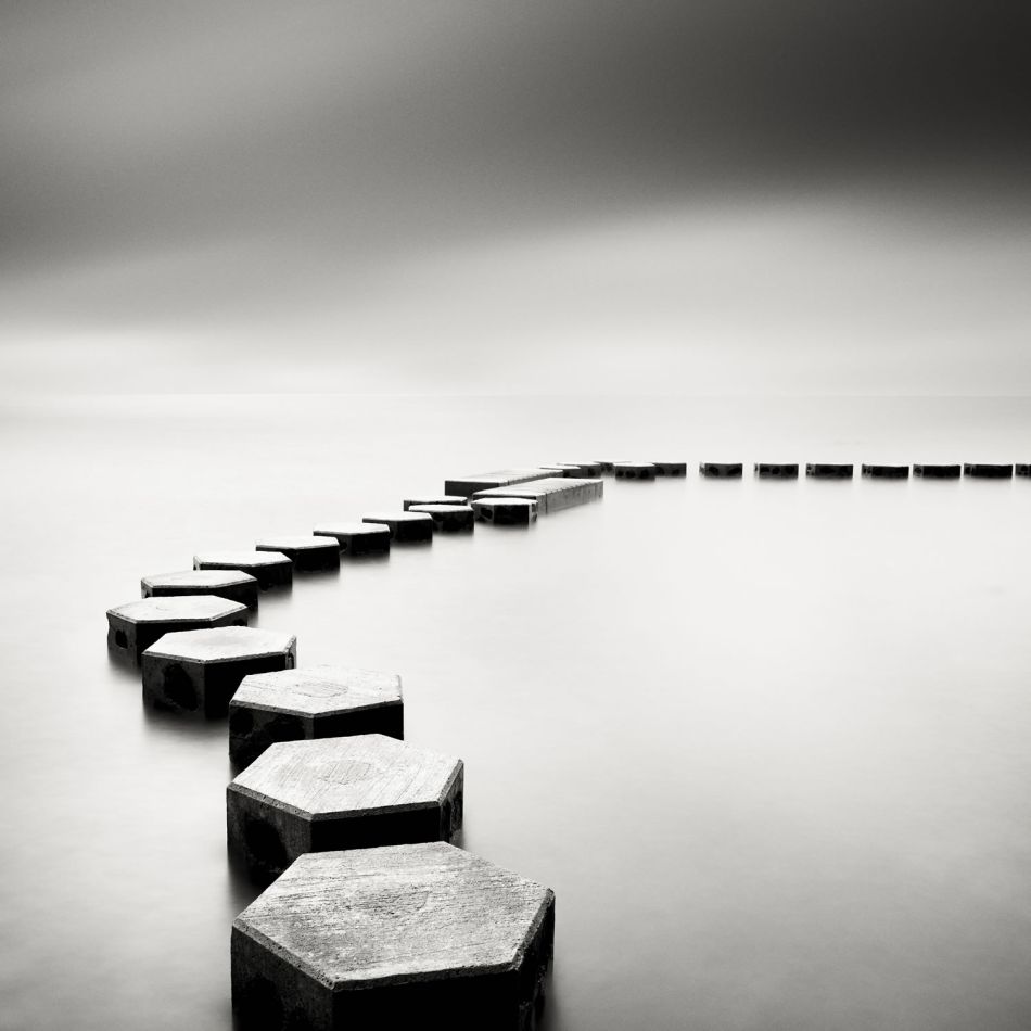
The square format works wonders when it comes to demonstrating all types of geometric shapes. Whether you want to showcase circles, squares, rectangles, or triangles, you can achieve terrific results by embedding such elements into the square format. In fact, such shapes look powerful and arresting inside the boundaries of a square. Personally, I like locating circles or pieces of a circle inside a square frame for a balanced and captivating composition.
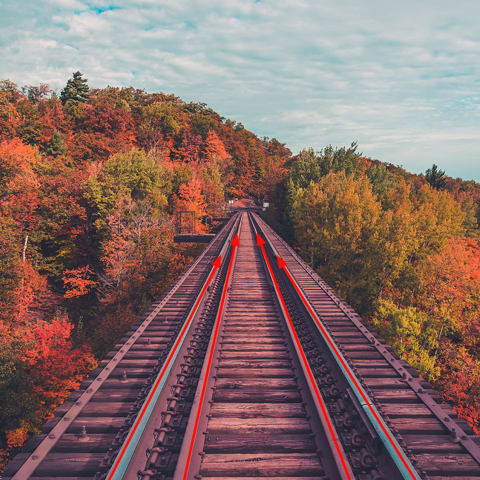
Leading lines photography is a cool image composition technique when a straight or almost straight object in the frame, e.g., a country lane or river, is used for directing viewers’ gaze to the key element of the scene. Thus, whenever we look at such a photo, our eyes follow a natural line and we inevitably end up looking at the needed item.
When examining images, people usually look at the foreground first and then head to the background. When reading text, the left-to-right approach works in most cases. So, if you practice landscape photography and want to use a square composition, you need to find leading lines that extend from the bottom left. Alternatively, you can frame pictures so that leading lines start in the foreground and protrude to the background. However, putting leading lines into a square format may be difficult due to the limited space at your disposal.

Some photographers like to crop their images to a square format in order to get rid of needless or ineffective negative space, but you need to think twice about whether this approach is suitable in your case. In fact, negative space photography has its charm especially if images are accurately modified to a square shape. Of course, cluttered and sloppy photos can hardly cause a wow effect but if you cut off distracting items, you will receive a beautiful, minimalist picture.

One of the most useful photography composition techniques is the diagonal principle. Those interested in square format photography can use this approach without worries. Square compositions have a feeling of stability in them, which immediately triggers the idea of permanence. If you want to add some dynamics to an image, you should use diagonal lines.
According to the diagonal principle, it is necessary to locate the key objects diagonally so that they preserve the sense of balance both in horizontal and vertical planes. By arranging the composition this way, you can highlight perspective, and add depth and dynamism to a photo.

You have probably noticed that the most captivating Instagram squares have a centralized composition. If you want to draw viewers’ attention to a specific object, you can hardly find a better method than locating it in the middle of a square.
This works particularly great when a subject has a defined shape, so that the empty space around it highlights it even more. Besides, the peculiarities of the subject will be more noticeable. The square format in this case offers a perfect, balanced frame.
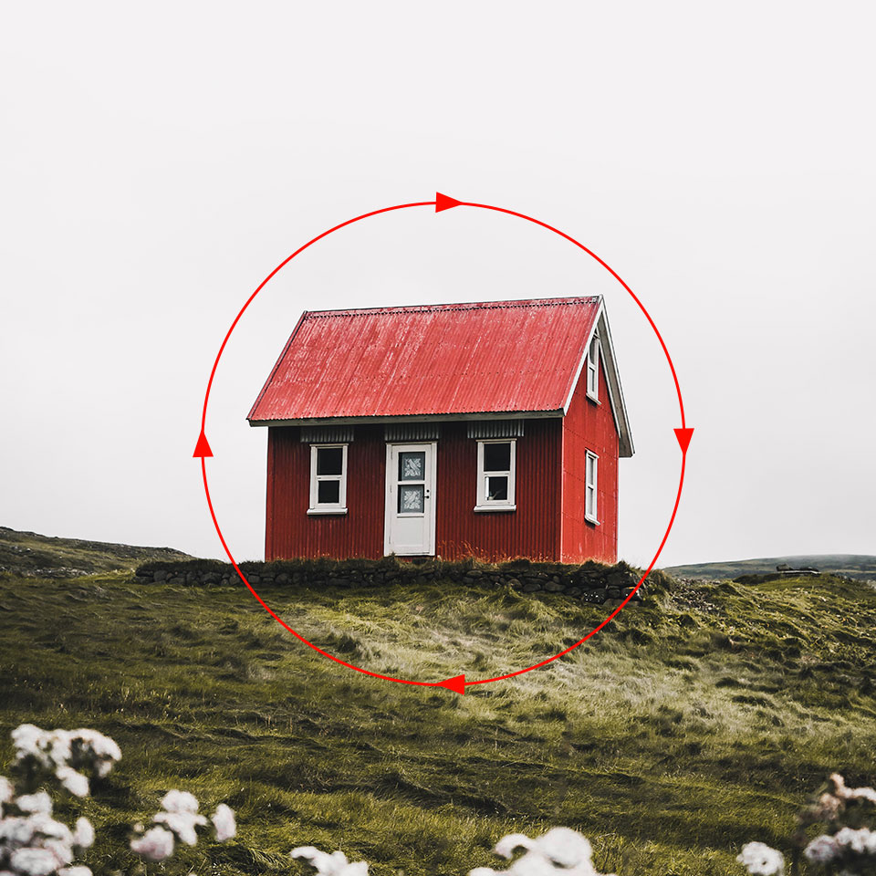
The rule of thirds in photography is a guideline for most genres that require a traditional rectangular aspect ratio. However, when it comes to square photography, the result will disappoint you.
This happens because our eyes don’t follow the longer edge of a rectangle from side to side or in the up > down direction if we are talking about a portrait format. It goes around the frame in a circle, so it makes sense to take care of the balance of a picture in the first place.

If you want to get a perfectly symmetrical composition or an image where details and abstract forms are front-and-center, you should definitely try a square format. Since it is symmetrical by itself (1:1), when combined with scenes that evolve around symmetry, the result is bound to look amazing. I highly recommend using a square format for landscapes and pictures of urban places. Similar to locating the main subject in the center of the composition in order to make viewers instantly notice it, symmetry provides the same effect.
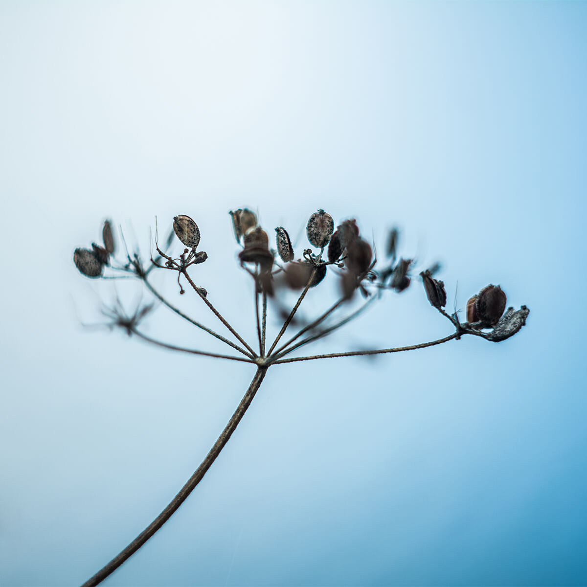
Square format photography is actually very easy to grasp, as it boils down to using simple approaches. To put the accent on a specific object, you need to keep a composition as plain as possible, and doing this with a square frame is a breeze as there is little spare space.
To receive impactful and meaningful photos, you should ditch as many distractions as you can. Make sure your subject is like a magnet that attracts viewers’ attention. Evaluate the frame meticulously and you will understand what should be removed.

If you want to establish a connection between an object depicted and viewers, you should add some details to a photo. This is indispensable for portrait photography that must evoke specific feelings and emotions, provoke thoughts, etc. Think about what elements will add meaning to the main subject without stealing attention from it. This can be something minute and unflashy, but personalized.
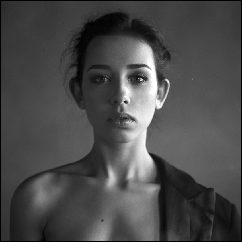
Taking away colors from images is a favorite technique of many photographers, who want to highlight genuine emotions and share a deep concept with their audience. Lines, textures, and shapes become tremendously important in this case, so you can use the black & white shooting principle in square format photography without hesitation. Many contemporary fine art photographers are gradually switching to black and white photography because of its ability to “tell stories” without employing colors.
So, the next time you will be taking square images, switch your camera to a monochrome mode and see what you’ll get. Or, you can take color photos and then modify them in black and white apps, like Lightroom mobile app, or Monokrom.

If you don’t have medium format cameras that take square photos but want to experiment with this technique, there is still a way out. You need to frame your composition wider. Both a portrait orientation and a landscape one are suitable for such experiments. Later, you can crop an image in Photoshop, or use photo square apps like Instfit, and Square Sized. Thus, you can better grasp how a composition is made and create several versions of one shot.
Do you have lots of Instagram squares and want to improve them in a quick way? Then download and use these professional actions. The collection contains Instagram, film, matter, and many other filters. Using them, you can maintain one style across a number of images without editing photos one by one. Learn how to install Photoshop actions and get down to the creative part.