How to Write a Photography Bio: 25 Tips

A photographer’s bio is a short text about you as a photographer that is usually seen at your portfolio, website or Instagram. What visitors find written on your website influences on their decision.
Photography bios help understand the type of personality you have and estimate whether working with you would be efficient and easy.
25 Tips on Writing a Photographer Bio
Here is a list of useful advice that will help you to create a proper client magnet on your personal website. Even though such info pages are only there to attract more customers, you should treat the task of compiling it as a new art project you can enjoy creating.
1. Start with the Name
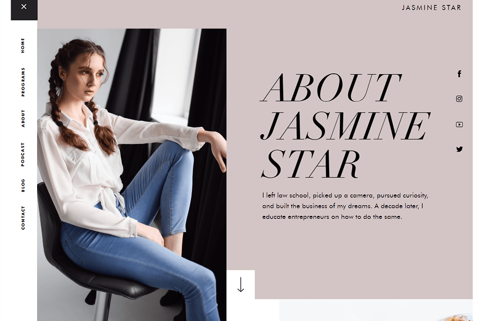
The standard ways of naming this section, such as “Bio” or “About me”, are explicit and helpful. You want the visitors to be able to quickly navigate themselves. For that reason, the less common synonyms like ‘information’ or ‘skills’ should be avoided, because such a section could contain anything. Make it obvious that clicking on this headline will allow the viewers to know you better.
- Find inspiration for your photography business names.
2. Count the Words
Keep it around 150-200 words. Don’t bore people, just make sure to provide sufficient information. Break the whole text into small paragraphs, just a couple of sentences.
Verbose and complicated sentences might show your writing skills. But they are hard to read so it is best to avoid them too.
3. Write an Interview
If you struggle to write a whole text about yourself, change the style and make it look like an interview. This way you can answer common or interesting questions in your personal manner. In addition, check whether this page is easy to find.
Add links or buttons to it to every section of the website so that whenever your visitors are at the moment, they only need to do one click to find out more about the professional they are considering.
4. Try Video Format
As another alternative to writing texts, you could feel comfortable narrating your story in front of the camera. This can also show off your skill of finding breathtaking locations and setting up the light. In addition, many people actually don’t like having to scan through texts.
So a short clip would feel a more convenient and natural option. Not to mention that after watching a photographer bio video, people would feel more connected to you and would be able to better understand your personality from the tone and body language.
- Find out about the best free video editing apps to make a video about yourself.
5. Make It Mobile-Friendly
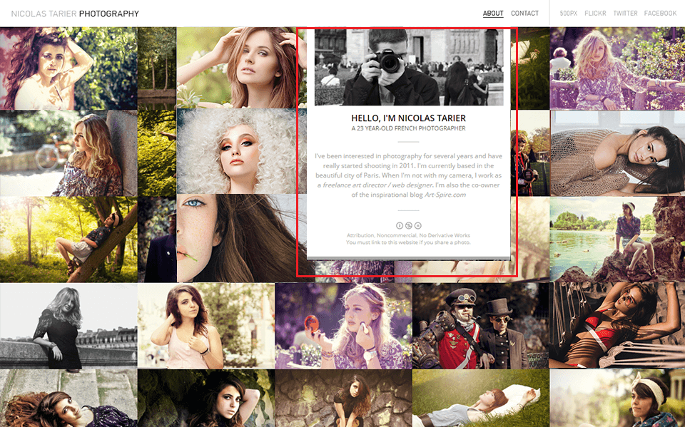
It should be obvious but some people overlook the fact that a large portion of the traffic nowadays comes from portable devices like phones or tablets. That is why, when you’re putting out the pictures or videos and formatting the text, you should spend extra time checking that it looks equally good on smaller screens.
If you take care of this detail that many photographers prefer to ignore, you will show that you really are better than the average representative of this profession. You belong to one of the few professions where extra attention to minor details is cherished by customers.
- Read about the best website builders for photographers.
6. Think About Look
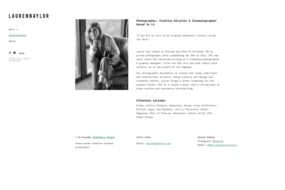
Your creativity might demand some color and motion on the page, suggesting that you use weird colors and fonts or put many gifs. You should try to moderate that desire and stick to simpler things.
If you look at photographer bio examples, you will notice that most of them have a common black font. The point here is that with a unique font, the text will become harder to read, because the classic ones were designed to facilitate reading.
Since people only need to quickly find the needed information, they prefer seeing relaxed color schemes and conveniently formatted text. Put the information out in white yellow and reading that would actually hurt.
The same concerns pictures, you only need one or two in the text. Put more and it will be harder to read. Besides, your website already has a gallery, so there is no need for that.
7. Answer These Questions Before You Start
Whose page is it? Viewers who are thinking of employing you care for such basic information as your name, contacts and the area where you work. It sounds obvious but many shooters actually forget to mention these important things.
Why should the customers give consideration?
What’s the benefit for the customers? Quite reasonably, you should explain how working with you would be different and more beneficial to your potential customers. Answer these questions to show why you are a better choice.
What is your field of work? One more important point is the genre you specialize in. If a bride is looking for a photographer, she needs to see immediately that weddings are what you do and she’s not wasting her time.
8. Try to Use Less ‘I’
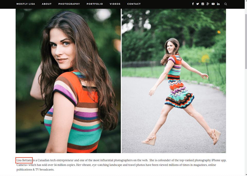
This might sound counter-intuitive but if you think about it, when people read about the photographer, they are actually trying to figure out how they would feel being photographed by this particular person.
When you constantly use the personal pronoun, you’re basically writing a memoir. Even though the viewers are interested in your personality, what they really want to see is how compatible it would be with theirs. So remember, it’s still about your client even when the text itself describes you.
The goal is easy to achieve, just take a sentence about yourself, like “I like shooting in natural light”, and flip it around. Ideally, it would sound something like this: ”Your beauty will reveal itself in all force under the soft natural light. I will bring you to such impressive locations that you will feel mesmerized.”
It will be great if you use ‘you’ more often when describing your work. This way, the stranger who wandered on your page would be able to feel more connected to the photographer they’ve never seen before.
9. Mention These Things
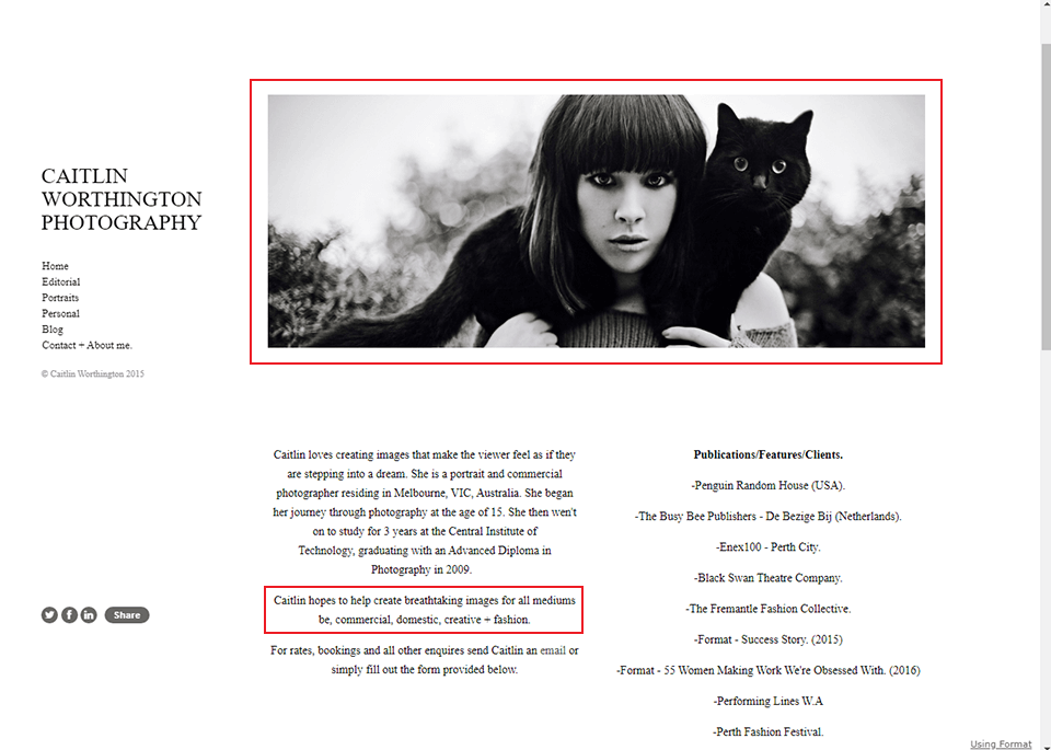
The timeline of your business. The truth is, people read your photography bio only to know about the things you can do now. No one is interested in the history of your growth and development.
Your strong love of photography. Naturally, people would assume that you do this job for the love of photography, so they won’t be interested in reading about it. If you still think that showing your passion is important, better put it in one phrase, as a motto, and place it under your photo.
Your family. You might think that some fun or touching stories would help people connect or think better about you. But these things have no place in your bio either.
10. Think About Awards and Accomplishments
Here, you should also look from the perspective of the potential client. Regardless of how proud some award makes you feel, a common person might not even understand the award’s significance.
Even if you just mention that you have won several international awards, it still won’t impress the customer that much. See if you can pull something more meaningful out.
Find the things that your customers do value. One great thing you can mention is some widely known magazine that you have done some shots for in the past, especially if your potential clients might read it themselves. Another way to impress is to name the famous people that you took pictures of.
11. Quote Your Satisfied Clients
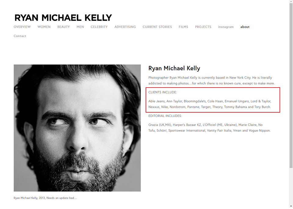
Unlike self-praise, testimonials of satisfied customers in the photographers bio are a great way to show how good you are without making yourself look too cheeky or self-centered. There is simple psychology that makes it work. If there are people who already like you, potential clients start believing that they are likely to feel the same way.
The trick is to use the right amount of praise in the right form. Pick several great comments from people who agree to have those published on your website and mention their names. This will make it look more real.
12. Always Remember About SEO
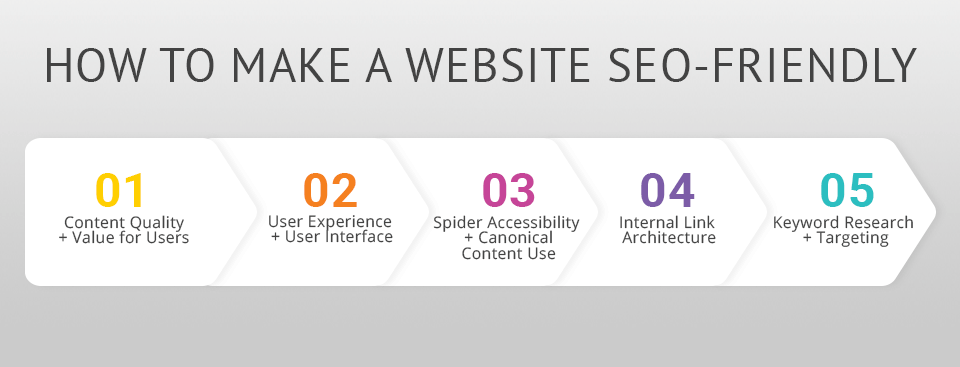
Search Engine Optimization has appeared in order to put websites higher in the list of search results with the help of keywords. Actually, people do that as a job so I highly recommend you to study the subject intently. There are, however, a few small things you can do to your photographer self introduction before you investigate the subject.
The whole task holds on keywords so research which would fit your web page. When a photographer becomes famous, even his name becomes a keyword, but for those who have started recently, there are more fitting options, like the name of your genre or the locations you work in.
The easiest way to do it is to pretend that you are a potential client yourself and think of how you would search for a photographer for a special occasion yourself.
13. Add a Call to Action
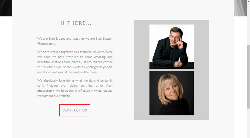
This is a great trick that actually works on people. Once they’ve collected all the information there is a moment of inaction. If people are told what to do next, many actually take the step. This is especially true in cases when potential clients like the text and only need a slight push.
One way of doing it is to place a link to your booking page or maybe contact information. Quite often, entrepreneurs use selling phrases like “book now”. Though they might work occasionally, many people feel manipulated and become irritated. You could try to rephrase it in a softer way, like “check for free days”, or whatever else you come up with.
14. Pay Attention to the Tone of Voice
Your photographer bio is a good place to brag. But if you do it too intensely, people won’t like it. Make sure to show off your best skills and include other information, like your big struggles or what you’re still learning, to balance it off.
A potential client would expect to see an enthusiastic and confident professional busy in self-development. You can’t project that with over-the-top boasting.
15. Visit the Pages of Photographers for Inspiration
You don’t need to invent the page from scratch. Make use of the great examples that you can rearrange or take ideas from. Check the websites of your favorite professionals, especially those role models who work in the same sphere as you.
Observe all the details of that page, note the particular colors, fonts, arrangements of text and pictures, what style the text is written in. Examine each famous photographer bio and pay attention to each element that is there to speak to your subconscious mind.
16. Remember About Testimonials
Inspiring confidence and trust is crucial when you want the viewers to choose your services out of the big variety that the Internet offers.
Real testimonials from clients and display of statistics from social accounts, such as the number of followers, likes, re-tweets, serve that purpose.
For the testimonials to look real and convincing, they should have a number of additional tokens, like a portrait and full name, possibly the job title. Also, it will be great if you indicate their location and a link to the social media account as well.
17. Don’t Forget About Social Media Profile Links
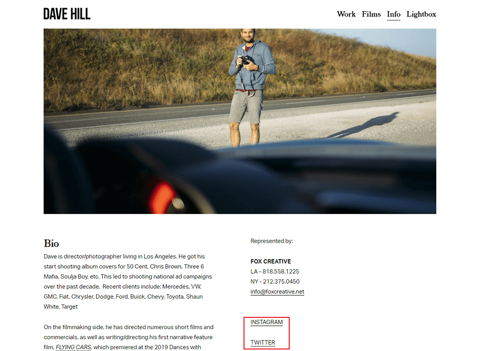
After you have described your photographer biography, let the viewers know you even better by following you on the social media of their preference, the link to which they can find below.
Don’t bother to include a share/tweet link as the About page of a photographer is something rarely anyone would like to share.
- Learn more about the Instagram profile photo requirements.
18. Don’t Be Pompous
Since you’re not yet a big celebrity with international fame, try to not write self-important notions on the bio page. Some potential clients might just think you’re a capricious prima donna or that you won’t listen to their requests or directions and create other difficulties at work.
A passage like this is definitely too harsh: “I never want to take a predictable or boring picture. So I fight this by asking after every shot whether it is something worthy of being put in a gallery!”. There isn’t anyone who would try to take predictable pictures.
19. Don’t Get Too Lengthy
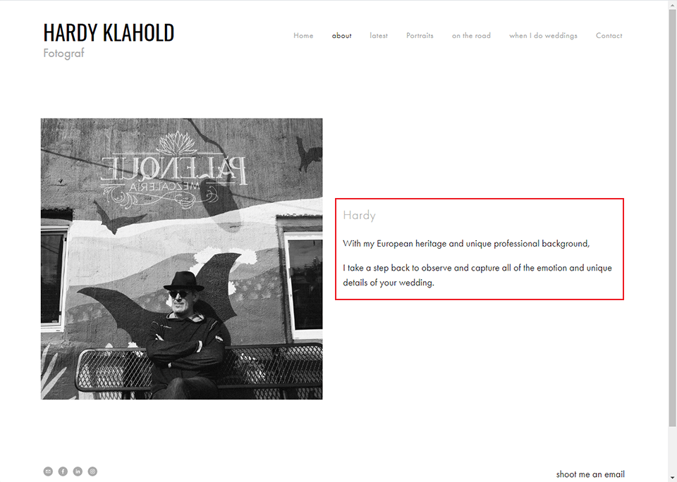
There isn’t much to explain here. Just give a short description, don’t write a novel. You want the clients to crave for more information. If you don’t know where to start, take a look at the official website of Leawo to find the best Facebook bio ideas.
20. Don’t Mention Your Gear
While your equipment is very important to you and might prove a few points to other professionals, the crucial point of how to write photographer bio is to remember that it is meant for a client.
This information will not only fail to impress them, but almost none will make out what you’re talking about here. Plus, the complicated words and unknown model numbers will scare clients away from you and towards someone more understandable.
21. Don’t Be Careless
Get rid of any imperfections like typos, grammar or spelling mistakes, uncouth phrases and the rest. If you can’t seem to write decently or don’t know the language well enough, hire a writer for the job and don’t even think of using an online translator for making copies in other languages.
In addition, engage at least one more person to read through your text. People won’t trust someone who didn’t even bother to proof-read their own introduction.
22. Do Have Fun
If you want to grab someone’s attention, you need to insert some creativity and a bit of fun into the text.
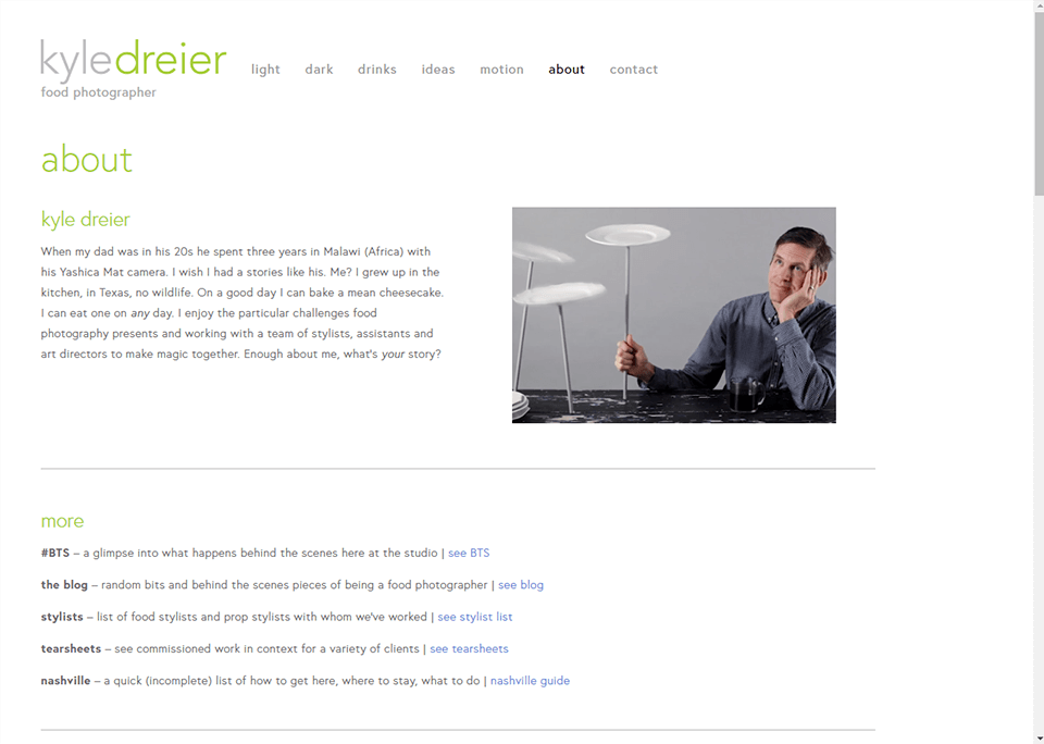
For instance, Kyle Dreier decided to make key points out of his lack of adventure in life and an abundance of cheesecakes. He writes that his dad spent 3 years in Malawi (Africa) shooting on a Yashica Mat camera when he was only in his 20s.
He regrets that he doesn’t have such a story to tell since he grew up in Texas, where there is hardly any wildlife, and spent most of his time in the kitchen. On a special day, he can make a stunning cheesecake, the rest of the days he can simply eat one.
Still, he enjoys doing food photography, cooperating with a team of stylists and other specialists who work together to make art out of food.
23. Do Keep It Short and Sweet
If you look at each photographer bio example below, you will find that conciseness, informativity and thoughtfulness are their strengths.
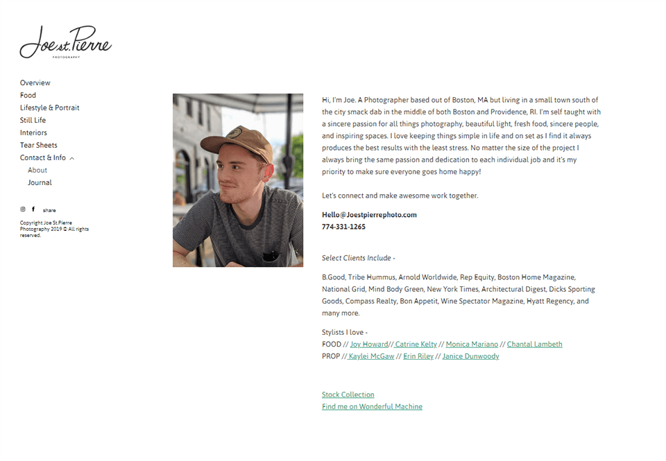
For instance, Joe St. Pierre puts an emphasis on his passion and his desire to keep things simple. He starts off with a sentence that mentions the city he works in and the small town he actually lives in. Next, Joe mentions his self-education and passions that reach beyond photography to sincerity in people and beauty around.
He puts in another sentence on how it is important for him to maintain simplicity in life and work for the best results in both. Joe follows that with an assurance that he treats small and grand projects with equal passion, even when he needs to take an extra step to make everyone happy. The finishing sentence is a delicate call to action.
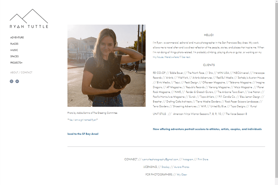
Ryan Tuttle welcomes people in her life and her adventures with a few links. She introduces herself briefly, mentioning the photography genres and her location.
Next, Ryan describes how her work often takes her to places and brings new inspirations which are reflected in her pictures. Then she literally urges people to follow her adventures, which could be anything from rock climbing to playing music or even designing miniature living. There are links to Ryan’s profiles plus some updates on her latest undertakings.
24. Do Have A Photo
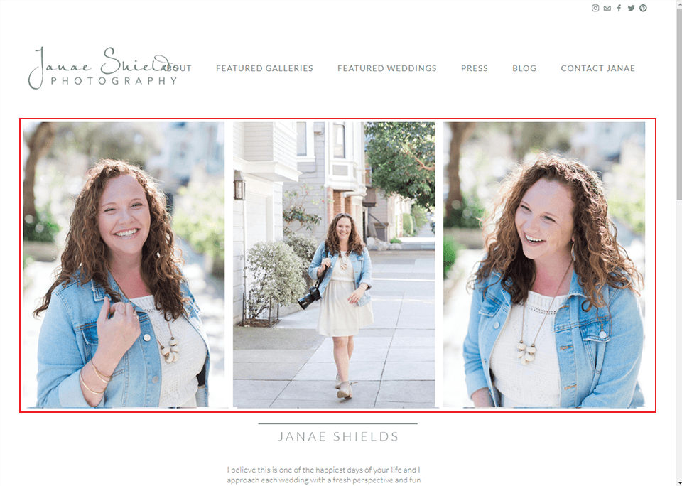
Whenever I’m looking through a photographer biography, I always search for a picture and so do most of the page visitors. It helps to put a face to a name and visitors will also feel more connected once they’ve seen your smiling face on a portrait.
But even more important is the possibility of understanding your type of personality and trying to imagine whether it would be comfortable to work with a person like you. The type of picture that will be put up can be any – a studio portrait or a shot behind the scenes.
As a matter of fact, clients love seeing photos from behind the scenes and it is a great idea to put a few out. If you specialize in weddings, it would be great to have your assistant shoot you as you’re trying to capture the perfect moment. If traveling is your genre, make sure that adventures pour even out of your own portraits. It could be an image of you with gear on at the edge of a cliff.
- Check out information on how to take a good profile picture.
25. Check Out These Examples
If you need additional photographer bio examples, these ones will give you some ideas on how to introduce yourself better and lure customers in.

Gladys Jem
A clean design, a smiling face on the portrait and a heartfelt message.
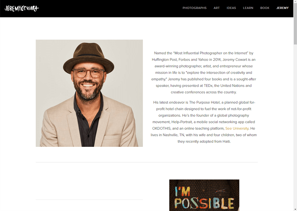
Jeremy Cowart
His career being a success so far, he presents his services in an elegant way.
Freebies for About the Photographer Page
Each photographer should be distinguished by a personal style and his own identity. In order to make this easier for you, I offer you three of these free materials.
Logo Template

Photographer needs a logo, as this creates his/her personality. In addition, such a logo can be placed on your photos as a watermark.
Marketing Template

I recommend using such marketing templates for Facebook. They will add creativity to your feed and attract the attention of potential clients.
Facebook Cover

The cover for Facebook is an attempt to create a corporate identity, which makes you more professional in the eyes of customers.


