If you are a retoucher, Photoshop is an extremely useful tool when it comes to enhancing the overall quality of your images. But even so, people manage to take photos that become real Photoshop fails.
This collection features the photos with too many limbs, weirdly bent legs, and incidentally deleted body parts. It’s beyond understanding how these mistakes have been overlooked by editors.

This recent fashion trend is bound to be embraced by those, who think they spend too much money on their bags.
The designers admired the dress so much they didn’t want to distract viewers from it. So, they have cut out the bag. It might have been better if they would have edited out the handlers as well.

When you hire a pro-level photographer, you expect that your family members to look better in a photo than in reality. Not in this case, though. As the picture became viral, the family members must be elated that they are virtually unrecognizable in it.

The obvious explanation is that these young men have been cast for the TV show "The Apprentice" because of their mutant hands. It is either that, or the designers responsible for this striking example of the most common Photoshop fails have no experience whatsoever.

This model is supposed to look sexy. In a way, she does if you aren’t afraid of aliens with clawed hands. The creator of this photo must have read too many comic books.

We don’t even want to discuss the way some words on the cheque are spelled. The shadow is pretty telling but we like the reflection as well. Would you pay for such a half-hearted attempt that looks like one of the worst Photoshop fails?
This photo becomes positively spooky when you take a look at the disembodied hand on the girl’s shoulder. We will never know what the man has been found guilty of but it seems like there is no place for him in this paradise.
This editing masterpiece reminds me of an original Cinderella story where one of the sisters cuts her feet to put on the shoe. This girl seems to have gone as far as to cut off her leg to lose some weight. Not sure if Prince Charming is worth such a sacrifice, though.

I would like to know what has happened during this photo set as it doesn’t look like anyone is capable of posing for photos like this.

Beware, buying this product won’t make your life easier. The designer seems to imply that one day you might find a baby-monster in a cradle.

While it can’t be considered to be one of Photoshop fails in the strictest sense, the designer of this amazing ad has found a smart way to remind us what happens when one goes nuts without sweets.

After coming up with a new motto for Turkish Airlines, the designers must have decided that one can ‘widen their world’ only by boarding a plane without a front wheel. It also looks like they aren’t fans of the laws of physics as well.

The retoucher probably implies that this model would be better off without her belly button. Because of this Photoshop mistake, the girl reminds me of the figure of the Biblical Eve.

Some photographers are known to be afraid of working with hyperactive children. I don’t know what the girl did during her photo session to deserve this but her hand has mysteriously disappeared. It is a worthy addition to the list of funny Photoshop fails.

Thankfully, the woman who has posed for this photo has never suffered from an accident and she has all her limbs intact. The retoucher, however, wasn’t thinking clearly while trying to edit this ad. Otherwise, it’s impossible to explain why one of the arms has been edited out.

While creating an ad for this SD card, a designer must have been unsure about its specs. Probably, the difference between 8GB and 4GB is too much to grasp when you don’t know how to use basic Photoshop tools.

The person who created this state-of-art photo must have terrible Photoshop skills and believe that footballers are an overpaid bunch of ball-tossers. Otherwise, I don’t know why one of them has been shown a red card and has his hand cut off from his body.

I don’t know what has happened to this girl to make her legs look so long but I am fairly convinced that this photo doesn’t contribute to a healthy self-perception of young women.

If the designer is a lifelong fan of pizza, then making the mitts look like claws seems a perfectly sensible thing to do. You can also call it one of the weirdest Photoshop failures.

I used to think that surfing is dangerous if there are many sharks around. It seems that surfers should be aware of the retouchers as well. I am completely lost as to why the editor has decided to show Veronica Kay legless.

When global warming melts the ice caps, swimmers will rule the world, provided they grow such long limbs as this woman has.

The person responsible for this Photoshop fail doesn’t fully grasp the meaning of the word ‘selfie’. Take a look at these cool selfie ideas to avoid such rookie mistakes.

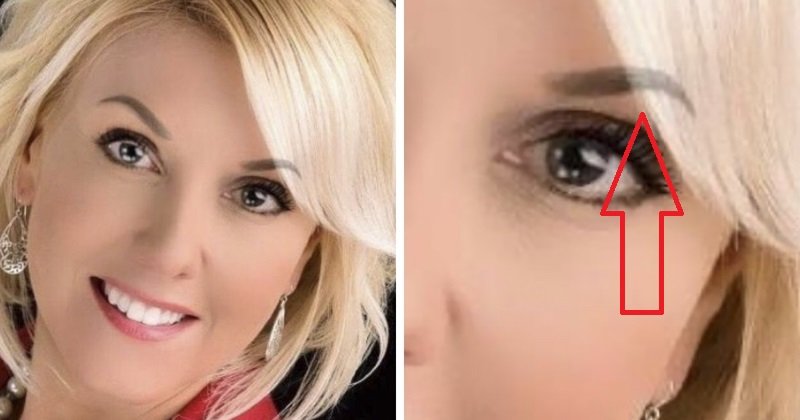
This is what happens when your eyebrows take your psychologist’s advice too seriously and get a life of their own.

It’s the funniest fail ever. The man is all smiles. It looks like he is happy about his body transformation.

It’s the funniest fail ever. The man is all smiles. It looks like he is happy about his body transformation.

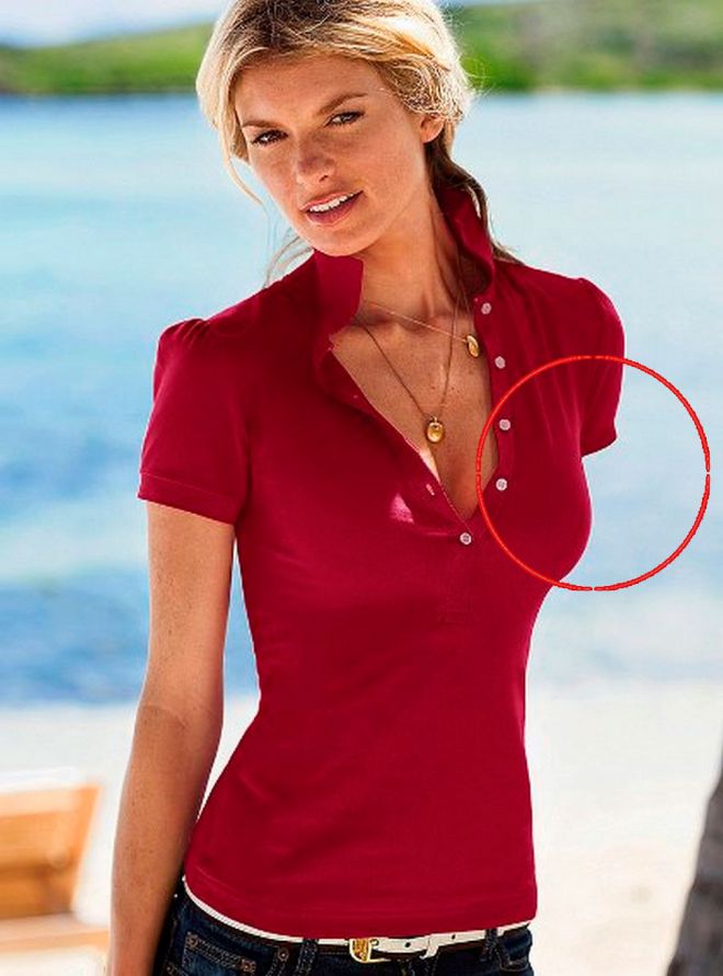
Lingerie photos are supposed to be perfect, or so I used to think. It seems that nowadays unnaturally long, differently colored arms are in fashion when it comes to bad Photoshop pictures. Designers also consider it cool to erase parts of lingerie if they are too difficult to edit.

Another striking example of sloppy editing. I wonder if the editor really thinks that the photo has been enhanced.

This is how inconspicuous Instagram ads usually look like. I am not sure why the retoucher hates proportions so much.
Photoshop fails must be contagious. If it has been done intentionally, I don’t get what were the reasons behind this decision. It didn’t make the girl look more beautiful, that’s for sure.

It’s quite puzzling why this baby needs an additional pair of hands to keep it but disembodied arms contribute to the spooky feeling this ad conveys.

The girl looks happy but I suppose she would be even happier if she had her arm back. As for now, she looks like a living proof of what might happen if you trust your editor too much.

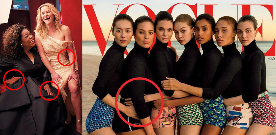
It is one of the most iconic celebrity Photoshop fails. Kim Kardashian is a living legend but when she becomes a trend-setter, it looks slightly disturbing. This model didn’t benefit much from being photoshopped.

This model’s pose seems to defy the laws of geometry. While her outfit looks nice enough, I fail to understand how she has managed to bend her legs this way.

Just like ‘The Matrix’ star, this carrot has seen the better days. At least, it has a nice pair of sneakers!

I don’t know what has happened to the girl’s briefs but it looks like someone has demonstrated just how unprofessional one can be without basic photo editing skills.

In this poster for ‘I Am Wrath’, John Travolta is supposed to look 62. His character is ready to risk his life to take vengeance for his wife’s death. However, his face looks so smooth and young here that I can’t take him too seriously.

The Aquaman promotion poster raised some eyebrows in 2018 as some users noticed photos of sharks from Getty images in the background. To make it even better, movie fans started adding cameos of their favorite Disney characters.

Not sure why John Travolta is so unlucky but this poster is yet another example of the most epic Photoshop fails. The actor’s proportions look weird regardless of the angle you are looking at this poster from.

One would think that Angelina Jolie has suffered enough not to be subjected to someone’s poor image editing skills. This poster for Wanted is a total failure if you take a closer look at the actress’s arm and thumb.

When I look at this poster, I honestly don’t understand how its author has come up with this idea. All these limbs look quite unsexy in their severed state while Hayden Christensen reminds me of a pretentious vampire. It’s an example of really bad Photoshops.

Is it just I, or there are too many hands for two people? It must have been difficult to hire a pro-level designer in the Middle Ages.

What is it with surfers and missing limbs? One would think that it is not a good idea to add a spoiler while creating a poster.

Take a closer look at the guy’s neck. I can’t tell for sure what has happened here but it looks like this man has some mutant genes. Just like other Photoshop fails, it is too obvious to stay unnoticed.

The designer seems to imply that this guy is so tough he can easily live without several fingers. Nobody thinks that protecting society is an easy-peasy job anyway.

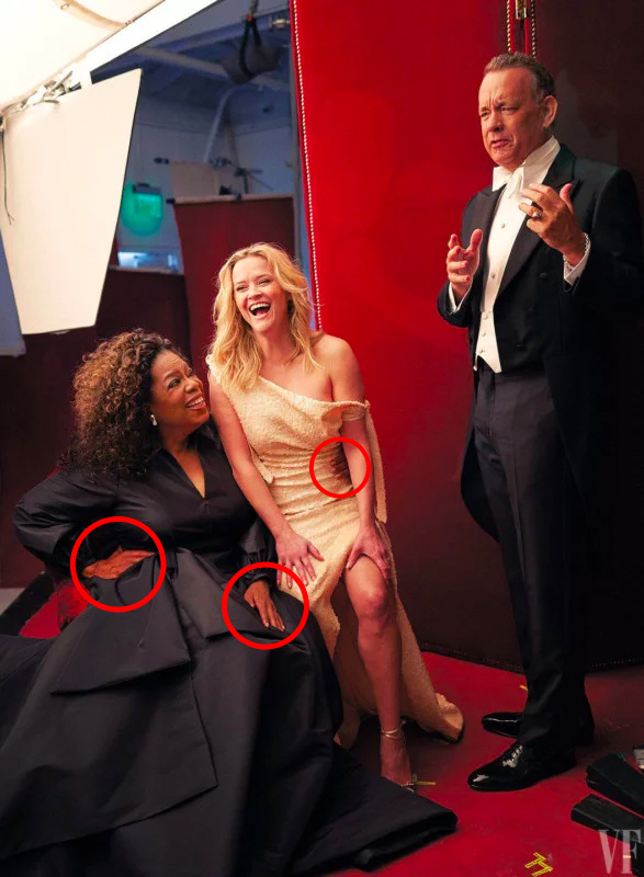
In this photo, Oprah Winfrey has three hands. Reese Witherspoon seems to have grown a third leg during a photo session with the same photographer.

Adam Levine has a nicely shaped torso so it’s a shame that the editor has decided to cut it in two to make the celebrity look slimmer. However, Photoshop fails have never made a handsome man ugly.

No one knows why the editors decided that Michelle Obama had to hold her husband’s hand while leaving Air Force One but it resulted in her getting more hands that she is supposed to have.

It is beyond me why anyone needed to edit this photo at all. As a result, the curb has been bent under an extreme angle which is hard not to notice when you look at the picture. Kim has confirmed that the photo has been edited but decided against explaining her reasons.

The editor must have decided that two-time Emmy winner Melissa McCarthy will look better if she becomes someone else instead. The result is simply disgraceful. Some might also call it one of the biggest Photoshop fails.

The designer doesn’t know a thing about proportions. These pictures look positively amateurish.

I would have thought that this photoshopped model earns enough to hire a professional editor but this picture proves otherwise. Her left leg looks too long to be real while her head is turned at an impossible angle.

It looks like the owner of this leg has become a persona non grata in the Vatican. Otherwise, I don’t know how to explain his ominous disappearance.

Sandra Bullock looks quite threatening here. Her posture, facial expression, and body proportions make her virtually unrecognizable.

I wonder why some designers think that it’s a great idea to edit photos if they don’t know how to do it. This is an example of bad Photoshop as this girl’s thumb looks as if it was dislocated right before the photoshoot.