I work as a photo editor at FixThePhoto, and my job involves trying out popular new styles to make pictures look modern and catch people’s eyes. Recently, one of the most popular requests from our followers has been for the spray paint effect in Photoshop. People especially want those strong, graffiti-style edits that are common on social media platforms like Instagram and TikTok.
I frequently use the spray paint effect in different projects, like artistic designs, social media posts, and current advertising graphics. I use it when a project needs a creative and bold style. This effect is an excellent method for making pictures more noticeable and adding a lively, graffiti-like feel.
However, even though the effect is very attention-grabbing, it can be tricky to use. The most typical problems are using too much of the effect, making mistakes with how the layers combine, or using the wrong settings. These mistakes can cause the textures to look fake or the colors to not match properly.
The spray paint effect is so popular because it mixes the raw, energetic feel of street art with the precision of digital design. It’s a way to bring the look of graffiti into your photo editing.
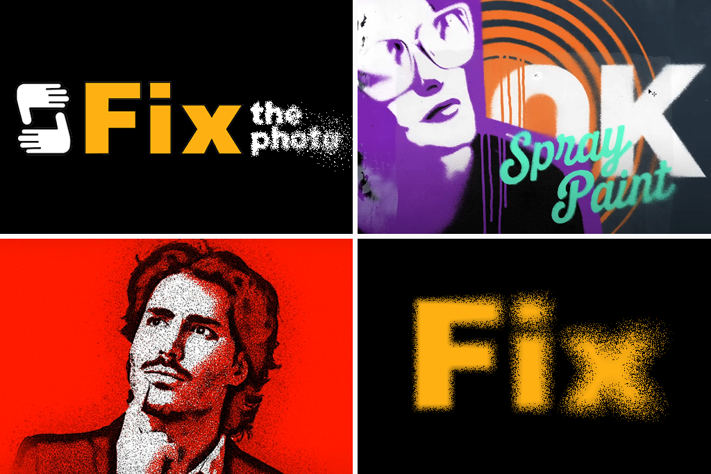
You can use it as a photo manipulation idea to draw attention to certain parts of a picture, add bright splashes of color, or design unique backgrounds that look like they were sprayed on a wall.
You can use the spray paint effect in many places, like:
What I often use it with:
“To make it look natural, I always create a spray paint effect gradually. I keep the opacity and flow settings low and add many light layers. This gives me more control and prevents a fake look.”

You can make this spray paint effect with many different photo editing software for PC, macOS, or even on your phone. Some examples are Photoshop, Photopea, Canva, Photoshop Express, Pixlr, and PicsArt.
However, we tested many of these programs. We found that Photoshop creates the best results. It lets you control the brushes, masks, and how layers blend perfectly. This full control is the most important thing for making the effect look clean and real.
Here is the description of how to make a spray paint effect in Photoshop:
Step 1. Prepare text or image. To start, I open Photoshop and either begin a new project or open the photo I’m editing. When I need to add text, I use the Type tool to write out FixThePhoto. I always choose a bold, clear font that has a strong spray paint style.
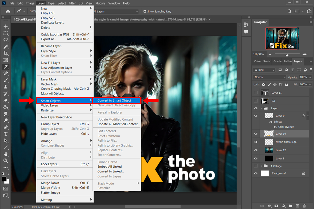
Step 2. Convert text to Smart Object. I always make the text layer a Smart Object by right-clicking on it. This is a safe way to work because any effects I add won’t damage the original. If I change my mind later, I can easily go back and edit the text or the effects.
Step 3. Fill with base color. I pick a bright, solid color to fill in the text. This will be the main spray paint color. Bright colors usually look the most like real spray paint.
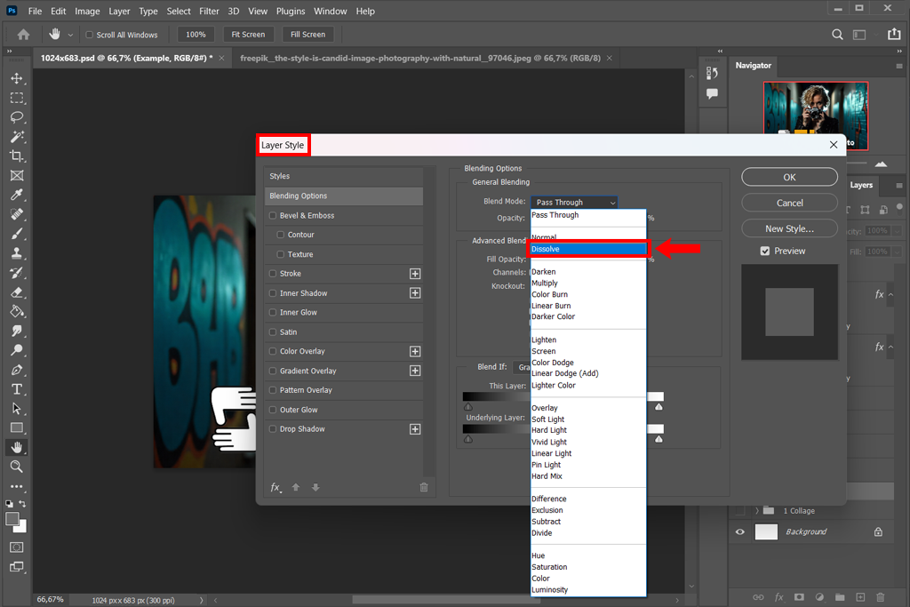
Step 4. Dissolve the layer. I change the style of the text layer to Dissolve. Right now, it doesn’t look much different, but this setting is the most important step. It creates the tiny, scattered dots that we will later turn into the realistic spray paint texture.
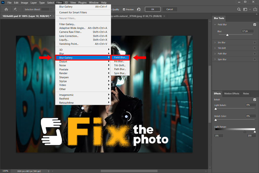
Step 5. Set the blur points. Next, I use the Field Blur tool to add a soft, splattered spray effect. When I open the tool, PS adds a blur control point automatically. I drag that point to the spot where I want the spray to look heaviest.
Then I add more points in other areas (for example, one in the top-right corner) and increase the blur on those. This makes the spray look uneven and natural, just like real spray paint.
Step 6. Make it blurrier. I keep adding more blur dots in different spots, making some stronger and some weaker. This helps create that faded, scattered look of real spray paint. I pay special attention to softening the edges of the text so it looks like the paint has lightly spread around it, just like real overspray.
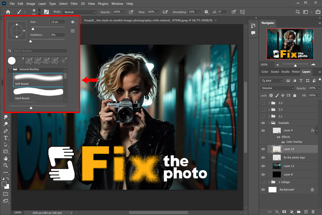
Step 7. Choose a soft brush. To add more nuanced detail, I select the Brush tool with a Soft Round brush and lower its opacity. This allows me to gently paint on the layer mask or directly on the Smart Object layer to create subtle spray paint textures and spots.
Step 8. Add grit. Next, I make the text look rough and worn. I do this by adding a special layer mask to the text. I use a rough black brush to paint on the mask, making parts of the letters look faded and scattered, like spray paint, which gives them a more real and unique look.
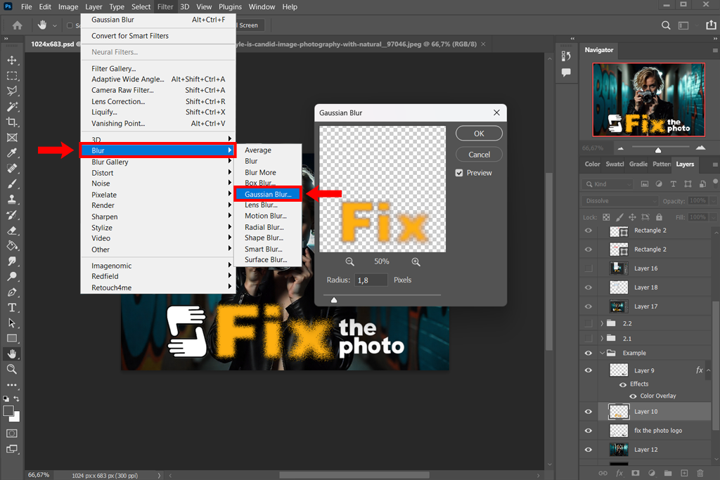
Step 9. Soften the edges. As a final step, I turn the whole layer into a Smart Object to keep everything together. Then, I change its style back to Normal. Finally, I use a filter called Gaussian Blur (Filter > Blur > Gaussian Blur) to gently soften any rough spots. This blends all the spray paint dots together, making the final effect look smooth and unified.
Step 10. Final details. Finally, I add some bright spots, dark spots, or a rough texture on top. This makes the spray paint look more real and complete.
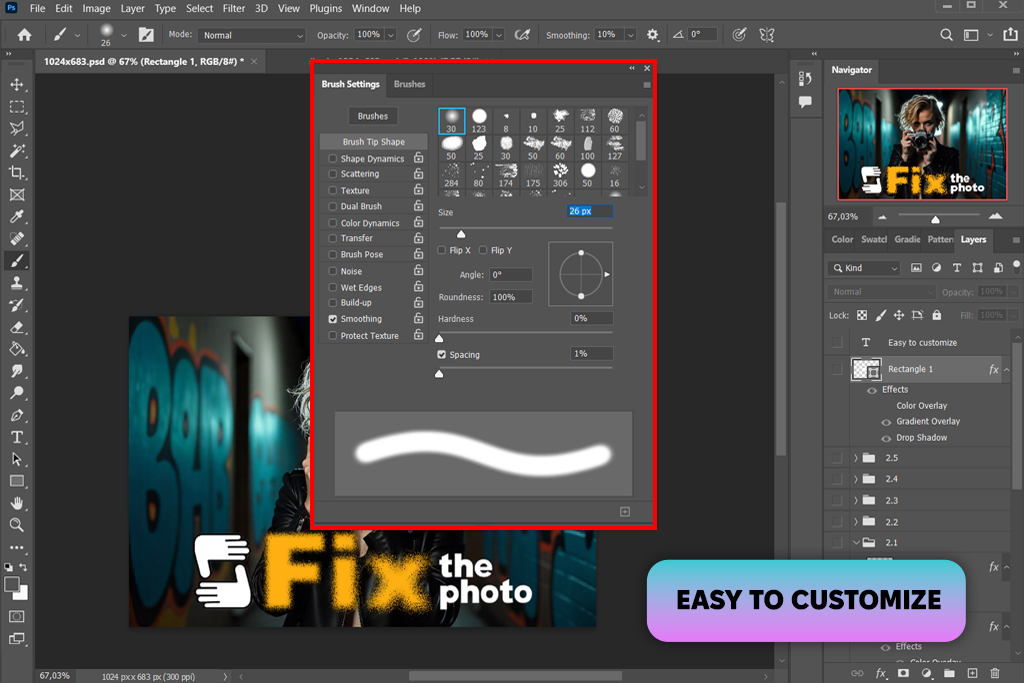
My FixThePhoto colleagues and I highly benefited from Photoshop spray paint brushes to make the design feel more dynamic. The variety of colors, sizes, shapes, and colors, the brushes are available in is amazing.
These handy instruments in .abr format are compatible with Photoshop 4-6 and apply to RAW and JPG images.
Once installed Photoshop brushes, I pick the Brush tool and find the spray paint brush, which matches my vision perfectly. I change the brush size and strength to control how thick and spread out the paint dots are. Then, I carefully paint around the edges of the text to build up the spray paint look.
“Picking the right brush is very important. I use brushes that look like spray or splatter marks because their uneven texture looks more like real spray paint.”
Based on my work at FixThePhoto, I’ve learned that making the spray paint effect look real takes some practice and careful work. Here is the advice I use to make sure my spray paint designs look genuine and of good quality:
“For a more realistic spray paint look, apply a subtle noise or grain filter over your finished effect. This helps blend the digital look into something that feels authentic.”

To make a spray paint stencil effect in Photoshop, first create or bring in the text or shape you want to use. Then, convert it into a Smart Object to keep it editable. Next, make the design solid black and white to give it that classic stencil look. On a new layer, use spray paint brushes to dab color around the edges, which creates the realistic look of paint spraying under the stencil. Finally, add some paint splatters and a rough texture to make the whole effect look even more authentic.
To create splatter effects, I use brushes that are made to look like spray paint or spatter marks. I make a new layer, then lightly click or brush around the spot where I want the splatters to appear. Changing the brush size and transparency helps make the pattern look uneven and natural, just like real paint splatters. If needed, I use an eraser mask to soften or clean up the edges of the splatter.
To make paint look like it’s dripping, you use special brushes or paint the drips by hand. First, paint your main color. Then, on top of that, add drips that run down. Make some drips long and some short, some thick and some thin. Finally, add a bit of dark and light shading to make the drips look real and three-dimensional.
Try using brushes that spread and have a textured look to make them feel like real spray paint. There are plenty of free and paid brush packs online made for spray paint and splatter effects. Testing different brushes and changing the settings will help you figure out what fits your style best.
Absolutely. There are no just spray paint text effects. This technique can be applied to photographs and other graphic elements. It is excellent for imparting an urban, street-art aesthetic that can turn a standard image into a striking artwork.
I control the look of the spray paint by using masks to hide or soften areas, and by switching up the brush’s size, transparency, and pressure as I work. To make it feel more natural, I mix in splashes, drips, and textured layers so the surface doesn’t look too flat or perfect.


