How to Make a Lookbook in 25 Steps

A lookbook is a collection of images that shows your latest products in an appealing way and also advertises your business to potential customers. It is a visual assistant that offers different ways of styling apparel and helps people imagine how it would feel to own it.
This guide will explain the particularities of creating a lookbook that is fashionable and will stand out and imprint itself in the memories of people.
How to Make a Lookbook in 25 Easy Steps:
Whatever the content and style of your lookbook is, there are basic elements that affect its success. To make sure you’ve used them to your benefit, read through these helpful tips for defining your brand in a striking way through a lookbook.
1. Create an Appealing Introduction Page

The hardest part of making a lookbook noticeable is to design its cover. A subtle change in the cover page can turn it from attention-grabbing to invisible. The cover gives the strongest impression, so it has to be appealing and informative but original at the same time.
The basics of the cover page are the brand name, the dates of the collection, the most characterizing picture of it, and the way you present them has to give enough information about the collection to make people want to turn the page.
The example from Arcadia can be called perfect. It immediately gives a hint on the information inside and makes you anticipate the content.
2. Create Simple Navigation

When you create a lookbook online, devote special attention to how clear and smooth the navigation system is. Make the info easy to find and this will ensure your visitors enjoy looking through the lookbook even more.
Business of Fashion added simple navigation buttons to let you skip to the very beginning or end.
3. Write Attractive Product Descriptions

The text should be informative, intriguing, but not too verbose. Obviously, it has to include information about the brand and the collection. Try to limit descriptions to 30-60 words.
Some consider text a distraction and aim to minimize it dramatically, but a better way of doing it is to create descriptions that play along with your style and concept. For a customer, it is important to learn more details about the product he/she fancied without extra hassle.
With that in mind, try to designate names to products rather than just numbering them because humans have a poor memory for random digits and that may reduce the lookbook’s efficiency.
4. Include “Buy” Buttons

If you want people to buy things from the catalog, place multiple buttons with purchase options throughout it. Its design has to be noticeable and also convey the possibility of clicking, with the font that’s easy to read.
Attach a link to the website where they can make the purchase. Brixton offers a more discreet way of doing the same thing - making the button visible only when the person hovers over a certain catalog picture.
5. Include Contact Options

Provide viewers, who have questions, with multiple possibilities to pose them immediately. Give your contacts and links to social media, offer to sign up with email, etc. The latter is a great way of tracking potential buyers and improving your offers.
6. Invest in High-Quality Visuals

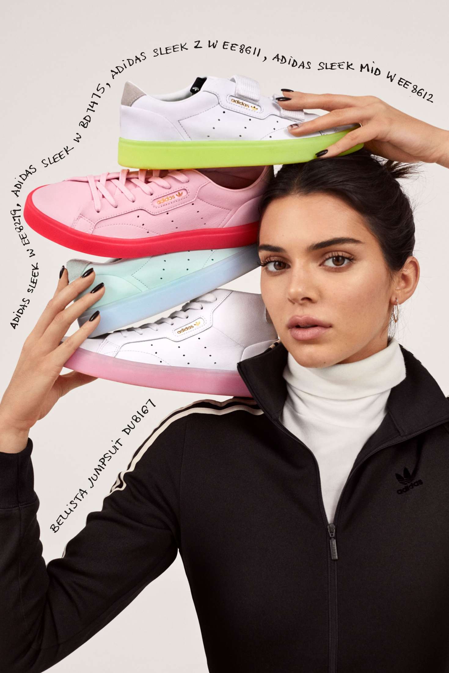
Surely, the most powerful influence of your lookbook is the images you fill it with. Consider what aesthetic you are going for and then give all it takes to create a catalog that follows it in every single detail.
Spare no resource to get a professional photographer and an experienced model, find the best shooting location, take a wide variety of images. The only way how to make a lookbook outstanding is to get professionals to work out every tiny detail of it.
A great example here is Fashion Nova’s lookbooks because they go out of their way to make the promotion shoots stunning and yet within their own theme.
7. Tell a Story

Through the lookbook, you should show your customers what their life would be like once they get the depicted products. To get a vision for that, ask yourself a few questions about that product, like what problems can it solve for the owners, what benefits will your clients get after the purchase?
Gather true answers to those questions, put them out as a cohesive story, and see how successful such a purposeful catalog will be. If you want an example, a great story has been told in the Of Mercer’s “Work Meets Wear” lookbook.
They were aimed at women, who want to combine professionalism with style and comfort and that is why the clothing was shot in specific daily situations. Models were captured getting into a car, making phone calls, taking a break, etc.
8. Take Your Brand Personality into Account

What is a lookbook if not your brand in a nutshell? Make sure the concept and personality of the brand literally shine through its pages. This Pull&Bear catalog is the perfect example; you can see from the images that they are going for a fun and relaxed theme with a lot of friendly pictures of youthful people.
This correlates strongly with the brand’s identity, which sells fun, urban clothing that largely appeals to teenagers and younger adults. Make sure your concept is as visible in your own lookbook.
9. Add Trend Sections

People like following trends and you need to keep that in mind when creating a lookbook. I recommend dedicating a few pages to the current trends to cater to your trend-oriented customers.
Topshop knows that the 90’s fashion is back so their “’90’s Antwerp” is a great example of this trick. Remember, that there is no limit on how big a lookbook should be, just make sure to organize it and help customers understand and get excited about the new trends.
- Read more about fashion photography.
10. Think About Phone Users

Statistics show that for most mobile users a web search results in an action within an hour whereas a search from PC takes a week on average to get acted on. When you create a lookbook online, consider that mobile users offer the biggest opportunities and so you should make sure their viewing experience is as comfortable as it can be.
That will mean investing in a design that will look equally good on any device, and while that is expensive it also pays back well.
11. Create Lookbooks Every Season

Rather than being a simple selling device, a lookbook is a record of your brand’s evolution. If instead of sticking to one design, you freshen it up with every new season or collection, the customers will be more likely to stick. Modern people support companies that keep up with the times and evolve.
You can see a famous brand like Samsoe doing exactly that, updating their lookbooks each new season.
12. Use a Fun and Relatable Approach Like Of Mercer

If you position your brand as daring, you might follow the example of the Of/Mercer lookbooks. The images are a skillful combination of extravagant yet realistic styles which appeals to many viewers.
They went for a bit of fun in their digital lookbook but made sure that outfits and accessories feel like they have a place in the real world. This way, potential clients see how they can balance together work and life in such clothes if they buy them.
- View more unusual model poses.
13. Incorporate Storytelling Like Ted Baker

Another impressive kind of a lookbook was designed by Ted Baker. The brand is great at incorporating a story within it and makes sure that keeps the viewers engaged.
The biggest achievement of such an approach is that their online catalog is unmistakably recognizable and makes the brand stand out.
14. Come Up with New Approaches Like One Tribe Apparel

If you’re searching for inspiration on how to create a digital lookbook that is unique in itself, then turn your attention to One Tribe Apparel. This was definitely the first and, possibly, still is the only crowd-sourced catalog out there.
In their own words, you will find outfits put together by people from 6 continents, 16 countries, and 21 locations. To support that statement, the brand put a map on their website where you can pick a region of interest and see the styles popular there now. The pictures are provided by various contributors few of which can be called professional models or photographers.
15. Keep it Simple Like L.K. Bennett

If you want to cater to people who appreciate simplicity and sophistication, nothing works better than the clean white background used throughout catalogs like the one by L.K. Bennett.
Some might argue this is boring but a large number of users appreciate straightforward brands that stick to minimalistic designs and only showcase the actual things they offer without extra décor.
As a result of such a strategy, the brand is respected for its cohesive and easy-to-navigate lookbooks that allow customers to do what they came for.
- Read more about clothing photography.
16. Stick to Rules Like Topshop

Being one of the biggest retailers, Topshop can really be looked up to in the quest of how to make a lookbook that increases sales.
They kept the design clean to help viewers concentrate their attention on bright fashion items, provided them with useful and concise descriptions, and spread pop-ups, urging messages, and buttons in strategic places. Such a design is well thought over and highly functional.
17. Use Flipsnack to Create Lookbooks

To make the process of creating a lookbook easier, go for a good software piece like Flipsnack. Instead of just making a simple catalog with pictures, it helps you create something interactive where you can easily navigate and follow links.
For the fashion industry, there is a selection of different templates that can be adjusted to match your brand’s style, be it modern and flashy or sophisticated and minimalistic. If nothing really fits, be free to create a unique template that will help viewers identify you.
18. Use Catalog Machine to Create Lookbooks

If you are looking for the simple lookbook software, this program will help you quickly put together a new Online & PDF Product catalog. It contains free templates and allows you to create your own designs, which can later be combined together in one brochure or catalog that will contain all your best offers.
- Check out product photography tips.
19. Use FlipHTML5 Pro to Create Lookbooks

This is an assistant that will allow you to create a rich lookbook project with different content that can be shared afterward through local storage or online, as well as added to your website as a plug-in. It has a great set of templates that make the work easier but allows some customization when needed, plus the program is not overloaded with advertisements. Generally, a great tool for a modern, unique, and content-rich lookbook.
20. Promote on Social Media
Hardly there is a more powerful means for advertising than social media, so use it to promote your own brand. Share lookbooks on various sites and benefit from the increased traffic and sales they can provide you with.
21. Reach Out to Influencers

Apart from placing ads on social media, you can also collaborate with bloggers or celebrities, who can either participate in your lookbooks, share your online lookbook or give it a review. It is pretty easy to reach out to some social media influencers but be mindful as you do that.
Such people attract a certain type of audience and if it is too far from the people you’re aiming at, such collaboration will give you no benefit. Make a selection of potential candidates and research their content and the audience before you make a move.
- Read more about lifestyle product photography.
22. Use Email Marketing
A great combination of simple and yet efficient advertising is a mailout. Just send out the latest offers to make them noticed and work on stimulating the recipients to respond or share them further.
23. Offer Coupons

To make the lookbook content even more attractive, sprinkle promotions or special offers throughout it. As a benefit from those coupons or codes, you will get the increased loyalty of your customers.
24. Advertise
For the campaign to be a success, it must combine paid and organic tactics in it. Fire out social and other kinds of advertising plus pay for optimizing the search results and let them bring your lookbook out to potential customers.
25. Use Smart SEO
To make sure that paid advertisement does its best, take care of those webpage details that are used by search engines. Set out the main keywords and put them in meta descriptions, title tags, alt text, links. Then make sure your website works fast and has no broken pages or mistakes in content display.
How to Create a Lookbook in Google Sliders
When a business doesn’t produce its own lookbooks, most often the reason is the lack of sufficient skills in design. The reality is, you can manage with just Google Sliders or PowerPoint, a photographer, and a model, and the result will be good enough.
Here is an example showing you how to create the initial two pages.
Step 1. Open Google Sliders

You can start the program on your computer or open it online on Google/slides. With the latter, you will have to create an account if you don’t have one.
Step 2. Choose the Theme
Click on “Create new presentation” and the new window will be the start of your next lookbook. At this step, you can already set the background if you want one.

Don’t worry about a lookbook template, there are plenty of layout and color options to select from.
Step 3. Set Up the Dimensions

Once you plan the design of the page, you should specify its measurements. For that, go to File - Page Setup at the top of the screen.
A few parameters will define the lookbook dimensions for you, mainly the orientation of your images and the amount of info you want to fit on one page. If the standard options don’t match your vision, set custom measurements.
Step 4. Add Photos
Once you have the content for the catalog, simply drag and drop the needed images in the corresponding Presentation Slides.

Step 5. Add Text
To give viewers some information about what they’re looking at, you need to create a title and an intro on the first page.
Find Insert - Text box in the toolbar and designate a space for the text fragment on the page. Then type in any comments you feel are necessary.

When you want to see how the result looks so far, click on “Present” at the top of your screen.
Step 6. Create More Pages

There are no rules on how to create a lookbook. You can attach a few pictures of the same outfit from different angles to let your viewers inspect in thoroughly.

To give it more structure, use borders to separate elements of the page from each other like in this sample.
Step 7. Done! Enjoy the Result
When you think you’re done with placing all the elements, give the result one final look to see if all the details are in place. Once you’re fully satisfied, then save the file or export it if you were working online.
Free Templates for Creating a Lookbook
Designing your digital lookbook on your own is pretty time-consuming. There’s no reason to go create it from scratch. Spare yourself the trouble and use the 5 free templates below. All of them were created with the latest trends in mind.
1. Elegant

This template grabs the attention with its simplicity. It is also an excellent solution for those who like to go into detail in their description and prefer to use a lot of text.
2. Studio

This template, with its unconventional text and image placement, will give your lookbook visual flair. It makes a great pairing with photos taken in the studio.
3. Fashion

This visually stunning template has a fantastic layout that is sure to leave a solid impression on potential clients.Great for those who want to present fashion images alongside text in a fresh and stylish way.
4. Product

This sophisticated template features an enticing layout, that is perfect for product photos. The template features minimum text to better emphasize the visuals.
5. Minimalistic

With this template, your photos get all the shine. Note the excellent use of white space. This minimalistic and clean design will definitely trigger the potential clients’ interest.


