Do you believe that fonts have a significant impact on the success or failure of your project? In today's age, it has become easy for designers to pick the required font due to their enormous choices. The primary typefaces are further divided into different categories, so it is guaranteed you can find the demanded font for your forthcoming task.
In today's guide, I will introduce you to one of the most in-demand and popular sans-serif fonts, Avant Garde, which is a logo typeface. Let’s talk about this font that stems from Tom Carnase and Herb. I will also discuss how Avant Garde font can change the photography captions game. To know all the details, keep reading till the end.
Knowing the history of a particular font you plan to use in future work is essential. Avant Garde is a san-serif font that made headlines in 1968 when 2 notable designers, Tom Carnase and Herb Lubalin, presented it to the world. Since its emergence, this font has expanded a lot in terms of weight and style.
If you are working on a project that demands an old look and style like the 70s, Avant Garde font can clearly be your priority. When it comes to art, this font is a sure winner, be it some project associated with media or any photography work. To make your photography captions stand out, Avant Giant is here for you.
In 1970, the ITC company released this font. In fact, it was the first font released by this agency. Later, it presented many other fonts. In the following years, it has submitted different versions, some of which were created by Ed Benguiat. In 2005, there appeared the pro version, which contained lowercase alternates and an additional cap.
It is not easy to get the most appropriate retro-style look that perfectly defines the fashion people were following in the past. If you are working on a site that reflects both modern and old-style fashion, you can combine Avant Garde typography with a modern font, as it will make a perfect combination.
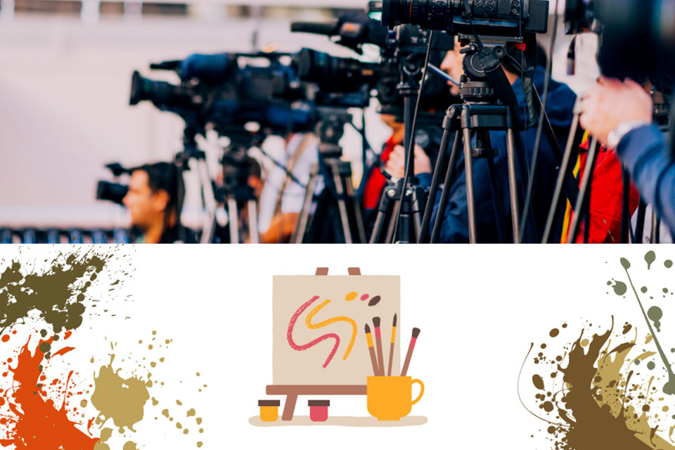
If you are an Arts person or associated with the media, this font should be on your top list. Being a photographer, you can make your caption game strong by choosing Avant Garde font. Moreover, if you have been searching for a perfect font to use in logos of upcoming series, make sure to choose this font. It has 2 versions – fitting for headings and suitable for the text.
Choosing a font for logos and headings is a big deal because all your efforts may go in vain if you select poorly. Avant Garde font works perfectly for logos and titles because of its tall x-height and large open counters.
The best thing about this font is that you do not need to ask for permission in order to use it in your projects. Whether you want to complete your personal project or you are looking for a free font for your commercial project, go ahead with this one without any license issues.
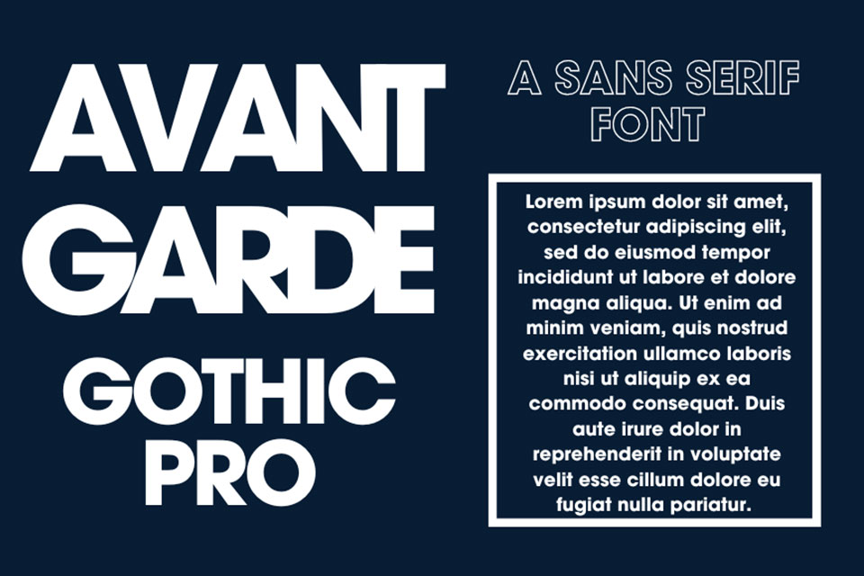
Here is the first digital version of the Avant Garde font that contains numerous features including lowercase alternates, additional cap, unicase glyphs, etc. It is great for numerous scenarios as it includes Latin character sets, Adobe 2, etc.
It comprises 2 versions - the Monospaced version and the digital one. The Mono version was created in 1983 by Ned Bunnel. The digital version was created by Elsner and Flake. It is an extended family of four fonts.
It is also a well-known digital version of the Avant Garde font.
The Government of Alberta had been using this font in the logo till 2009. Moreover, till 2019, they have used this font on the registration plates of various vehicles.

On media platforms, the Avant Garde font has remained front and center. It has been used in titles of different Netflix shows and numerous video games. The popular show on Netflix ‘Master of None’ used this font in the logo.
The 2011 Eurovision Song contest also picked this font for the slogans and score charts. In 1999, the popular band ‘The Man Who’ used this font on one of their albums. Different television series used this font on the closing and opening credits.
Real estate is another sector that needs attention when it comes to photography. If you know how to create amazing real estate photography, you are likely to get more sales.
Since 1991, the American real estate agency ‘Century 21’ has been using Avant Garde typography in the logo till 2018. Another American Real estate company called ‘RE/MAX’ used this font till 2017. A public broadcaster located in America used this font in the logo.
Decker is a san-serif font that you can use free of charge for personal use. For commercial use, you should get your hands on the license. It has numerous versions.
Here is another great alternative that you can use if you do not want to pick Avant Garde font. It contains the regular font, which was released in 2015 for the first time.
This san-serif font contains 4 different styles, including Bold, Regular, Oblique, and Bold Oblique. It has an extended font family and is undoubtedly one of the best alternatives to Avant Garde font, so you can use it whenever you want.
For any personal work, you can choose this font for free. It is surely another great alternative but is not free for commercial purposes.
Do you want to know more alternatives? Here is another one that is also a san-serif font introduced by Linotype Company. You can download the free version for personal use.
Avant Garde is the number 1 san-serif font that has earned popularity and fame for being used in important projects. As a designer, I know that a font can entirely change the meaning of a design both in a positive and negative way so always choose wisely. This guide covers Avant Garde font, its usage, the best alternatives you can find, and a lot more.
Whether you are looking for a font for an entertainment platform or you want a perfect font for a logo, this option can be your ultimate choice in every case. You can pair this font with numerous other options as well. Moreover, in case you do not want to use it, you can choose different alternatives mentioned above.
Go through the entire article so that you find your favorite font. Remember that Avant Garde font is the best option for small texts and logos.