Icons play a crucial role in promoting apps and their functionalities, so many designers and business owners eagerly seek guidelines on how to create an icon for an app that is easy to recognize and remember. Besides, with the right logo, potential users can quickly find your app amidst a vast array of other tools on their phone.
Drawing inspiration from seasoned designers, you can create icons that are not just captivating but also highly effective. With such icons, your apps will immediately catch users’ attention and stick out from the crowd.
How to create a desktop icon for an app? There are several core factors to prioritize:
An icon should be scalable and easily identifiable. It should align with your brand strategy while preserving uniqueness. Besides, it should be purely visual, without any accompanying text.
If you don’t want to use a free stock icon from public platforms, take advantage of these tips to create a logo that suits your goals.
To make your icon recognizable, think about a symbol or shape you can use for it. Analyze the logos of famous brands and how they use simple shapes in their icons.
For example, you will definitely not confuse the Twitter logo with other social networks, thanks to the bird on the logo.
When creating icons, simplicity is key. Put aside complex design techniques fitting for mockups or other types of graphic design. Instead, prefer one or two easily recognizable elements.
However, when going for simplified icons, keep your brand promotion and identity in mind. The shape of the icon should convey the values or essence of the brand, carrying the main message. Therefore, do not oversimplify. Add some elements that will be etched in people's memory.
An icon is a graphic symbol that should be understandable to potential app users without additional words. Sometimes it is OK to add text labels to desktop icons, but things are different with mobile applications. They occupy limited space on the screen, so it is worth using it strategically and create an icon without text.
It is perfect when users, looking at icons and logos, can recognize the application flat out without reading the name. If a designer has managed to create such a logo, they have surely achieved success.
Typically, it is possible to switch between light and dark themes on mobiles, so you need a logo that is clearly visible regardless of the chosen theme.
Choose shades that will look good in both themes and will be easy on the eyes. Graphic designers first select shades for a light theme, and then adapt them to a dark one (these are not the same shades). If you look at the logo of the WhatsApp application, you’ll see it looks equally cool in both light and dark themes.
If you are just learning the ropes, you can find many resources on the net where you can enter the desired shade code and automatically generate a dark theme version of it. Look for this option in Coolors, Adobe Color, Color Hunt, Paletton, and Colormind.
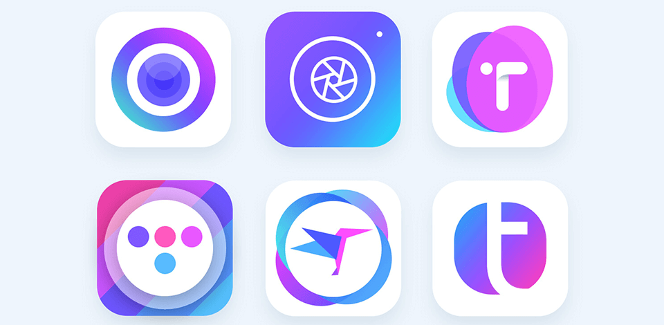
Creating a perfect set of icons on the first try is rarely possible, so develop as many variations as you can. To understand which icons are most suitable, utilize A/B testing options alongside icon maker software. For instance, Facebook has experimented with several logo variants already.
If your app is cross-platform, it's important to ensure that icons look good on each platform. To do this, you can use specialized marketing resources like Optimizely, Google Optimize, Mixpanel or Firebase A/B Testing.
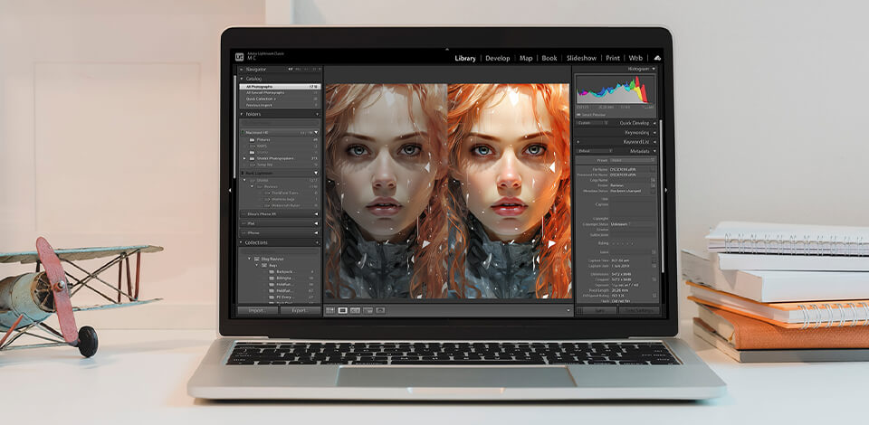
To ensure that icons can be easily scaled without losing quality, you should create them in vector format. This means you'll need to use vector graphics software. Adobe Illustrator is an industry leader in this regard, providing both a free trial version and various paid plans.
No less important is to create icons that fully harmonize with the entire brand identity. Icons must align with other elements in terms of color and style, blending seamlessly into the overall aesthetic.
However, if the brand has more than two primary colors, it's best not to introduce new ones when creating icons. For instance, the Slack app features four distinct colors, and designers stick to using only those. Sometimes, you can also incorporate black but avoid an overload of hues.
All icons for your mobile app should maintain a consistent style. For example, they could all be filled or outlined. The most crucial consideration is to adhere to the singular design style of your app. This means that if your app has a minimalist design, avoid creating icons in a brutalist style.
Designers should be very attentive. Before you start creating your own icons and other elements, check out how other representatives of your niche have tackled this task.
What colors do they use? Which style do they prefer? How do the icons fit into the overall design of the app?
If you noticed that your competitor updated the icons, analyze whether it helped or not to promote their mobile application. Decide whether it has affected recognition and more feedback. Think about what you could improve or change and what you can take for your app’s logo design. However, don't confuse inspiration with plagiarism.
Avoid trivial ideas as much as possible. Devote your time to releasing the creative power of yourself into the development of a concept that will differ from the rest of your competitors.
Look at the logos of Reddit and Evernote; they are soo creative and funny. Both applications employ logos with interesting characters, so easy to remember. Such logos are pretty close and closely associated with those mobile applications.
Keep up with trends and tailor your ideas to meet these demands. To get inspired and stay abreast of trends, visit Behance, Dribble, Mobbin, Pinterest, as well as sites like Icon8.