These logos have achieved universal recognition in the world. Their design rarely changes, as they perfectly convey the intended message. Many of the examples you will see on this list have been used for decades. I have selected the most effective designs that demonstrate the values and the mission of a brand.
If you are interested in logo design, make sure to consider these examples to see why they are so successful. Each of them has become iconic. Some of them were only slightly tweaked, while others were changed to become more powerful. You will easily recognize each of these logos as they are a part of our culture.
Creator: Henry Dunant (the founder of the International Committee of the Red Cross (ICRC)
Year of creation: 1863
The Red Cross logo features a cross shown against a white background. It’s a commonly used symbol of humanitarian missions. Despite the simplicity of its design, it’s quite effective. The logo became the symbol of neutrality and protection.
The first version of the logo was presented in 1876. Muslims often replaced it with the red crescent preferred by soldiers from the Ottoman Empire. Since then, both these logos have been used across the globe. In 2005, the Red Crystal logo was presented. The three versions of the logo have the same meaning.
Interesting fact. The Red Cross logo became an international symbol of humanitarian missions. It was recognized by many countries as a universal emblem for non-combatant and military units conducting humanitarian operations. Unauthorized use of this logo in the war zone breaches the Geneva Conventions and other treaties.
Creator: Rob Janoff
Year of creation: 1977
When looking for the top 10 best logos in the world, don’t forget about this iconic example. Initially, Apple's logo included a picture of Isaac Newton. Steve Jobs decided to change it and hired a professional graphic designer, Rob Janoff. After the new logo was approved, it was only slightly tweaked in 1998. Now, it no longer has colored stripes.
The fact that the apple in the logo is not whole indicates that the company tempts its clients with new technologies. Some critics suggest that the bite symbolizes a “byte,” which shows that the company prioritizes computers. Some people also believe that it is a Biblical reference, saying that the apple shows that the company opens access to knowledge.
Creator: Stanley Meston
Year of creation: 1952
The history of the famous McDonald's logo began in 1952, when the owners of the company tasked Stanley Meston with creating a design for their first franchised restaurant, in Phoenix, Arizona. George Dexter came up with the idea to add two huge yellow arches to both sides of the restaurant.
A decade later, when Ray Kroc became the head of the company, these arches were used as a source of inspiration for a new logo. The version that is used now was registered as a US trademark in 1968.
Interesting fact. The logo became a symbol of globalization both for the proponents of the global markets and those who do not agree with the ideology of capitalism. The New York Times even published a column about it in 1996 titled The Golden Arches Theory of Conflict Prevention.
The authors ironically suggested that no countries that have McDonald's have been at war with each other. However, after Russia invaded Ukraine, this theory lost all its relevance.
Creator: Paul Rand
Year of creation: 1956
The blue color is often used in logo design, but IBM designers managed to make it more recognizable by using parallel blue lines. It creates an optical illusion, which makes it quite attention-grabbing.
Other versions of the IBM logo are more colorful. The company experiments with different designs to demonstrate that it can convey its main message using various elements.
Despite its basic look, the IBM logo is quite powerful as it includes horizontal stripes that symbolize speed and reflect the company’s commitment to innovations. In addition, such elements demonstrate that the company is looking for development opportunities and employs edgy technologies.
Creator: Frank Mason Robinson
Year of creation: 1886
The Coca-Cola logo has a truly iconic status, which helped the brand achieve widespread recognition. The first version of the logo was created back in 1885 by Frank M. Robinson who worked as the company’s bookkeeper. He utilized the Spencerian script that was widely used at that time, which allowed the company to differentiate its products from the rest.
Even though the company made some adjustments, the initial design remained the same for over a century. The red color symbolizes energy, passion, and excitement, as the company strives to provide its clients with an unforgettable experience.
Interesting fact. Besides its iconic logo, Coca-Cola has achieved widespread recognition thanks to the design of its bottles. The contour bottles were presented in 1915, which helped the company to improve its signature identity. The designers drew inspiration from the cocoa pod. The company has changed the design of the bottle since then but it still has the same recognizable curves.
Creator: Frank Mason Robinson
Year of creation: 1971
Even if you aren’t a huge fan of Starbucks, you might still admit that its logo is extremely effective. The usage of the image of a mermaid and bold colors was a successful mix that improved the company’s recognition. This logo helped the company to establish its presence in 84 countries across the globe.
Founded in 1971, Starbucks was named after one of the characters of Moby Dick by Herman Melville. Terry Heckler was interested in using seafaring motives and added an image of a mermaid to a 16th-century Norse woodcut hoping that it might help him to come up with innovative ideas.
Then, he decided to use this sketch for a logo. It was improved multiple times, but the initial concept stayed the same. What makes it the best logo in the world is that the design is not symmetrical, which adds to its appeal and makes it more thought-provoking.
Interesting fact. In ancient Greek mythology, sirens were mythical creatures living in the sea. They were the embodiment of its dangers. In the Starbucks logo, the image of a siren symbolizes the fact that the company allows its clients to enjoy exquisite coffee from different parts of the world. It shows that every client is invited on a journey of exploration and discovery.
Creator: Carolyn Davidson
Year of creation: 1971
Nike’s logo demonstrates that even the most basic graphic design ideas may work well. Portland student Carolyn Davidson came up with the idea of the checkmark logo in 1971. The company paid her $35.
On Nike’s official website, one can read the history of the logo. According to the information posted there, founder Phillip Knight initially did not like the design but was hoping that it would grow on him. The logo has improved the company’s recognition. In 1983, Knight gave Davidson a gold ring with a diamond and Nike stock.
Interesting fact. While most people believe that the logo was created to convey positive emotions, initially, the designer wanted to refer to the goddess of victory Nike. Davidson also later said that she intended to give a logo a dynamic feel.
Besides, Phillip Knight liked the Adidas logo, so it might have been used as a source of inspiration. The company later registered the logo as a trademark. Nike changed the lettering, but the overall idea of the logo stayed the same.
Creator: James Modarelli
Year of creation: 1959
The NASA’s first logo was often compared with a meatball. It was designed back in 1959 when the agency had just been created. It symbolizes the mission of the organization and shows that NASA prioritizes science and space exploration. The updated version of the logo released in 1975 was compared to a worm. While it looked stylish and more modern, most people preferred the previous version. Due to this, it became the official logo again in 1992.
The “meatball” logo was created by James Modarelli. He headed the graphics department of the Lewis Research Center. The designer decided to use a simple circle, a spacecraft, and a red chevron to convey the idea that NASA explores space.
Creator: Colins (design agency)
Year of creation: 2013
The Spotify logo initially looked quite different from the version we are used to. The first version included a green circle with three sound waves. Later, the design was simplified. Now, it features a green circle with three curved lines.
The Colins logo design company decided to express the main idea of the logo in a subtle way. By replacing the sound waves with curved lines, it streamlined the design while preserving its original meaning. The updated version of the logo still shows that the platform provides audio streaming services.
The designers intentionally picked the green color for the logo. They wanted to associate the brand image with such connotations as harmony, vitality, and growth to demonstrate that Spotify provides artists with an opportunity to connect with their audience in a meaningful way.
Creator: Landor Associates (brand consulting company)
Year of creation: 1994
The FedEx logo might be not as famous as other examples on this list, but it exemplifies the brilliant use of white space. This design was developed by Landor Associates in 1994. The agency utilized negative space in an innovative way to demonstrate what services the company provides. Pay attention to the arrow between the E and X letters that adds a sense of movement.
This design is not as confusing as CM Punk best in the world logo, which explains why it won different contests and has over 40 awards. It has never changed due to its widespread popularity. Lindon Leader, who was senior design director at the company, later said that the logo helped the company’s clients to learn more about FedEx and the whole range of services it provides.
Interesting fact. Lindon Leader noticed that many clients called their parcels “a FedEx package” even if they were shipped by other providers. Due to this, his team advised FedEx to leverage the widespread recognition of the brand.
The company’s name was initially too generic. The name FedEx was more recognizable, which allowed the enterprise to reach out to a wider audience.
Creator: James Modarelli
Year of creation: 1947
The Ferrari logo is called the "Prancing Horse" or "Cavallino Rampante" in Italian. It was created in Maranello, where Enzo Ferrari founded his car manufacturing company in 1939. At first, the logo was used for a race car in 1947, but later it also became associated with such qualities as luxury and powerful performance.
The designer who created the logo was inspired by a story of a World War I hero Francesco Baracca, who painted a prancing horse on his plane. After the pilot’s tragic death, his mother allowed Enzo Ferrari to use a similar logo for his race cars. The modern version of the logo also has a yellow background, which refers to Ferrari’s hometown Modena.
The logo designs you saw in this article provide useful information about brand identity. They tell an important story about the brand’s values. A good logo should invoke emotions and make you feel something. When a brand has a suitable logo, it attracts more attention.
There are multiple factors that ensure that a logo will be successful:
A logo is the first thing that clients see when they try to learn more about a brand. Professional designers specialize in different types of graphic design, which makes it easier for them to develop suitable logos for their clients.
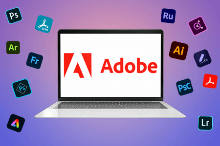
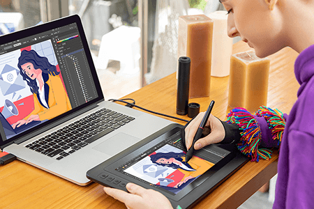
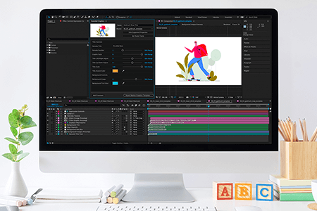
You will find a lot of dedicated logo makers and advanced design software that will allow you to work on projects of different complexity. You can select the most suitable option depending on your preferences and needs. For instance, you may use Adobe Illustrator, Canva, Affinity Designer, Sketch, LogoMaker, and other similar software.
You might notice some counterfeits sold with logos of Johnny Walker, Adidas, Puma, Nike, Converse, Coca-cola, Apple, McDonald's, KFC, and Starbucks.
In addition, criminals often use the logos of Louis Vuitton, Panasonic, Lifebuoy, Olay, Dairy Milk, Colgate, Head & Shoulders, Rexona, Calvin Klein, and Supreme.
The price of your order will depend on the complexity of the task and the amount of time the designers need to spend to create a logo in accordance with your requirements. When choosing a service provider, check whether it provides free revisions. The prices for logo design services start at $50 for basic tasks. However, you might have to pay thousands of dollars for a logo designed by a famous agency.
To design a good logo, you should learn more about a company’s target audience and competitors, come up with an idea, create a sketch, and select suitable fonts and colors. Many companies hire seasoned professionals who specialize in designing logos and use vector graphics software when working on their projects.