With the best infographic examples, it is easy to capture the attention of viewers, which is very important considering the fact that the average human has an attention span of just 8.25 sec.
As web users see tons of data every day, their attention span is quite narrow, so keeping people interested is a very difficult task.
As for me, infographics are not only eye-grabbing but also aid in comprehension and retention, making them precious in today’s marketing.
As our brain better perceives visuals more effectively than text, this type of graphic design is designed to make difficult topics easier to understand and remember.
Infographics can come in handy when you need to:

Made by OneSpot
Effective infographics often prioritize simplicity and clarity in design.
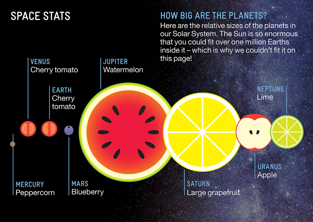
The infographic makes a comparison of the sizes of the planets very easy. It does it actually in such an easy comparison: plants versus fruits – so fresh and engaging.
Movehub's infographic looks very attractive as its author masterfully played with colors to explain complex ideas.
The initial color is like a visual map for defining the tone and color of each subsequent section.
Another thing that impresses me is the seamless integration of this guide at the bottom of each part, ensuring trouble-free navigation and overall comprehension.
Such an approach reminds the way things work in kaleidoscope, so such infographics attract the viewers and allow them better understand the delivered message.

This is one of the best infographic design examples for presenting data and creating the scene.
This sample discloses the top 10 popular books in the world people were able to read during the last 50 years, and you can take advantage of the best free infographic maker to design similar pics.
The image mimics a bookshelf and the height of each book corresponds to the number of samples sold.
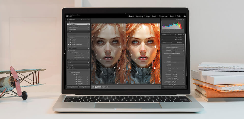
![]() If you want to create similar infographic samples or unique designs, Adobe Illustrator will come in handy. The program allows customizing the artwork, charts, and graphs, generating attractive icons, and changing data without trouble.
If you want to create similar infographic samples or unique designs, Adobe Illustrator will come in handy. The program allows customizing the artwork, charts, and graphs, generating attractive icons, and changing data without trouble.
To make the design process more efficient, think of purchasing the All Apps plan, and entering the Adobe Creative Community to take advantage of other resources and support.

Presented by Hoodzpah Design, this spectacular infographic piece has both a modern and vintage feel.
The pic is captivating and turns the viewers’ attention with slick typography and generous use of shadows.

Valentina D'Efilippo drew inspiration from the post-war “In Flanders Fields” poem to create this spectacular infographic.
It features the remembrance poppy to honor soldiers who sacrificed their lives in war.
The author used the data visualization tool to present the statistics through poppies of different sizes.
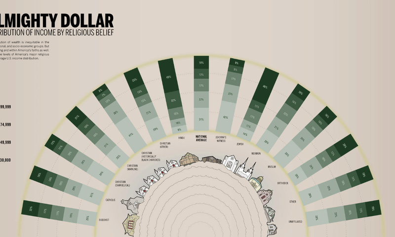
Although the color palette of this distribution map produced by Column Five and Good Magazine is muted, it is eye-grabbing.
Its color spectrum ranges from beige to green and yellow.
Besides, the designer used various shades of green to show the received income, with the darker hue indicating a greater abundance.
The way the statistics are organized (in half-circle form) is the peculiarity of this design.
Such a unique arrangement looks really interesting catching the viewers’ attention with rises and falls.

With the best free graphic design software, you can spruce up infographics with interesting illustrations.
When developing this beautiful design, the specialists of the financial company Digit wanted to explore the total good time cost of different songs.
The specialists can draw inspiration for creating the best infographic design examples virtually from anywhere.
And the most important thing is to craft an item that grabs the attention of viewers.
Creating marketing personas and delivering the ideas through them allows making sure that the content resonates with the audience.
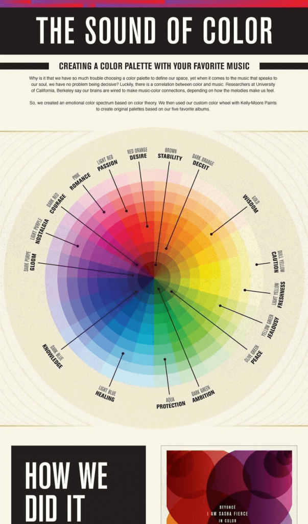
Picking the right color can be a real brain teaser no matter whether you are going to buy a new car or renovate the apartment.
Knowing well that this task is usually challenging, Kelly-Moore offers to base your choice on your favorite music.
It is an unusual and fun way to show your expertise in colors, as well as an eye-catching infographic.
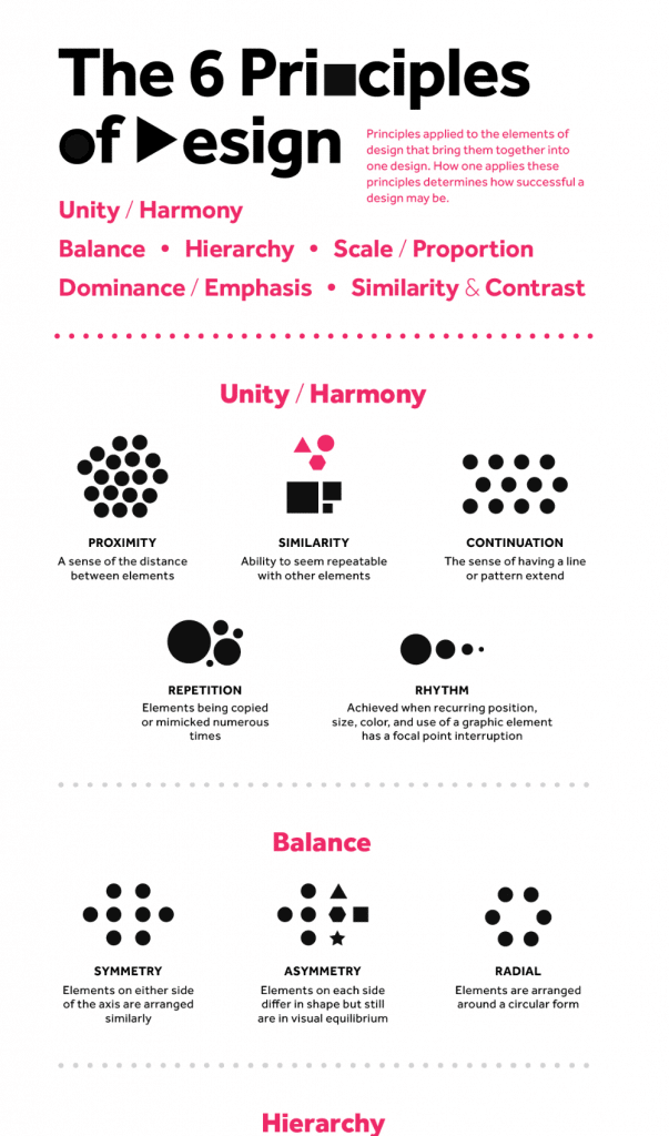
Polo is the designer behind this spectacular infographic that revolves around such notions as Hierarchy, Unity/Harmony, Balance, Similarity & Contrast, Dominance/Emphasis, and Scale/Proportion.
This is one of the best infographic examples proving that you do not necessarily have to use vibrant colors when working on the designs.
Two colors are actually enough to create amazing graphic design idea and communicate effectively.
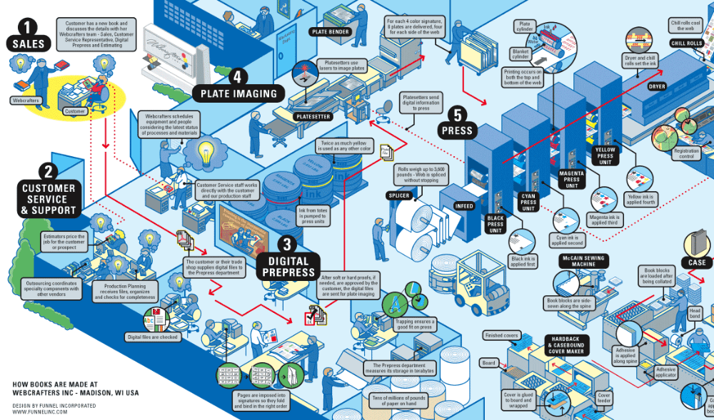
This infographic, introduced by Funnel Incorporated, has a cluttered design, but a viewer won’t have trouble to understand it.
It is easy to follow the red arrows that lead a reader to the final destination.
Due to such approach, this infographic is full of dynamism.

This infographic by Offerpop, a famous graphic designer, covers the history of hashtags, which are included in every graphic element of the composition.
Another interesting feature is that the overall composition is built around an oversized hashtag to bring the focus to the topic.
The use of graphic elements allows highlighting the subject of your composition.

Flowchart infographics. This type of infographic illustrates the process step by step, simplifying and clarifying each stage it contains.
A left-to-right or top-to-bottom approach is preferable when creating this type of infographic in a free flowchart software.

Timeline infographics. This is a perfect option for those who want to include the visual element when telling the history of something, giving a summary of the event, or highlighting significant dates.
When creating this type of design, you can take advantage of visual aids like labels, icons, images, and lines to focus on some point in time.

Comparison infographics. This infographic type provides you with a convenient way to compare several elements.
Usually, such designs split down the middle horizontally or vertically, with one variant on each side.

Hierarchical infographics. When there is the need to rank data from the least to the most important, this type of design is an ideal fit.
One of the most well-known hierarchical infographic examples in 2020 displays Maslow’s Hierarchy of Needs.

List infographics. A list infographic is perfect for sharing a list of examples, a list of resources, or a selection of tips.
To highlight each item use bright colors, original fonts, and icons.

Geographic infographics. Digital artists prefer this type for displaying demographic data or location-based data.
The focus visual of such designs is usually a map chart.
The success of an infographic greatly depends on the planning, so check these steps to better organize the process.
Determine your goal. Decide whether you want to raise awareness, explain the concept, or induce people to action with your illustration.
Know your viewers. Defining the type of audience is crucial for creating decent content. You should consider the readers’ interests and understanding to choose the appropriate language and visuals.
Gather your content. Make sure that the info you deliver is credible and taken from reputable sources.
Select the Right Infographic Type. The chosen type of infographic depends on the type of info you are going to present.
Plan the Structure and Layout. Outline the main points to organize your presentation more efficiently. Rank the data to create a clear picture for viewers.
Generate interesting text. Concise and interesting text is the key to every successful infographic. Divide information using headlines, subheadings, and bullet points.
Visualize your data. To deliver info more effectively, you should include visual elements like charts, graphs, icons, and illustrations.
Choose a Color Scheme. The colors influence readers’ emotions and attract their attention to the needed fragment. Define your topic and target audience to select the appropriate colors.
Get inspiration for your design. Look at other designs you like to come up with your own layout, color scheme, visual elements, etc.
You can read the best graphic design books or visit free online graphic design courses.
Plan for Sharing. It is also important to decide where you'll be sharing your infographic and how to optimize it for various sites.
An infographic is a visual representation of data or some insights. This is actually a graphic or illustration built around such elements as charts, graphs, icons, and text to deliver the info in the most comprehensive way.
There is no exact answer as it greatly depends on the content and the readers. For instance, if you need to compare two elements, a comparison infographic is the best fit. If you are going to share the content, prefer a data visualization infographic.
A clear purpose and focus, a clean design, eye-grabbing visuals, and data from reliable sources are what make a successful infographic.
Designers can create statistical infographics, informational infographics, timeline infographics, comparison infographics, process infographics, and geographical infographics.
Color coding, graphics, reference icons, as well as such content elements as time frames, statistics, and references, are crucial components for sharing knowledge through facts and deductions.
Excessive text, irrelevant visuals, unreliable info, cluttered design, and complex data can ruin any infographic.